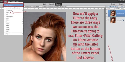
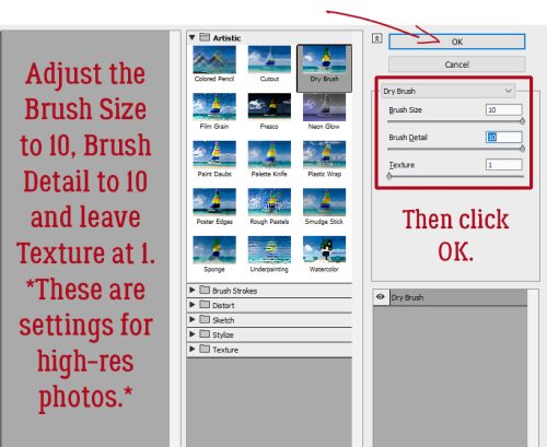
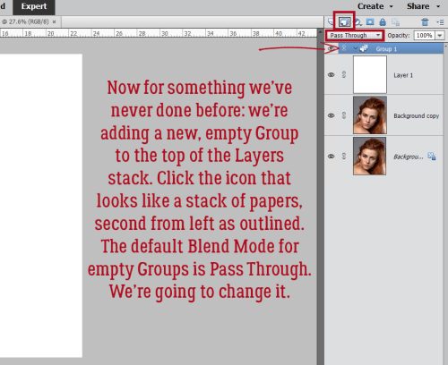
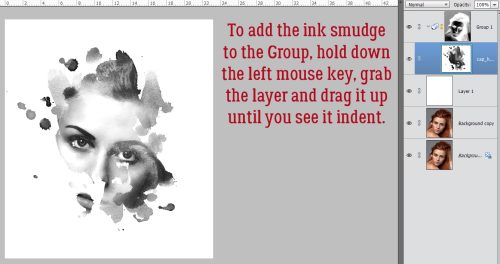
Challenge Spotlight: Mixed Media
![]()
Today I’m showcasing one of the new GingerScraps Challenges for 2024. Interestingly enough, it’s hosted by a designer who was a guest at GS for many months before she made it her home: Sarapullka Designs. This is the inaugural month for the Mixed Media Challenge. So we’re seeing the very first layouts posted to the Gallery! Larisa (Sarapullka) has provided an artsy paper and a paper cut element as the foundation for this month’s Challenge; participants were welcome to add anything they liked, as long as it came from Larisa’s store. They are required elements, which makes this Challenge an ideal one for my Individual Style analysis.

Because this is a brand new Challenge, there were only 6 layouts in the Challenge Gallery this morning. I hope, by putting a spotlight on it, we can bring that number up before the end of the month – and we do have an extra day… As always, each layout appears here in the order it was uploaded, and is linked to the Gallery so you can get a closer look, and maybe leave some feedback for the Scrapper. Just click on the Scrapper’s user name and you’ll be teleported to the Gallery.
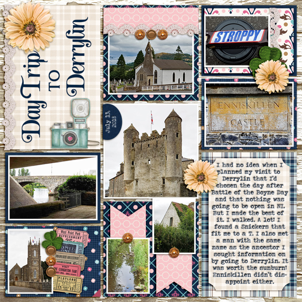
AJsRandom is up first. She used the paper in the background and turned the paper cut into a blended overlay. The layout is simple in its design and compliments her photo very nicely.

I really like how trinanne has used the paper cut element like a black stamp against the paper background. Then she used segments of the paper cut, recoloured pink and green, to frame her photo. The addition of several artsy brushes and a simple cluster in one corner pulls it all together.

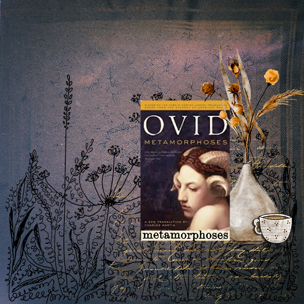
This is truly a mixed-media layout from lm44west. A simple still-life with the paper cut used as a stamp in black, a handwriting brush with gold leaf foiled to it and some subtle shadowing round out the design.
Alasandra went green! I’m adoring the blended daisy photo she’s layered over the paper and the 3D effect on the paper cut.

Oh Mylanta!! This is stunning! Yvonne55 has popped a blue paper into the background, added some crosshatched brushes over the required paper and those adorable little chickadees to the dried-grass paper cut. The extracted photo is the icing on the cake.

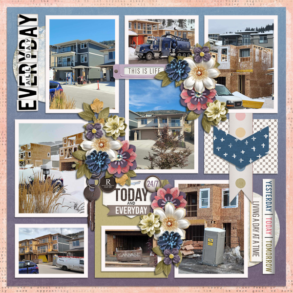
And last, we have a layout from the Queen of Challenges, KatherineWoodin herself. To give herself lots of space for her diary entry, she greatly downsized the paper cut element and duplicated it to create a stamped border. She changed Blend Mode on the paper to bring out the pinks and blues hiding within. Her photos are works of art in and of themselves.

What do you think? Is mixed media a style you’d like to try? I think I might give it a whirl… I watched a Facebook Live on creating bokeh mixed media backgrounds for greeting cards earlier and feel quite inspired!
![]()