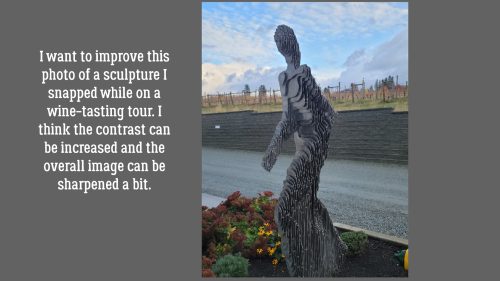
How Do I Know When to Stop? (Editing)
![]()
PDF Version : https://bit.ly/3nDFOZc
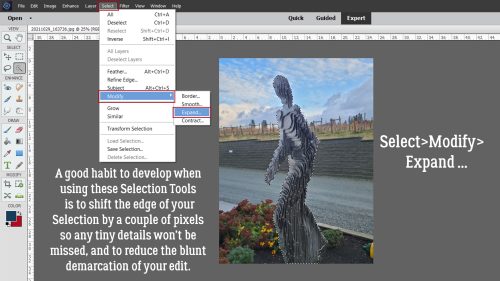
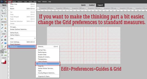
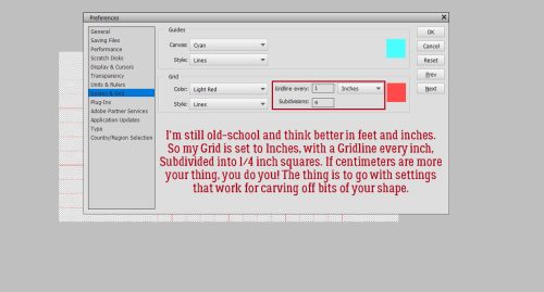
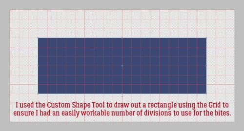
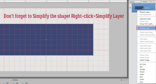
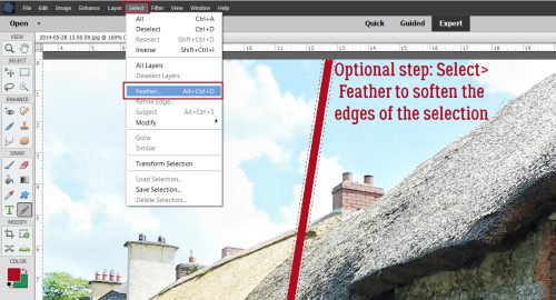
Last week this comment was left for the tutorial post: “I have trouble judging how far to make these setting changes. Is it simply a bit of practice? Or how can I make better decisions on the settings for these adjustments? Thanks, Lorri” Well, you know my reply would end up taking up the whole page and would end up not meaning much without visuals, so today I’m offering some tips on what too much looks like. Because I’ve definitely gone WAY too far with some of my edits when I was just learning the ropes and made a LOT of mistakes along the way (like saving the edit over the original so I can’t even fix it!). Anything I put particular emphasis on in a tutorial is something I’ve messed up badly at least once… and that answers part of Lorri’s comment. Some of it IS a bit of practice. Prepare for an onslaught of screenshots!
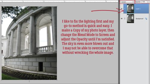
Here’s a photo of the World War II Memorial at Arlington National Cemetery in Virginia that I snapped when I was there in 2010. I’m going to show you my (new) process for those out-of-the-camera almost-good photos I have and show you one of my serious fails.

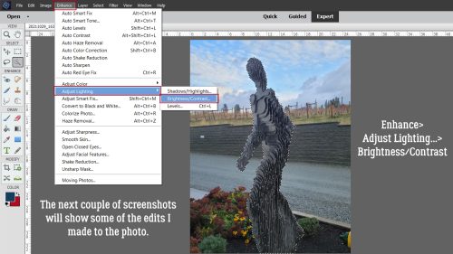
The first thing I like to adjust is the lighting. Sometimes that’s all a photo needs. There are a few ways of doing that using the Enhance tab menu, but this one is really simple and seems to give the best results. I’ve shown this before, so let’s review. Make a Copy of the photo layer: right-click>Duplicate Layer>OK or CTRL (Windows)/CMD (Mac)>J. On the Copy layer, change the Blend Mode to Screen then adjust the Opacity until the white balance looks right.
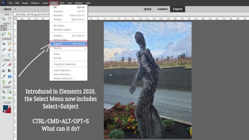
My next step is to use the Shake Reduction… command. This is a newer addition to my workflow; you may remember it from a few tuts back. It was added to the Enhance tab menu with Elements 14, so a lot of you should see it in your tab menu options. (I just ignored it. Sigh.)
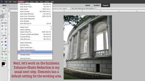
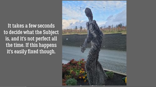
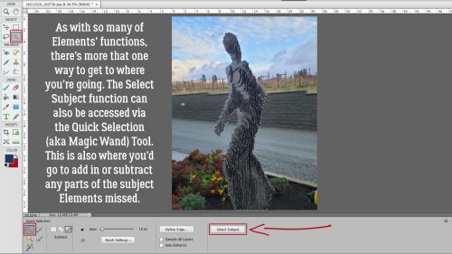
Elements decides where on the image it’s going to analyze shake. Most of the time, it seems to just go to the centre of the image. If it chooses an area of the image that isn’t what you’re really hoping to sharpen, you can wait for it to run then choose your own focal area and it’ll run again. Shown also is the default setting for the Sensitivity.

Make use of the sliders to adjust the Sensitivity so the effect doesn’t end up being phony-looking. Don’t rush the adjustment part; it only takes a few seconds most of the time to get the natural-looking sharpness you want. The default Sensitivity setting is where I’ve placed the red bar. Small adjustments can change the way your photo looks quite a lot.

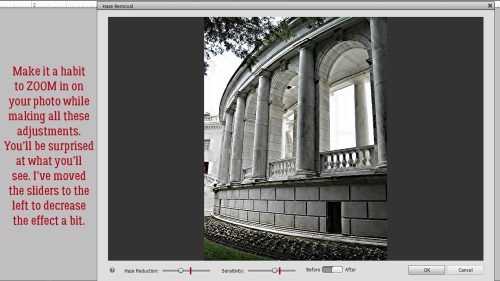
This is an important thing to keep in mind. All of these adjustments are ADDITIVE. Watching your image as it’s affected by your actions is really important to ensure you end up with a result you’re happy with. After adjusting the lighting and the sharpness, I use the Enhance>Haze Removal… (CTRL/CMD>ALT/OPT>Z) command. Haze Removal also adjusts lighting, sharpness and colour saturation.

Here’s an example of an over-processed image. I think it looks fake. As with the Shake Reduction command, there are sliders to control how sensitive the adjustment and how far the process will go.

Get in the habit of ZOOMing in on areas of your photo so you can see up close what’s happening. It’ll help with restraint. I’ve reduced both the amount of Haze Reduction and the Sensitivity to reach this effect.
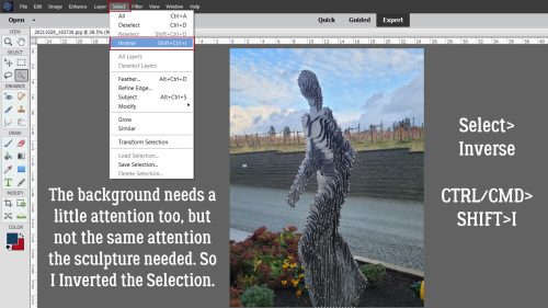
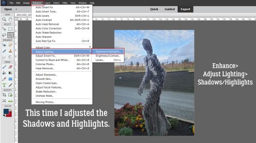
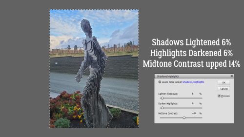
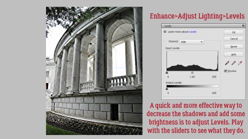
The shadows are too intense. I used to use Enhance>Adjust Lighting>Shadows/Highlights but have found I have better control using Enhance>Adjust Lighting>Levels (CTRL/CMD>L).
Noooope!! That’s not what I want to see! I mean, I like that the veins in the marble are more present but the highlights are so blown out it looks awful.

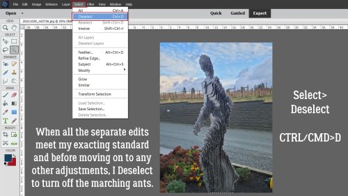
This is better. It’s never going to be perfect, but it’s better than the original, so I’ll Save this as Edit_1… just in case I make more changes later.

What can I do with this one?

The lighting is already okay, so I’ll start with Enhance>Shake Reduction…

Ooh, look at how high the default Sensitivity is! Do you suppose that’s a comment on my photography skills?

Better.
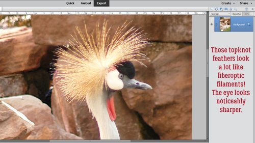
On to Enhance>Haze Removal… (CTRL/CMD>ALT/OPT>Z)

The feathers on the bird’s neck look 3D almost, with the sliders all the way to the right.

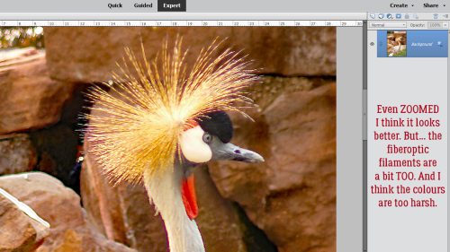
Up close, those filaments are pretty obvious, and the colours are too bright.
I think that’s better. Most of the time, just small adjustments are all that’s needed.

Oh, wait. That’s not what I want to see! Look at how pixellated -and greenish! – those feathers are.
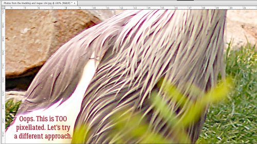
I tossed that edit and went back to the original so I can show you another way to sharpen without ruining your image. This time I’ll use a High Pass Filter. This option requires a Copy layer. CTRL/CMD>J.

With the Copy layer active, click Filter>Other>High Pass.

Here’s where it’s clear that less is more. For the best outcome, you don’t want to see any colour coming through the filter.

To see the sharpening effect of the Filter, change the Blend Mode to Overlay. You’ll see what I’m saying about less is more as we look at the next couple of screenshots.

Look how awful the grass is! And the feathers look almost green.

When we look at his head, the fiberoptic filament effect is even more exaggerated, the bill looks jagged and everything is just. Not. Right.

Here’s an unretouched look.

And with the Filter on? Ooh nooo!

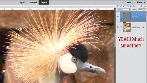
So let’s lower the Radius on the Filter way down from 12.5 pixels to 2.0. There’s no colour visible through the Filter.

Mm. Better-ish.

It’s much smoother. It’s a good trade-off.
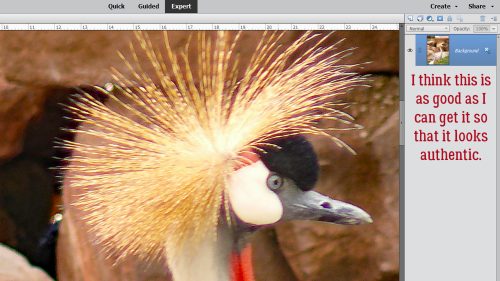
On to Enhance>Haze Removal… (CTRL/CMD>ALT/OPT>Z)

Not bad. Actually, it might be a good place to stop.

It’s still a bit soft, but that’s at extreme ZOOM. As a print, or part of a layout, it’ll be just right.
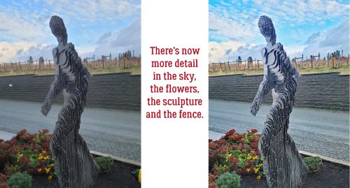
Side-by-side. Looks better, but not phony.

Let’s revisit the World War II Memorial. That middle one is garbage. See what I mean about fake? I tried to add some colour to the sky, and it’s nasty. The actual marble isn’t that pinkish travesty either. The third one has picked out details not seen in the other two and even with the blown-out sky, it’s overall a better image.

I couldn’t resist just one more tweak on this one. In the Guided Edit>Special Edits menu you’ll find Perfect Landscape. This Edit lets you do a bunch of neat things, including replacing the sky. I’m not sure if this is exactly the right look, but I wanted you to see it. Is this one tut-worthy?

Sorry this was posted a little later than normal. It sort of took on a life of its own!
![]()