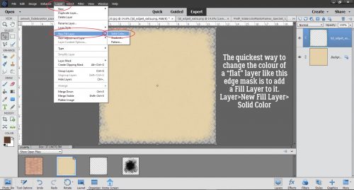
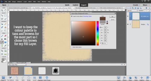
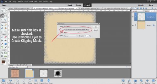
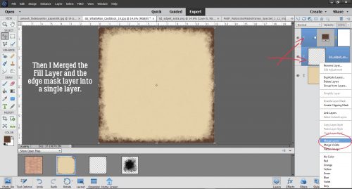
How Can I… Pierce my Paper?
![]()
Greetings from the sunny Okanagan! It looks like summer has finally arrived, and the rain has gone away. (That reminds me, I need to water my pots!) I hope your weather is treating you well too, and you can get outside in the fresh air.
Today’s tutorial came from a challenge of sorts from Steph, who likes to see digital methods that emulate paper-crafting techniques. She sent me a couple of images showing a paper-piercing technique and asked if I thought it could be done digitally. Well, of course it can! I just had to figure out how! The image below is from Lisa Addesa‘s blog I’m In Haven. See the areas where she’s punched through her cardstock to add some texture and dimension to her card? How cute is that!

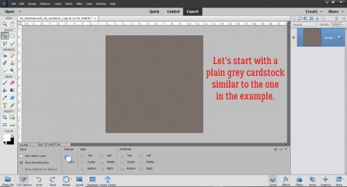
I went through my stash and found a cardstock that’s a similar grey. I could have chosen any colour, but thought it would make easier to see how it works if I used grey.
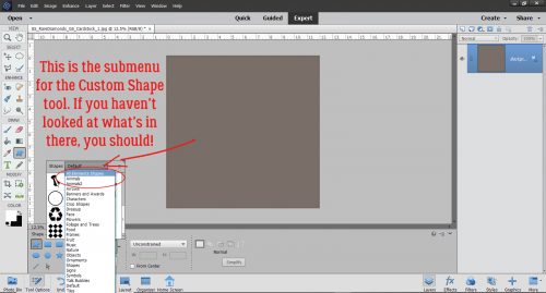
I thought about what would make the most sense to the most people (and didn’t cost anything) and opted to use a Custom Shape to create my path for punching. You could use a swirly brush, an element from a digi-kit or a hand-drawn path if you wanted to. The default shapes are uh… not what I was looking for!
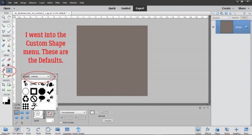
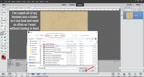
So I clicked on the triangle at the side of the Custom Shape tool bar and opened up the tool’s menu. Right at the top of the list is an option to see ALL of the custom shapes in the library. And there are a lot.
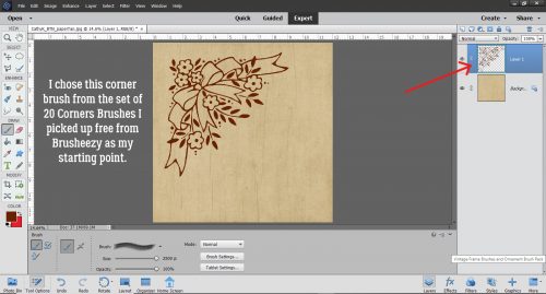
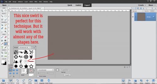
I found a swirl about 3/4 of the way down the list that looks a lot like the one in the example, so I chose that one. But this technique can be adapted to ANY of the shapes you see here without any difficulty.
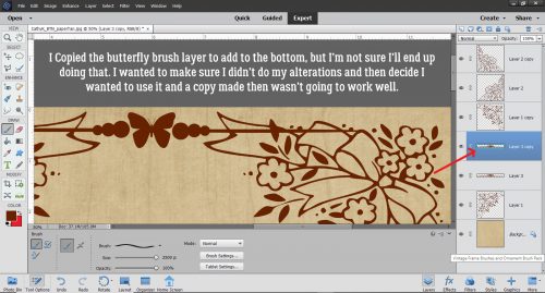
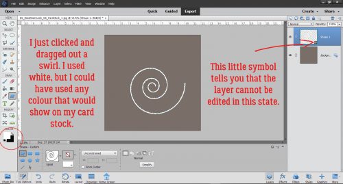
I used white as my foreground colour but again, it doesn’t matter at all what colour I used. As long as it shows up against the background, it’s all good. I clicked and dragged out a swirl as you can see. The shape is created on a new, “Smart Object” layer, meaning it can’t be altered in any way in its original state.
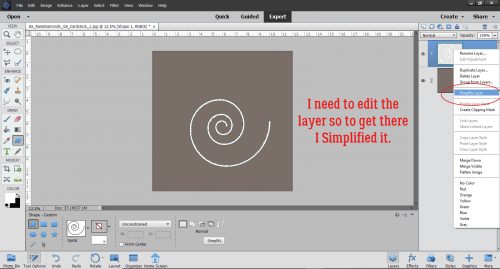
I plan to make some alterations so I right-clicked on the layer and chose Simplify Layer.
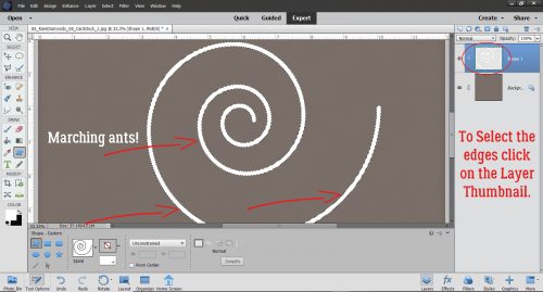
Now I CTRL/CMD>Clicked on the Layer Thumbnail (that little picture of the layer I’ve circled). That “selects” the edges of the image.
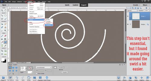
This step isn’t essential, but to avoid confusion I’ll show you what I did. You could just use the swirl as it appears, but this makes it easier. I clicked Select>Modify>Contract and that moves the marching ants that delineate the selected area inward. (Expand would do the opposite and make the selected area larger.)
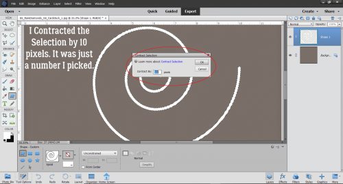
I just picked a number (10 pixels) and tried it to see if it was a good number. It was, so onward ho!
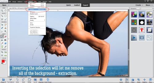
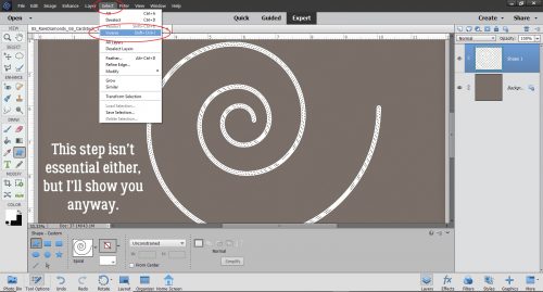
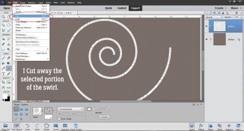
This step too isn’t essential. You could leave the selected area inside the swirl alone and carry on to the next step. In fact, if I was using a more complex shape, I think I would skip this step altogether. Anyway, I clicked Select>Inverse to move the selected area from inside the swirl to outside.
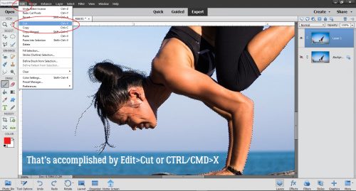
Then I clicked Edit>Cut (CTRL/CMD>X) and that removed a large amount of the swirl without altering the shape.
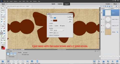
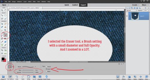
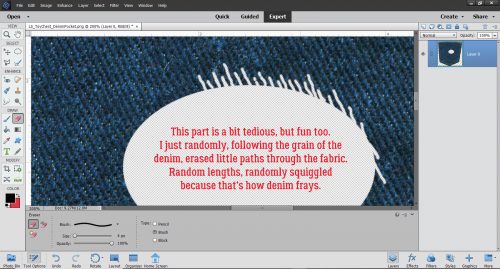
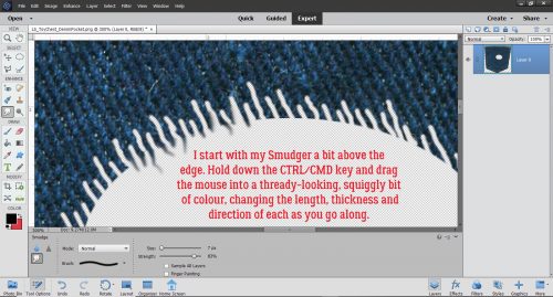
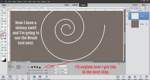
See how it’s so skinny now? If I hadn’t Inverted my selection, instead Elements would have cut away the centre of the line, which would work well for the next steps too. I chose the Brush tool, a hard round brush 16 pixels in diameter at 100% Opacity and made some adjustments to the Brush Settings, which I’ll show you in the next image.
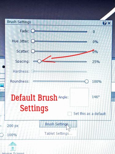
My current laptop isn’t as user-friendly with screenshots as my previous one was, and I couldn’t screenshot the Brush Settings menu, so I took the laptop into the laundry room where there’s very little light, and took a photo with my phone. The image shows the Brush Settings defaults. We’re going to adjust only that “Spacing” setting. I ended up choosing 125% as my spacing, but if you want your piercings to be closer together, use a smaller number. Farther apart? Go larger.
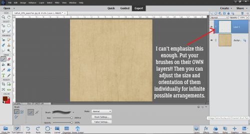
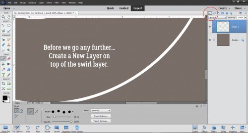
But………… before we go any further, Create a New Layer!! Brushes ALWAYS go on their own layer.
The starting point is a matter of preference. I zoomed in a ton and started at the open end. I held down the left mouse key and slowly, slowly followed my swirl path with my brush. The dotted line just appeared as I went along. When I had to stop and reposition my workspace, I just eyeballed the spacing for where the next dot should be and started brushing again from there.
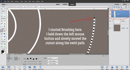
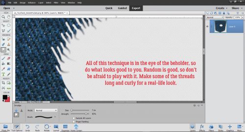
Don’t aim for perfection. If you were actually piercing paper with a needle tool, the holes wouldn’t be perfectly spaced (although these ones are) and they wouldn’t perfectly follow the swirled line. It took me about 10 minutes to work my way around the entire swirl with my “holes” quite close together and my swirl covering most of my 12×12 paper. If I’d just Cut away the centre of the shape, it would have created a grey opening in the white swirl for me to follow. I tried it both ways and it really doesn’t matter with this kind of shape.

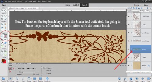
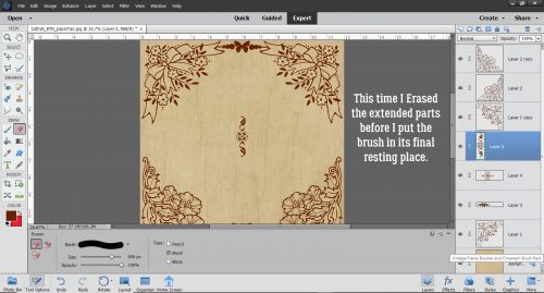
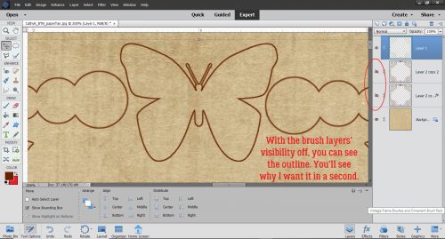
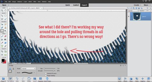
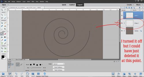
This is where you see how important it is to put the brush on its own layer. If I’d brushed directly on the swirl, I wouldn’t be able to turn it off and just have the brush left. At this point the swirl shape layer can be deleted. It isn’t needed any more.
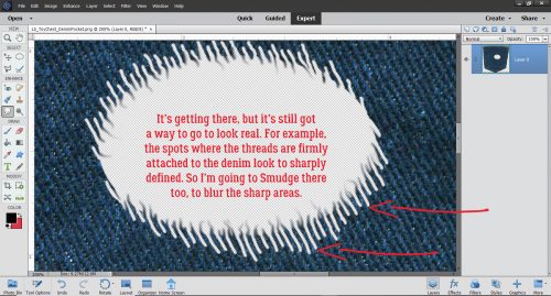
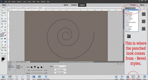
Okay, that’s great. But it doesn’t look like the paper has been pierced. How do I get that? If you read and tried the tutorial on letterpress, you already know! I applied a Bevel Style: click the Style button at the bottom right of the workspace then select Bevels from the drop-down.
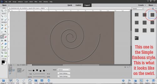
The best choice for this technique is the Simple Emboss bevel, the one in the upper right corner. It’s hard to see in the screenshot, but now it looks a bit like Braille.
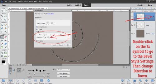
To get the Bevel to look like a piercing, it’s necessary to change the settings on the Style. Double-click on the fx icon on the brush layer and change the Direction to Down. Leave the size at 21 pixels.
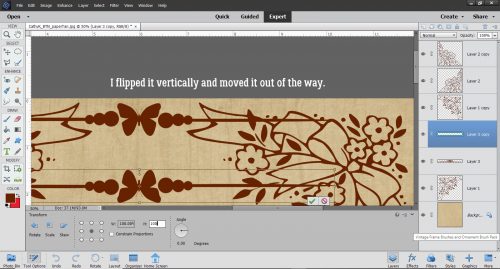
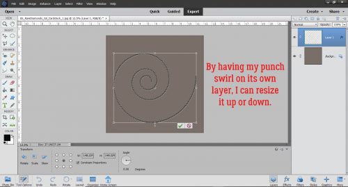
Let me show you what else you can do with that brush on its own layer. You can resize it to whatever size works for you. I like to start with a large image and then size it to suit, which makes it easier to see what I’m doing. (One caveat: if your dots/”holes” are close together when the image is fairly large, they will appear to run together when you shrink the image. So if you think you might want to make it smaller, leave more space between your “holes”.)
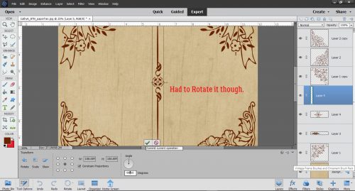
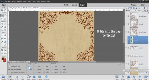
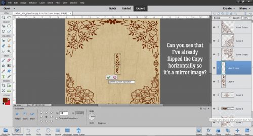
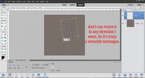
And you can copy it, skew it, rotate it and play with it until you have the look you’re after. I know I’ll be doing this on some of my creations!
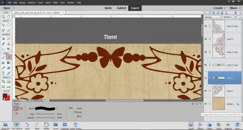
That’s it for this week. Give it a try!
![]()