Tutorial Tuesday (Photoshop Elements)

A Little Crisp Around the Edges

PDF Version : https://bit.ly/3JeXrGz

Today’s tutorial is, once again, pulled from the GingerScraps Challenges. When I started thinking about how I’d meet the criteria for the Inspiration Challenge, which is to create a junk journal page, I started imagining how I could use the lyrics from one of my current favourite Lainey Wilson songs. They resonate with me on a lot of levels – although I don’t really think I’m a redneck. The chorus goes like this:

If I look a little drunk, it’s ’cause I drank some;

If my neck’s a little red, it’s ’cause I am one.

Heaven’s where I’m gonna go, the Bible says so on my shelf,

But if I smell like smoke, it’s only ’cause I’ve been through hell.  

So then I was thinking about how to really sell it. And I came up with the idea of altering an element to look like it’s been singed. I ran with it! Let me show you how I “burnt” some paper. I used this stack from Aimee Harrison’s The Work in Between – which is part of a mega-collab kit created by Aimee, Cheré Kaye, Cindy Ritter and Connie Prince. (Click their names to see their kits.) The collab is an ideal choice for junk journal pages; there’s a goldmine of ephemera in there. As you can see in the screenshot, I’ve dropped a blank layer with a transparent background underneath it. You’ll see why in a bit.
First step is to “tear” the area of the paper that will have the scorch marks on it. I Zoomed in on the upper left corner of the papers and chose the Eraser Tool. Set with a hard, round brush from Elements’ Basic Brushes, about 30 pixels in diameter and full strength Opacity.

I just nibbled away at the corner of the paper, with some sharper and some rounder bits. It’s not going to be perfect.

Now you can see why I put that layer under the paper. As much as I’d like to think I got it all when I was removing the corner, with very little contrast between the paper and the background, it’s hard to be sure. And leaving the odd little bits there would show up later, and not in a good way. So I dumped some black into the bottom layer with the Paint Bucket.

That made it really easy to clean it up.

I decided the opposite corner would be another good place to scorch my paper. Fire will spread to the bottom sheet in this arrangement, so I “burnt” both.

It doesn’t look quite right to me.

Easy enough to fix!

Time to play with fire! If you think about how paper burns, it changes colour first, as heat spreads through the fibers in the paper, taking on a brown tinge. So I chose this as my first scorching colour. The hex key is #883102, if you’d like to just type it in.

After I turned the black background layer off, I chose the Brush Tool, set to a SOFT, round Basic Brush at 300 pixels and 35% Opacity. It’s a good place to start, and allows for adjustment later. The Basic Brush set is one of the Brush collections that is included in Elements when you install it. To see what Brushes you have, click on the thumbnail – the squiggle with the little triangle to its right – and the list will open up. To locate the one I’m using, click on Basic Brushes, then scroll down past all the hard-edged ones until you get to the soft ones. The thumbnail will look like it fades from the centre. That’s what you want.

Say it with me… ALWAYS PUT BRUSHES ON THEIR OWN LAYERS!!! If you were to just run a Brush over the edge of the paper ON the paper layer, there’s nothing you can do to adjust that Brush that won’t also affect the rest of the things on the layer. So **BRUSHES ALWAYS GO ON THEIR OWN LAYERS**. Now, I simply ran the Brush over the edge of the paper as shown. It’s fine that there’s a mess in the background. It’s temporary.

With the same Brush active, I dropped the Opacity to 17% and dragged the Brush over the edges again, this time not overlapping the background too much. This step deepens the scorch closer to the actual burnt area.

To further deepen the singe look, I changed my foreground colour to the darkest brown in the same family of orange-brown. The hex key is #010000.

This time I made no changes to the last Brush settings and brushed over the edges again – this time with MORE of the brush OFF the paper.

See how the colour blends and fades? That’s exactly what I was trying to achieve.

Smoke show time! I used the same process as before, the same Brush but with different settings: 150 pixel diameter and Opacity at 57%. **…** The black Brush goes on its own layer.

Now to clean up the background. Select the edges of the paper stack. You can click the Select tab and then Select All, or you can CTRL/CMD>click on the paper layer’s thumbnail. That’ll turn on the marching ants.

To make the areas NOT inside the paper the active bit, Select>Inverse or CTRL/CMD>ALT/OPT>I. Don’t forget this step!!

With both the brown and black Brush layers active, to remove the brushed area that spilled over the edge of the page, Edit>Cut or CTRL/CMD>X.

And like magic, all that spillover is gone.

So I adjusted the Brush layers. The brown one drops to 47%.

The black Brush layer dropped to 45%. It looks pretty darned good!

As my faithful readers know, I can never just *be done* so I went ahead and used a tiny, soft, round black Brush to add a little more dimension to the spot where the two sheets of paper overlap. It’s a subtle thing, and totally unnecessary, but I did it anyway. I changed the Blend Mode to Multiply so the paper underneath shows through better, and lightened it to 29%. Now I’m happy!

Lyrics credit: Derek George, Lainey Wilson, Lynn Hutton and Monty Criswell.

Now, I have a question for you… As you can see, I’ve changed the Elements background to blue. Is it easier to read the text on the blue, or do you prefer any of the various shades of gray that are options?

Tutorial Tuesday (Dingbats)

Inspiration for the April Scraplift Challenge

I’m very literal (I know, I say that ALL the time) when it comes to the Scraplift Challenge. If I like a layout enough to emulate it, I’m gonna EMULATE it. So I was looking at the April 2024 Scraplift Challenge last night and what resonated with me was the abstract drawing Alexis used for her no-photo sample layout.

Then I started thinking about what I could use to emulate it. Do I have any doodle drawings in my stash? Will they work? What else could I use? And just about the time I fell asleep, it occurred to me that maybe using a dingbat could be an option. So I pored over the dingbat section at dafont.com and I found a few you might like. All the sets I’m showing you are 100% free for personal use; the bold name of the dingbat (font) is a direct link to the download. Let’s take a look.

First and most closely related to the image above is this collection called Woman Faces. Don’t be fooled… there are a LOT of options with this set that wouldn’t fit into the screenshot. 236 different glyphs, to be exact! Many of them are line-drawings, so very suitable.

If you like a less formal effect Cartoonabha might work for you. This one comes with 66 different options. some of them are very expressive!

This set contains the 12 constellations that make up the Zodiac. If you’re into that kind of thing, Constellations Ostia could provide your non-photo focal point. Or you could use the glyphs as background stamps.

The Goddess gives off a bit more of an esoteric vibe. There are 30 options in this one; the letter X is a fairy!

Art Nouveau Flowers offer a lot of possibilities. They can be filled with the Paint Bucket, Styled to look like wrought iron or lead, have papers clipped to them, or just be left as is.

For a more whimsical take, Country Cuties is your friend. Mostly line-drawn, there are some sweet kittens, cutie bears, a frog, and that hilarious pig.

For the Disney fans, there’s Disney family 1, with all the usual suspects represented.

If you’re more of an old-school Star Wars gal, check out Lucas characters. No Grogu… so if you’re looking for him, skip this one.

These Vintage Mixed vol1 dingbats remind me of print ads from the 60s. There’s even an image of Fred Astaire and Ginger Rogers for elegance. The pointing finger could work for quite a few topics, don’t you think?

I just love the gossipy image! Vintage Mixed vol2 has even more retro images; I think my fave is the cartoon bride and groom on the run.

If you’re in the Path of Totality for this month’s solar eclipse, this set called Galaxia might have something you could put into a photo-less layout. Or you could use the drawings for a border.

These just made me laugh. Smile 2 Me has a huge assortment of expressions; I love the one flashing a peace sign.

From the ridiculous to the sublime… Caligrafia Divina strikes a more elegant chord. The dragon is fabulous.

And last, since we do Takeout Tuesday at my house, there’s a food set called LMS Junk Food Junky. (Of course!) I could see myself creating a layout and calling it In Praise of Pizza.

I had one more for you but for some reason WordPress isn’t allowing me to attach an image of it. I’ve tried several different tricks and failed……… It has a selection of fairy tale images in it and is called Once Upon a Time2.

If you’re not sure you see anything you like, check out the other dingbats at dafont.com. There’s something for everyone there. These are just my picks for what would work as line drawings. (I won’t tell you how many I downloaded today. 😉 )

Before I let you go, I should explain how to use these dingbats as line drawings, shouldn’t I? Install your dingbat set; they take a little longer to install than say a script font, because of the added details. Then open Elements. Dingbats are essentially fonts, so the Text Tool will let you see what’s in the set. I usually run through the alphabet, looking at which image is attached to each letter. For this purpose, I’d use a huge size, like 200 pts. Then I’d Simplify the text (image) so it can be manipulated. Now it’s resize-able to whatever will work best. And then I’d work my layout into the canvas.

For sets that have additional glyphs you can’t access via the alpha keys, check out this tutorial Unlocking the Secret Extras in Your Font Files.

This might be fun!

Tutorial Tuesday (GingerScraps Forum)

Quick Trick: Cleaning Out the Cookie Jar

PDF Version : https://bit.ly/3PzYww0

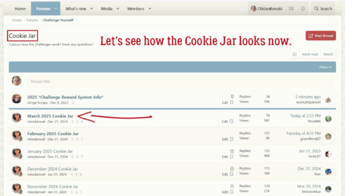
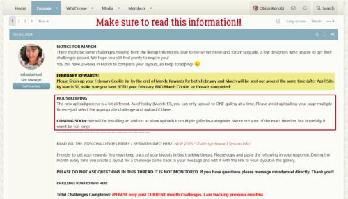
I’ve noticed when I’m adding my Cookie Jar entry for the month that a lot of GingerScrappers fill their Cookie Jars with lots of unnecessary text, and I think that has to make life for Missi much more difficult than it needs to be. She checks every Cookie Jar every month to make sure Challenge Rewards are distributed to all who qualify. Sifting through the chaff to find the wheat takes time. Right? So I thought I’d show you all a way to ONLY have Cookies in your Jars.

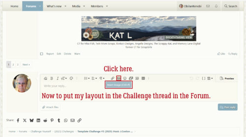
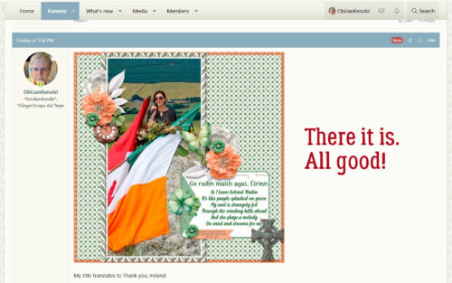
I think we all understand the basics of Copy-and-Paste when it comes to putting the Gallery links into our Jars, so I won’t spend a lot of time on that. But I will tell you how I do things so that I’m Working Smart, Not Hard. My method is probably not what IT security folks would call safe, but it’s worked for me for 14 years, so I’m not gonna change it now. I always have three GingerScraps tabs open. One has my Cookie Jar (so I don’t have to remember what page it’s on, since I usually end up somewhere around page 90) all ready to edit. One has the Gallery open so I can quickly upload my new layouts. And one has the Forum open, so I can move between Challenges quickly, both for making sure I’m meeting the requirements of the Challenge and adding my finished layouts to the Threads. [editor’s note: If you do this, you’ll need to Refresh the tabs before you can do any editing of posts. Ask Jan how she knows.]

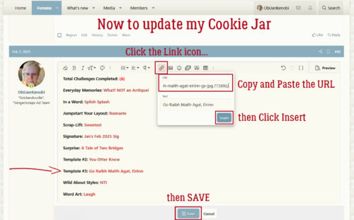
Let’s start by going to my Cookie Jar tab. (I reallyreallyreally wish I could make these screenshots bigger so you can see things better. Sorry…) In this image, I’ve clicked on the Edit button to get into the actual post so I can add my new layout.

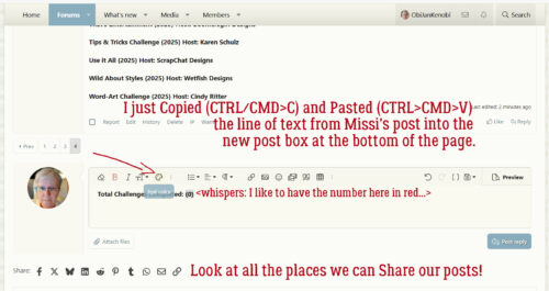
The first thing I do after that is change the number of Challenges Completed. So I don’t forget to do it! When I set up my Cookie Jar post, I only Copy-and-Paste the first bolded line from Missi’s Cookie Jar post. I leave the bold format in, because I like it. 😀 I don’t bother with all the possible Challenges, because I know I’m not going to do them all. Or even most of them… Doing this gives me a place holder in the Thread.

Then I type in the name of the Challenge I’ve completed, followed by a colon and the name I’ve given my layout. As a modified Type A, I insist the Challenges are in alphabetical order. You can see how I’ve done that in the screenshot, if you squint.

Next, I Highlight just the name I’ve given my layout by click-dragging my cursor over it. Then I click on the button in the Control Panel that has a globe-with-links-of-chain on it, the one to the right of the emoji icon.

If I’ve remembered to Refresh the tab, this dialog box will open up. The outlined bar is where the layout’s URL from the Gallery goes. It’s been copied and pasted into the box. Then I click OK.

All that’s left is to click Save, so the name of my layout becomes a clickable link to the Gallery, making it super-easy for Missi to check if she needs to. And the bonus is that my post takes up very little space in the Thread while being simple, tidy and straight-forward. It can be scrolled past in a matter of one second…

Do you think you might switch to this method? You might find you like it!

Tutorial Tuesday (Individual Style)

Challenge Spotlight: Word Art

Whew! I wasn’t sure I’d get this tut out to you today. We started the day with an unplanned trip to the dentist – Adam lost a filling that had only been in there a short time and it was RIGHT IN FRONT!! He needs IV sedation for dental work and that adds a ton of time to everything. But in the end, he was awake enough to get him into the car before noon so here I am! I’ve chosen the Word Art Challenge this month; the Challenge is to use the provided word art as inspiration and have it on the page somewhere. The host for this Challenge is Cheré Kaye and this is the word art she created for us. There are so many ways this can be used!

March is a brutal month for choosing a Spotlight ChallengeScrap-a-Thon being in full swing. The Gallery is overflowing!! So, in a bit of a departure, rather than showing you every layout that has been submitted for March I decided to go with every OTHER layout. Otherwise we’d be here all week. 😉 The layouts are in the order they were uploaded, the GingerScrapper‘s user name is the direct link the the layout in the Gallery so you can get a closer look and leave a comment or two (I hope you’ll also look at the others, they’re awesome!) and I’ll be making my own comments as we go.

First up is Karen Diamond. She preserved the gradient colour of the word art, using it as her title, and took colour palette cues from it. It’s a little ironic that she chose the humble dandelion as her focus – they seem to “awaken” earlier than a lot of other plants.

This layout from jojores is a true original. The word art title looks a bit muted, but in the original gradient colours. I like the detail she’s added to the upper corners and how she included food-related elements to riff on the book covers in her photos.

For her layout demma_b13 also used the word art as is, and drew her palette from it. I can almost hear birds singing when I look at her layout, and don’t know how the woman in the photo can sleep through it!

Look at all the white space tillykaye has given us. The simplicity of her layout lets her photo shine. As the others have, she pulled colours from the word art for her palette.

Dhariana has given us more white space with her layout. She’s scaled everything down to draw the eye to the butterfly in her photo. I like the washi tape holding the photo in place. Against the buttery-yellow background the colours in the word art seem a bit brighter.

It’s interesting how the background colour can change the way our eyes see something, as biche57 shows us here. The gradient colours of the word art look more purple. It’s a perfect accent.

Let’s look at photocrazy‘s entry. See?! By putting the word art against a bright yellow background, the colours in the word art pop yellow too! She’s the first one (of this baker’s dozen) to use the wings that Cheré included with the word. The blue provides beautiful contrast.

AHA! AlyciaIN recoloured the word art!! Such a rebel. 😉 In the same way nature changes all the brown to green, she’s given the word art a lovely, shimmery look.

Jill went in a different direction with the “awaken” theme, and it works really well. Her shadows really give the brushes and paintbox realism and dimension. The word art colours appear in the paint splatters to tie it all together.

I like how greenfiend27 created contrast with the teal and blue elements to coordinate with her photo. Using a gradient paper in one of the shades in the word art is next-level thoughtful.

CathyS opted to recolour the word art to pick up the sandy, beachy look of her photos. Good choice!

Windswept has gone Easter-candy with her colour palette. The beautiful pink of her photo demands some drama. Clever girl, she used the same font to build her own addition to the word art, and she eliminated the white border around the words. Pretty!

Lucky 13 belongs to Zanthia. And her layout is stunning! She used the word art as created, pulled colour from it and reinforced the theme with her photos.

We’ve had four days of record-breaking warm days in a row here, and there are already two wildfires in the area. What will it take to awaken people to the climate crisis? I don’t know, but I’m really not looking forward to fire season. Please send rain!

Tutorial Tuesday (Photoshop Elements)

Tucked Photo Frames Made Easy

PDF Version : https://bit.ly/3VmV2R8

Anyone who has spent any time touring the GingerScraps Gallery knows that we have some inordinately talented and creative scrappers in our midst. And some equally superlative Designers. If you’re ever needing a healthy dose of inspiration, you won’t have to look far. Karen found a layout using one of these fabulous tucked frames in the Gallery and had to try it for herself. Turns out Sheri (Jumpstart Designs) has already done ALL the work and all we have to do is customize. Here’s a link to the product in her Shop.

So how easy is it to use these gems? I’ll show you! While I’m at it I’m going to add my tucked photo to a template from this month’s Spotlight Designer, Connie Prince. (Alas, it’s discontinued, but this will work regardless.) As you can see in the screenshot below, I’m using a layered file, in this case a PSD.

The only difference with using PNG files for this is that you’ll have to add them to the template’s photo spot manually, one at a time, aligning them as needed. I dropped this photo of my grandson Aaron onto the Photo Mat layer of the PSD.

When I Resized my photo, I found it still wasn’t a great fit; there were important details I didn’t want to crop out.

But… I CAN Resize the rest of the layers to fit to the photo. I Activated all those layers EXCEPT the photo and made my adjustments. The nice thing about the Photo Mat layer being black is that it’s easy to see if the Resized frame still isn’t right.

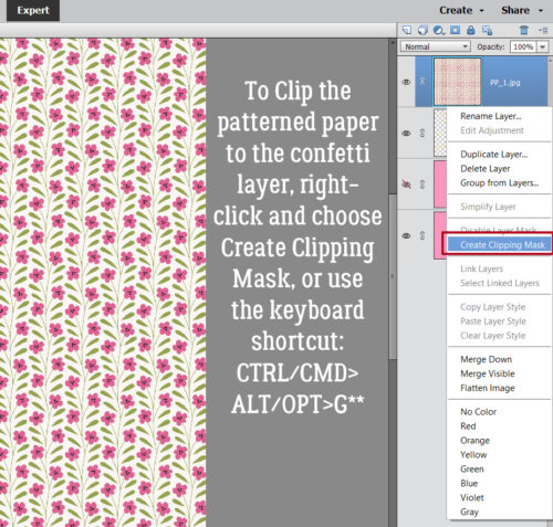
Did you notice the tab is partially covered by the photo – which isn’t the look I want? To solve that problem I just Clipped the photo to the Photo Mat layer. There are always multiple ways of doing these types of things in Elements, and I usually will show you two of them. Right-click>Create Clipping Mat is one way. The keyboard shortcut for Elements 14 and earlier versions is CTRL/CMD>G. For Elements 15 and more recent it’s CTRL/CMD>ALT/OPT>G.

Simply by Clipping the photo to the Mat, the tab now looks like it’s part of the paper the photo/frame combo is tucked into!

Now to move it all to the template. I just moved the whole stack as one object onto the photo spot on my template. Will it still work like a PSD though? One way to find out!

Brilliant! All I did was turn visibility for the template’s photo spot off and the tab looks like it’s the same paper that’s under the photo.

As you can see on the finished layout, Clipping a paper to the template did exactly what I wanted it to do, and my photo is neatly tucked under some brown cardstock.

Now I can’t wait to try the others in the package!!

Next Tuesday, it’s YOUR turns to shine! Which Challenge will be in the Spotlight?


Tutorial Tuesday (Photoshop Elements)

Text on a Custom Path – Keeping the Path

PDF Version : https://bit.ly/3ToXcyv

One of the very first tutorials I wrote for GingerScraps was about putting text on a path – geek-speak for lettering that isn’t on a straight line. (If you want to see it, look here.) Early last week I got this message from Karen: “I found your tutorial on how to put text on a wavy line but what I want is for the line to stay with the text. I just cannot accomplish that.” So immediately – literally – I opened up Elements and figured out how to do it. We decided it would be a good tutorial topic, so here’s what I did.

If you’re a frequent reader, you know one of my mantras is to put things on their own layers so they can be manhandled without manhandling anything else. So of course, first thing to do is to create a new, blank layer to put your wavy line on. Then activate the Pencil Tool, with a hard, round tip at about 5 pixels in diameter. It can be thicker, but it’ll be more jaggy if it’s thicker, so choose accordingly. (It can be made thicker later if desired.) You can choose a colour now, or add a Fill Layer>Solid Color later. Set the Opacity at 100%.

Now, draw your wavy line. Moving your mouse quickly with the left button down, drag the cursor in a swooping motion. The faster you move the mouse, the smoother your line will be.

The font you choose will make or break this technique. If you’ve got a bit of a bumpy curve, using a font with a slightly wandering baseline will disguise that. But those really fancy fonts might look a bit weird. Choose one you like, and give it an audition. If it’s not what you were looking for you can change it later. I’m using one called Natalia Regular.

Activate the Text Tool and then choose Text on Custom Path Tool. The icon looks like a capital T sitting on a snowboard. The Tool will default to Draw.

The Tool Tip will look like the nib from a fountain pen. For those too young to have seen those, here’s one.

Carefully click-and-drag the Tool Tip along your curvy line. I find it easier to pull when doing this; I’m much more shaky when pushing.  But this can create problems when the text goes the wrong direction. 😉 So my advice is to draw your guideline in the direction you want your text to travel. You can take a break if you need to; to find out where you stopped, turn visibility for the master line layer off momentarily and you’ll be back in the game. Go slowly and try to stick as close to your master line as you can.

Once you’ve gotten your text line in place, click on the Modify Button in the Tool Options. Wherever your text line departs from your master line, Elements will put a dot – they’re your “handles” to move the text line to where you want it. Click-and-drag the dots closer to your master line until you’ve got the text line and master line touching each other.

Know where your Text Tool is going to put your letters. Mine is usually set to Center, so I’ve put my cursor there and clicked to activate. You’ll know you’ve actually activated the Text Tool when a blinking line appears. If you have yours set to start at the left side, that’s where you start. Now I’ll just type my text.


The text may not fit properly on your master line. You can easily resize it, or add some extra spaces, change the Tracking if you’re using a more recent version of Elements… or you can change it to a completely different font. Until you Simplify it, you can make all the changes you want. Once it’s Simplified, the text line that told Elements where to put the text will disappear.

All that’s left is to decide how far away you want your master line. Nudge it with your arrow keys. If your master line seems a bit too jagged at the size you’re going to use this, add a small Stroke, centered on your line. That’s easier that trying to Refine it.

Here’s another sample, this time using an arrow brush.

And then I did this, which is when I found out the Tool takes its direction from – well – the direction the text line was drawn. I had started at the top of the bell and drew down to the lower left edge, and the text ended up on the inside of the line, not the outside. UndoUndoUndo! If I Rotated the Stroke line layer, I was able to get the Text where I wanted it.

I might have to try this one again, but with a shamrock, to celebrate my Irish heritage. [Editor’s note: Shamrocks have 3 leaves, to represent the Holy Trinity, not 4. Those 4-leaf clovers aren’t shamrocks!] See you next week!

Designer Spotlight: March 2024

Connie Prince

I think everybody already knows Connie. Some of us know her quite well, either as one half of North Meets South Studios (she’s the South half) with Trixie Scraps, or through her Shop at GingerScraps. But a Spotlight is a Spotlight, so she agreed to (another) chat with me. She’s had a hectic year so far, so this was a gracious act on her part… This is how our chat went.

J: Connie, thank you so much for taking a few minutes with me so I can introduce you to all the new folks in the GingerScraps community and to maybe give the rest a bit more of a glimpse into your creativity. I think this is our fourth Spotlight together, so I hope you’re not bored! Let’s talk creativity for a moment and then we can just gab. What are your most favorite and least favorite colors?

C: I love primary, bold colors. Pastels are my least favorite!

J: I think anybody who’s browsed your Shop would know that. <winks> We’ve talked about all the other mundane stuff, like what got you started and how your workflow goes a few times already so let’s talk about fun stuff! Can you play a musical instrument?

C: Yes, piano and it soothes my soul so much!

J: I know I’ve mentioned this before, that I took piano lessons as a middle-schooler. I wish I could have kept it up, but we didn’t have a piano at home and practicing was very challenging. I love music and, like you, I find it very therapeutic. This is a weird question so let me set it up for you. When we moved into our new house back in May 2020, for the first time in my life I had a BIG walk-in shower. I feel like we could have a party in there! I put a waterproof Bluetooth speaker in there and play my Amazon playlists while I’m unwinding. So, are you more likely to dance or sing in the shower? I do both…

C: Definitely dance!

J: Yeah, a good, non-slip base is really dance friendly. But boy am I glad no one can see me doing it! Good thing my family know I’m… um… quirky. What one word would your friends and family use to describe you?

C: Loyal.

J: Well, that’s a lot better than weird! And it’s an amazing quality to have. I wonder if I can guess your answer to this one. What would you do if you won the lottery?

C: Travel, travel, & travel some more!

J: Yep, nailed it! I “travel” vicariously with you through your Facebook fan group. Except when you cruise. I just can’t… the ICU nurse in me won’t. So, let’s shift to what your dream vacation looks like.

C: Anywhere tropical works for me!

J: I’ve done a few semi-tropical vacays – Florida, Louisiana, California – but the only truly tropical locale I’ve visited is Jamaica. I’ve never been a lie-on-the-beach-baking-in-the-sun kinda gal, but I’d absolutely go back to Ireland any time. England, Scotland and France too. Excuse me a second, I’ve got spaghetti sauce needs stirring. Ah. If you could only eat one meal for the rest of your life, what would it be?

C: Steak and salad!

J: Hmm, not very tropical! <winks> So, tell me. Aside from the necessities like food, water, sleep and exercise, what one thing could you not live without?

C: My phone!

J: I know, right?! My husband doesn’t understand how I can use my phone as much as I do; maybe it’s because he needs his text super-huge so he can read it, he doesn’t really know where his phone puts things or how to get to them, and his fingers just don’t behave accurately enough for a phone keyboard. I don’t know. (I’ve had to teach him how to send text messages, and how to attach photos to them, as well as how to use most of the apps he has.) But I use mine for everything! It’s one of my super powers. If you could have a literal super power, what would you like it to be?

C: Manipulate time, I’d definitely make use of that one!

J: YEAH! Extend your tropical vacays!! Push back deadlines. Get out of things you’d rather not do just by skipping over that day. I could use that. Is there any one thing about yourself you’d change if you could?

C: I would love to master the art of being patient. I’m working on it, but it is for sure a big struggle!

J: I’ve been told I have the patience of a saint. I don’t know about that; there are some things that drive me absolutely crazy and my fuse is short when I have to do them. Anyhoo, I’ve taken up enough of your time. I’ll take care of the rest of the Important Spotlight Information. Thanks again for giving our community a little insider 411 on Connie!

As with all of our Spotlight Designers, Connie is the provider of the Daily Download for this month – links are found here on the Blog each day and are good for 5 days – and the host of the Designer Spotlight Challenge in the Forum. She also is the regular host of the #2024 Challenge that is in essence, a minikit challenge. This is what the March kit looks like. And did I mention it’s FREE?

So cute!!! The other Important Info is that Connie has a coupon for y’all… and a GENEROUS one at that!!!!!

Ready? Set? SHOP!


Tutorial Tuesday (Photoshop Elements)

Quick Trick: Toggling Between Tool and Color Picker

PDF Version : https://bit.ly/3V8fV2q

Today’s Quick Trick is one of those Work Smart Not Hard tips I only just discovered. Have you been using a Brush, Pencil or Text Tool in Elements and thought, “Gee, I’d really like to change colours for this fill in the blank” and then clicked through to the Color Picker, chose your new colour, clicked OK and then clicked back on your Tool? Would you like a shortcut for those 4 steps? I have one!

This Trick makes multi-coloured titles easier and much more fun to create, lets you throw a bunch of paint splatters in different colours onto your canvas, and whatever else you might use the Color Picker for. I’ve played with it so I can explain how to use it, but screenshots won’t be helpful, so don’t look for them. 😉

Once you’ve chosen your Brush or Font and applied your first colour, hold down the ALT/OPT key and click on the Color PickerRelease the ALT/OPT key, choose another colour and click OK.  Bingo, you’re back to your Brush or Font and your new colour is ready to go! If you’re working with the Brush Tool, you can change the size, shape, Opacity and orientation after you’ve changed the colour by going into Brush Settings… If you’re working with the Type Tool, you’ll love this! After you’ve changed your colour, you can also change the Font, the Size, add an Underline, turn it Bold or Italic and not have to Simplify in between!!

Okay, I lied. I have a screenshot for you. I decided to run a quick test and count the keystrokes I needed to obtain 3 different colours of paint splatter. 8. The answer was 8.

I’m going to use this Trick ALL THE TIME!!

Tutorial Tuesday (Individual Style)

Challenge Spotlight: Mixed Media

Today I’m showcasing one of the new GingerScraps Challenges for 2024. Interestingly enough, it’s hosted by a designer who was a guest at GS for many months before she made it her home: Sarapullka Designs. This is the inaugural month for the Mixed Media Challenge. So we’re seeing the very first layouts posted to the Gallery! Larisa (Sarapullka) has provided an artsy paper and a paper cut element as the foundation for this month’s Challenge; participants were welcome to add anything they liked, as long as it came from Larisa’s store. They are required elements, which makes this Challenge an ideal one for my Individual Style analysis.

Because this is a brand new Challenge, there were only 6 layouts in the Challenge Gallery this morning. I hope, by putting a spotlight on it, we can bring that number up before the end of the month – and we do have an extra day… As always, each layout appears here in the order it was uploaded, and is linked to the Gallery so you can get a closer look, and maybe leave some feedback for the Scrapper. Just click on the Scrapper’s user name and you’ll be teleported to the Gallery.

AJsRandom is up first. She used the paper in the background and turned the paper cut into a blended overlay. The layout is simple in its design and compliments her photo very nicely.

I really like how trinanne has used the paper cut element like a black stamp against the paper background. Then she used segments of the paper cut, recoloured pink and green, to frame her photo. The addition of several artsy brushes and a simple cluster in one corner pulls it all together.

This is truly a mixed-media layout from lm44west. A simple still-life with the paper cut used as a stamp in black, a handwriting brush with gold leaf foiled to it and some subtle shadowing round out the design.

Alasandra went green! I’m adoring the blended daisy photo she’s layered over the paper and the 3D effect on the paper cut.

Oh Mylanta!! This is stunning! Yvonne55 has popped a blue paper into the background, added some crosshatched brushes over the required paper and those adorable little chickadees to the dried-grass paper cut. The extracted photo is the icing on the cake.

And last, we have a layout from the Queen of Challenges, KatherineWoodin herself. To give herself lots of space for her diary entry, she greatly downsized the paper cut element and duplicated it to create a stamped border. She changed Blend Mode on the paper to bring out the pinks and blues hiding within. Her photos are works of art in and of themselves.

What do you think? Is mixed media a style you’d like to try? I think I might give it a whirl… I watched a Facebook Live on creating bokeh mixed media backgrounds for greeting cards earlier and feel quite inspired!

Tutorial Tuesday (Photoshop Elements 15+)

Ink Smudge Technique for Photos

PDF Version : https://bit.ly/3SWPxqJ

Spoiler alert: This technique is an advanced one, but hopefully I’ve made the instructions clear enough that it’s achievable by everyone. Hence the huge collection of screenshots……

As I mentioned last week, Karen is trying to stay busy and has been looking online for new things to try for her digital scrapbooking repertoire. She came across a YouTube video showing a beautifully manipulated photo and wanted to try it for herself. But the video host’s accent was really heavy and he moved through the steps really quickly and soon she found herself lost. AND he was using Photoshop, not Elements – where terminology is different and some options and tools aren’t included. She uses Elements, so she asked me to look at it. I watched the video 3 times, watching what he was doing more than listening to what he was saying, before I ventured to try it. Then I did 3 dry runs, consulting the video as needed, before I started screenshotting my work. Ready for a workout?

Another caveat: There are steps in this technique that weren’t available in Elements until version 15, so if you’re working with an older version, I’m sorry, this one isn’t for you. As usual, I’m including commands for both Windows and Mac. I work in Windows, so that goes first. 😉

First thing is to choose a photo to manipulate. I looked at thousands at Pixabay and almost chose a photo of a cheetah, but then I found this one from Jerzy Gorecki that I really like. Portraits are most effective when the eyes are the focal point, and for me, that’s what I see here. Next, I hunted for some ink smudges or smears in my digistash. I found a bunch, all from the talented Connie Prince. I chose one from Hakuna Moscato and one from My Lucky Stars. And then… I discovered as I was doing my dry runs that PNG-format ink smudges don’t work for the technique. At all. They have to be JPGs. I converted them so I could keep going, but YOU could use brushes in black on a white background, then Save As a JPG and go with that.

It’s a good idea to get in the habit of doing techniques like this on a COPY and not the original, just in case something goes sideways. Right-click on the layer then choose Duplicate Layer.

You can change the name of the layer to keep them straight; you want the Copy layer to be with the original so nothing needs to happen with the Destination Document. Then click OK. If you’re into keyboard shortcuts, you can skip these two steps and just use CTRL/CMD>J.

Filters are marvelous things. I highly recommend playing with them sometime so you can see what you can do with just a couple of keystrokes. But for right now, Filter>Filter Gallery>Artistic will do. Or Filter>Artistic – skip a step. OR… click on the Filters button at the bottom of the Layers Panel. They all end up in the same place.

The Filter we’ll use is the Dry Brush.

Any adjustments to the Filter will depend on the resolution of the image you’re working with, as well as how much you want to alter the image’s appearance. This photo is pretty sharp, so I went BIG, with a Brush Size and Brush Detail of 10, but I left the Texture at the default 1.

The effect isn’t really obvious, but trust me, it’s there. Now let’s drop a New blank Layer on top of the photo layers.

Fill that new layer with white with the Paint Bucket.

Ready for something we’ve NEVER done before in any of my tutorials? We’re going to add an empty Group to the Layers stack. This is what will let us get the special effect on the image in the end. Click on the icon that looks like several sheets of paper spread out on a table, second-from-left at the top of the Layers Panel. The default Blend Mode is Pass Through, and we’ll need to change that.

The Mode we want for the Group is Multiply.

We’re breaking a lot of new ground with this tut! Now we’re going to add a Layer Mask inside the Group. Click on the icon that looks like a blue square with a gray circle inside it, fourth from the left at the top of the Layers Panel. See how the new layer with the mask is indented? That’s how you’ll know you’ve put something into the Group.

Now go back to the Copy layer that we added the Dry Brush Filter to, down there second from the bottom. Click Select>All or CTRL/CMD>A. That will Select the photo and the Filter.

Next, click on Edit>Copy or CTRL/CMD>C. (See the marching ants around the outside of the photo?)

Move back up to the Layer Mask up there at the top of the stack. Hold down the ALT/OPT key and click on the Mask thumbnail. Then Edit>Paste or CTRL/CMD>V.

Now you know what that Mask will do… the photo turned to black and white. It needs a tiny tweak before we go on. The contrast needs some help. Enhance>Adjust Lighting>Levels or CTRL/CMD>L.

Go for drama with this step. Move the sliders on the histogram toward the middle. Watch as you adjust so you know when it’s right.

Now we’re going to turn the black and white image into a negative by first Deselecting the Mask (CTRL/CMD>D or ESC) then click CTRL/CMD>I.

Drag and drop one of your ink smears onto the canvas on top of the white layer. See how it completely hides the Mask?

Not for long! You can use CTRL/CMD>] to move it up the Layers stack and into the Group, or you can drag it up there. That’s all it takes to have some of the photo show again!

Here’s where you get to play around with it! Resize the ink, Rotate it, Reposition it, move it about until you like what it’s showing.

But first things first. Let’s change the Blend Mode on the ink layer to Multiply too.

Now I’ve added my second ink smear onto the canvas and made sure it’s inside the Group. It’s obscuring the photo though. See the edge of the “paper” background?

Easy fix!

I think I like it. Most of her face is visible, her eyes are sharp, so let’s add some colour back!

We’ll need another Copy of the Dry Brush layer for this step.

The new colour layer needs to be on top of the whole stack. There are a few ways to do that. One is to click Layer>Arrange>Bring to Front. Another is to hold down the CTRL/CMD key and use the ] key to jump it up there. Or grab it in the Layers Panel and drag it!

Some steps just don’t screenshot. This is one of them. Yeah, I’ve added an Inverse Layer Mask to the colour photo layer I just dragged to the top of the heap. That’s how the colour is going to get into our image, so let me tell you how I did it. After the photo layer was positioned, I held down the ALT/OPT key and clicked on that same Layer Mask button – the one that looks like a blue square with a gray circle in the middle. That’s all!

Then I used the Brush Tool and some Ink Blot Brushes to bring the colour up. Don’t have any ink blot/splatter/smear Brushes? Check out Brusheezy.com!! They’ve got a ton of free Brushes and 98% of them are Elements-compatible. For this step be judicious. Drop the Opacity to 40-50%, no stronger. I think I used 3 different Brushes, sized fairly large, and just clicked them one time over a part of the image. Don’t forget that you can go into Brush Settings… and Rotate them, squish them and make them less Hard. Don’t be afraid to experiment!

When you’re satisfied with your efforts, you can Merge or Link the layers and Crop the image. It’ll have a solid background so it can’t be used like a PNG, but it CAN be Clipped to a Mask to eliminate a bunch of the white space and soften the edges. Anything you can do with any other photo can be done with this.

Next week we’ll be looking at Individual Style and a Challenge Spotlight. Where does the time go??