Challenge Spotlight: Pinterest
![]()
This month, Lisa Minor chose this fall wedding photo as her Pinterest Challenge inspiration.

Her description of the photo is “it’s all about the colors!”, “floral fall colors” and her Challenge is to use the photo to scrap what the Pin says to you. So far, eleven scrappers have taken her up on it. They mostly seem to have chosen the same theme for their layouts, as you’ll see. As with each month’s Challenge Spotlight, these layouts appear in the order they were uploaded. I’ll point out the aspects that caught my eye, and each layout is linked to the Gallery so you can pop over and offer some praise. Just click on the scrapper’s user name and you’ll fly over to the Gallery.
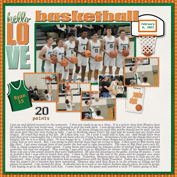
First up is B2N2Scraps. She’s got the fall theme, the colours from the photo and the flowers. She didn’t miss a trick! Her simple layout puts the focus on the smiles in her photo.

KarenDiamond has the fall theme as well, with a bit more of the blue from the Pin. I see she’s anonymized the child in the circular photo as a silhouette. This technique works perfectly in a backlit photo, instead of just blurring features.

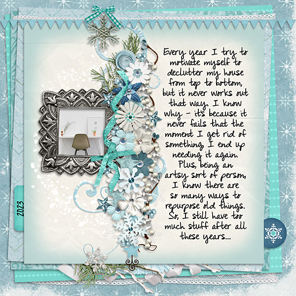
DianeInOz went for the colour palette, creating a whimsical layout with a clever nod to autumn. I love that wood-look cow cutout!

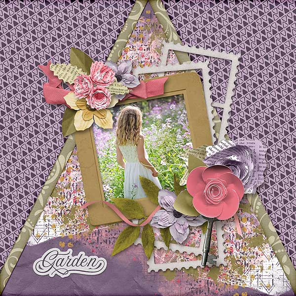
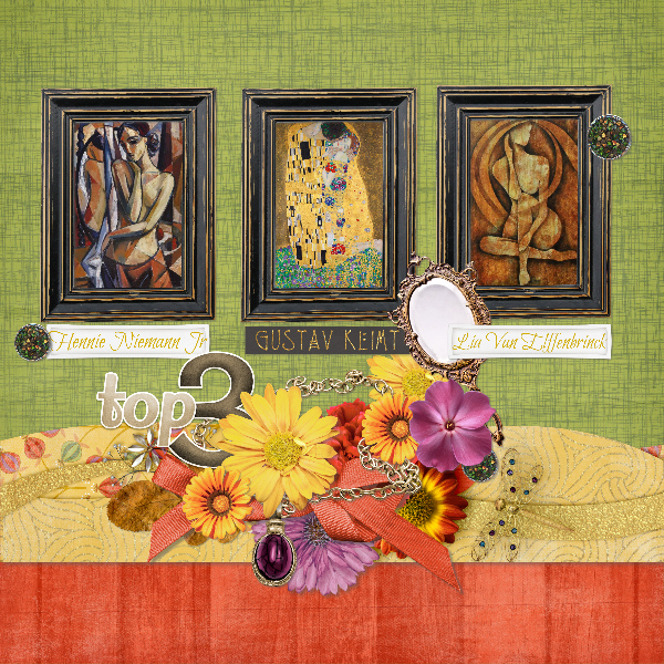
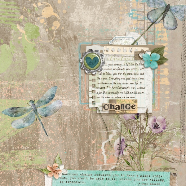
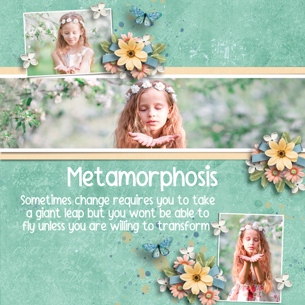
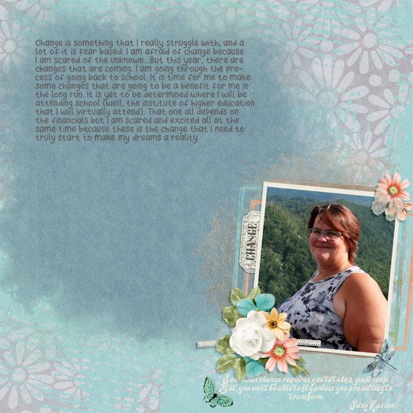
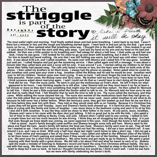
This stunning layout is from greenfiend27. Her choice of soft oranges and corals against a gray, dusty background, with ample floral elements, provides the perfect foil for that beautiful photo. The result is elegantly grungy. I think this is my favourite of the bunch.
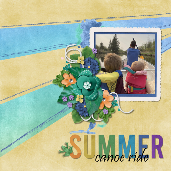
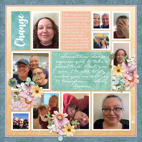
Windswept has all the colours in there, and chose our major autumn celebration as her theme. Her focal photo is so cute!

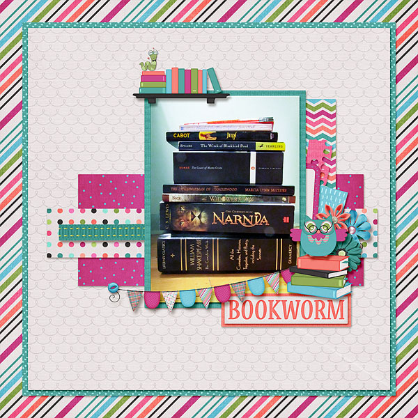
The pocket style of zippyoh‘s layout works so well with all those pumpkin photos. The harvest/autumn theme is obvious but not in-your-face. She accents all the orange in the photos very nicely with touches of purple, gold and white. Aren’t those little foxes just too sweet?

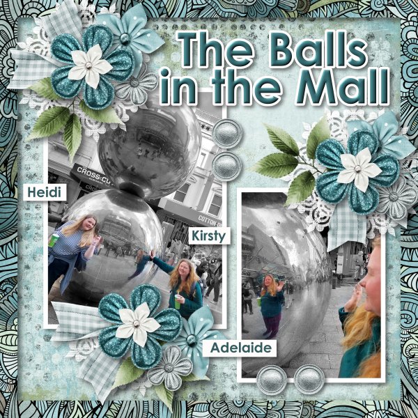
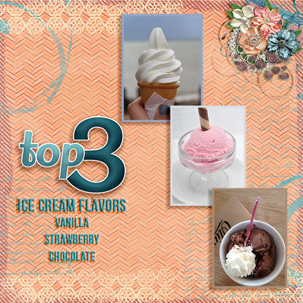
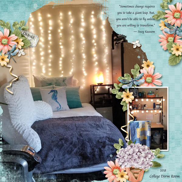
For her layout, pinklily chose to document a week of her late fall activities from last year. (I’ve been to that mall… just sayin’. Winkwink!) The colour palette was what inspired her here.

Route66 pulled only 4 of the dozen colours in the Pin for her layout. Looks like somebody’s been playing with title tuts. 😉

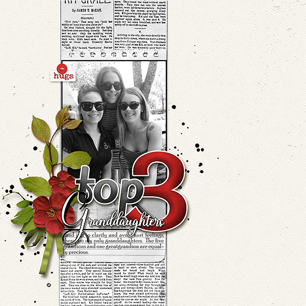
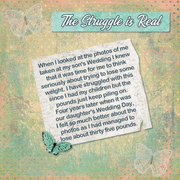
The subject of this layout from gmae is a somber one. It could be seen as a play on “fall”, and a clever one at that. She has pulled a few of the fall colours from the Pin, and added some floral elements. Possibly the only flowers these resting places see these days…

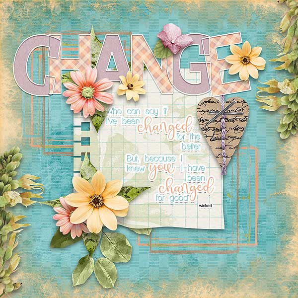
Pippin went all in on individual style here. Her sole connections to Lisa‘s comments are her floral clusters and the pinks and blues from the Pin photo. This is a layout after my own heart.

Last up is this very autumnal layout from snojewel. She has some subtle hints of gorgeous teal stamped in her background. The oranges, browns, golds and burgundies complement her photos of Ben very well.

Next week I’ll have a Quick Trick for you. I haven’t decided which one from my little list of topics… we’ll all find out together!
Given what’s happening around the world these days, I hope this has given you a brief break from fear and worry. I also hope the people you love are safe and healthy. And that we all stay out of harm’s way.
![]()