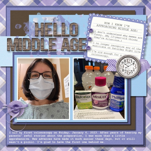
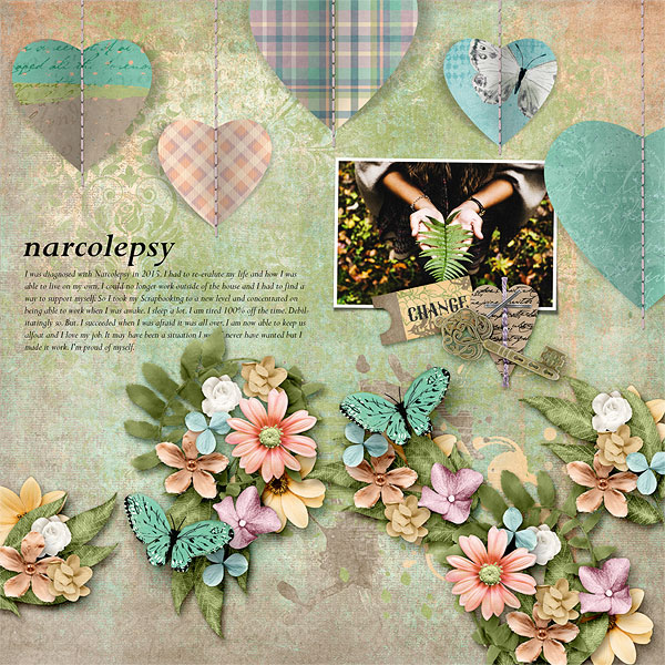
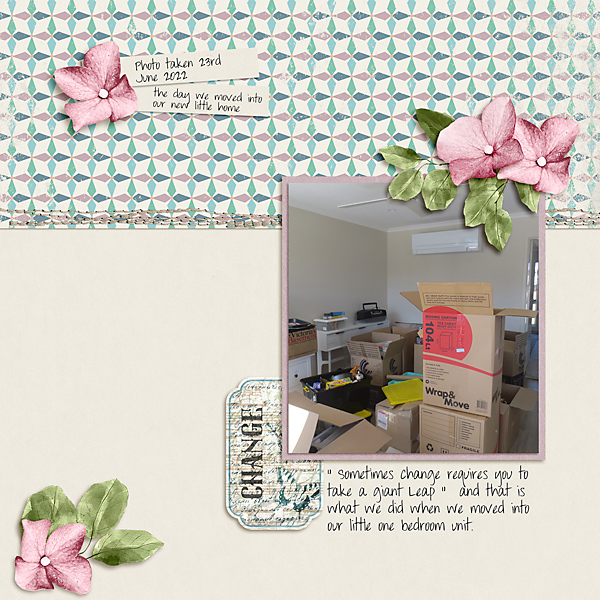
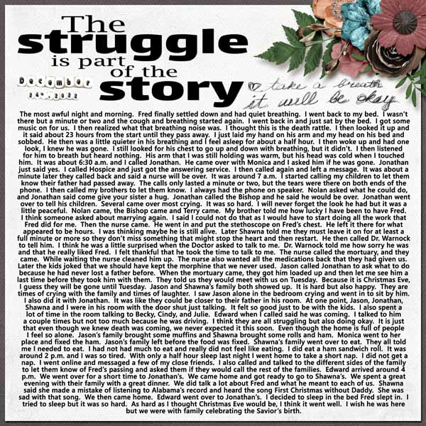
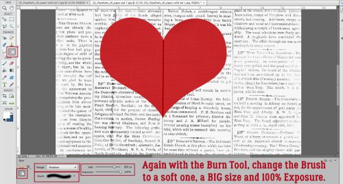
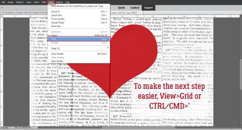
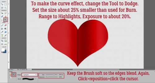
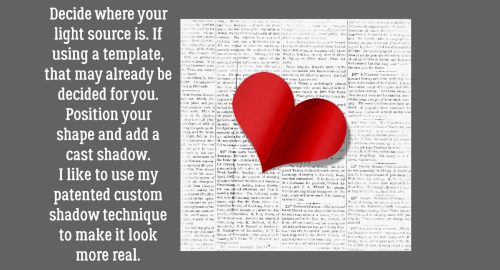
![]()
It’s Miss Fish!

Many of you will already know Juli, aka Miss Fish. Lately she’s moved past mainly template designing and is bringing more of her talent to entire kits. I know I’m happy to see that! She’s also been in the Designer Spotlight before, so we talked about some different things this time to keep it fresh. (Since we both have the same first initial, I’m going by “O” today.)
O: Let’s get the bread and butter out of the way. What motivates and inspires you as a designer?
J: I love designing templates that make me want to stop what I’m doing and scrap a page. I often will plus in my own photos
and some elements to make sure designs will look good for my customers.
O: Segué ahead… What one word would your friends and family use to describe you?
J: Busy! Lol…I work full time, plus I design and we like to have fun with friends and travel. I’m not one to just plop down and relax.
I go all the time!
O: It can be exhausting, right? I enjoy traveling too, so why don’t you describe your perfect vacation.
J: Anywhere in Europe close to a train station so I could go on different adventures every day.
O: So is that what you would do if you won the lottery?
J: YES! I’d quit my day job and travel full time. I’d bring along my laptop so I could design and scrap in my free time.
O: Oddball question, that I can probably guess the answer to: are you more likely to dance or sing in the shower?
J: Sing.
O: Yep, called it! Do you have a green thumb? What do you grow?
J: Yes. Currently growing Brussel sprouts, cherry tomatoes, peppers, arugula, and some herbs. Plus my cat’s favorite, carnations.
O: I’ve grown broccoli but never Brussels sprouts. Now I don’t have room for much but I have some flower boxes and a small bed in the front yard. Most of my blooms are purple, white or pink. What are your most favorite and least favorite colors?
J: My favorite color is blue. My least favorite color is orange.
O: Oh, I don’t like orange much either, or yellow. Hence they’re not prominent in my garden! {Except the Stella d’Oro lilies the developer planted. They can stay. What would your dream car be?
J: Something red and fast but in an SUV size, maybe a Porsche?
O: That would be amazing! My daughter had a BMW SUV, but didn’t love it so she’s driving a VW Tiguan now. If you could change one thing about yourself, what would it be?
J: I would make myself able to actually remember words and why I walked into a room.
O: I can definitely relate! Aside from necessities, what one thing could you not go a day without?
J: My phone. I’m embarrassed to say how attached I am to it.
O: I’m finding myself falling into that habit too, at least until my eyes start protesting. If you had a warning label, what would yours say?
J: Caution: probably crabby, feed for best results.
O: Hahahahaha!! Me too! Let me get you a snack, girl!
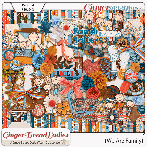
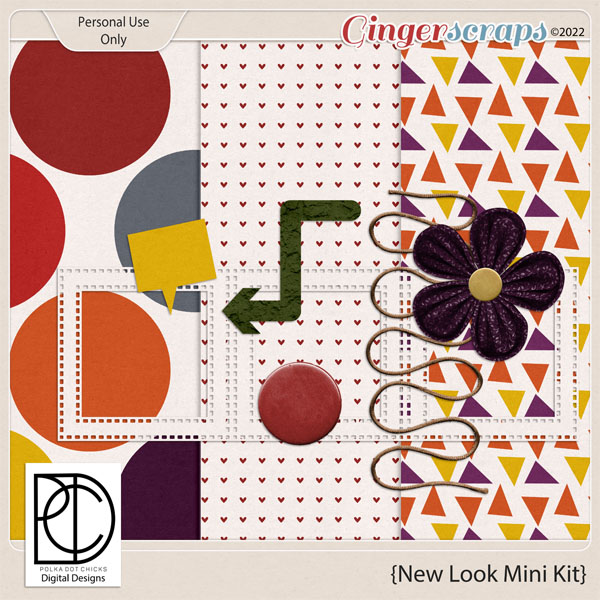
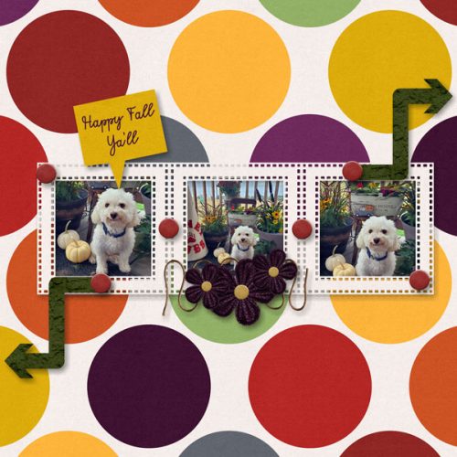
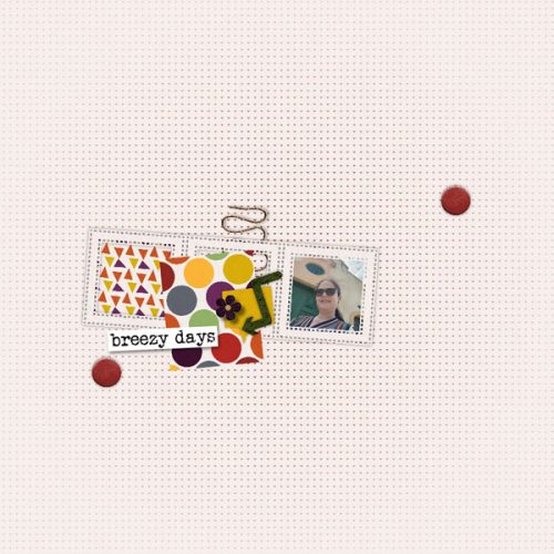
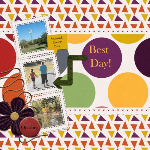
Before we disappear with our treats, I want to remind everybody that Juli is not just the IN the Designer Spotlight, she’s hosting the Designer Spotlight Challenge this month AND is providing the Daily Download on the Blog too. Each snippet of the Daily Download is available for 5 days; if you miss one or two and are heart-broken, don’t worry. The entire kit will be available for purchase in March. (Egad, did I really just say that?)
![]()