Hey there fellow scrappers. We’re at the first Friday in June and we have a few things going on this week.
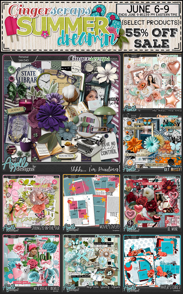
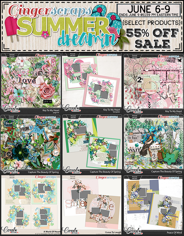
• Summer Dreamin’ Flash Sale (June 6-9)
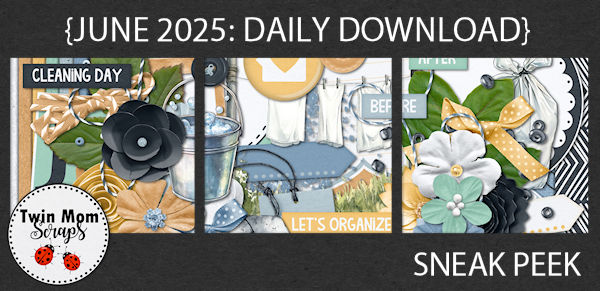
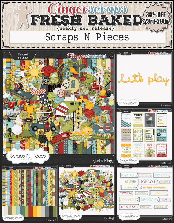
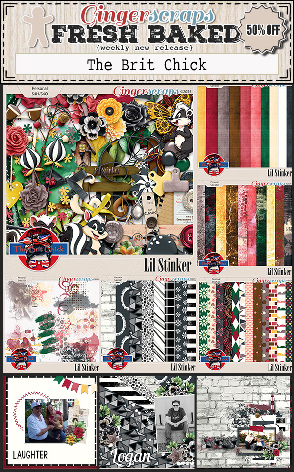
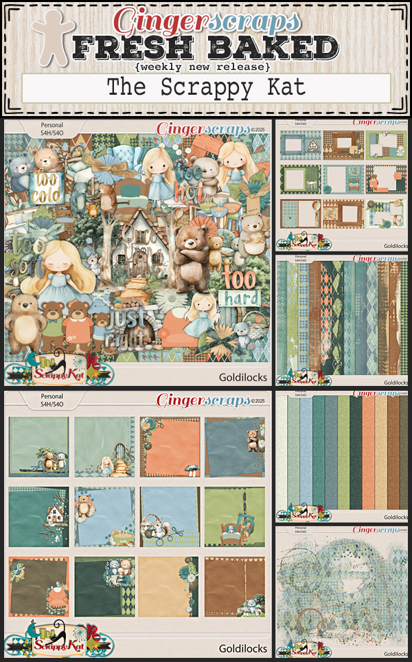
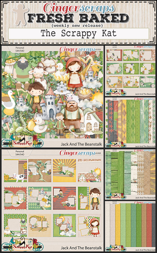
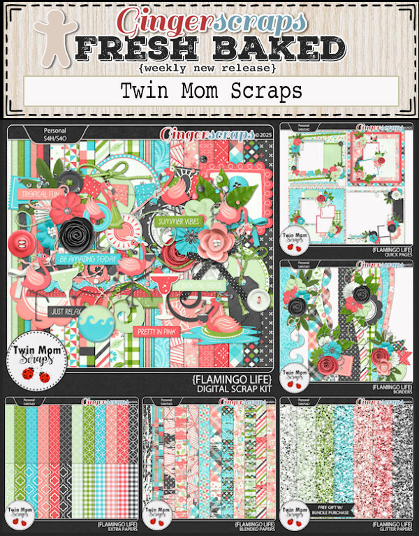
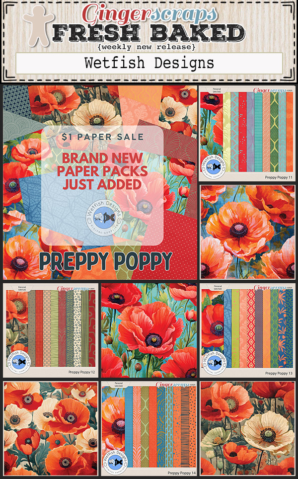
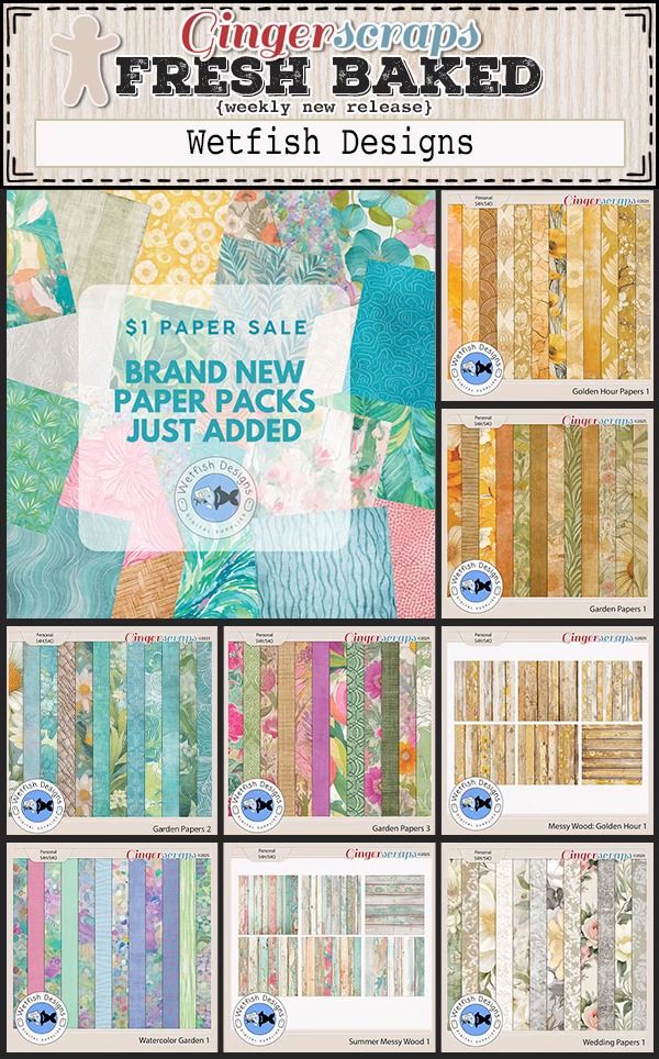
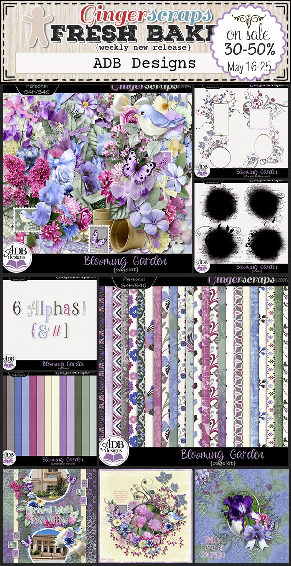
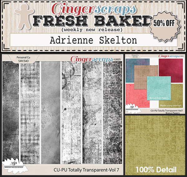
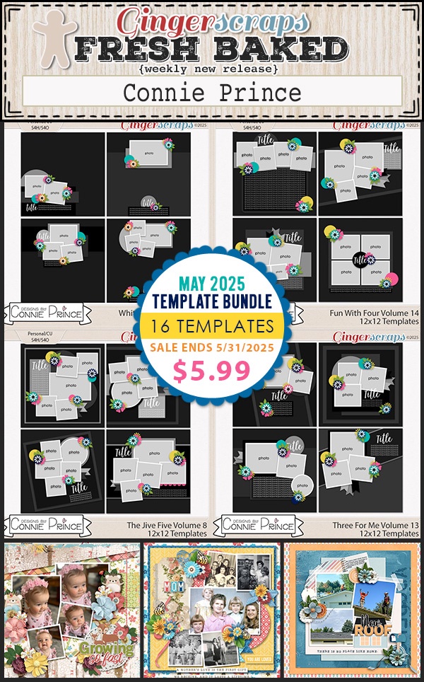
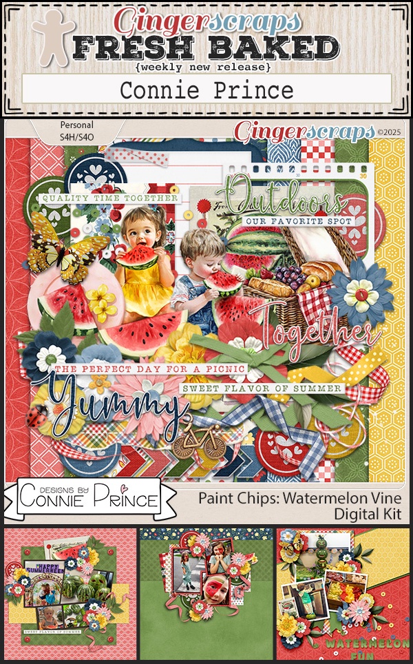
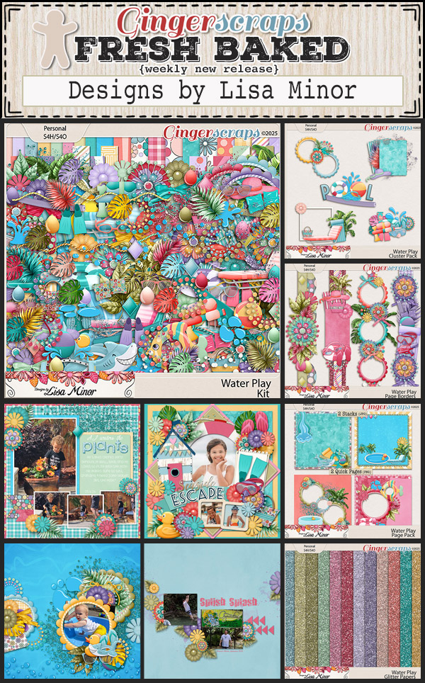
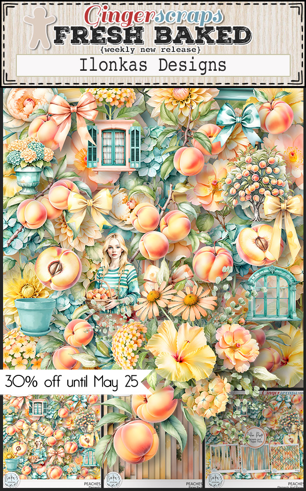
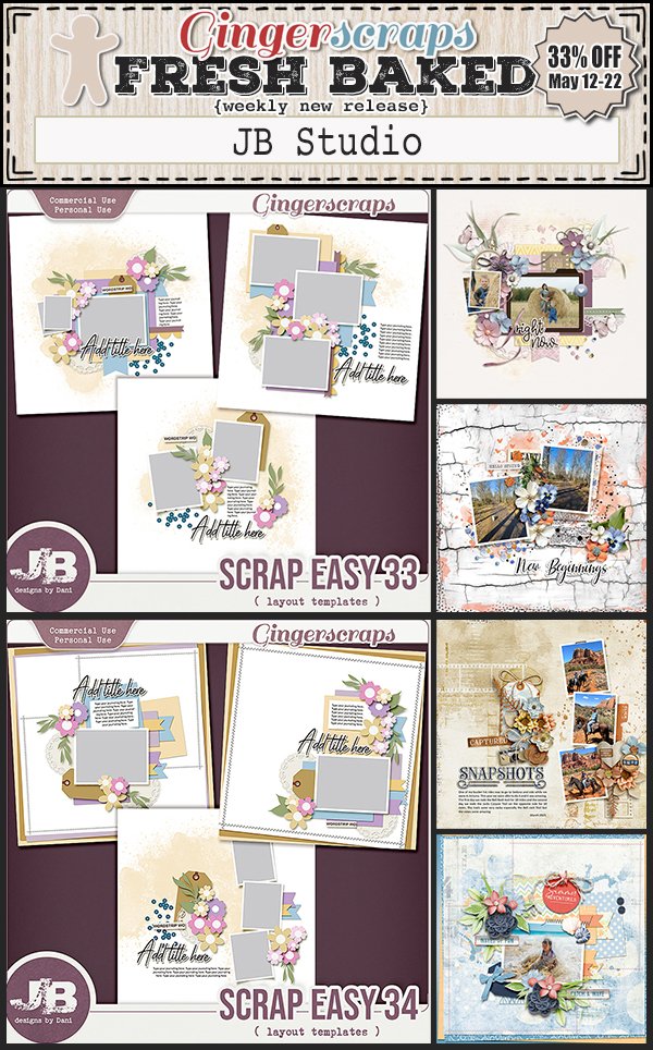
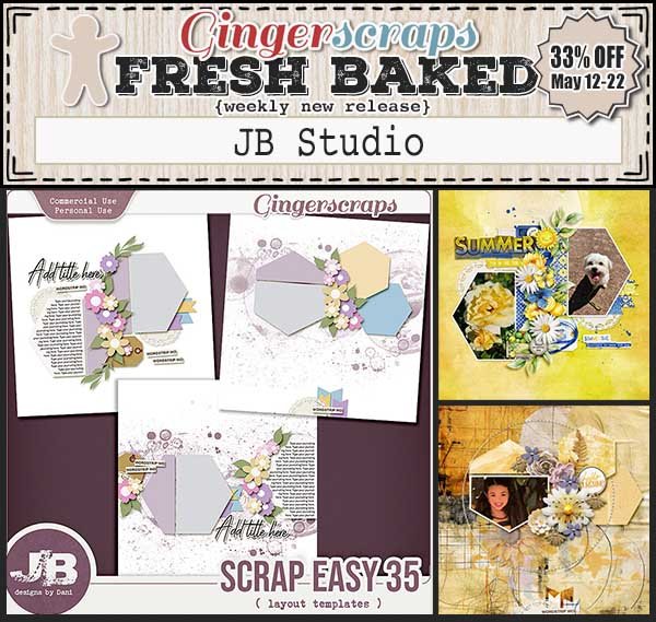
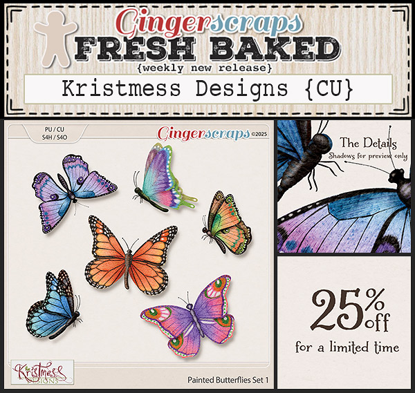
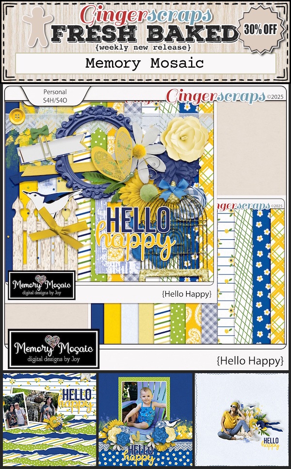
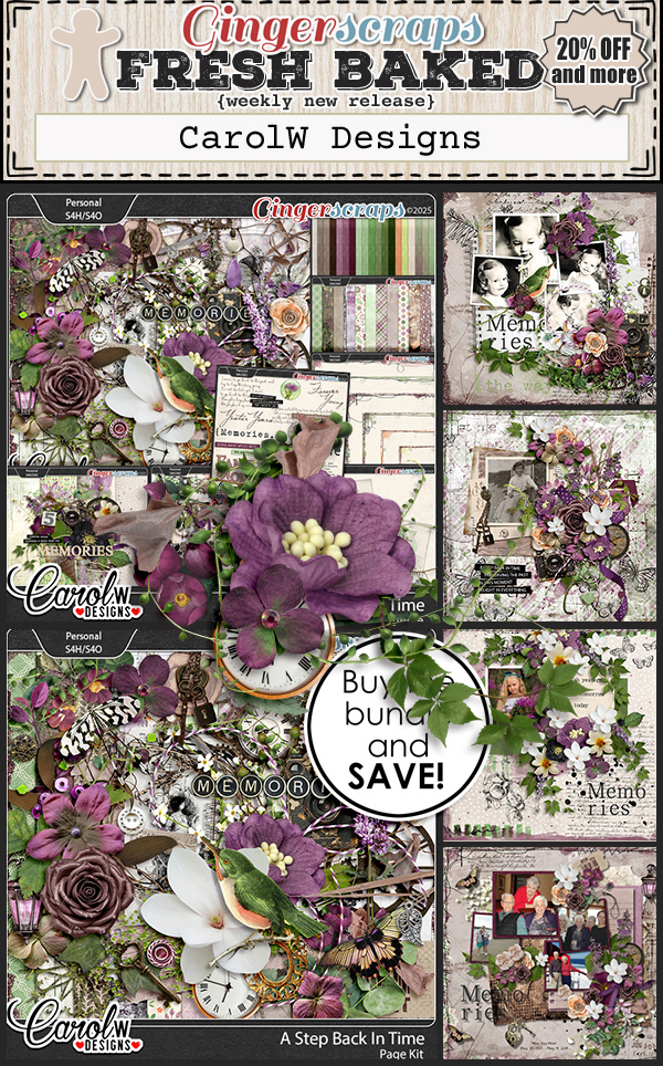
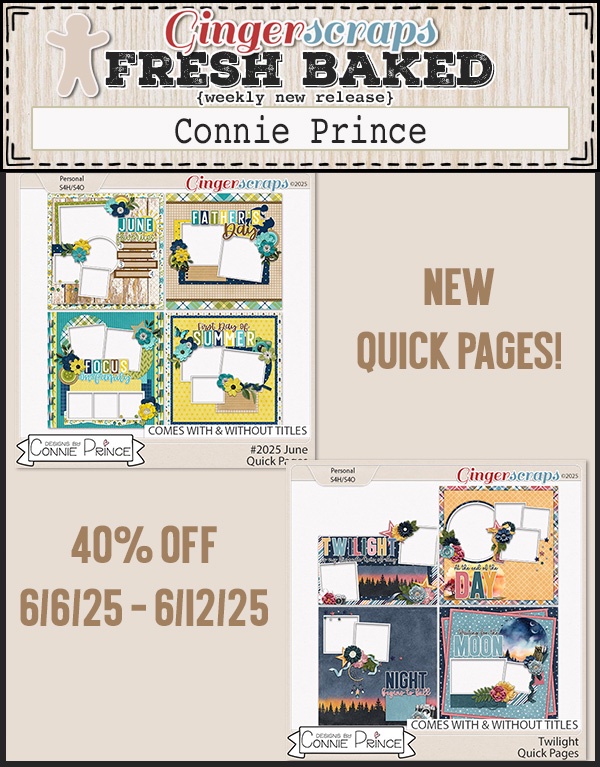
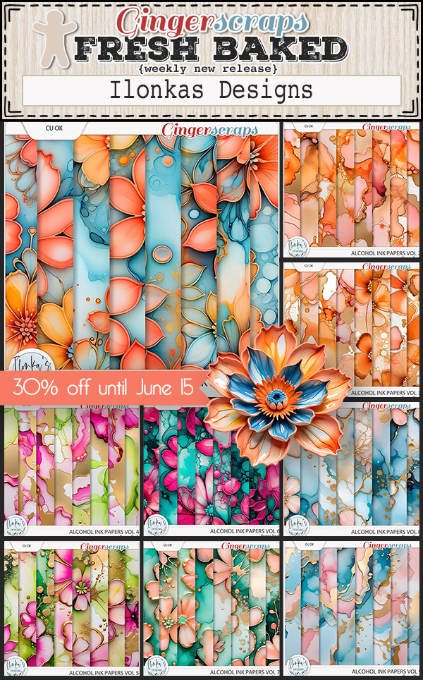
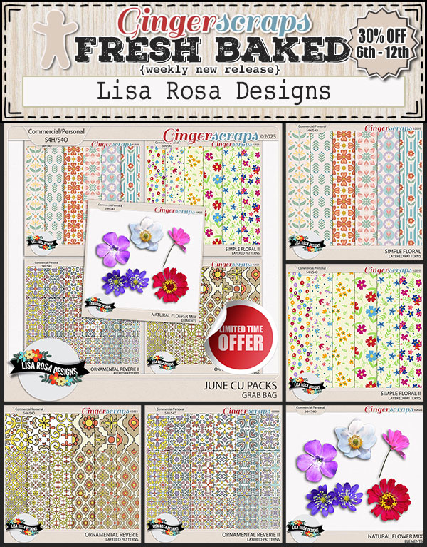
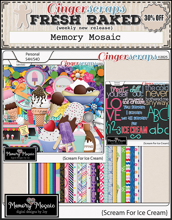
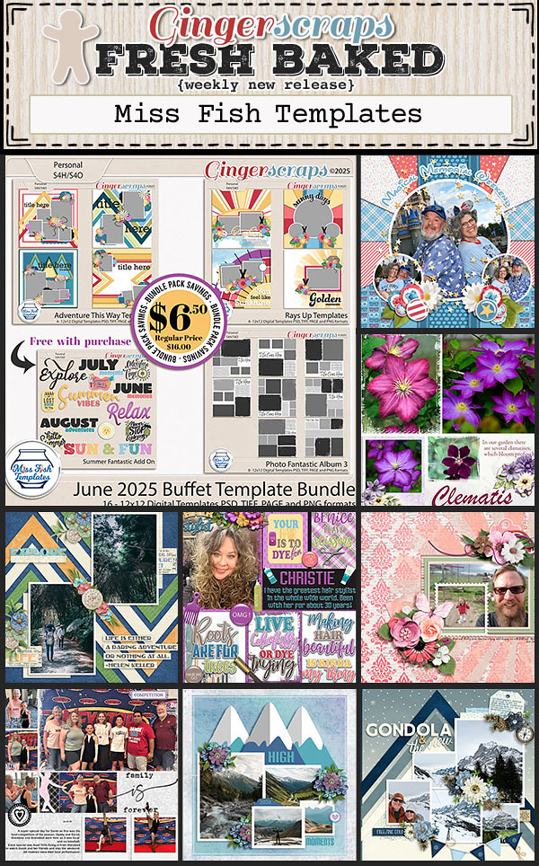
• new Fresh Baked items
• Fun challenges in the forum

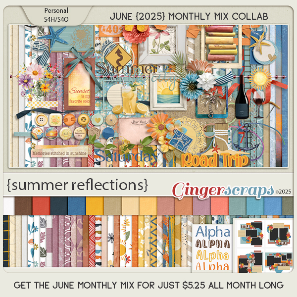
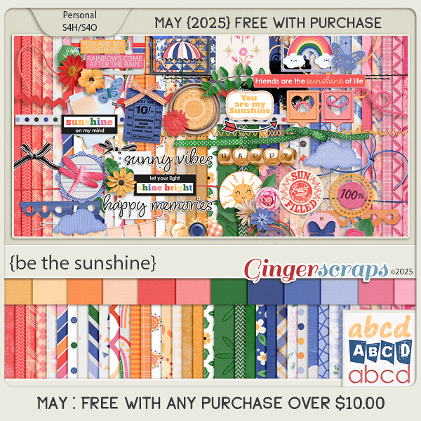
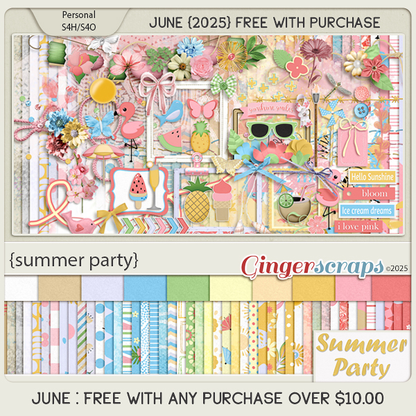
Remember if you spend $10 in the store, you will get this great collab for free.
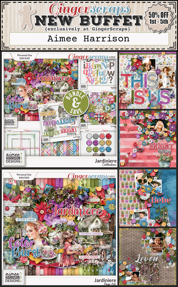
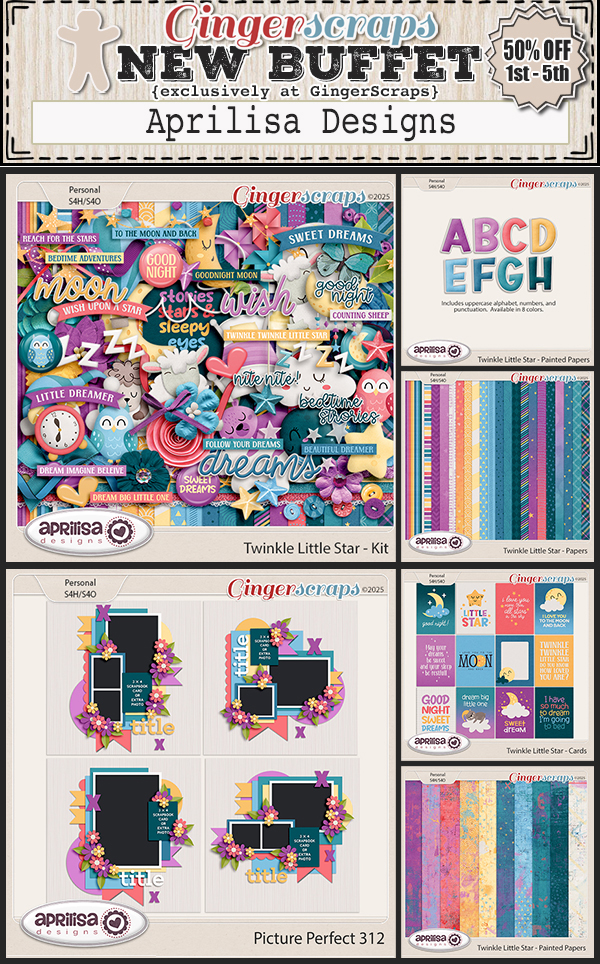
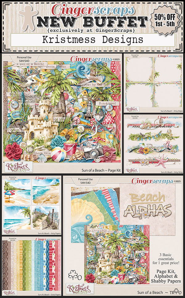
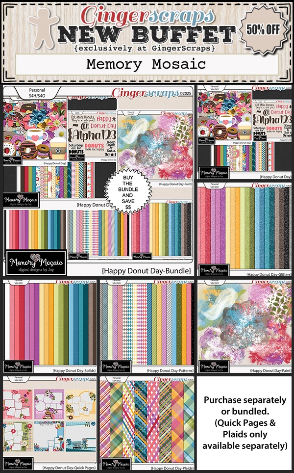
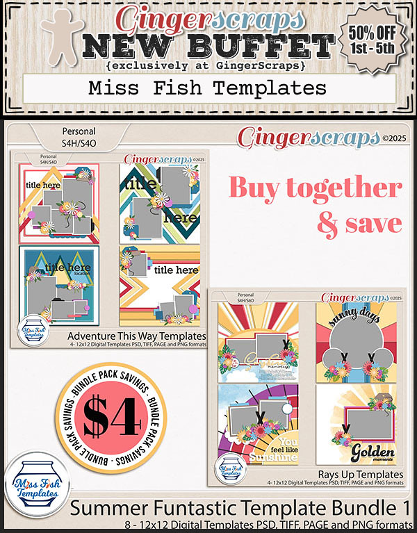
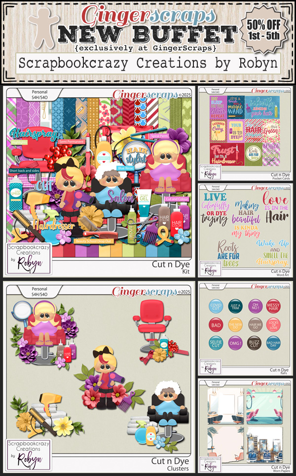
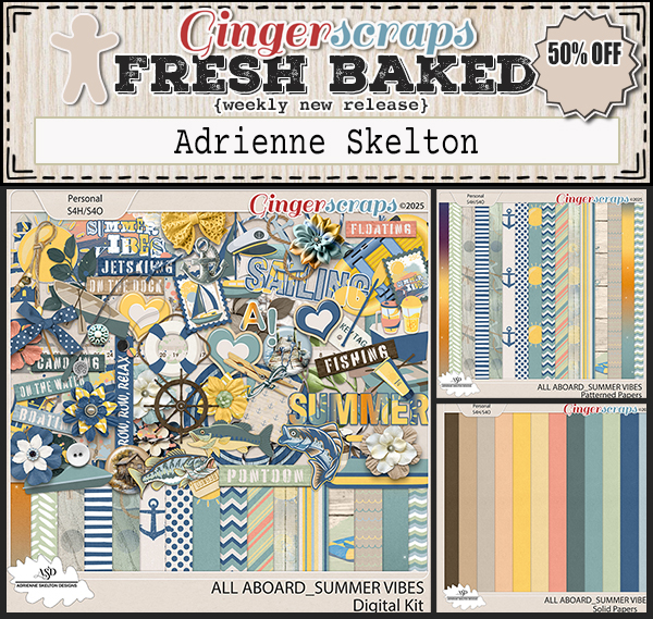
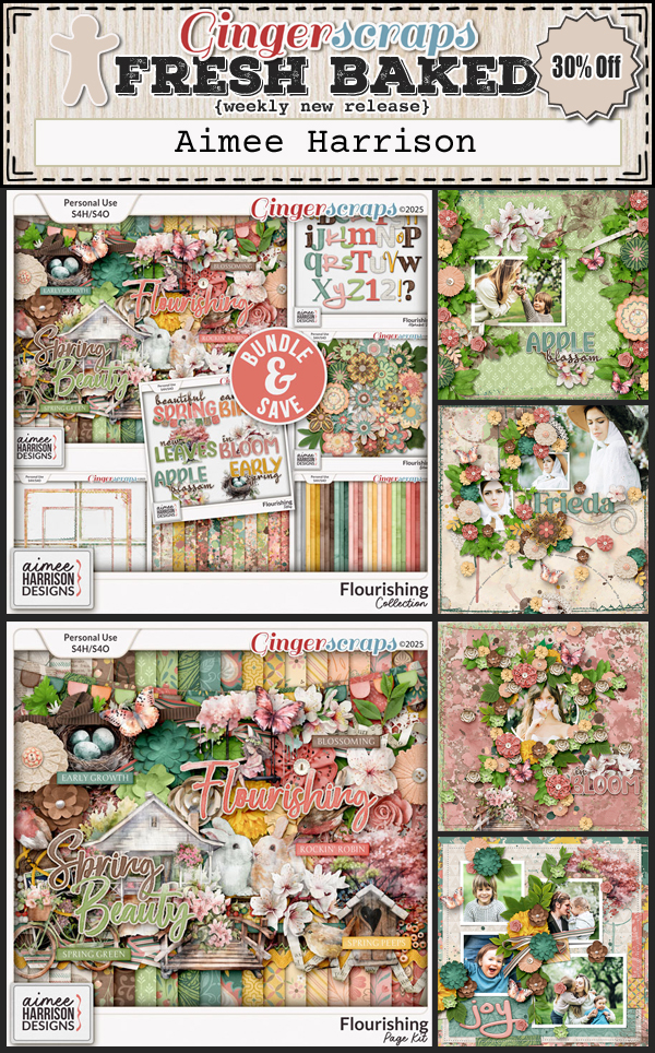
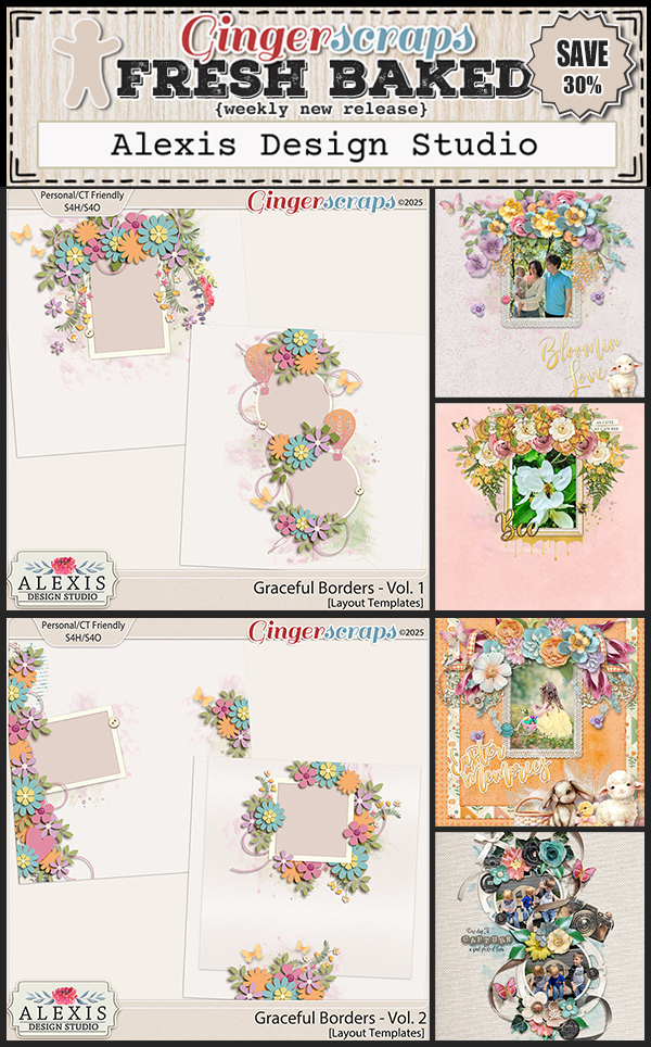
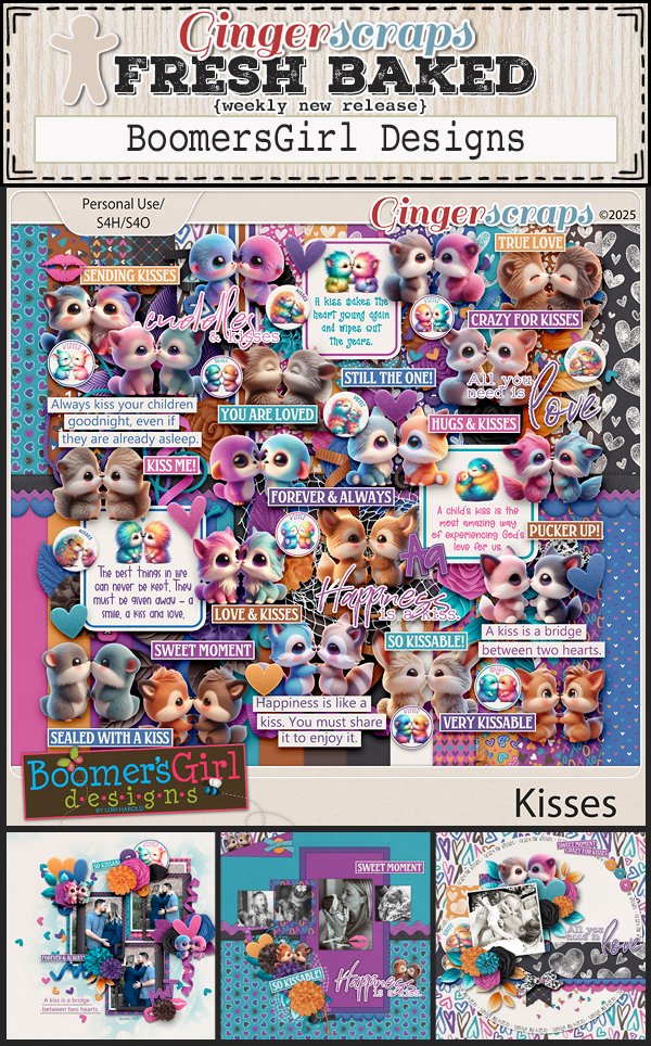
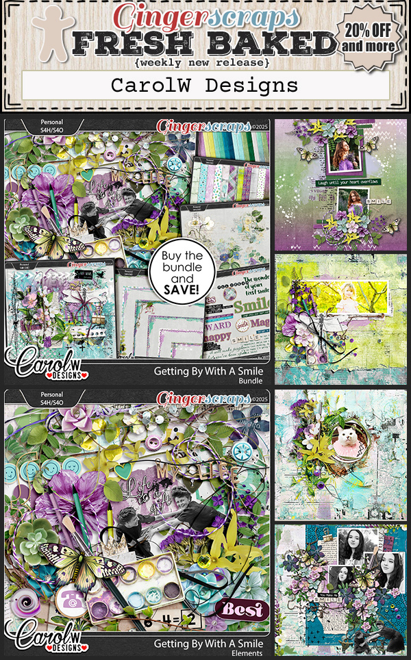
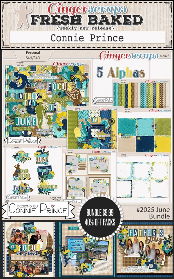
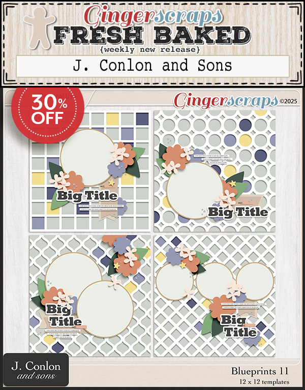
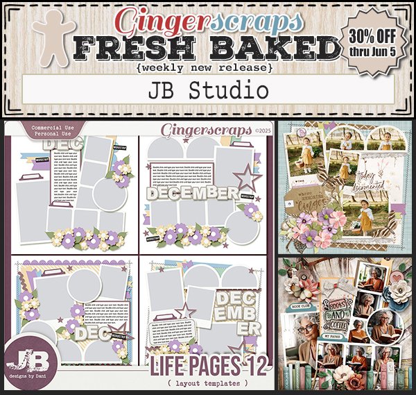
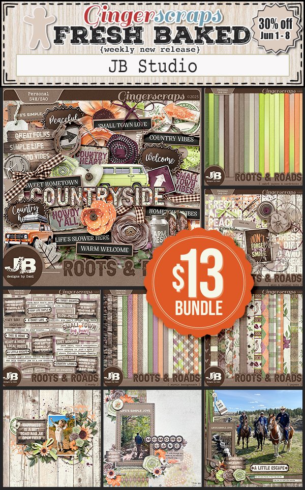
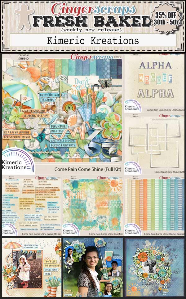
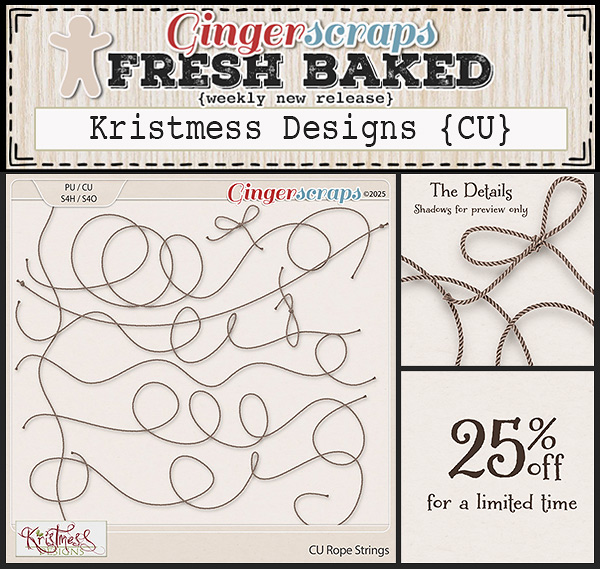
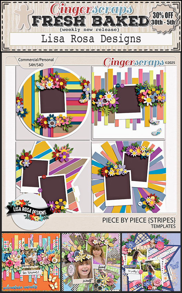
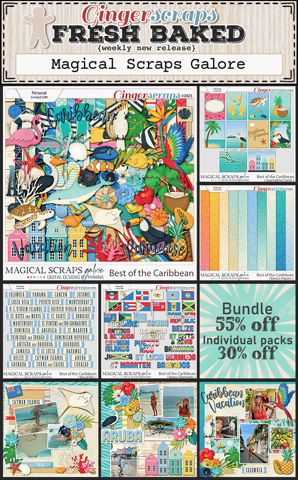
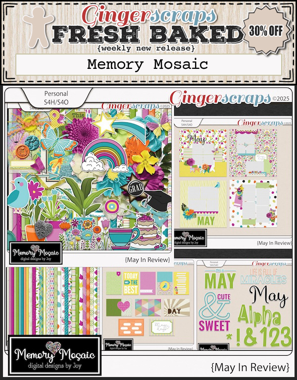
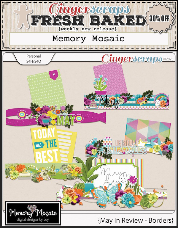
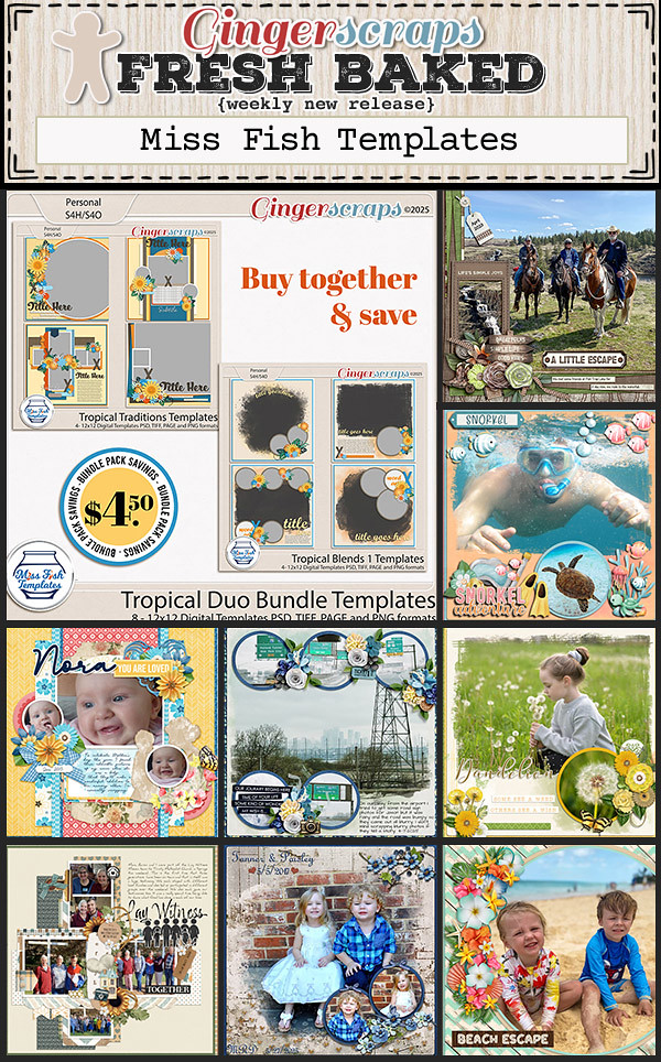
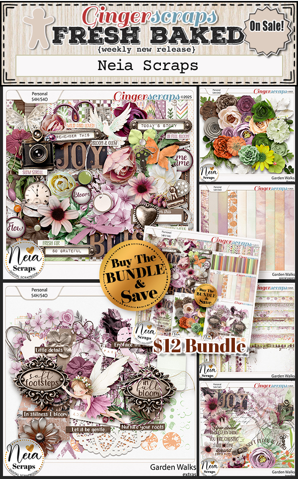
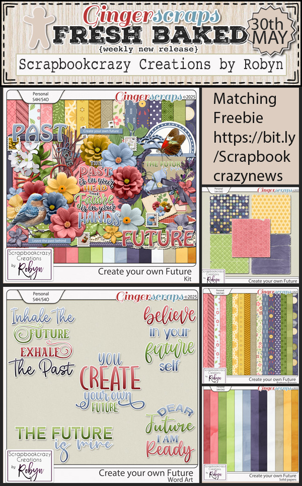
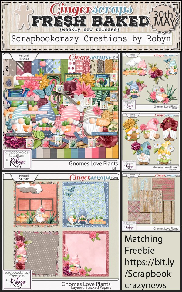
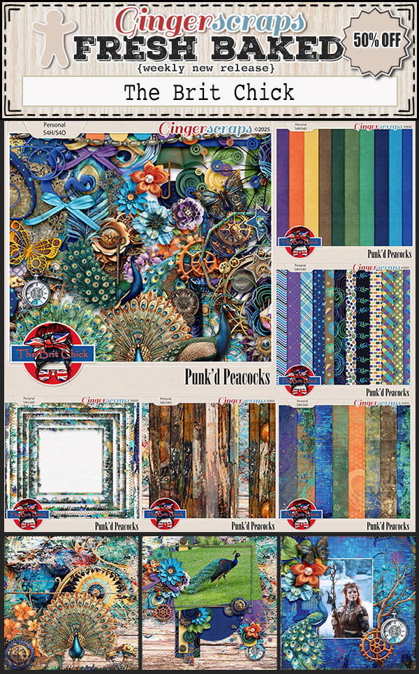
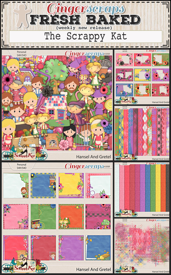
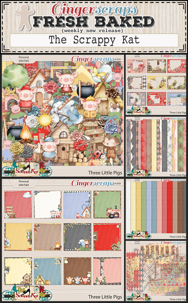
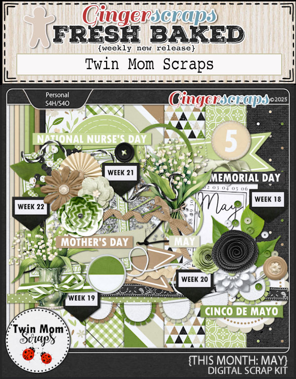
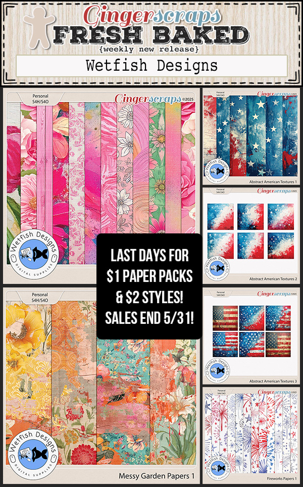
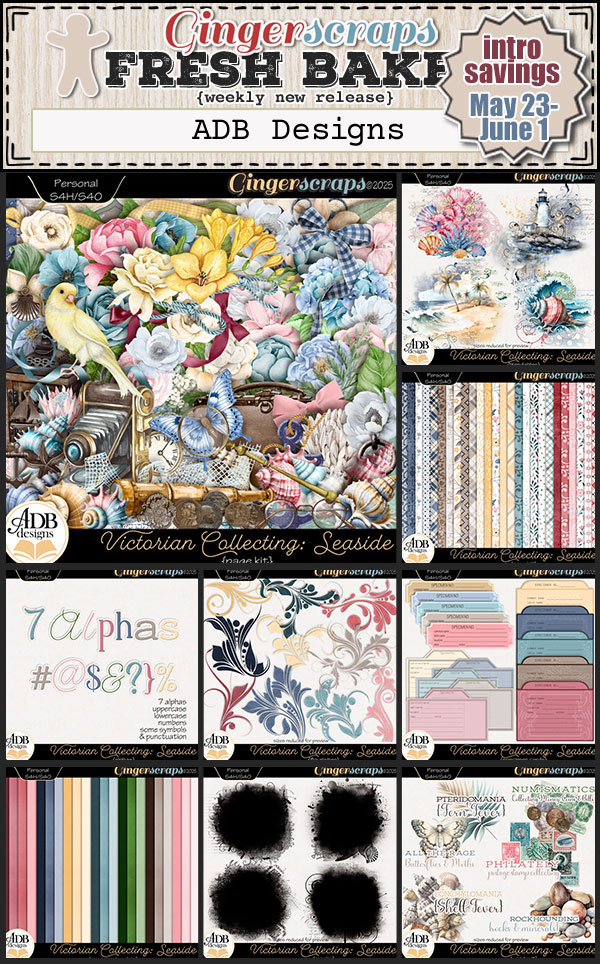
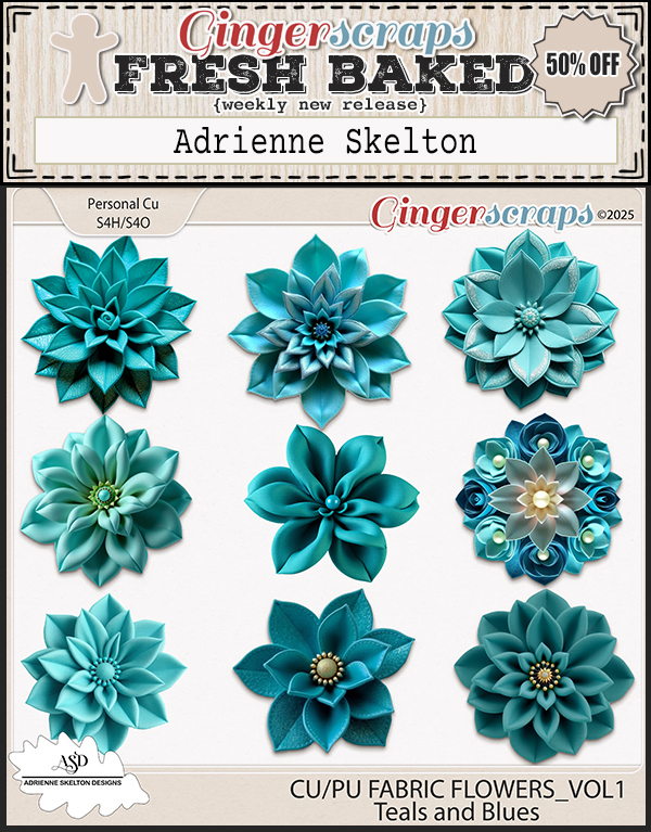
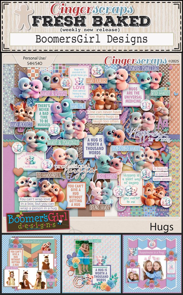
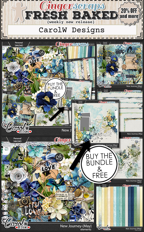
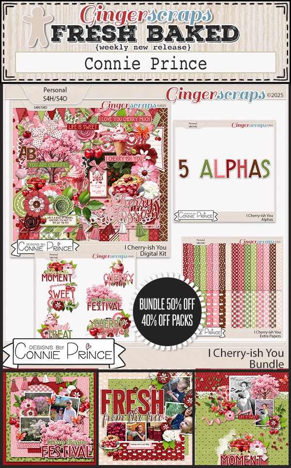
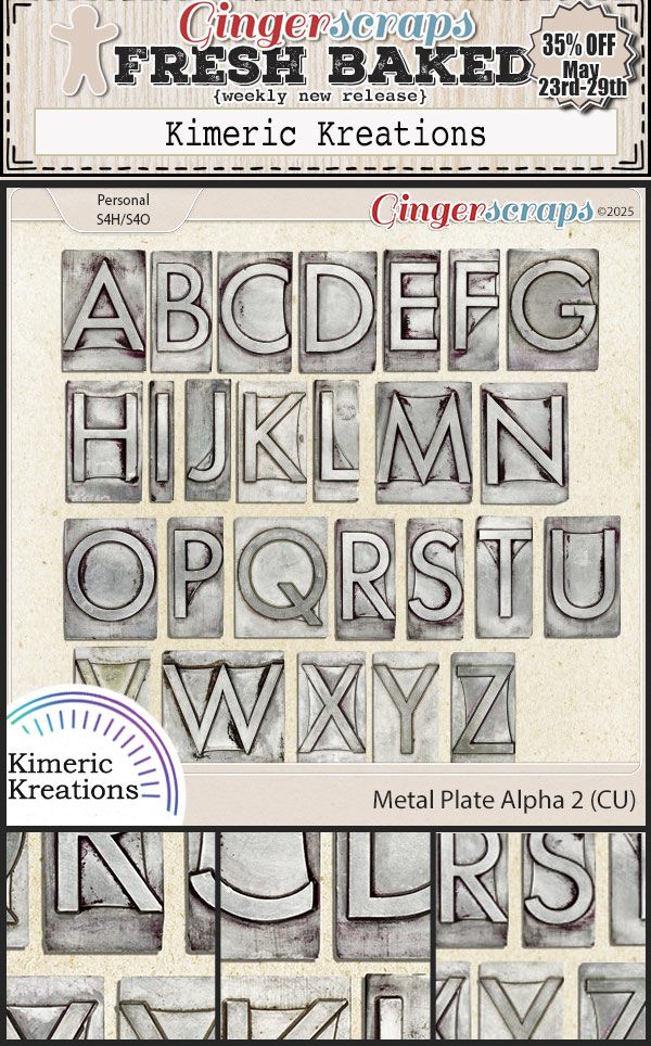
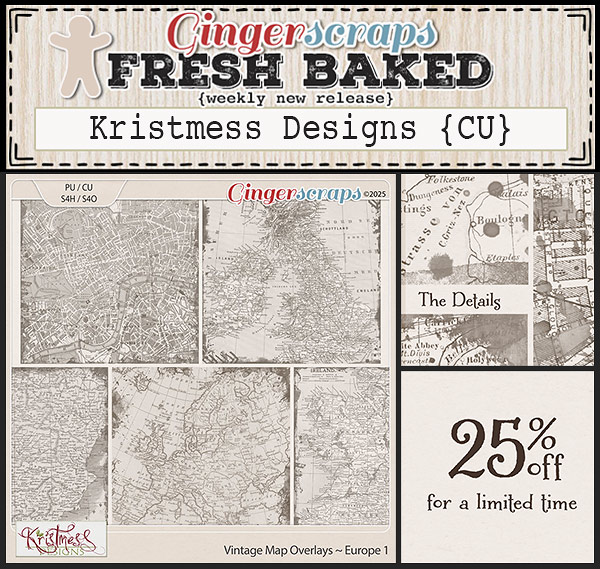
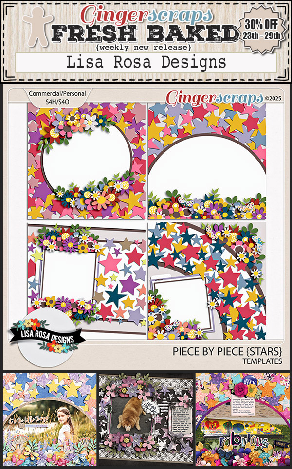
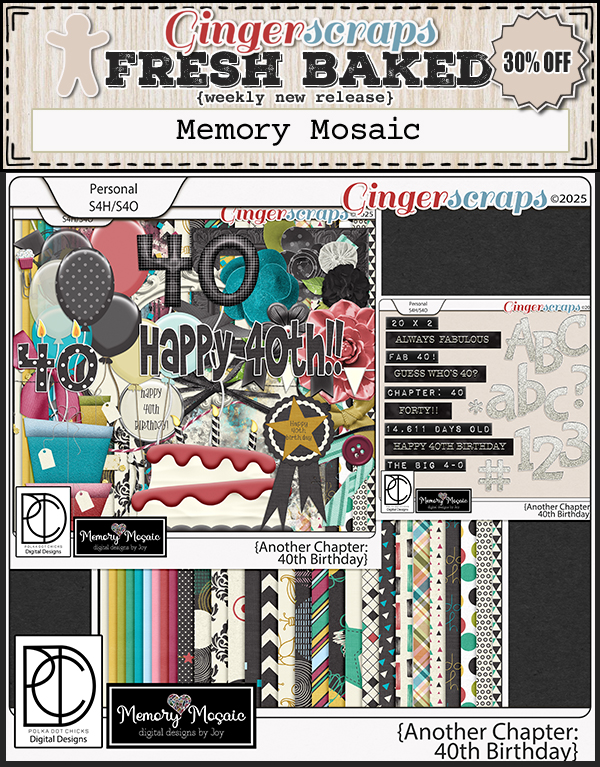
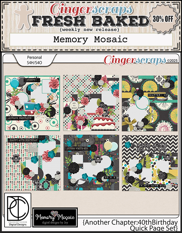
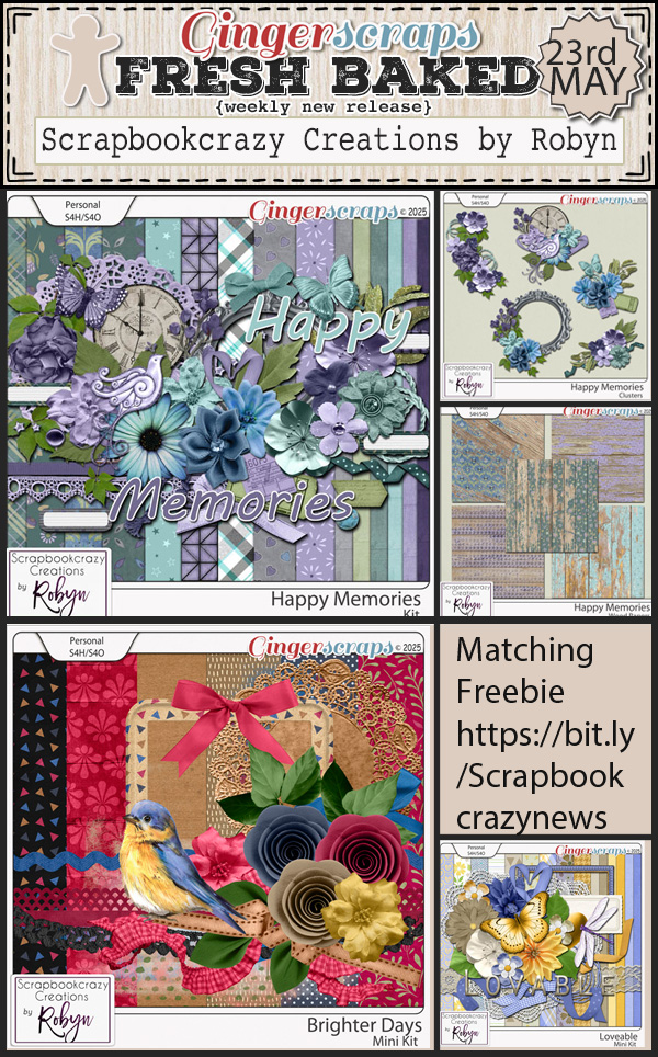
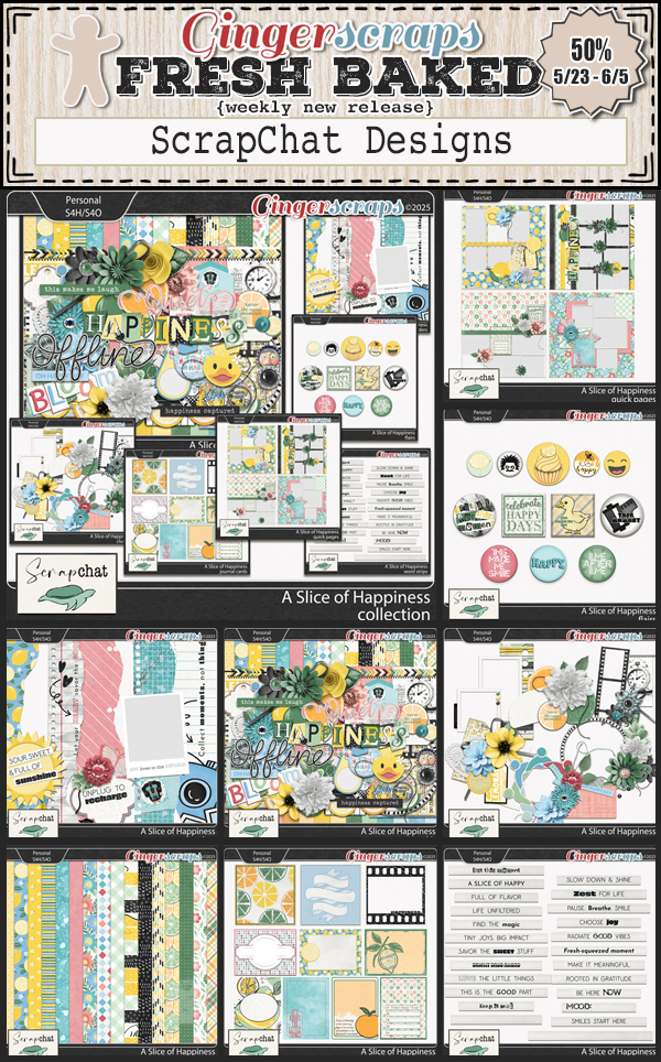
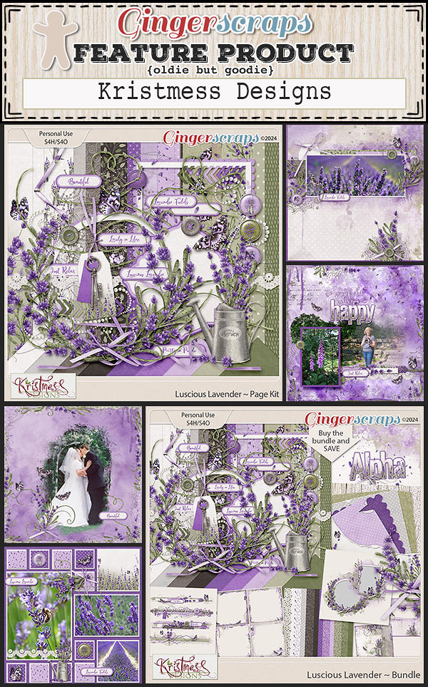
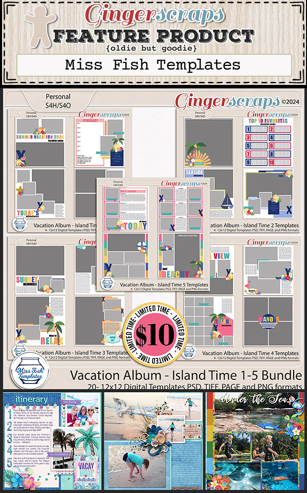
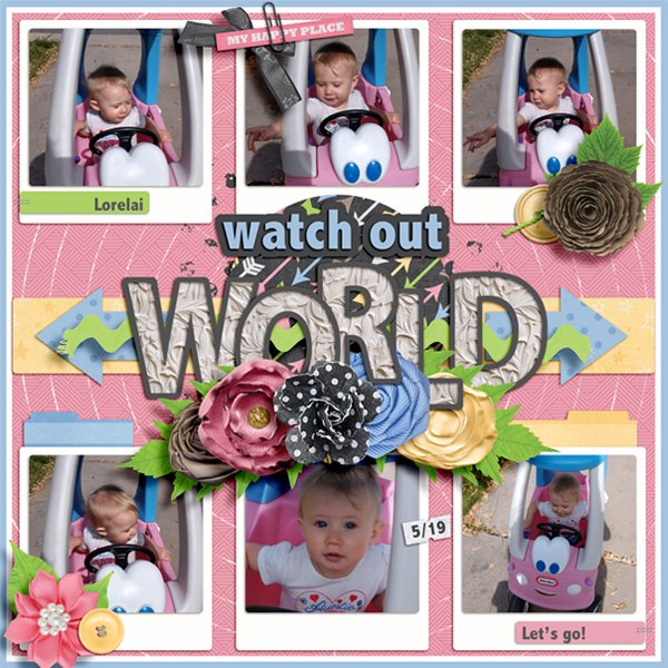
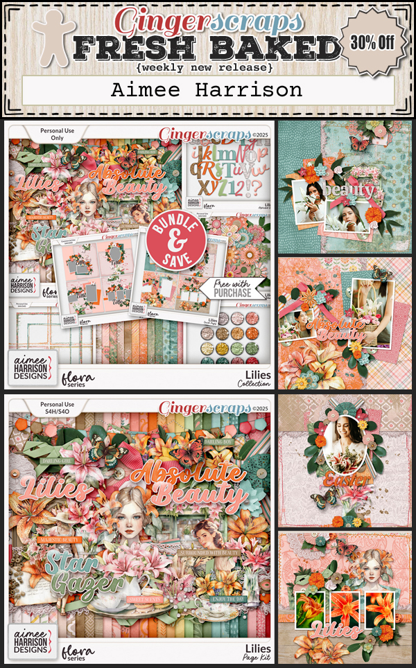
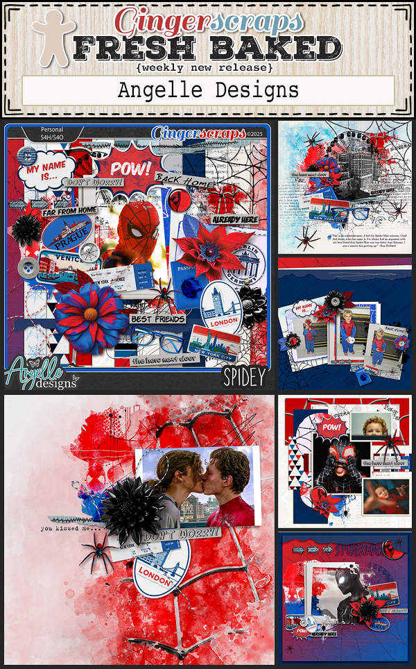
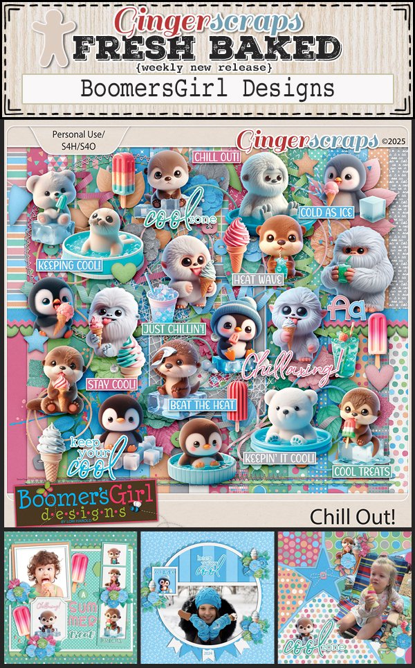
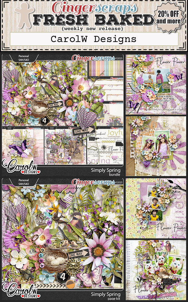
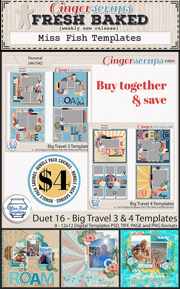
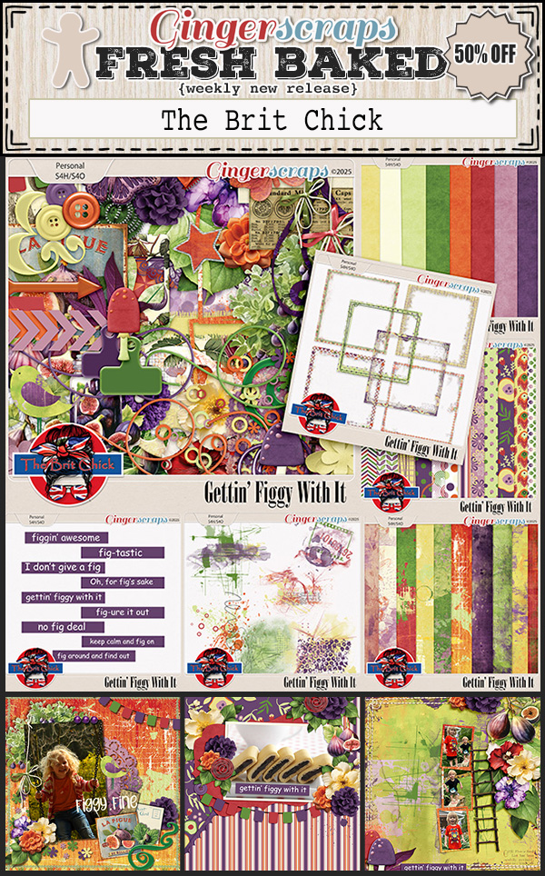
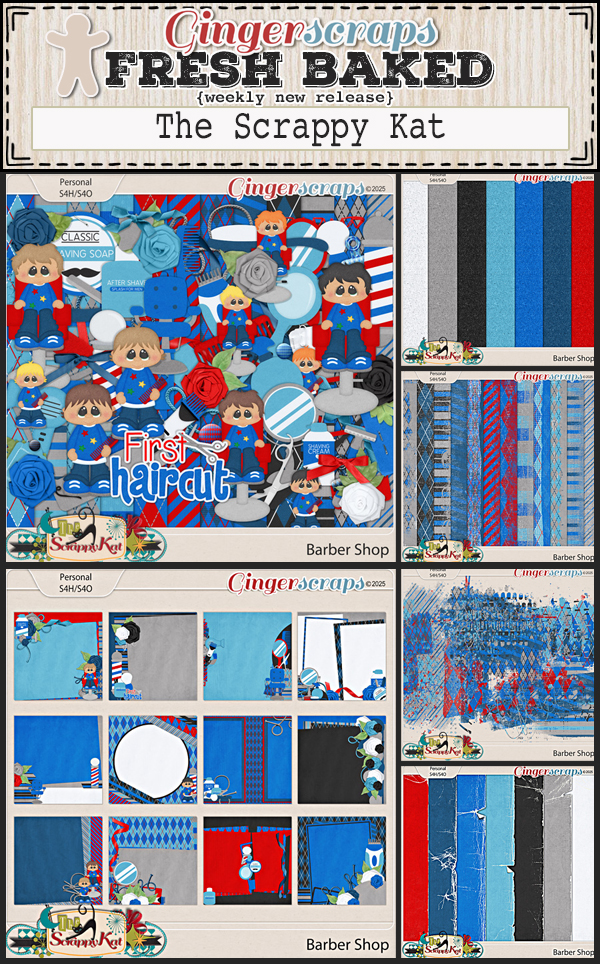
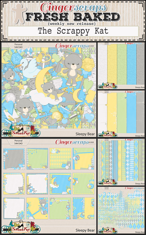
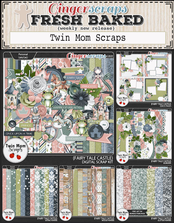
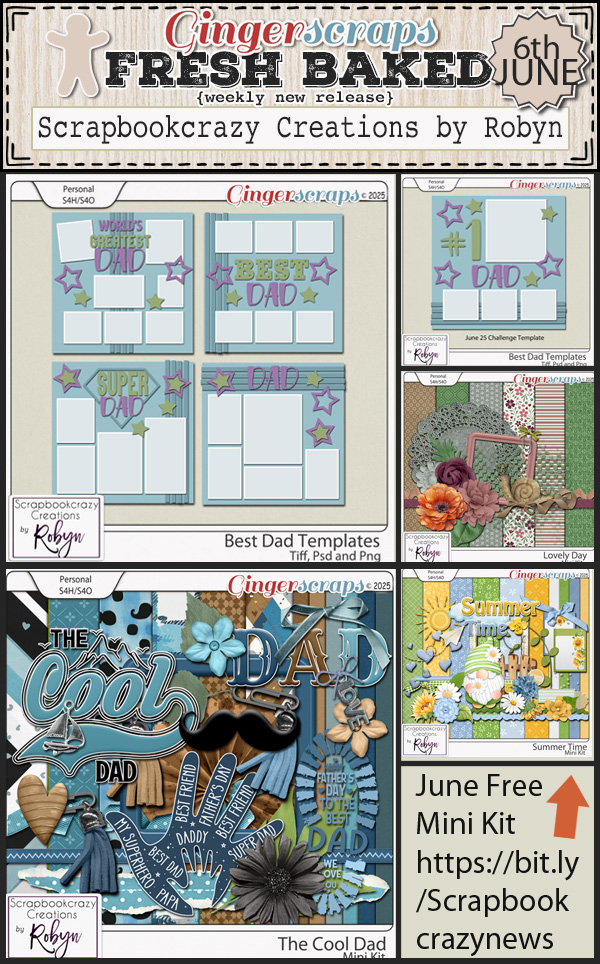
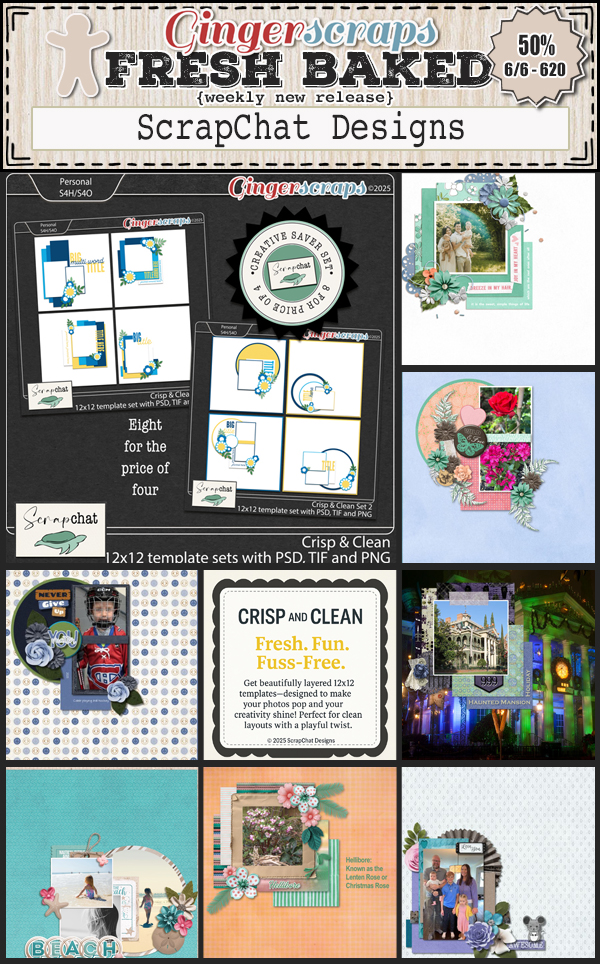
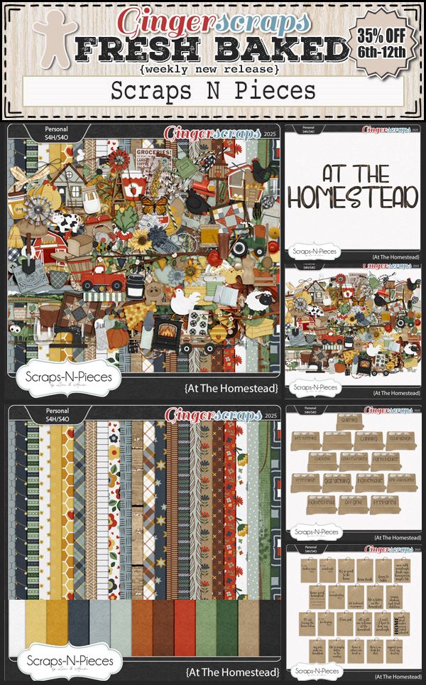
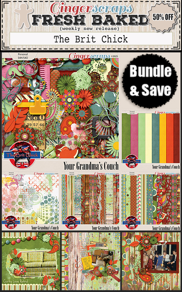
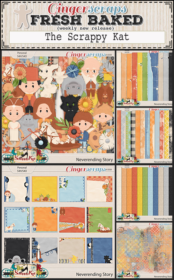
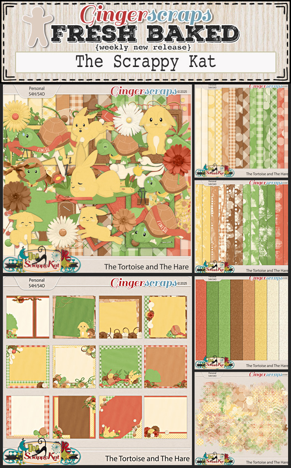
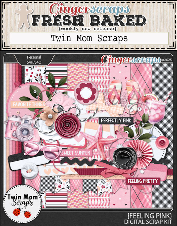
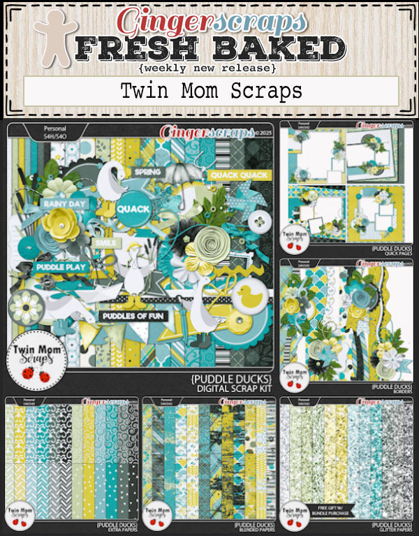
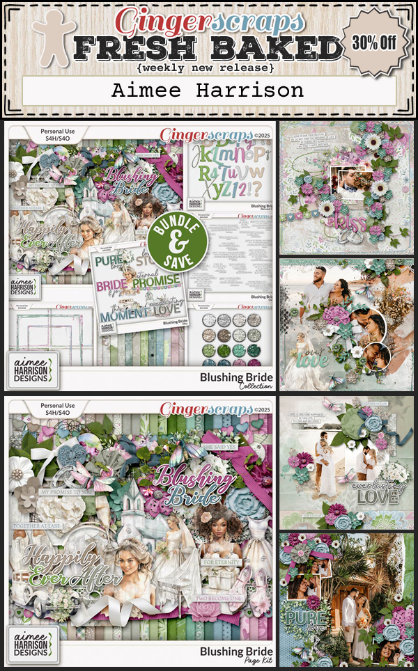
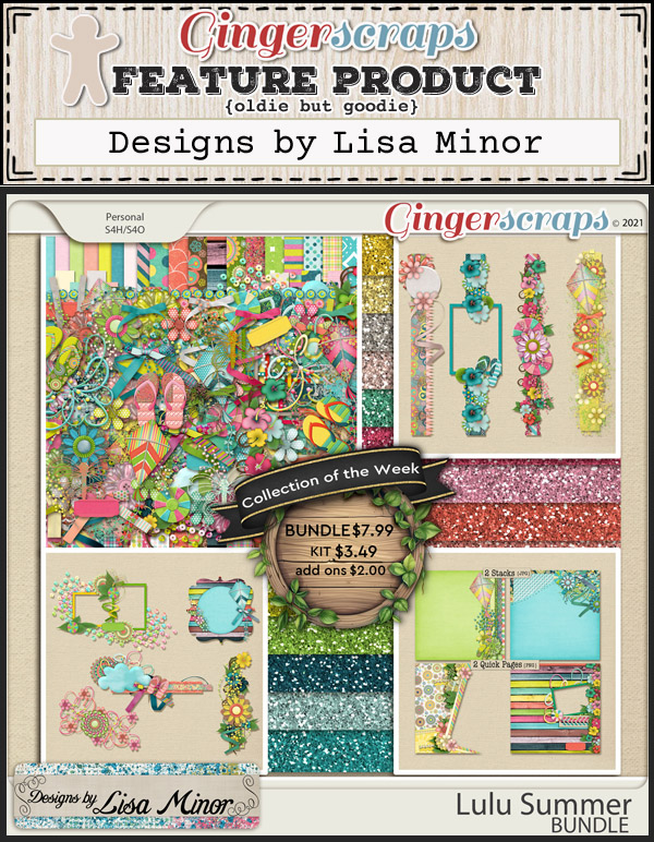
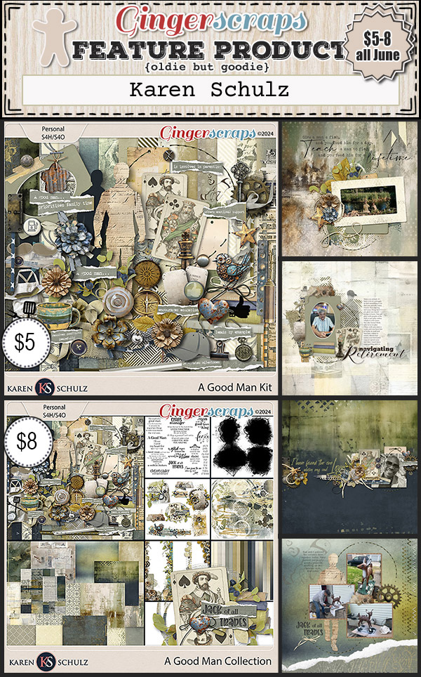
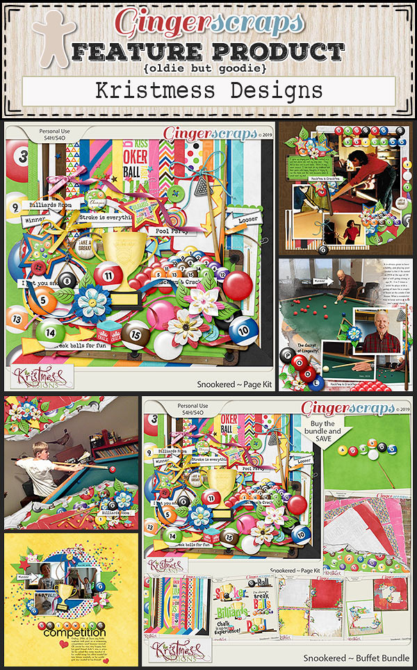
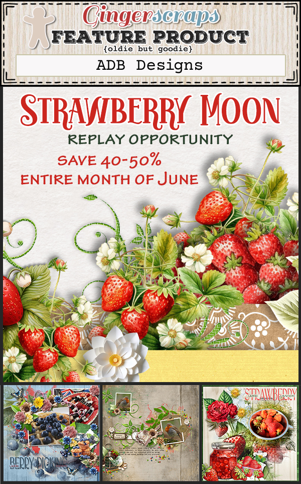
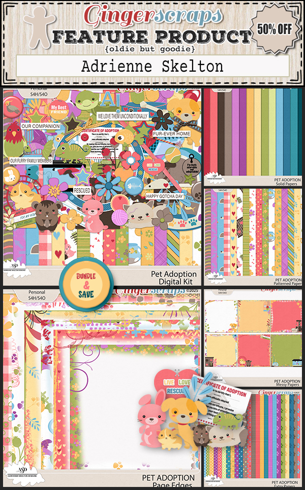
Let’s see what the designers have new for us this week.


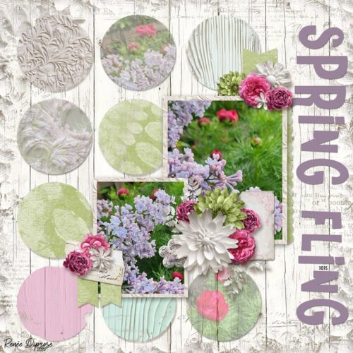
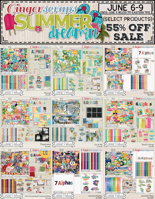
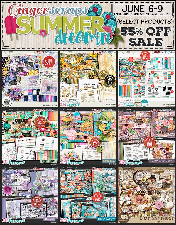
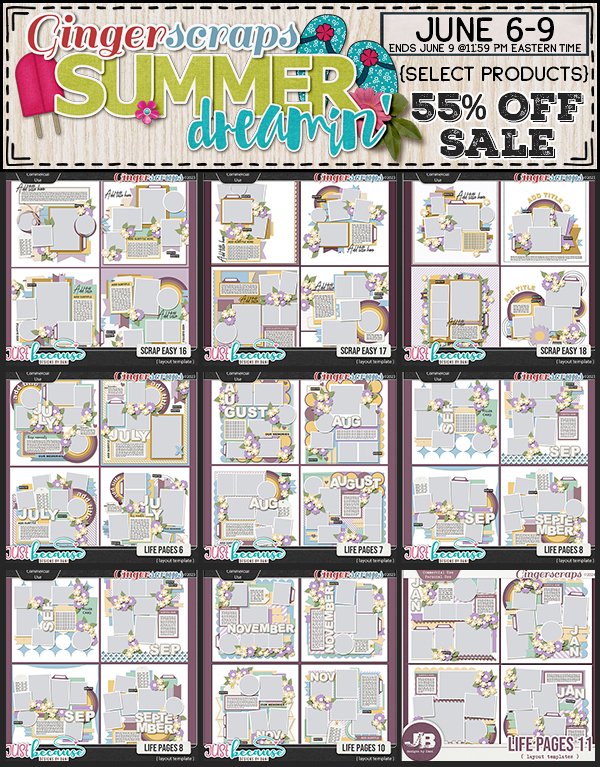
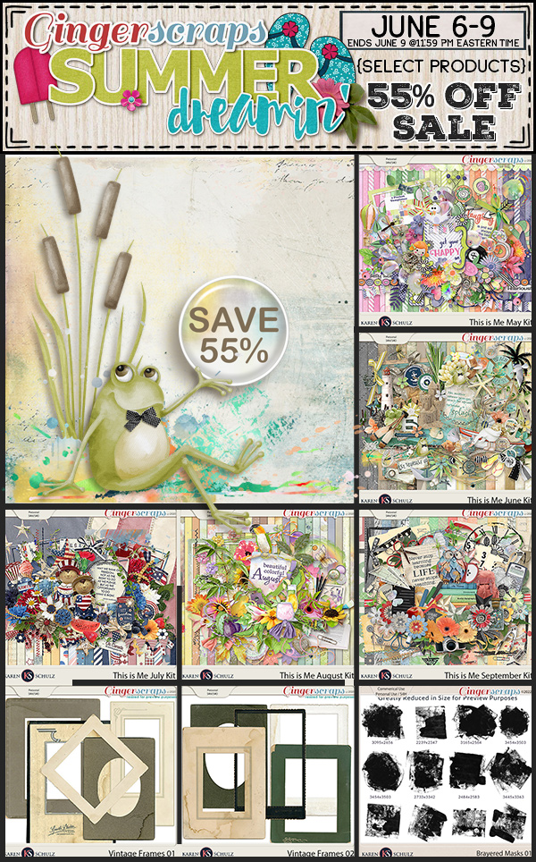
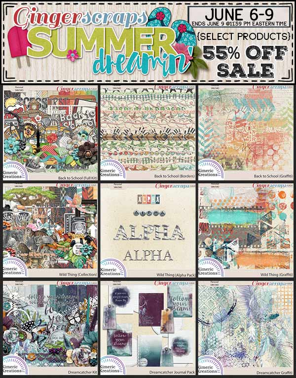
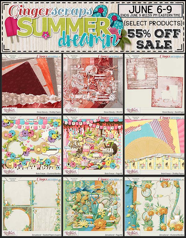
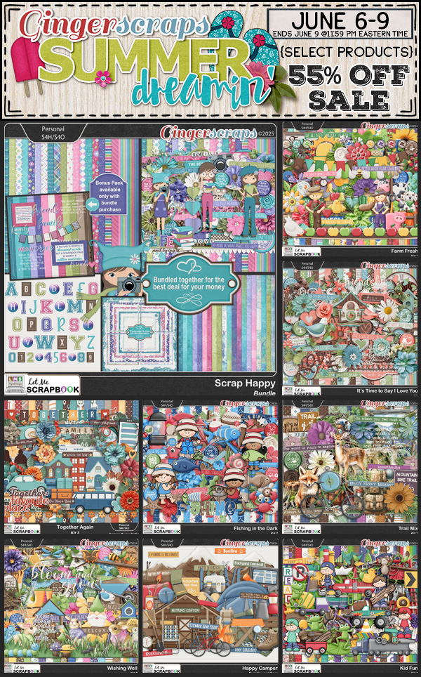
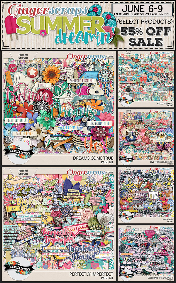
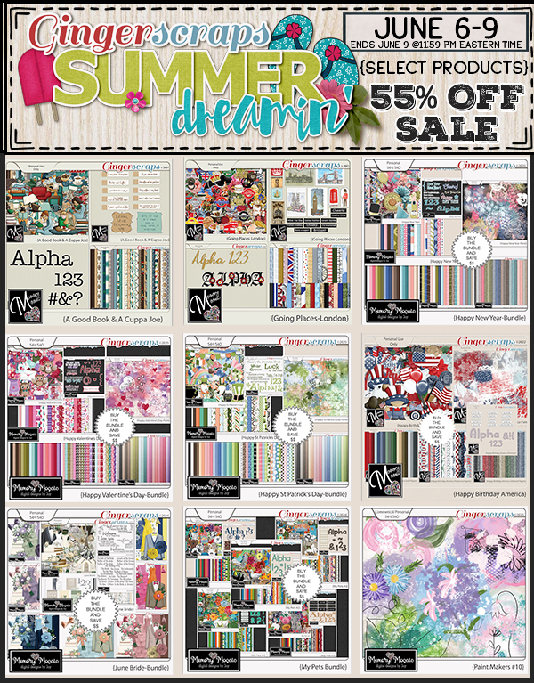
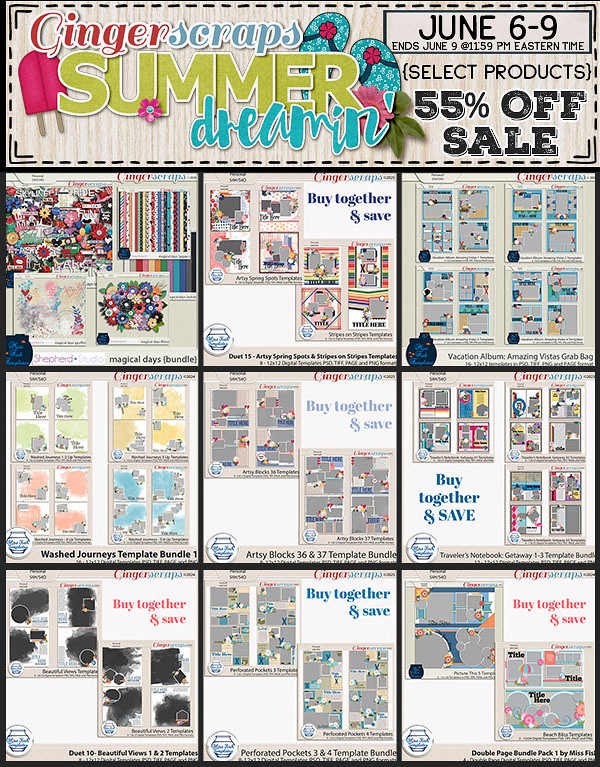
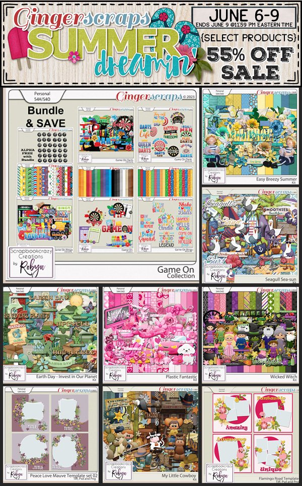
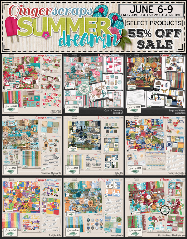
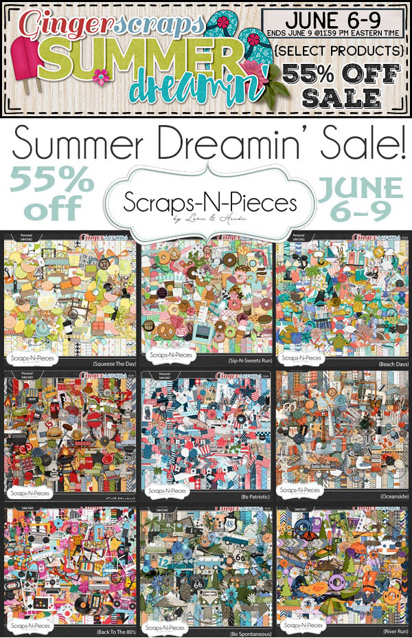
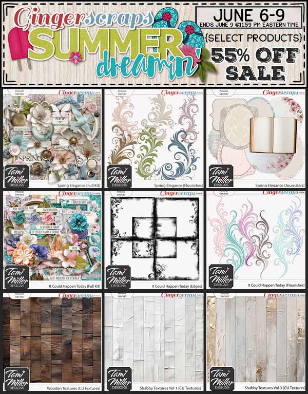
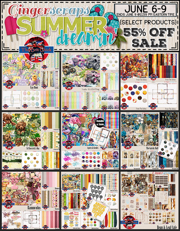
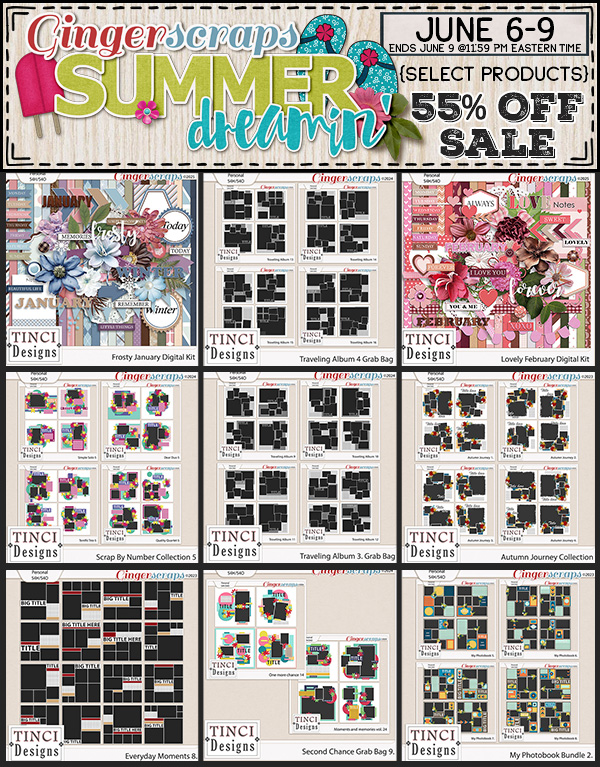
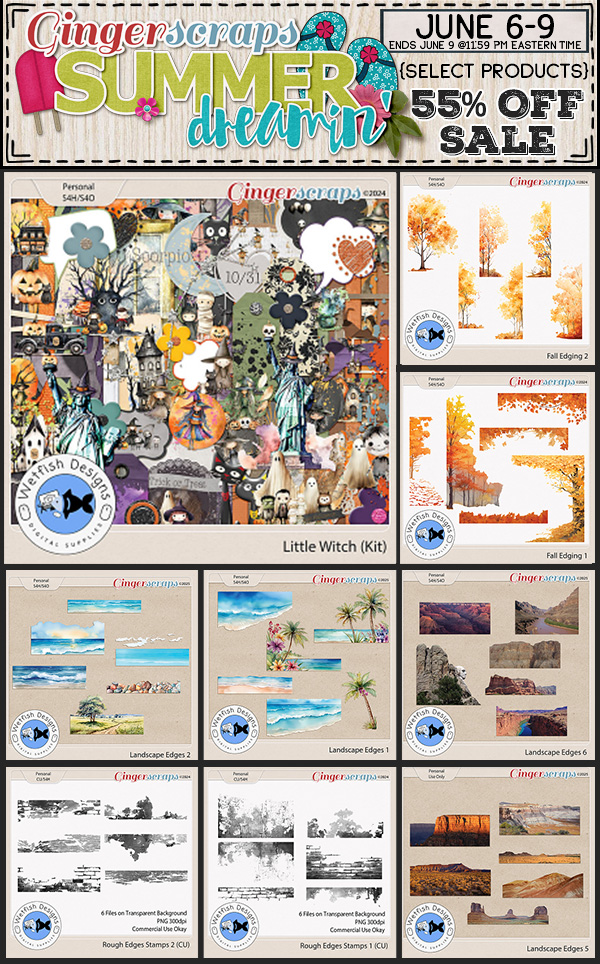
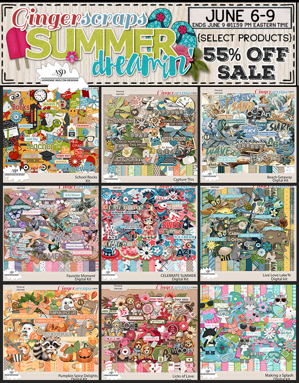
Let’s see what our designers are offering in the Summer Dreamin’ Sale!

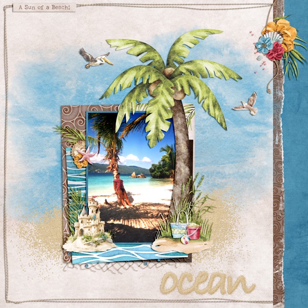
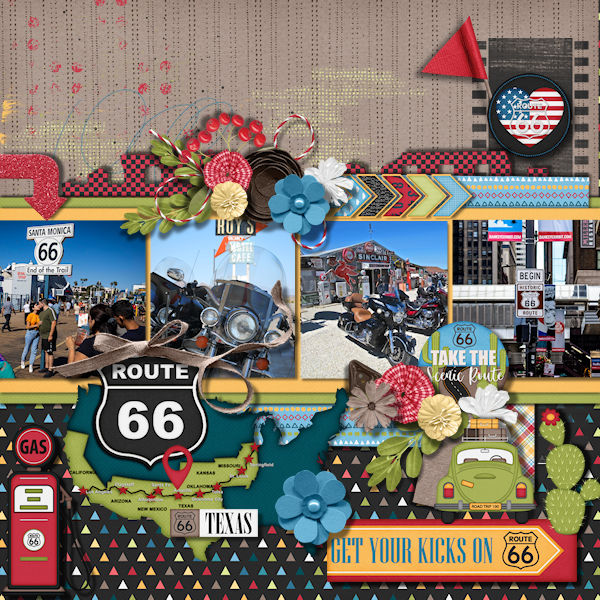
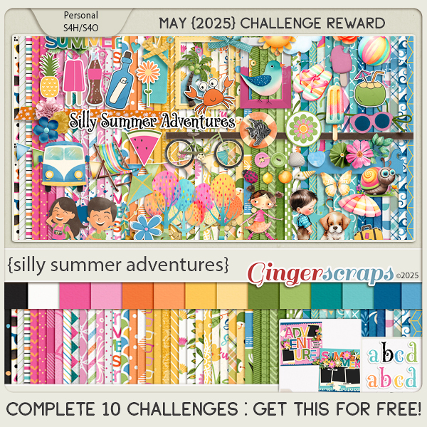
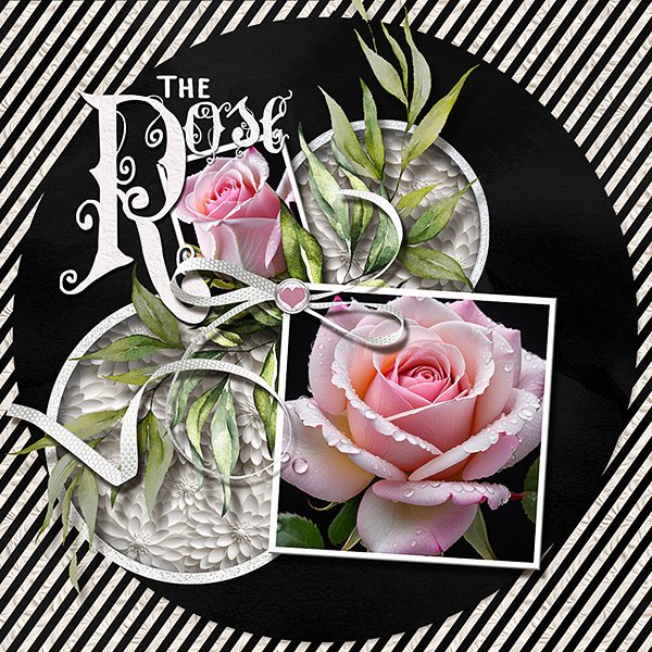
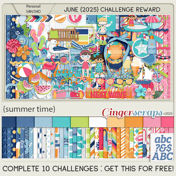
Have you started on your challenges yet? If you complete any 10 challenges this month, you get this gorgeous collab (or a variety of other choices from previous challenge collabs) as a reward!


 Aimee
Aimee