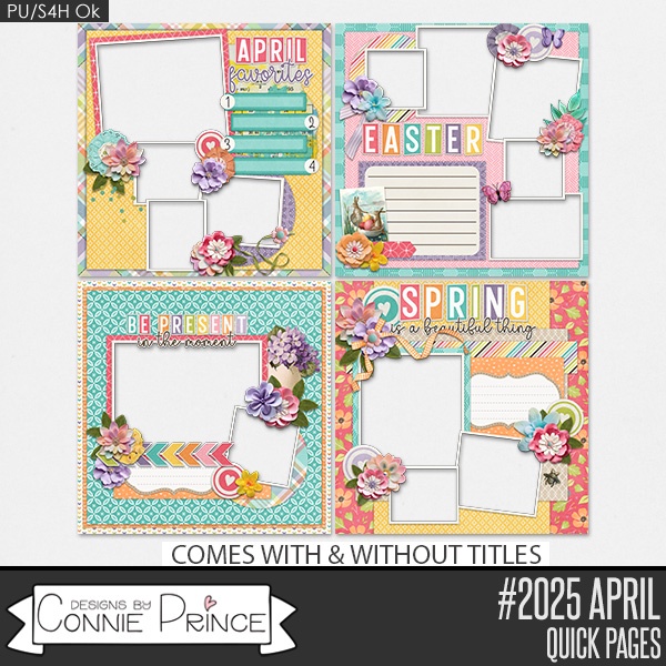
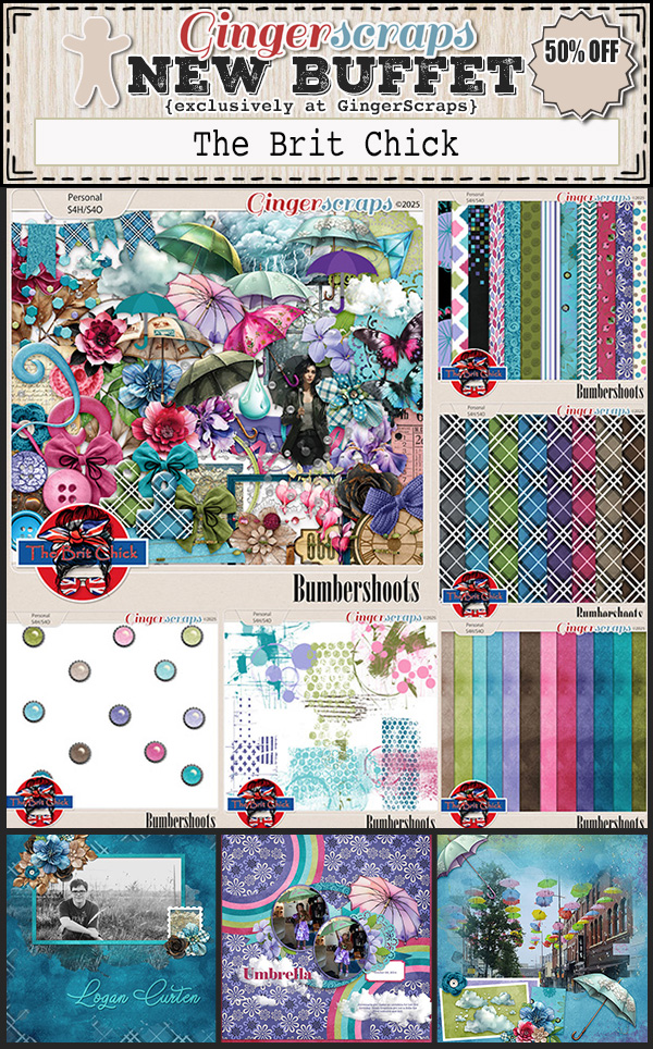
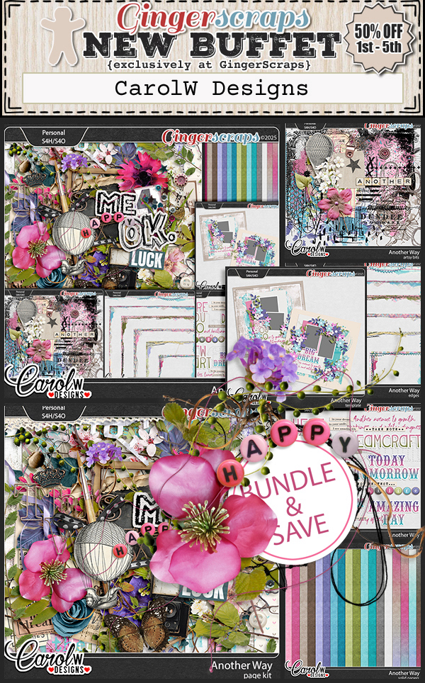
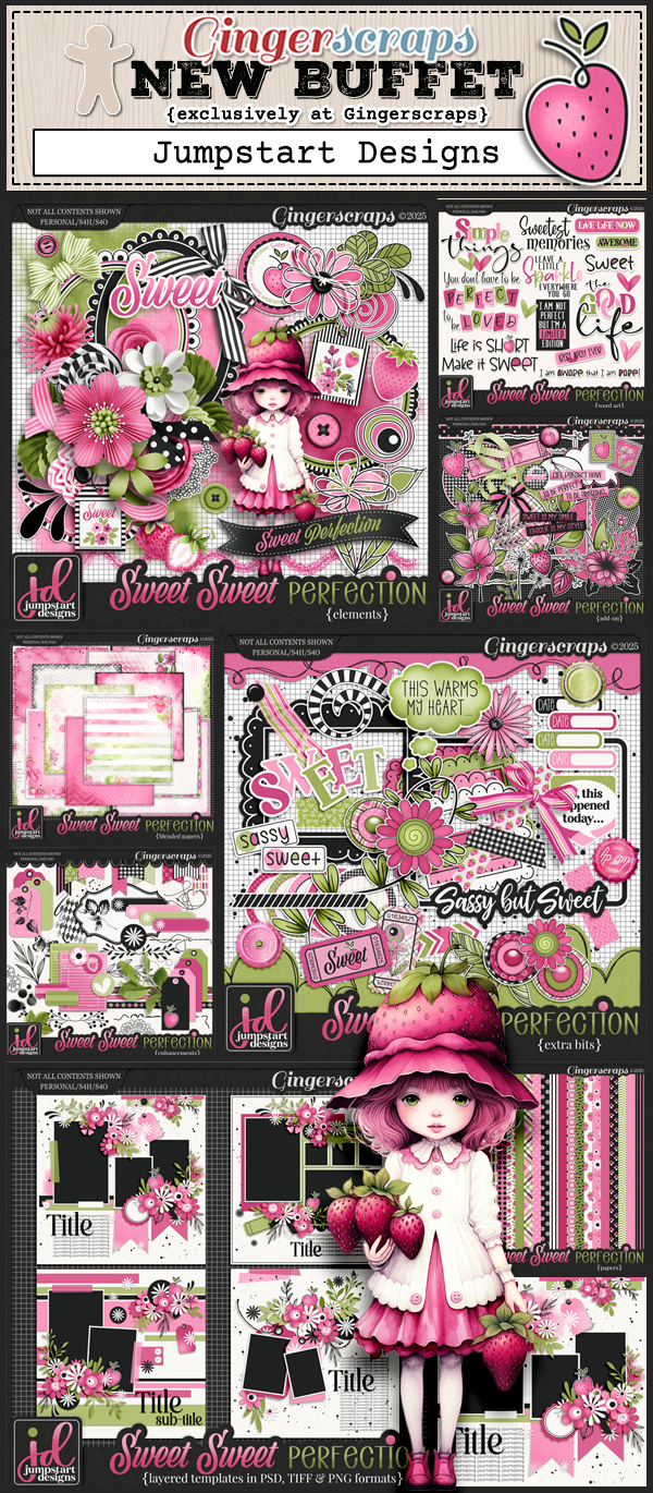
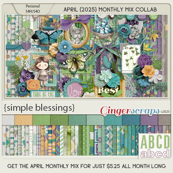
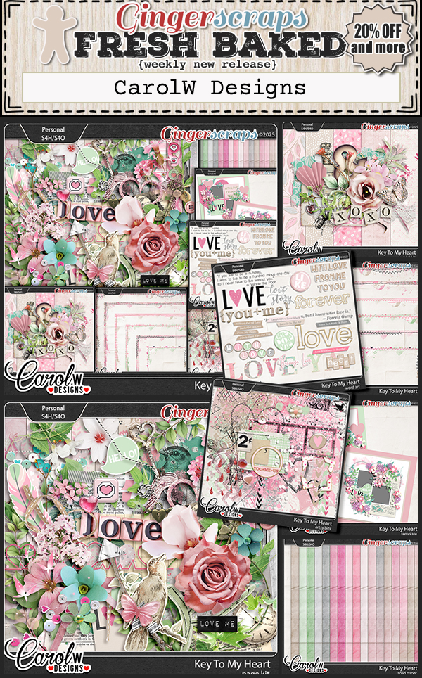
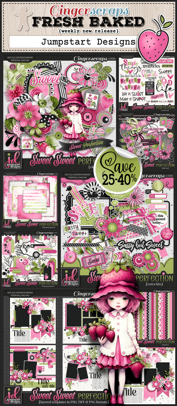
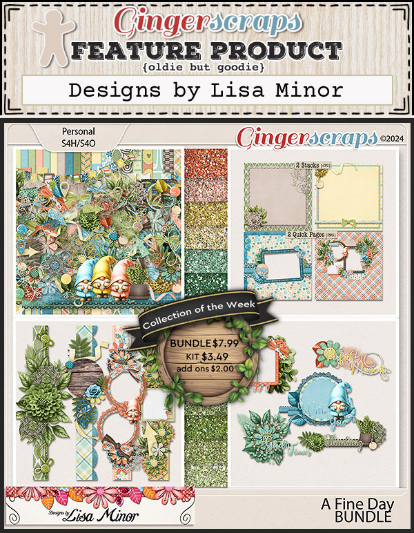
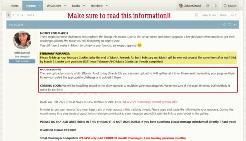
Jumpstart Designs

Okay, so I’m going to warn you right from the jump… Sheri and I have known each other a LONG time, so this post is going to be … chatty. Maybe grab a beverage and a snack!
O: Sheri, remind me again, how long have you been designing?
J: Almost fourteen years!
O: I think I started collecting your designs very near the beginning. I have some kits and templates that go back to 2012! What motivates and inspires you when you sit down to create?
J: Color (sic), and spending time on Pinterest and similar sites. I always have a bunch of ideas of what I’d like to design and do differently but finding the extra time to play around with new ideas doesn’t seem to happen very often.
O: Pinterest can be such a rabbit hole! I have to limit my browsing time, otherwise nothing gets done. Time for the favourite child question. Do you have a current favourite kit in your store? <hyperlinked to Sheri‘s store!>
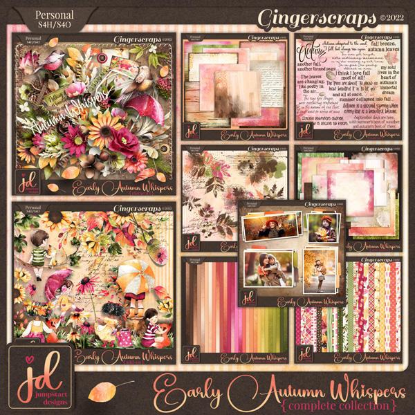
J: EARLY AUTUMN WHISPERS. Fall is my favorite time of year and I wish it could stay autumn all year long! I try to enjoy every minute of this season before the cold and snow sets in.
O: I LOVE that one!! I have the whole collection. I really like the way you use colour, and how your illustrations always fit the theme so perfectly. I also love fall, once I’ve got my garden put to bed and the days are still warm. It’s like life just slows down a bit. Since I’ve just given you a compliment, what’s the nicest thing someone has ever said about you?
J: That I must be a good mother because my children are awesome! Some days I question my parenting, but I’ll take that compliment any day!
O: Same, sister, same! What one word would your family and friends use to describe you?
J: Probably smart ass. LOL. Oops, that’s two words!
O: Well, I think it’s one word. Smartass, dumbass… right? I’d be called the same. Have been called the same. And other less savoury terms. Warning label?
J: WARNING: Subject prone to sarcasm!
O: This must be why we’re friends! Super power?
J: Being able to make time stand still.
O: Ooh, that’s a good one! But it could be dangerous in the wrong hands. You’d have to be careful when choosing when to stop the clock. Would it just be YOUR time that stops, or everybody’s? Yep, overthinking it again… Have you ever thought about time travel?
J: I’d go BACK IN TIME for sure! I’m not too thrilled with society these days. I think we’ve lost our collective minds and I fear for how things will be for my children and grandchildren. I miss the good old days when most people valued self-reliance, integrity, and knew how to be respectful of others.
O: Well said! Pair time travel with being able to stop time and we could have a much better world. With the way things are right now, it’s sure not Shangri La. Seems like the people with big money are running the world and that’s a bad thing… What would you do if you had lots of cash, like a lottery win?
J: Probably buy just enough property in the mountains to build a few little homes so my kids and grandkids could all live with me forever. If I had my way, they’d be with me no matter how old they get! Oh yeah…. And I guess saving for retirement might also be good idea so I don’t have earn a living until my last dying breath.
O: Mom and Nana Jan loves the idea of a family compound where all the people I love would be in one place. Labour organizer Jan would totally approve of your second goal. It’s something I tried really hard to get through to the young nurses I worked with who complained about having to contribute to the pension plans we had, and who didn’t want to put away a little money now in a retirement savings plan that our employer would match, to have a nest egg for later. If they could see my retirement investments now, after I’ve already been retired nearly 6 years, they’d maybe understand. It’s always a good plan to save for the day when you don’t have employment income. Now, let me slink down off my soapbox. Time for a fun topic: sing or dance in the shower?
J: Neither! I’d probably trip and fall over the edge of the tub, and God help anyone who’d have to hear my voice! That’s one talent I did NOT inherit from my parents. They were both musical and had a country-western band for many years. They were even good enough to play for President Ronald Reagan when he came through town back in the day, but it’s better for everyone if I don’t attempt singing myself! LOL
O: I do both! I have a waterproof Bluetooth speaker in the bathroom, Sirius XM on my phone and a gigantic shower stall. I mostly go with 60s and 70s hits and belt ’em out at the top of my lungs. Don’t care if the neighbours hear me either! When The Drifters start into On the Boardwalk, I can’t stay still. I love country music too; maybe I’ve heard something your parents have done. Since you’re from a musical family, can I assume you play an instrument?
J: I played the piano for many years but haven’t touched one in a long time. I also bang on our bongo drums now and then and have always thought it would be fun to be a drummer.
O: My husband fancies himself a drummer, and even has drumsticks. But no drums… he just bangs on tables, books, couch cushions and sometimes (gently, with just his hands) on our son’s belly. What’s your dream car?
J: I’m and SUV sort of gal but ultimately I’d just like one that’s paid for, haha.
O: We downsized to one vehicle this time last year. We need an SUV or station wagon (I don’t think they make them any more) because of our son’s wheelchair so I put a lot of research into what we chose. We traded in my nine-year-old Escape and hubby’s six-year-old Fusion for a 2024 Kia Seltos and it’s great! We didn’t have to come up with a ton of cash either; the trades were quite generous. Even with the chair in the cargo area, I can haul a LOT of groceries! If you could only eat one meal every day for the rest of your life, what would you go for?
J: Homemade tacos! Actually, anything Mexican with lots of cheese!
O: Mmmm, tacos!! I love a good fish taco myself. I’m not sure what I’d choose if I had to though. Gotta watch that good old Hemoglobin A1C… getting old really isn’t ideal. Other than necessities, what’s the one thing you couldn’t live without?
J: Hugs from my grandkids!
O: Yep, that’s it right there! Speaking of, I think I hear them now. Go get you some hugs, Grandma! Thanks for the chat!!
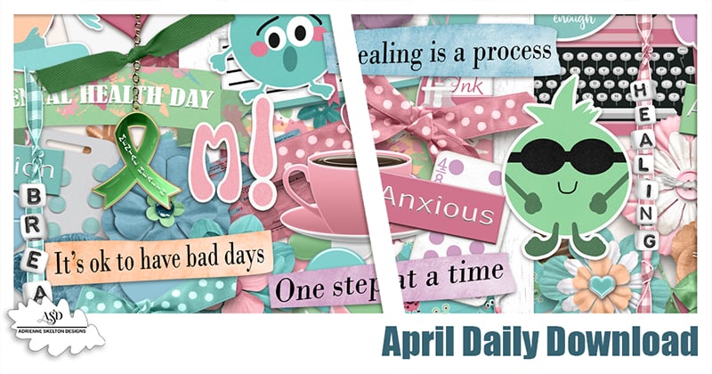
Now, before I forget, Jumpstart Designs is providing one of the Daily Download kits here on the Blog. She’s also one of the hosts of the Designer Spotlight Challenge in addition to her regular monthly Jumpstart Your Layouts Challenge – where you get a free minikit every month Are you playing along with that one? You should!! Don’t miss out on the COUPON either!!
![]()