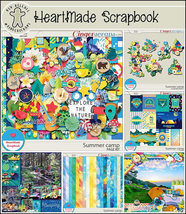
It’s HeartMade Scrapbook!


Today I’d like to introduce you to one of our newest designers, HeartMade Scrapbook – who is also known as Ngoc! She very graciously agreed to let me pick her brain, and now I get to share what I’ve learned about her with all of you.
J: So tell me, how long have you been designing?
N: I’ve been designing since May last year (2020).
J: Ah, another CoVid convert! Welcome to GingerScraps!! What made you decide it was time to hang up your Creative Team hat and jump into designing?
N: In 2020, the CoVid-19 epidemic broke out, I have more time and I want to try a whole new field. And there’s really a lot to learn, but I’m very happy with the design.
J: I think all of us would be thrilled to have more time. What tools do you use in your design process?
N: I use Photoshop and Illustrator.
J: Well, you’re way ahead of me. I’m still plodding along with Elements. What’s your design motivation/inspiration ?
N: My main motivation and inspiration are my kids and the life around me. I want to be a memory keeper!
J: Most of us would say the same. It’s pretty much the whole purpose of our community. Now I’d like to know which of your kits currently in the GingerScraps shop is your favourite, and why.
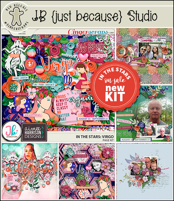
N: Cool Summer: Because I like pastel colors and summer is my favorite season!
J: Abrupt subject change!! What would you do if you won the lottery today?
N: I will buy a farm in the countryside to grow vegetables and flowers.
J: That sounds like a LOT of work! Are you more likely to sing, or to dance, in the shower?
N: Yes, I will sing sometimes, even though I’m not very good at it.
J: Everybody is a star in the shower! Weird question… If time travel was possible, would you go forward in time or back, and why?
N: I would go to the future, I want to know when covid-19 will end.
J: You and all the rest of us! 🙂 It has really turned the world upside down, hasn’t it? Design-y question again. What colours do you love, or NOT love?
N: My most favorite colors are pastel & bright colors. My least favorite colors are dark and heavy colors.
J: I love jewel tones most. And I’m so happy there are designers who do too. Last question, another one about favourites. If you could only eat one meal for the rest of your life, what would it be?
N: It’s PHO Vietnam, widely known as Vietnamese noodle soup, is a highlight of Vietnamese cuisine. I can eat it everyday and never get bored – Vietnamese people love eating PHO for breakfast, lunch, and dinner. Despite looking simple outside, PHO has the fascinating complexity of textures and flavors. Normally, PHO Vietnam is made of rice soft noodles called “banh pho”, some slices of meat, traditional herbs and is served with consommé which is made by the simmering bone of the chicken, pork or beef.
J: I’m missing out, clearly! I’ve never had pho. But to do it justice, I think I’ll wait until my CoVid-damaged sense of taste goes back to normal (if it ever does…) since all of a sudden I’ve developed an extreme distaste for anything containing onions.
Now, before we go, Ngoc has a gift for us! She’s got a 50% off coupon for her store. Thank you so much for visiting with us, sharing your talent, and for the gift!
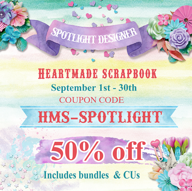
The coupon code is HMS-SPOTLIGHT and it’s valid until midnight September 30th.
![]()


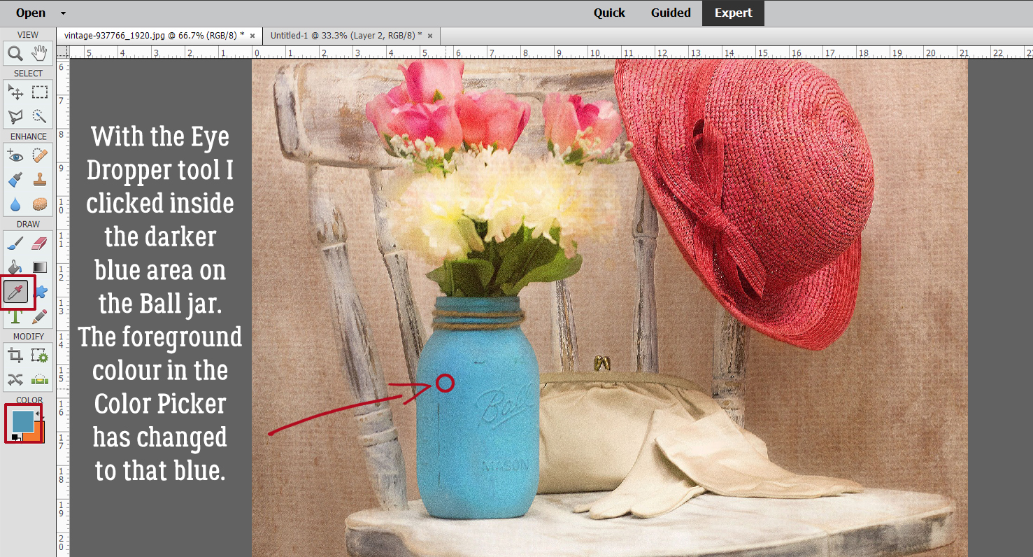
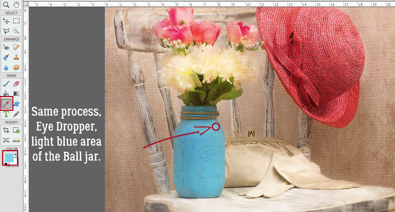
 Following the same process I used the Eye Dropper to pick a spot of lighter blue.