Today’s tutorial has been derailed by a medical emergency with my Dad. He’s back in the ER with severe dizziness and is probably bleeding internally following a procedure he had recently. I just can’t concentrate on anything at the moment. I apologize. Profusely.
Jan
Tutorial Tuesday – Pre-empted
October 20, 2020 by
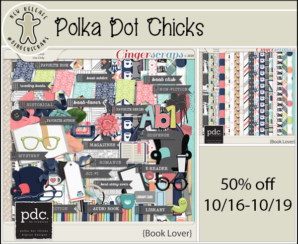
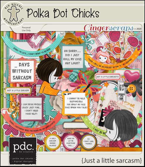
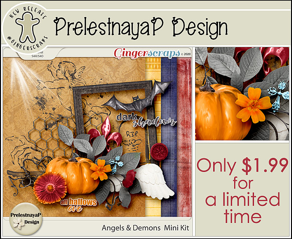
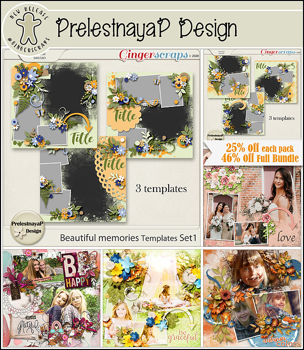
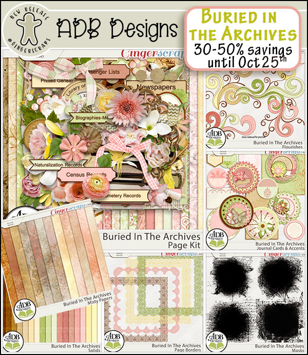
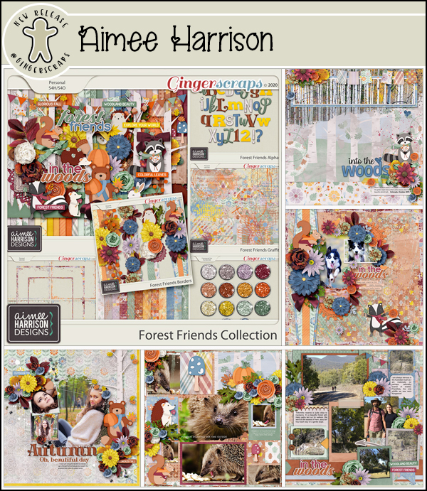
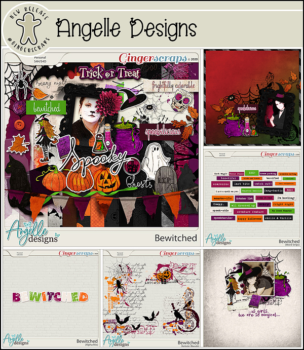
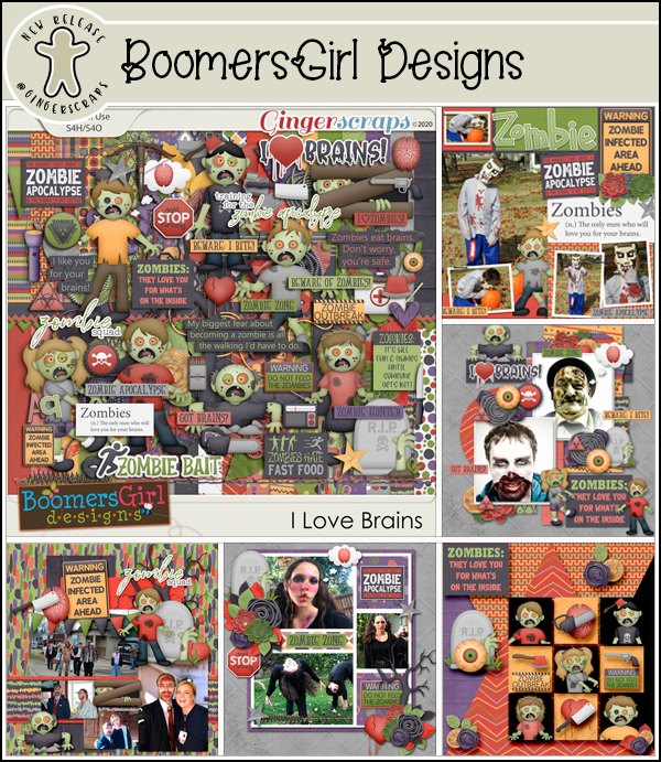
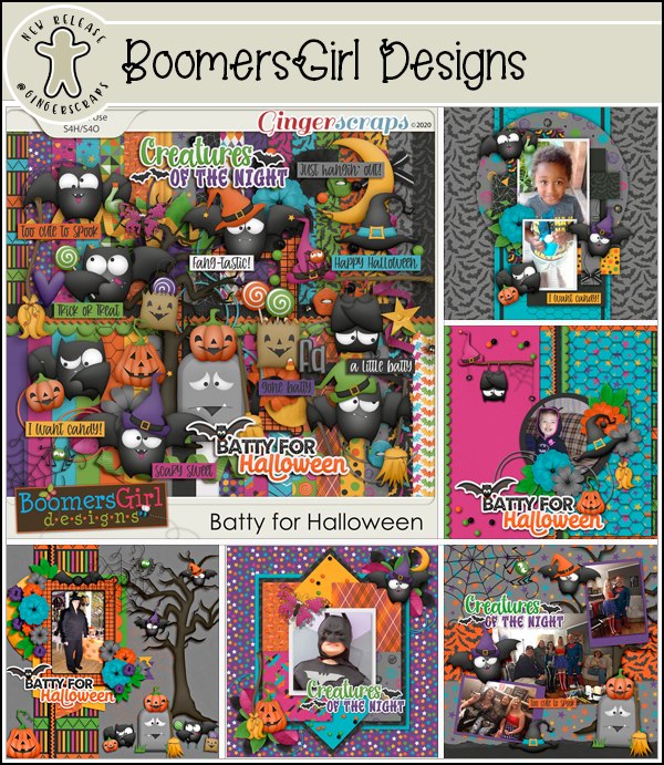
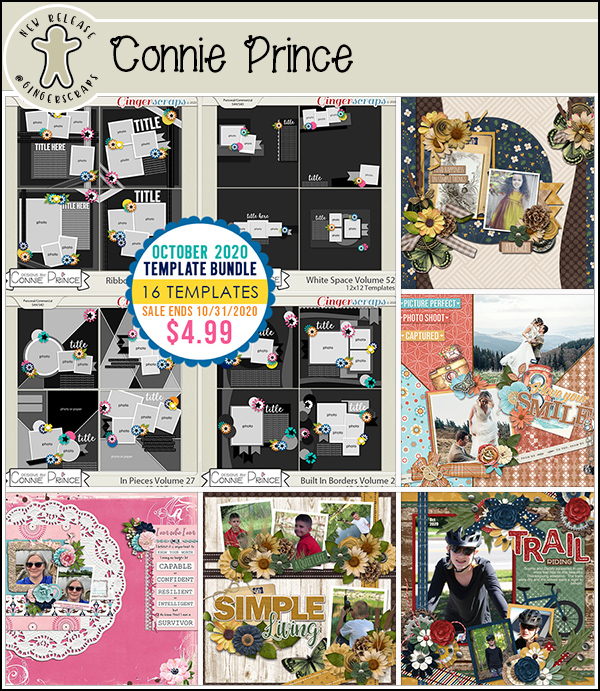
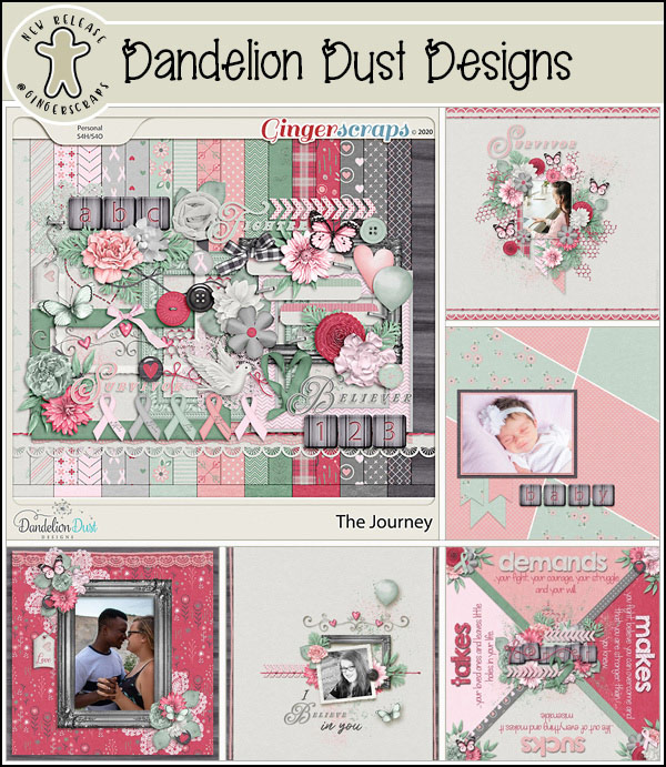
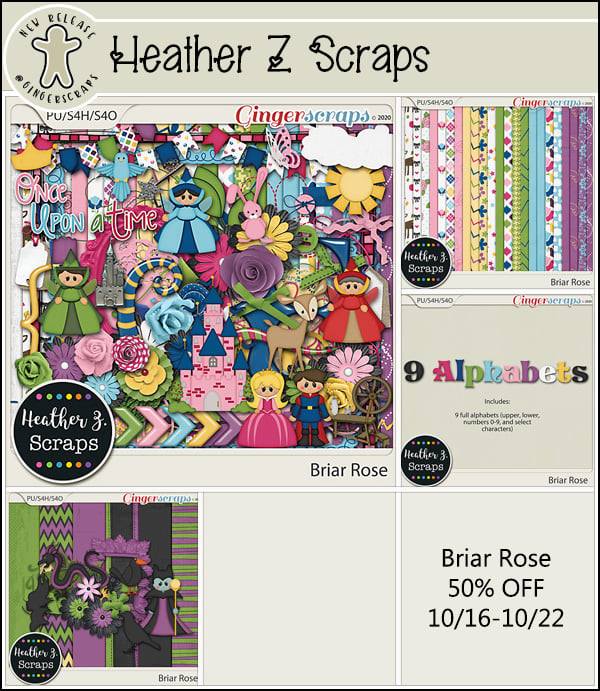
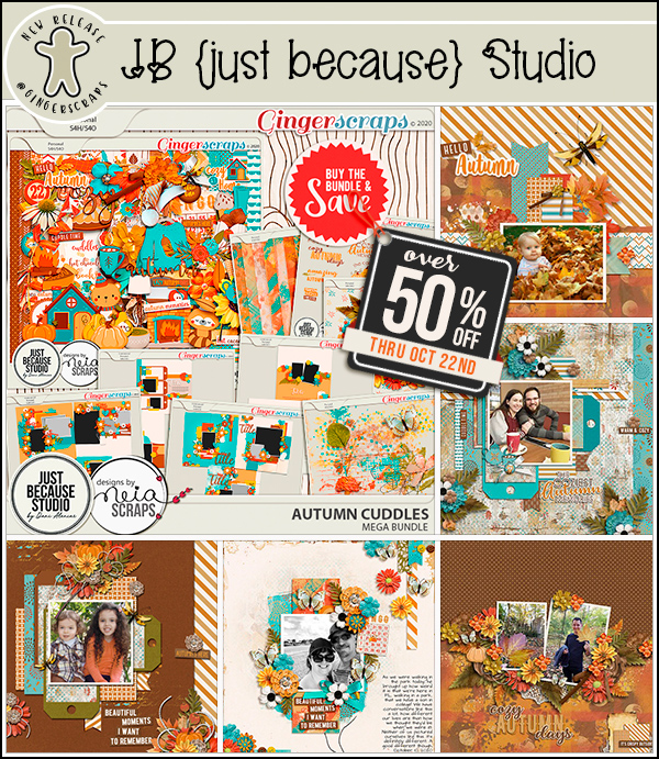
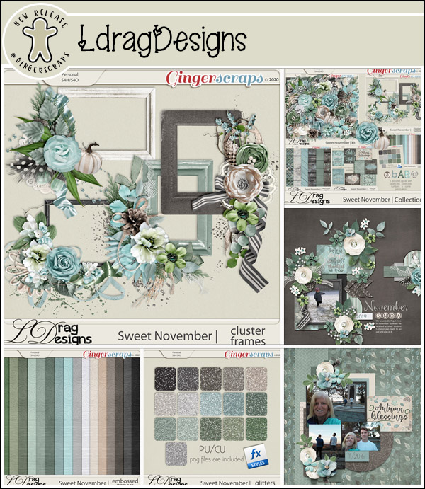
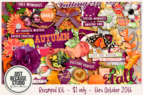
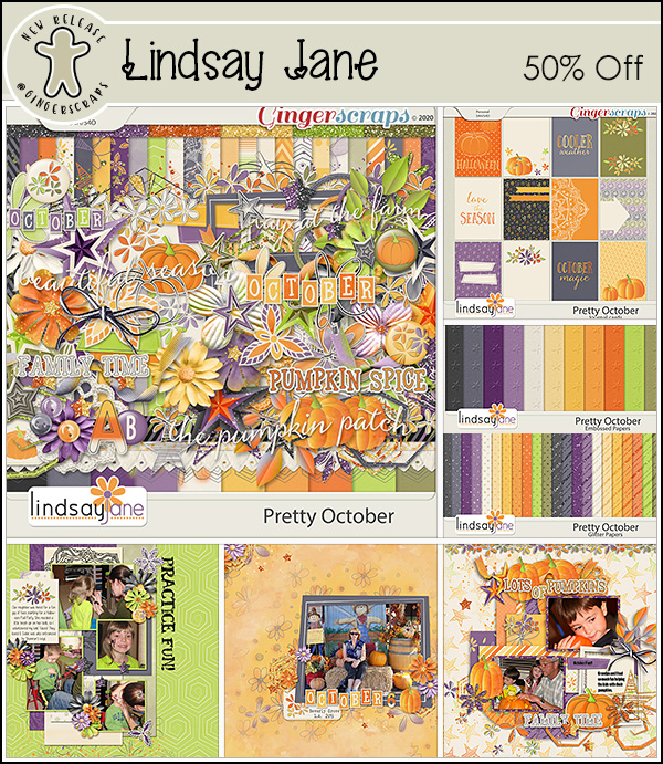
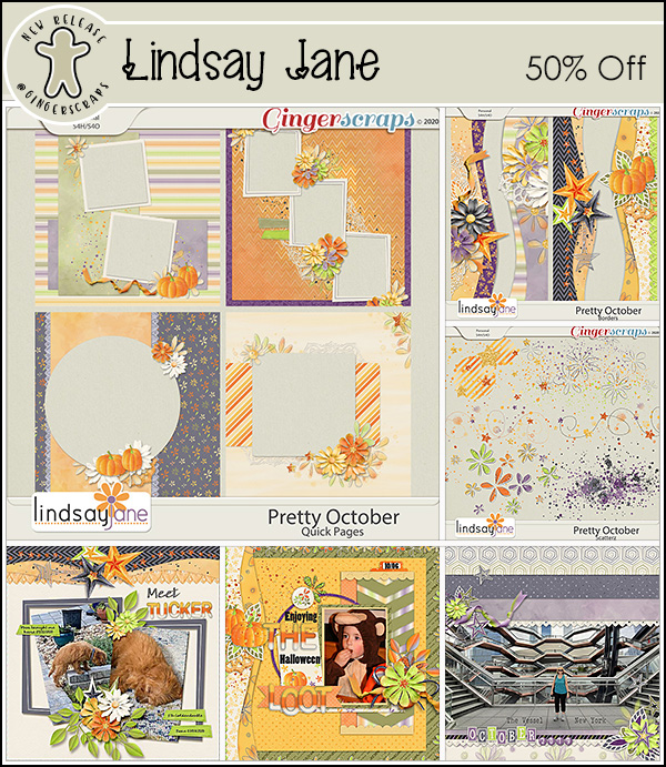
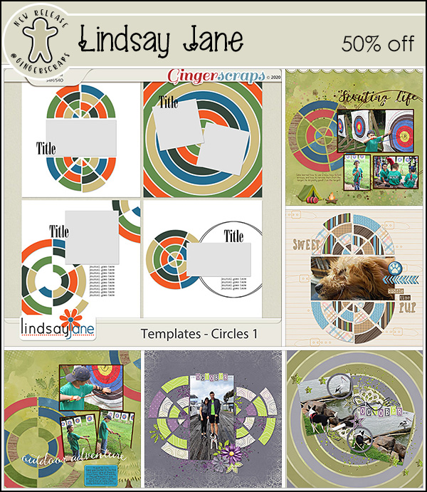
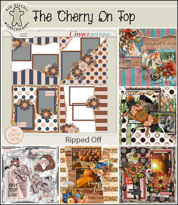
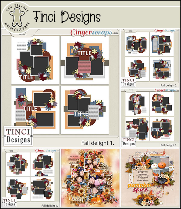
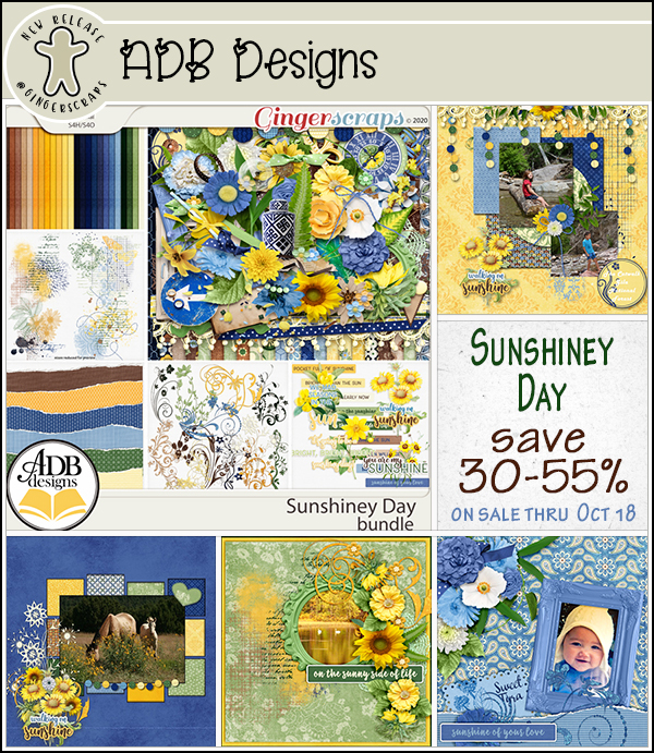
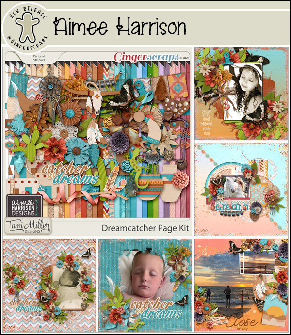
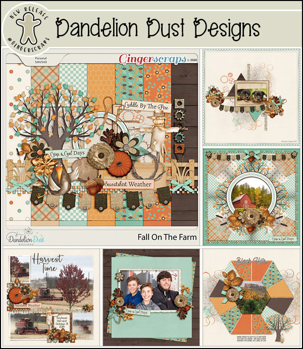
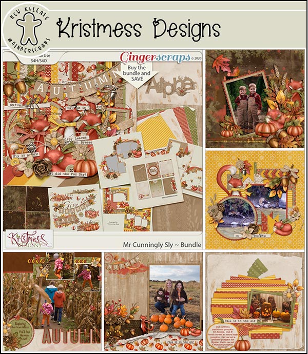
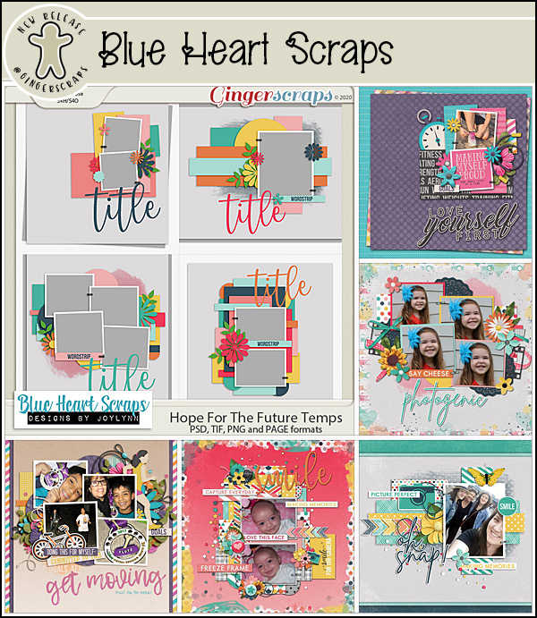
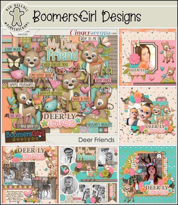
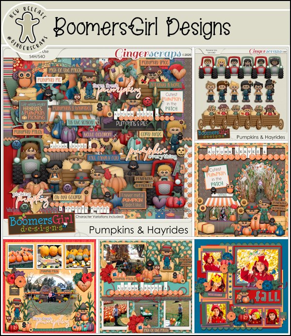
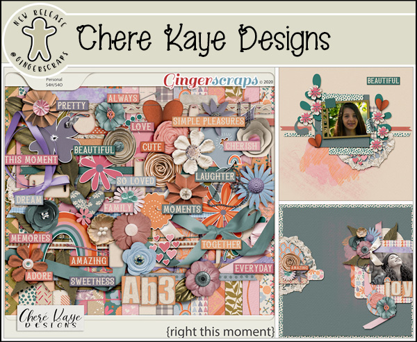
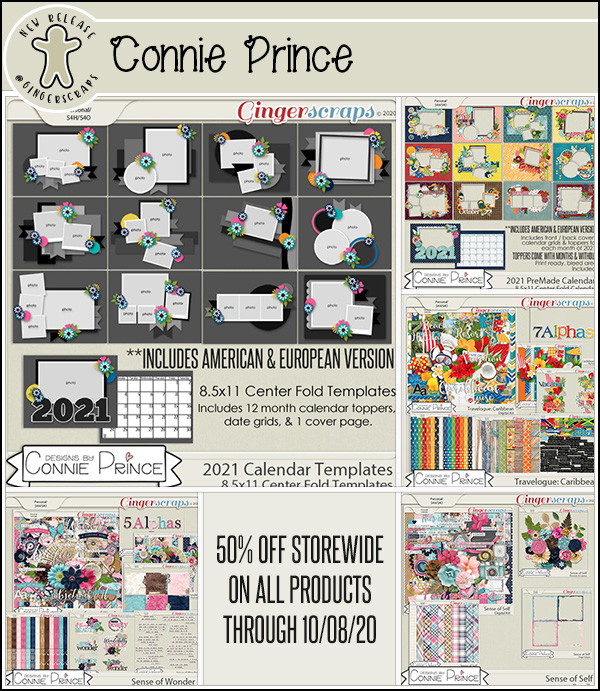
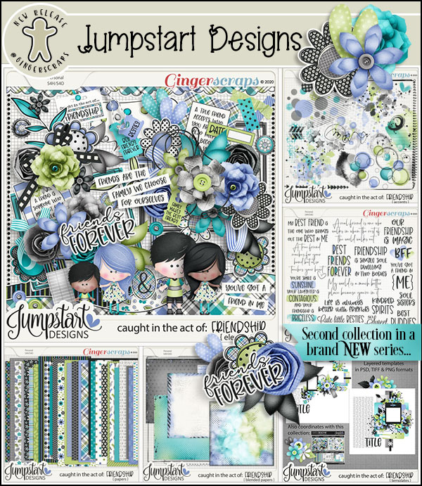
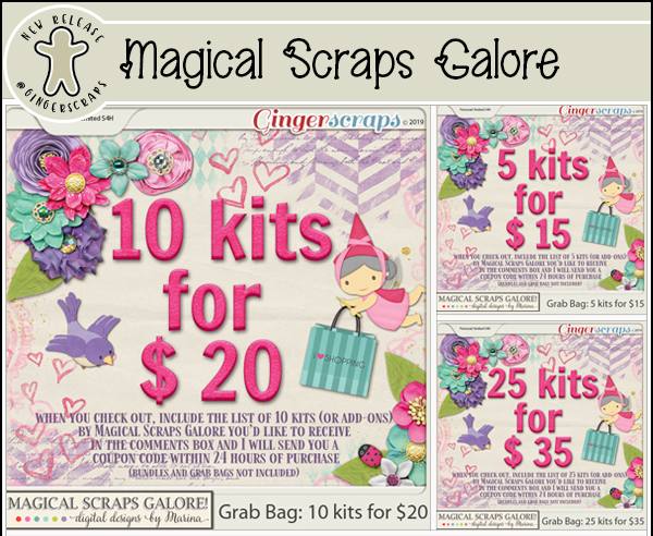
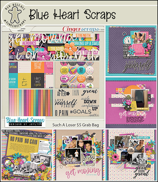
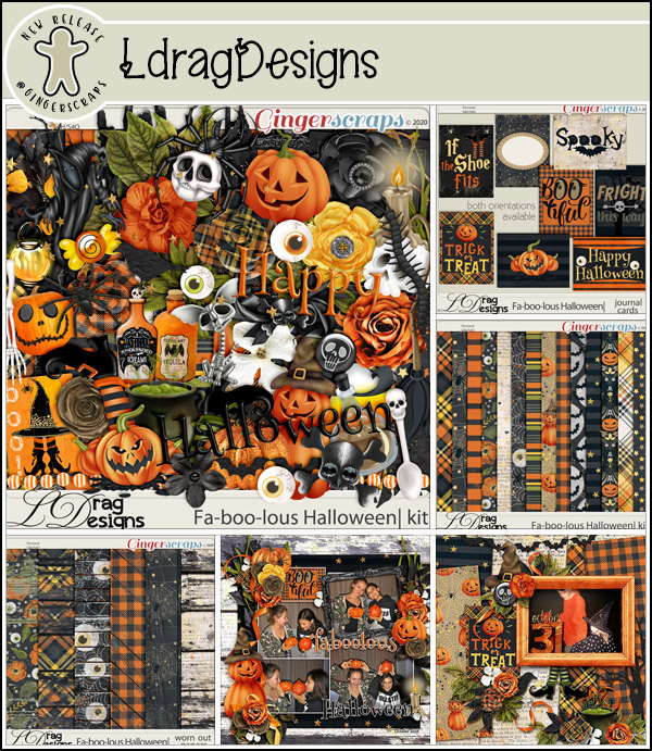
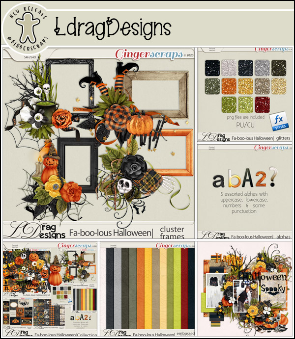
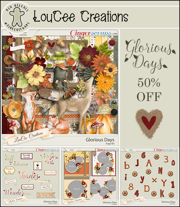
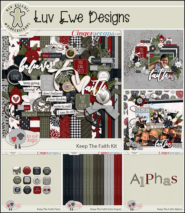
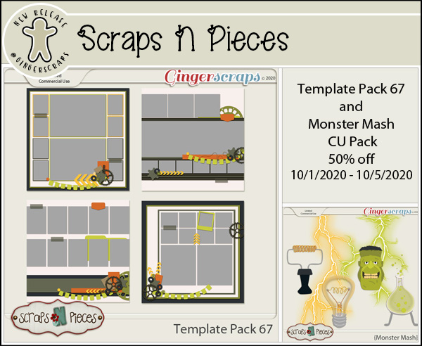
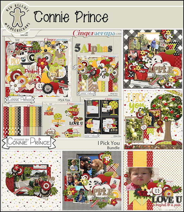
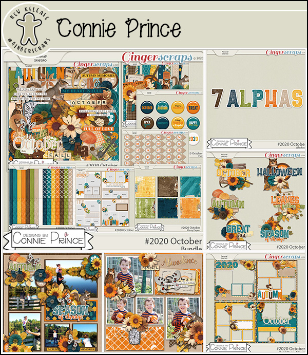
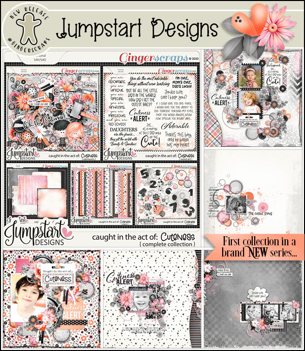
Fresh Baked: October 16, 2020 & $1.00 Bake Sale NOW OPEN!
October 16, 2020 by
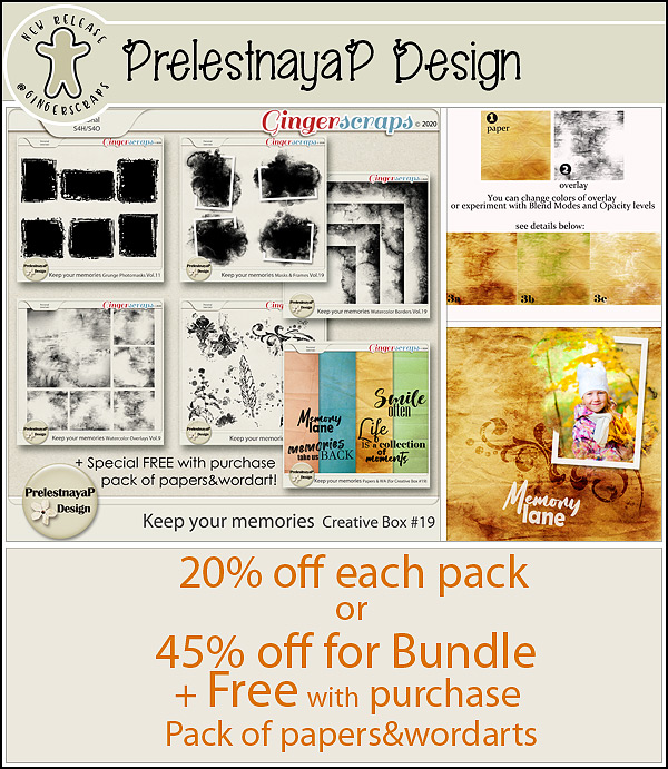
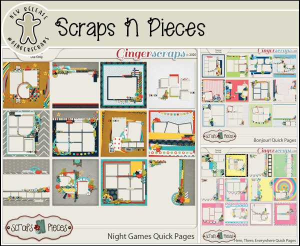
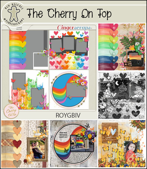
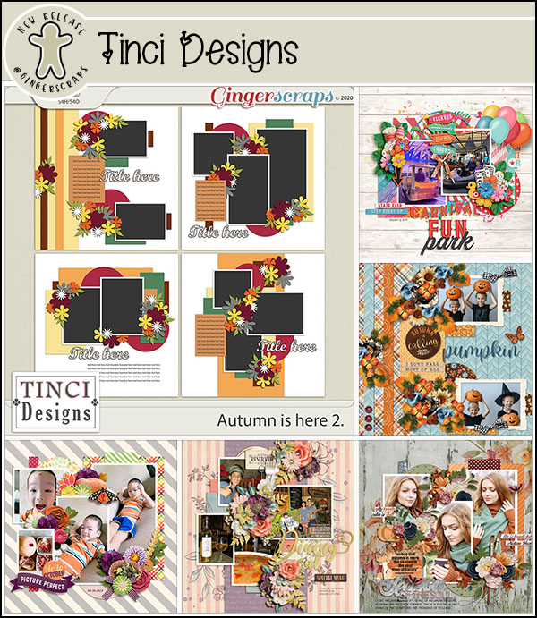
We have so many gorgeous goodies for you this week! We also have the $1.00 Bake Sale happening NOW too! If you are new to GingerScraps, we have a $1.00 Bake Sale every month from the 15-20th, it is a perfect time to shop some awesome deals!
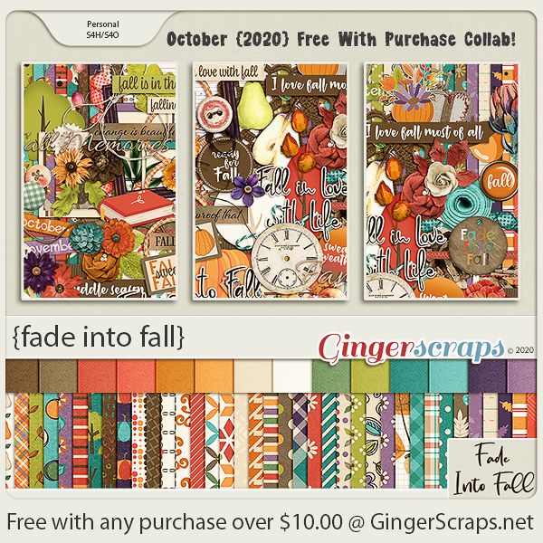
Make sure you spend at least $10.00 so you qualify for the October Free Collab too. This wonderful fall kit is yours free with any $10 purchase in the store.
Let’s see what our designers have for us this week.

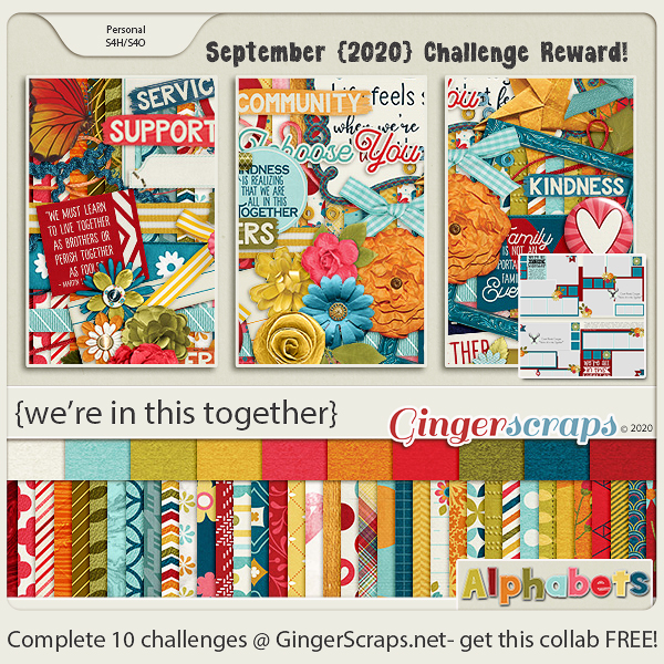
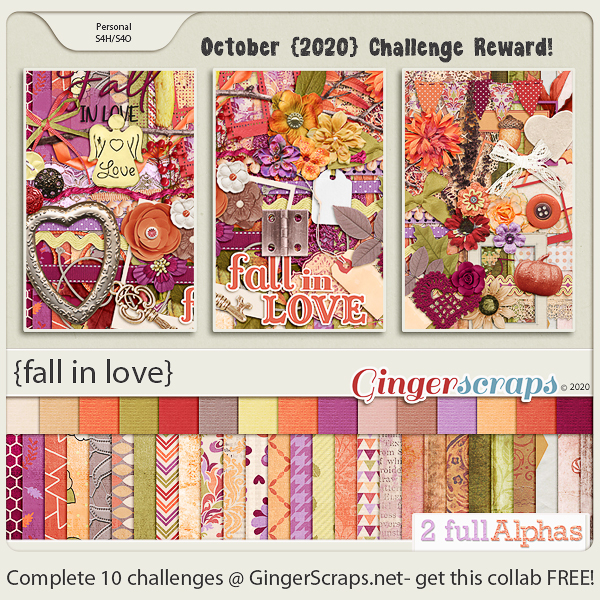
How are your challenges going? Remember for completing 10 challenges you get this great kit as a reward.
Tutorial Tuesday (Potpourri)
October 13, 2020 by
Method Scrapping – What’s My Motivation?
![]()
Actually, I think I should call this tutorial “WHERE is my Motivation??” I’ve really been struggling lately trying to find some inspiration and some enthusiasm for scrapping. Between our move, all the things that moving entails, my dad’s failing health and all the other minutiae of life, it feels like my mojo just got left behind. So I started to think of all the different methods of resurrecting it and thought maybe I should put them all down in a blog post as a way of solidifying them for myself while possibly helping someone else who’s in the doldrums too.
I think the easiest and most obvious mojo-recharger is to do a GingerScraps Challenge or two. What makes them a good jumpstart? Well, they take a lot of the work out of the process. The challenge gives a framework for the layout, whether it’s a beautiful brush, inspiring word art, a terrific (free) template, a beautiful layout to scraplift or cutting out all the hardest part by providing a recipe. But the best part of this is that you’re not limited to only this month’s Challenges! The Challenge forum has 5 months’ worth of them to look at and find inspiration from.
Another way to stir your creative juices is to look at what other people are doing. Pinterest, Instagram and our GingerScraps Gallery are filled with incredible layouts to draw sparks from. A way to refine that even further is to narrow your browsing to a favourite Designer Gallery. There’s where you can see their designs in action and find innovative ways of using them.
That brings me to a motivator that might seem more like a cattle prod… organizing your supplies. Sometimes I get caught up in the acquisition part of it all, adding more and more beautiful kits to my stash without any clear plan for how I’ll use them. And, of course, I forget what I have and go buy more! I had a HUGE downloads folder filled with still-zipped files sitting on my laptop and every time I opened the folder, I had an anxiety attack. So the other day, I took the first step and ran them all through ExtractNow. I have only a handful of really new files that I picked up over the weekend that need extraction; the next step will be to sort through the files and condense them into kit-specific folders. Then I’ll have refreshed my brain and might find my way back to productivity.
A much more fun way to get back in the saddle is to look at all the recent photos on your phone or computer. We take photos so we can remember a special person, event, place or object. Recapturing the moment by looking at the photos can be very stimulating. Over the weekend (Thanksgiving in Canada) I went on a mini wine-tasting tour with my daughter, her husband and sister-in-law. It was so much fun, and so educational. And naturally it spawned a LOT of photos. I know I can scrap them into more than one layout, and right there, I have some motivating ideas. (I also have quite a number of photos of my grandchildren that are crying out for some spotlighting!)
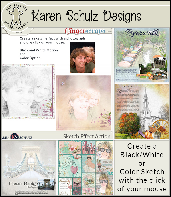
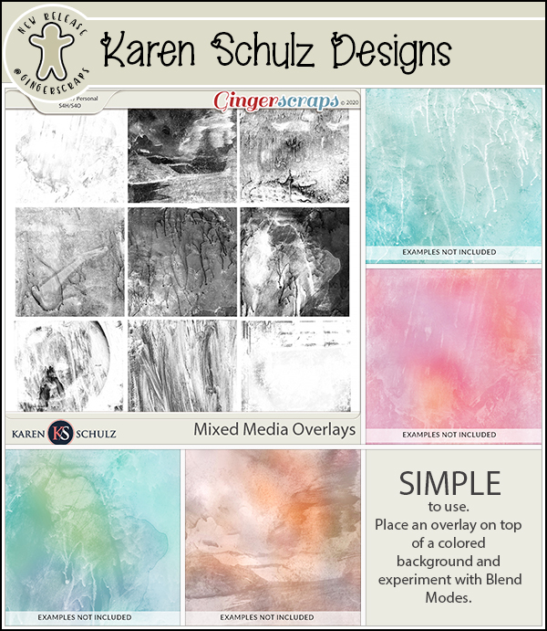
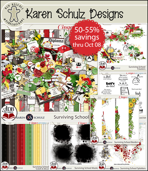
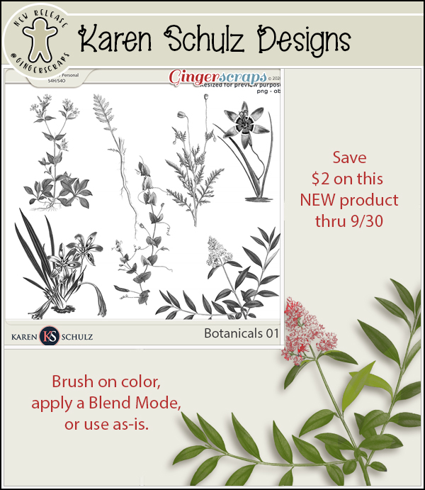
Trying a new technique is another way to stir up some interest. Working through one of my tutorials or watching a YouTube video by someone whose work you admire can be very invigorating. Our own Karen Schulz (formerly Snickerdoodle) has a YouTube channel filled with great ideas. Why not watch one or two of hers?
Project Life offers a good compromise between free-wheeling and quick ages. Katherine Woodin is a prolific Project Life scrapper. If you’re unfamiliar with the concept, Project Life is a method of celebrating the everyday activities that we often overlook as food for creativity. And it’s very flexible. You can choose to do a layout a day, keeping track of what happens and how it affects you each day as a form of daily diary. You can do a weekly layout (P52) with just the highlights of the week, or a monthly one (P12). You can use pocket-style pages, or free-form it.
Focusing on a single event or family member (a wedding, a birthday, a new job, a new house, a pet… you get the idea) can be another way to get going again. This one is a bit more of an exercise in self-discipline; making a decision to scrap a layout about fill-in-the-blank and just doing it may break the drought. I think this is where I’ll start. I haven’t changed my Signature in the Forum since MARCH!! And my Facebook header is one I created in July 2019. (It hasn’t been on display all this time, I swear! But it’s due for a refresh.)
Before I post this, I think I should remind all of us that turning a hobby into a chore isn’t a good thing. If you’re in a scrapping funk, especially one that has endured for awhile, it can be extremely daunting to think about picking up the tools and getting back to work. If you’re really not feeling it, don’t push it! Do something else that feeds your soul. It’ll be okay!
What are your methods of breaking a slump?
![]()
Fresh Baked: October 9, 2020
October 9, 2020 by
Hey scrappers!! Did you have fun with all the DSD celebrations. We hope you took advantage of all the sales and fun and games in the forum. It’s always a fun and busy time.
Isn’t this Free With Purchase collab just amazing? This wonderful fall kit is yours free with any $10 purchase in the store.
Let’s see what our designers have for us this week.
 +
+

How are your challenges going? Remember for completing 10 challenges you get this great kit as a reward.
Tutorial Tuesday (Photoshop Elements)
October 6, 2020 by
Faking It – Those Incredible Full Moon Photos…
![]()
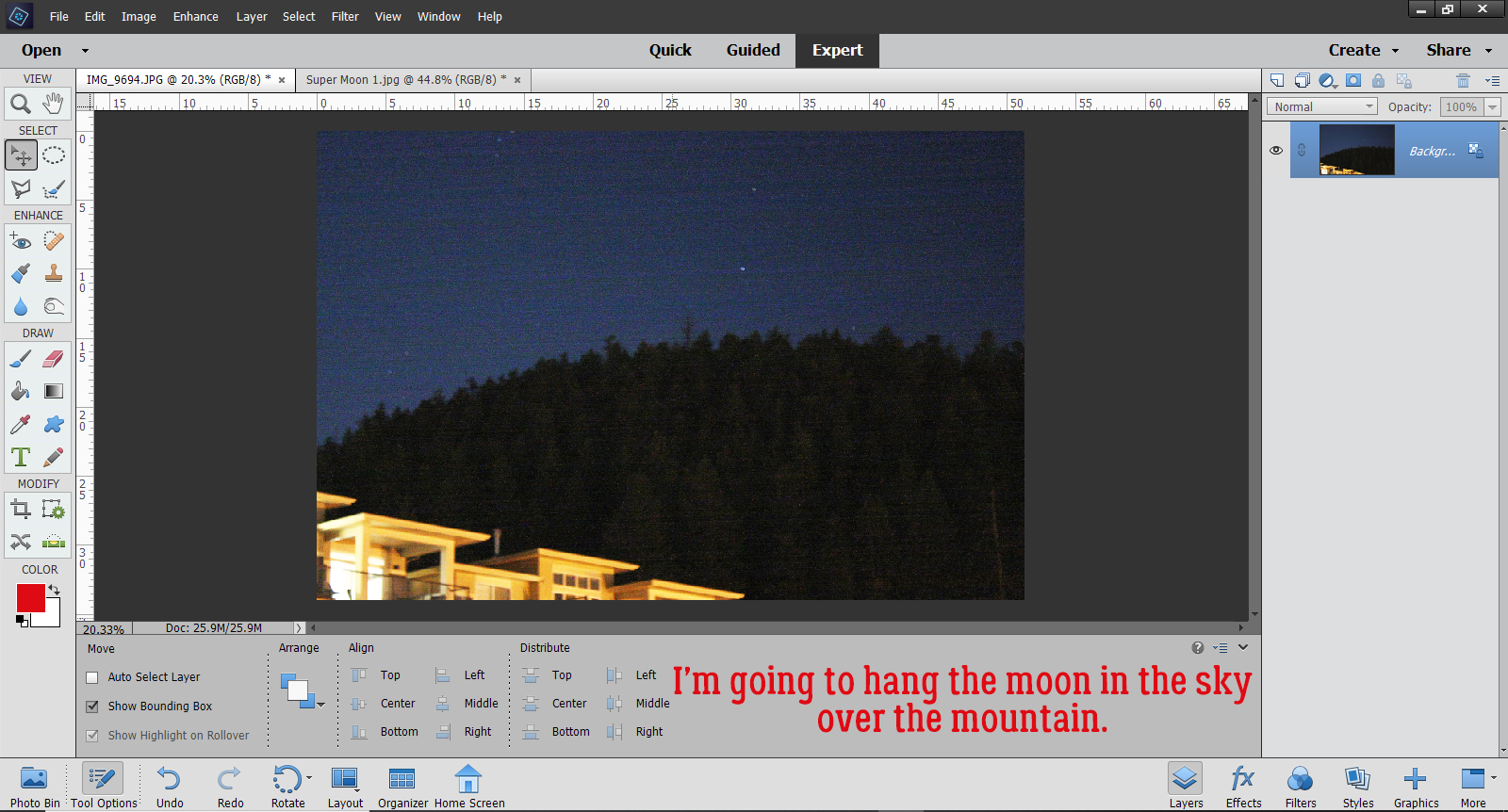
Have you ever looked at those totally amazing full moon photos where it looks like the moon is rising out of the ocean, or it’s rising behind a silhouetted city skyline and it’s huge and bright? And have you ever wondered how the photographer was able to capture that image? I know how they do it, and after this tutorial you will too. Because it’s all faked!
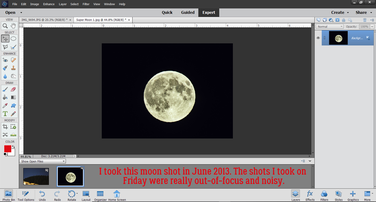
I wasn’t planning to take photos of last weekend’s full moon so I didn’t prepare for it. But then I took the dog out for a potty break and saw it hanging so brightly in the sky with Mars at its shoulder. So I grabbed my pretty decent DSLR, my telephoto lens and my very sturdy tripod and set up on the driveway. Rushing never makes for good results though and every one of the 70 photos I took was out-of-focus. The shots I took of the mountain were better, but pretty grainy. Thankfully I have a crystal-clear photo I took of the June 2013 Super Moon and that’s what I’m going to use to show you how I can make it look like the moon was over the mountain when it was quite far away in reality. This photo of the mountain that our subdivision snugs up to has been edited a bit to make the sky a bit brighter and the details a bit sharper.
Here’s my 2013 moon shot. I used a long shutter, a tiny aperture and manual focus to get it this bright and clear.
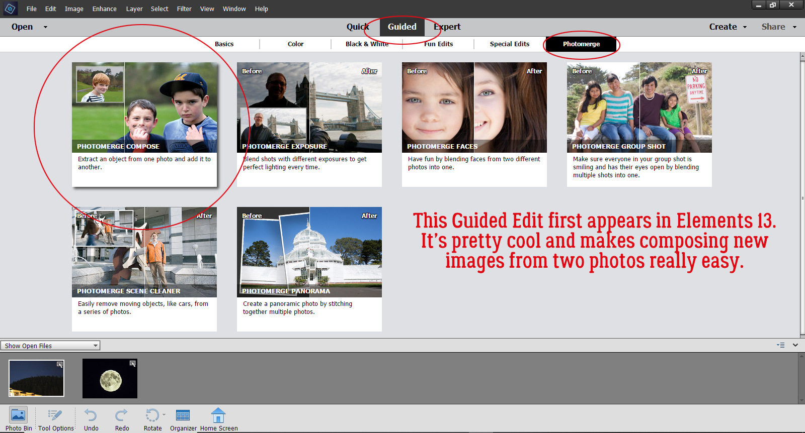
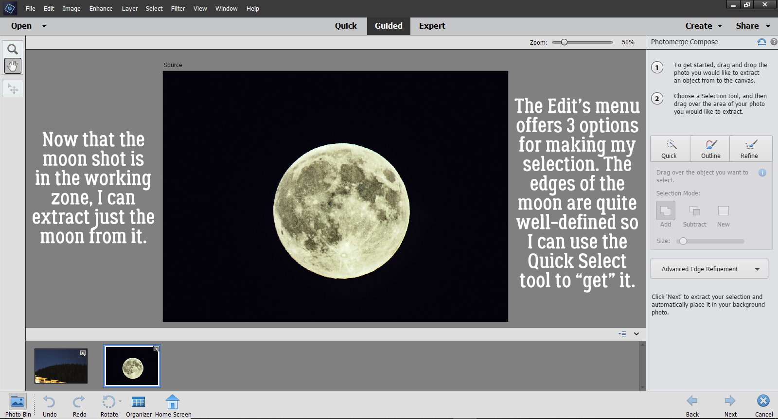
To hang the moon over the mountain, I’m going to use a Guided Edit that first appeared in Elements 13. Guided>Photomerge>Photomerge Compose.
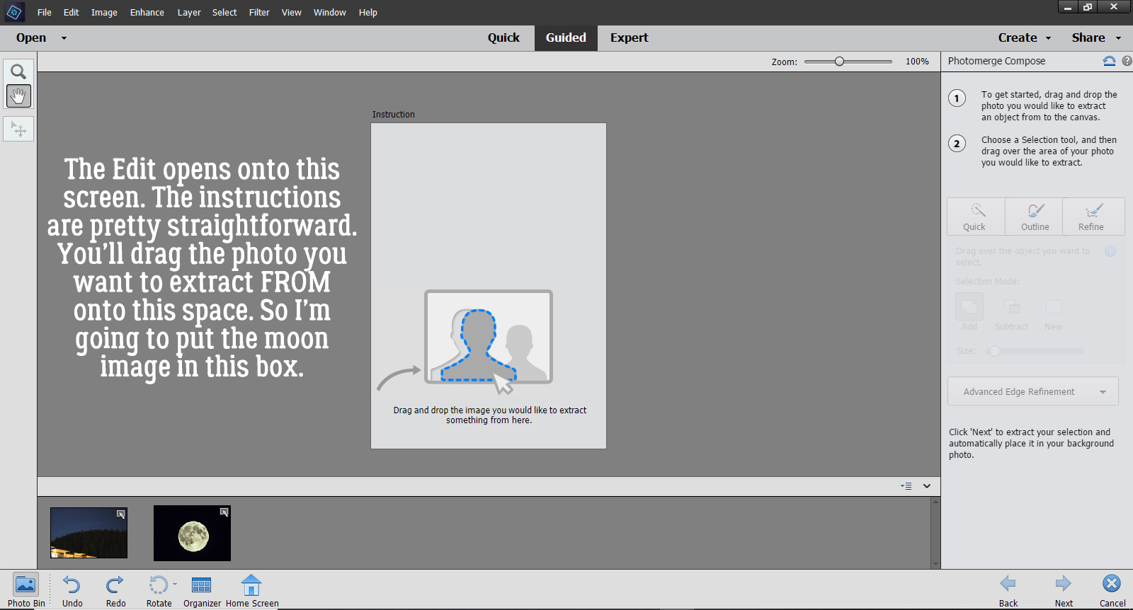
Once you’ve activated the Edit, this screen opens. The instructions are fairly clear, even for the uninitiated. It says to drag the photo I want to extract FROM onto the space, so the Moon is going here.
Okay, there it is. All I want from the photo is the Moon, which has a nice, clear, sharp edge, so selecting it from my photo will be easy. I can use the Quick Selection tool for this step. If my desired extraction had more detail, I could choose one of the other options. AND… there are further adjustments that can be made in later steps.
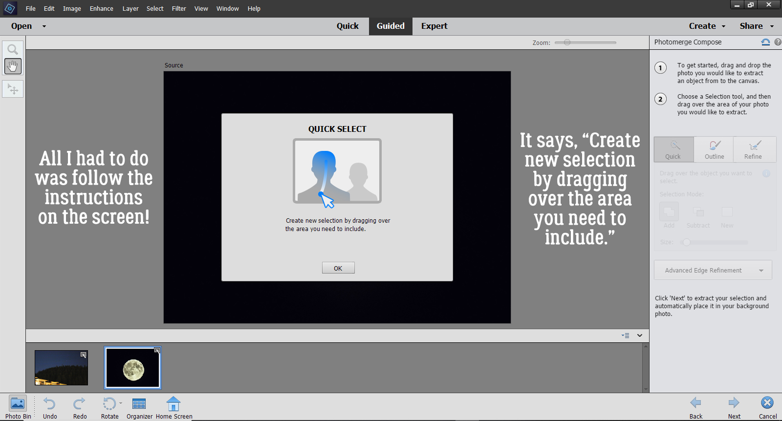
Once I clicked on the Quick button, this tool tip opened to Guide me through the next part. It says, “Create new selection by dragging over the area you need to include.”
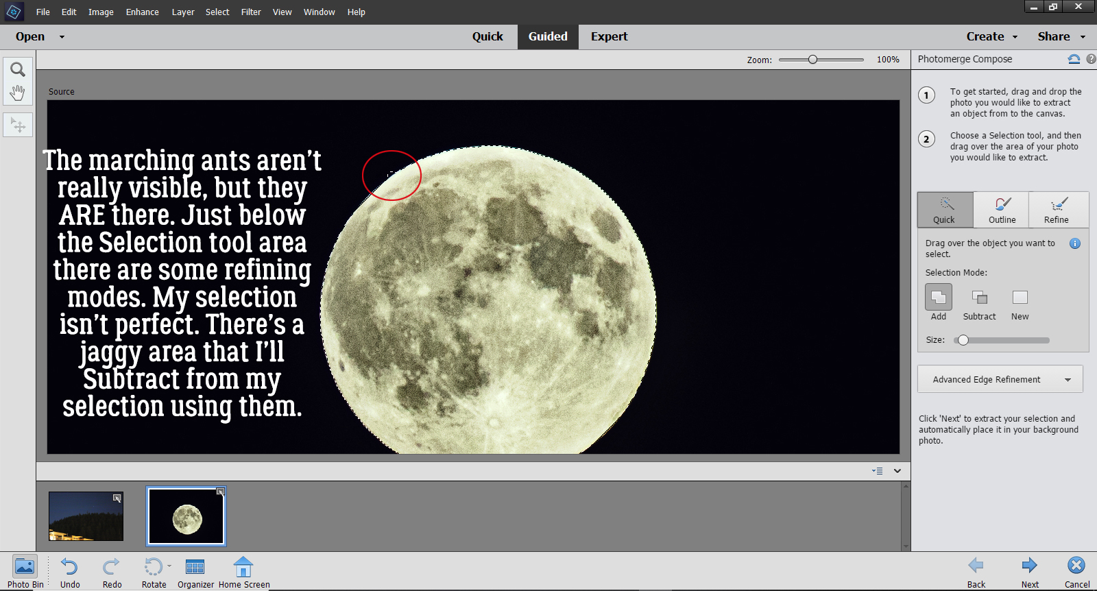
It’s hard to see the marching ants in the screenshot but they are there. There’s even a little jaggy part that I’m going to adjust by switching from Add to Subtract and scrape it off.
Done! As I mentioned, there are more refinements you can make to extract your desired image using the Advanced Edge Refinement menu. It’s found just below the red circle.
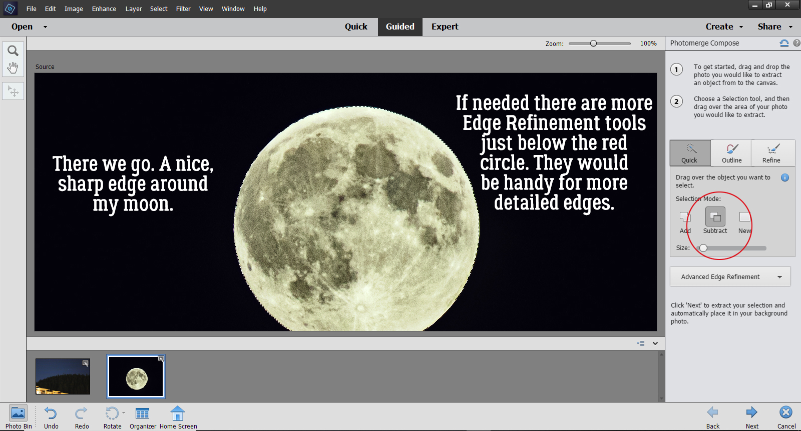
But since I just basically have a circle, I can move on to the next step by clicking the Next arrow at the bottom of the screen. Elements always drops things right in the middle of the canvas, so it’s great that I can move my moon off the mountain and into the sky.
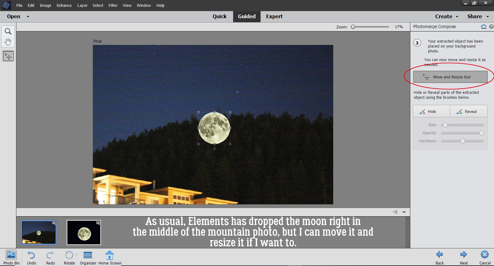
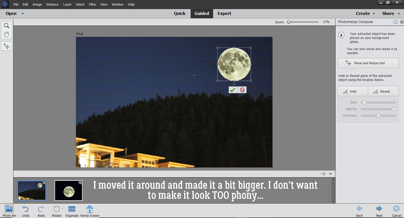
I decided to make it a bit bigger too, for dramatic effect. But I didn’t go too much bigger because I don’t want it to look completely phony.
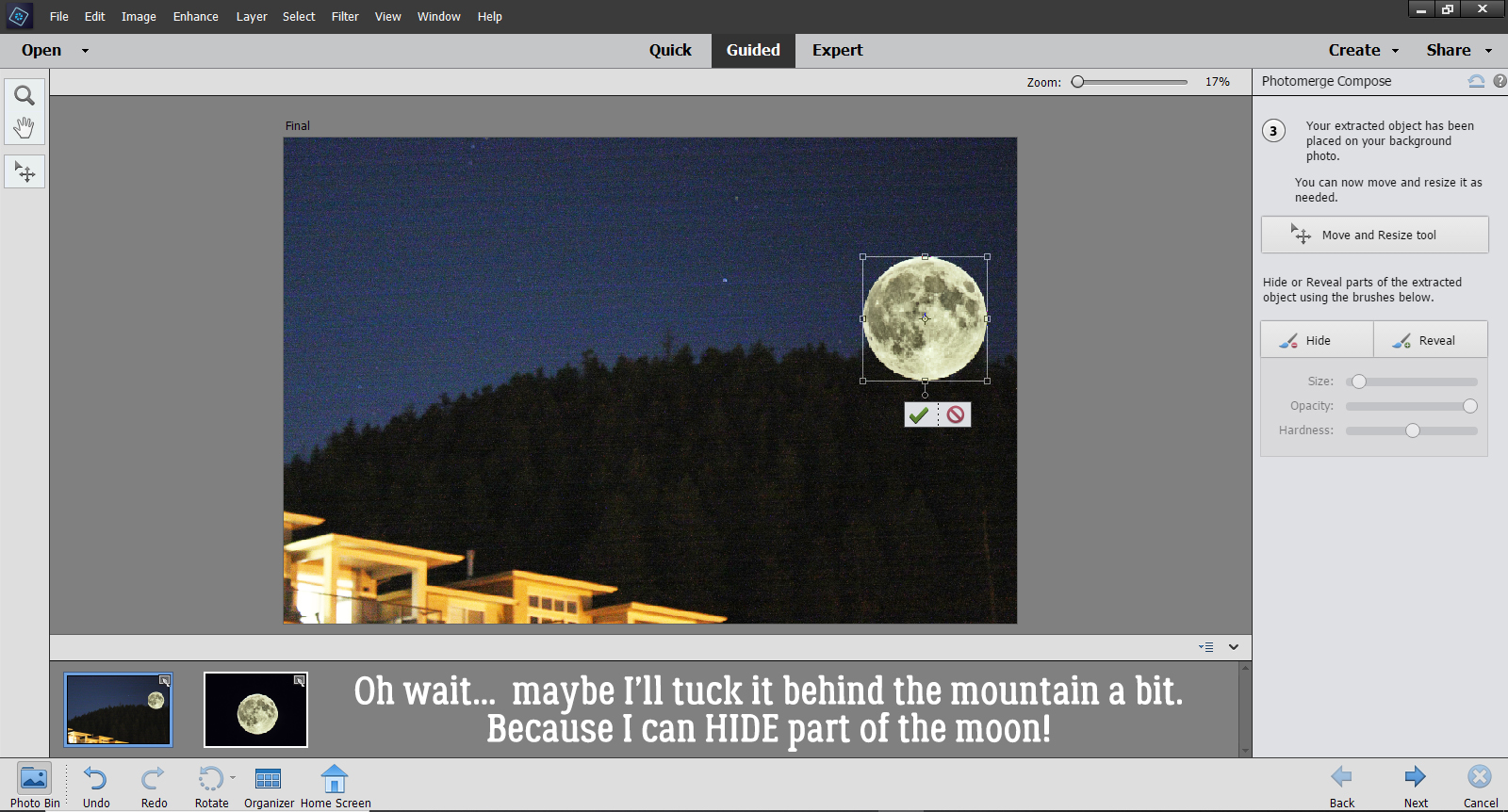
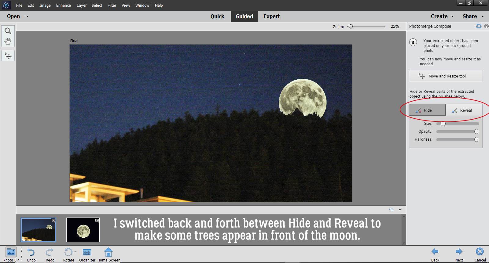
Then I had second thoughts and decided to anchor it a bit by tucking it behind the mountain a smidge… after seeing that I had some Hide and Reveal options.
I started that process by Hiding the lower part of the Moon just roughly. I used a hard round brush at 100% Opacity to brush over the area that will end up being hidden by the mountain and trees. It takes several passes to completely hide the parts that I want hidden. Once I had an idea where the trees actually are, I could go back and Reveal the Moon where the trees don’t obstruct the sky. You can see in the screenshot that some of the moon looks more blue than gray – that’s where the sky hasn’t been completely Hidden. I also adjusted the size of my brush tip as needed to make the trees appear “normal”.
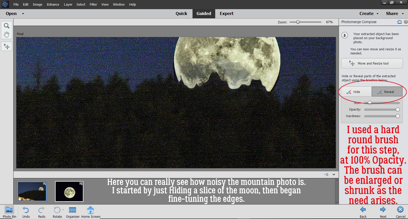
I switched back and forth between Hide and Reveal, adjusting the size of my brush tip until I had some natural-looking trees on my mountain. then I clicked on the Next arrow.
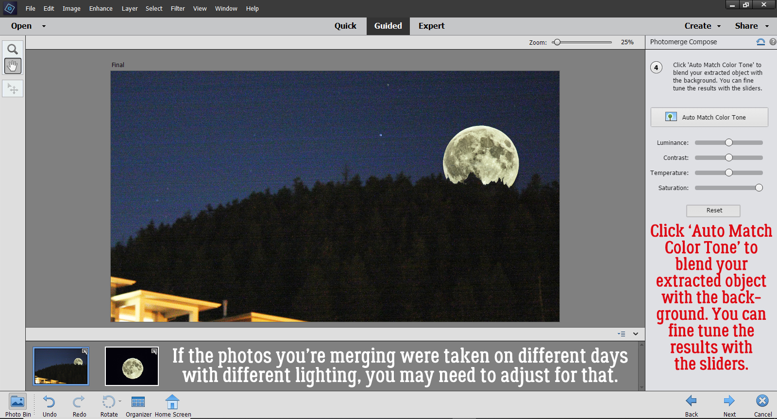
If your photos were taken at different times and in different lighting conditions, your composite might look pretty weird right now. Mine’s okay because night is night… But if you find your results aren’t making you happy, there’s still more in this Edit to help you get it right. The instructions say, “Click ‘Auto Match Color Tone’ to blend your extracted object with the background. You can fine tune the results with the sliders.” I highly recommend experimenting with this, because as you know, nothing is final in Elements until you say it is. If you click on the button and it does its thing but you hate the outcome, you can Undo it!! CTRL/CMD>Z should be an automatic movement. It sure is for me!
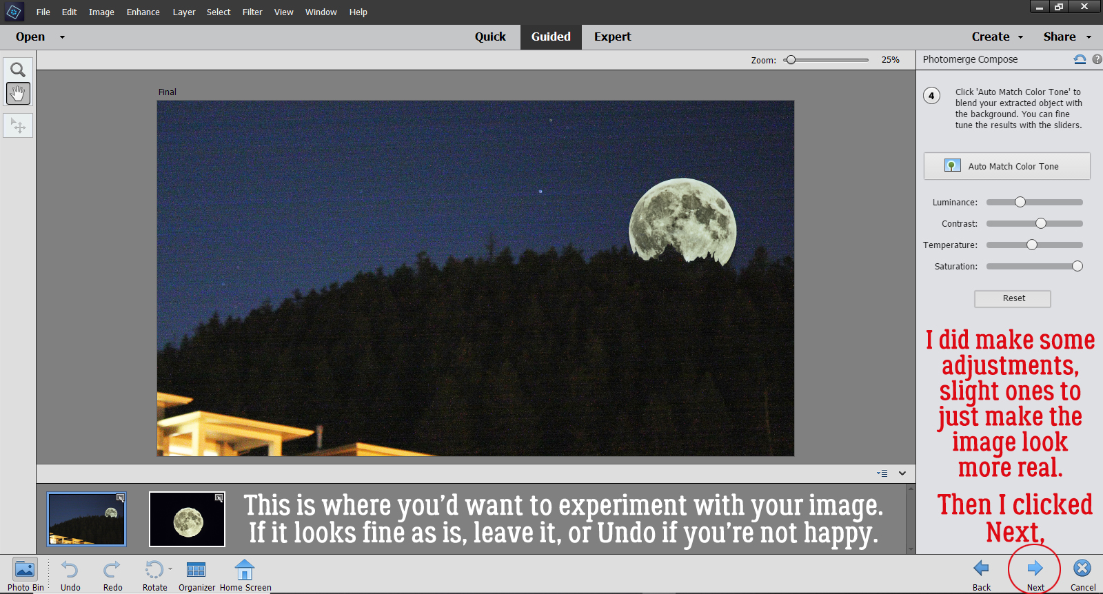
I didn’t like the results of the automatic process, so I made adjustments with the sliders. The image didn’t need a lot of adjusting to make it look more real. Then I clicked Next.
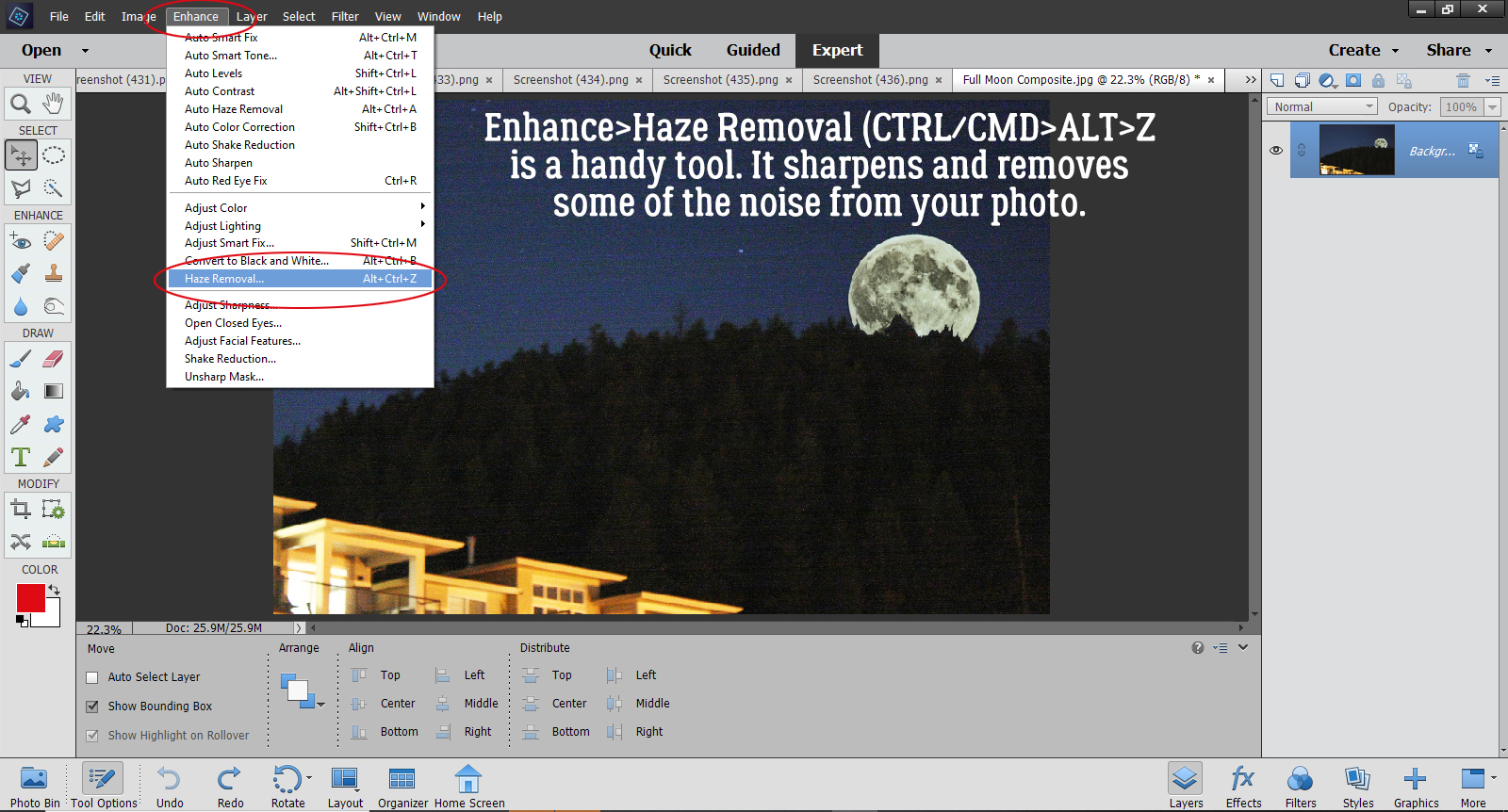
That’s the end of the Guided Edit. Now I can choose to Save, Continue Editing or Share my finished image. I want to clean up some of the noise by running the Haze Removal tool, so I’m going to click on In Expert and go there.
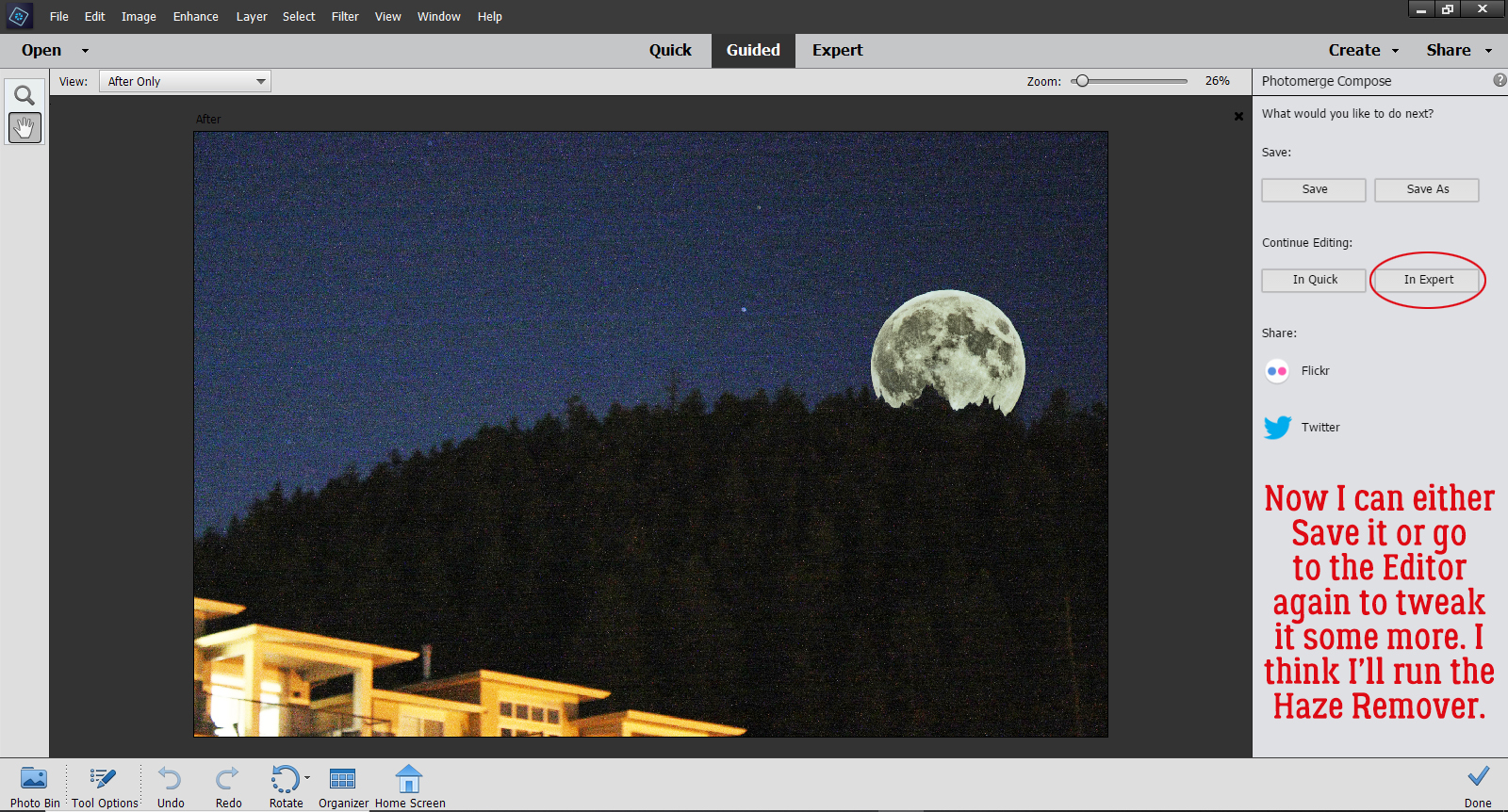
If you’re not familiar with the Haze Removal tool, I think you should give it a try! It sharpens your images and removes a lot of the graininess. You can get to it by Enhance>Haze Removal, or CTRL/CMD>ALT>Z works too.
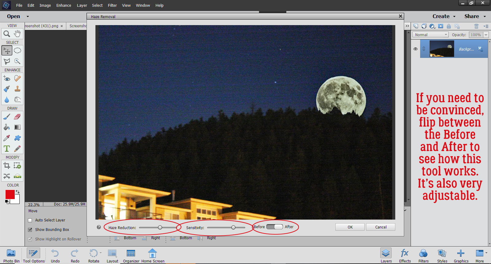
It’s still an interactive process. This screen opens up and you can make adjustments to the amount of Haze Reduction it does, as well as the Sensitivity of the action. And if you’re not convinced it’s actually making a difference, you can flip between the Before and After images and see how it’s changed.
There! I think it looks pretty good, all things considered.
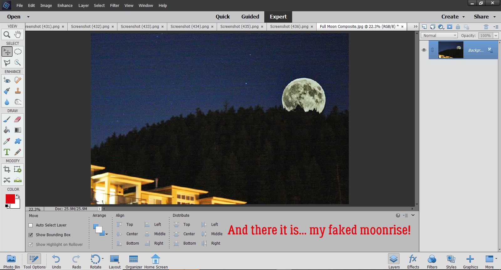
What do you think? Are you going to try this one? I think it would be good for adding a person who should have been in the photo but somehow wasn’t or to add someone who you only wished was there. Ooh, or maybe go right into fantasy and add a unicorn or a fairy to a photo of a baby. The sky’s the limit!
![]()
Designer Spotlight
October 2, 2020 by
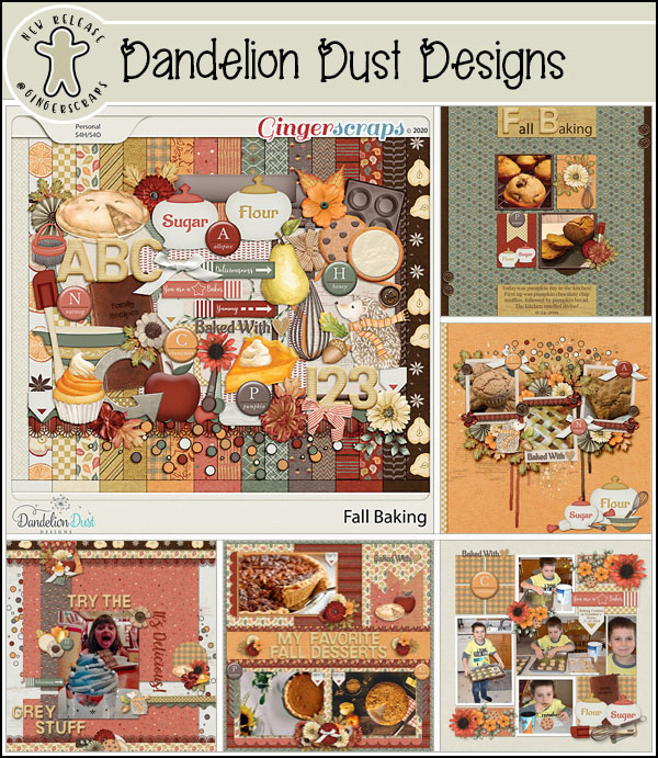
Dandelion Dust Designs!


Greetings all you GingerScrappers! Are you ready for a fantastic Digital Scrapbooking Day bash?! I’m heading to the shop as soon as I’m done introducing y’all to Ginger, the sweetheart who creates the delightful Dandelion Dust Designs goodies. I asked her the usual questions and she very promptly sent me her replies.
J: How long have you been designing?
G: Just over 11 years.
J: What made you decide to design?
G: I was a paper scrapper back in the day and never loved my pages (especially not being able to change them since everything was glued down.) I stopped paper scrapping for many years, and in 2009 I picked up a copy of PS Elements and there was a bonus CD included on how to digitally scrapbook. I made 2 pages and was hooked. 3 months later I started designing kits.
J: What do you use to create your designs (program, additional tools, etc.)?
G: I create and design in PS CC on an HP laptop.
J: Describe your design workplace.
G: I have a dedicated office in my home that is super clean, everything in its place, over the top organized with my laptop on my desk looking out a window at a mountain in the distance.
J: What motivates and inspires you as a designer?
G: I always start with beautiful photos that inspire or motivate me in some way, and create custom color palettes for each Dandelion Dust Designs’ Collection off the photos. I have to LOVE the color palette to be able to work and design with it.
J: What is your favorite kit currently in your GS store and why?
G: Oh boy….each collection is so special for a variety of reasons to me as a designer, but if I had to pick only one, I really love Joy of the Season. It was one of those kits that came together magically from the photo inspiration, to the color palette, to the papers and elements and reminds me of the holidays growing up.
J: If you could only eat one meal for the rest of your life, what would it be?
G: Oh wow…I don’t think I can narrow this one down, as I love making so many different types of meals.
J: What is your favorite game or sport to watch and play?
G: I was born and raised in Nebraska, so even though I haven’t lived there in 30 years, the Nebraska Cornhusker Football team, will always be special to me. I watch every game they play.
J: What did you want to be when you were small?
G: I thought I would be an architect, as I loved drawing house floorplans (on graph paper of course, because the lines had to be straight…LOL), when I was like 9 or 10 years old. My degree is in Business Administration and Management, but I still love looking at floorplans and doing interior design! My main career is as a REALTOR®, so that is as close to architecture as I came.
J: Aside from necessities, what one thing could you not go a day without?
G: Besides my family, probably internet service, as all of my careers require being able to access multiple websites and resources each day.
J: Who would you want to play you in a movie of your life?
G: Julia Roberts
J: If you had a warning label, what would yours say?
G: Procrastinators…you have been warned.
J: What celebrity would you like to meet at Starbucks for a cup of coffee?
G: Jennifer Garner
Ginger, I’d love it if you’d come over and organize my workspace for me! I think as a REALTOR® you’re right where you’d be happiest. You have the insight to help people see themselves in the space and that’s a real gift.
Ginger would like you all to know she has put her entire store on sale for the whole month of October. How very generous! Don’t forget to pick up the Daily Download too!
Dandelion Dust Designs Store will be 50% off during the DSD Sale October 2-8 and then will be 30% off October 9-31
![]()
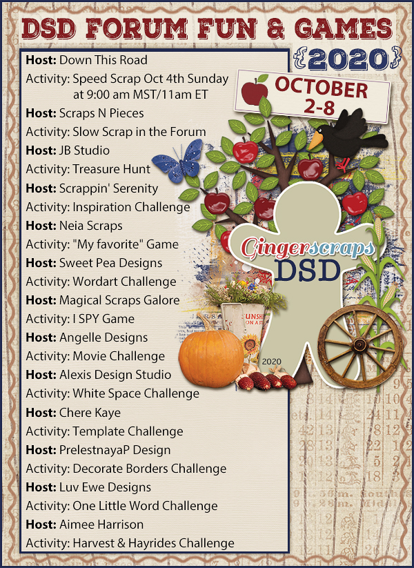
October 2, 2020: Fresh Baked and Digital Scrapbooking Day!!
October 2, 2020 by
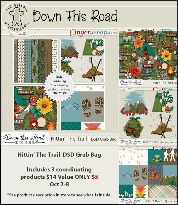
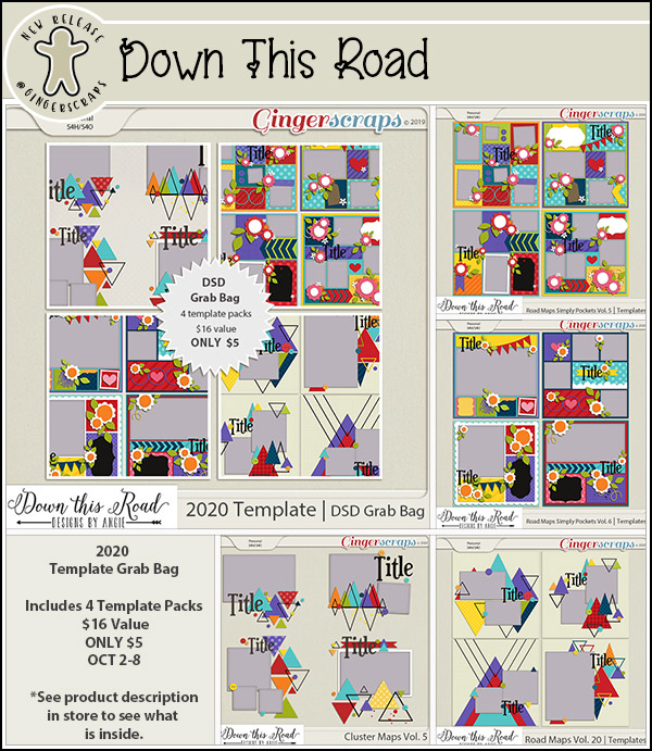
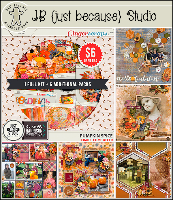
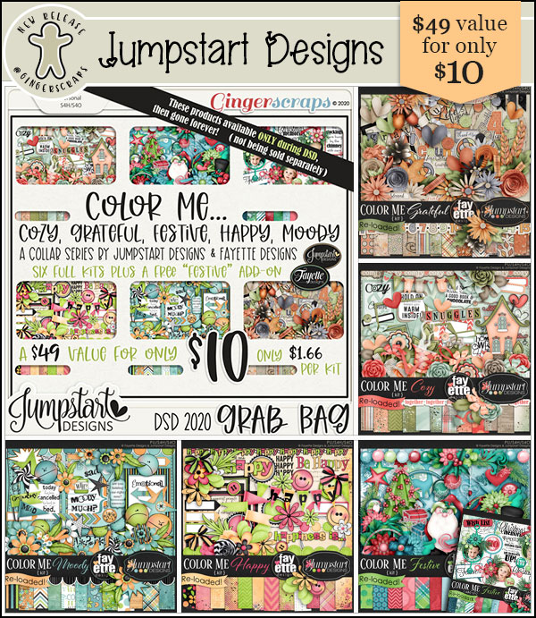
Are you ready to have some fun. Today starts the DSD2020 celebration in the store and forum. Just look at all the fun things planned, including a storewide sale and mege FWP kit!
Remember you get this kit with a $10 purchase.
Fresh Baked goodies for this week:


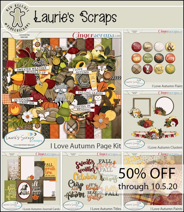
How about some fun Grab Bags. These are an awesome buy.

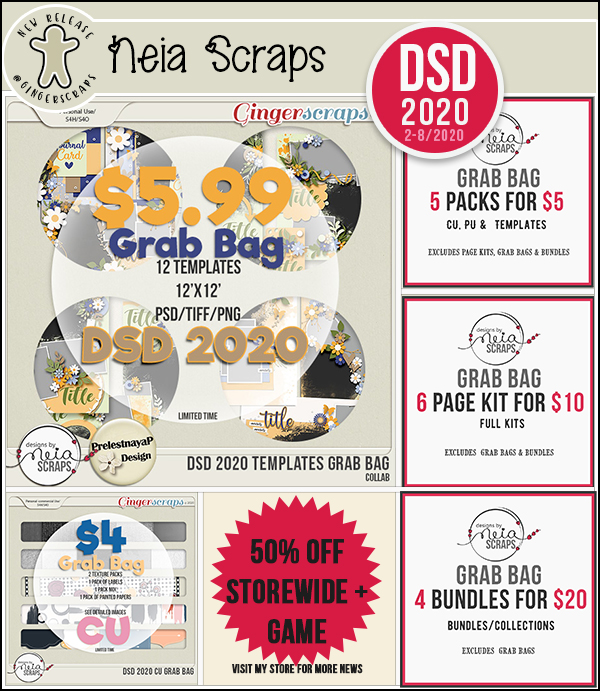


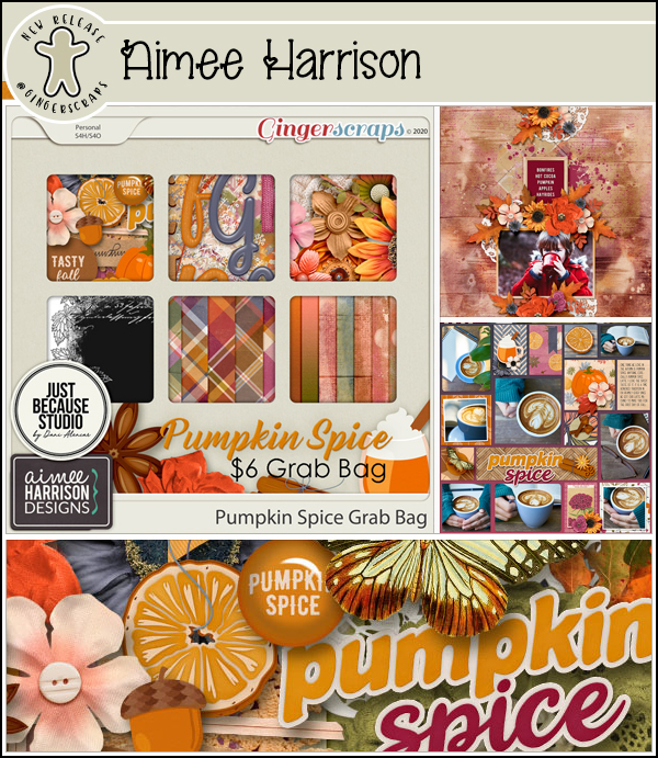


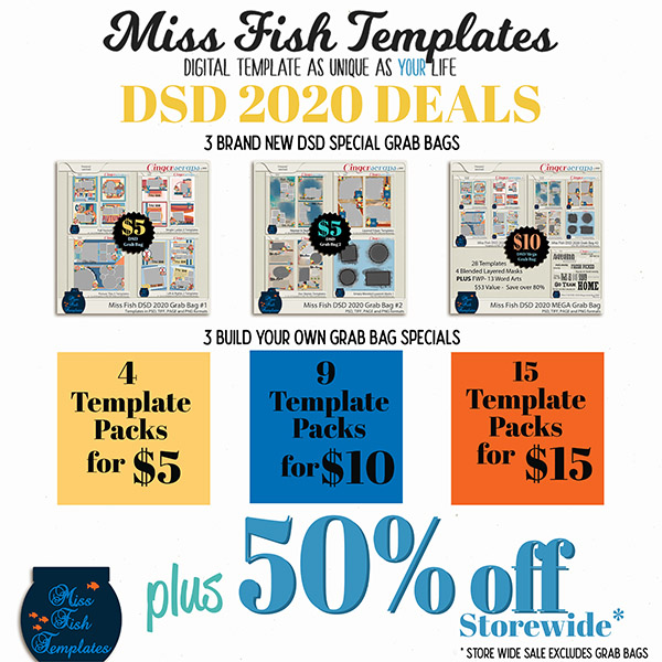

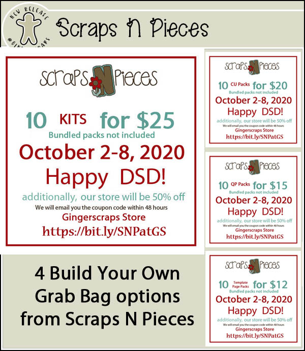


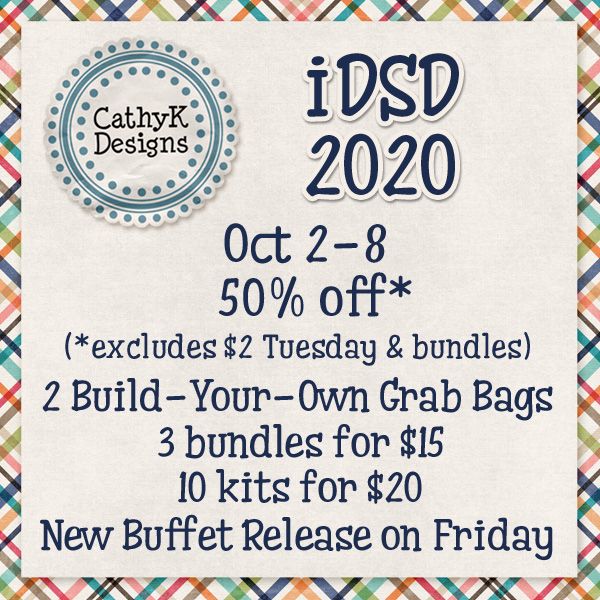


Look at all the fun and games going on in the forum. Come join in on the fun!!!!
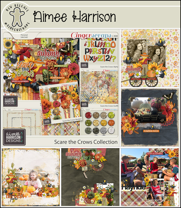
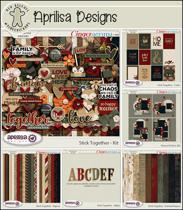
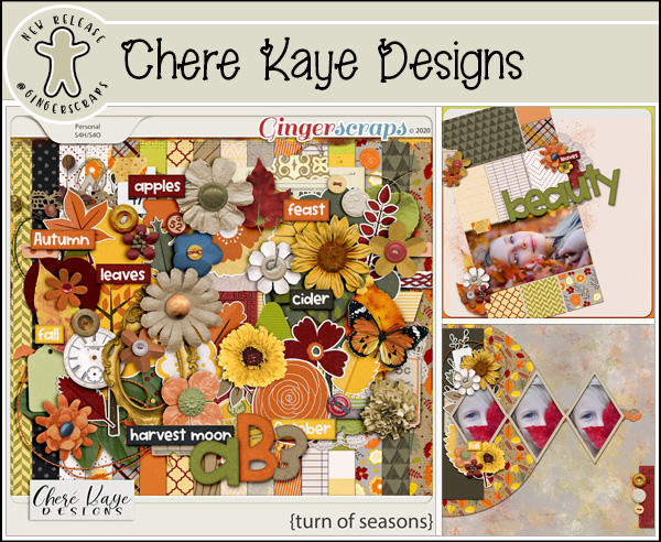
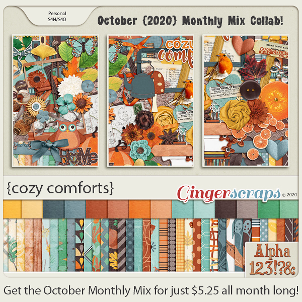
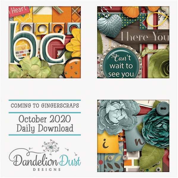
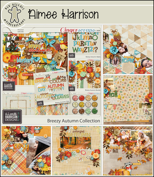
Fresh Baked: October 1, 2020 & NEW Free With Purchase, Monthly Mix and More
October 1, 2020 by
Ahh…it’s October already. Can you believe how close we are to the end of 2020? I think this year I’m actually ready for it to get here. Make sure to read all the way to the end. We have some fun stuff coming up this weekend.
Don’t forget to check out the Buffet Bundles. One easy click to add bundles of Buffet goodies to your cart.

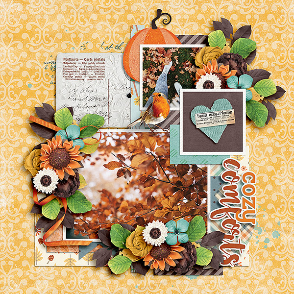
New Buffet magic from our designers. You’ll find a few of the layouts the store CT made using these fabulous kits.

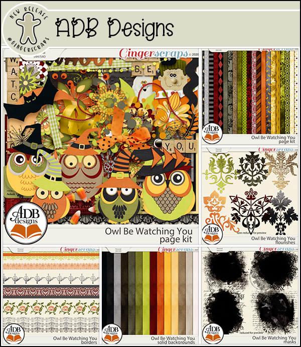
Look at this fall beauty you get for spending $10 in the store. Isn’t it gorgeous?
The Monthly Mix has a bit of fall flair as well. Look at those papers.
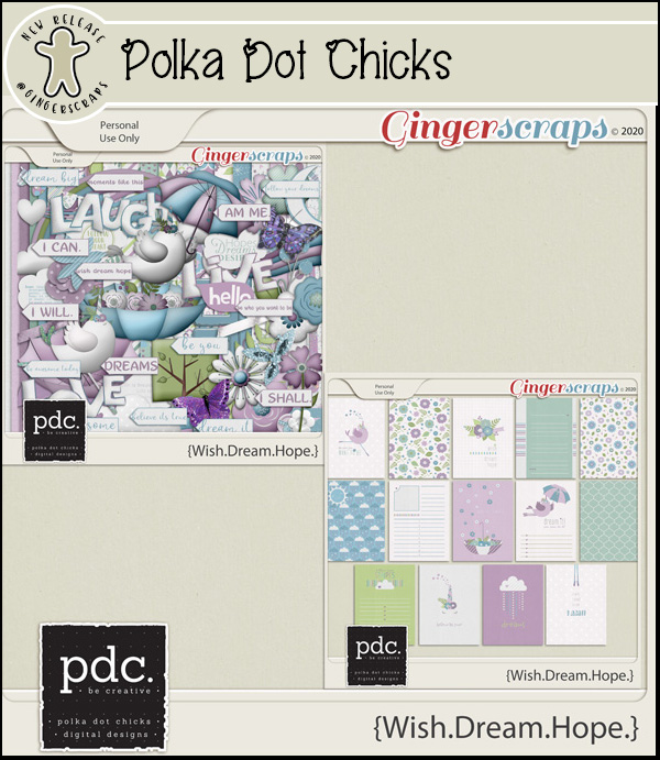
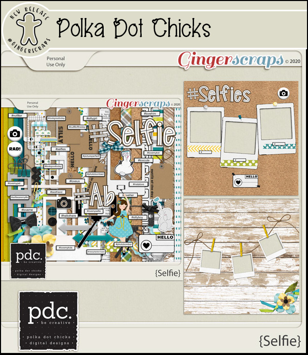
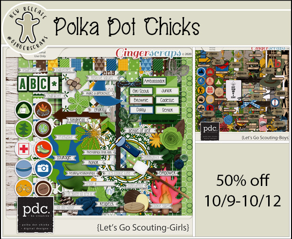
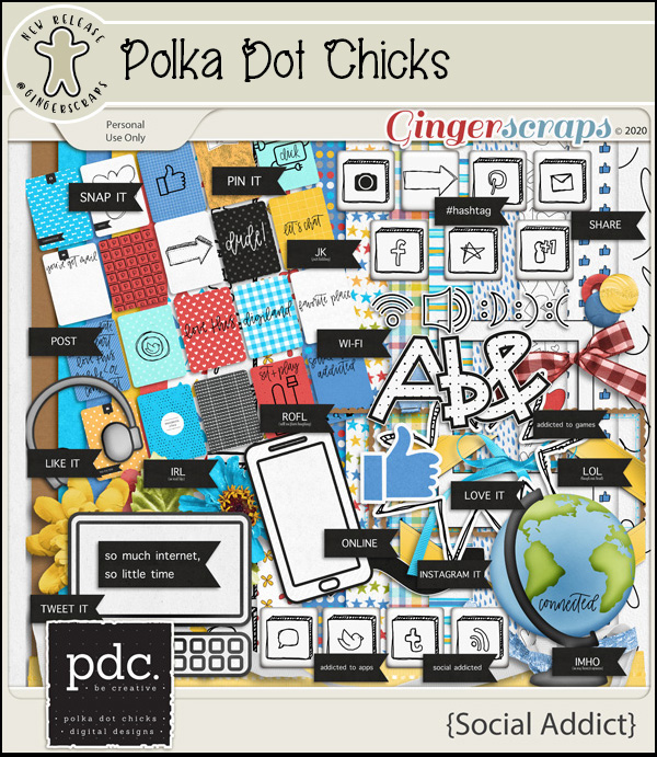
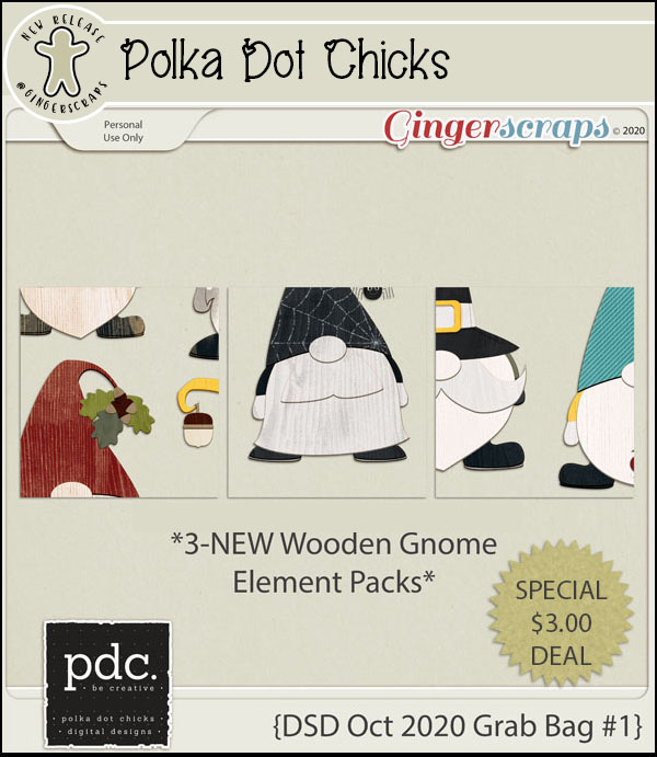
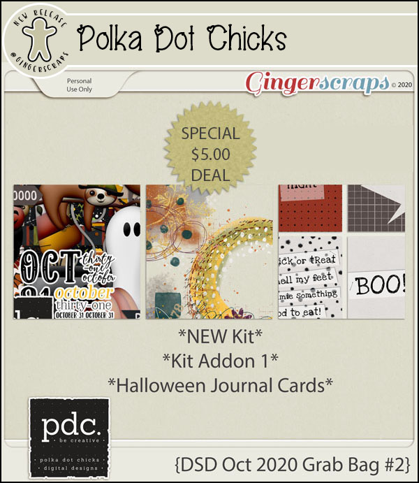
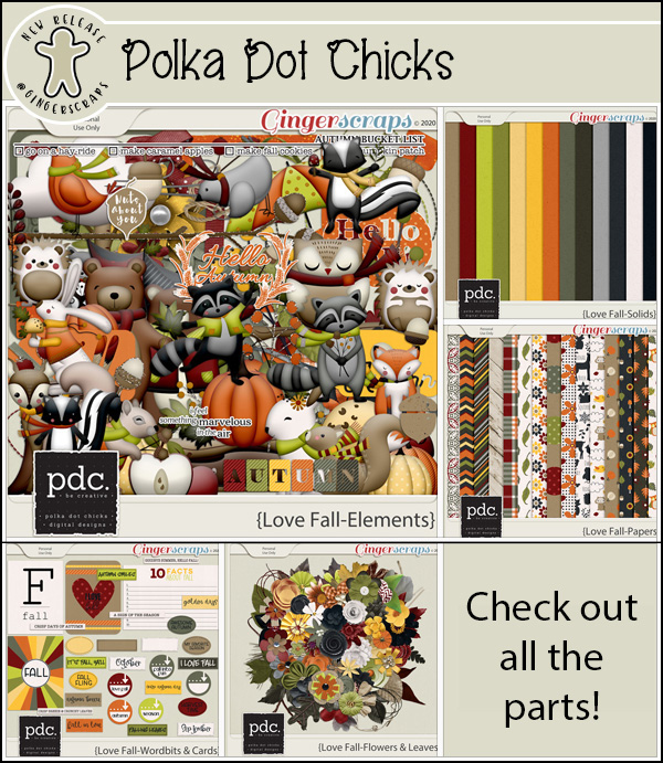
I’m super excited to announce that Chere Kay Designs AND Polka Dot Chicks are both staying and becoming a full member of our GS Family.
October brings us a new Daily Download. October is courtesy of Dandelion Dust Designs. Doesn’t this look wonderful?
The new challenge reward is a bit of fall and a bit of love. Complete any 10 challenges and you will get this full kit as a reward.
Let’s see a few of those beautiful layouts from our store CT.
Are you ready for some Digital Scrapbooking Day fun? Just look at what we have planned for you!!
Tutorial Tuesday (Photoshop Elements)
September 29, 2020 by
The Photoshop Elements No-Diet Weight Loss Plan
![]()
Take THREE! Today’s really starting to feel more like a Monday than a Tuesday… WordPress isn’t playing nice again this week. But I’ll persevere, because I really want you to have this little weapon in your arsenal. Kim Kern asked in the comments after last week’s post if I knew how she could slim herself down a smidge in a photo she otherwise liked. So I dug out a photo of yours truly that didn’t make me cringe so I can show you how to lose 10 pounds without dieting.
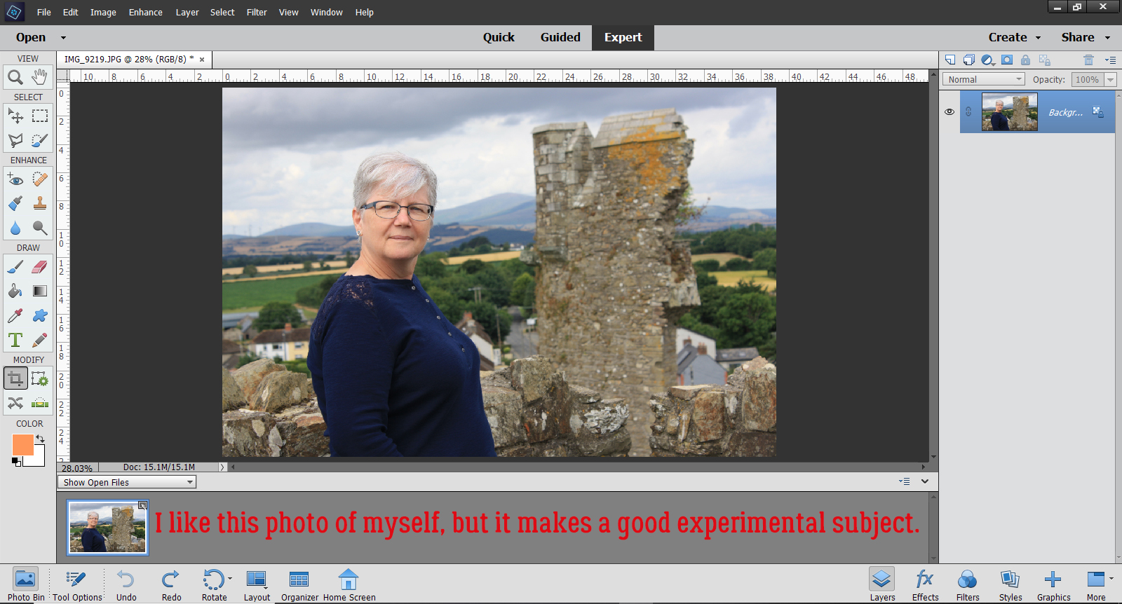
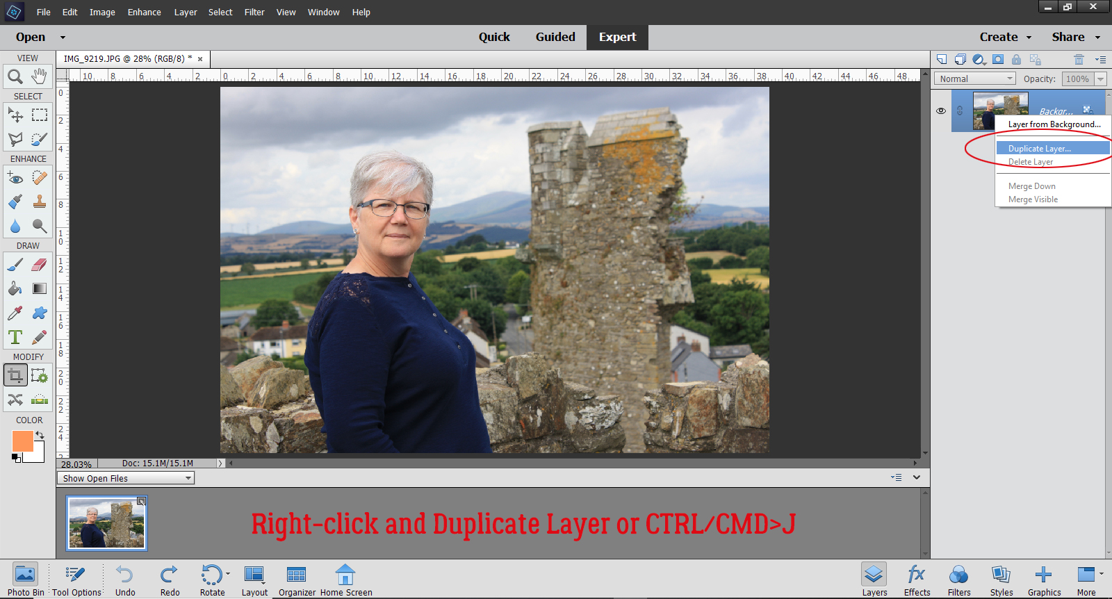
First things first. I made a Copy of my photo so I could do all my experimenting on the Copy layer and lot the original. This is a good habit to get into when you’re photo-editing because if you’re not thrilled with your efforts, you can go back to that background layer and start over. To add a Copy layer, right-click on the photo layer in the Layers Panel and select Duplicate Layer, or use the keyboard shortcut CTRL/CMD>J.
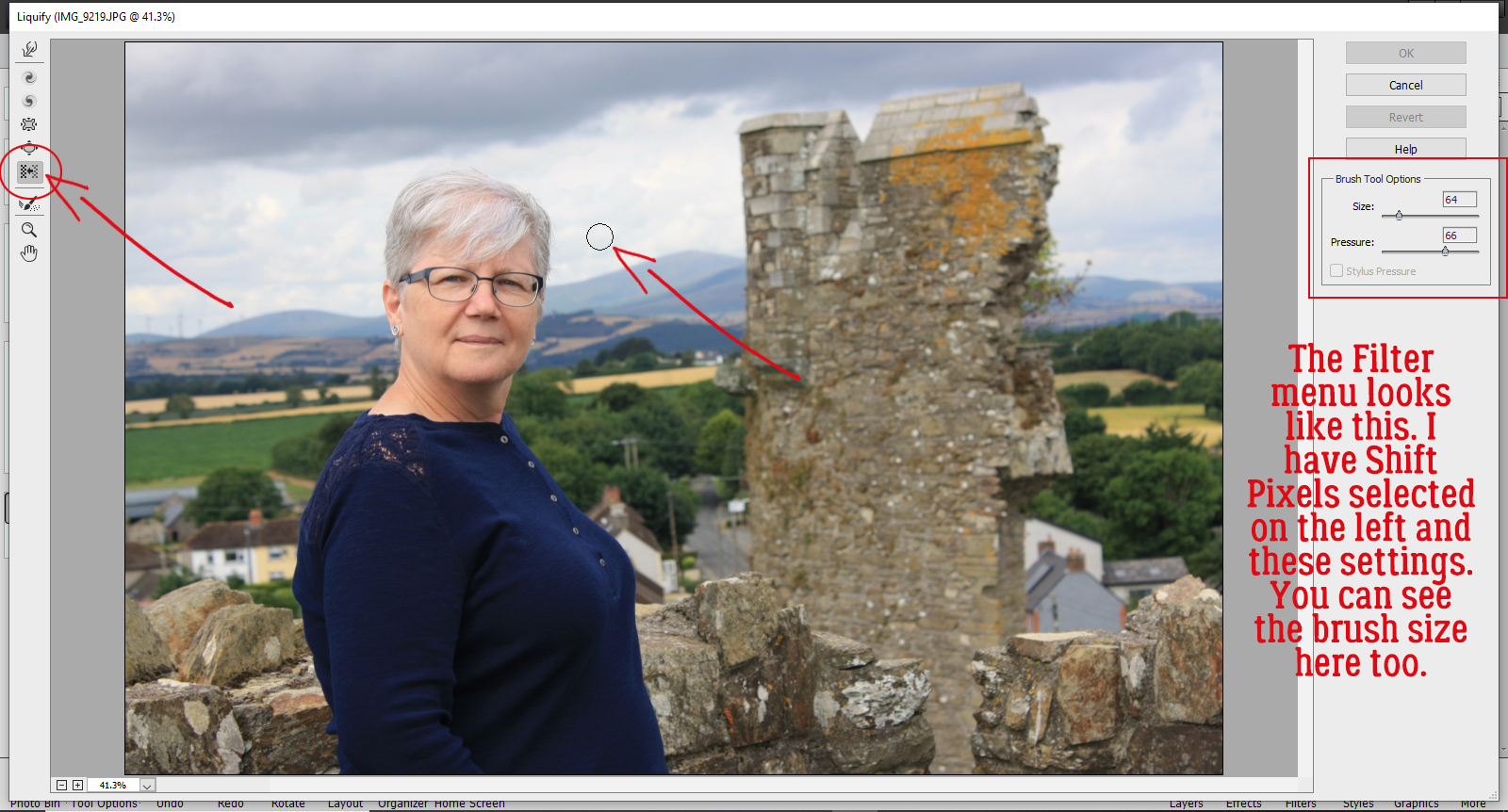
Now, to that Copy layer, I’m going to apply a Filter. Click Filter>Distort>Liquify.
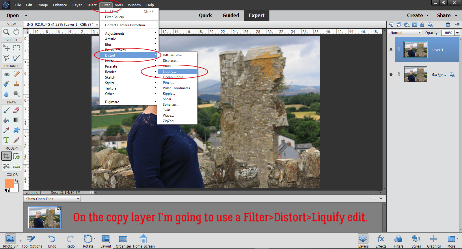
The Filter menu looks like this. The Tool options are along the left hand side of the workspace and the settings are on the upper right. For this edit I’m going to use the Shift Pixels option, the one with the icon that looks like two parallel brick walls with an arrow in between them. The brush I’m using is a soft, 64 pixel basic brush with a Pressure of 66. A light hand and a soft touch will give you the best results with the least backtracking.
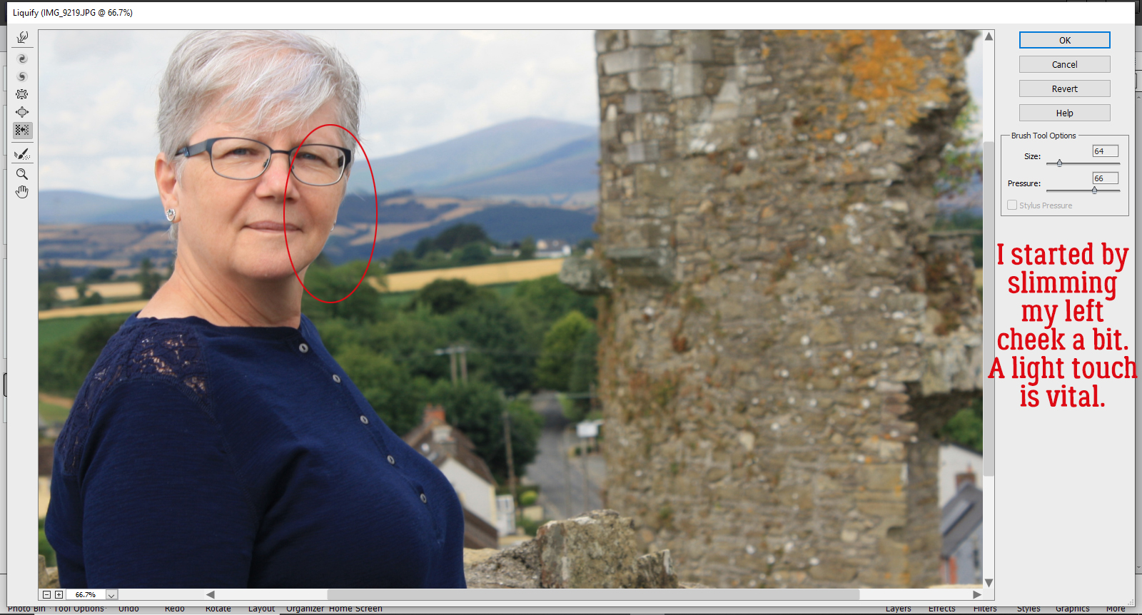
I started my weight loss by gently slimming my left cheek. There’s no obvious clue for which direction to move your brush, or at least I didn’t find one. I started near my chin and very gently brushed upward until I got to the top of my ear. Just a tiny change is all that’s needed.
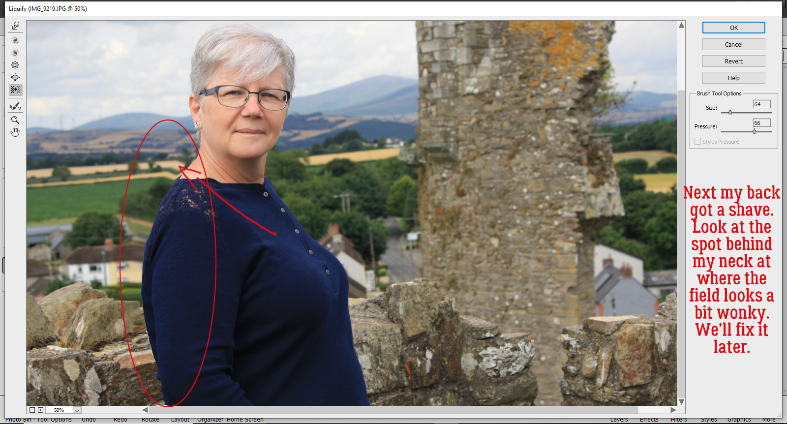
Then I took on my back fat. For this part, I started at my neck and brushed toward my bum. This is where you can see the distortion that happens in the background. It’s something I’ll fix later.
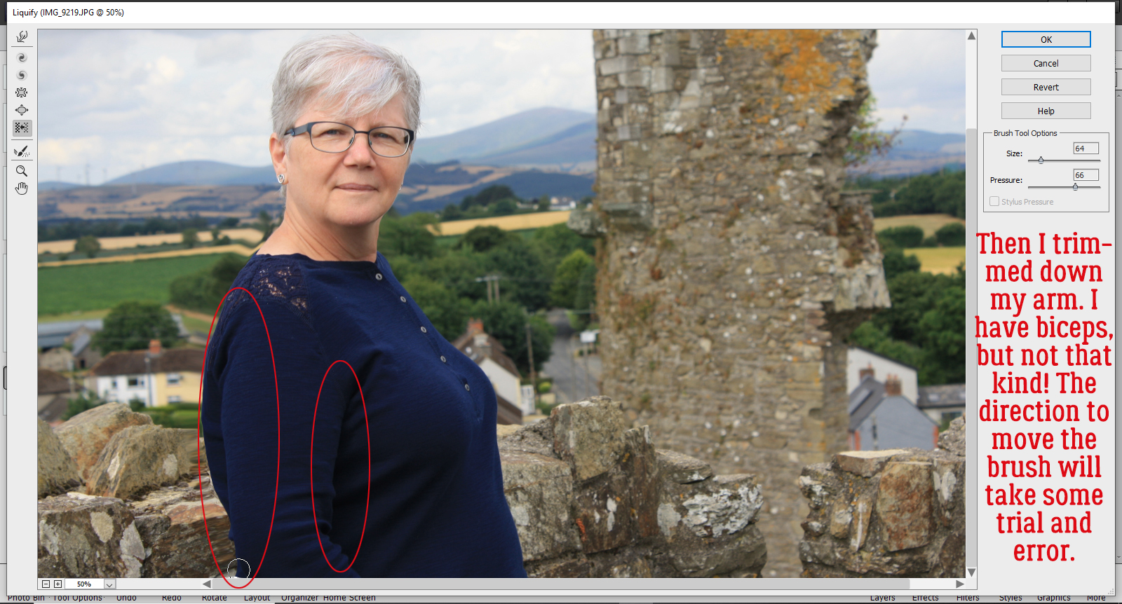
I moved on to making my arm look less meaty. I went elbow-up on the back of my arm and shoulder down on the inside.
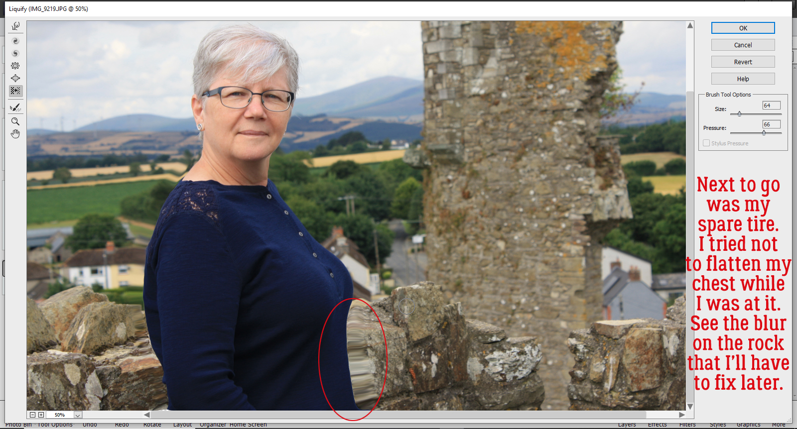
Muffin top was my next zone. It too worked better going bottom up. It took me a few small adjustments to get to where I felt thinner, and I was careful not to flatten my chest. It’s really easy to see the blurring on those stones!
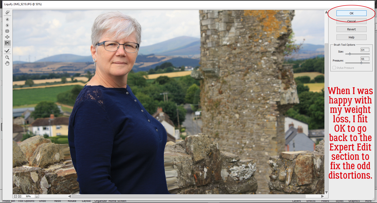
Once I was satisfied that I’d successfully slimmed but didn’t go overboard, I clicked on OK to go back to the Expert Editor.
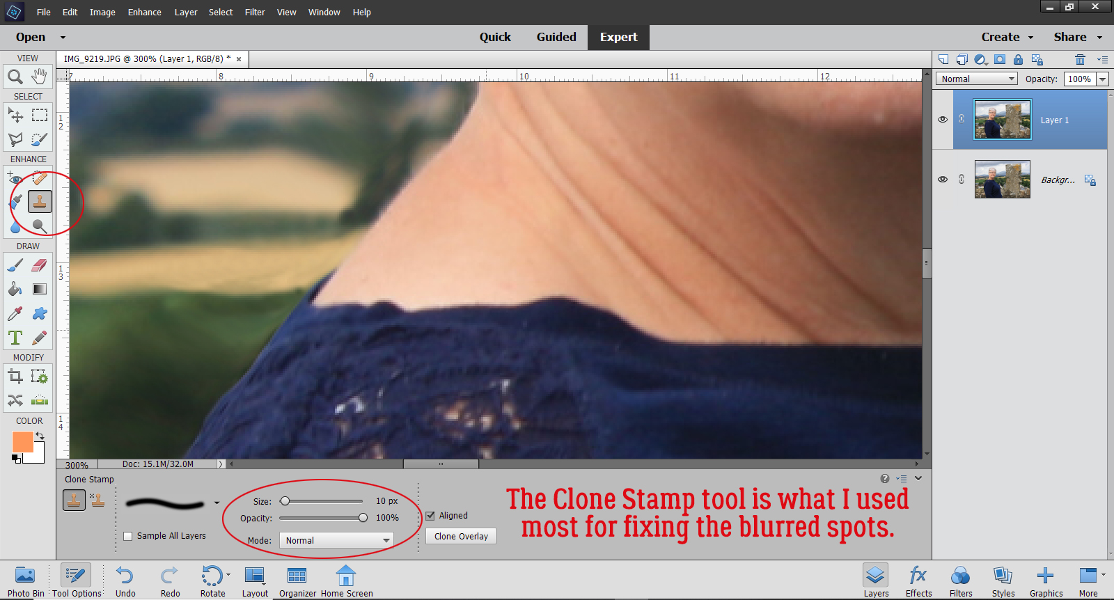
Now to fix the weird spots. I started with the Clone Stamp tool and Zoomed in a lot so I could make my adjustments minutely. For this part, it’s best to use a fairly small soft round brush, at least at the beginning. Never used the Clone Stamp? Decide what part of your image is going to make the least visible correction and hold down ALT then click on that spot. Move your cursor to where you want your change to happen BEFORE you click again to apply that area you just Cloned. If you’re too close to the source, you’ll end up with a muddy mess. I worked on that bit of field behind my neck.
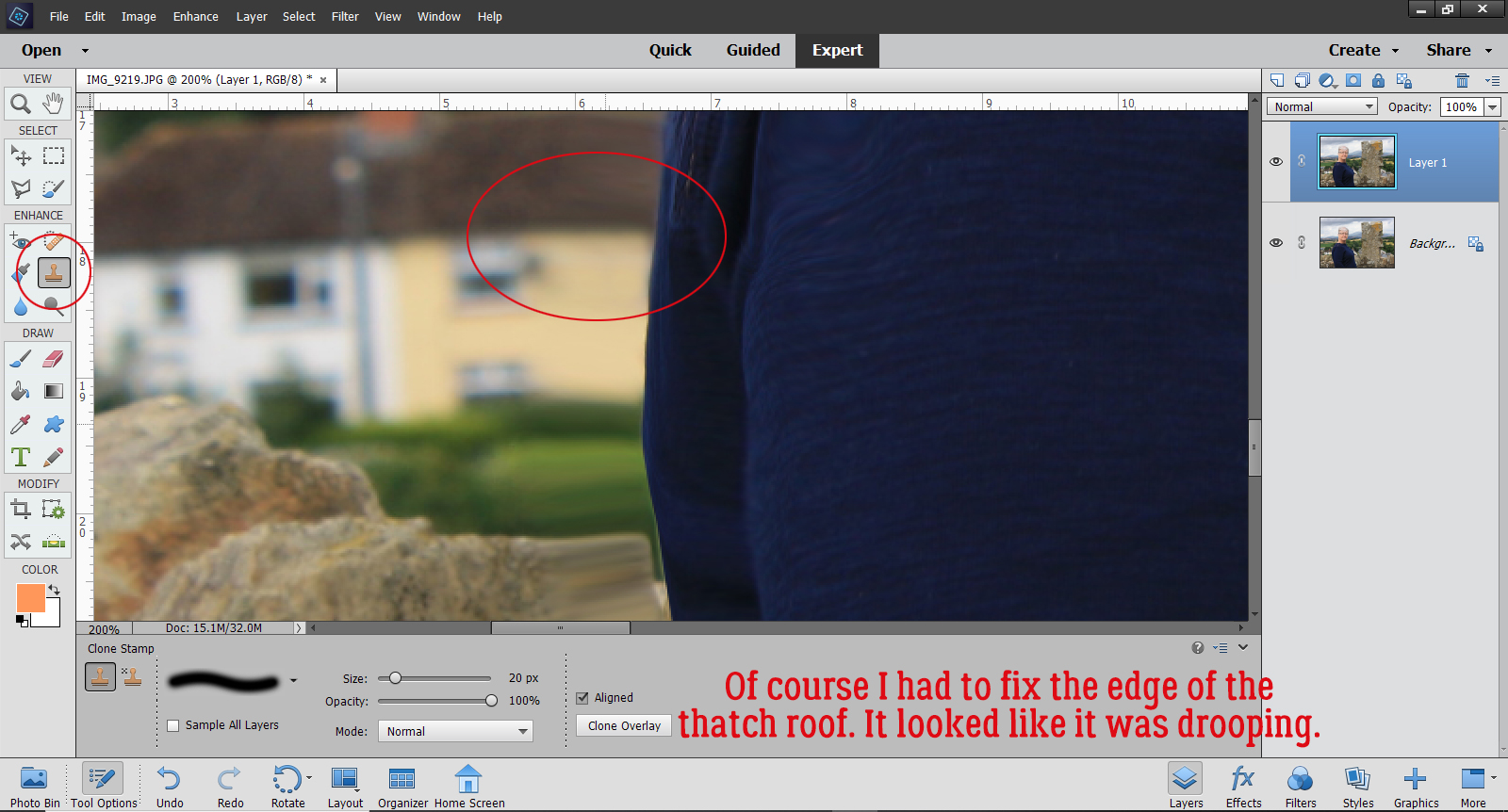
Then I moved on to remove the droop from the thatched roof on the yellow house at my back. For this kind of fix, if you click for your source with your cursor right over the straight edge of the object, Elements will give you a nice continuous straight line when you move the cursor over. To avoid visibly blurring an area that should be sharp, like where my sweater overlaps the wall, I switched my brush tip to a hard-edged one.
One disadvantage to using the Clone Stamp tool is that it reproduces patterns exactly, so as you move along, you’ll end up with some visible pattern repeats and that will look unnatural in most cases. That’s where the Spot Healing Brush comes into the game. For this fix, I used a small, hard-edged brush, selected Content Aware and Sample All Layers in the controls and randomly clicked on the stones to break up that repetition. If I noticed that my Spot Healing looked too sharp, I swapped out my brush tip back to a soft one.
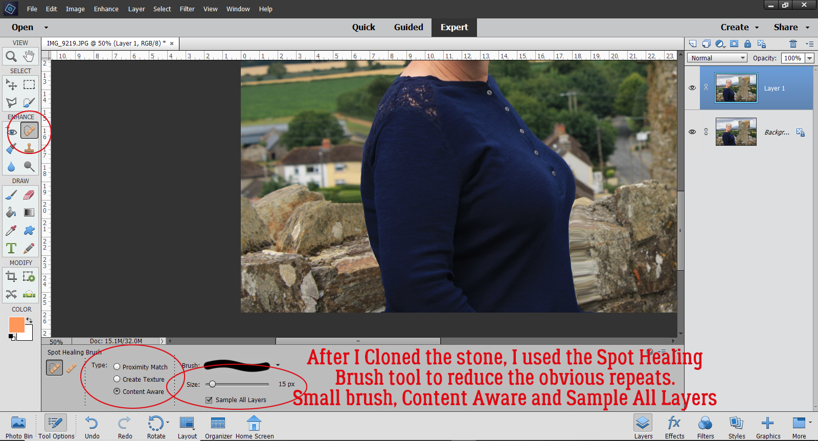
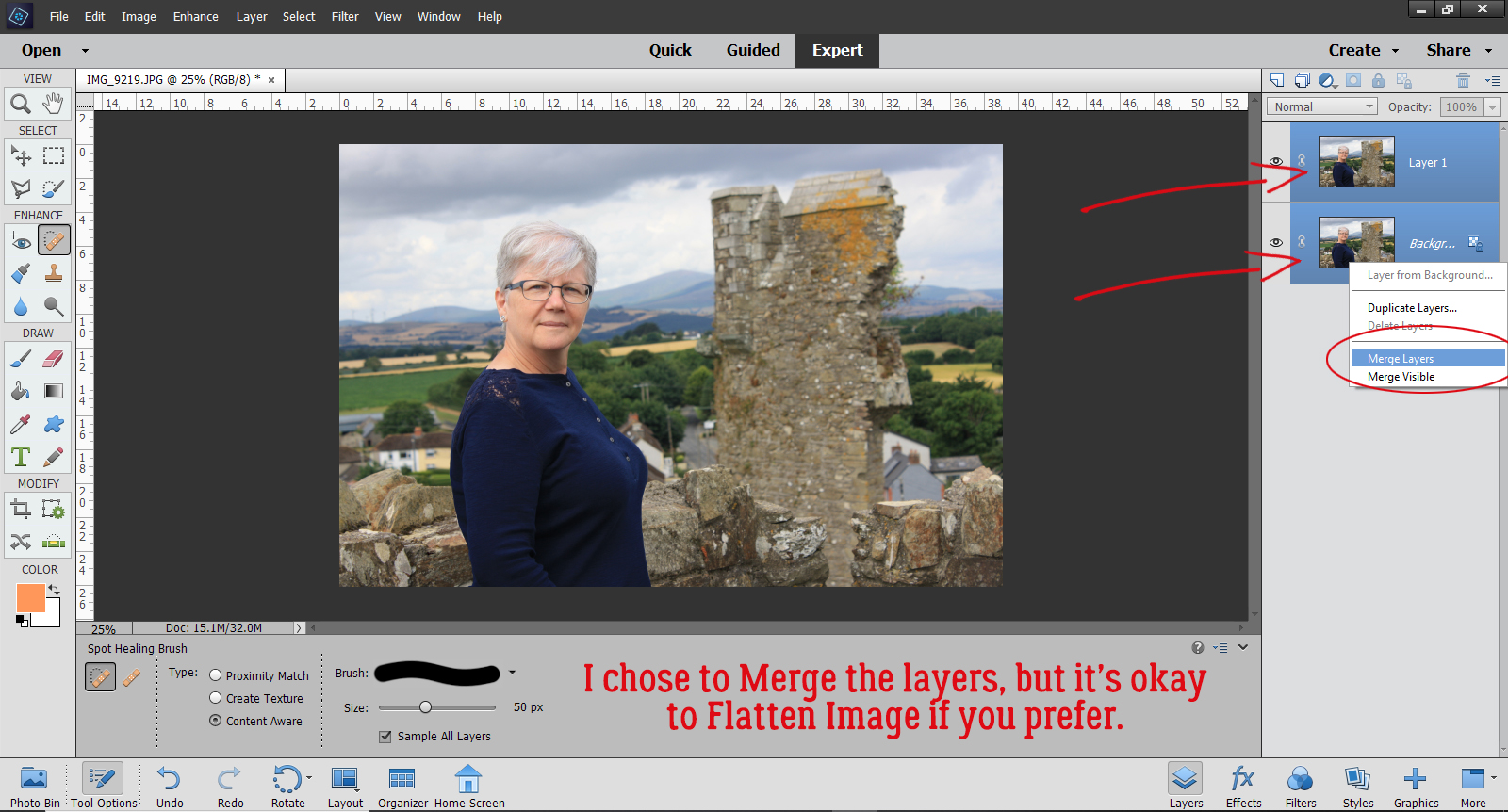
I moved on to the blurry stones to my left and followed the same steps. After I’d cleaned that area up, I Zoomed out and looked closely at the entire image to see if there were any glaring areas that still needed retouching. Then when I was satisfied with the whole image, I selected both layers, right-clicked and Merged them. But it’s just as appropriate to right-click and Flatten Image.
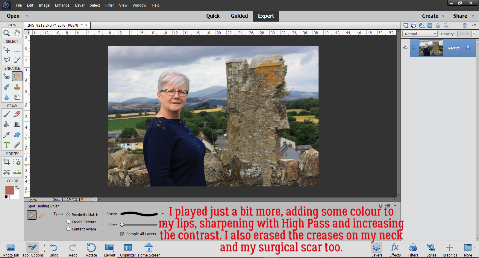
That’s it! That’s how I lost 10 pounds without even giving up jelly beans. My final image got a bit more adjusting: First I smoothed out the wrinkles in my neck and erased the scar from my parathyroid surgery. I Duplicated the image and sharpened it with a High Pass filter. That layer’s Blend Mode was changed to Overlay. I made yet another Copy layer then I changed the Blend Mode on that new layer to Multiply and dropped the Opacity to 25% to add some more contrast to the clouds (both are discussed in a previous tutorial). Overall, I’m really pleased with the way it came out. I look like me, only better!
Mm-kay. Let’s see what else I need to do to this post to get it right. I might even make my deadline! See you next week.
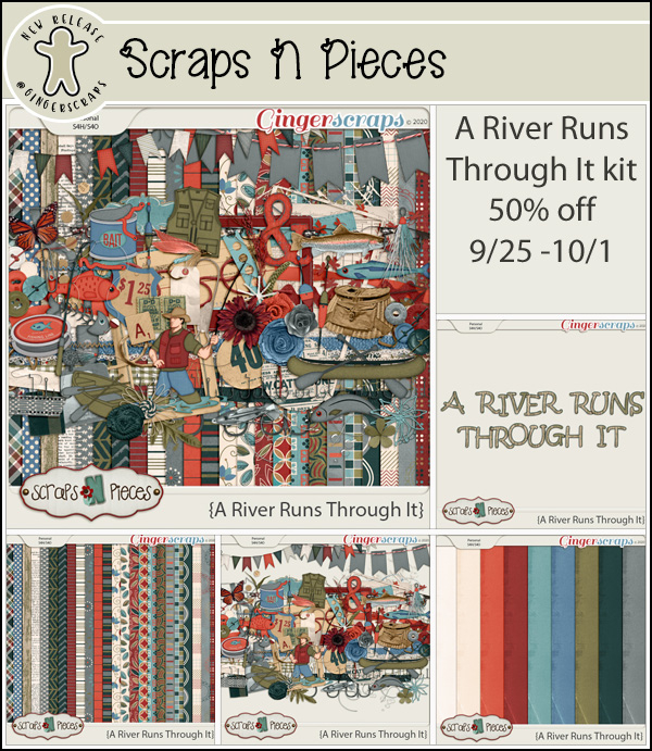
Fresh Baked: September 25, 2020
September 25, 2020 by
Here we are at another Friday. Weren’t we just at Friday? This week has flown by. We hope you are all hanging in there. Mother Nature is sure wreaking havoc. If you’ve been affected by any of the crazy weather, just know we are thinking about you all!
Remember, spending $10 in the store gets you this wonderful kit for free.
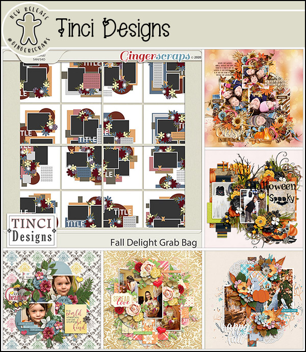
Let’s check out some of our new kits for the week.
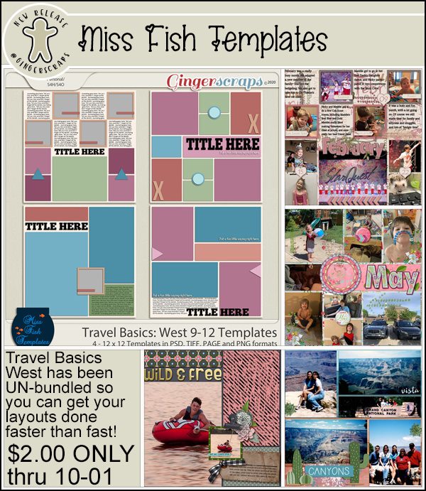
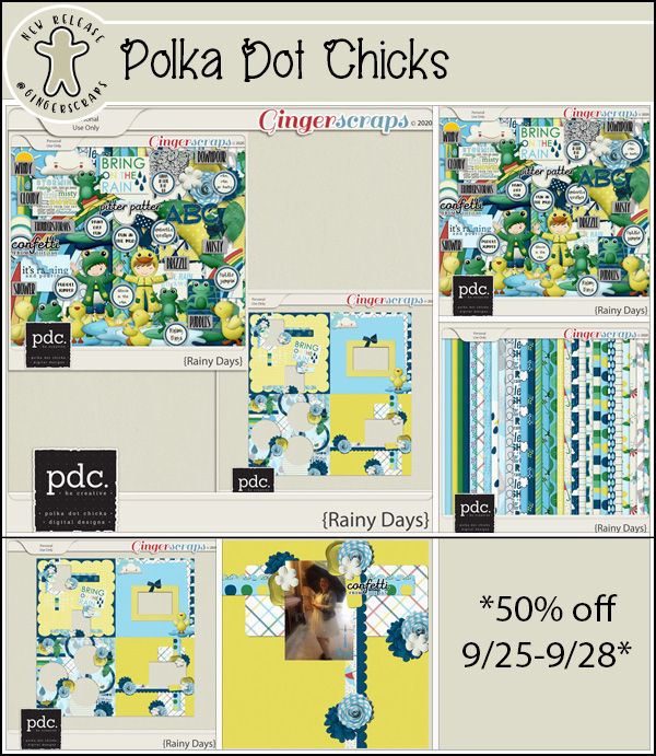
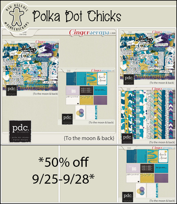
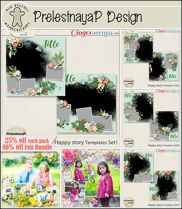
You still have a few more days to get those challenge layouts uploaded and tracked. This fun kit is your reward for completing 10 challenges.