Hey there everyone! We’ve reached the halfway part of summer (or winter if you are in the southern hemisphere). Have you done anything special? A family vacation or getaway? Do you have one planned? Remember to take all the pictures so you can scrap them all when the weather gets cooler.
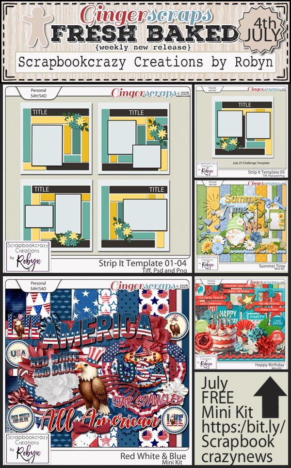
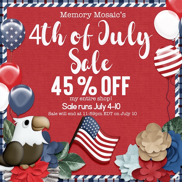
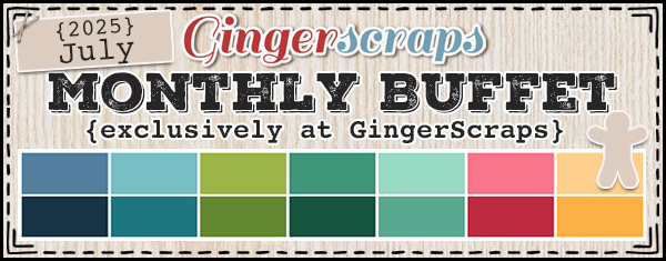
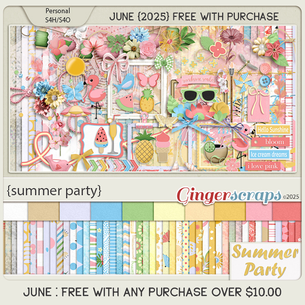
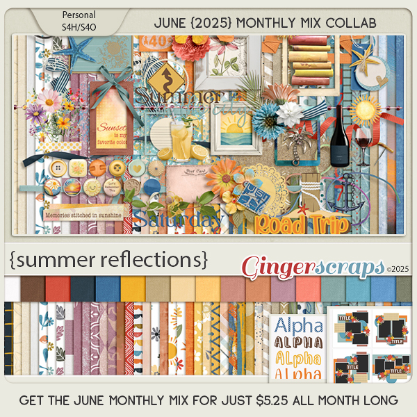
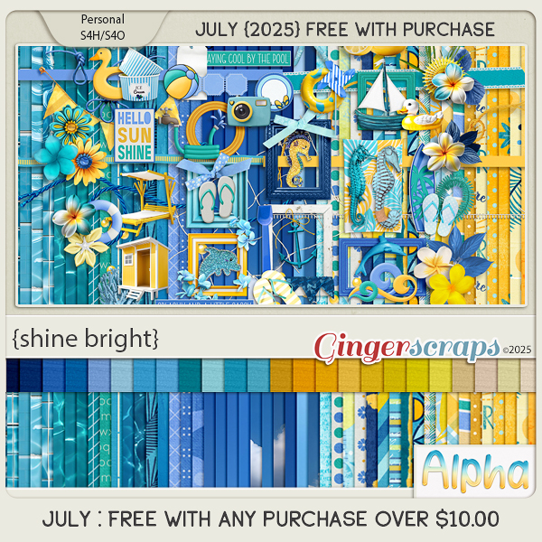
Remember if you spend $10 in the store, you get this great kit for free.
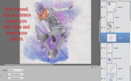
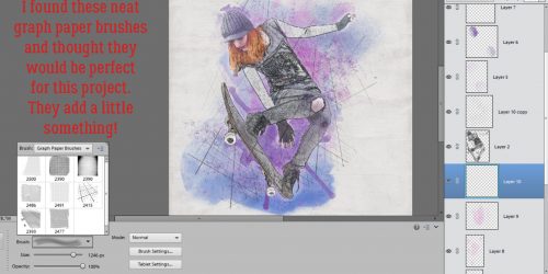
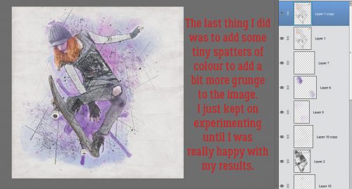
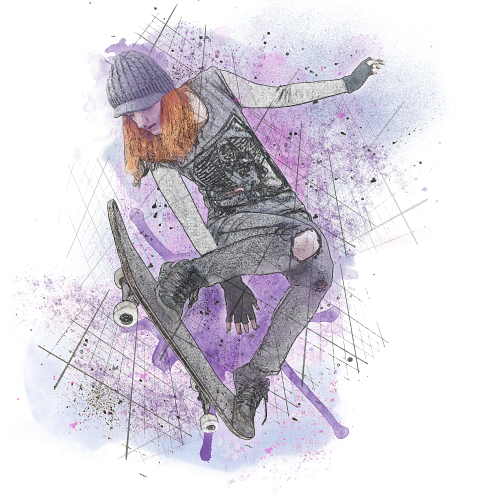
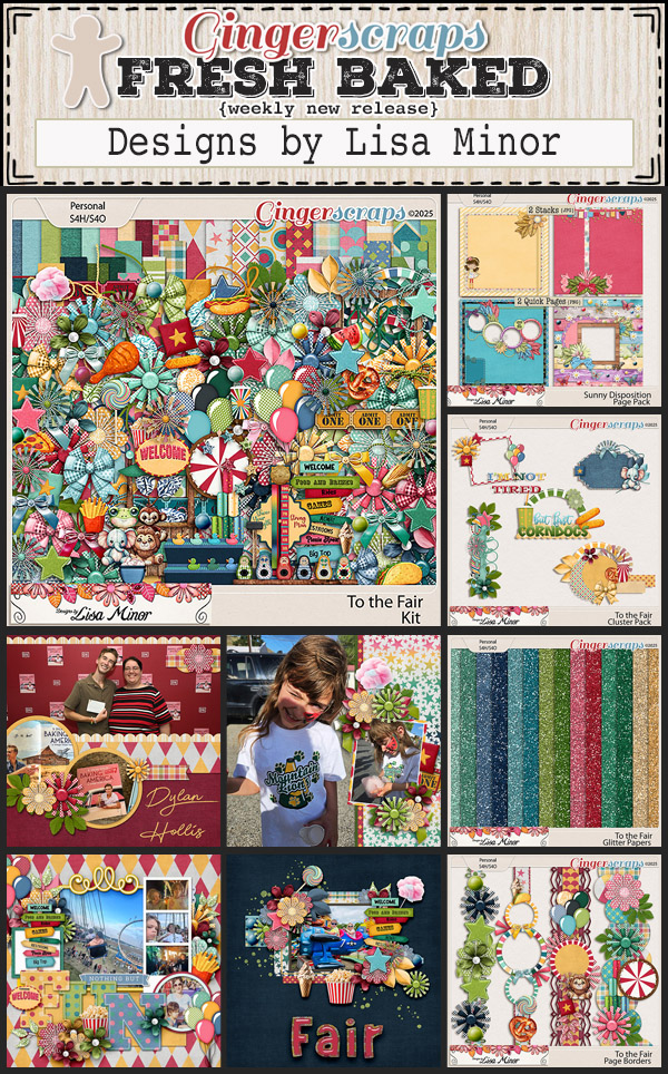
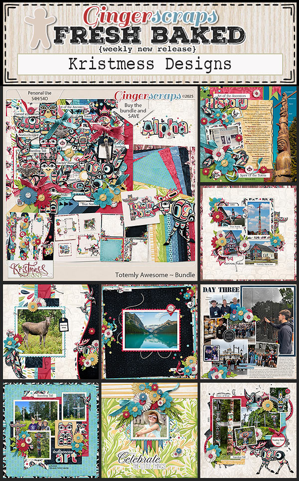
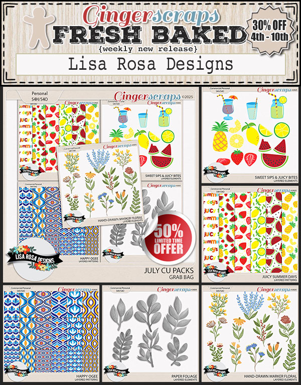
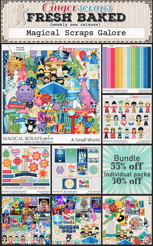
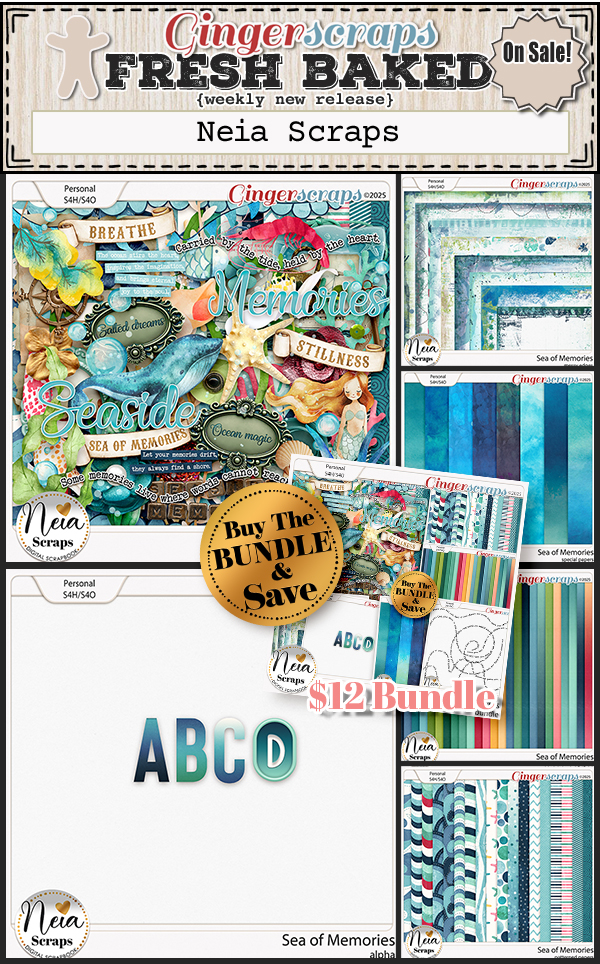
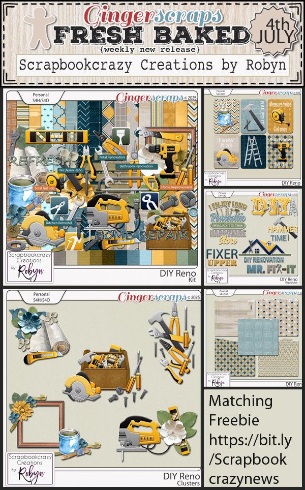
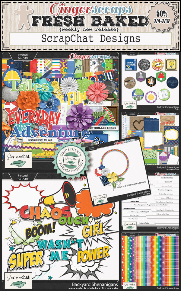
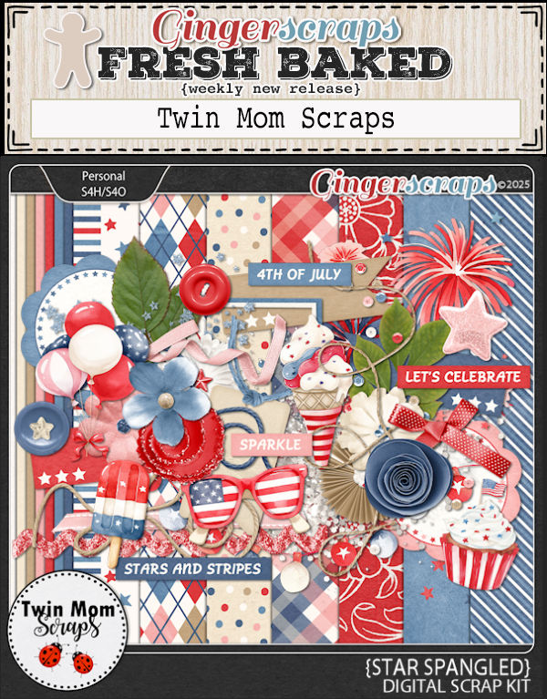
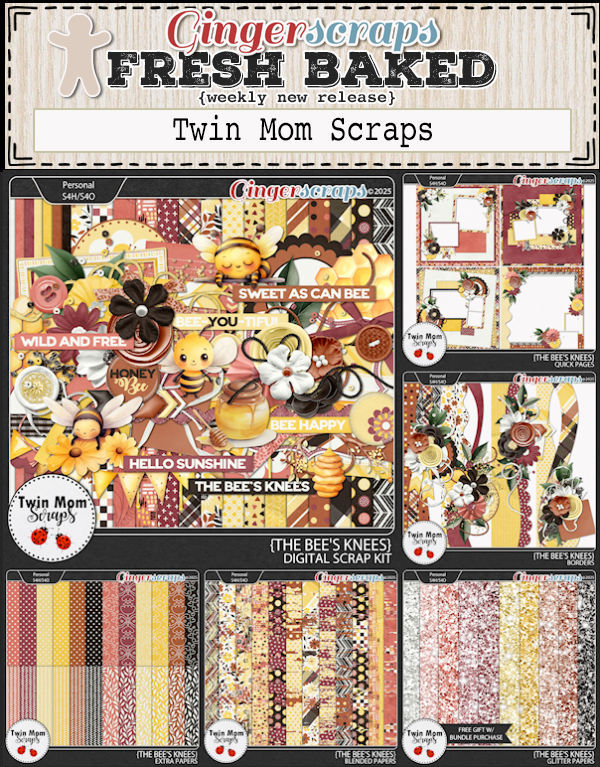
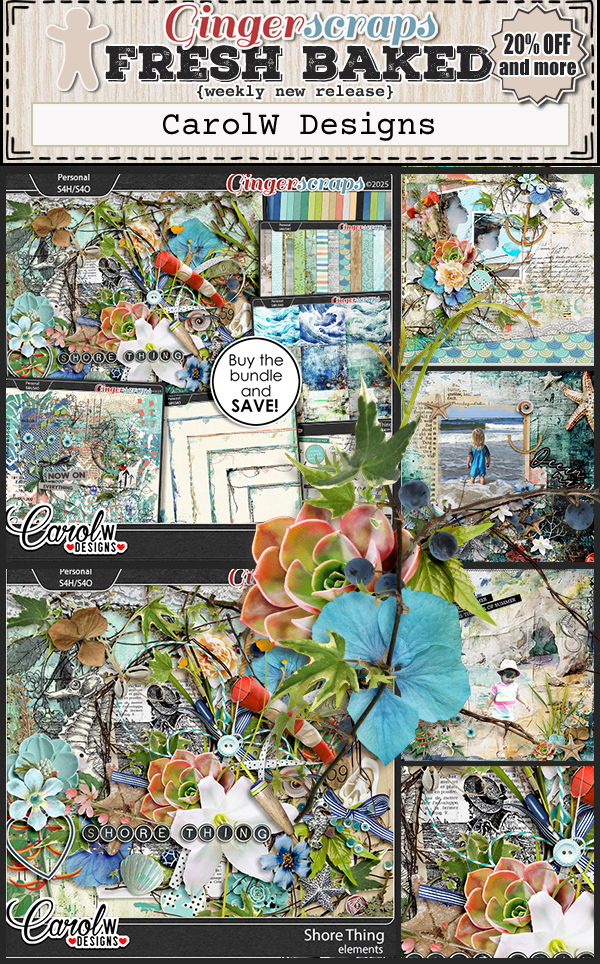
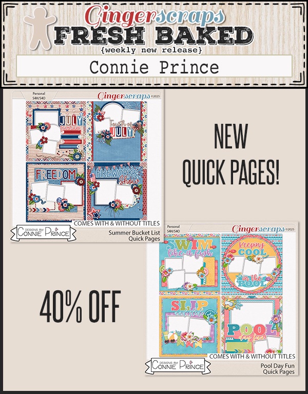
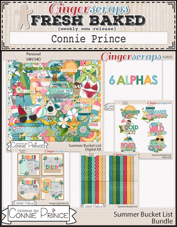
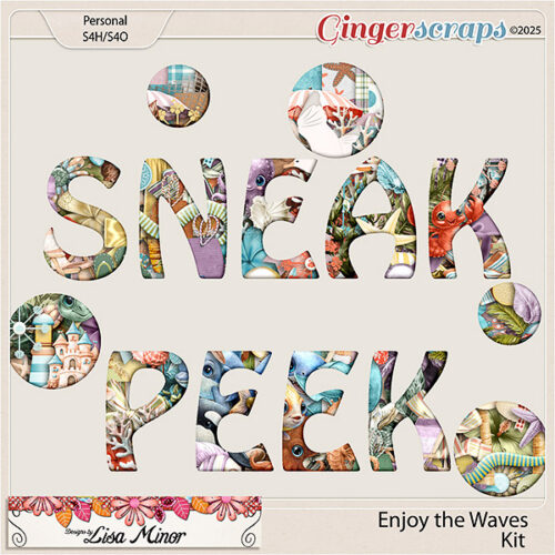
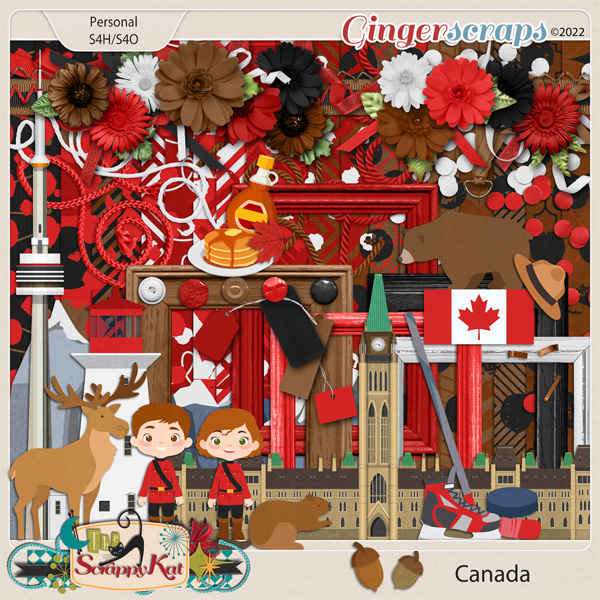
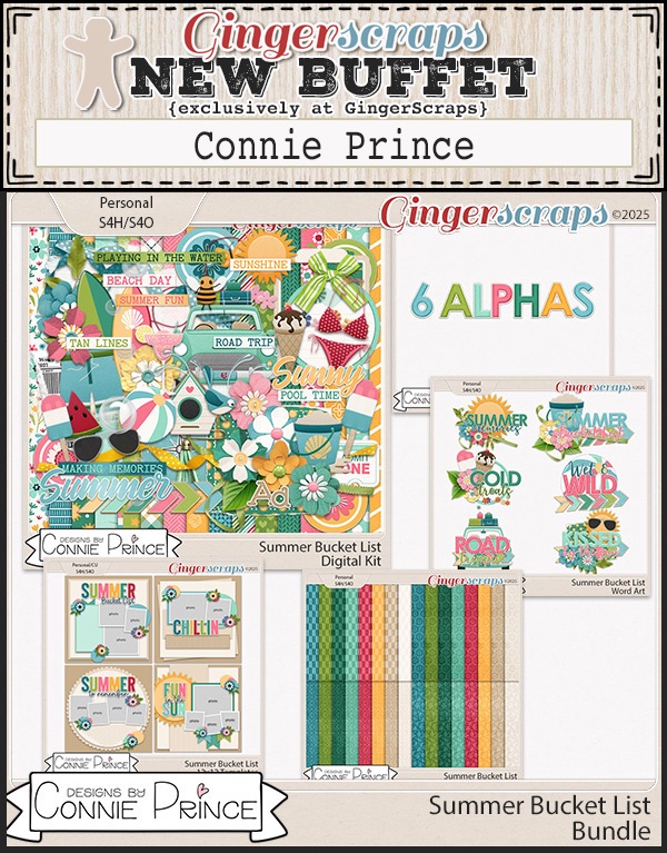
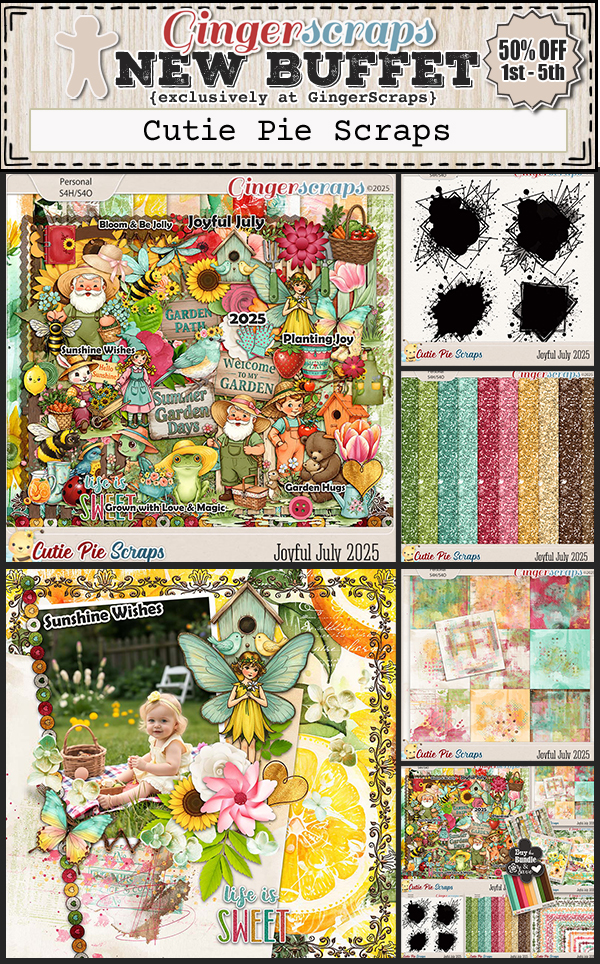
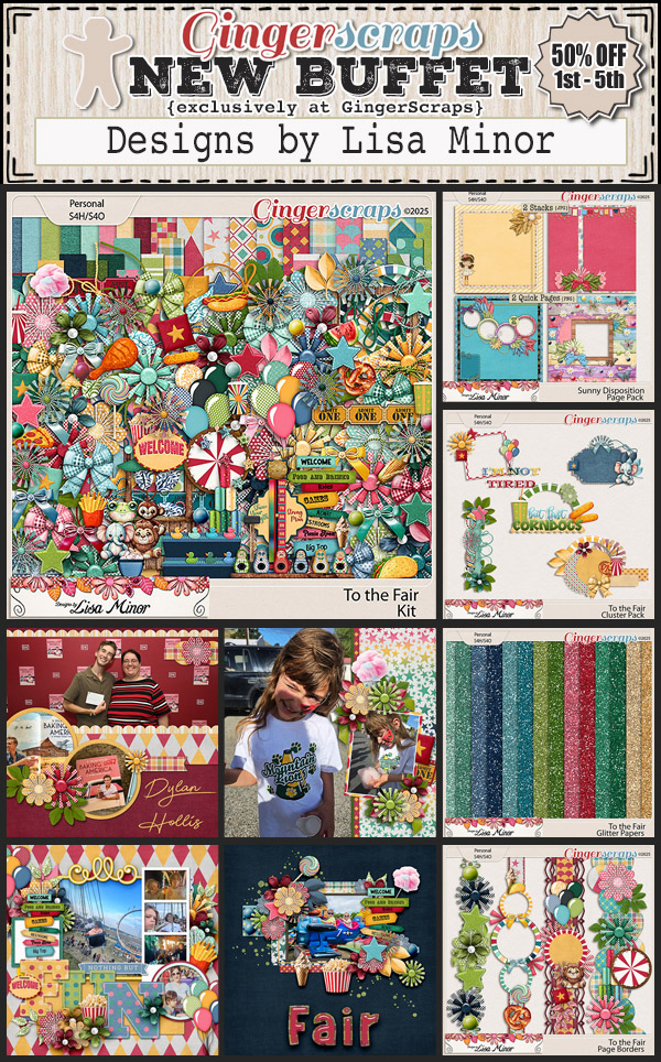
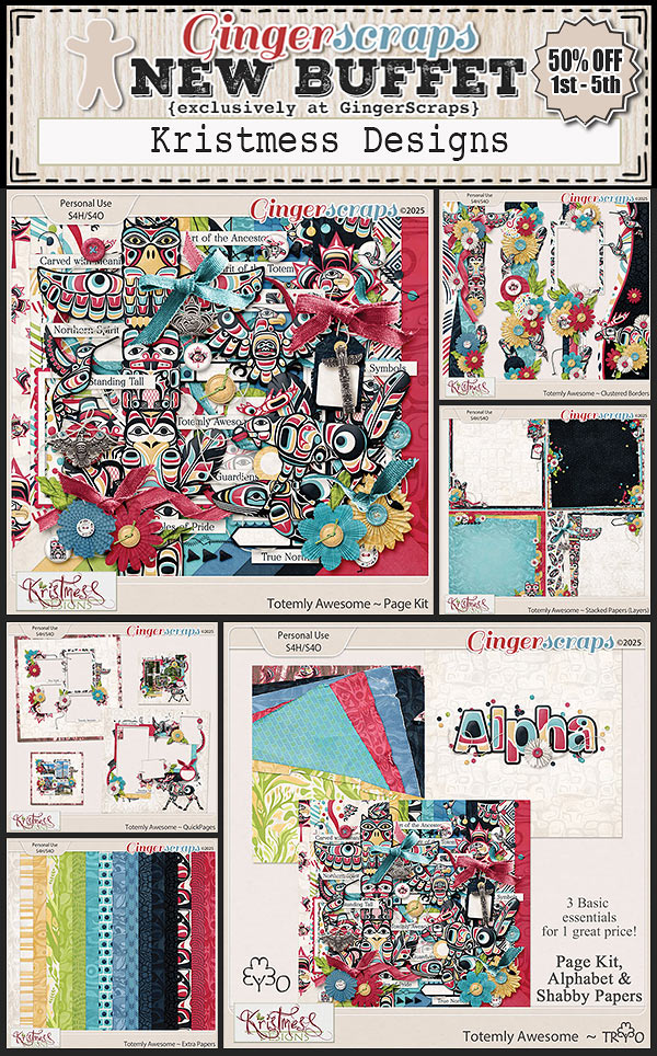
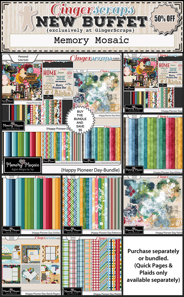
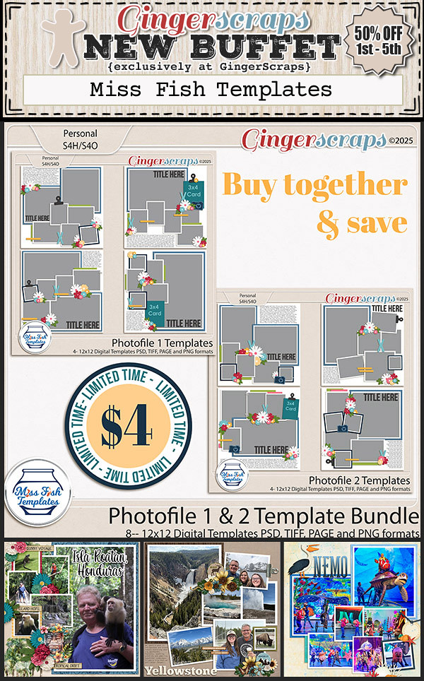
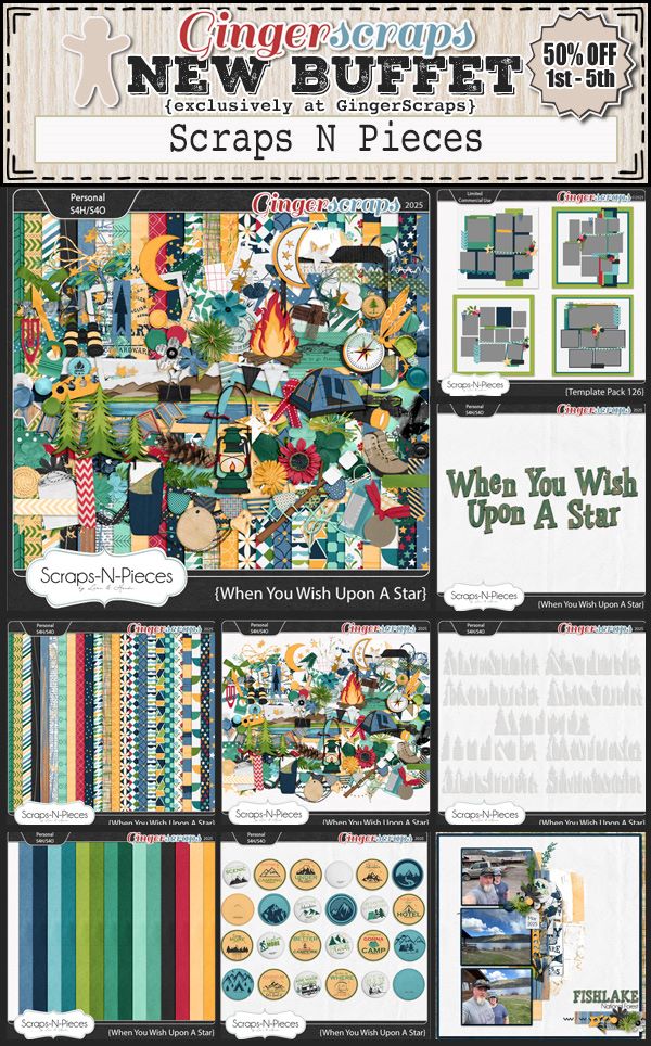
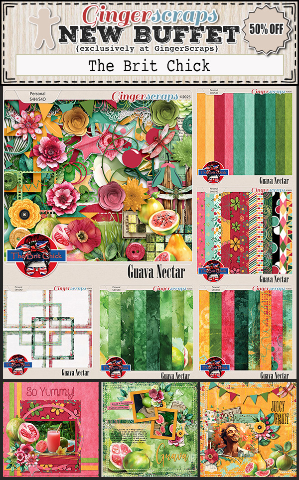
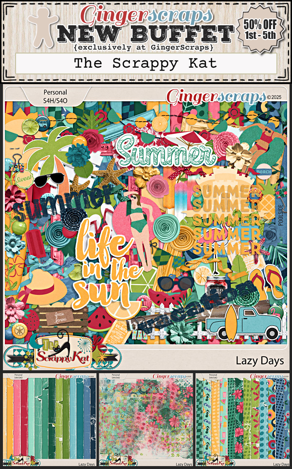
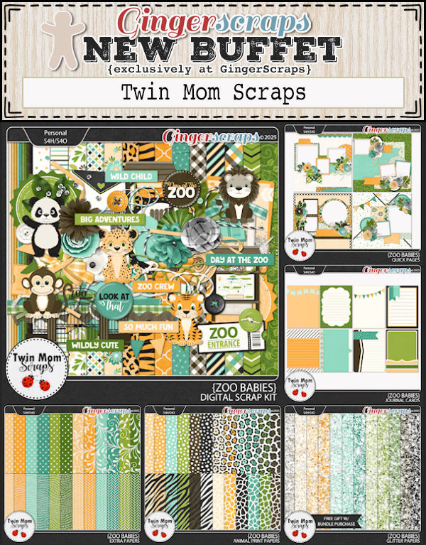
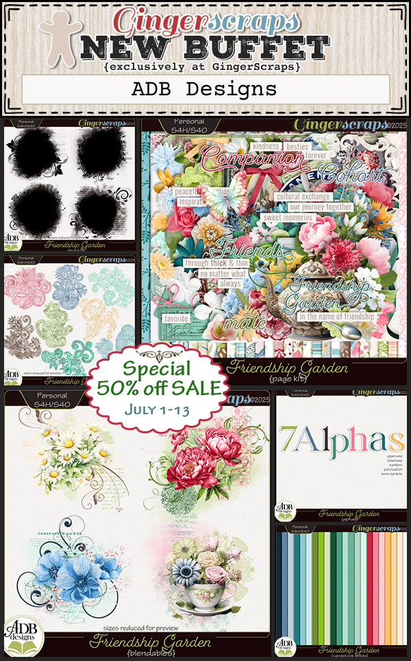
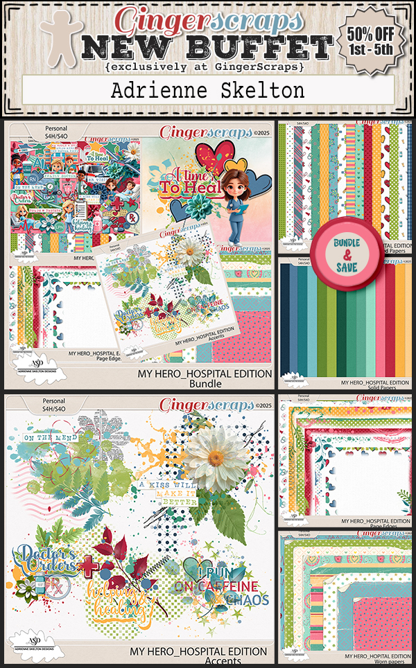
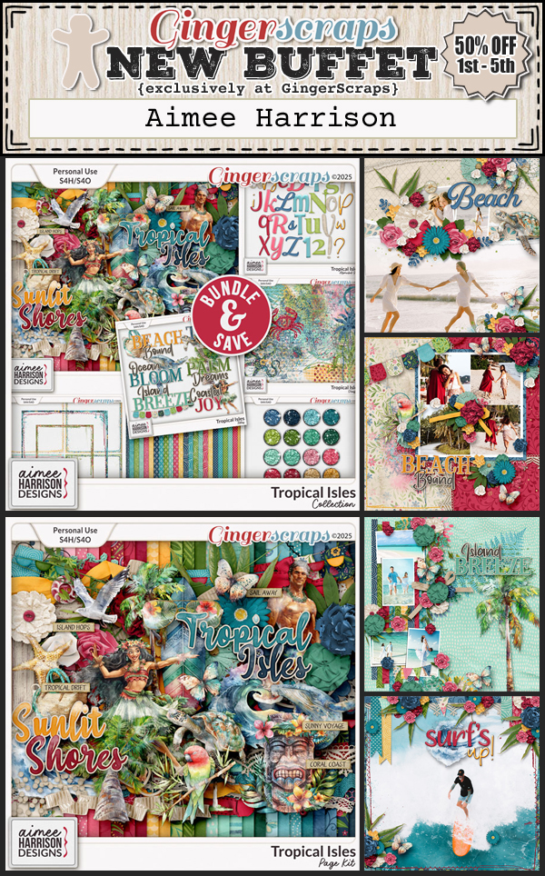
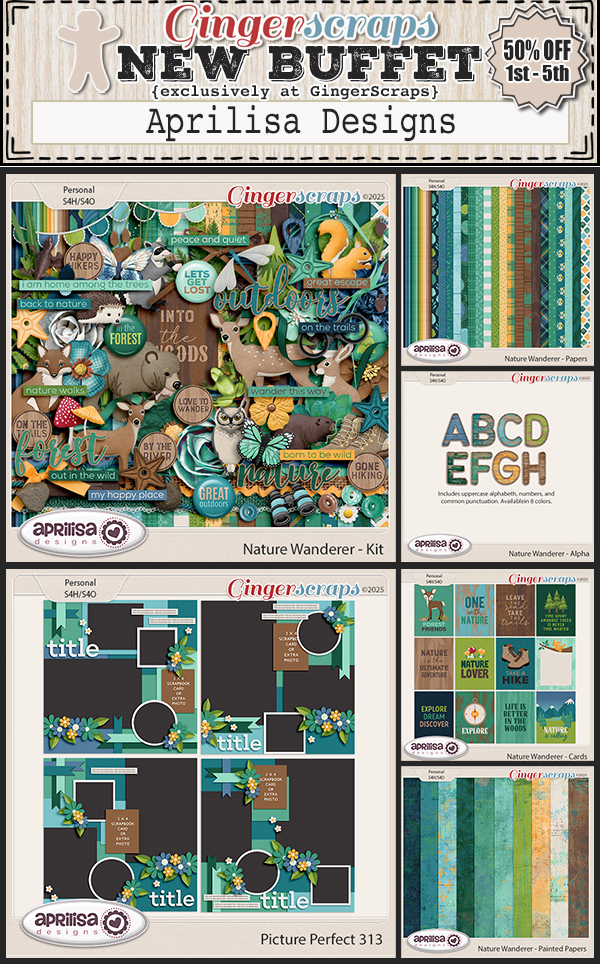
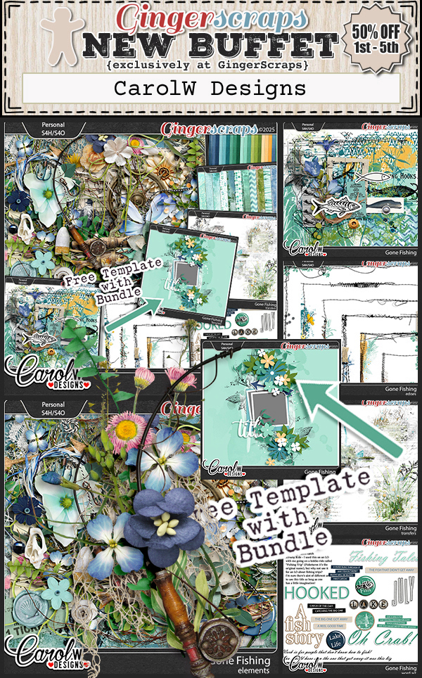
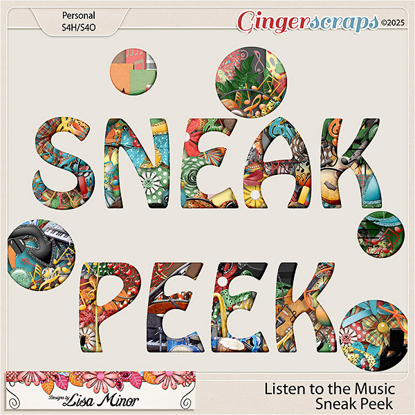
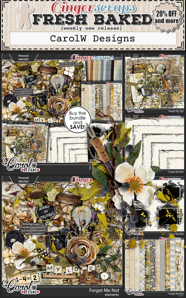
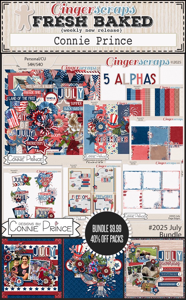
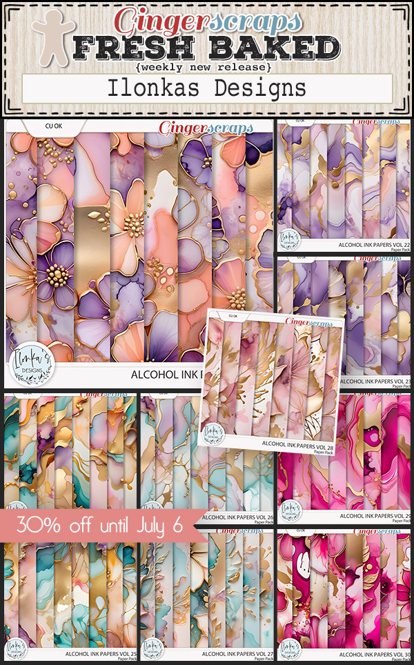
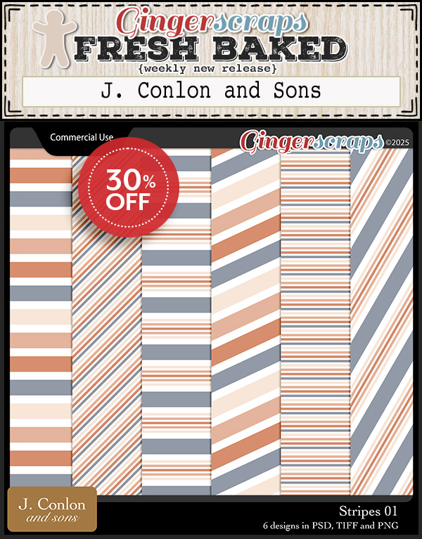
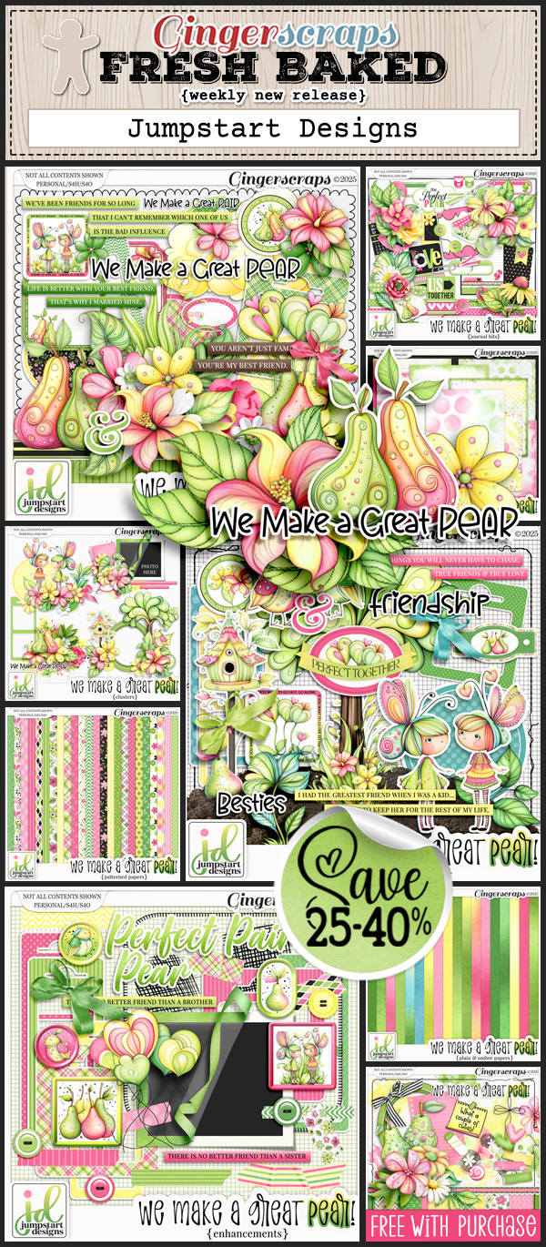
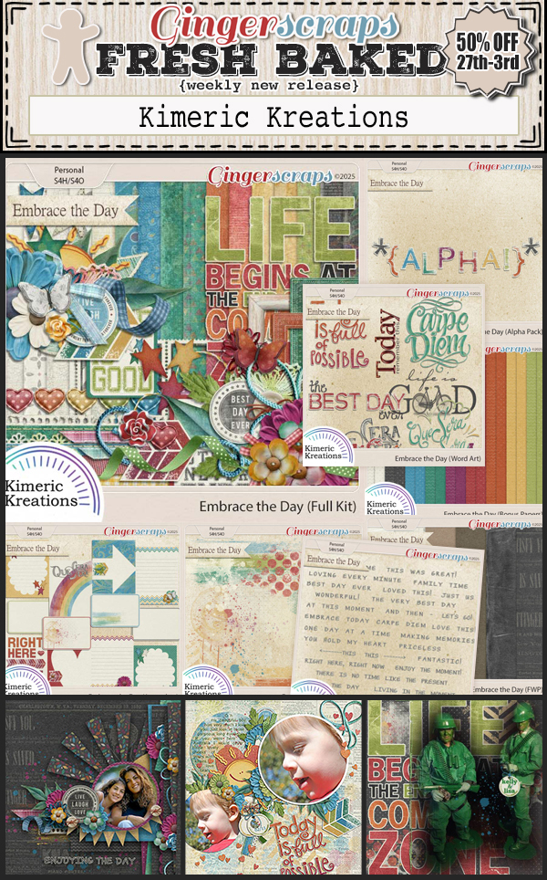
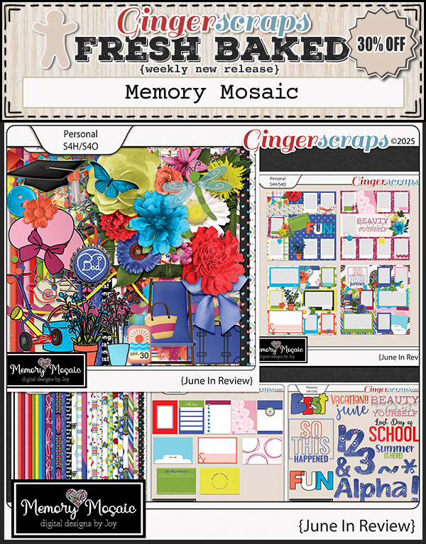
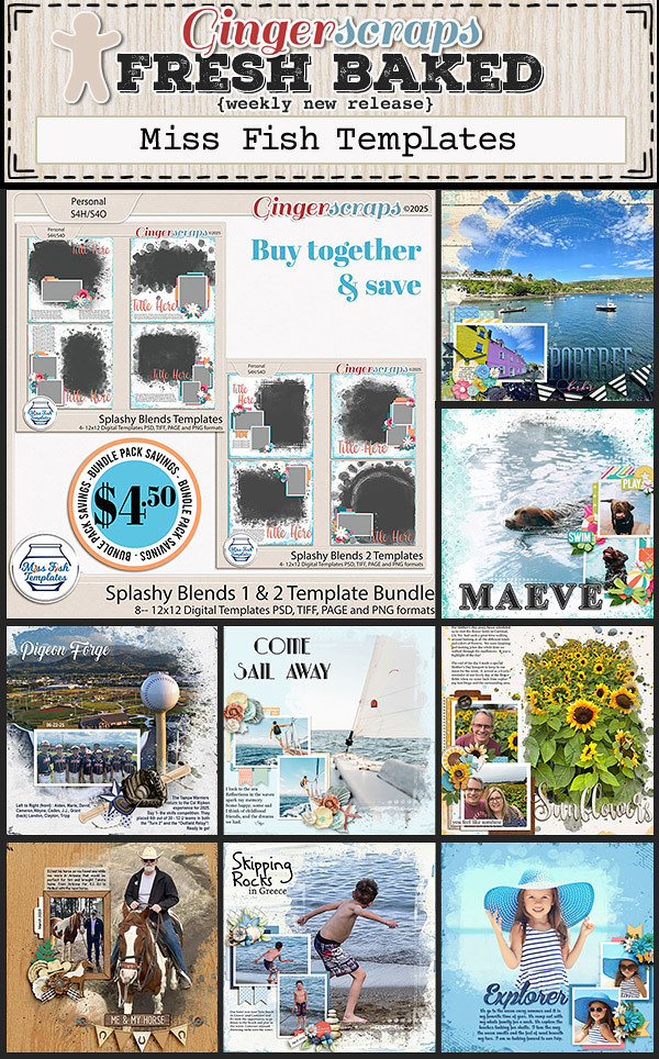
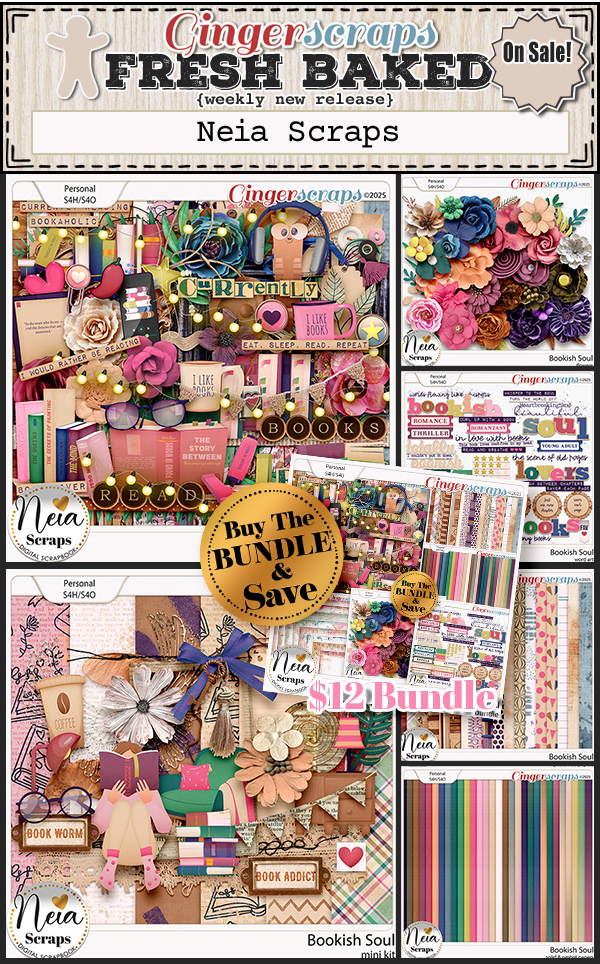
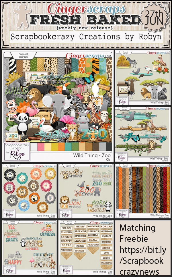
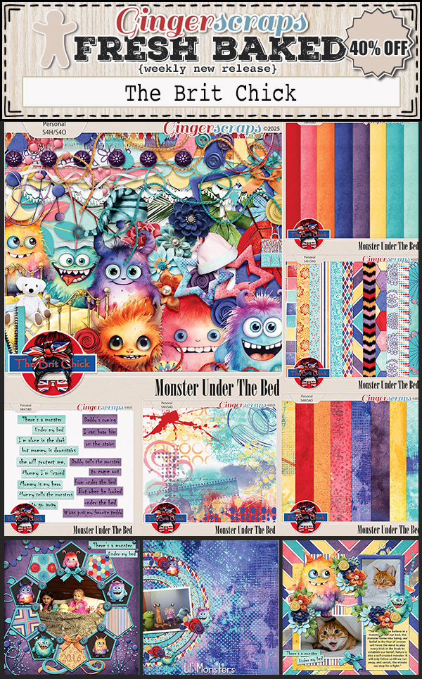
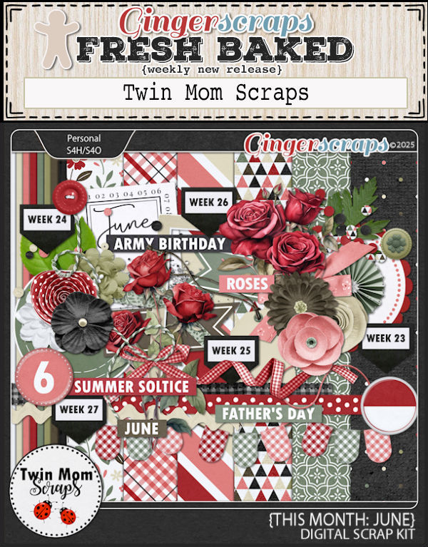
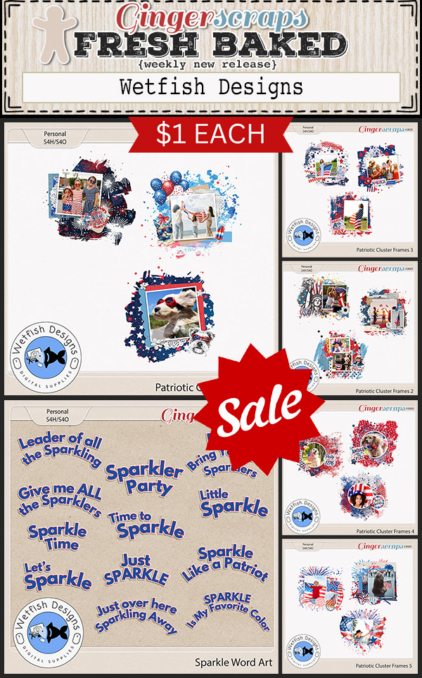
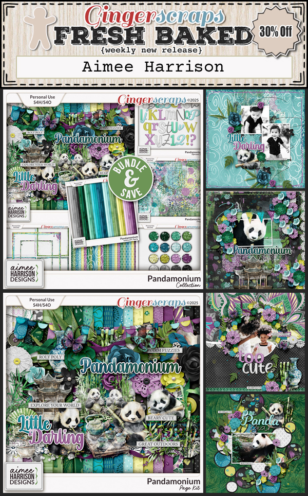
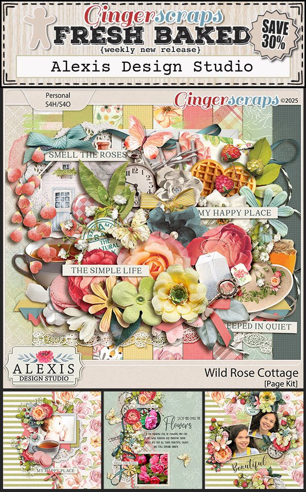
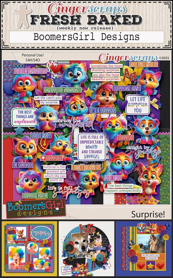
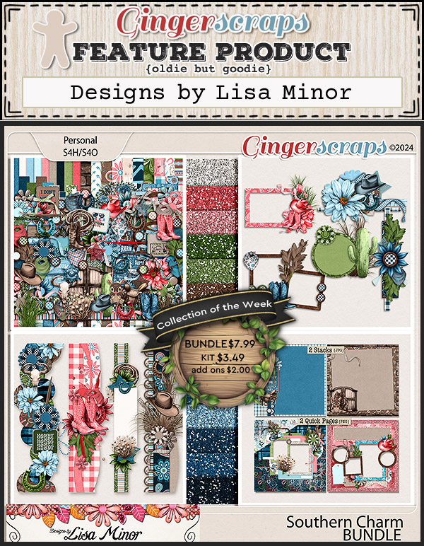
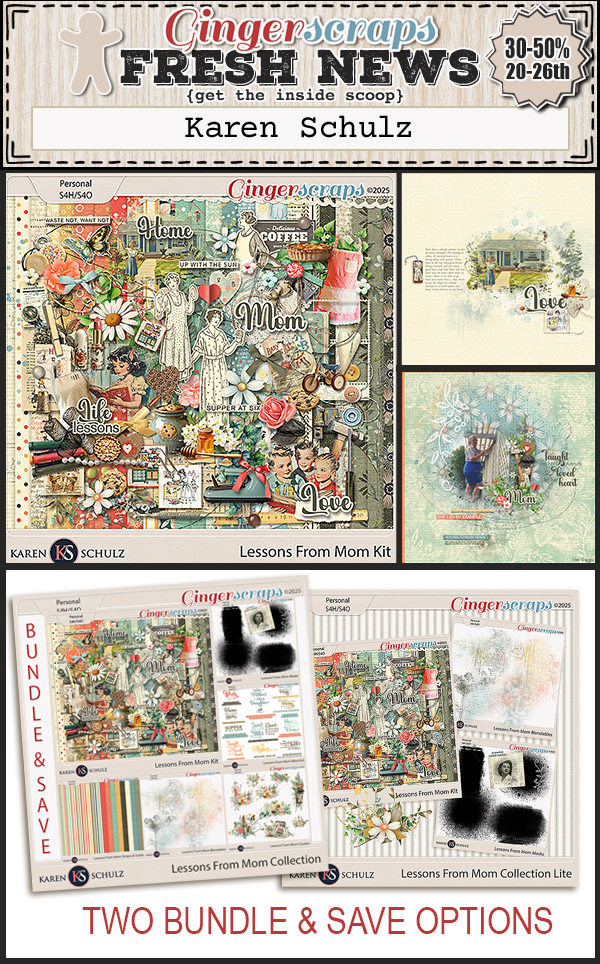
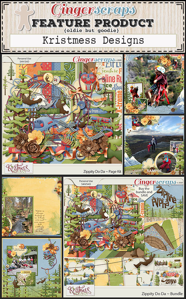
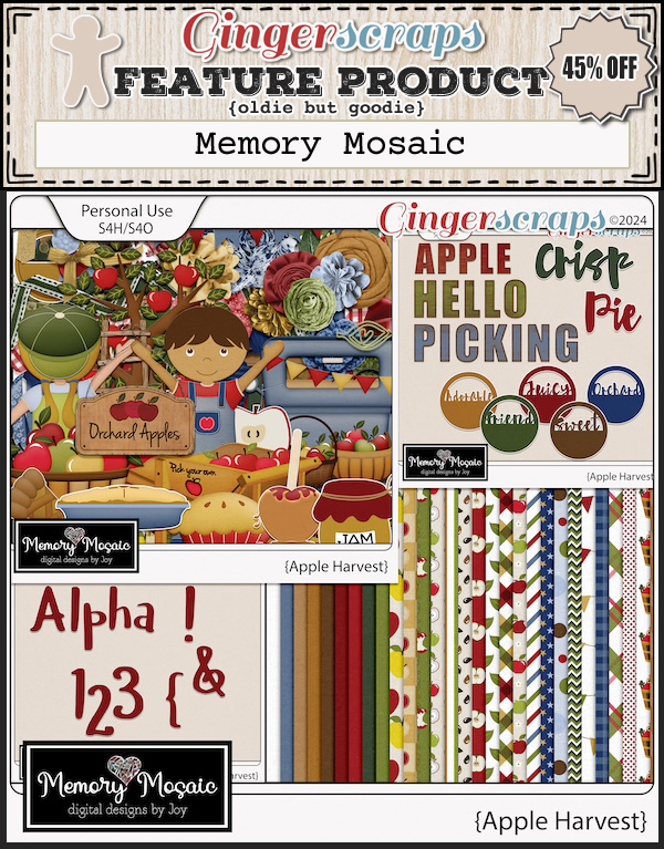
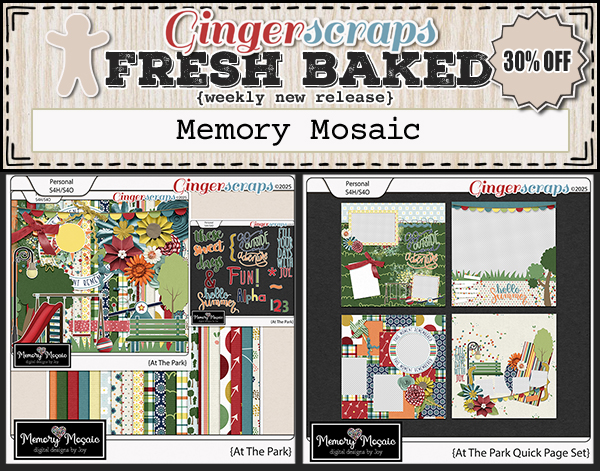
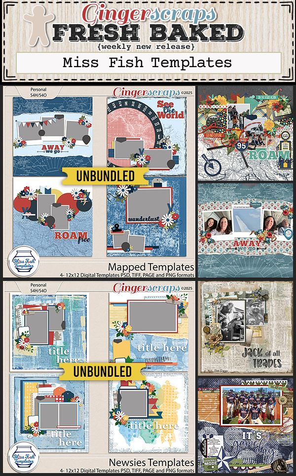
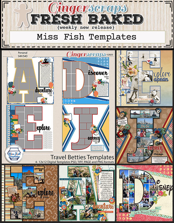
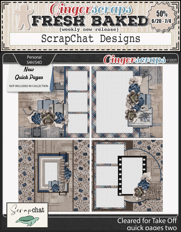
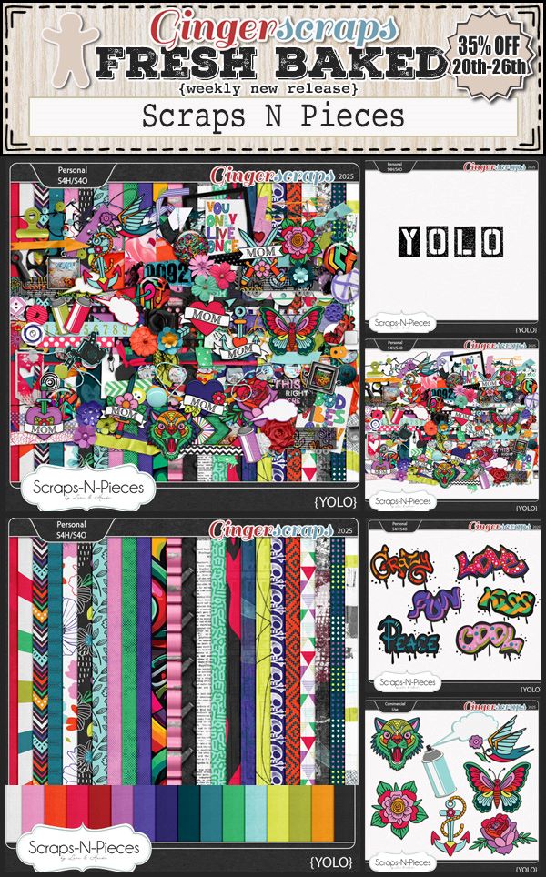
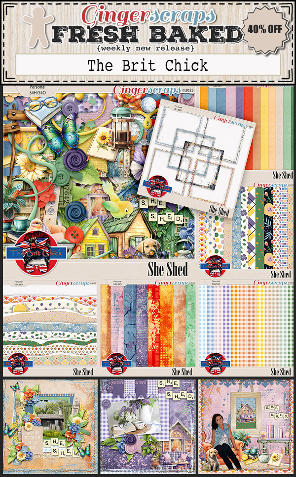
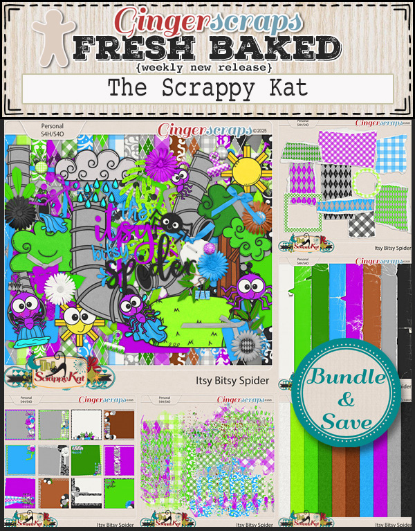
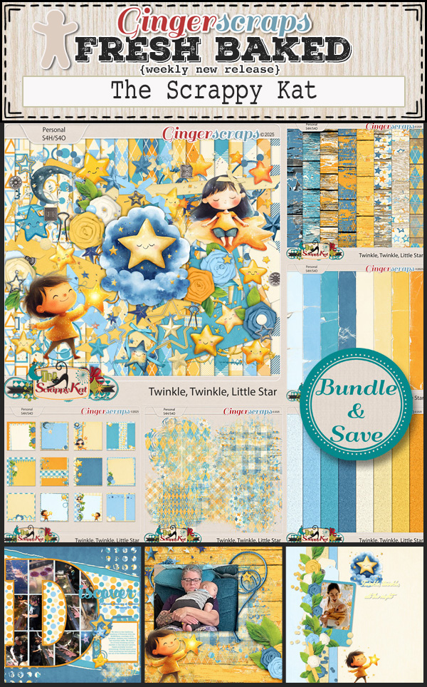
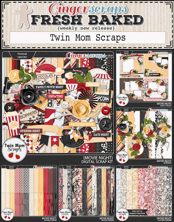
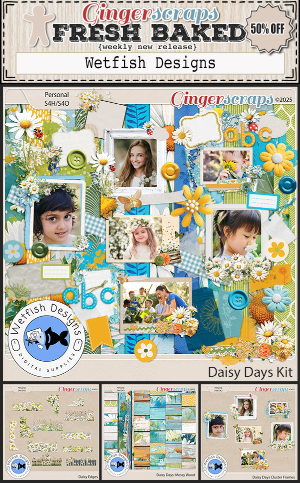
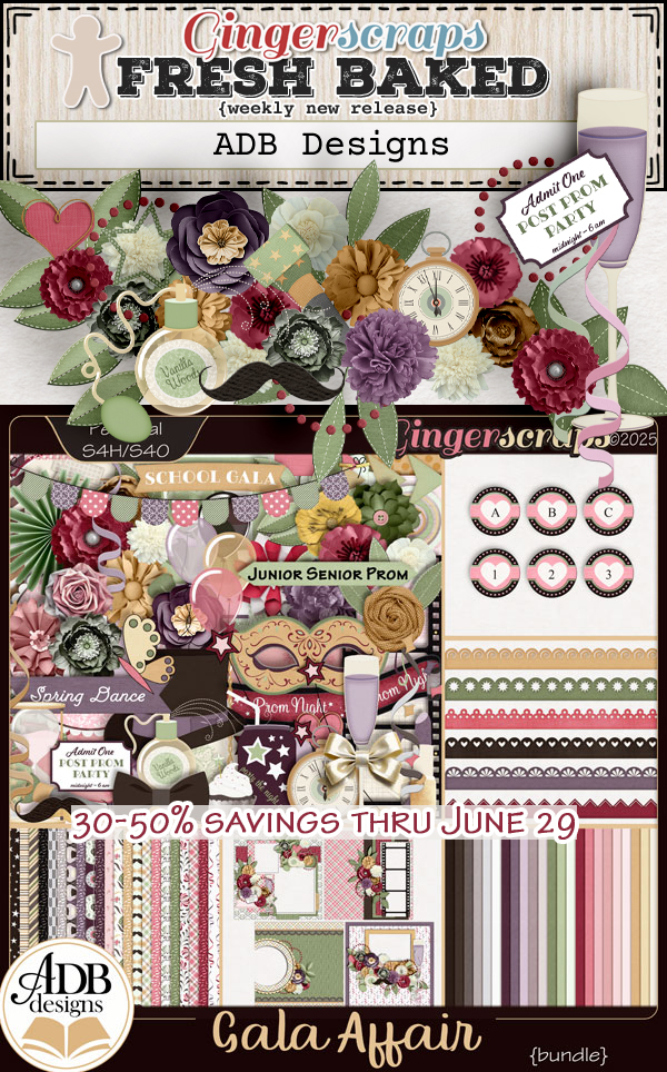
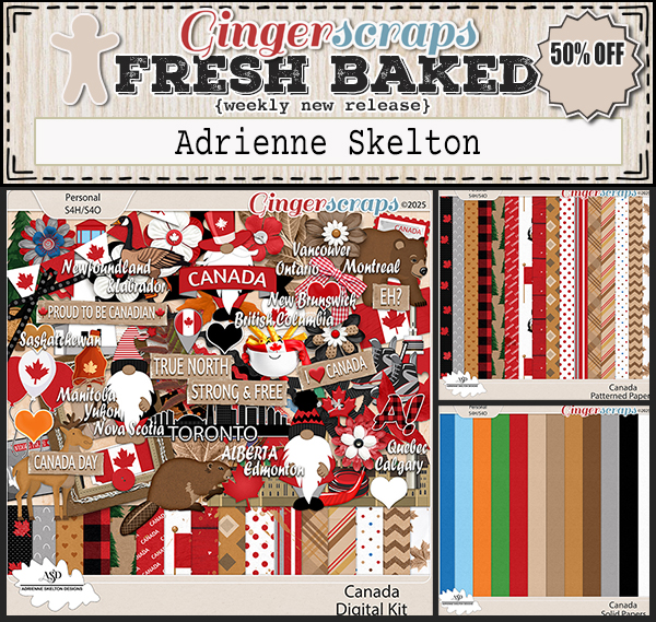
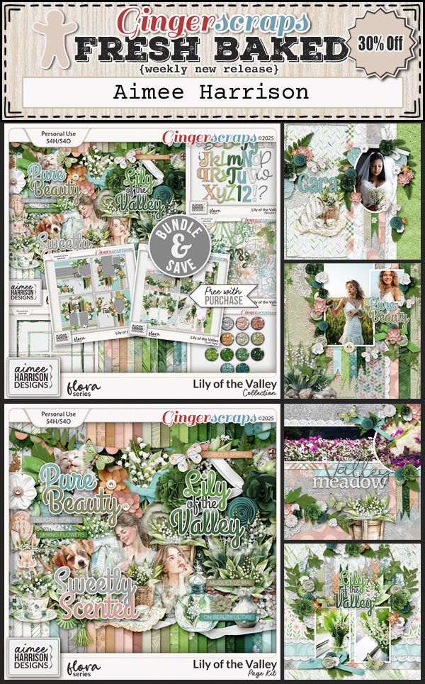
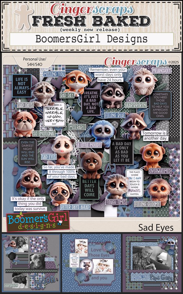
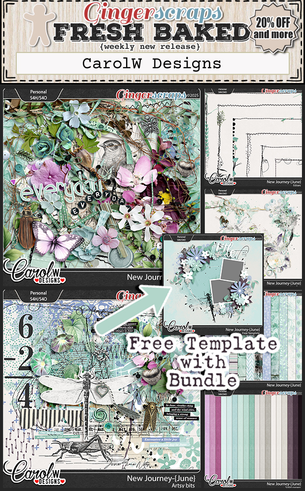
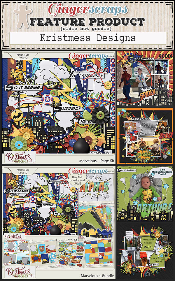
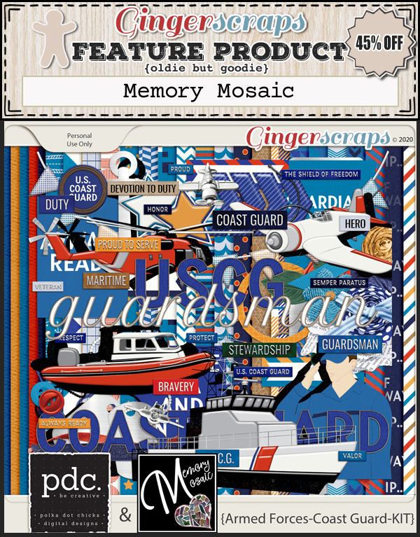
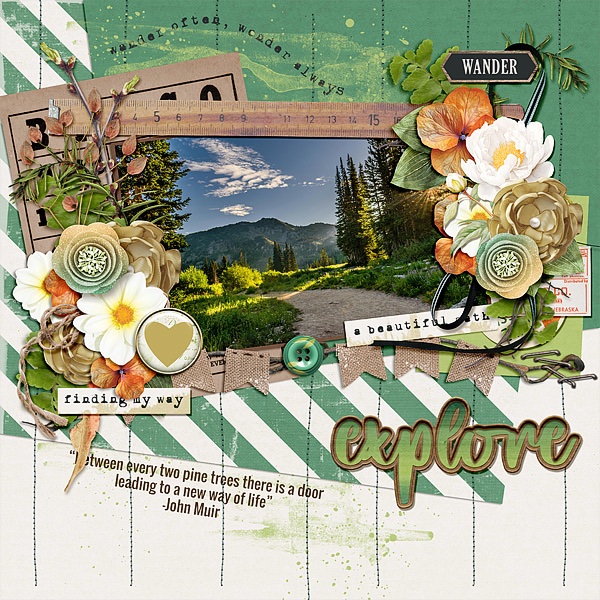
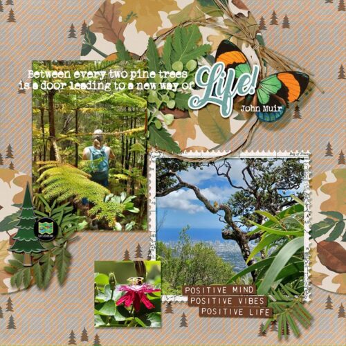
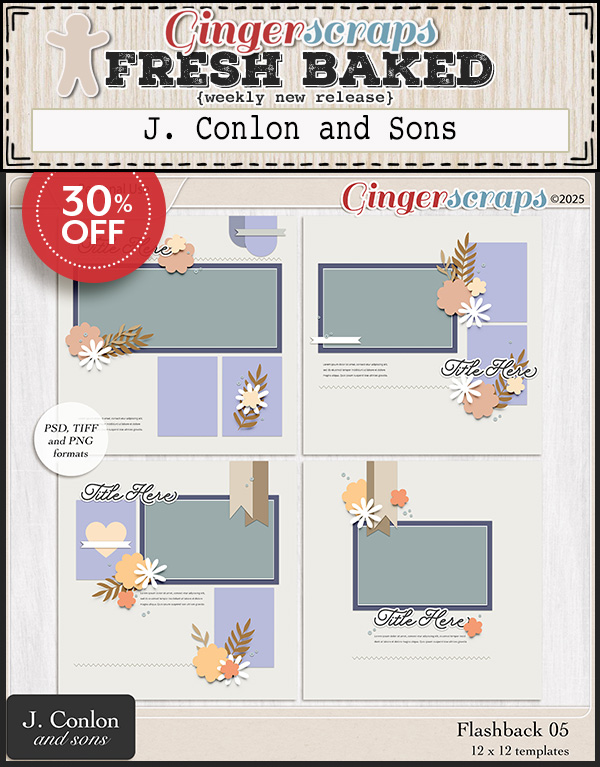
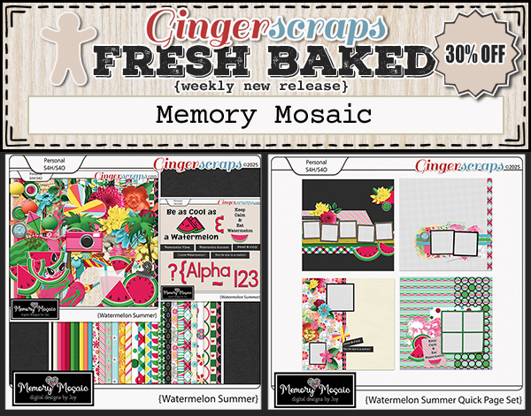
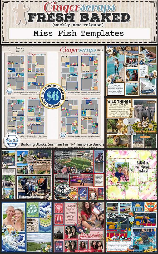
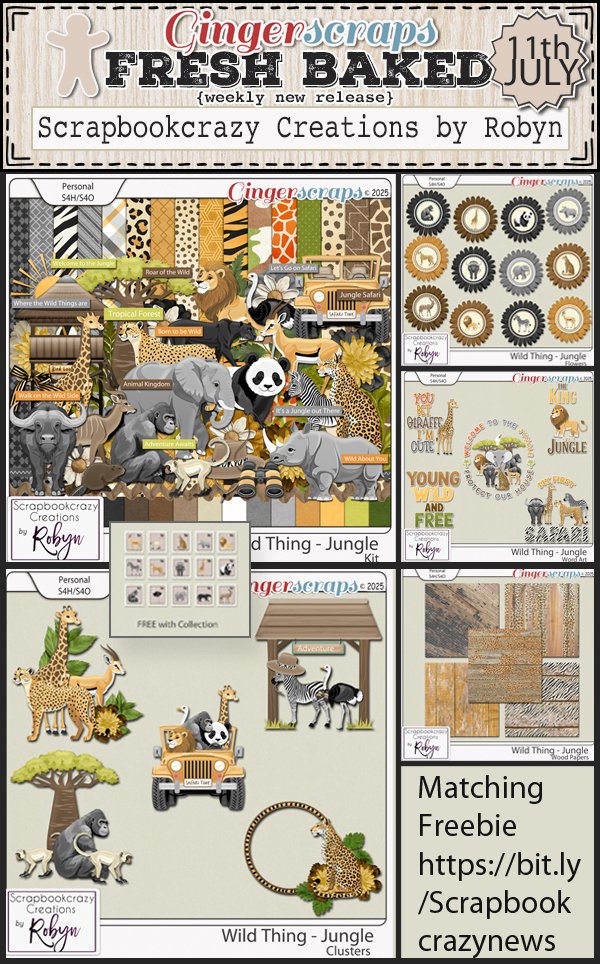
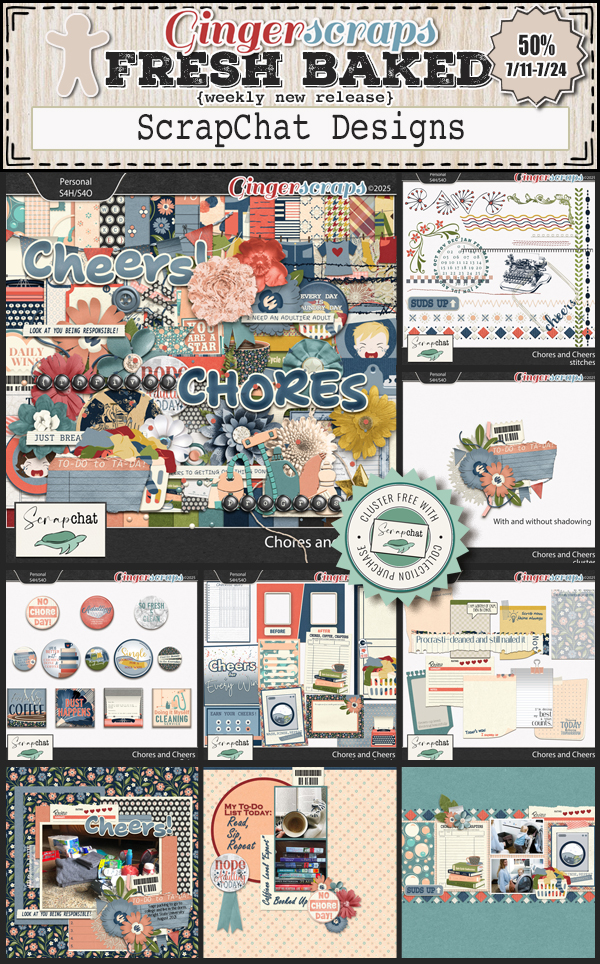
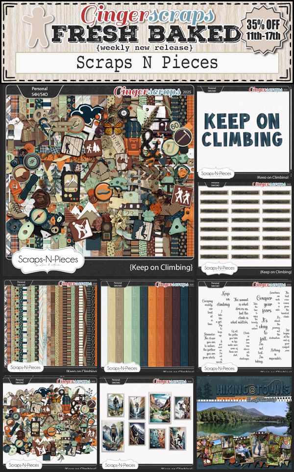
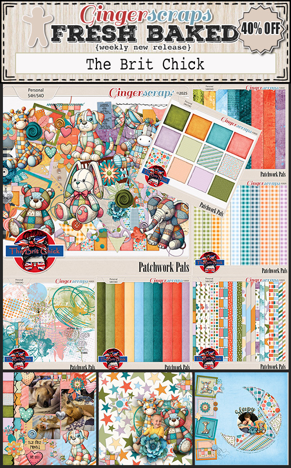
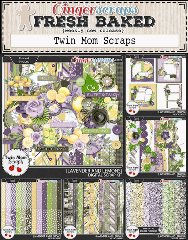
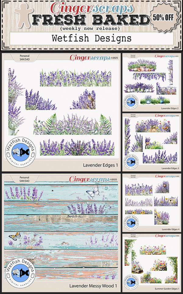
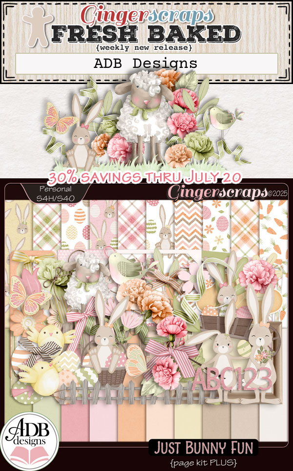
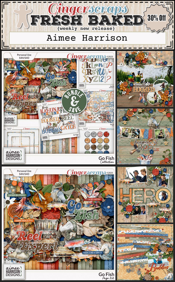
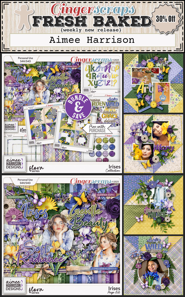
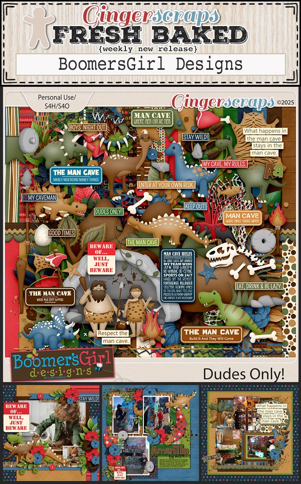
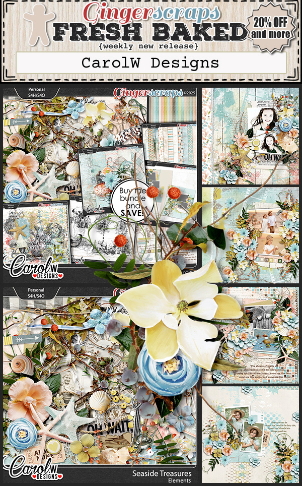
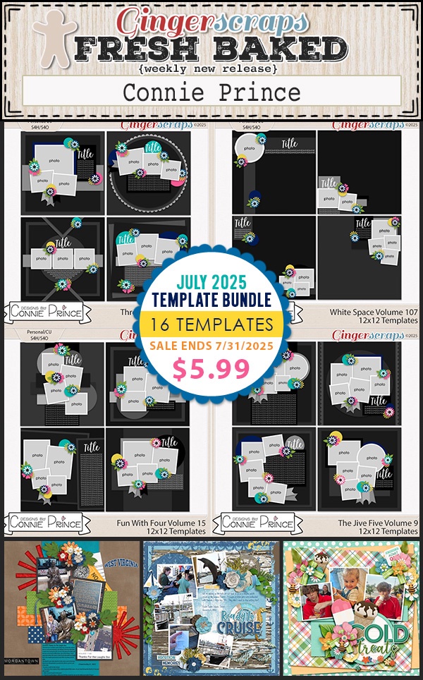
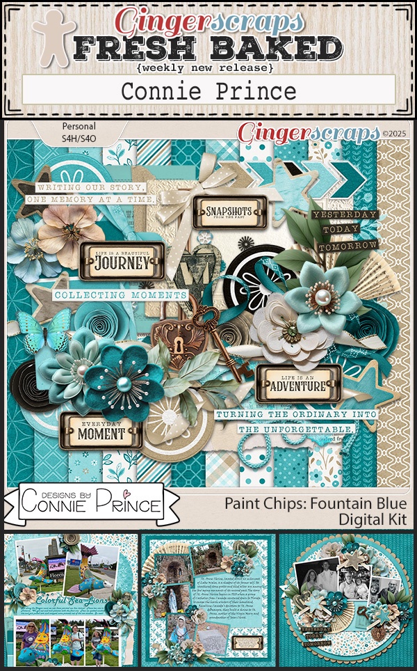
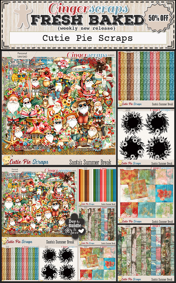
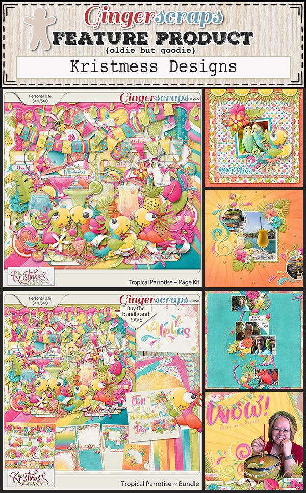
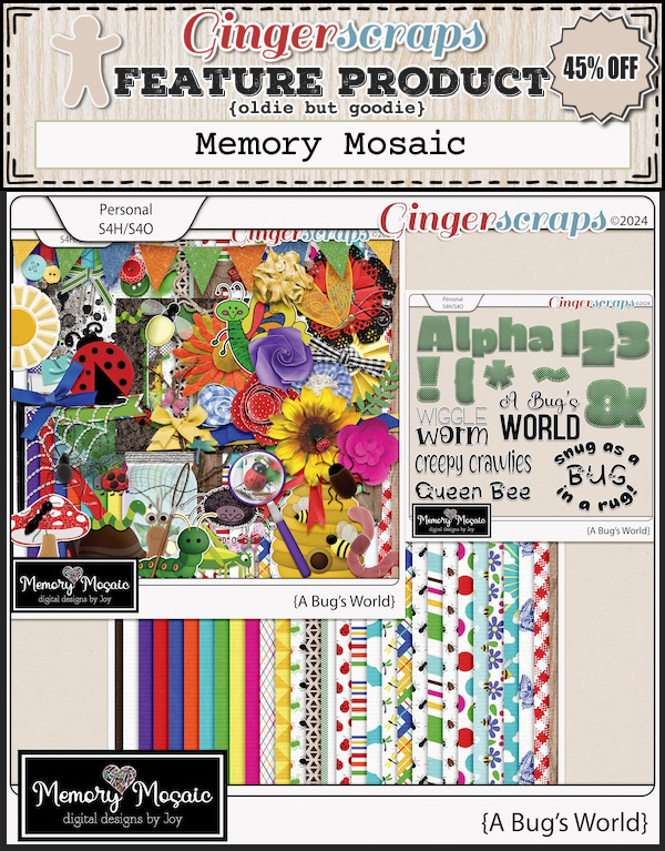
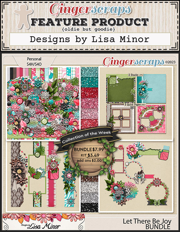
Ready for the new releases? There is a fun mix of topics this week.


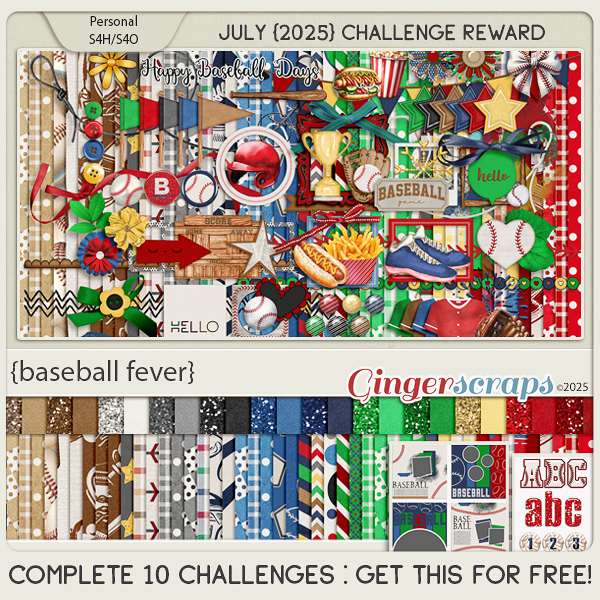
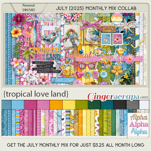
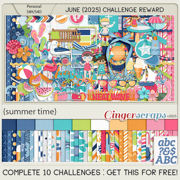
How are your challenges going? If you complete any 10 challenges this month, you get this gorgeous collab (or a variety of other choices from previous challenge collabs) as a reward!