![]()
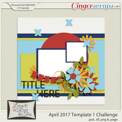
I can’t believe it’s already Bake Sale time. Goodness 2018 is flying by. Let’s see what our designers are offering up this month. Remember these kits or template packs are $1 each through July 20.

Head over to the store and grab these goodies.
![]()

Happy Thursday! I hope you have some time to scrap this weekend because you are going to love everything coming out tomorrow!! There’s so much awesomeness! Let’s take a peek!
From Heather Z


From Miss Fish


From Tinci


From Clever Monkey Graphics


From JoCee


From Ponytails


From Aimee Harrison


Come back tomorrow to see all the awesome releases!

Creating ‘Mazing Monograms
![]()
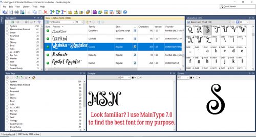
Lately I’ve been really interested in designing labels for decorative items I’m planning for my home. It’s a challenge, but it’s also a lot of fun and lets me use my creative eye, PSE skills and a little ingenuity. When my grand-daughter was born late last month, I thought I should design a monogram to use as the title of a layout introducing her to the world. I think we all know what a monogram is. But did you know there are some conventions around them?
Monograms have been used for about 2 millenia. Yep, they’ve been around since about 350BC when they began to appear on coins issued by Greek cities, identifying the coins as having come from there. They’ve also been used as signatures by artists and craftsmen, especially when trade guilds began enforcing their rules about membership and took measures against those engaging in those activities without authorization. They later were used as signatures of monarchs and noblemen to identify their holdings, their armies and their money.
Individual monograms came into use as a natural continuation of their use by Important People. They can be part of the letterhead on personal stationery, to identify one’s luggage, to fancify their handkerchiefs, shirts and ties and oh, yeah… wedding invitations! If the monogram is that of a woman, her surname initial is the central, larger one, with her first initial on the left and her middle initial on the right. For men, that convention is often ignored, and their initial are put in order of appearance in their name. Engaged couples may choose to have their two first initials entwined and newlyweds might have one member’s first initial on the left, their joint surname initial in the middle and the other member’s first initial on the left.
The example below has my grand-daughter’s initials following the first individual convention. I used MainType 7.0 (as described in the tutorial on organizing your fonts) to find the perfect font for the job. The font I ended up using is one I picked up at the FontBundles July $1 event. It’s called Quiska Regular and it’s gorgeous!
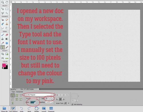
Once I’d settled on my font, I opened a new 12×12 document in PSE. I like to work large and then resize because detail is so much more visible. Then I found the font in my Type tool menu. (Keyboard shortcut is just the letter T.) I increased the size of the font to 100 pixels. And last, I changed the colour to that luscious fuchsia.
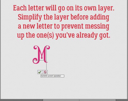
I put each of my 3 letters on their own layers. I know I’m going to want to make adjustments to one or more letters, but not necessarily all of them at once.
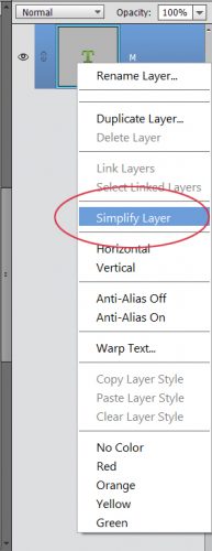
I’m not lecturing you, really… but remember to Simplify those letters as you go along. Elements has a bad habit of messing with your existing text should you decide to change fonts or colours if you don’t take that step. Once the layer is simplified you can’t change the font, but you CAN resize, recolour and play with it.
For that middle initial I changed the size of the font (just by typing in the number I want into the box I’ve circled below) to 150 pixels.
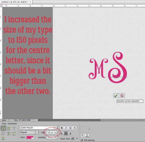
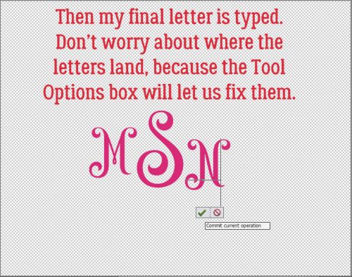
Then I went back to 100 pixels for my last letter. You’ll notice they’re randomly placed, and that doesn’t matter, because Elements has tools to fix that.
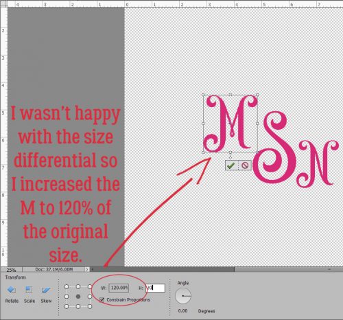
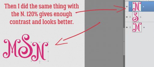
While I was playing with the letters, I didn’t like the size differential so I decided to increase the size of the smaller letters by 20%, to 120 pixels. Then it looked right!
By selecting all three layers, I could then use the Align tool to line up the horizontal centres of the letters.
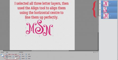
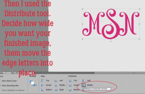
I wanted a little bit of an overlap on the letters to tie the monogram together. So I used the Distribute tool too to shift the letters based on their vertical centres.
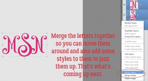
All that’s left is to Merge the layers together to make a single object. They’re already all selected; right-click on them and select Merge, or just hit CTRL/CMD>E and they’ll unite.
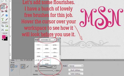
Those of you who read my tripe weekly will know that I wasn’t serious when I said I was done. I decided to add some flourishes to my monogram. I love brushes and have quite a collection of them that I’ve often downloaded free from Brusheezy.com. The one I opted to use here is part of a collection called 20 Dividers V2. Did you know that if you hover the cursor over your workspace you’ll get a preview of the brush just like I’ve shown you below? You’ll know what it looks like and can then adjust your size and angle before you even use your brush.
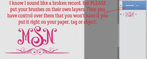
I know I sound like a broken record. Good habits are important to streamline your workflow and prevent oopses. If you put your brushes on their own layers, you have total control over them. If you put them right on your paper, you can’t do anything with them – can’t change their colour (easily) or opacity, increase or decrease the size, apply a style, copy them or any other tweak you might decide is needed. So just put them on their own layers!
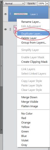
For balance I want a second flourish; duplicating the layer is the easiest way to ensure they’re identical. Either right-click on the layer and select Duplicate, then click OK in the pop-up menu or simply CTRL/CMD>J to copy it.
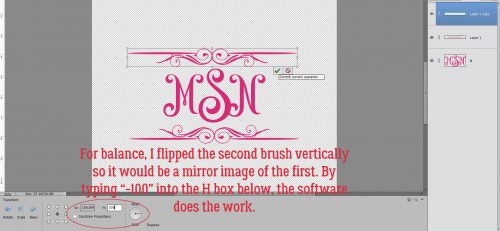
Then I flipped the second brush vertically so the two brush layers are mirror images. The easiest way to do that is to grab one of the middle handles on the bounding box then drag the handle in the direction you want the flip to go. (Either horizontally or vertically.) Don’t obsess over dragging it to exactly the same size, because you can simply type -100 into the corresponding box in the tool options below. Then the software does all the work. WSNH!!
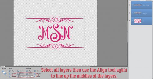
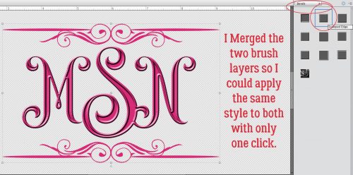
Again, let the software do the work to Align all the layers again. I opted to then select the two brush layers and shrink them somewhat so they were closer to the same scale as the monogram. Then I Merged the brush layers into one.
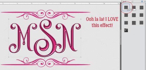
I might be done… but then again, I might not be done! Let’s see what we can do to really make this monogram pop. I’m going to use a Bevel Style.
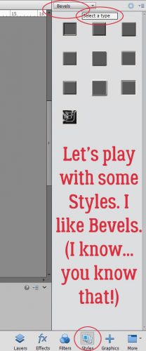
I have the letters layer selected and used the Inner Ridge Bevel. It looks like enamel and I love it!
Then I selected my brush layer and hit it with the Scalloped Edge Bevel just to give it a bit more weight and dimension.
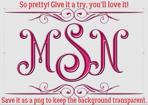
Isn’t that amazing?! And so simple!! I saved it as a png file so I can use it as the title for my layout when the time comes. Keep your eye out for it in the Gallery!
I’m departing tomorrow (July 11/18) for a two-week genealogical expedition to Ireland. So there won’t be a tutorial next Tuesday or the Tuesday after. If I’m not totally whipped when I get home again, there MAY be one ready for the 31st. Think about what I can teach you next. Sláinte!!
![]()
Happy Thursday!!! I hope everyone had a wonderful 4th of July and the fireworks didn’t keep you up too late! Our designers have lots of goodies ready for tomorrow! Let’s check them out!
From Ponytails


From Lindsay Jane


From Tinci


From JoCee


From CathyK


From Miss Fish


From Luv Ewe


From Aimee Harrison


Have a great weekend!
Like a Broken Record
![]()
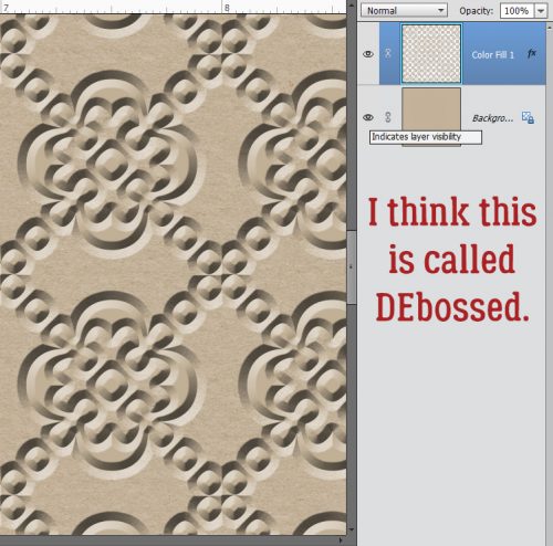
I was fooling around with a thought I had to see how it would look and a tutorial was born! I love papers with a small pattern repeat and I adore embossed cardstock. But I can’t always find what I want when I want it, so I decided to give creating my own a try. It’s so simple!! (But let’s not put our awesome designers out of work, ‘k?)
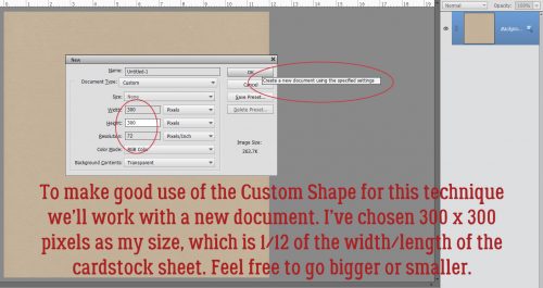
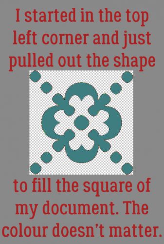
I started out with a plain Kraft-coloured cardstock from Scraps N Pieces‘ Oh Canada… Eh! collection. Then I opened a new document (CTRL/CMD>N). I knew I was going to use something that would resemble a tile effect and chose to work on a 300 x 300 pixel square canvas. Our 12 x 12 inch layouts are 3600 x 3600 pixels, so this size will be 1/12th of the length/width of the overall cardstock.
I opened up the Custom Shape Tool menu then chose All Elements to see every shape available.
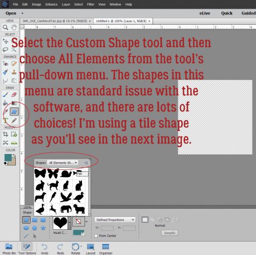
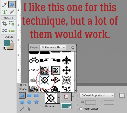
I played with more than one of these shapes before I settled on this one.
I put my cursor at the upper left corner and pulled the shape diagonally across my square canvas to completely fill it. The colour I used isn’t important because I’m going to change it later. I wanted something I could see easily.
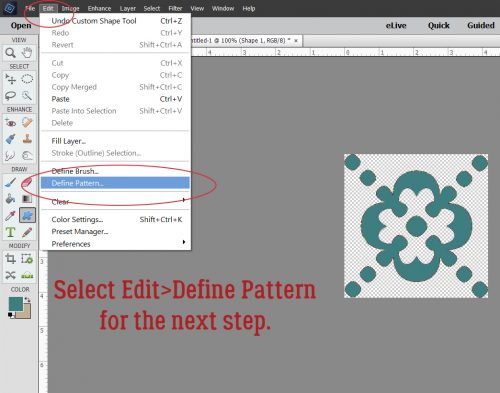
Then I clicked Edit>Define Pattern. This is going to allow me to use this little doodad as a repeating pattern on my paper.
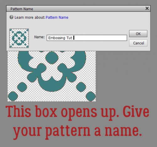
The Pattern Name menu opens up. I gave it a name that meant something to me and would be easy to find later. There’s a clue in there as to where we’re going to end up.
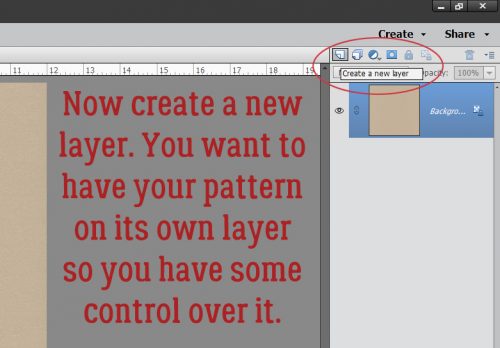
If you’re familiar with my tutorials you’ll know I always tell you to work on a separate layer when using brushes. It goes double for patterns!
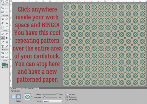
You may have noticed that many of the Tools in Photoshop Elements have multiple options. The Paint Bucket has one I’d never used before but now that I know what it does, I’m SOLD! With this versatile tool you can fill an area with colour or……. a pattern!
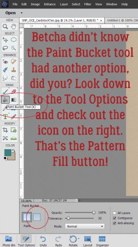
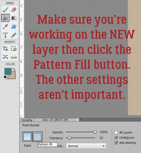
Make very sure you’re working on the new, blank layer. Click on the Pattern Fill button, the one that looks like a square with a bunch of diagonal lines through it.
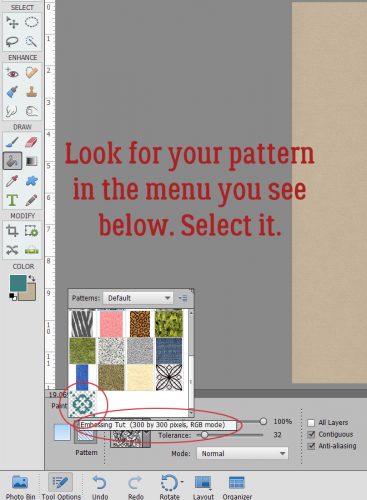
When the Pattern Menu opens up look for your new pattern.
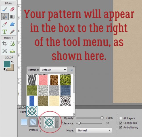
Elements will open up your pattern in the active box as shown.
Now just click anywhere within the borders of your canvas. It’s like magic!! I have 144 little repeats of my pattern creating an Argyle effect. I could stop here and have a cute custom patterned paper. I’d love to do something like this with a tone-on-tone, or with either white or black. Then I’d Merge the layers and save it somewhere I’ll be able to find it again.
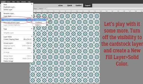
But you know me… we’re going to keep going. I want to show you how to turn it into embossed cardstock, so turn off the visibility to your cardstock layer and have your pattern layer selected. Then Layer>New Fill Layer>Solid Color.
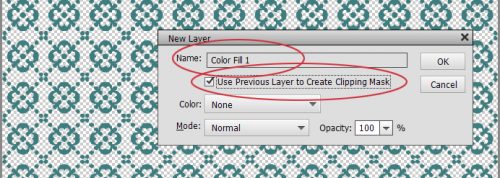
In this menu, click the Use Previous Layer to Create Clipping Mask then click OK.
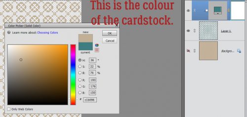
Use the same colour as your cardstock by clicking on it with the Eyedropper.
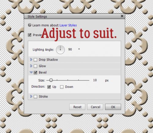
Merge the Color Fill layer with your pattern layer. Then you’re going to hit it with a Bevel Layer Style. Bevels are included with the software and can be found in the Styles menu. Below I’ve used the Simple Inner bevel. It’s a nice, rounded bevel that raises the pattern off the surface beautifully.
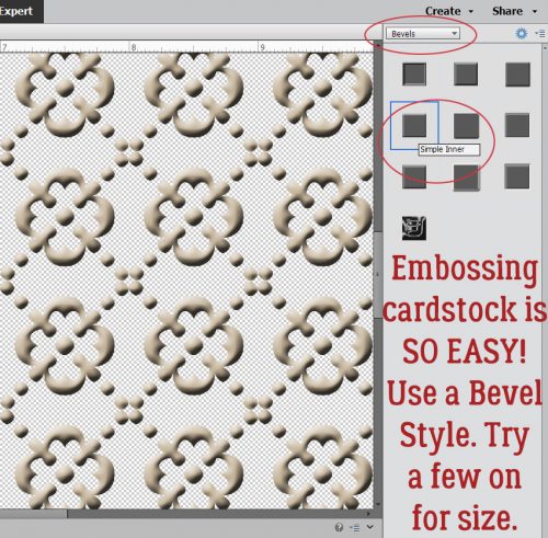
If you feel that the bevel is TOO obvious, you can click on the fx icon on the layer and adjust it to suit. (This is the only Bevel I adjusted while putting together this tutorial.)
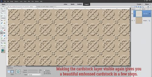
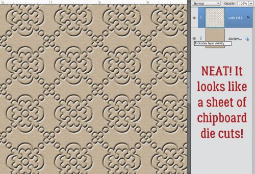
Turn on the cardstock layer and voilà… Merge the layers and now you’ve got a custom embossed cardstock.
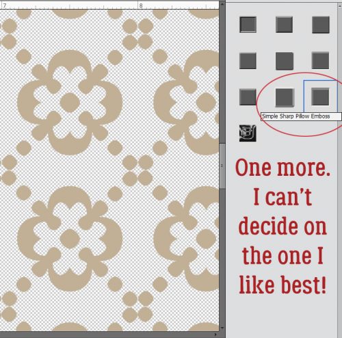
Some of the other Bevel styles work for this technique too. Let’s look at the Simple Pillow Emboss.
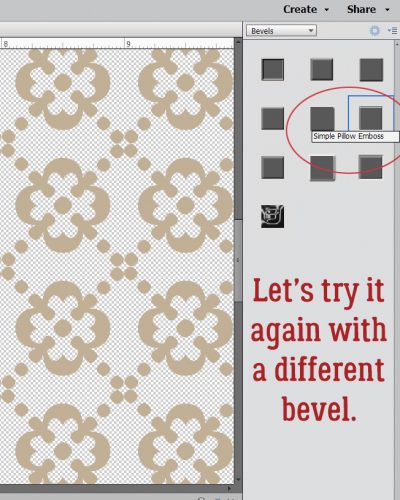
Is this the effect you were expecting? It looks a lot like those sheets of die-cut chipboard!
Simple Sharp Inner looks like this on just the pattern layer.
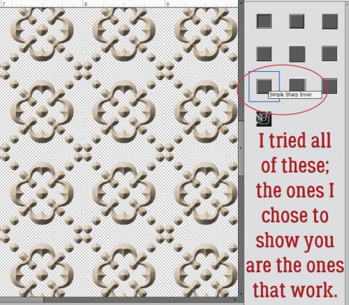
I really like the look of this one.
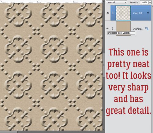
One last one… Simple Sharp Pillow Emboss.
This effect is really interesting. If I went into the fx controls and reversed the direction of the bevel it would raise it off the paper. Might be worth trying!
I can think of a long list of ways these simple techniques can be used to elevate my scrapping. Can you?
![]()
Happy Thursday! The end of the month is almost here which means I can show you a sneak peek of the buffet as well!!
First lets see some new goodies coming to the store tomorrow!
From Aimee Harrison


From Miss Fish


And now for a peek at the Buffet!!


Come back tomorrow and on Sunday to see all the new products!
Where the Boys Are
![]()
Today I thought I’d do something just a little different. Rather than me showing you haw I do some of the things I do for my layouts, I thought we could have a chat about how to increase the value of our templates and kits by using them in unexpected ways. For another few weeks, I only have grandsons, and I love to create layouts about them with the photos their mom takes of them. (You might have noticed…) But how many templates are really boy-centric? There are lots of kits out there that are boy-centric, but they tend to have the same sorts of elements and similar papers. I don’t let that get in my way though! So let’s look at some ways to make the most of our stash to scrap photos of our favourite boys.
I don’t believe in rules when it comes to creativity. So when it comes to colour, anything goes! So many of the boy-themed kits have a navy/brown/forest green/gray palette and there’s nothing wrong with that, but I’ve used a feminine, pink-heavy kit for boy layouts without making them look overly foofy. It’s all in how you use colour. If you start with a neutral background, you can add colour in lots of ways. Because my little men are just 4 and 2 1/2, I tend to use a lot of primary colours, but not always! I like to use soft greens, aqua, lavender, coral and even fuchsia for my boy layouts. Here’s an example.
Here’s another example.
What about flowers? Do you feel like you can’t put flowers on your masculine layout? Well, of COURSE you can! I’ve used flowers on both those layouts. I tend to choose flowers that aren’t overly fluffy, and natural-looking. Daisies will always work with photos of children. Some designers create beautiful composite flowers and I sometimes create my own by putting a screw head, a plain button or a gear – or all three – in the centre.

But what can I do when looking at a template FILLED with flowers, and the photo(s) I want to use are either of my son or my grandsons? I substitute lots of things for those flowers. Gears, paper rosettes, tags and labels, stars, hearts, buttons, flair, bows, string, ribbons and word strips all can take the place of flowers.
Or like this…

Ready for some audience participation? Okay, now the ball is in YOUR court… What are some of the ways you scrap layouts of your boys and men? Please leave your tips in the comments! I appreciate it.
![]()
Still MORE Fun with FONTS!!
![]()
We’ve done a lot of cool things with fonts, but I know there are still so many even cooler things to try. Last week I bought a new font bundle from The Hungry JPEG, a selection of vintage fonts for a smokin’ hot deal. It’s not as if I’ll ever have too many fonts, right?
Anyway, while I was downloading these fonts, several of which were actually font families, I looked at the samples the site uses for advertising and it hit me… Why not try layering two fonts from the same family and see what happens? Font families are a collection of very similar fonts with some subtle differences; there may be a regular, a bold, a light, an outline, a grungy and an italic version, for example. This tutorial was fun for me, because I really didn’t know what it would look like when I was finished, but the idea was firmly in my head and I had to try it. I impressed myself so much I needed to widen the doorways. But… it didn’t turn out the way I expected it to. It’s BETTER!
I went through my fonts, using High Logic’s Main Type, to find a font family that would hopefully give me the look I could see in my head. The one that looked most promising is called Nomos, by Cruzine Design. It has several variations on the basic font, so I went with it. I started with Nomos Regular Regular for my basic title. I selected a medium gray to be my starting colour from one of the papers I used in my layout. And I set the size at 100 pixels, knowing I’d probably resize it to fit my canvas. Remember, I usually create my title on its own canvas, sizing the basic working space to approximate the area I want it to fill. No distractions, nothing to work around. So once I decided on my font and colour, I opened a 5 1/2 x 1 1/2 transparent canvas on my workspace.
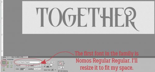
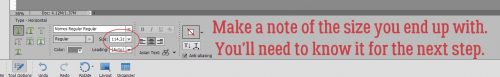
I typed out my one-word title, then resized it to almost fit my space. I made a careful mental note of the exact size of the final font so I wouldn’t have any guesswork for the next step.
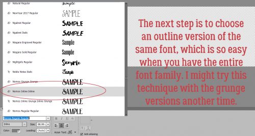
Then I went back to my fonts and chose an outline version of the same font. It’s called Nomos Inline Inline. (I don’t know why the designer used so much repetition in titling…)
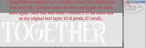
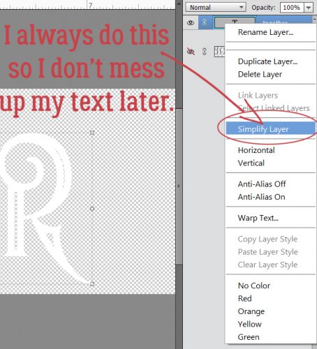
I Simplified the original layer then turned its visibility off. Why Simplify? When working with fonts in PSE, if you DON’T simplify the layer, then select a different font for your next text layer, that first layer will morph to that new font. And you might not notice it until MUCH later and have to go back and fix it. So don’t forget to Simplify once you’re satisfied with spelling, grammar and punctuation. After that, I typed out my title exactly the same as the first layer, only in white this time. And I resized it to the same size as my original layer. Here’s where the people really paying attention can give me the gears. My resized font is 114.31 pixels.
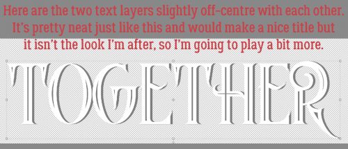
They weren’t in exactly the same place on the workspace, but it looks really cool just like this! If it was what I was after I’d just have gone with it. But I envisioned something more, so I kept going.
PSA: Simplify your text layers!!
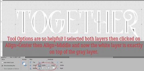
I wanted the two layers stacked perfectly, white over gray, so I used the Move Tool Options to Align the layers, first by Center then by Middle.
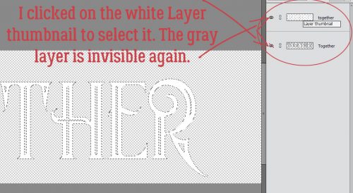
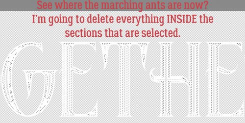
I turned off the gray layer again and concentrated on the white outline layer. I clicked on the Layer thumbnail to select the edges of the letters as shown below.
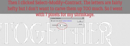
I want the white sections to be thinner so more of the gray shows through, so I clicked Select>Modify>Contract. I didn’t want to lose too much, so I went with a single-digit shrink of 7 pixels.
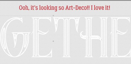
If you look closely you can see where the new lines of marching ants have appeared. I’m now going to DELETE those sections. CTRL/CMD>X
Ah! Not exactly what I was expecting, but really, really neat!
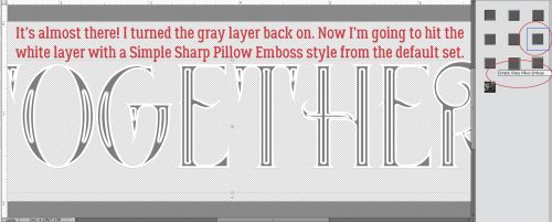
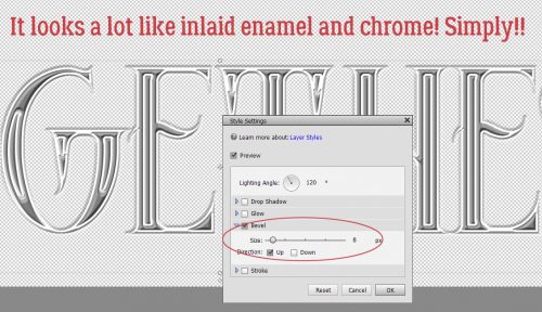
I couldn’t wait to see what it looked like with the gray layer on. I wanted to add some dimension to the white layer, which I did by using a Simple Sharp Pillow Emboss bevel style, one of the integrated styles the software comes with.
It looked really good, but just a little TOO… too. Easily fixed by adjusting the bevel settings.
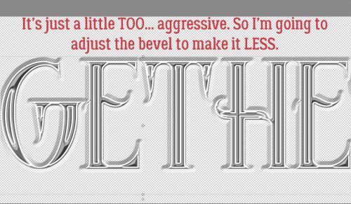
I clicked on the fx icon on the white layer and made the bevel much smaller. I think it looks like inlaid enamel and chrome, don’t you? Now I’m itchy to try this with other fonts and see what different effects I can achieve just by layering two fonts. Who knew it would be so much fun?
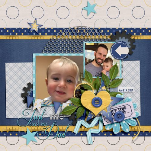
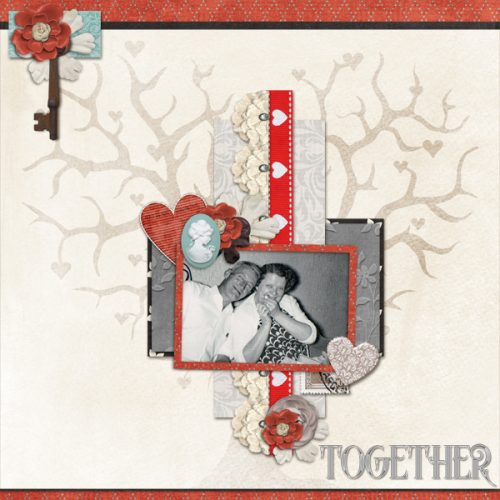
Here is my finished layout. It’s for the Designer Spotlight Challenge this month and was created with pieces of 3 kits by Connie Prince and a template from Trixie Scraps. The people in the photo are my grandparents; it was taken in the summer of 1961. By the following Easter he was gone; this is one of only 2 photos I have of him where he doesn’t have a cigarette in his hand. I see a little bit of my dad in each of them, and my sister’s eyes crinkle in the same way Grandma’s do. I’d never noticed it before, so this was a labour of love.
![]()
Happy Thursday!! We are almost to the weekend! I hope you are enjoying the last few days of Spring because summer is almost upon us! Hopefully this week’s new releases will inspire your scrapping! Here’s a peek!
From Ponytails


From Tinci


From Cornelia


From Aimee Harrison


I hope you have a wonderful memory filled weekend!
Everything New is Old Again
![]()
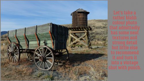
No, you didn’t read that wrong. Today’s technique is going to turn a sort of ho-hum colour photo into something that looks like a vintage one. It will work with any colour photo at all, but it looks best when there’s lots of detail and texture.
To begin, I opened my photo in Elements then selected Guided Edit. When the menu shown below opened up, I selected Fun Edits>Old Fashioned Photo. These Guided Edits transform photos with only a couple of clicks and a little tweaking.
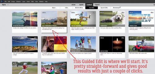
There are three presets in this menu as shown below.
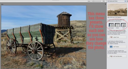
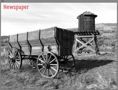
The first preset is called Newspaper. And it looks a lot like those black-and-white photos found in any newspaper. There’s a good amount of contrast and sharp details.
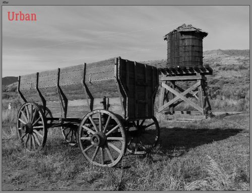
The second preset is Urban. It’s a little softer but grungier.
The last one is Vivid; it looks like a happy medium between the first two. It’s the one that adds the most oomph to the sky.
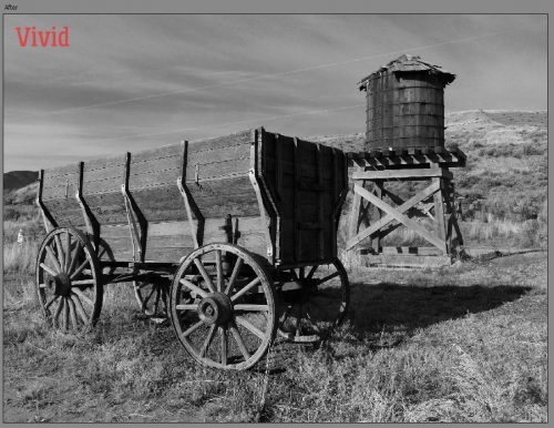
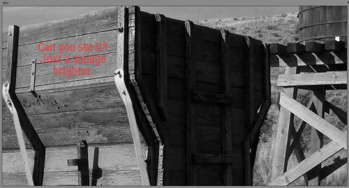
I liked the look of Vivid for this photo. The next step is Adjust Tone. The effect it has on the photo is pretty subtle, and you might not really see it.
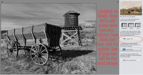
It’s just a little bit brighter, and perhaps the details are a tad bit sharper. Clicking on this tool multiple times doesn’t add any further effect.
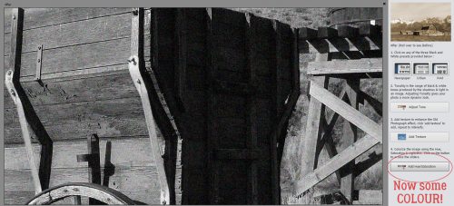
Let’s add some texture. Unlike the previous step, multiple clicks will increase the amount of “texture” which actually is more properly called noise.

It’s looking really interesting, but we still need to add some colour.
Shown below are the default settings for the colour adjustment.
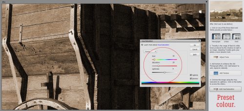
I made some very slight changes to the settings, warming up the colour just a hint, adding a tiny bit more saturation and lightening it up a barely-there amount.
I like how dramatic the sky looks with this Edit. Then I clicked the Next button.
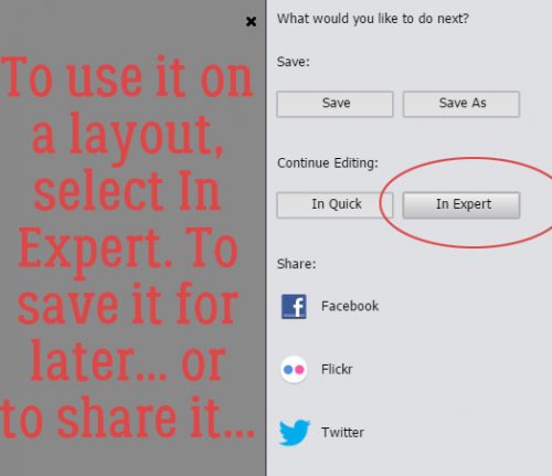
Here’s where you decide what you’re going to do with your photo. If you plan to use it right away for a layout, or if you want to make more adjustments to it, obviously you’ll click In Expert.
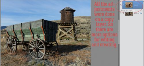
When the Expert workspace opens, you’ll see right away that all the changes you’ve made have been done on a copy of your photo.
Let’s play a little more. Remember Blend Modes? I tried them all on this photo. Some looked really interesting, some where downright HORRIBLE. The ones I’ll show you are the ones that didn’t make my eyes hurt.
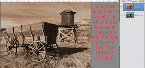
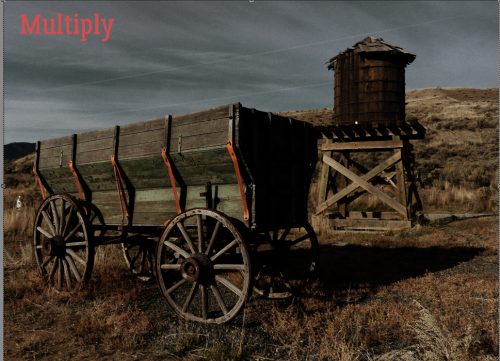
Multiply made the colour come back and the overall look is very moody.
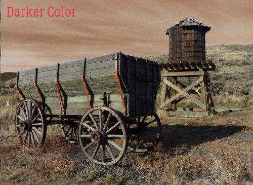
Darker Color also let the colour come through again, but kept the sky that weirdly unnatural brown.
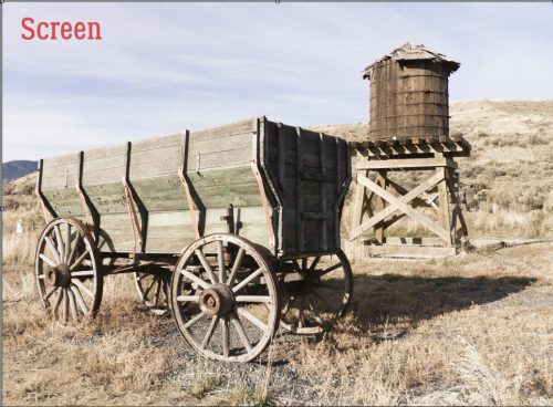
This one is muted and soft.
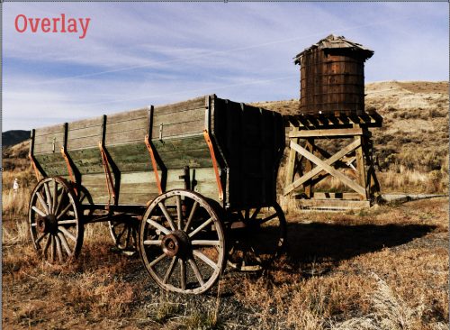
Usually Overlay lightens and softens too, but not on this technique.
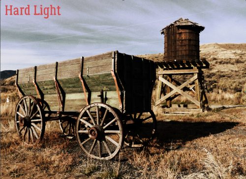
I think this mode is well-named. It’s HARD!
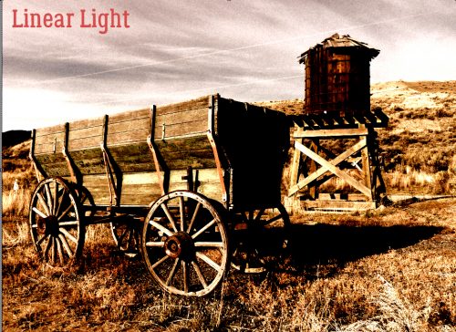
Linear Light makes me think of movie posters from the 50s and 60s.
This was one of the odder ones.
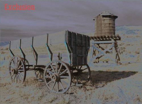
A Clockwork Orange, anyone?
I think this one is rather odd, too. Misnamed, for sure!
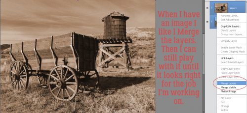
See anything you’d like to incorporate into a layout? At this point, I chose to Merge the two layers together. I could now save it as a new version of the original.
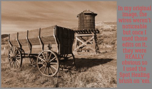
As I was running through this edit, I found the power lines were really jarring. In the original they were virtually unnoticeable, but in some modes they jumped off the screen. The water tower and wagon are so vintage, but the wires looked out-of-place. So I used the Spot Healing brush to remove them.
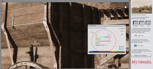
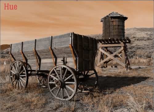
I played a bit with the Hue/Saturation a bit too. Quick keys for that adjustment are CTRL/CMD>U.
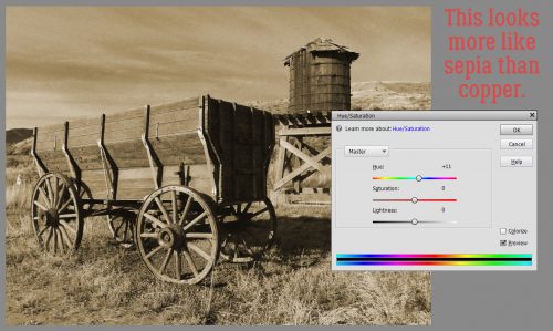
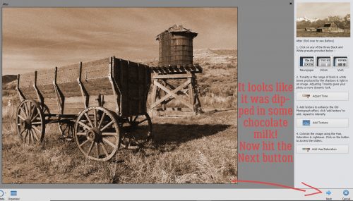
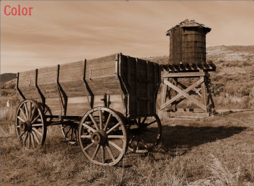
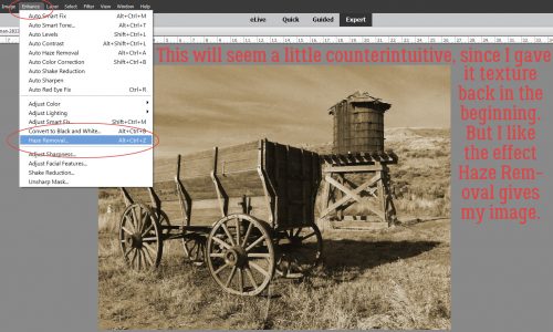
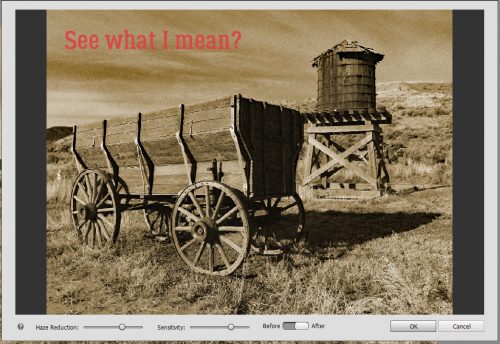
I liked it slightly more sepia than copper. This step will seem really bizarre, since I made a point of adding texture to the photo way back at the start. But when I hit it with Haze Removal, I LOVED how it looked.
See the difference? I think it looks like a real, vintage photo from 100 or more years ago.
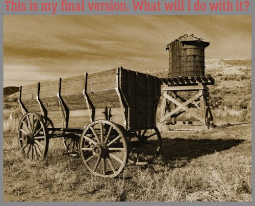
This is where I stopped. I have no idea what I plan to do with it, but I know I’ll be using this edit again!
Don’t be afraid to play with the features Elements has to offer. All you’ll give up is a little bit of time, and you might find something that defines your style perfectly!
![]()