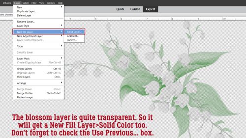
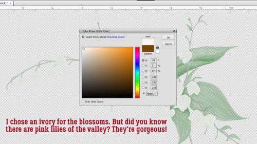
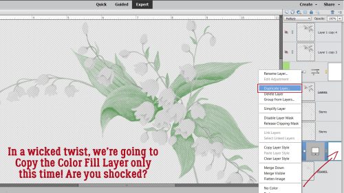
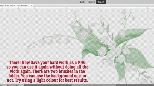
Challenge Spotlight: Back It Up
![]()
This month’s Spotlight Challenge is brought to you by ADB Designs (aka Diane). Her gentle reminder each month that we should practice good data management habits seems to be lost on me. I’ve backed up SOME of my photos. I’ve unzipped and organized SOME of my digistash. I’ve unzipped but not organized SOME of my digistash. I’m not the best one to be giving anyone advice on this topic and I know it! Diane uses her Back it Up Challenge to prod us into action, and while we’ve got those photo folders open, she gives us a theme to keep in mind as we’re backing them up. This month the theme is Picnic/Summer Food. There are so many ways this theme can be addressed in a layout. Let’s have a look.
As always, the layouts shown are linked to the Gallery so you can pop over there and leave some praise for the GingerScrapper. Just click on the user name and you’ll be right there. The layouts are in the order they were uploaded and I’ve snagged all of them this month. Ready?
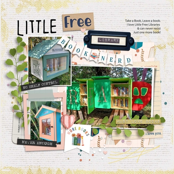
Rhewko‘s large-and-in-charge photo is quite literally the centerpiece of the layout. Does it reflect the theme? 100%! I love the line of actual marching ants across the bottom that adds a nice whimsy.

There’s a casual elegance to kabrak1207‘s layout. The barbecued meat photo is making my mouth water. I almost didn’t notice the two grills used as circle elements behind the photos. Clever!

Tamsin McAtee has pulled colour from her photo and chosen a beautiful kit to build her layout with. How romantic?!

For her layout, lawyerlyn has also used colour from her photos. Those bright, summery paper pieces she’s scattered behind them are so pretty. That coconut shell beverage is the perfect foil for the street-food fruitshake photos.

CathyS has picnic food in a supporting role for her family day layout. I tend to remember more of the who and the fun and less of the menu with events like this, so I might have done the same!

I can also relate to DianeInOz‘s situation regarding group tours. The food looks delectable and she couldn’t really enjoy it! (Sorry about the broken foot, Diane.) The muted colours she chose for her layout work really well with the muted colours in her photos, so they’re the focus.

I love the steampunk feel to wendeeds‘ layout. Look at all those photos! What a great adventure they had. Victorian food isn’t exactly run-of-the-mill… terrine of pheasant and venison anyone? Beats the medieval dinner I once enjoyed – with my fingers.

Camping and cooking over an open flame can be so much fun. The cheery colours chigirl has used for her layout mesh with her photos, reflecting fun, and I bet there were smores galore later.

Is there any food that says summer quite like watermelon? Theme? CHECK! This layout by ollitko is such an attention-getter. Beautiful!

Is it just me, or does this layout not radiate warmth? Everything ranchcreations has used just blasts love and sunshine.

This layout by msbrad takes me back to when my daughter played softball and weekends were spent outside, food was scarfed down with abandon and everybody had fun. Her use of primary colours against a sheet of scribbler paper evoke those memories even more sweetly.

And finally, I’m always fascinated by how KatherineWoodin approaches a challenge. She never disappoints!

We’re having some weird weather in western Canada right now. Snow in the mountain parks in June?! WHY!! Maybe the wildfire situation can be sorted out now. I had a dream about tornados after seeing reports from the midwest. We’re not paying enough attention to climate change, are we? Anyway… go back up your important files before you forget!
![]()


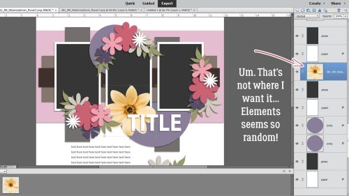
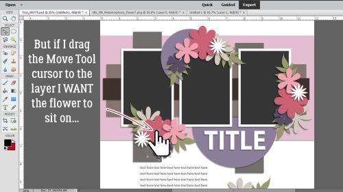
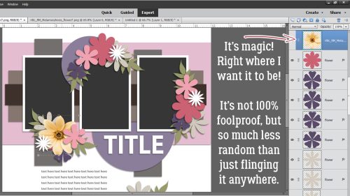


") ” Jen commented she likes to have lots of journaling on her layouts, and that her favourite papers or cardstock are the lighter, more neutral papers.
” Jen commented she likes to have lots of journaling on her layouts, and that her favourite papers or cardstock are the lighter, more neutral papers.