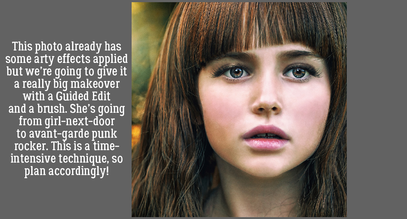
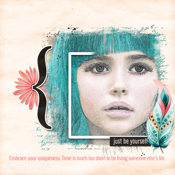
QuickTrick: Improving the Work Flow with Templates
![]()
PDF Version: https://bit.ly/3EUJdHB
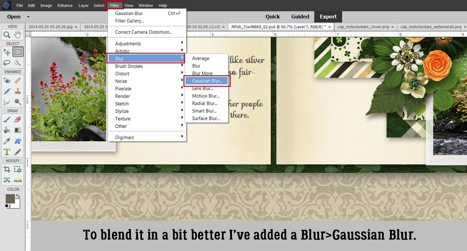
Hey ladies! I was led to an absolutely amazing resource for “secret” tips on using Photoshop Elements (thank you Kathi, aka granny5pics) and it gave me an idea. The fourth Tuesday of each month, I’m going to show you something I learned from it, complete with screenshots, and I’m calling it QuickTricks. Most of the things I’ll show you will be really streamlined but detailed enough for beginners to get the hang of right away. Today, our topic is an Elements workaround for something easily done in Creative Studio Photoshop versions. I’m still deciding whether I’ll be making it a habit, but I do think it’s Working Smart, Not Hard.
I love using templates as a springboard for creativity. They make a lot of the decision-making less complicated and produce predictable results. And I do find I work quickly when I’m using a template. So you’ll understand when I tell you learning there’s a way to make templates do even more of the work shook me right up! It represents a shift in thinking for me, which is why I’m not sure it’ll be a permanent change for me… but I said that about custom shadows too. So who knows? But enough gabbing. Let’s get to work!
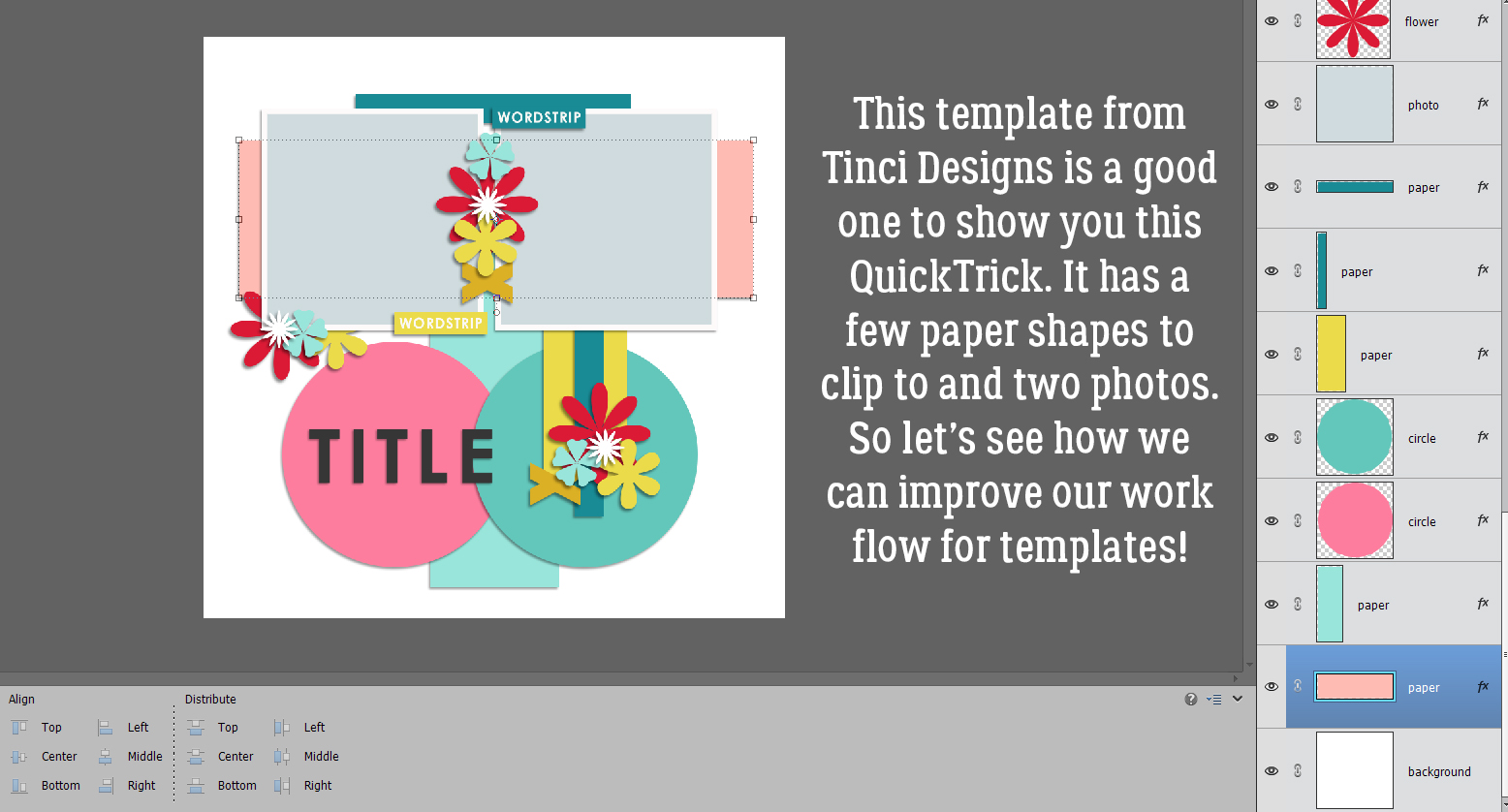
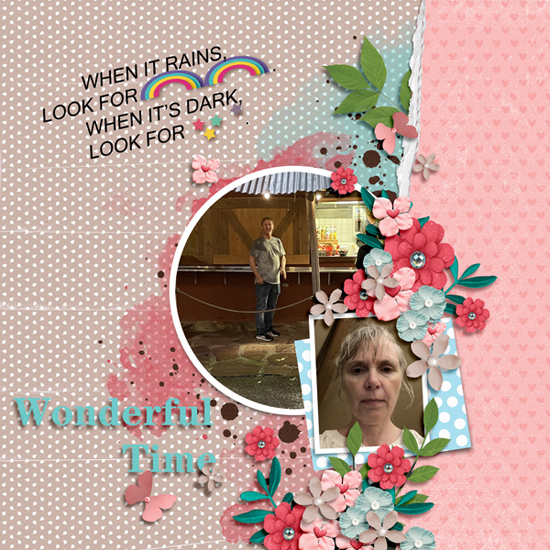
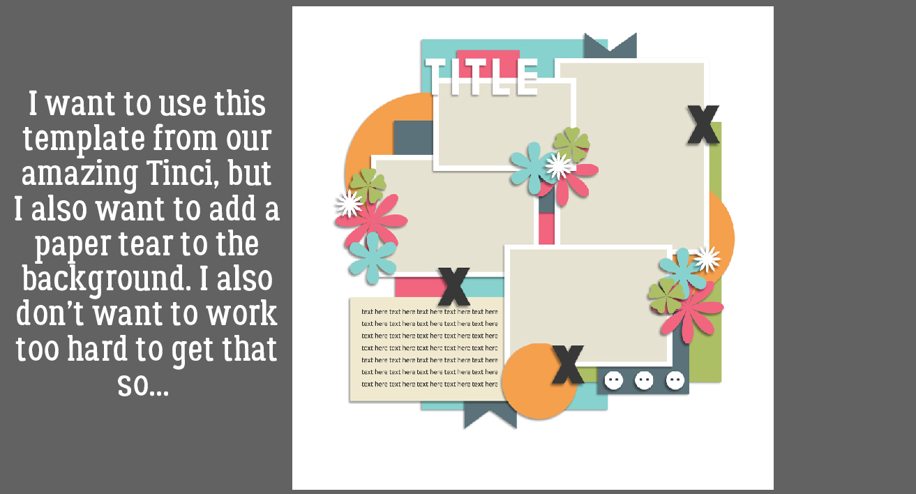
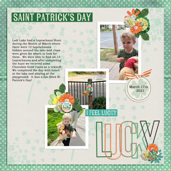
I chose this template from Tinci Designs for this tut because it’s got a few paper shape layers and a couple of photo spots, but not too many. (It’s a freebie from several years ago so I can’t link you up to it. Sorry.)
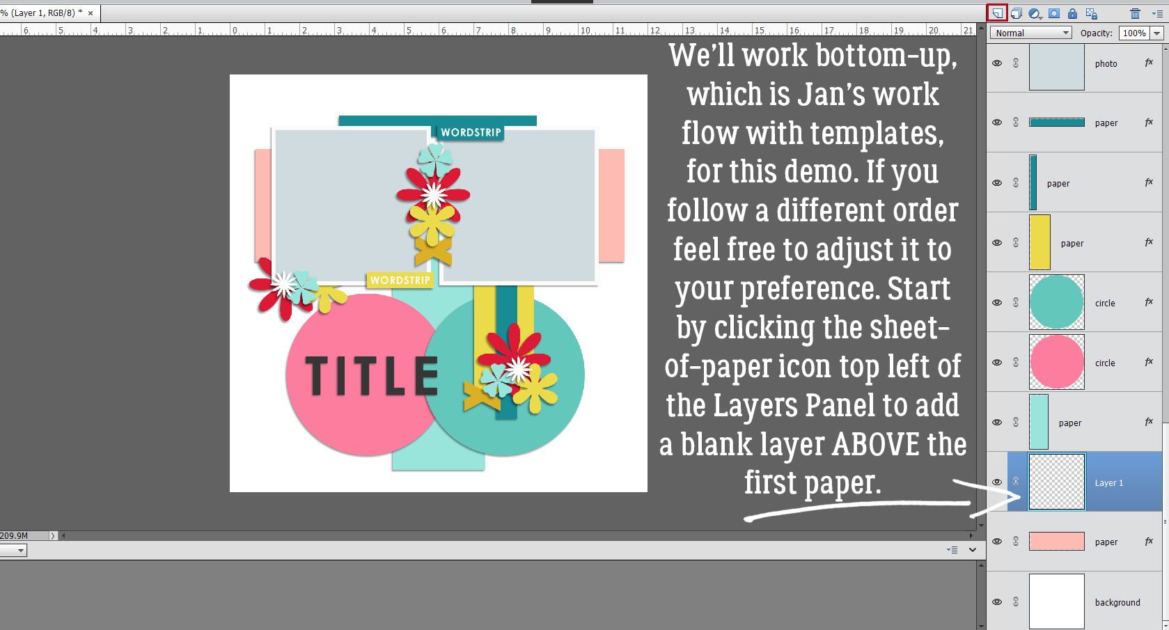
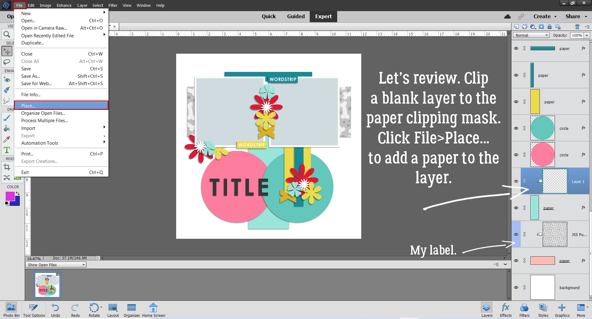
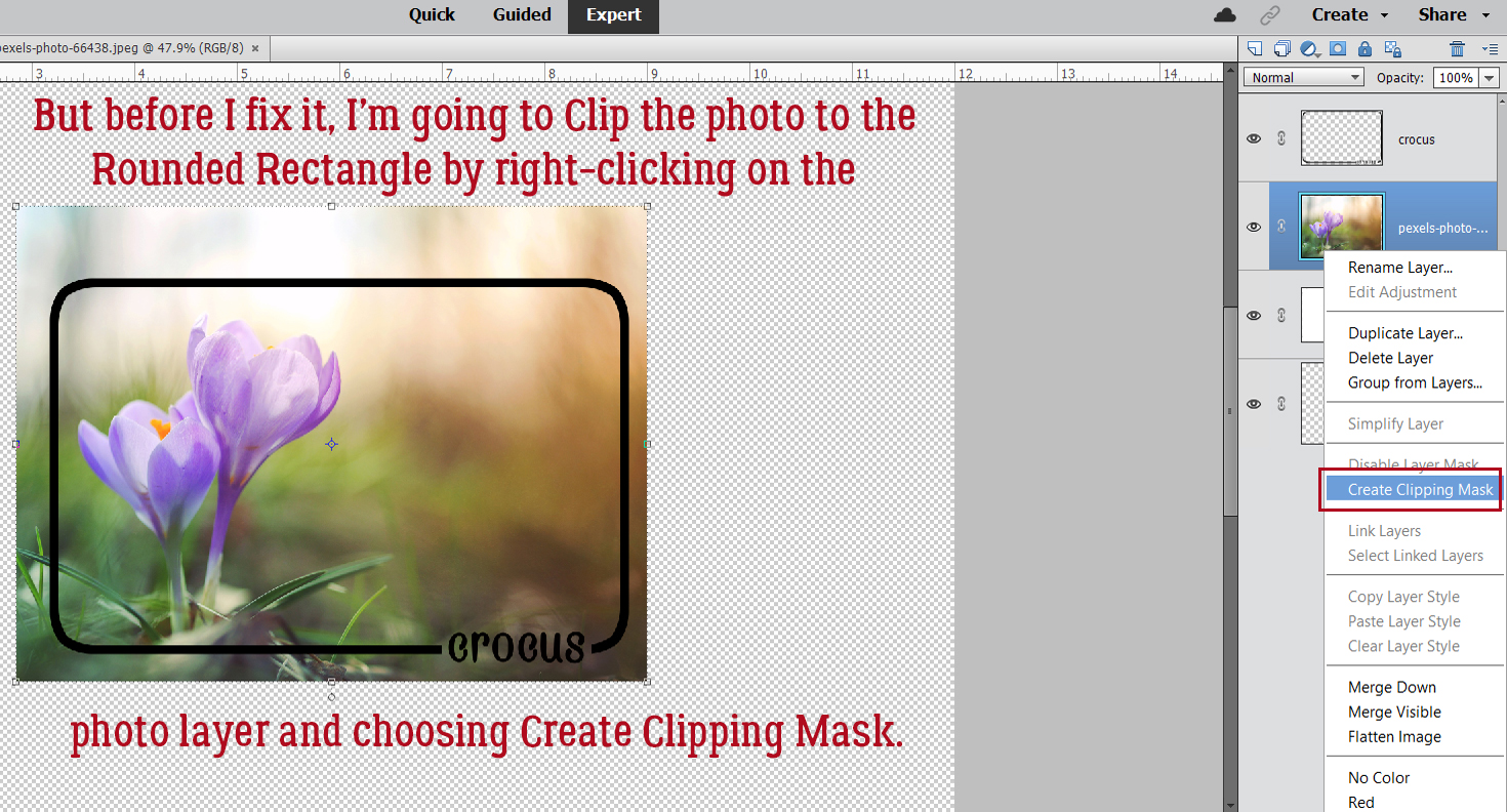
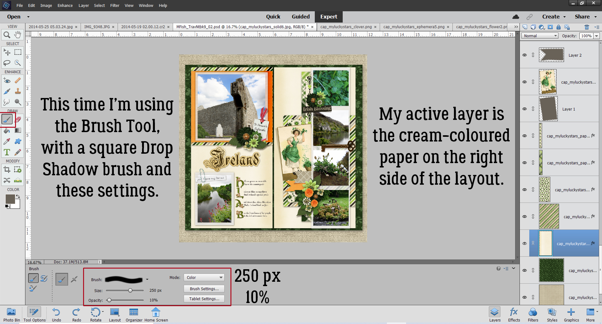
I work from the background up, just as I would if I was using paper and glue. If that’s not how you work, you’ll see it’s easy enough to adapt the process to your preferred method. The active layer on the template is the very first paper shape layer. Click on the sheet-of-paper icon at the top left corner of the Layers Panel to add a new blank layer above the paper shape.
Now, right-click on the blank layer and choose Create Clipping Mask – yes, with the blank layer! Seems a bit unusual, but trust me. If you’re a keyboard shortcutter like I am, you can click CTRL/CMD>G if you’re using versions 14 and lower, or CTRL/CMD>ALT>G for PSE 15 and more recent.
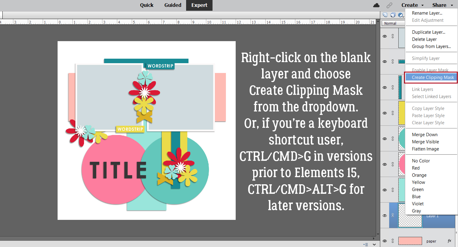
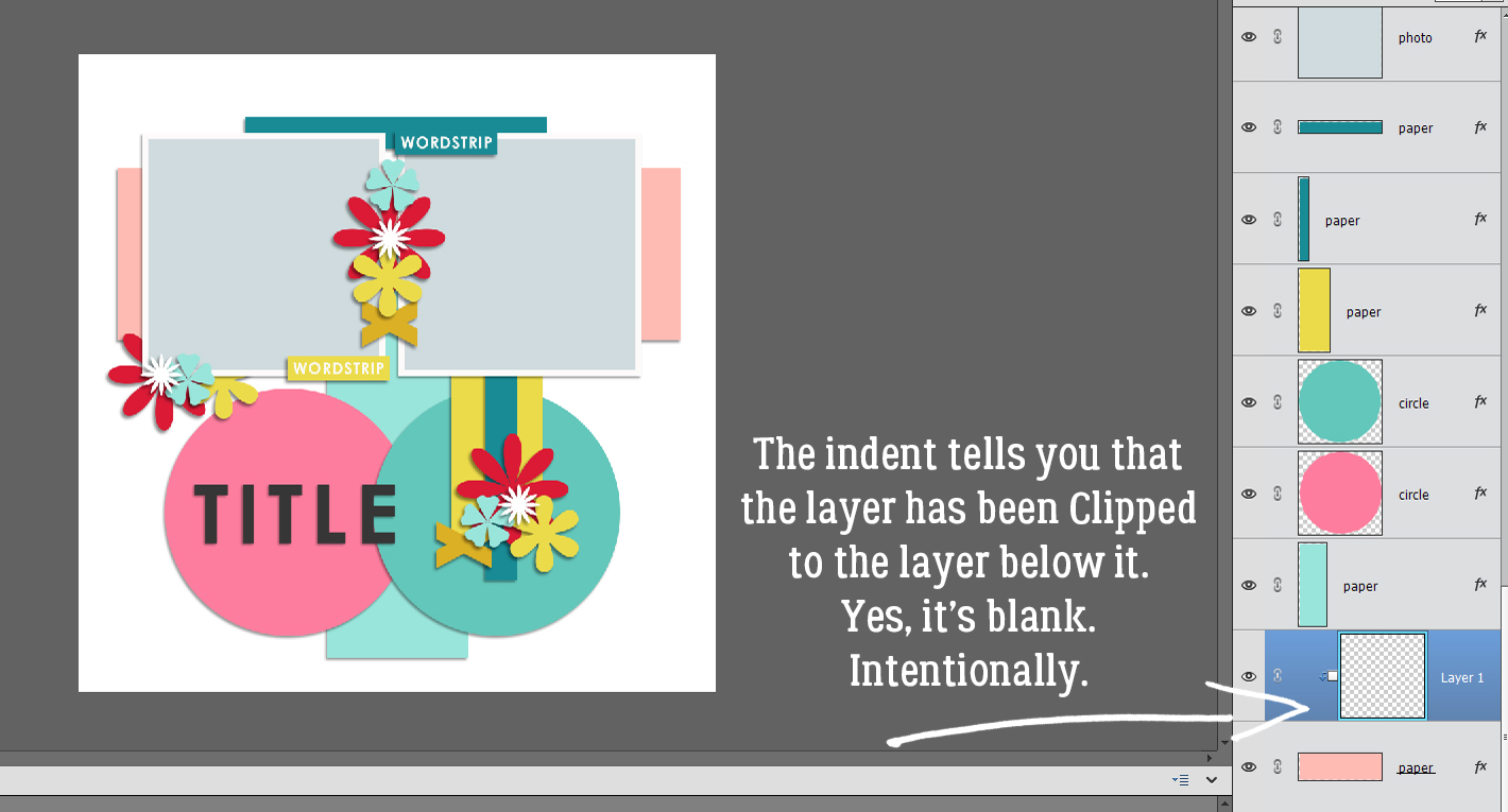
The blank layer is now indented, and that’s how you know a layer has been Clipped to another layer.
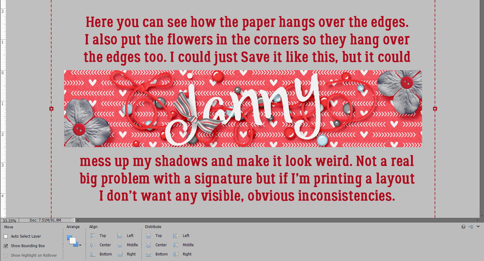
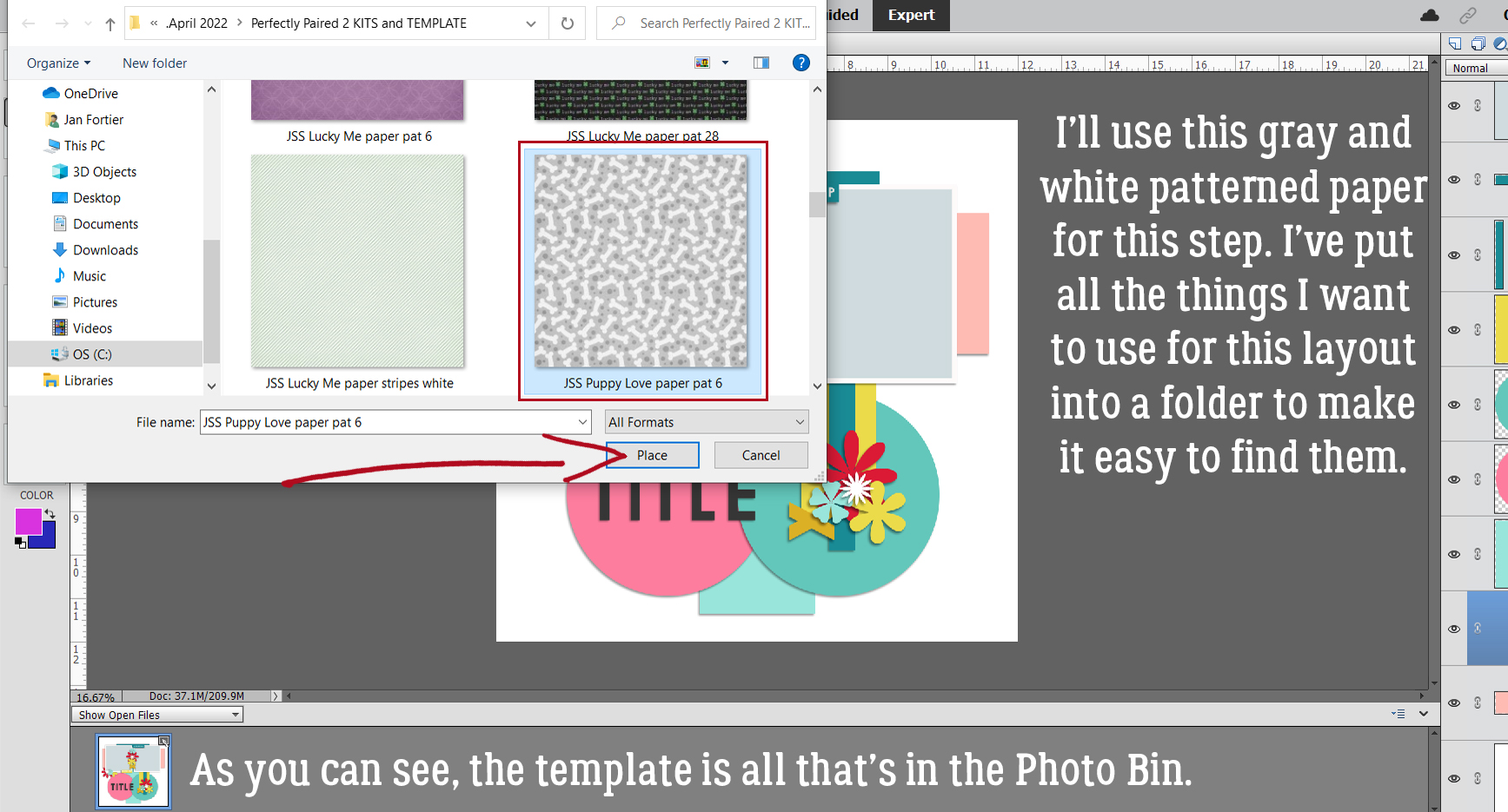
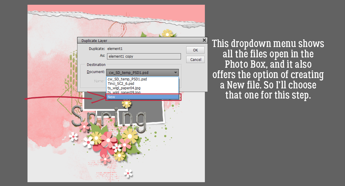
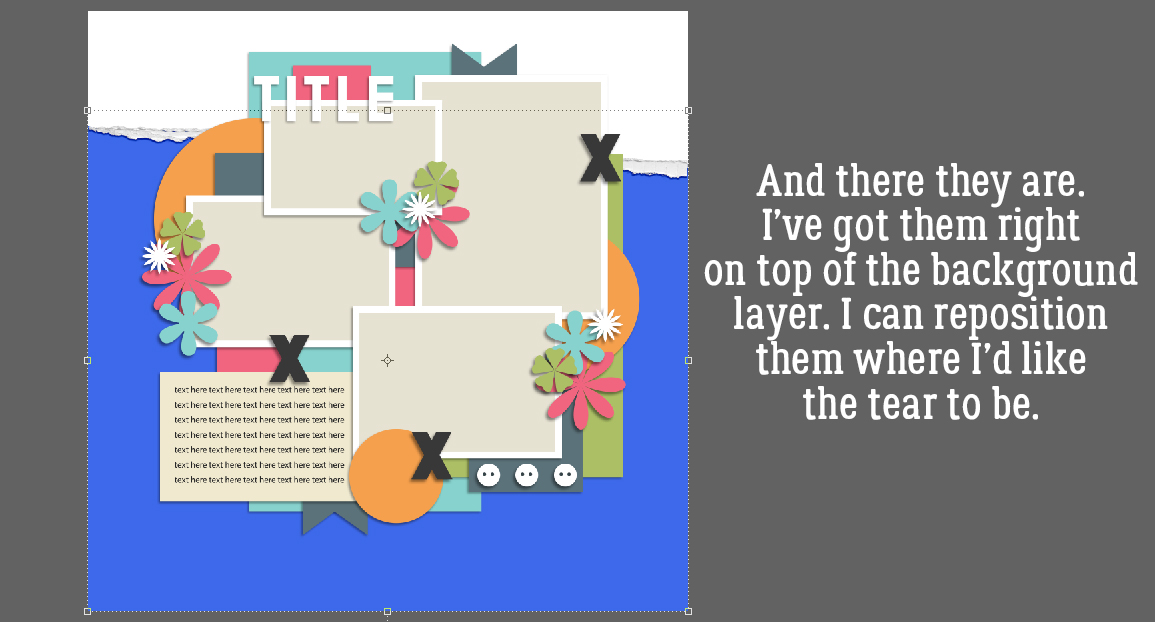
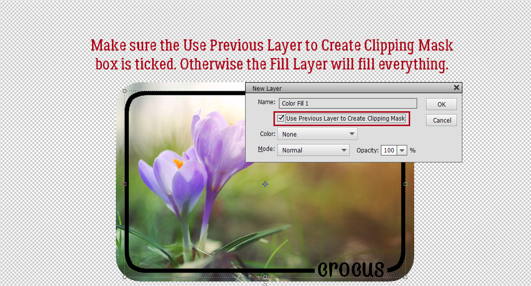
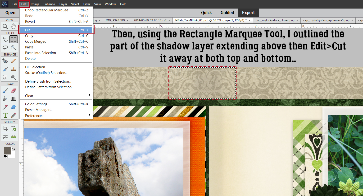
Here’s where the work flow changes. Rather than dragging and dropping a paper onto the canvas then Clipping it to the layer below, we’ll use the File>Place… command. When using this method, it’s not necessary to open all the papers and photos into the Photo Bin. But it does pay to have all the papers, photos and elements in a dedicated-to-that-layout folder.

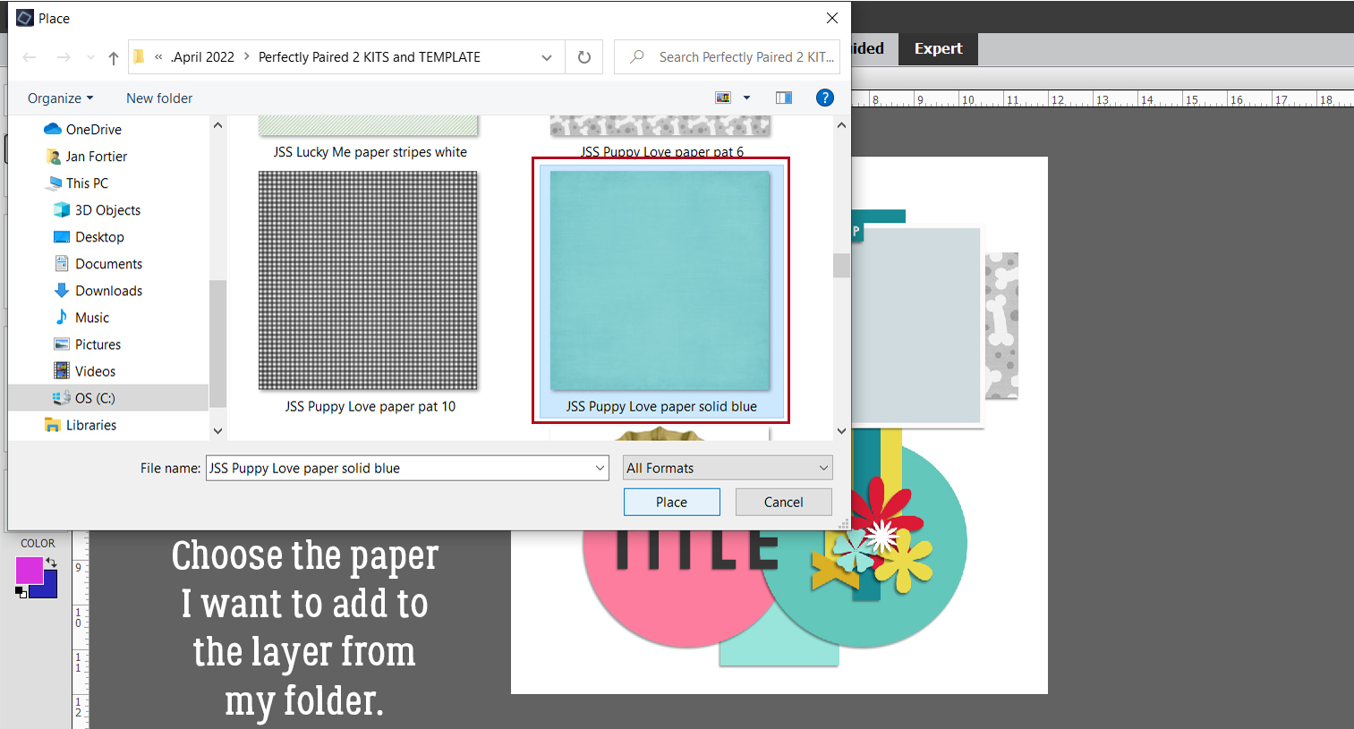
Elements will go to the last folder you opened anything from; in this example it’s my Perfectly Paired challenge folder. I make a new folder for every layout, adding into it copies of the template, photos, papers and elements I want to use. Everything is in one place. When the layout is finished, I delete all but the layout’s PSD and 2 sizes of JPG to save space. That’s worked well for me and it’s second nature now. Plus, it makes this trick a lot easier to manage that if I had to search through a bunch of folders. Let’s use this gray and white patterned paper from Just So Scrappy‘s Puppy Love for the first paper shape, then click Place.
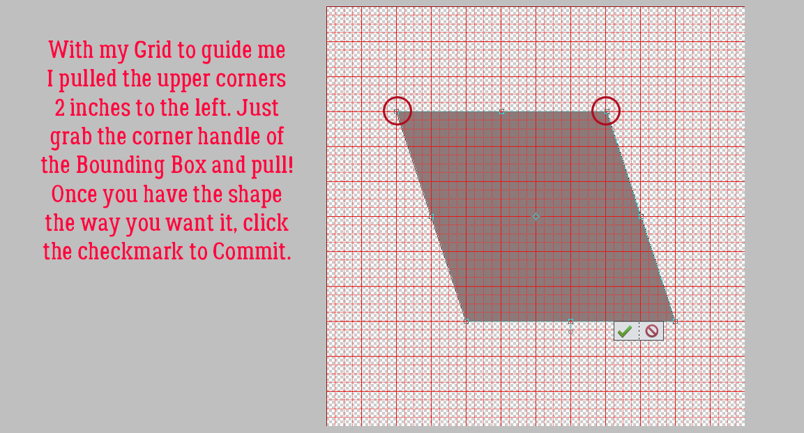
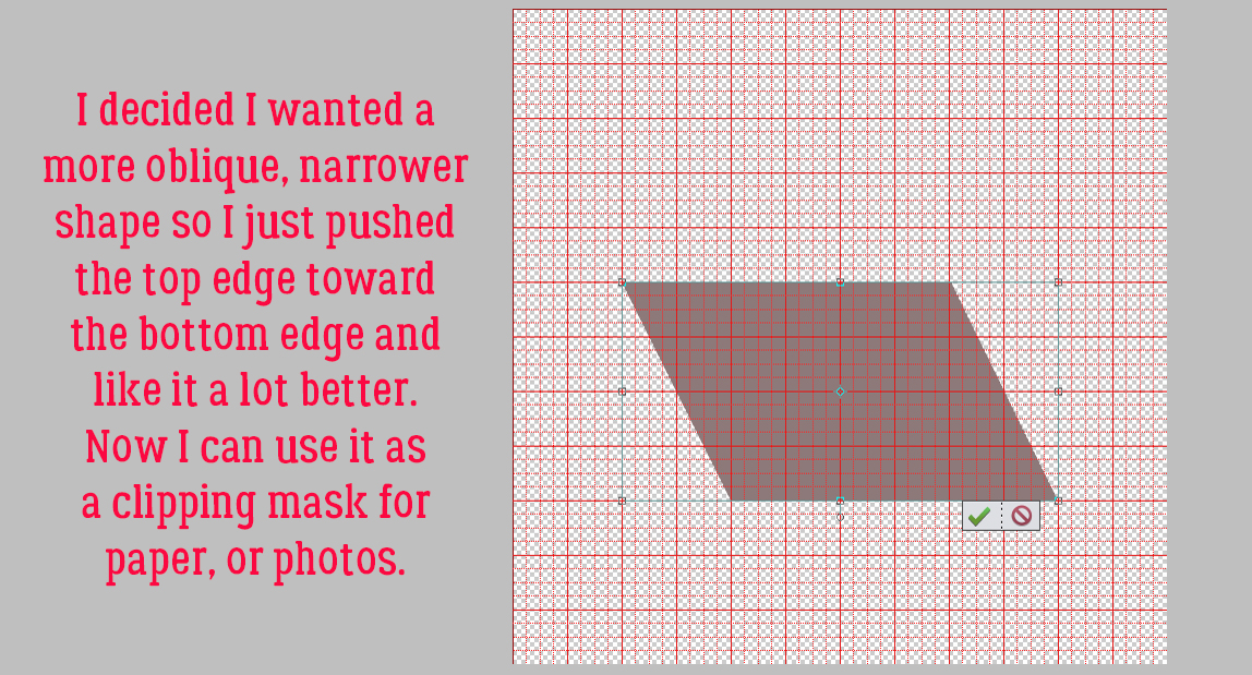
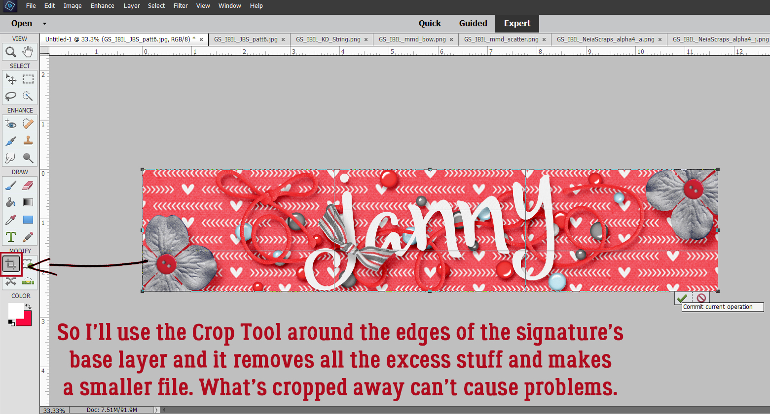
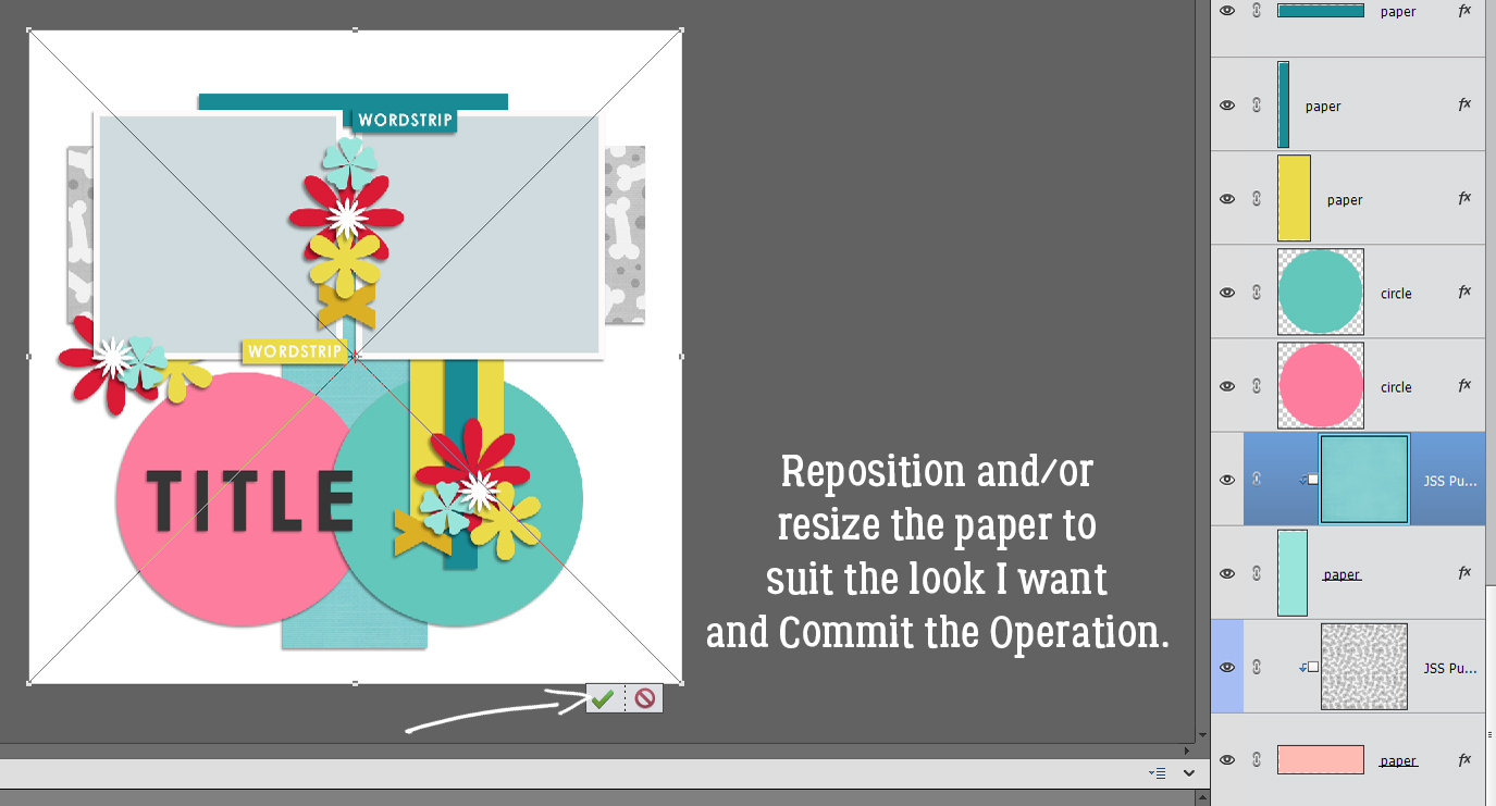
Like magic, Elements has automatically clipped the paper to the shape; see the paper where there was a blank layer before? It’s so simple!! The paper has a bounding box and crosshairs, as shown in the screenshot. It can be resized, rotated and repositioned however you need it to. Then click the checkmark to Commit the Operation.

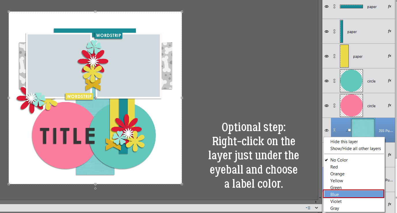
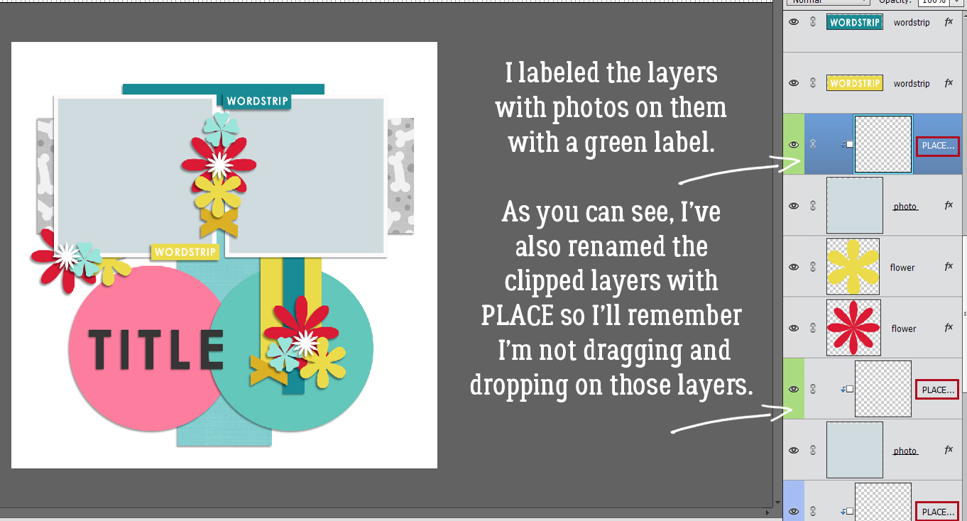
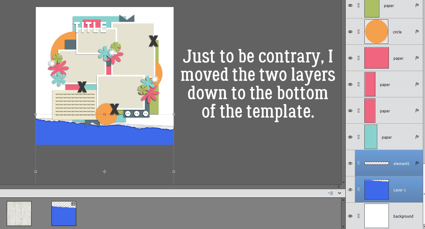
Now, this next step is 100% optional. I’m just showing you how to do it in case it might help you with organizing work flow in your mind. Color-coding layers can provide a visual reminder of the task at hand. Right-click on the pertinent layer just under the eyeball icon. That activates the label area and opens this pop-up menu. (Notice what all is in there. We’ll revisit that on another day.) Choose a color you like. Let’s do blue. 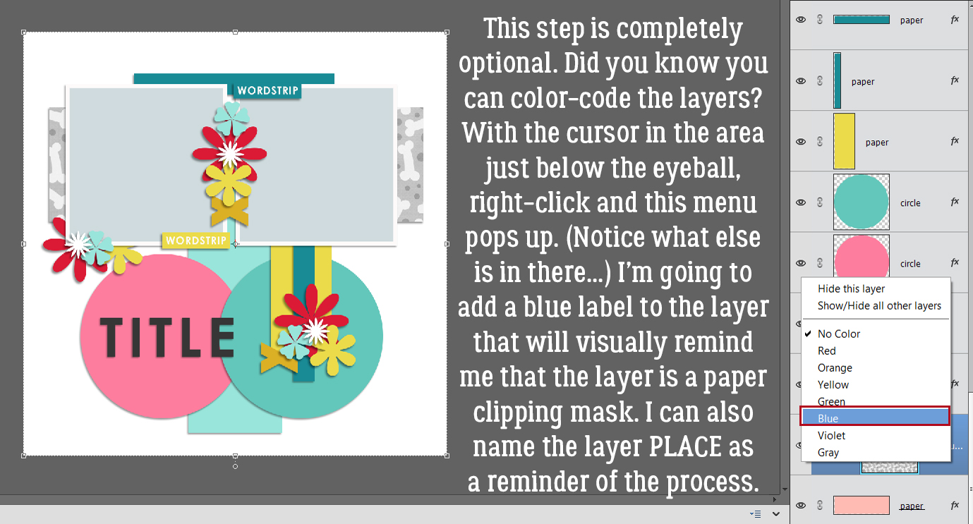
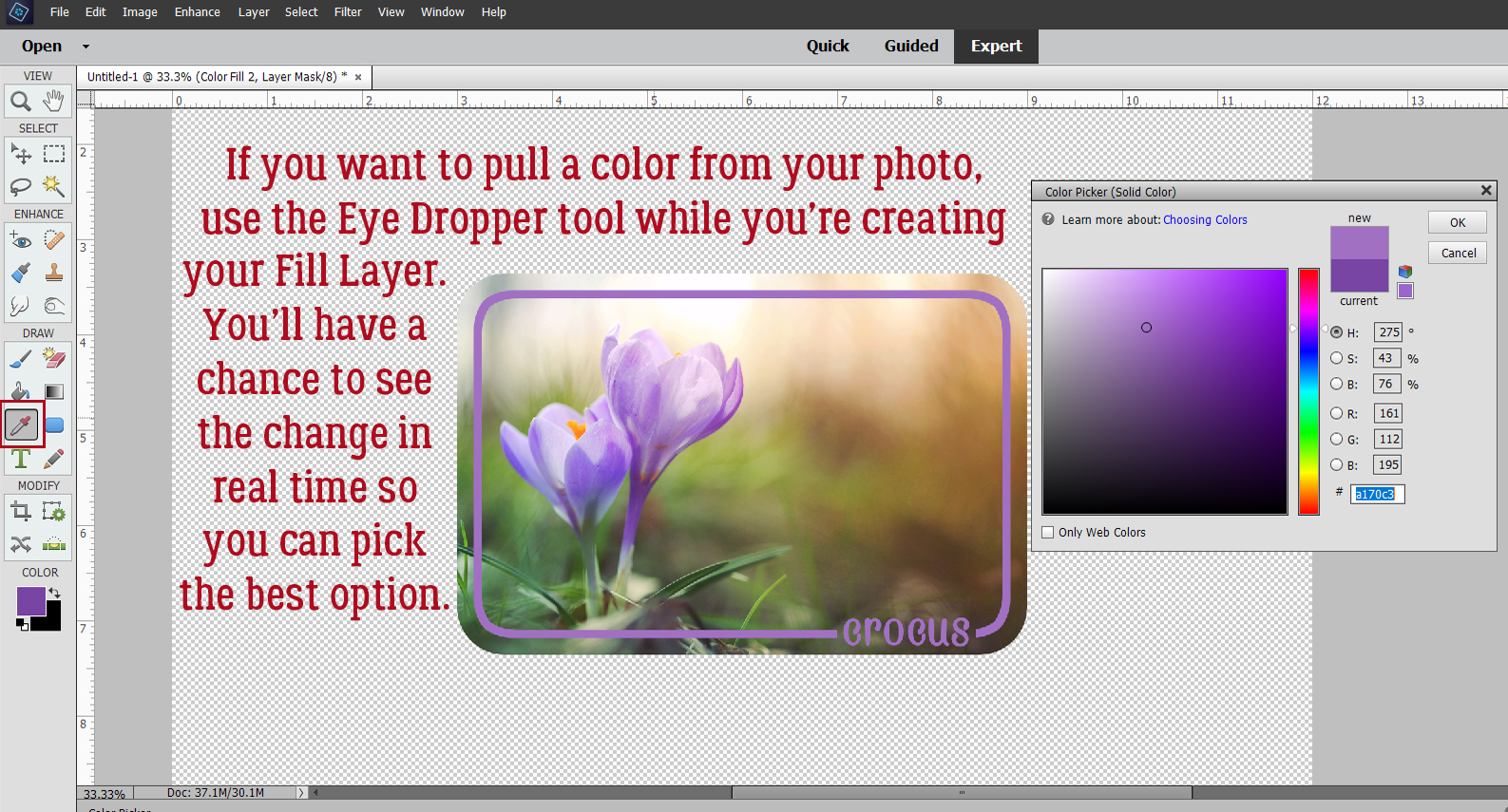
The next couple of screenshots are a review. Activate the paper shape/photo spot layer, add a blank layer above it then clip that blank layer to the paper shape below. File>Place… to add the actual paper.
Choose your paper/photo from your folder and click Place.
Make any adjustments you might want to the paper/photo. Then Commit the Operation.
Optional step: Add a label to the layer. To provide yourself with another reminder of the process, you can also change the name of the blank layer to “PLACE paper here” by double-clicking on the name in the layer box and typing it in.
I labeled the photo layers green to distinguish them from the paper shape layers. You can see I’ve renamed those layers too.
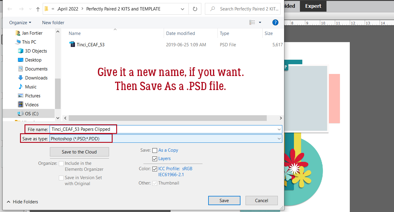
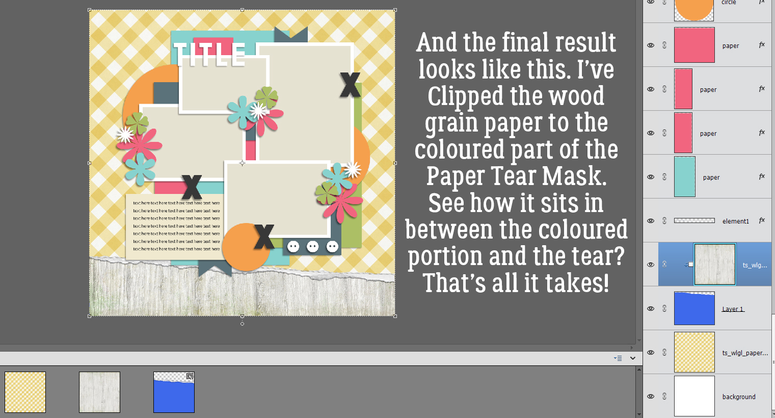
Now, to really make this shortcut work for me, I’m going to Save the template. This step would come BEFORE I’ve Placed anything onto the layout but AFTER each of the clipping layers have been added. File>Save As… (CTRL/CMD>ALT>S)
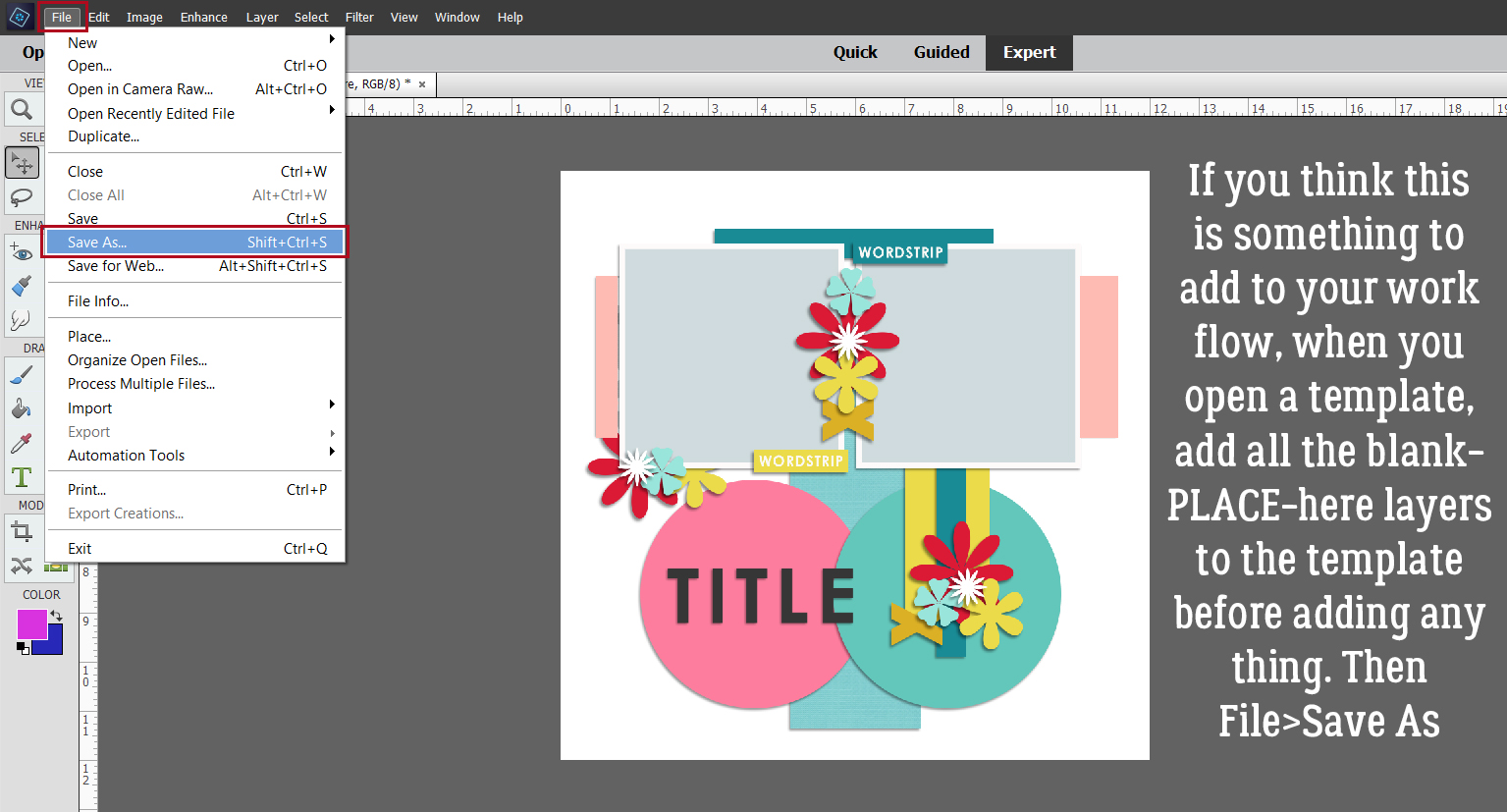
I changed the template’s name, leaving in the designer info but indicating I’ve set it up for auto-clipping. Then I chose PSD as my format, although you could choose TIFF if that’s your method. And there! You’ve got a template ready for action the next time you want to use it. It takes a few minutes up front to get the clipping layers in there, but I think in the long run it’ll save time later. Thoughts?
It’s been a rough week for us here. One of our dogs had a partial bowel obstruction requiring treatment, antibiotics and hand-feeding to prevent vomiting. That was fun… 🙁 She’s all back to normal now, so it was worth it. Then our disabled adult son developed an infection in his foot and isn’t standing on it. He’s heavy and we don’t have lift equipment; moving him around while not injuring anyone is a challenge. More antibiotics, analgesics and frequent position changes for him have kept me on the go. I’m tired… but not too tired to be excited about National Scrapbooking Day coming up on May 7th!! See you in a week.
PDF Version: https://bit.ly/3EUJdHB
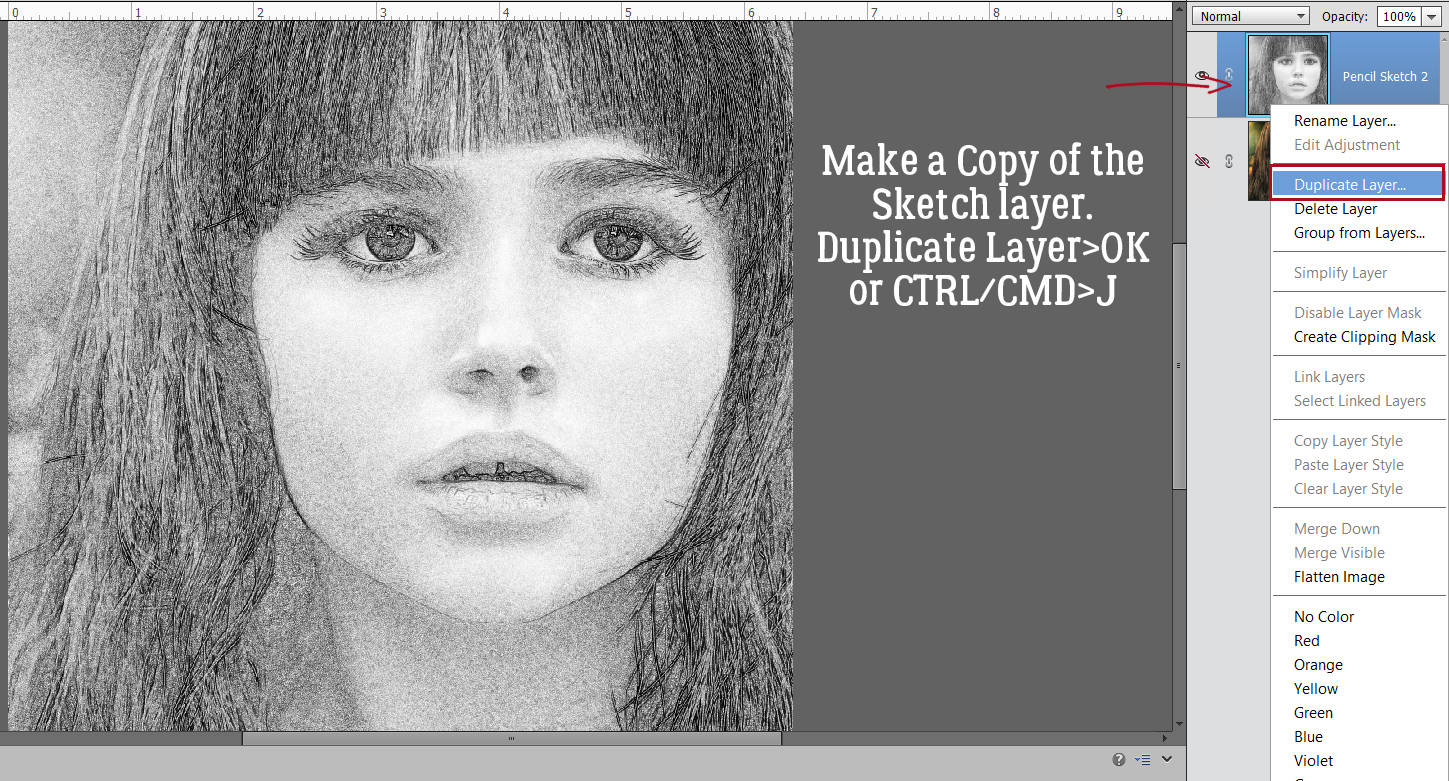
![]()


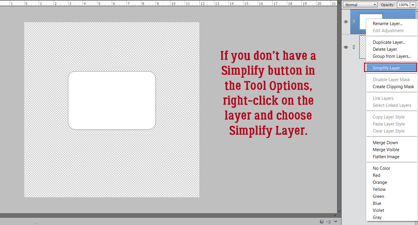


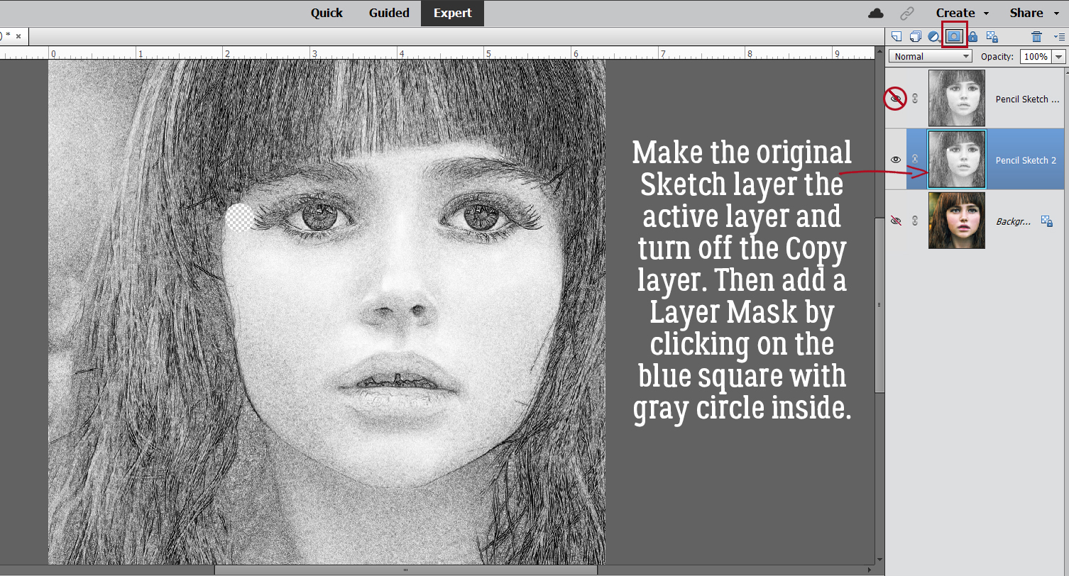
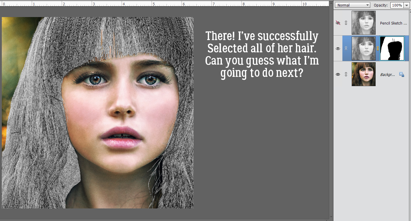
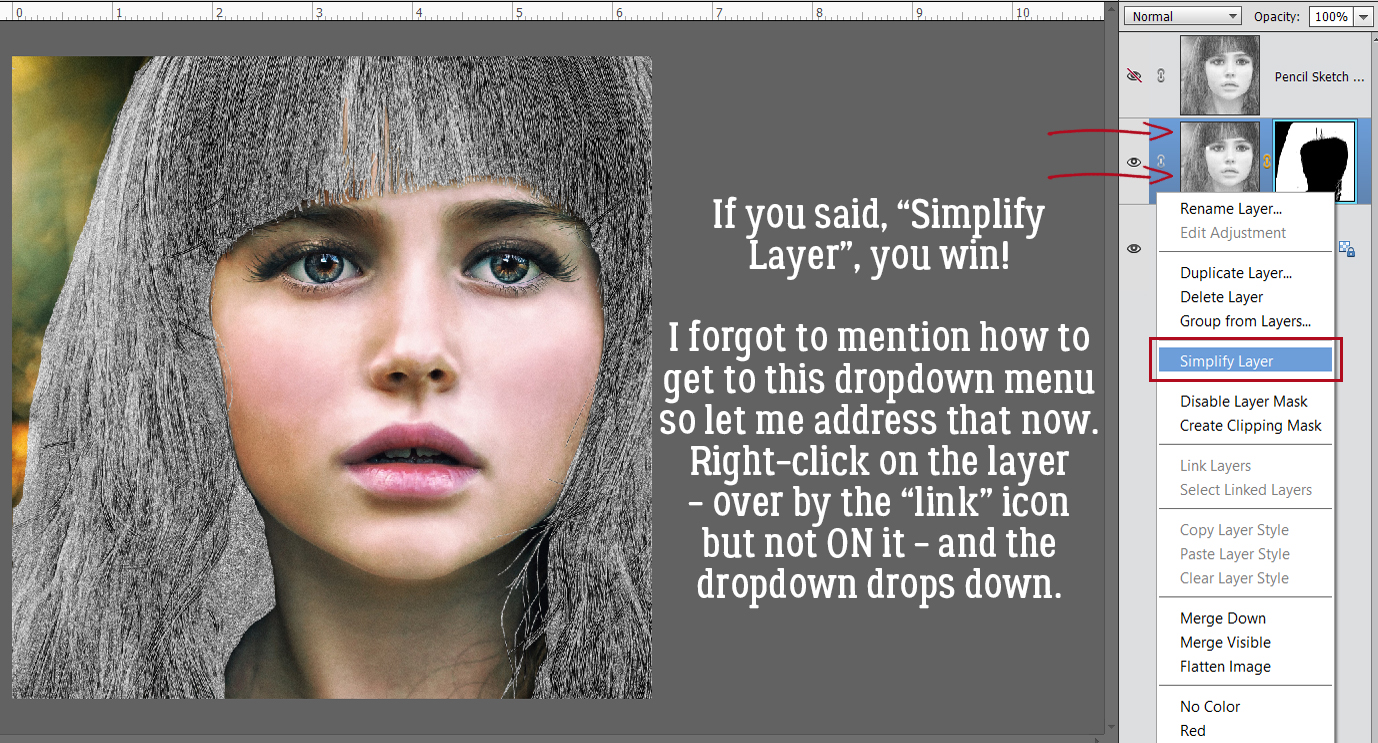
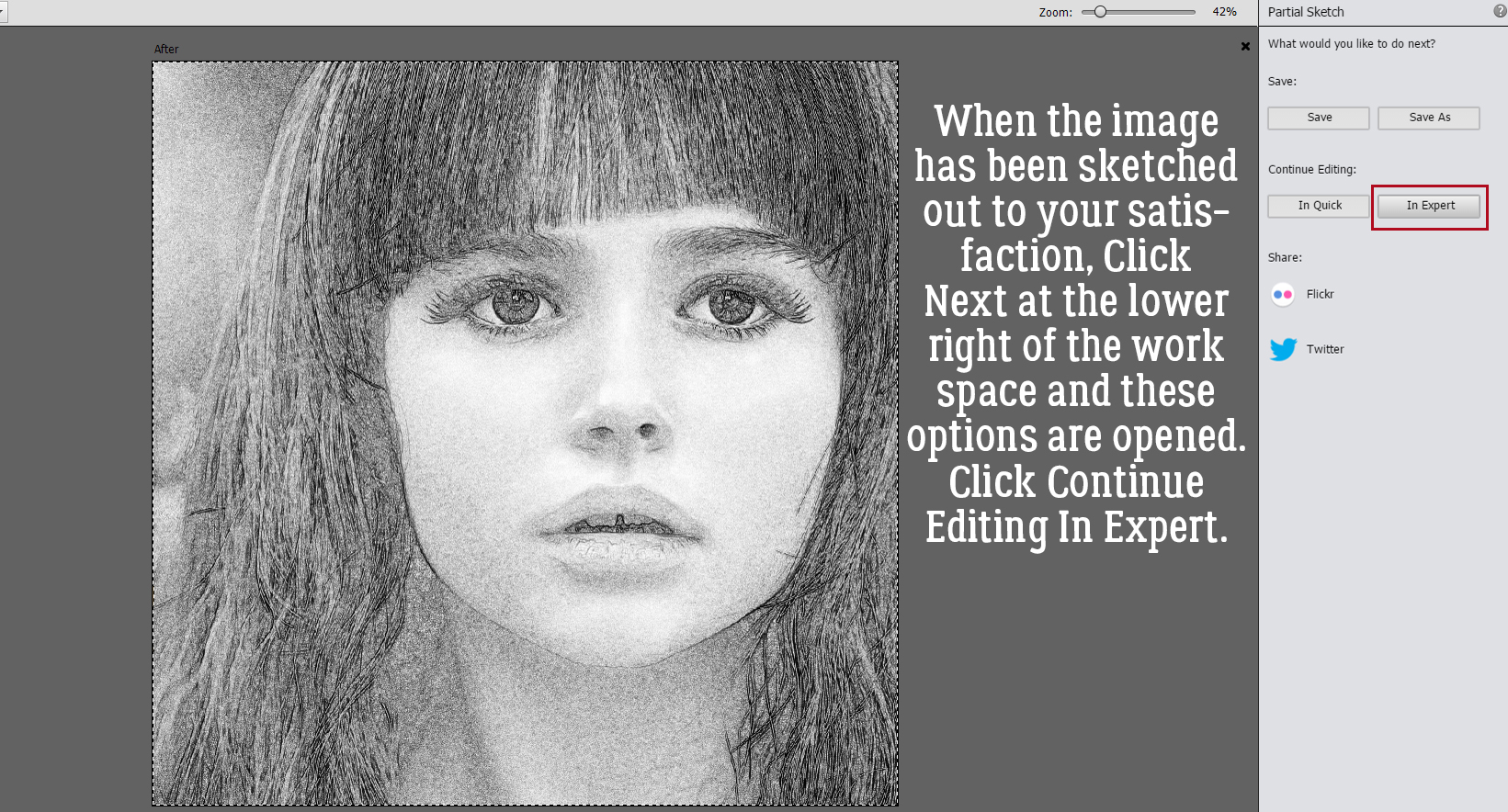 Now it’s possible to see what Elements was doing in the background while we were busy and oblivious. Now I have 3 layers: the original, a sketch layer with a black Layer Mask and a sketch layer with a white Layer Mask. It’s possible to do the following steps using these two masked layers, but it’s a bit more challenging than my approach, so we’re not going to do that. The layer that I want to work with is the one with the white Layer Mask, but I need to Simplify it. Right-click on that layer – over on the left of the layer near but not ON the link icon – then choose Simplify Layer.
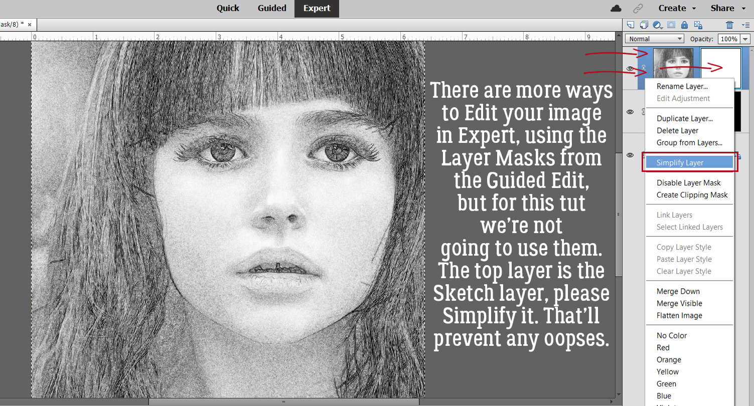
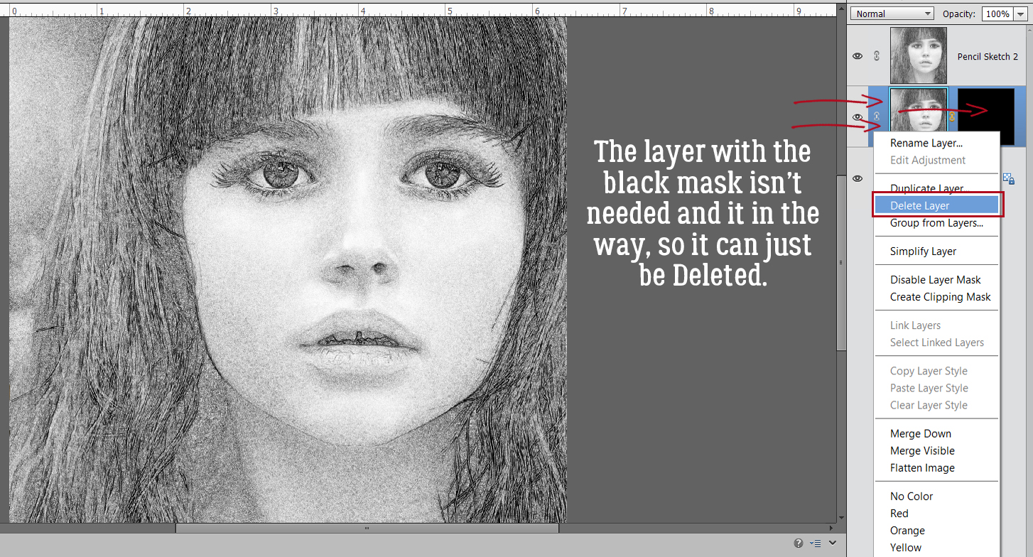
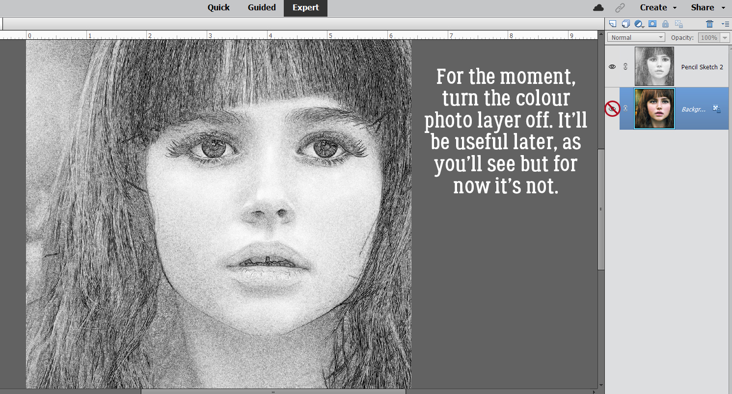
 I also discovered that toggling the colour layer on and off makes it easier to see edges of things better.
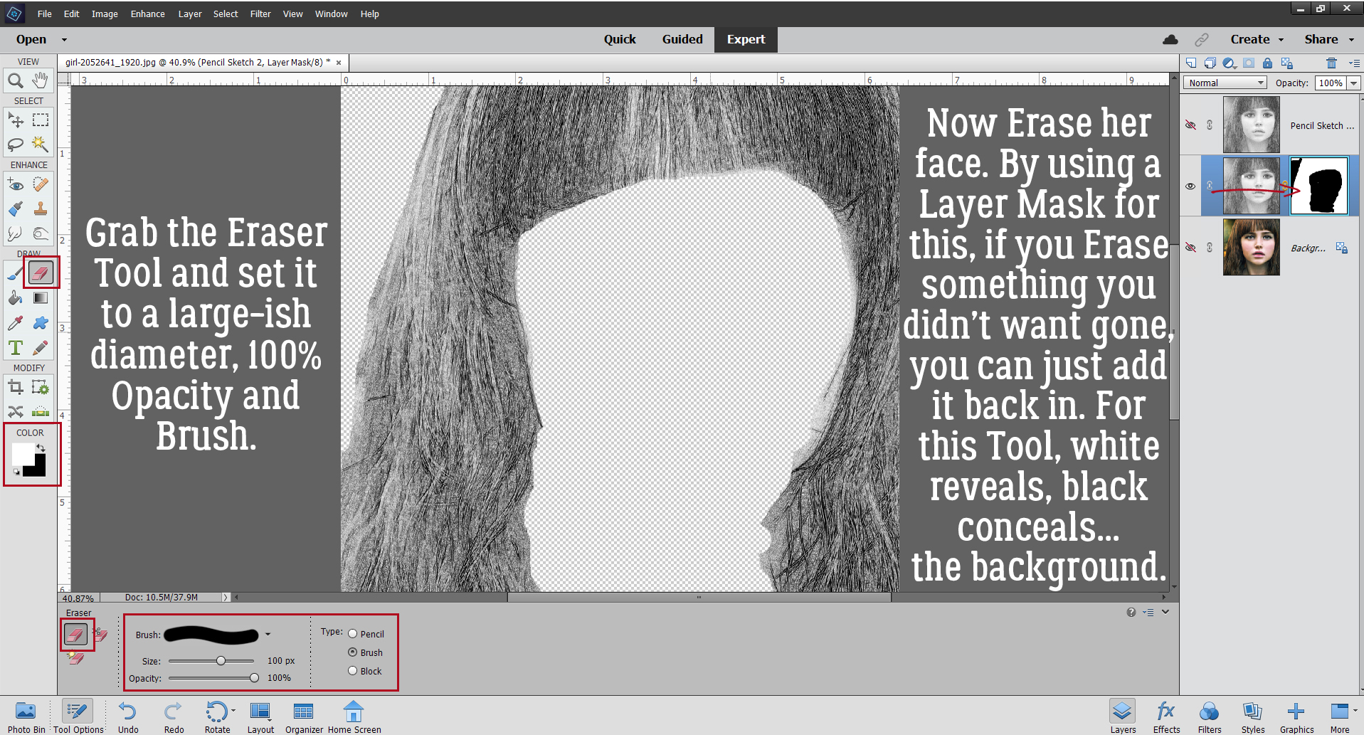
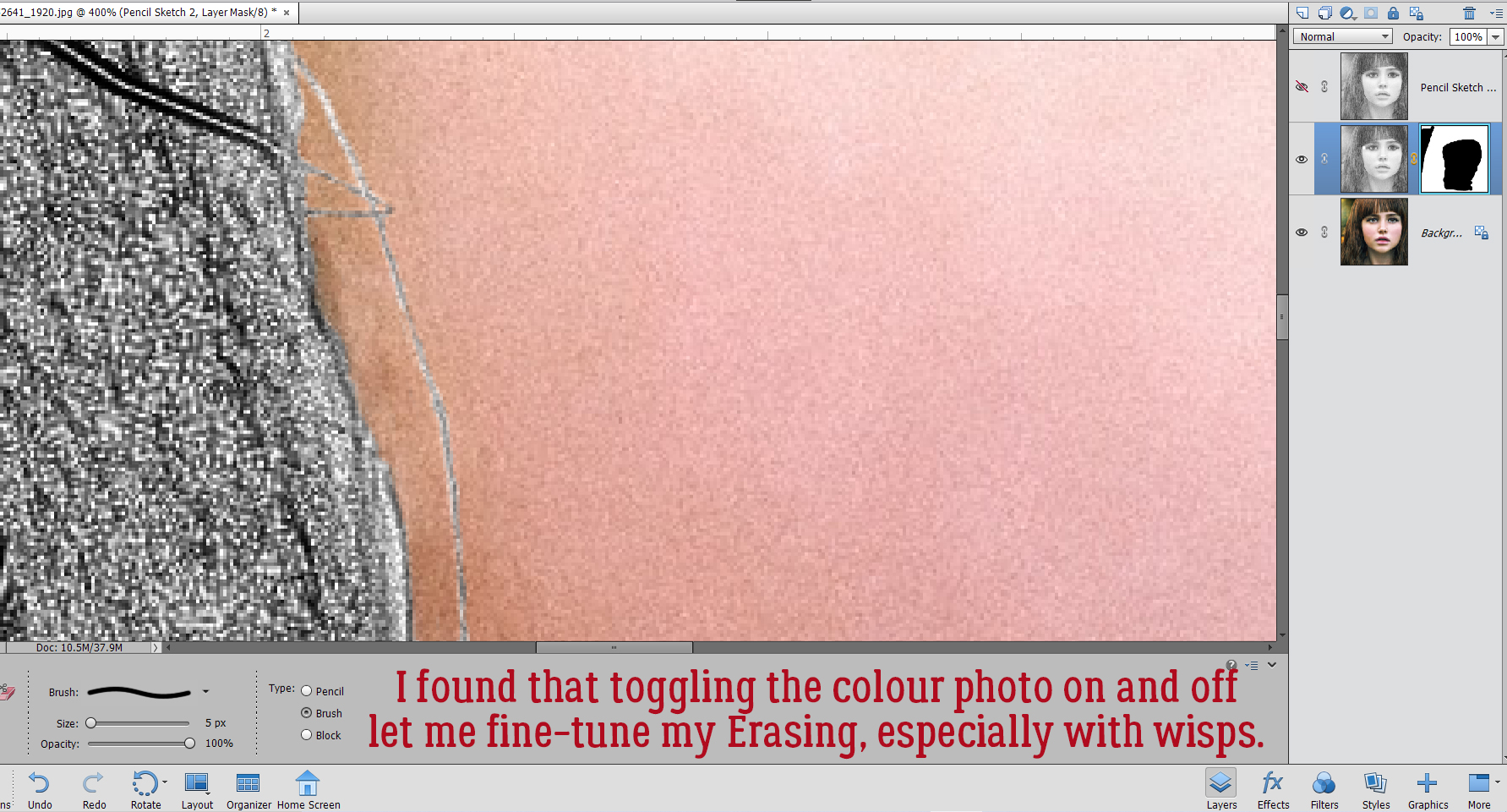 Aaaaaand toggling the sketch layer on and off helped me see where and what needed more help.
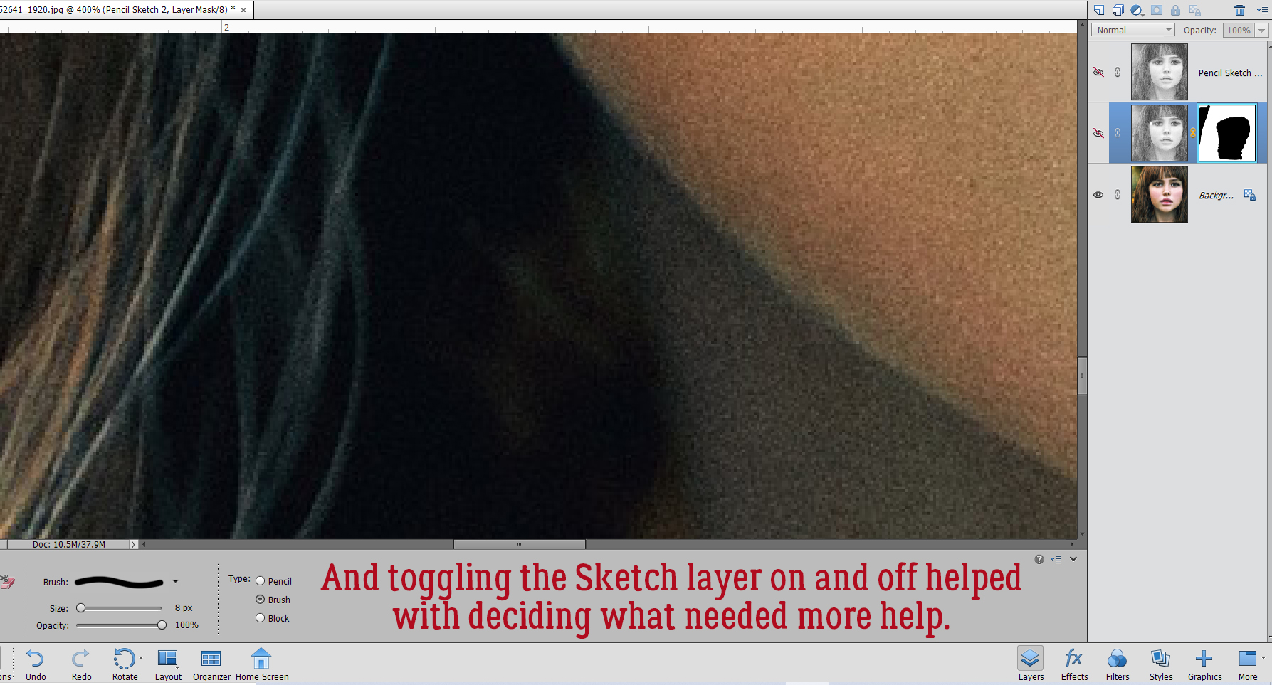


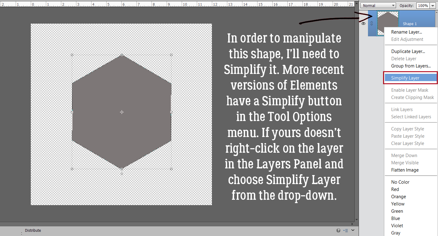


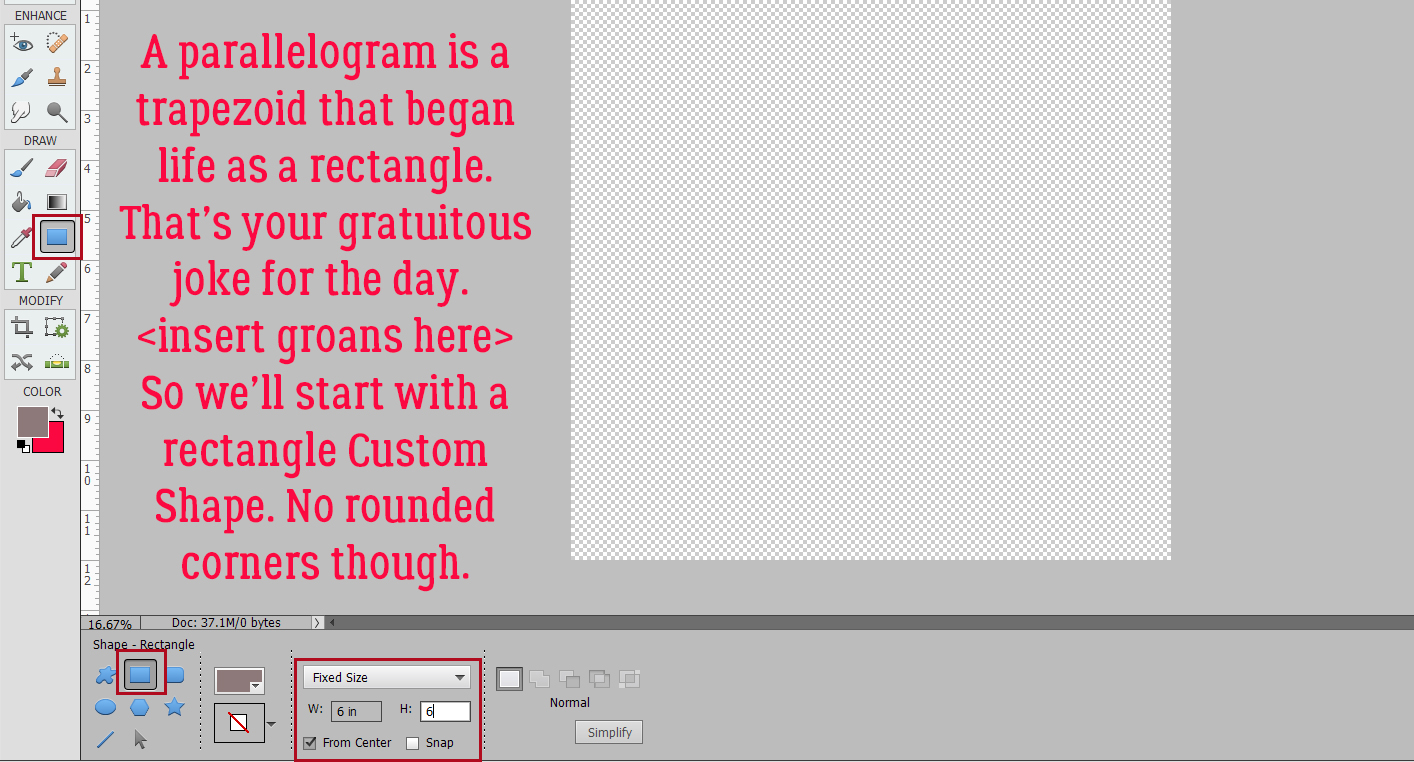
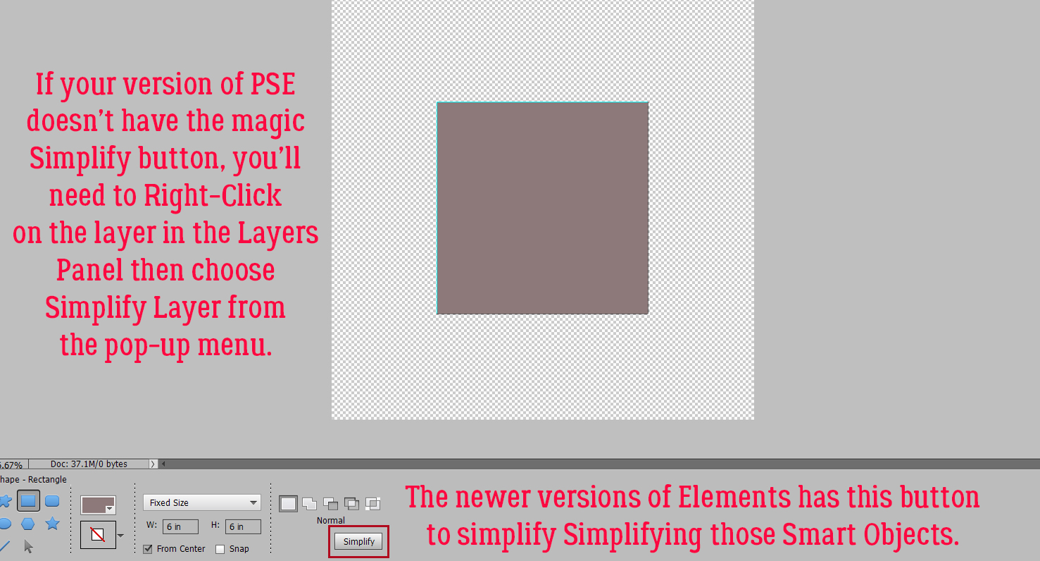
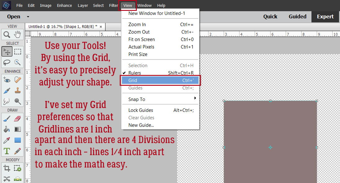
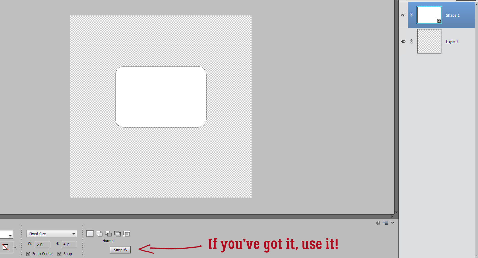
 We’ll come back to the hexagon in a minute. What if you chose a more complicated shape, like this seal? You can use all the controls in the Tool Options, like using Defined Size, and if you tick the From Center box, Elements will put the shape right in the centre of the canvas. Here, I’ve shown the Simplify button (the one you may not have). Experiment with your software; the more you play with it, the better you’ll understand what it can do and what it can’t. (And these tutorials will make more sense…) You’ll find a system and a rhythm that works for you.

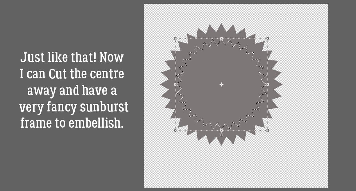
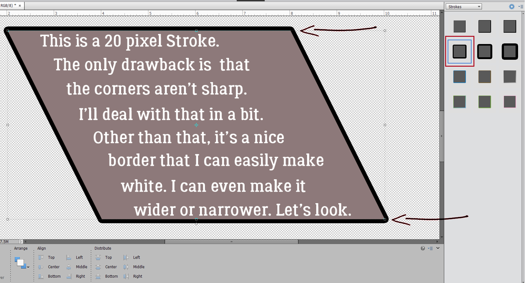
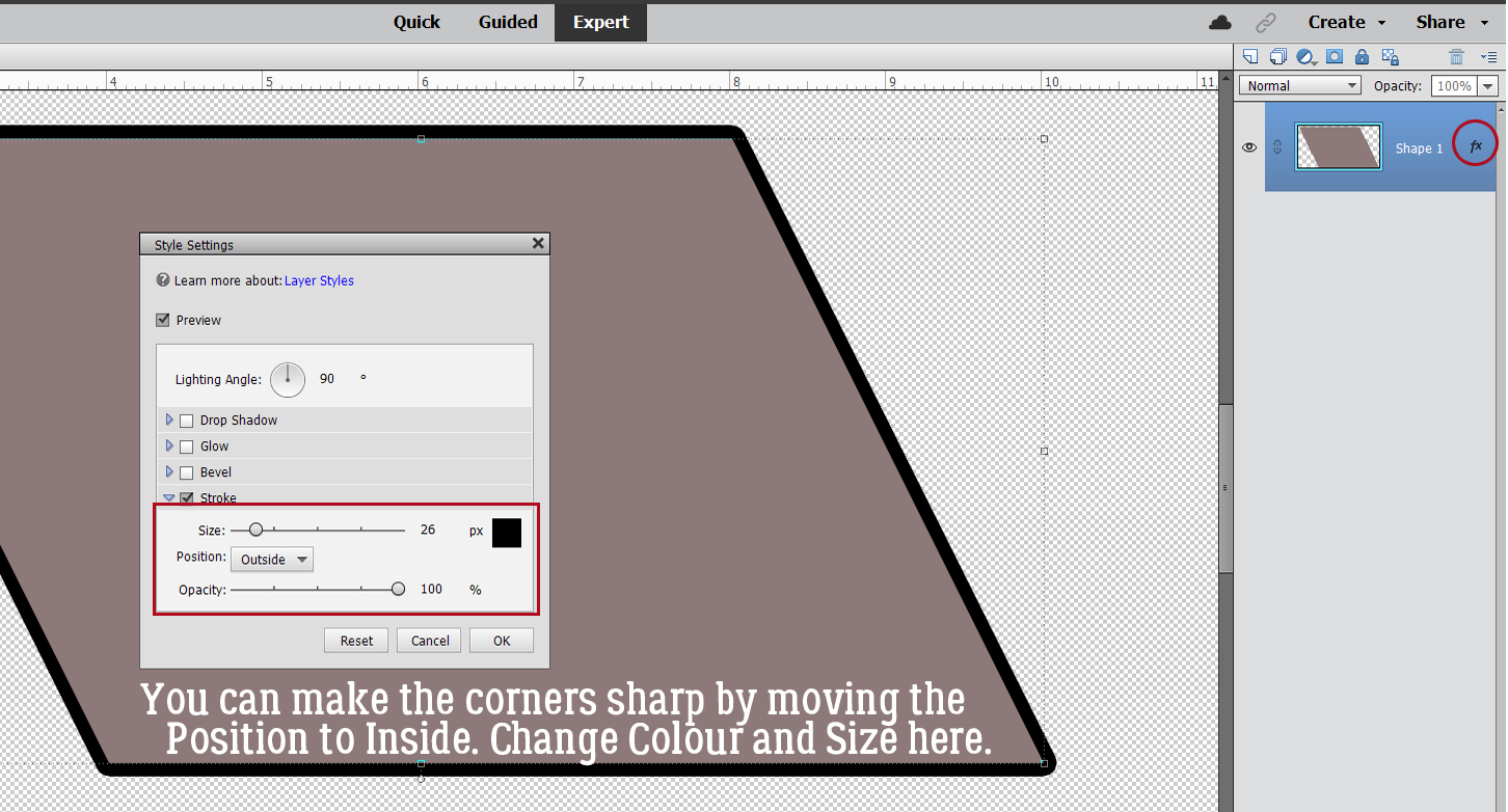
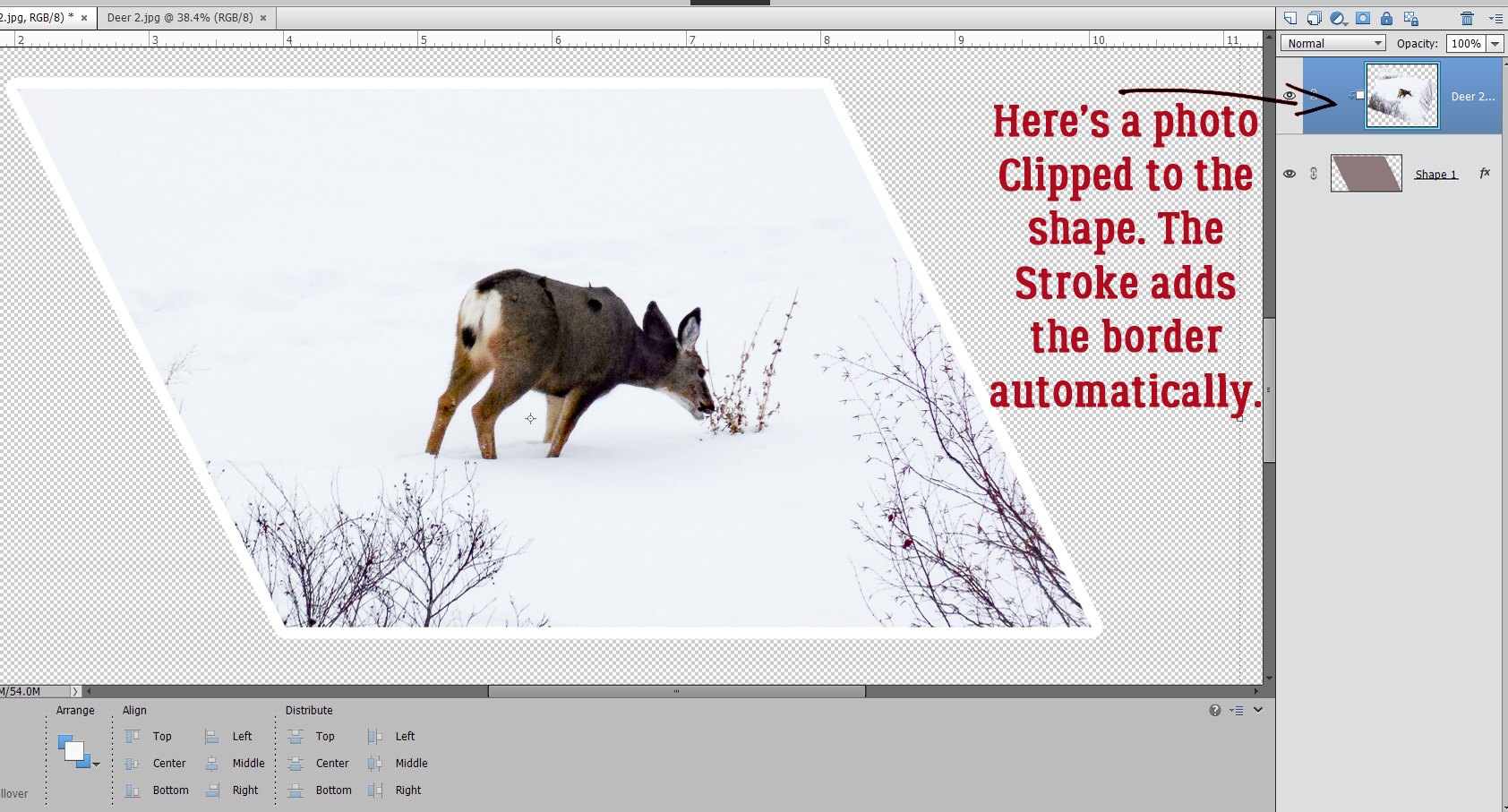
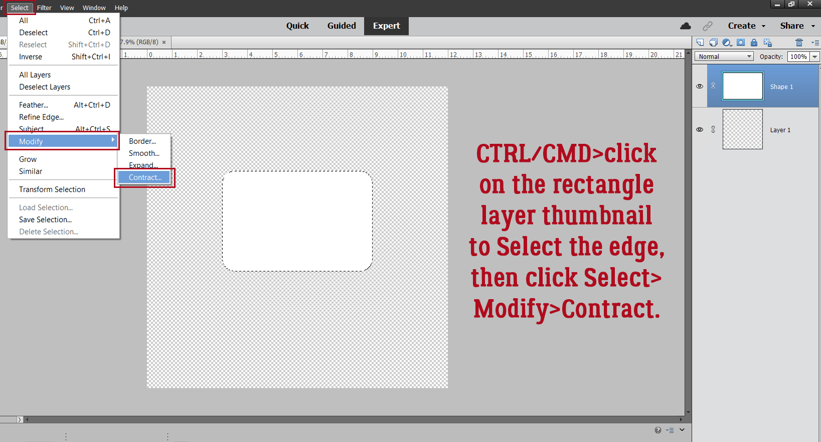
 Quick-and-easy border making uses the Stroke Edit. CTRL/CMD>click on the Layer Thumbnail to “Select” the edges of the hexagon, inside and out. Make sure you’re on the blank layer, then Edit>Stroke (Outline) Selection.