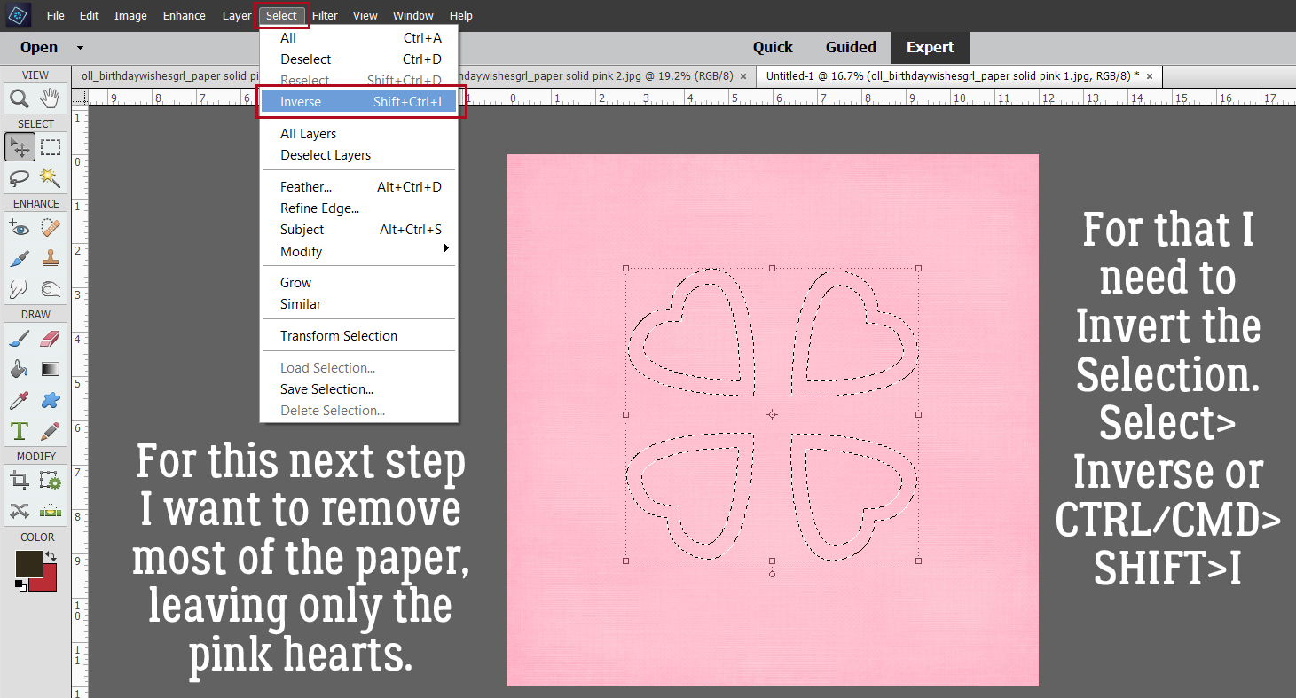
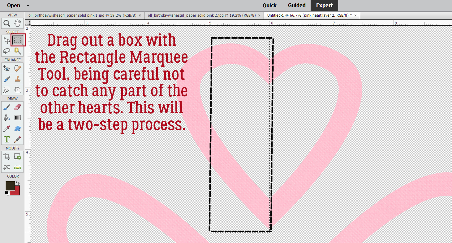
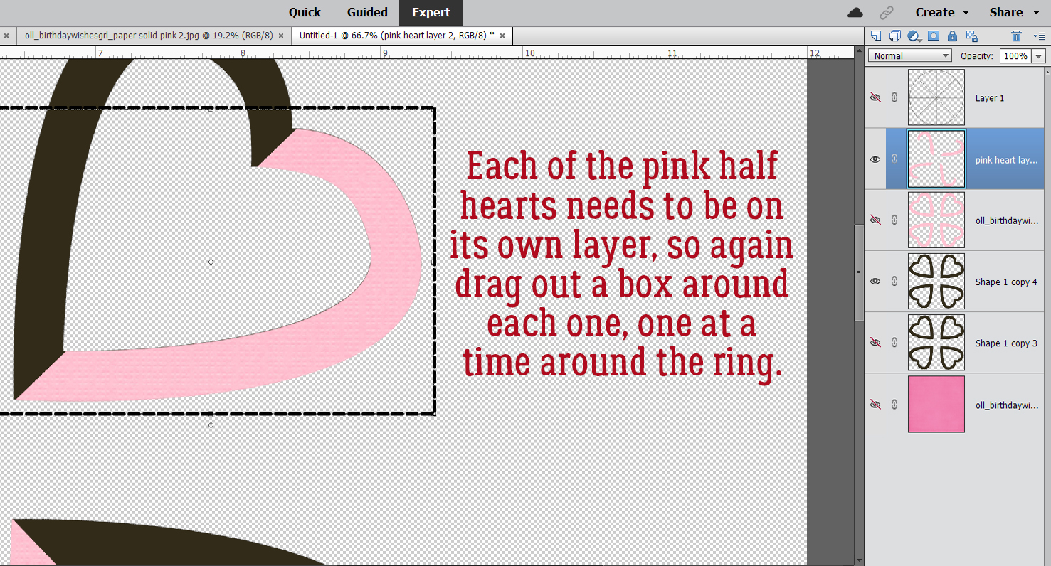
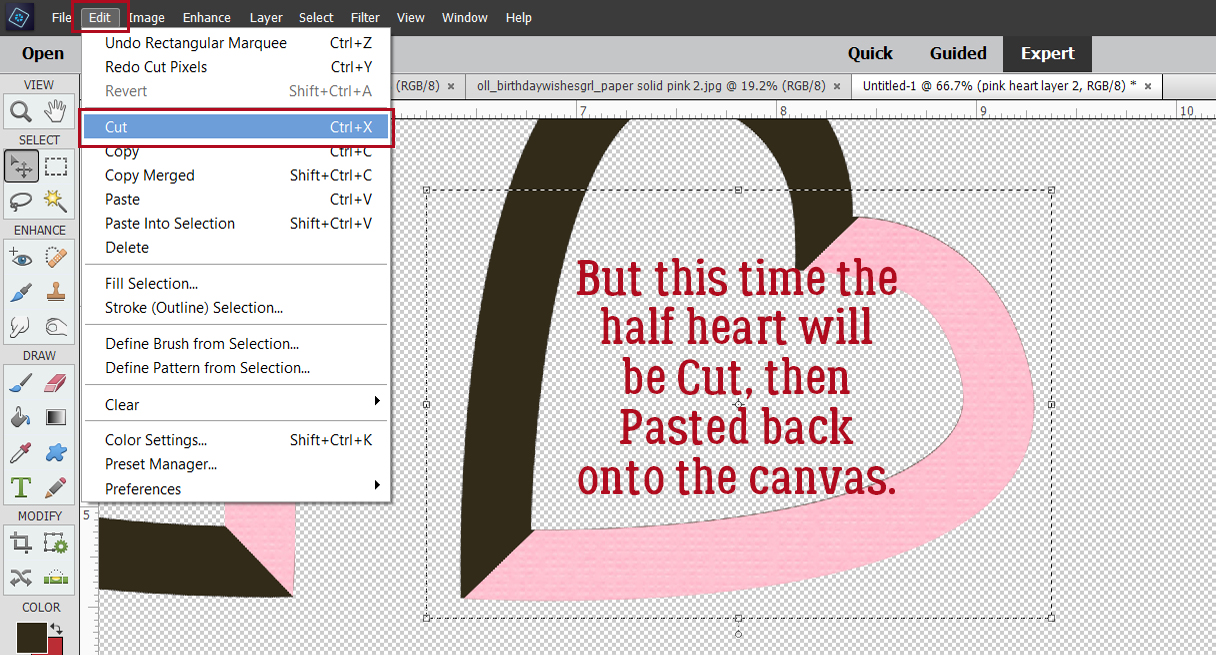
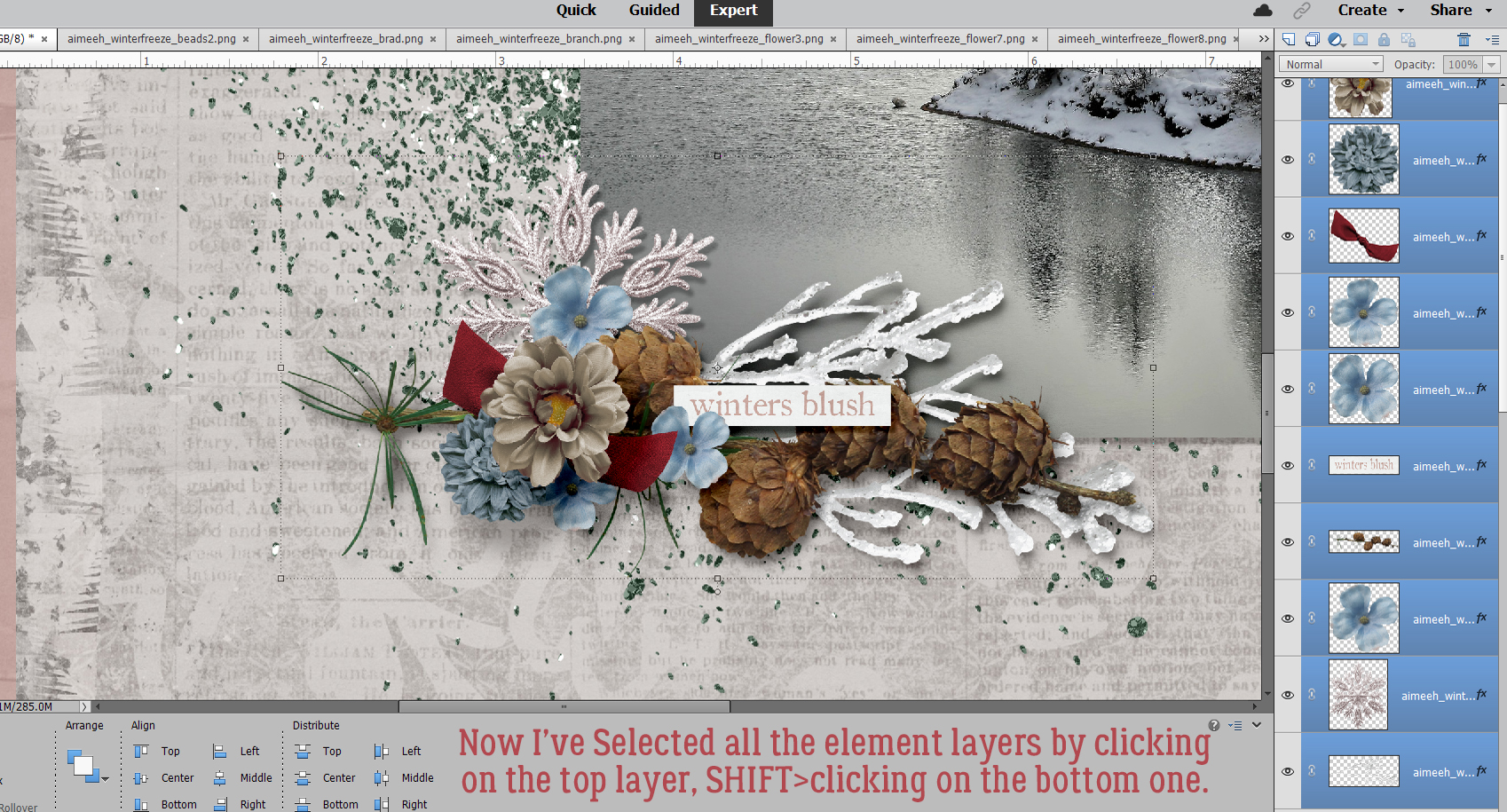
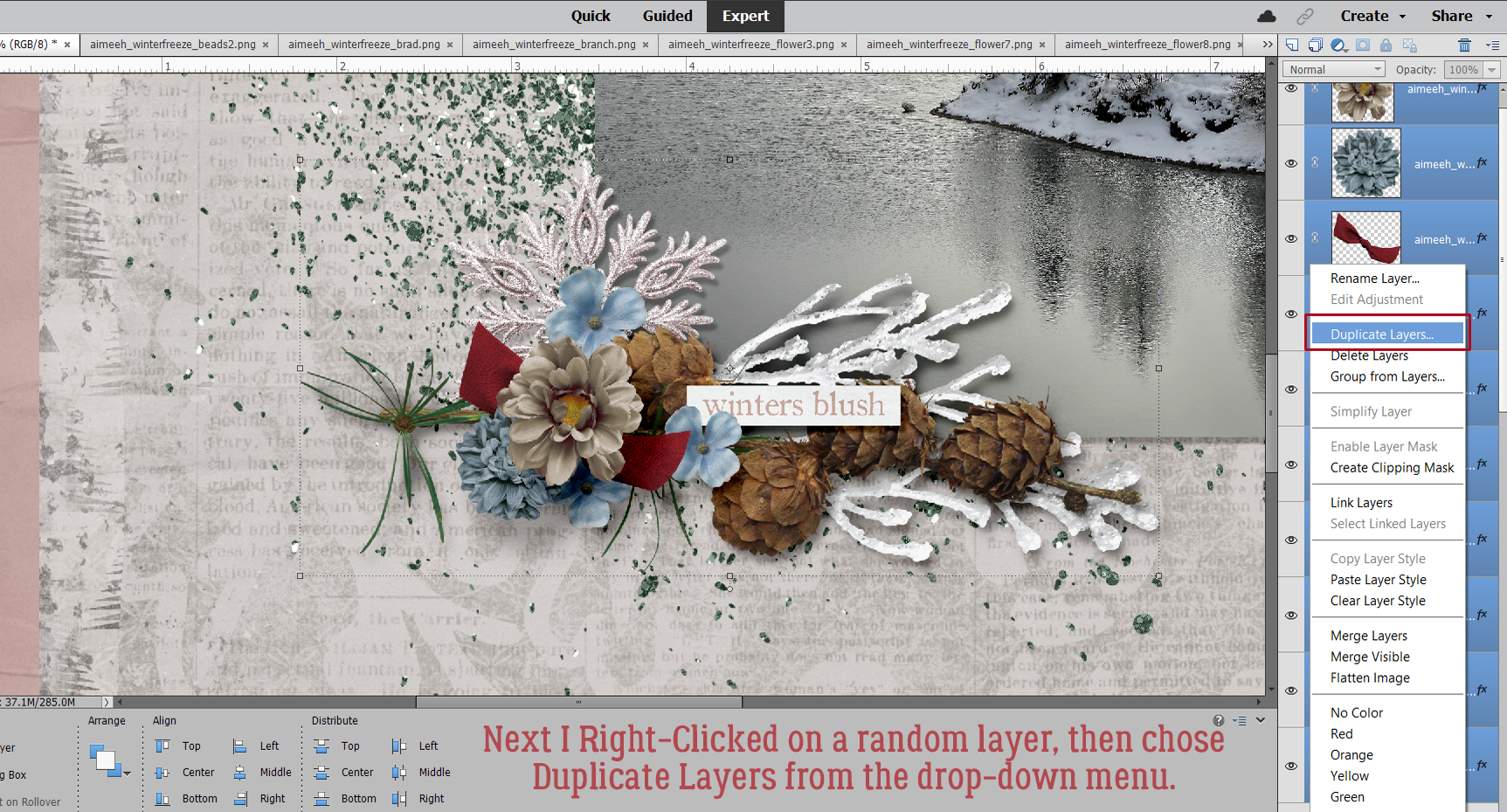
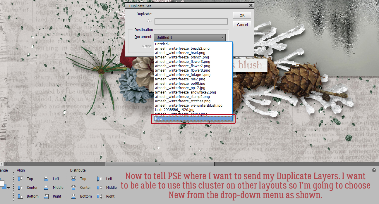
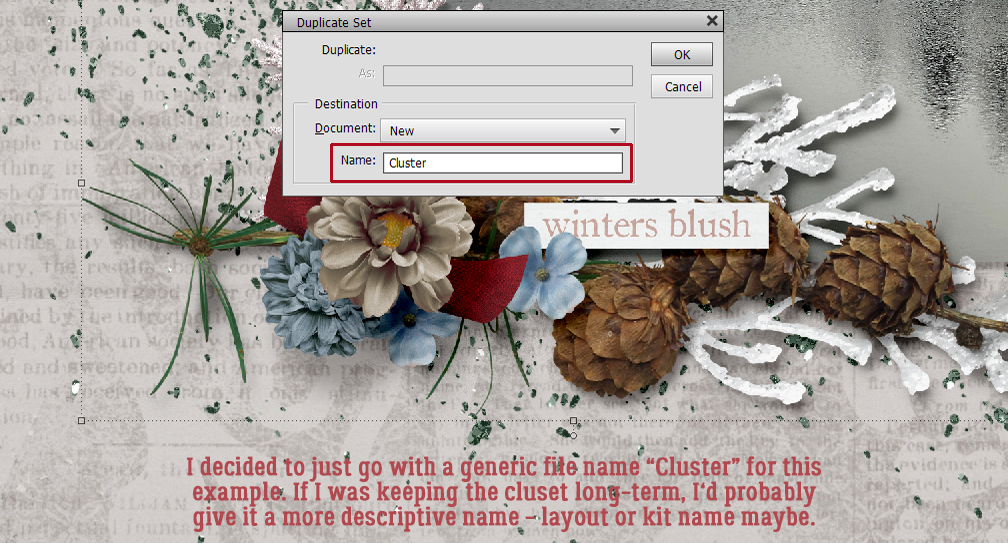
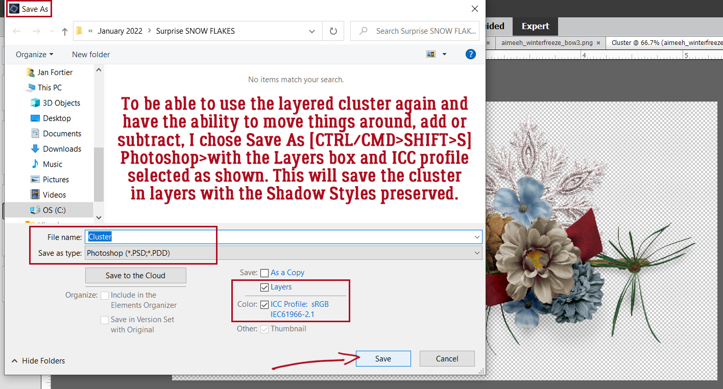
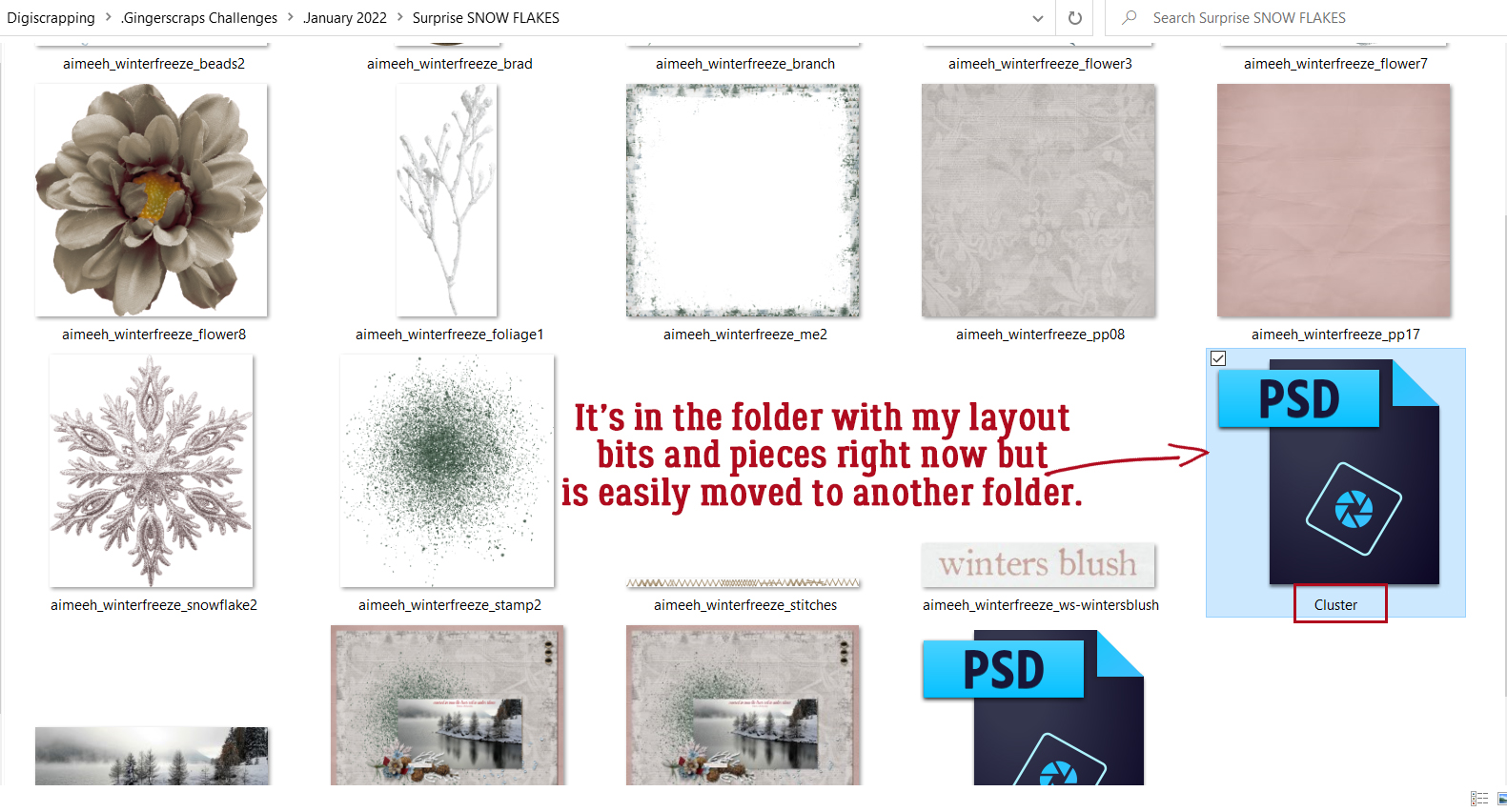
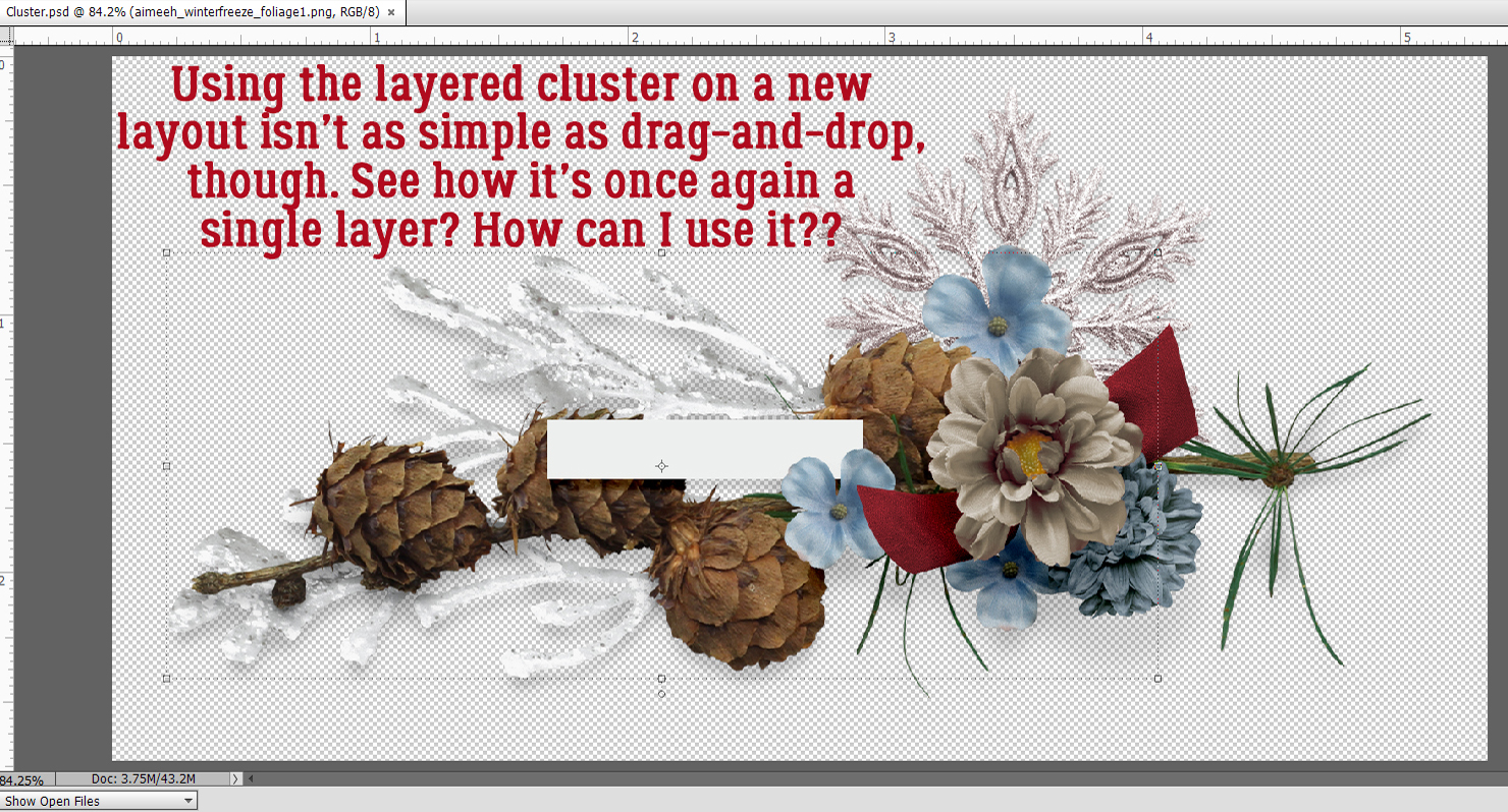
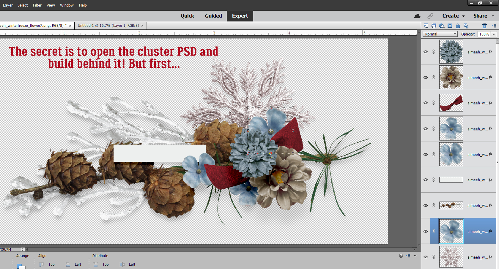
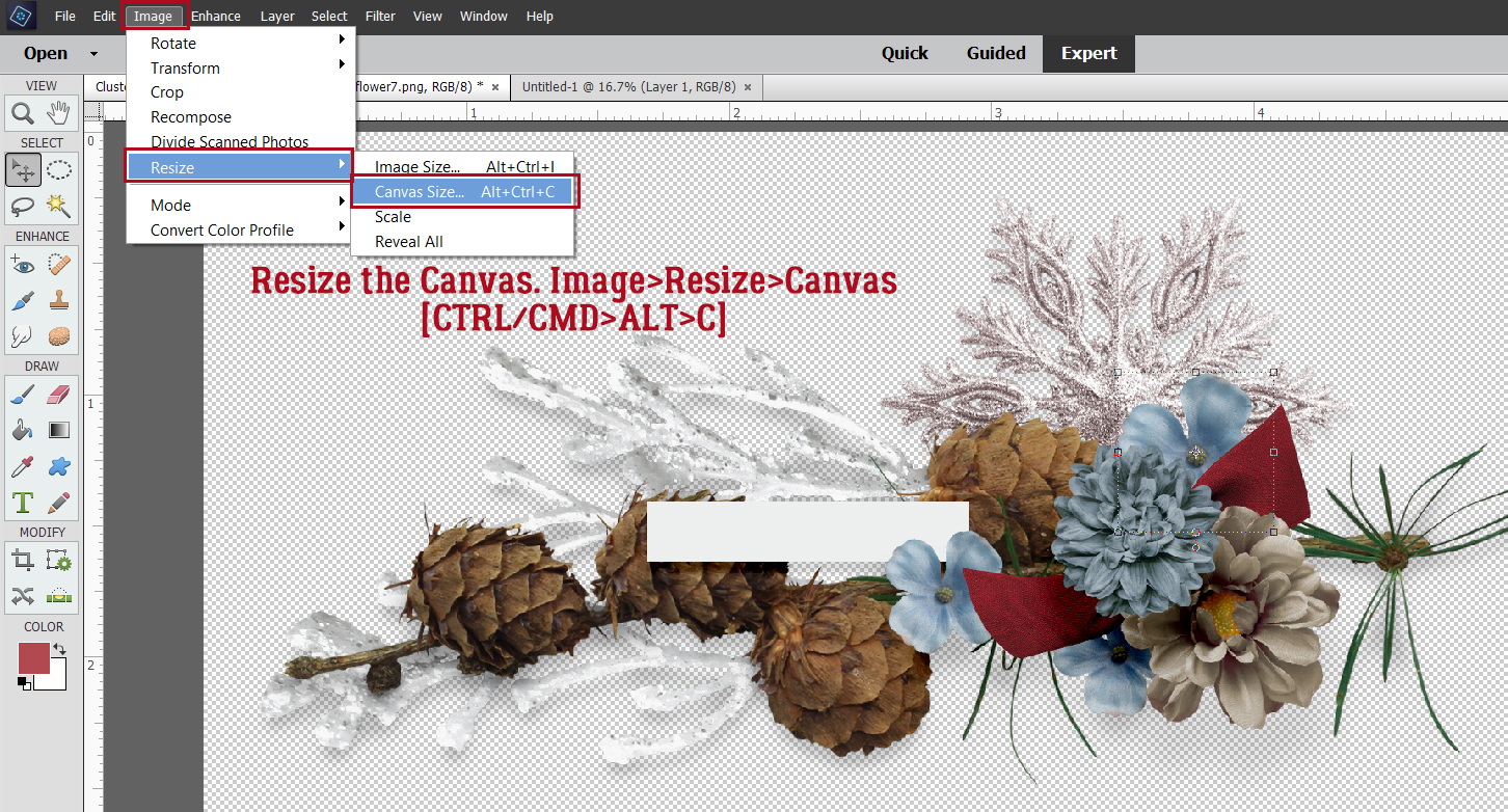
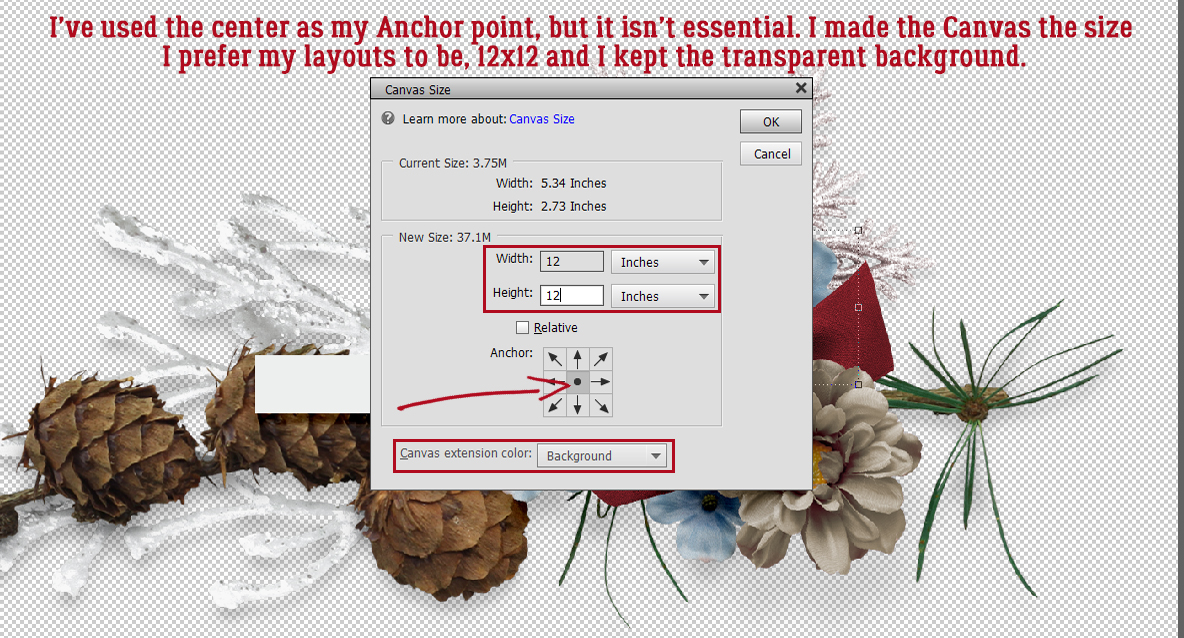
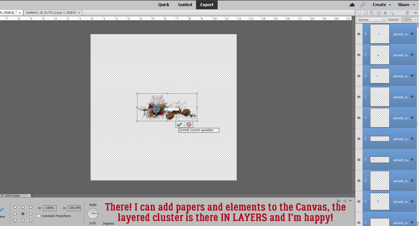
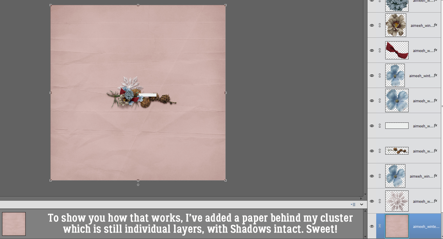
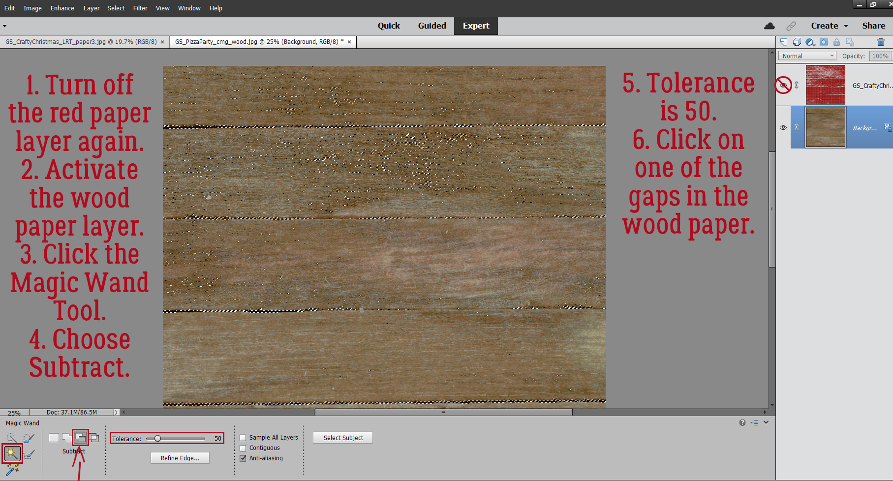
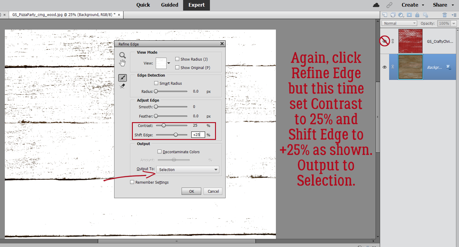
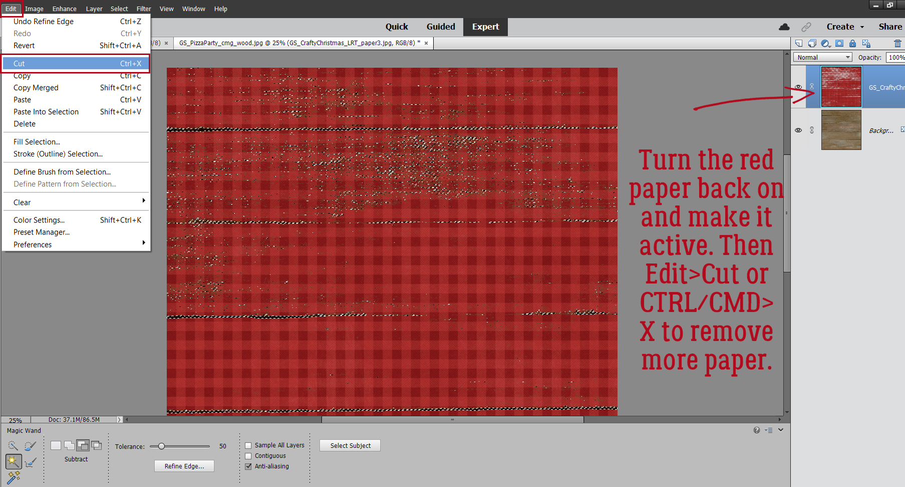
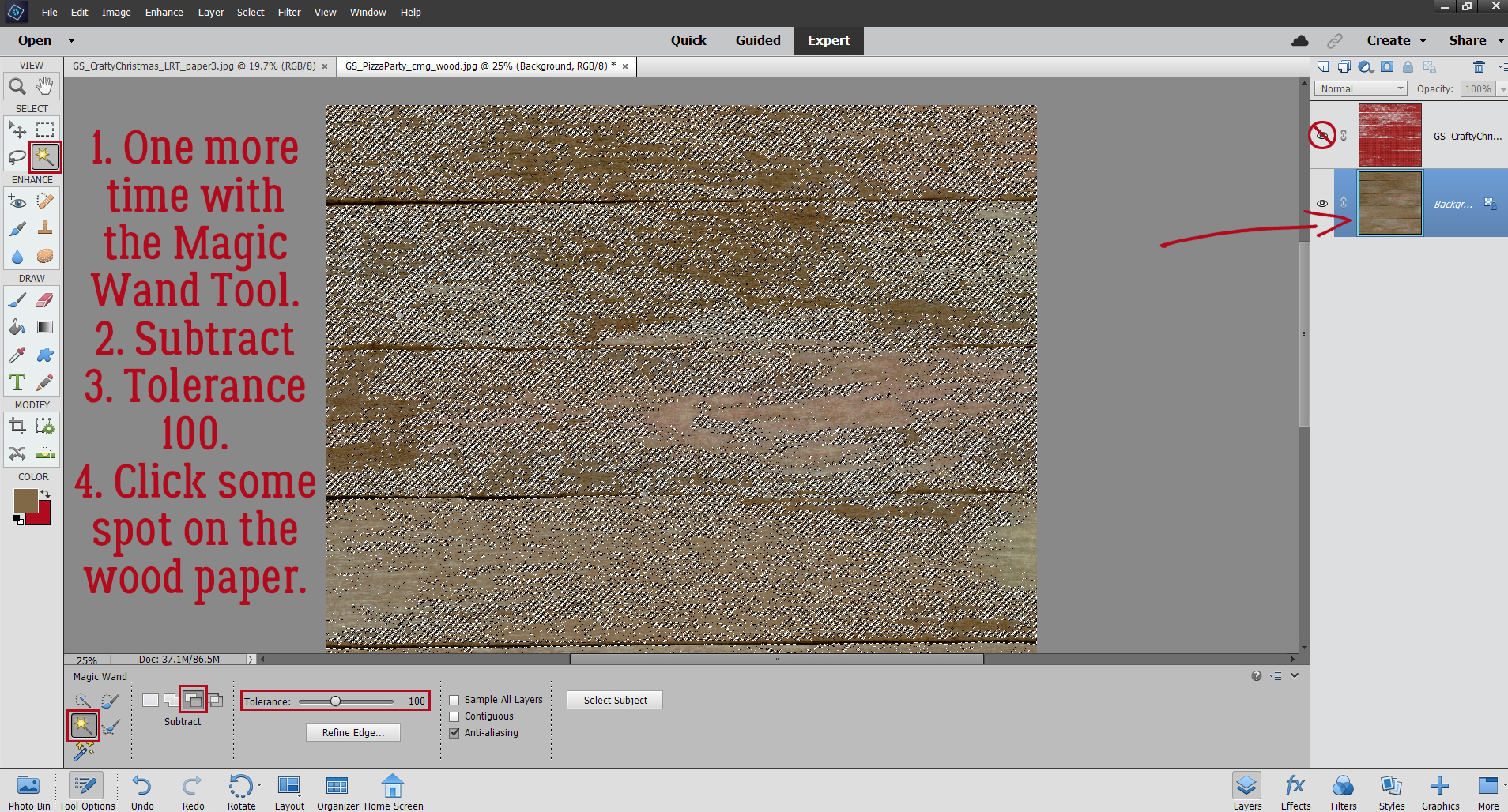
Challenge Spotlight: INSPIRATION
![]()
Yes, it’s the third Tuesday of February already! This month and next start on a Tuesday, so here we are… looking at a Challenge and the Individual Style each of us brings to a common goal. With the month really only halfway over – and both the Olympics and the Super Bowl squeezed in there, it was a challenge in itself to find one with enough examples to make a good post. But not to worry, the Inspiration Challenge, with Memory Mosaic, fills the bill. Before I go on, these Challenge Spotlights aren’t only meant to encourage you to give them a try, but also to help with the logistics. There are several layouts displayed in the thread that aren’t found in the Challenge Gallery. Posting your layouts to the Challenge Gallery is a required element for proper credit toward Challenge Rewards. So don’t forget that step! Now, let’s talk Inspiration…
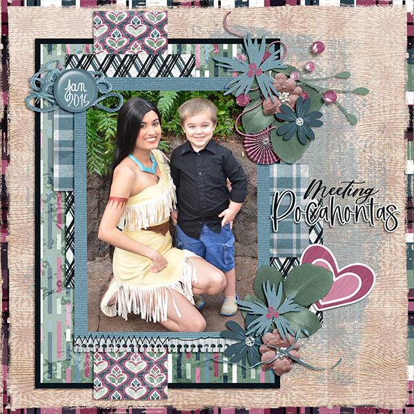
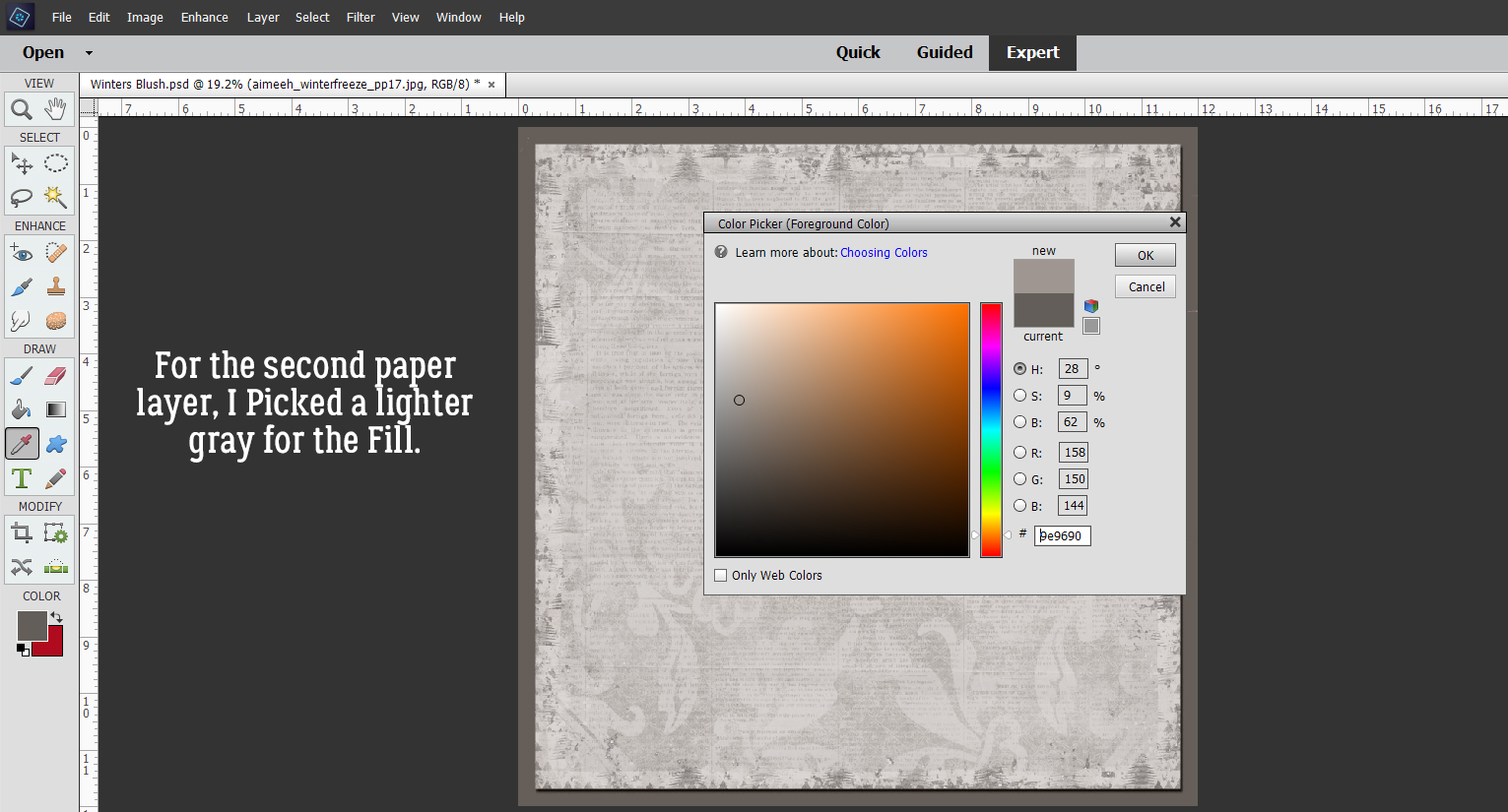
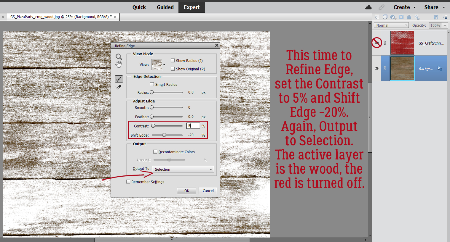
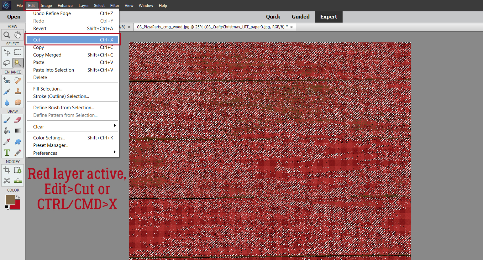
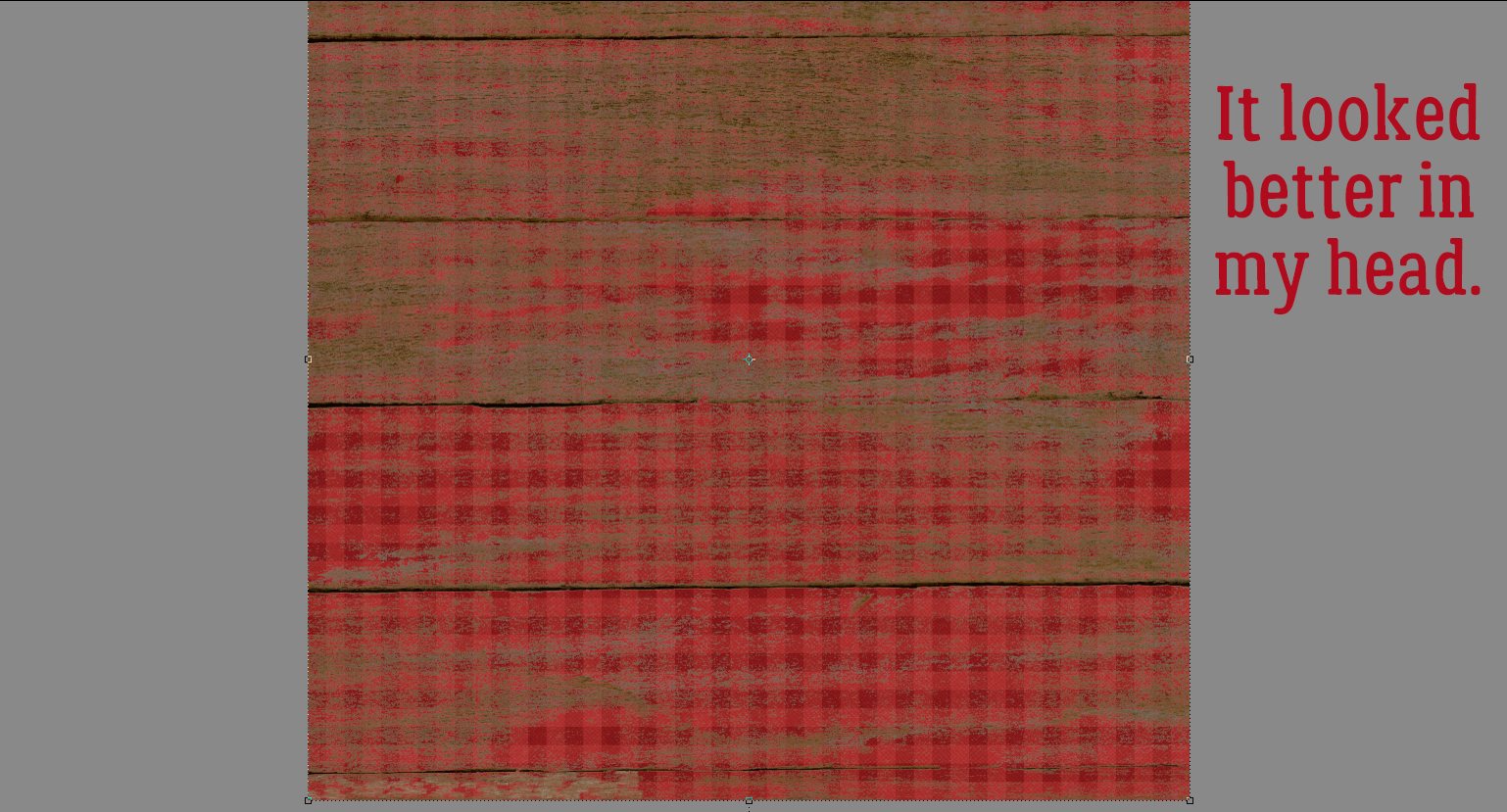
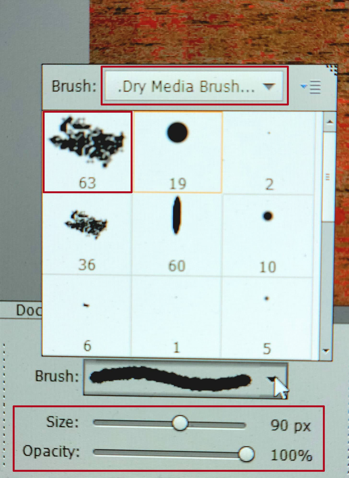
Joy’s theme for this month’s challenge is SHAPES. But she also wants a brief explanation of how the participants decided which shapes to include. There are some unique takes on this one, and my descriptions aren’t going to replace the scrappers’ own words. You’ll have to check out the layouts in the Gallery to see those. Each layout is linked to the Gallery through the scrappers’ names, so please do drop by and leave them some praise.
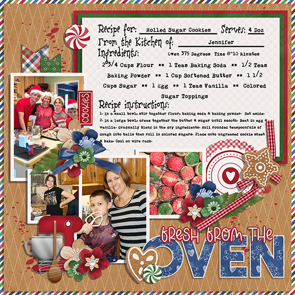
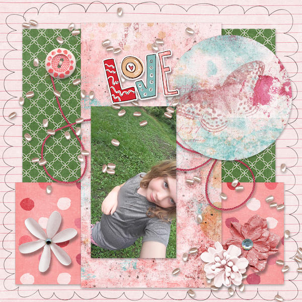
First up is this one by B2N2Scraps. She has a variety of geometric shapes here: circles, rectangles and parallelograms. (Thank you, Google, for helping me out with the names of some shapes that I’ve forgotten.)
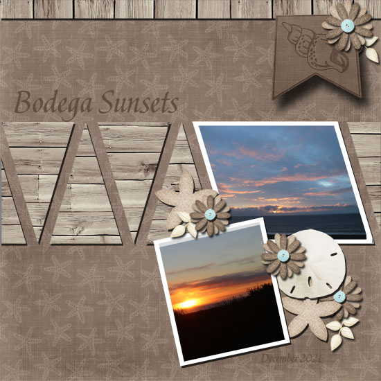
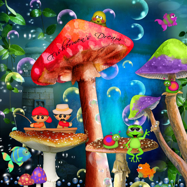
What has Pippin got going on here? I see hexagons, triangles, trapezoids, pentagons, circles and rectangles. Oh, and some square gems too!
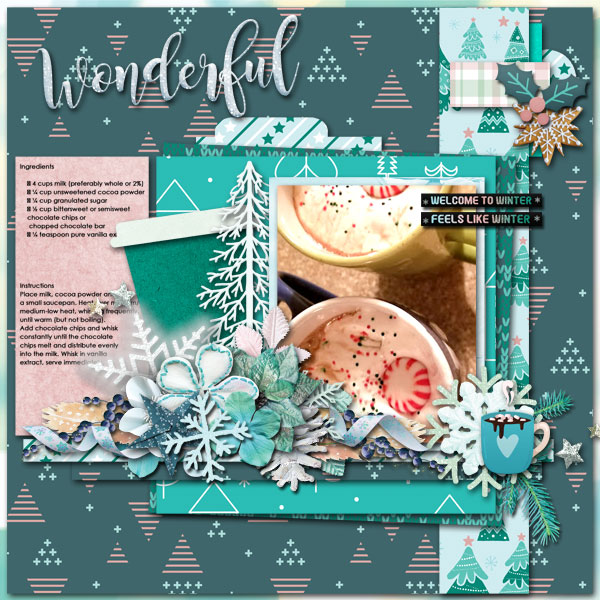
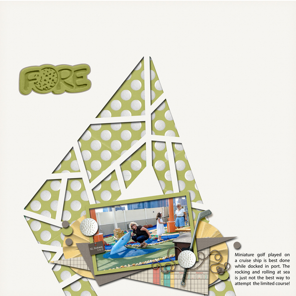
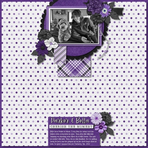
In SusanSays‘ layout the predominant shape is the triangle, but it isn’t the only one. I see squares, rectangles, circles, trapezoids, a couple of ellipses and a star.
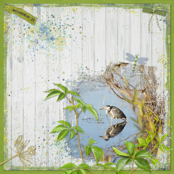
Tbear has used lots of circles, but she’s also got some pyramids there, some trapezoids and rectangles too.
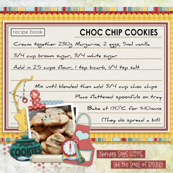
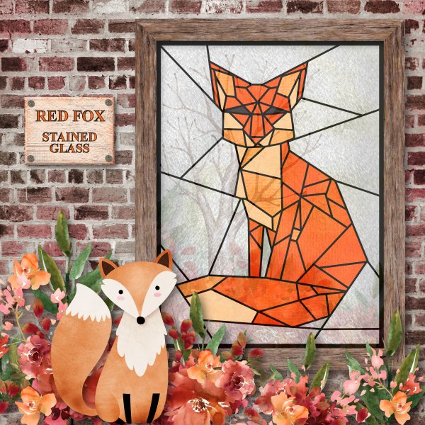
This layout by greenfiend27 is too clever by far! There are a plethora of trapezoids, triangles, rectangles, squares and at least one pentagon in there. I almost overlooked the tiny circles!
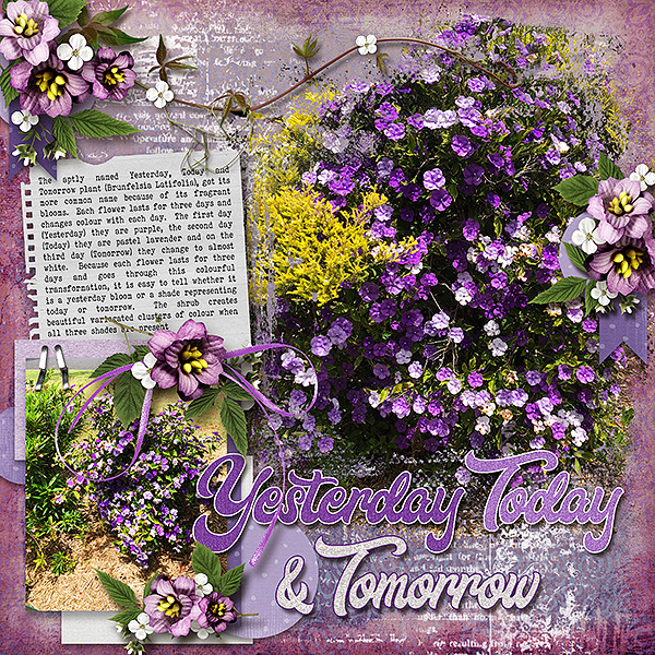
I like how simple mdusell’s layout is, but still contains a number of shapes: triangles, a parallelogram, rectangles, circles and two overlapping trapezoids.
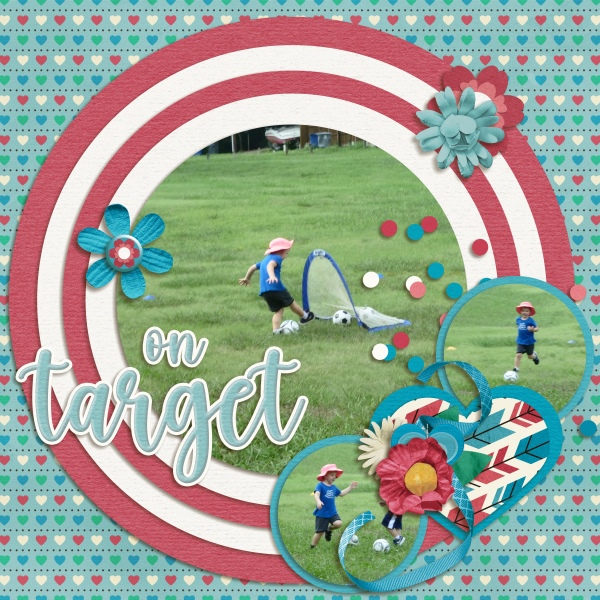
Trapezoids seem to be a very popular shape! pjm117 has included some circles and triangles, as well as a couple of rectangles too.
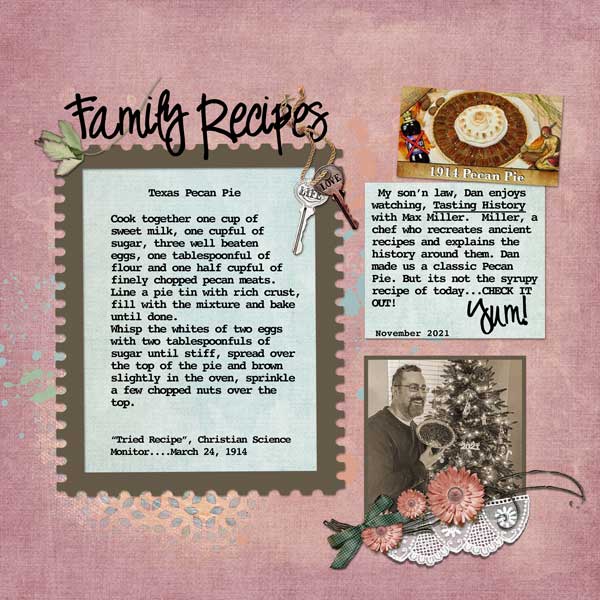
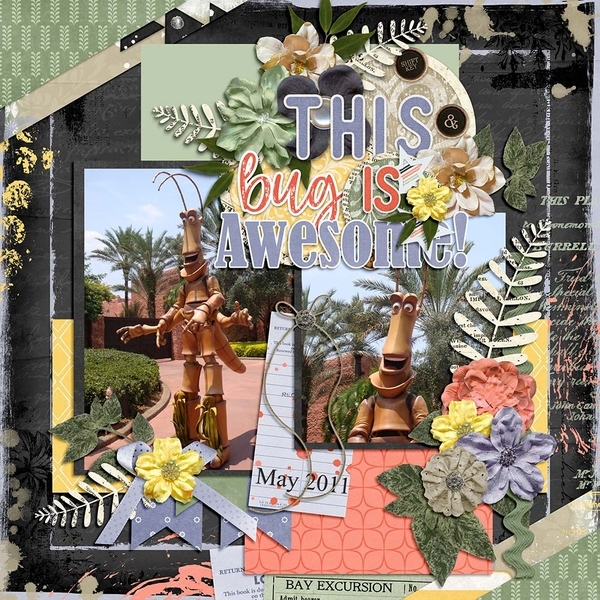
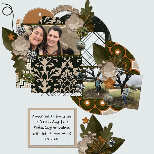
There’s a lot going on in Lisa Campbell’s layout, but a close look shows triangles, parallelograms, circles, rectangles and some overlapping trapezoids.
Dovedesign made it easy. Circles and rectangles are obvious; ellipses are less-so… they’re the beads!
Basketladyaudrey made it easy too, big squares, rectangles, a big circle and two overlapping trapezoids are there.
Here, lousmith went with just the square of her background and LOTS of circles.
Last but not least, princess-scrap has circles and rectangles and one solitary square photo.
Great layouts, ladies!!
PDF Version : https://bit.ly/351E7f8
![]()