They say that Friday the 13th is bad luck. Well, today, you’re in luck! We have some awesome new stuff available in the store! Oh, that’s not it! We also have a new designer joining the store!
Remember when you spend $10 in the store, you get a great new collab!

https://store.gingerscraps.net/GingerBread-Ladies-Collab-Boys-To-Men.html
I did mention a new designer, didn’t I? Well, it’s Patricia of Paty Greif Design Studio!

She went above and beyond when giving us a bio! She created a beautiful graphic for it!

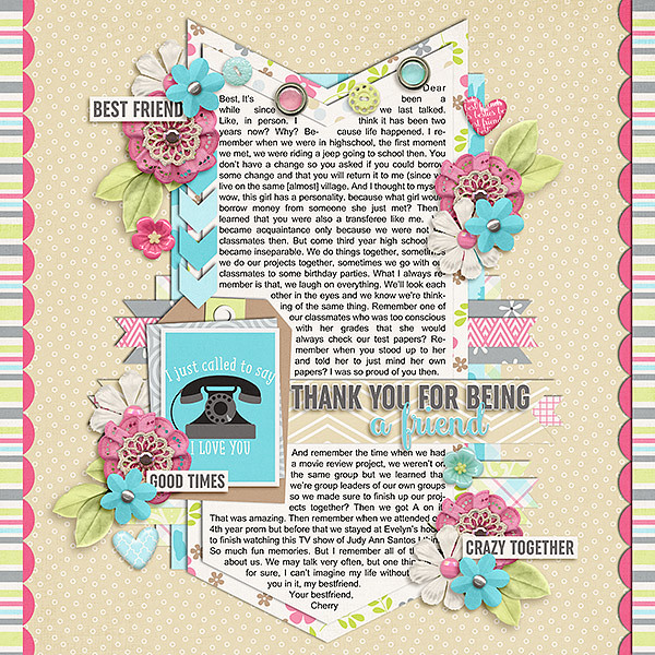
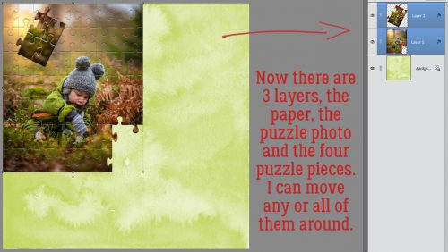
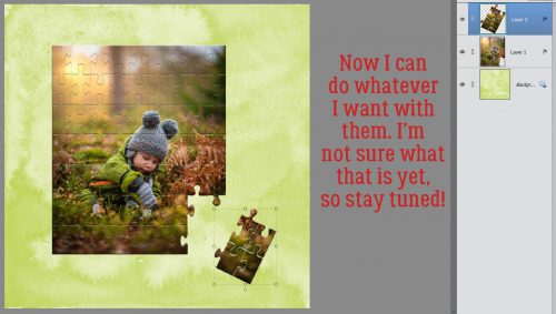
Here are just a few things in her store!

https://store.gingerscraps.net/Paty-Greif-Design-Studio

https://store.gingerscraps.net/Paty-Greif-Design-Studio

https://store.gingerscraps.net/Paty-Greif-Design-Studio
And she has a great sale going on as well!

https://store.gingerscraps.net/Paty-Greif-Design-Studio

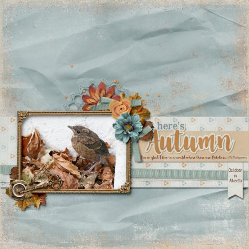
https://store.gingerscraps.net/All-about-autumn.html

https://store.gingerscraps.net/Jump-into-fall-1..html
https://store.gingerscraps.net/Jump-into-fall-2..html
https://store.gingerscraps.net/Jump-into-fall-3..html
https://store.gingerscraps.net/Jump-into-fall-4..html

https://store.gingerscraps.net/Brushed-3-Template-Set-Templates.html

https://store.gingerscraps.net/Simply-2-Template-Set-Templates.html

https://store.gingerscraps.net/David-and-Goliath-BGD.html

https://store.gingerscraps.net/Daniel-in-the-Lions-Den-BGD.html

https://store.gingerscraps.net/Time-for-Wine-Bundle.html

Kit: https://store.gingerscraps.net/Time-for-Wine-Kit.html
Word Bits: https://store.gingerscraps.net/Time-for-Wine-Word-Bits.html
Wood Papers: https://store.gingerscraps.net/Time-for-Wine-Wood-Papers.html
Extra Papers: https://store.gingerscraps.net/Time-for-Wine-Extra-Papers.html

https://store.gingerscraps.net/October-2017-Template-Bundle.html

https://store.gingerscraps.net/Landscapes-2.html

https://store.gingerscraps.net/Pocketful-Of-Love-4-Spookalicious.html

https://store.gingerscraps.net/Layers-Of-Fall-By-Dandelion-Dust-Designs.html

https://store.gingerscraps.net/Believe-in-Magic-Page-Kit.html

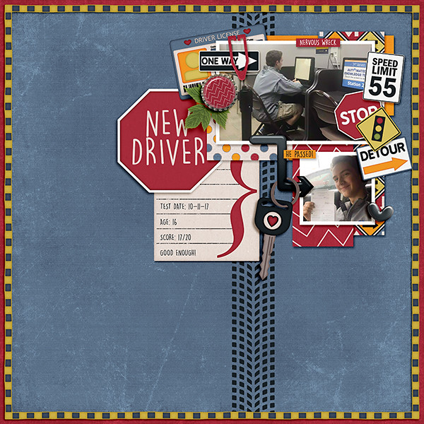
Bundle – https://store.gingerscraps.net/Road-Trip-BUNDLE-by-Heather-Z-Scraps.html
Kit – https://store.gingerscraps.net/Road-Trip-KIT-by-Heather-Z-Scraps.html
Journal Cards – https://store.gingerscraps.net/Road-Trip-JOURNAL-CARDS-by-Heather-Z-Scraps.html
Accents – https://store.gingerscraps.net/Road-Trip-ACCENTS-by-Heather-Z-Scraps.html
Street Signs – https://store.gingerscraps.net/Road-Trip-STREET-SIGNS-by-Heather-Z-Scraps.html
Word Bits – https://store.gingerscraps.net/Road-Trip-WORD-BITS-by-Heather-Z-Scraps.html

Bundle: https://store.gingerscraps.net/Wicked-Sisters-BUNDLE-by-Heather-Z-Scraps.html
Kit: https://store.gingerscraps.net/Wicked-Sisters-KIT-by-Heather-Z-Scraps.html
Accents: https://store.gingerscraps.net/Wicked-Sisters-ACCENTS-by-Heather-Z-Scraps.html
Flairs: https://store.gingerscraps.net/Wicked-Sisters-FLAIRS-by-Heather-Z-Scraps.html

Bundle: https://store.gingerscraps.net/A-Pirate-s-Life-BUNDLE-by-Heather-Z-Scraps.html
Kit: https://store.gingerscraps.net/A-Pirate-s-Life-KIT-by-Heather-Z-Scraps.html
Solids: https://store.gingerscraps.net/A-Pirate-s-Life-SOLIDS-by-Heather-Z-Scraps.html
Weathered Wood: https://store.gingerscraps.net/A-Pirate-s-Life-WEATHERED-WOOD-by-Heather-Z-Scraps.html
Journal Cards: https://store.gingerscraps.net/A-Pirate-s-Life-JOURNAL-CARDS-by-Heather-Z-Scraps.html
Borders: https://store.gingerscraps.net/A-Pirate-s-Life-BORDERS-by-Heather-Z-Scraps.html
Paint and Scribbles: https://store.gingerscraps.net/A-Pirate-s-Life-PAINT-AND-SCRIBBLES-by-Heather-Z-Scraps.html

https://store.gingerscraps.net/Months-Of-The-Year-Photo-Masks.html

Bundle: https://store.gingerscraps.net/October-Bundle.html
Kit: https://store.gingerscraps.net/October-Kit.html
Photo Masks: https://store.gingerscraps.net/October-Graffiti-Photo-Masks.html
Journal Cards: https://store.gingerscraps.net/October-Journal-Cards.html
Ombre Papers: https://store.gingerscraps.net/October-Ombre-Papers.html
Basic Papers: https://store.gingerscraps.net/October-basic-Papers.html

https://store.gingerscraps.net/Kristmess/

https://store.gingerscraps.net/Kristmess/

https://store.gingerscraps.net/Kristmess/

https://store.gingerscraps.net/Laras-Digi-World/

https://store.gingerscraps.net/Cajun-Princess-GB.html

Bundle: https://store.gingerscraps.net/Explore-The-Lake-Bundle.html
Kit: https://store.gingerscraps.net/Explore-The-Lake-PageKit.html
Flairs: https://store.gingerscraps.net/Explore-The-Lake-Flairs.html
Grunge: https://store.gingerscraps.net/Explore-The-Lake-Grunge.html
Ombre Papers: https://store.gingerscraps.net/Explore-The-Lake-OmbrePapers.html
Titles: https://store.gingerscraps.net/Explore-The-Lake-Titles.html
Clusters: https://store.gingerscraps.net/Explore-The-Lake-Clusters.html

https://store.gingerscraps.net/Halloween-Eve-Collection-by-Lindsay-Jane.html

https://store.gingerscraps.net/Halloween-Eve-by-Lindsay-Jane.html

bundle: https://store.gingerscraps.net/Be-Silly-bundle.html
kit: https://store.gingerscraps.net/Be-Silly-full-kit.html

Bundle: https://store.gingerscraps.net/Family-Fun-Day-BUNDLE-by-MagsGraphics.html
Kit: https://store.gingerscraps.net/Family-Fun-Day-KIT-by-MagsGraphics.html
Flair: https://store.gingerscraps.net/Family-Fun-Day-FLAIR-by-MagsGraphics.html
Journal Cards: https://store.gingerscraps.net/Family-Fun-Day-JOURNAL-CARDS-by-MagsGraphics.html
Word Art: https://store.gingerscraps.net/Family-Fun-Day-WORD-ART-by-MagsGraphics.html

Bundle: https://store.gingerscraps.net/Wicked-Adventures-BUNDLE-by-MagsGraphics.html
Kit: https://store.gingerscraps.net/Wicked-Adventures-KIT-by-MagsGraphics.html
Alpha: https://store.gingerscraps.net/Wicked-Adventures-ALPHA-by-MagsGraphics.html
Journal Cards: https://store.gingerscraps.net/Wicked-Adventures-JOURNAL-CARDS-by-MagsGraphics.html
Word Art: https://store.gingerscraps.net/Wicked-Adventures-WORD-ART-by-MagsGraphics.html

https://store.gingerscraps.net/Tuck-It-2-Templates-by-Miss-Fish.html

https://store.gingerscraps.net/Simply-Autumn-Templates-by-Miss-Fish.html
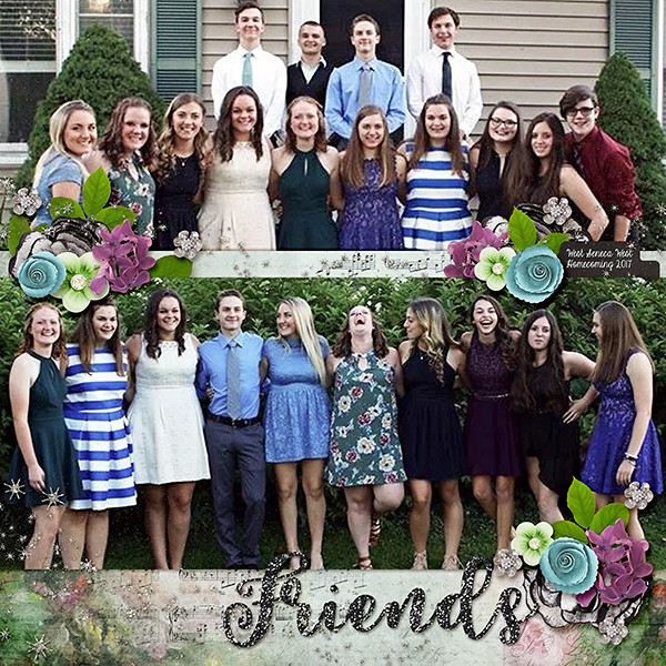
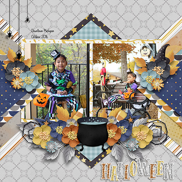
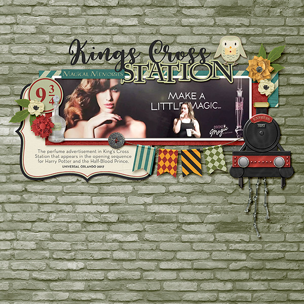
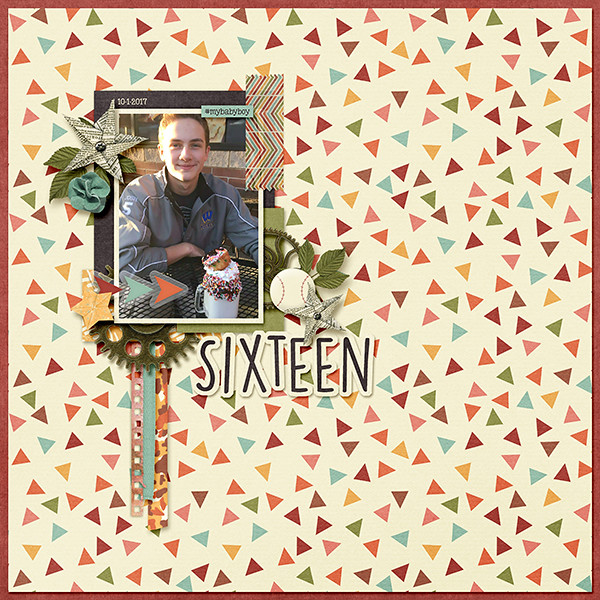
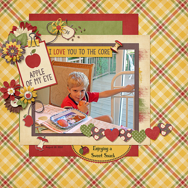
Remember, if you complete 10 challenges, just ten, you get a free kit as well!!

Fall is the perfect time to indulge! Join me in completing some challenges!