Challenge Spotlight: PINTEREST CHALLENGE
![]()
The Pinterest Challenge is a new-to-you-in-’22 challenge, brought to us by Lisa Minor. I’ll confess, when I first read the premise for this challenge I wasn’t sure how it would work, although I LOVE Pinterest and have to actively discipline myself or I’d never get anything done. I digress. The August 2022 Pinterest Challenge Gallery shows us how well the challenge works – really well. It works really well. Let’s have a look. In no particular order… the scrappers’ names are linked to their layouts in the Gallery, in case you’re inclined to leave them a comment.
The basic premise is that Lisa provides a pin (or several) she’s saved to one of her Pinterest boards as inspiration, with a brief description of what she’d like to see contained in the layouts participants create. For August 2022, she provided this image, followed by: “This pin says to me “beach, seaside, vacation time, travel, elegant, relax and make memories”. So what does it say to you? Scrap it!”

First out of the box is this layout by garrynkim. Can you see which aspects of the pin were chosen? Of course you can… the mood, the water and the colour palette are right there.
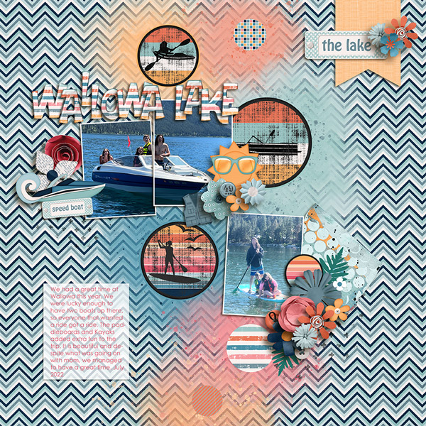
This layout from bkasko also features water, and the theme of rest and relaxation. I really like how her photos all have the waterfall in them, and how she’s masked her large group photo.

Oh look! B2N2Scraps has water photos too! I sense a trend. She’s also incorporated the colour palette from Lisa‘s photo. I just love the water droplets in the background here.
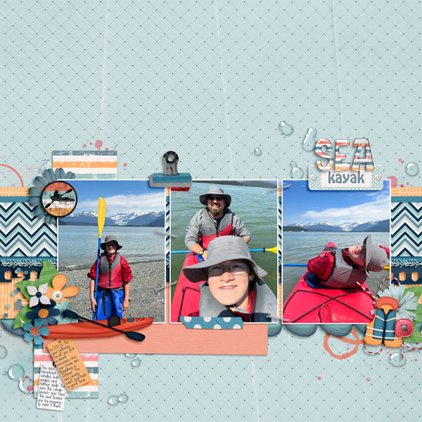
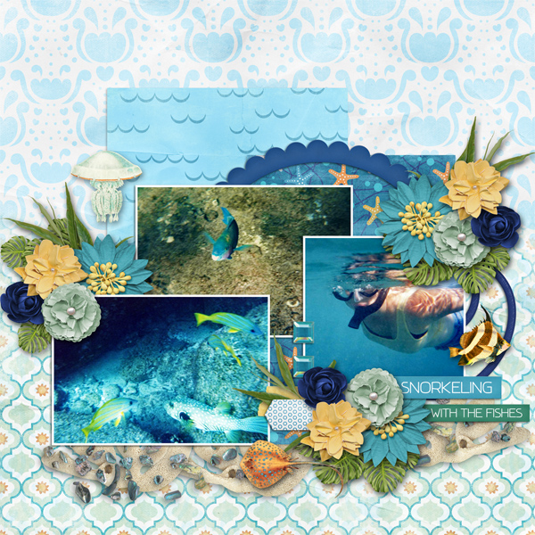
More water! These underwater photos are amazing!! The tropical sea elements robinoes66 has clustered around her photos mesh really well with the topic of the photos and she’s also pulled colour from Lisa‘s image. Strong work!
I’m starting to think water is an integral part of vacation… if I only had these layouts to define the word, that would be the most obvious aspect, amirite? I’ve gotta say kristal, that’s one HUGE pond! The colours from Lisa‘s image are there too.

Water sets the scene for basketladyaudrey too. She was inspired by the making memories part of Lisa‘s impressions. That woodgrain paper reminds me of a dock, and she’s pulled colour from her photos into her choice of papers and elements.

Even mary-lynne has included water in her layout, but more as a backdrop to their leisurely breakfast. Her colour choices echo her photo beautifully and she’s masked her large photo perfectly.

pjm117 took her inspiration from both the watery view and to a lesser extent, the colour palette. I love the quotes she’s used for her word strips… as I wiggle my bare toes.

Ah! A layout that was inspired by the food in the image… both are focused on breakfast. route66 kept it simple, with the breakfast photos taking the spotlight.

KarenDiamond really understood the assignment! Beach, vacation, relax, memories… they’re all in there – without literal water – and the kit she used screams summer and heat.

The summery colour palette of grannyNKy‘s layout, and yes… water, meet the criteria for the challenge too. They look like they really had a great time on the lake.

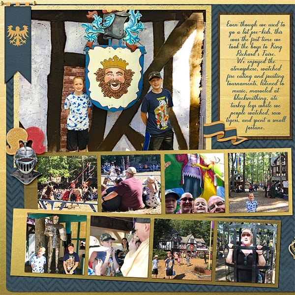
Last, but not least, this layout from DianeInOz went all the way down the vacation-making-memories path. The incorporation of a lot of photos tells a story of a busy, fun-filled day and the few elements she used to embellish them kept the overall impact from being overwhelming. Truly a case of less-is-more!
What would your layout look like if you took up this challenge? I’m not a beach person, but I do enjoy breakfast overlooking a scenic view.
![]()





 Wow…Thursday…I’m totally unprepared forLet’s get Crafty today! Even after Steph posted last week! I’m still not prepared. Since I am such a flake 🙂 For this weeks Let’s Get Crafty I am going to just feature a challenge from Gingerscraps! It’s is a crafty challenge though 🙂 The “




 These are great huh? Go make your own siggy! Put it in the Siggy Challenge gallery and put the link here in a comment for the chance to win a prize from me! CT & those who have already done the challenge are elligable. Let me see those comments!