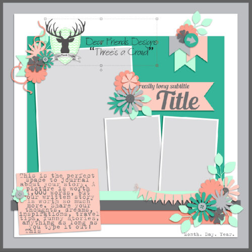
Challenge Spotlight: Favourite Winter Olympic Moment
![]()
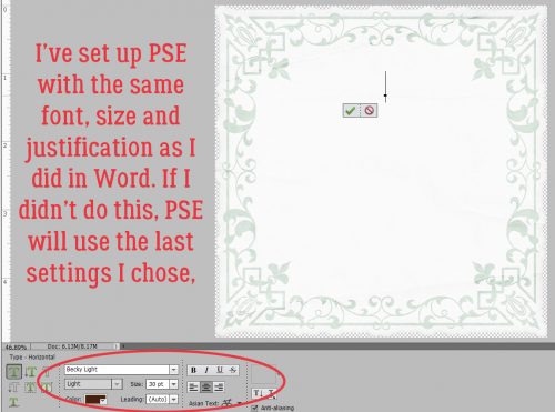
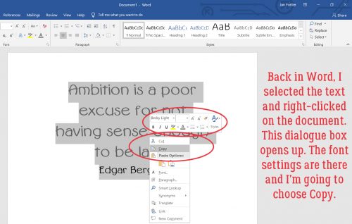
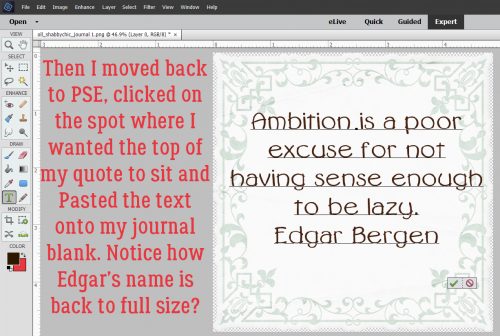
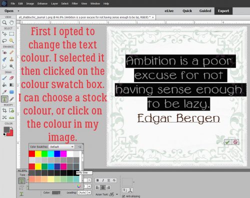
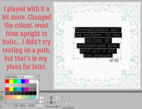
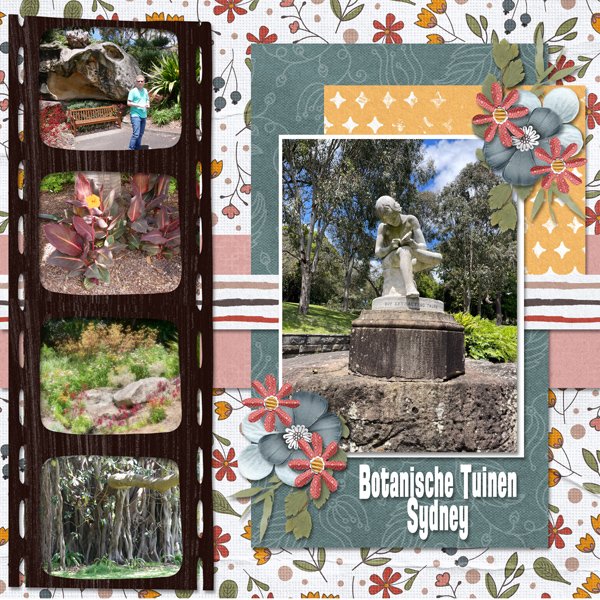
So, hosting my very first Challenge went pretty well! There were six layouts submitted (including my own) and they’re all different. If you missed the Challenge I issued. I asked GingerScrappers to create a layout about their favourite moment from the 2026 Winter Olympics. And there were so many to choose from!! (I spent a ridiculous number of hours glued to my TV, very thankful to have the CBC’s commentary on all the competitors.) I’ll share the layouts with you momentarily, but first I want to reiterate my Challenge Spotlight post flow. I look at each layout to assess how it meets the Challenge‘s criteria and identify how it reflects the Scrapper‘s individual style. Each is linked to its spot in the Gallery so you can get a closer look, and maybe leave a comment for the Scrapper. Simply click on the Scrapper‘s name and you’ll be whisked off for a better view. (Any time you see text that is bold, in colour and underlined, that tells you the word or phrase is a hyperlink.)
Several options occurred to me as to how others might approach the Challenge. Would the Scrapper choose to focus on a team sport, or an individual one? Or maybe the moment WASN’T sport-specific? Would a national flag become the colour palette? Would there be a lot of themed elements to the layout? Would there be a lot of journaling? Let’s take a look!
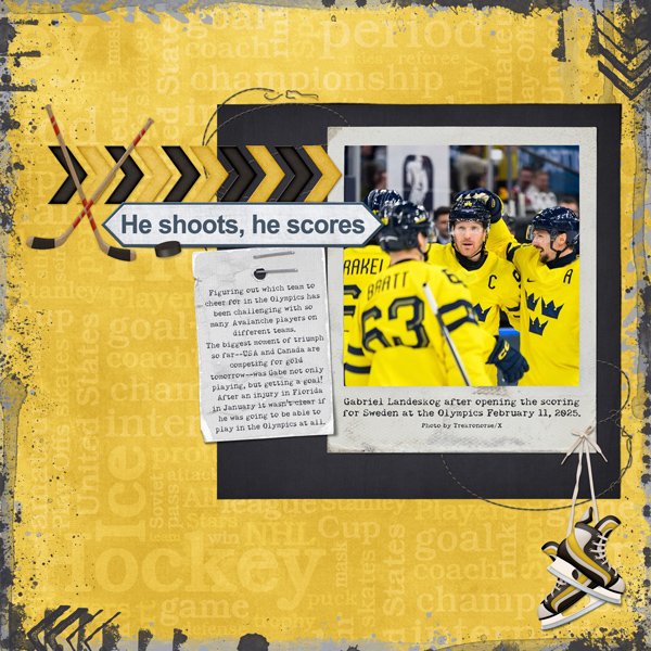
First out of the gate (see what I did there? :D) is this layout from KatL. First impression? She’s a hockey fan. Reading her journaling tells me she’s a Colorado Avalanche fan (the team formerly known as the Québec Nordiques p)) but her favourite moment came from Team Sweden, and her colour choices reflect that. I like how she anchored her title with the sticks, and dangled the (black and yellow) skates from her photo.
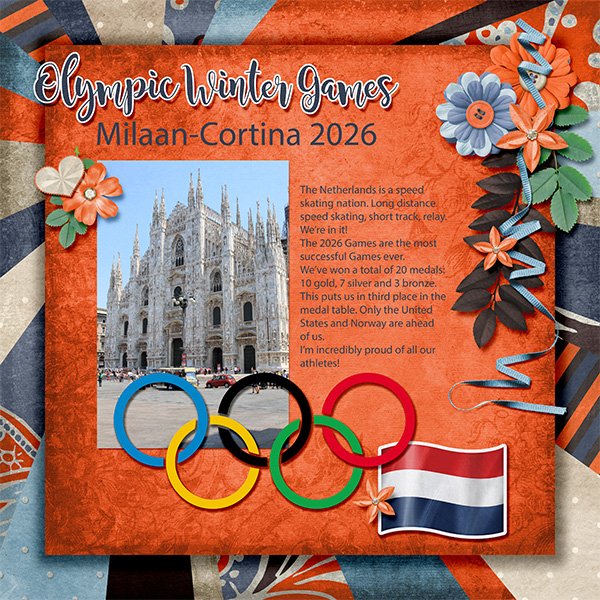
Yvonne55 chose nation first for her layout. The Netherlands’ team colours are predominantly orange with touches of blue and white. The Dutch team had a really successful Games this year, as she notes in her journaling. For embellishments, she has the Olympic Rings and the flag of the Netherlands, but no sporty ones. Anybody remember reading Hans Brinker and the Silver Skates?
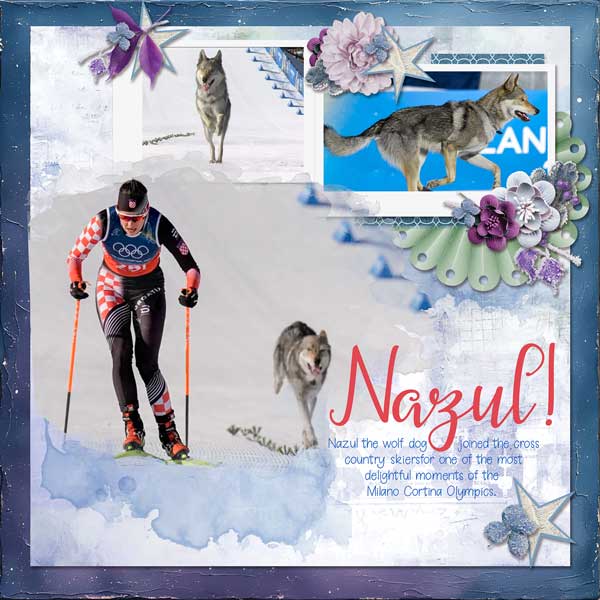
Somehow I knew glee would choose Nazgûl, the wolf dog, who “medaled” in cross country skiing. This was one of so many truly touching moments of the Games, and was on replay everywhere. Why did I know? Because she’s got a really quirky personality, and she lives in a place where winter sports are only ever on TV. Her layout focuses on photos, with some wintery coloured elements.
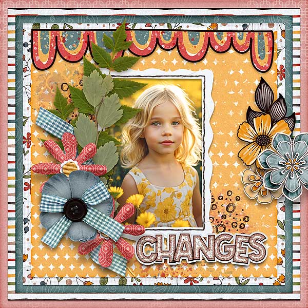
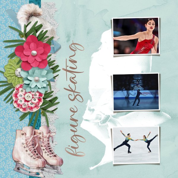
Grace. chose to focus on a sport and kept her layout elegant, which is the definition of figure skating. (The required strength, skill and determination are always secondary, although without them, there can’t be that elegance, but I digress.) Her palette is pulled from her photos, and she’s got a pair of skates and a tuque in there.
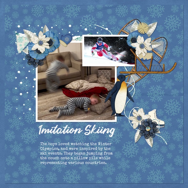
It looks like photocrazy viewed the Games through her kiddos’ eyes. She has a bunch of winter-sports related elements here, and that penguin is killing me! We who live where the air tries to kill us know about walking like a penguin. 😉 I like how that scatter behind her photos looks like snow spray.
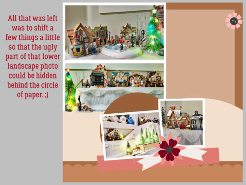
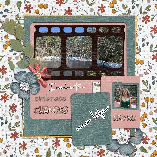
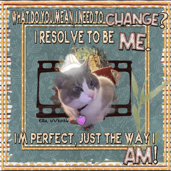
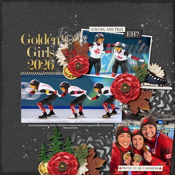
And last, here’s what I did. One of my grandsons is a speed skater so I have a special interest in it. Canada has long been near the top of the speed-skating heap and this year was no exception. What drew me to the team pursuit? Speed! But not just that… It takes a high degree of teamwork to skate at such speeds without crashing, finely-tuned balance, strength and spatial awareness. I swear I watched that race a dozen times. For my layout, I chose colours that represent Canada – red and white – plus the dark brown the designers at LuLuLemon decided should be part of our national Olympic uniforms. (yuk) The dark background was chosen to make my photos pop and to highlight the paint splatters that ground them. The speed skate element is a clip art piece I downloaded. The Mountie moose is a nod to my son-in-law. 😉 And I just want to mention, Valérie Maltais is my new favourite skater.
That was fun! Should I host another Challenge in the future? I’m working on that zen-doodle tutorial I mentioned last week and it’s coming along. I thin it’ll go better when I get my new spectacles and can see everything more clearly… it should help a lot! I’ll be picking them up today, once I get this posted. Happy St Patrick’s Day!
![]()