Challenge Spotlight: Pinterest
![]()
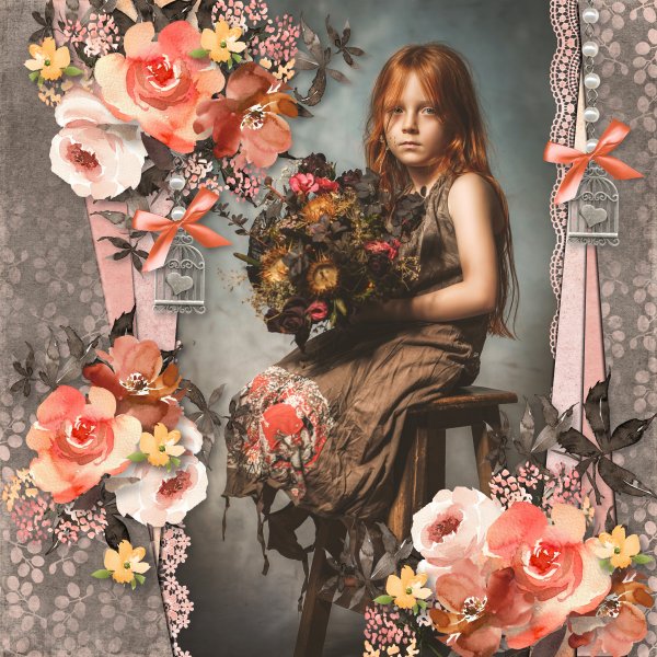
Over the last week I’ve spent a lot of time browsing Pinterest in an effort to put myself to sleep. I clearly don’t see the same boards that Lisa Minor, host of our Pinterest Challenge, sees… This image would give me the most crushing anxiety!

This is what she had to say about it: “This pin truly made me LOL! Do you have an office out of the home? Would you just go ‘buck wild and decorate like this? I would “like” to think I just might! This pin says to me “at the office, decoration, going overboard, gingerbread house, Christmas Village and candy” So what does it say to you?” I’m going to let the participants speak for themselves this time.
As usual, the layouts are in the order they were uploaded to the Gallery. Each is linked to its spot in said Gallery, just click on the Scrapper‘s user name and you’ll fly right to it so you can get a closer look, or to leave a comment.
First up is msbrad. I gather her granddaughter interpreted the Pinterest image as a play fort… “She created her own after I showed her the original inspiration photo here.”

Next is DianeInOz. Her Pinspiration: “Office party, Santa’s village, Christmas!”

Tamsin McAtee seems to be on the same wavelength with me! “Here’s mine.. this is exactly what it says to me, its so busy its almost painful for me to look at, I get really bad sensory overload and this is very overwhelming to me.”

I also think pinklily has a bit of pleasemakeitstop! “When I think of people going overboard, the Wiggles comes to mind, so I made this layout.”

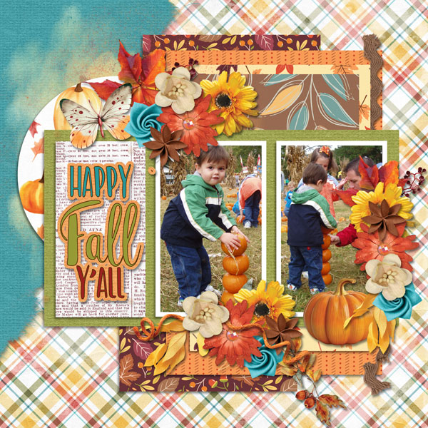
Grace. posted hers without comment, but she’s taken her Pinspiration from the overall Christmasy theme.

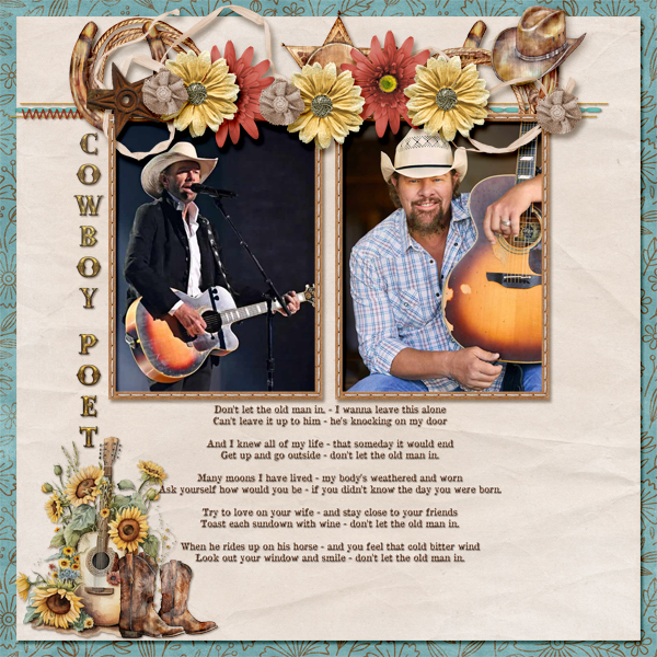
Last we have this one from Jill. “The Pinterest photo brought my local doctors’ centre to mind with all the Christmas doors.”

It looks like I’m in good company being crazybusy right now, given that only 6 layouts have been posted. As you’re reading this, I’m driving home from my parents’ house, a little over 2 1/4 hour drive from my house. I like to make a flying visit around this time, to take them a CARE package containing some Christmas treats and a nice bottle of local wine, as well as to wish my dad a happy birthday (the 21st). Last year the weather didn’t cooperate and it was the second week in January before I could make the drive safely. It was a crushing disappointment!
For those who are interested, my son’s new hospital bed is a huge hit with him! He hasn’t figured out that he can reach the controller yet, so we haven’t found him folded in half or standing on his head. Maybe he won’t notice? Thank you all again for your understanding and grace last week.
If you’re celebrating Christmas, I hope you have enough. Enough time with the ones you love. Enough good food to fill your bellies. Enough opportunities to have some fun. Enough help with the dishes… 😉
If this time of year is difficult for you, I hope you find a quiet place away from the frazzle where you can be whatever you need to be. That you have someone you can turn to for solace. That you have understanding people around you who won’t press you to put on a happy face. I hope you’re comfortable using your scrapping to release some of your anguish. You have support here.
I’ll be back on the 26th with a Quick Trick, but don’t feel like you have to read it!
![]()