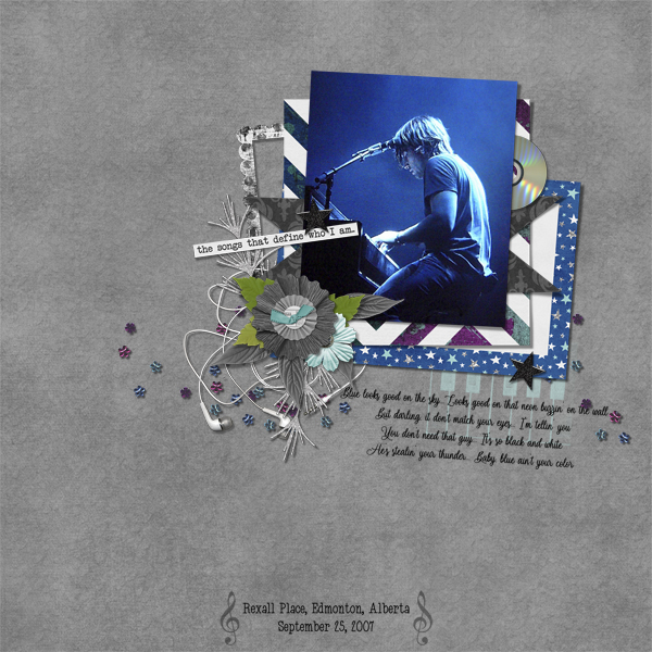
Quick Trick: Special Effects Brushes
![]()
PDF Version : https://bit.ly/45anqqZ
I was yesterday-years-old when I learned that Special Effects Brushes are well… special. Some of them don’t behave the way most brushes do. For example, the butterfly Special Effects Brush doesn’t use the foreground colour, it uses its’ complementary colours. It also gives you random sizes and rotates itself between clicks so you’re never exactly sure where it’s going to pop up on your canvas, or what colour it will be. That can be fun! If you want to click>hold the mouse button and draw a curlicue with the brush, it’ll give you a flight of multi-coloured butterflies in all sizes. Try it! It’s fun!!
What I learned while I was experimenting with these Brushes is that they can be really useful for adding some oomph to those reads-as-solid papers we were making a few weeks ago. Let me show you what I mean.

Start by creating your background paper using a colour from the kit you’re using, or from a photo you want to coordinate. Size is up to you; I scrap 12×12, so that’s what I’ve got. I just randomly picked a light green colour. I’ll go with a slightly darker, grungier avocado for the zhuzh. As I always say, put this zhuzh on its own layer so you have ALL the control.
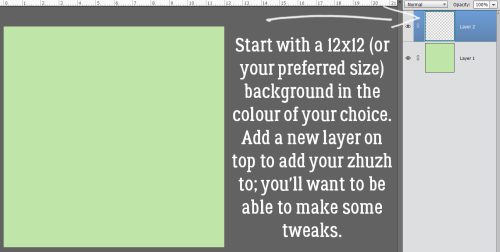
Now grab your Brush Tool and look for Special Effects Brushes in the pull-out menu. These are brushes that you got with your software, like the Basic Brushes and the Drop Shadow Brushes. You may be able to see in the screenshot that I’ve gone into the Presets>Brushes folder and put a period in front of all the PSE preloaded brushes so it sorts them to the very top of the list. Advanced users might try that. Anyway. Let’s click on the Special Effects Brushes and take a look.

You can hover your cursor over the Brush thumbnails to see what they’re called. I’m going to use the one described as Scattered Flowers Mums. It doesn’t actually look like a chrysanthemum when used, so I’m a bit confused. Some of these brushes do have an identifiable shape, like the daisy, roses, rubber duck, leaf and butterfly. None of the Scattered Flowers do, they’re all variations on texture. I’ve set the Size to 2500 pixels (maximum) and the Opacity at 100%.

This is an entirely optional step. I decided, after playing with the various brushes in the set, that I’d use Guidelines to help with positioning of my brush clicks. To create a horizontal Guideline, click-and-hold your cursor somewhere inside the horizontal Ruler (if you’re using them) or the top edge of the canvas then pull the cursor down to the place where you want the Guide and let go. To create a vertical Guide, click-and-hold inside the left side Ruler or at the left edge of the canvas, drag the cursor laterally to the spot where you want the Guide and let go. I’ve made my Guidelines thicker for visibility, You’ll see in the next screenshot how skinny they really are.
If you don’t want to be precise, you can randomly click your brush over the background, or drag it in a pattern, change the size and orientation of the brush or pretty much whatever appeals to you. It’s 100% up to you!

The brush cursor is a large circle with crosshairs in the centre. I used this bounding box to position the brush in each of my squares: the bounding box intersected with the inside corners of each square, which gave a bit of overlap where the brush fades. I can’t show you an example – I didn’t think of it while I was working this all out, and now Elements is PMSing on me. Sorry. Suffice to say, I covered the whole canvas with this splattery texture.

To turn off the Guides, click View>Guides and they’ll vanish. Or if you’re a keyboard short-cutter, CTRL/CMD>; will take care of it.

You could stop here and be very happy with your work. Of you could play with Blend Modes to see what might look better for your purpose. This is the Dissolve version. Once you’ve moved off the Normal mode, you can scroll through the Blend Modes using the Up and Down arrows.

If the result is too bold, you can adjust Opacity. That might be all you need. Here I’ve left the Blend Mode on Dissolve but decreased the Opacity to 10%. Now it’s subtly textured.

The following screenshots are pretty self-explanatory. I’m not going to show you Modes that really didn’t change the background green – that would waste all our time! Here’s Darken.

Multiply. The only change I’ve made from my original sample is to a new Blend Mode. It’s fun to see what they do.

Color Burn is really subtle, so I felt I should Zoom in so you could see it. This might be my favourite.

On to Linear Burn.

Darker Color seems softer, don’t you think?

Screen lightens and softens.

I didn’t expect Color Dodge to lighten and alter the colour this much.

Linear Dodge is just Color Dodge but MORE.

Vivid Light changes the avocado to more of a chartreuse. It’s hard to see in this image, because it’s so subtle.

Hard Mix is similar to Screen, but MORE.

Difference changes the colour completely and darkens it too. You can see the tic-tac-toe effect a lot more clearly here.

Exclusion has turned the avocado colour to a deep, almost purple blue.

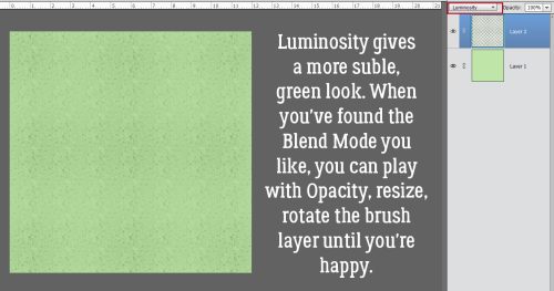
Last is Luminosity. It’s more delicate. When you’ve found the look you like, you can adjust Opacity, enlarge the brush layer and rotate it, or any other thing you might want to try. CTRL/CMD>Z will Undo if you’re not happy. Don’t be afraid to experiment! Nothing is permanent in digital scrapbooking until you decide it is.
I couldn’t resist trying another of the Special Effects Brushes, this time Petal Crystals. I used an aqua colour and really like this one!

We’re getting some of the rain from the big storm coming up the west coast right now. Looks like it’s going to bring some snow to higher elevations, and will linger around for the next couple of days. Maybe the two fires close to us will finally be snuffed out. A girl can dream, right?
![]()


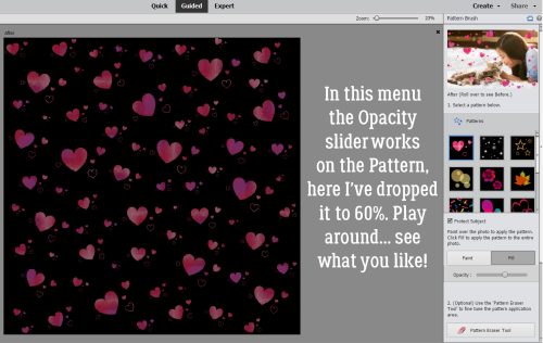


 In Expert mode, you can see the new layers Elements has added to the paper. The top and bottom layers are the only ones that matter. You can activate that pattern layer at the top and add a Layer>New Fill Layer>Solid>Clip to change colour, or you can play with the Blend Mode for that layer to see what works best for you.
 Here’s a close-up of the pattern so you’ll easily see the Blend Mode change.