Photo Edit: Plumb and Level
![]()
PDF Version : https://bit.ly/43vNXy1
I’ve been going through my sister’s Maritime vacation photos – I finally have all the ones I want to scrap in a folder on my laptop – and like most vacation albums, there are a number of local landmark photos. They’re important to the story, but especially if taken with a cellphone camera, buildings can look a bit off kilter, more like a pyramid, wider at the base with angled walls. Sometimes that affect is desirable because it gives a sense of the grandeur of the building. Other times it looks odd. But there’s an easy fix!
Let’s practice on this photo. Some of you will recognize it as the setting for Anne of Green Gables near Cavendish, Prince Edward Island. Built in 1831, it was originally the farmstead of David and Margaret Macneill, relatives of Lucy Maud Montgomery. She never actually lived in the house, but grew up nearby. The house is now a national historic site and has been carefully restored and renovated to more closely resemble Maud’s fictional farmhouse. You can expect to see a lot more of Green Gables over the next few months. 😉

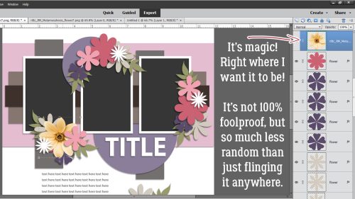
The easiest, most accurate way to straighten up a tilted building is to use the Grid Tool. You’ll have seen me use the Grid in previous tutorials, but I’ve never really talked about it. So let’s do that. To access the Tool, click on View>Grid or use the keyboard shortcut CTRL (for Windows users)/CMD (for Mac users)>’.
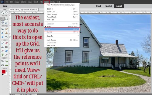
The Grid can help with object positioning, scale, speed scrapping, pretty much anything that requires precision, and for architectural repairs.

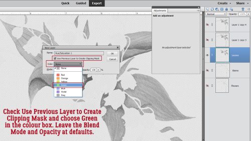
I’ve always used a red Grid, with Guidelines every 1 inch and Subdivisions every 1/4 inch. But it’s not going to be as useful for this with these settings. To change them, Edit>Preferences>Guides & Grid…
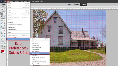
Here, you can customize your Guides and Grid to your own liking. My Guidelines are solid lines, Subdivisions are dotted lines, which is the default. If you’d prefer to work with Dashed Lines or Dots for your Division type, set the Style accordingly. They will be harder to see than solid lines though. You can choose the system you prefer: Pixels, Inches, Centimeters, Millimeters, Points, Picas or Percent. Then choose how you’d like your Grid to look. I’ll change my colour to Black; you can use the Color Picker to choose a custom colour if you like.

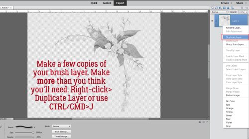
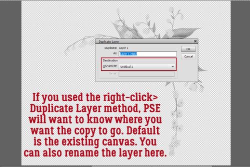
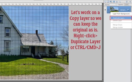
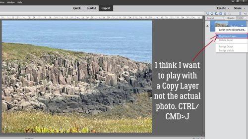
That Grid looks a lot more helpful now. But before we start messing with adjustments, I want you to make a Copy Layer to work on so the original remains original. Right-click>Duplicate Layer…>OK or CTRL/CMD>J.
Now to do those architectural repairs… Distort will undo distortion! Remember I mentioned how I like Distort because it allows adjustments in multiple directions in one step. Image>Transform>Distort.

Looking at the photo, I knew I had to pull the upper left “handle” further left and down slightly to make the walls plumb, and the upper right “handle” up and to the left a bit to make the foundation level. The Grid lets me align those edges appropriately. If you find that your roofline is raised or lowered by your adjustments, that’s easily fixed too. Turn your working layer’s visibility off and pull a Guide down from the top edge of the canvas so it lines up with the roofline on the original. Then switch back to the working layer and shift the upper edge of your photo so the “new” roofline matches the old one. Don’t worry about those gaps; they’re going away.

Before I sort out the empty gaps, I’ll turn the Grid off by reversing the steps to turn it on. View>Grid or CTRL/CMD>’ .

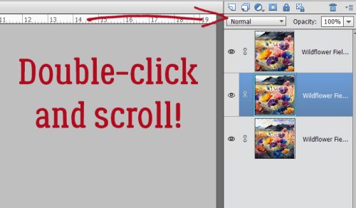
First I Cropped the photo to clean up the right side. Then to tell Elements what I want to Fill, I used the Magic Wand Tool set to New. That way I can Select the gap with just a single click.

Next, Edit>Fill Selection.
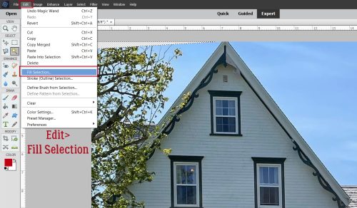
Choose Content-Aware from the pull-down menu, set to Normal Mode and 100% Opacity.
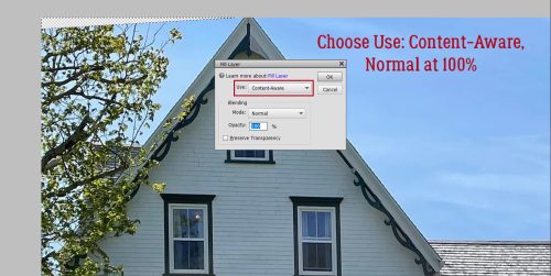
There! The gaps are gone! Select>Deselect or CTRL/CMD>D to remove the marching ants.

That weird lighter arc from taking a photo through a car window will take a bit of fiddling to dampen. But overall, I like how it looks.
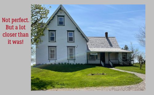
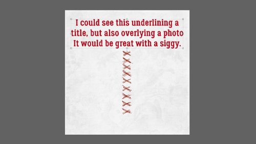
This is another little trick I expect to use a LOT now that I’ve taught it to you. Next week I’ll be shining the spotlight on all of you, with the monthly Challenge Spotlight. Which Challenge will I choose?
![]()


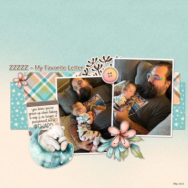
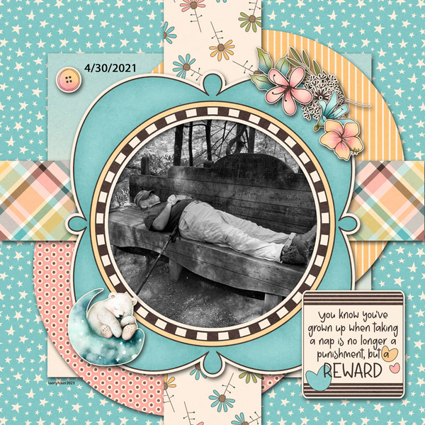


") ” Jen commented she likes to have lots of journaling on her layouts, and that her favourite papers or cardstock are the lighter, more neutral papers.
” Jen commented she likes to have lots of journaling on her layouts, and that her favourite papers or cardstock are the lighter, more neutral papers.