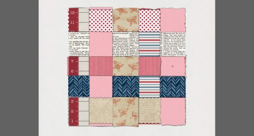
Buckle Up for [inter]National Scrapbook Day
![]()
According to the Master Index, this is my 300th Tutorial Tuesday post! And it’s also the lead-up to [inter]National Scrapbooking Day, which is formally set for Saturday, May 6th. I thought it could be a good time to revisit and update the Tutorial I wrote 5 years ago on how to survive the next week with your sanity intact.
I’ve been seeing a LOT of sneak peeks, ads and excited chatter, and I know there will be an overwhelming number of opportunities to get your scrap on, starting at different times over the coming week.
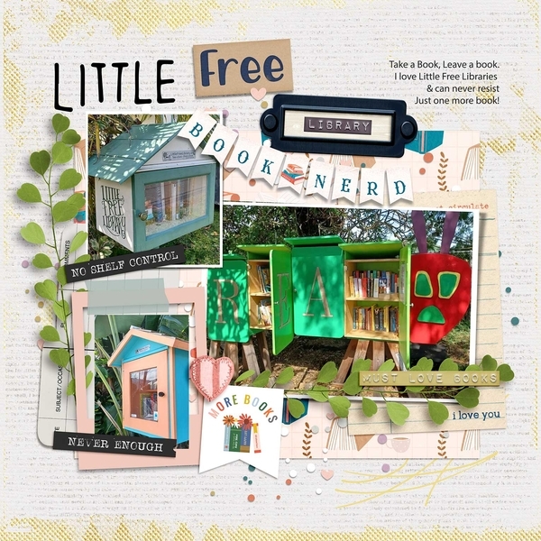
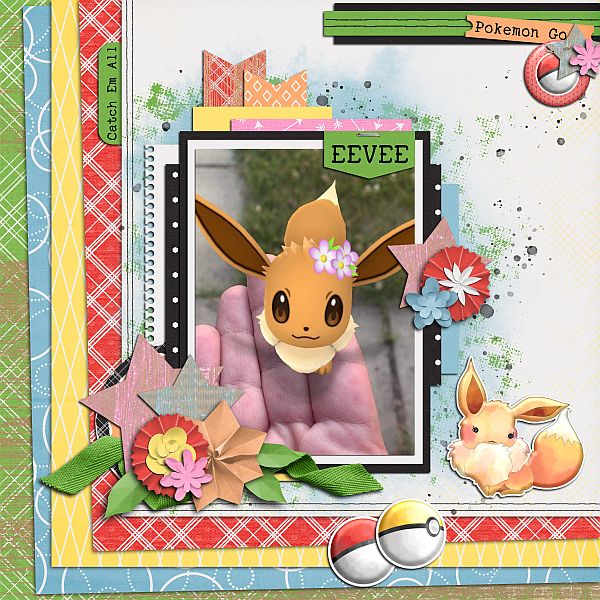
Here at GingerScraps, the people behind the scenes have been very busy organizing a celebration jam-packed with sales, games and a ton of fun. I haven’t seen any insider info on what’s planned for this year, but in the past, we’ve had a store-wide 50% off sale and a gigantic free-with-$20-purchase collab. The scavenger hunt is not only fun, it might show you designers you’re not familiar with and may soon become new favourites. Our designers usually create a fine selection of $5 grab bags – they’re always a great deal. And then there are the chats, speed scraps and games in the Forum. You don’t want to miss them!! And that’s just this one (albeit fantastic!) store!!
Back in 2010 when I was a digiscrapping newbie, iNSD and DSD (Digital Scrapbooking Day, which used to be in November but has been moved ahead to October because with Thanksgiving in the US, November was already too frenetic) were so exciting, but I found that I was a bit scattered in my approach. I ended up confused and bewildered, I overspent, and I wound up with a bunch of freebies I never use. So here are my tips for making iNSD work for YOU instead of the other way around.
A] Don’t dive in head-first! Take some time to look at the stores you frequent to see what their special events look like. Make a list of things that interest you, including dates and times for things like chats or speed scraps. That way you can see conflicts easily and make a decision about which will be more fun for you. Also include deadlines for any contests you may want to enter. Planning right at the beginning will really help.
B] Once your list is compiled and double-checked, create some kind of reminder for things that have a specific time associated with them. This can be as simple as a couple of Post-It notes stuck to the edges of your monitor, or as techie as reminders on your phone, complete with beeps or bells to prod you into action. I don’t know about you, but I’m becoming more forgetful all the time and without the pings on my phone, I’d miss a lot of things! Now I’ve even set certain notifications on my smart watch that are pretty hard to ignore. 😉
C] Set a budget and stick to it. Figure out BEFORE you look at the sales how much you can afford to spend and make sure you don’t go over. Because iNSD is the same week as my birthday, I tend to be a little generous to myself, but I won’t spend more than $20 at any one store, and no more than about $50 for the entire event. Inflation (and lousy exchange rates) notwithstanding. I may have to increase my limits to $25 and $75.
D] There are going to be lots of blog-hops with free collections from various sources out there. Don’t fall into the “but it’s FREE!” trap. Even free is too much if it’s something you don’t love and won’t use. Think of the storage space you’ll waste if you go hog-wild with the freebies. Look at each and every freebie with a discerning eye and only download the ones you know will work for you. Take a look at how much room you have for new files and perhaps move some less-favoured (and therefore less-used) stuff onto a memory stick or external hard drive. Personal note: When I replaced my laptop last year I opted for one with a smaller hard drive, partly to force me to do some decluttering. And while it worked, I’m such a collector… I soon was getting warnings about the lack of capacity. So I bought a SanDisk 512 GB USB drive that is so small and handy, it can stay plugged in all the time. I moved a bunch of files to it, can access them instantly and the nagging stopped. It was a bargain at $60. Might have to buy another!

E] Speaking of blog-hops, if you find one that’s especially fabulous and you HAVE to have it, you might find yourself signing up for newsletters or Facebook pages for designers you may never want to have on your Rolodex (or filling up your inbox). So make a list of ALL the places where you’ve signed up/subscribed/liked/followed so that you can later return and un-do them again. Don’t worry about offending the designer; they’re too busy right now to notice!
F] You might want to give some thought to pre-planning for any speed scraps you might join. Create a folder of possible photos to use. Have some in there that are in landscape format as well as some in portrait format, and some that can be made square or circular without losing anything important. Also have some that will work for multi-photo layouts, just in case. This will save you a lot of time when the speed scrap starts. Make sure you’re unlikely to be disturbed for the 2 hours a speed scrap usually lasts. And have a beverage and a snack ready before you begin.
G] Don’t try to conquer the GS scavenger hunt in a single sitting!! Your eyes will thank you. But by all means, DO play along. This is the exception to my rule about freebies, since the prize is usually a fabulous GingerBread Ladies collab. Who couldn’t use one of those?
H] And finally, review the tutorial I’ve provided on using a multi-file extractor. Don’t wait to unzip and organize all those amazing kits you’ve gathered, do it while you’re on a roll! You won’t regret taking the time now, but if you leave it, you might never actually look at any of the super-duper kits you just bought. And that would be a terrible shame!!
I’ll see you all again once we emerge from our iNSD-induced fugues with a new tutorial! I’ll be back tomorrow with the Designer Spotlight. Always busy!