Digital Zen Doodling (Part One of ??)
![]()
When I embarked on this endeavour, I had no idea how quickly it would run away with me! I looked at the screenshots I’ve compiled so far and knew immediately this would have to be a multi-part tutorial. It’s really not that complicated, and once you get the steps down in your mind, it goes fairly quickly, but there is a learning curve. I’d call this an intermediate-to-skilled technique, but I do think with some experimentation, it’s achievable by all. So let’s get into it.
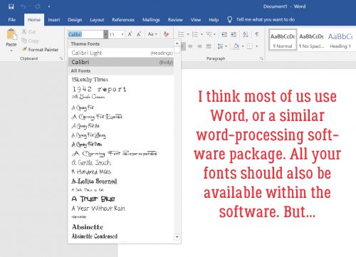
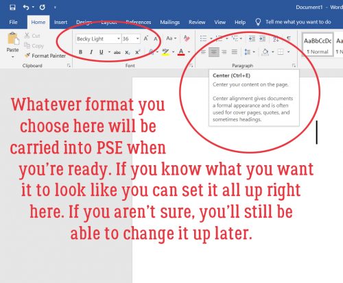
It’s been awhile since I posted a new, detailed tutorial so I’ll just make some pre-departure announcements. I make no assumptions regarding the level of expertise my tutorial readers may have. They’re written in deep detail so that even a beginner can follow along. If you’re a rockstar digi person and already know how to accomplish something, I’m not going to know if you skip that part! For keyboard shortcuts, I will always include both Windows and Mac commands; I use Windows so it always goes first. Any time you see coloured, bold, underlined text, that’s your signal that there’s a hyperlink there. And finally, any conversion to PDF format is a Ginger job. I don’t want to use any app or software that could create problems for her business, so that’s the work-around we came up with. Now, back to creating!
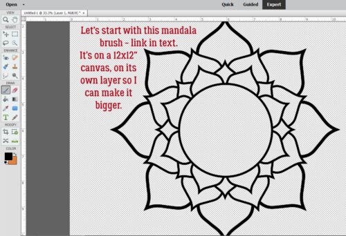
What better place to start a Zen doodle project than with a mandala? I found a set of free mandala Brushes at Brusheezy and downloaded them. You can get them here. I chose this particular one for its large areas just crying out to be filled. These Brushes are 2500×2500 pixels at their largest, so I put the Brush on its own layer so I can make it fill my page. One thing to know about Brushes: they aren’t “vector” images so they have some jaggedy edges when you Zoom in, but don’t worry, I’ll show you how to hack that.
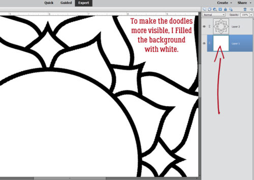
I realized I’d need a solid background to make the actual doodling part easy to see. So I Filled the background layer with white.
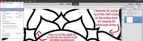
I wanted to isolate the various shapes to make doodling in them easier, so with the white background layer active, I CRTL/CMD>clicked on the brush layer to Select the outline of the mandala. Then I just Cut the mandala outline out of the background: Edit>Cut or CTRL/CMD>X.
I turned visibility for the outline off and this will form the basis for all the doodle-y layers. I can use the Magic Wand to isolate any of the cells in the mandala from the rest, jaggedy edges notwithstanding.

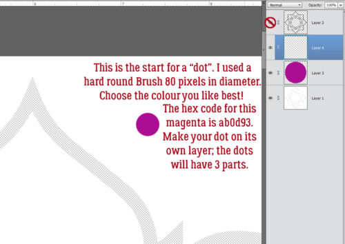
Zen doodling usually involves lots of dots of various size and colour. So the first thing we’ll do is create a 3D dot! Things like colour choice and image size are completely within your control – my stuff is simply for guidance. That said, I used a pretty magenta colour as my base. The hex code for it is ab0d93 if you’re a fan. I chose a hard round Brush from the integrated Basic Brush set in my version of PSE, sized it to 80 pixels and clicked it on its own layer. We want to be able to Duplicate these little elements so they need to be built up then Merged. You’ll see what I mean.
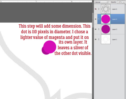
I wanted my dots to have a domed look, so I played around until I figured out the easiest way to do it. I went back into the Color Picker and lightened up the magenta a bit. Then I enlarged the Brush to 110 pixels and clicked it on its own layer at an offset so that it overlaps the darker dot with only a sliver of the darker dot visible.
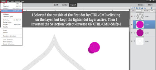
Your eyes are going to start glazing over when I talk about Selecting edges, and once you know how to do it, you can skip ahead. 😉 With the lighter coloured layer active, I CTRL/CMD>clicked on the darker coloured dot layer to Select the edges of that smaller dot. Then I Inverted the Selection: Select>Inverse or CTRL/CMD>Shift>I
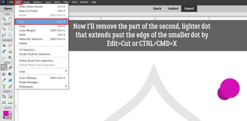
To remove the part of the larger, lighter dot from where it extends past the edge of the darker, smaller dot, Edit>Cut or CTRL/CMD>X
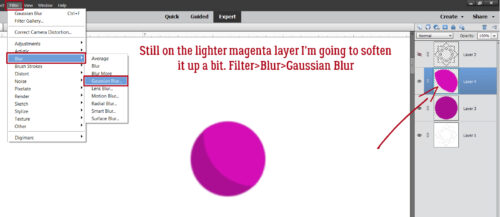
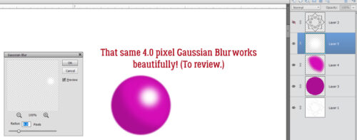
It looks a little harsh, so I’ll soften up the lighter area using a Blur. Filter>Blur>Gaussian Blur
It’s cool that as the Filter is applied, the result is visible in real time. After some dithering, I decided that 4.0 pixels was the right amount. But now the lighter magenta blur sticks out…
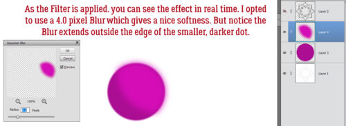
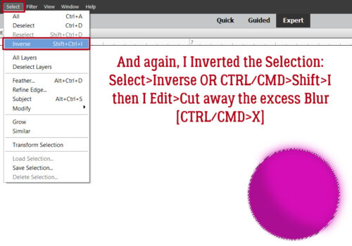
So I Selected the edge of the darker, smaller dot AGAIN, and Inverted it AGAIN with the lighter layer active so I could cut away that overflow.
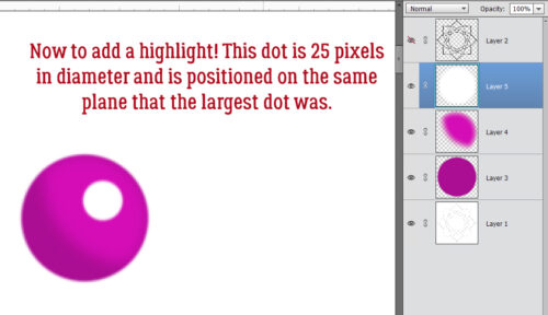
Now it needs a highlight! I added a new layer to put a 25 pixel white dot onto, positioned at the same angle as the middle layer.
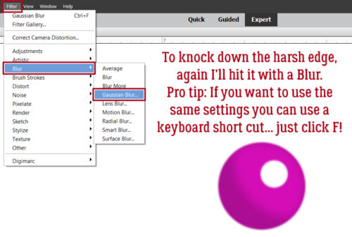
It’s too harsh, so I’ll use that Gaussian Blur again. Here’s a Pro Tip™: as long as you haven’t made any setting changes since the last time you used a Filter, you can just click the F key and it’ll apply the identical Filter to the new layer. Very helpful for custom shadowing!
This is a review……….
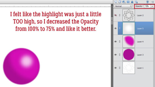
It really felt a little too bright to me, so I decreased the Opacity of the white dot layer to 75% and liked it a lot better. Gives a bit of a pearlescent look!
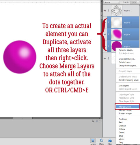
I want to be able to Duplicate this 3D dot, so I activated all 3 layers (click>shift>click on each) then Merged them: right-click and choose Merge Layers or CTRL/CMD>E
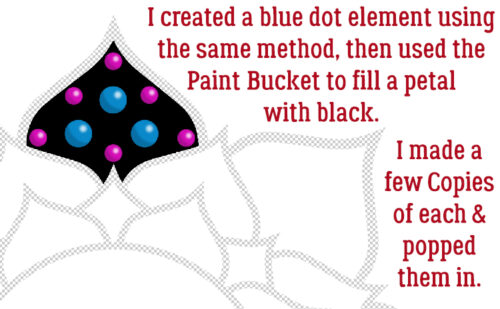
As you can see, I Filled one of the petal-shaped segments of the mandala with the Paint Bucket and black. Then I made another dot, this time a bit bigger and with blue shades, Copied (CTRL/CMD>J) them all a few times, then distributed them inside the black petal. Don’t be too concerned with perfection here! Zen doodling done with ink, marker or paint is never going to be exact. Eyeballing is all good!!
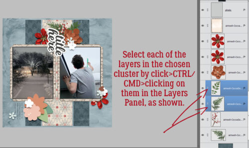
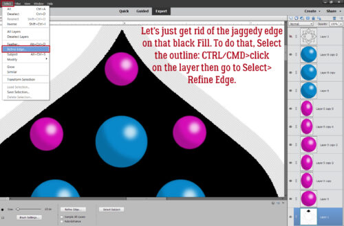
Remember those jaggedy edges on the mandala Brush? Let’s deal with that now before we move on to the next phase. Select the edges of the black petal: CTRL/CMD>click on the layer, then go up to the tabs. Select>Refine Edge. The screenshot below shows that the black segment is on the main, background layer and each of the coloured dots are above that in the Layers Panel.
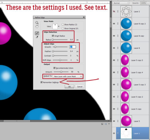
This menu pops open. Some of the settings you see are defaults, and as you adjust the sliders, you can see the effect in real time.
Edge Detection: Smart Radius>0.0 pixels
Adjust Edge: Smooth>17 Feather>0.4 pixels Contrast>3 Shift Edge> -1
Decontaminate Colors: Amount>50%
Output to: New Layer with Mask
Remember Settings
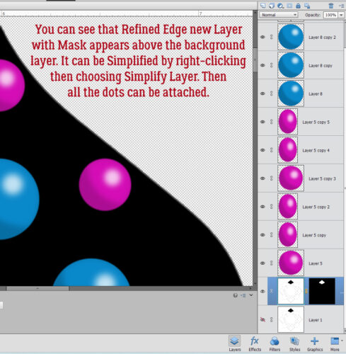
Make sure to Simplify the new layer so it can be Duplicated! Right-click on the layer then choose Simplify Layer.
That’s where we’re going to stop for today. I want to keep the screenshot load to a manageable number; 20 (plus the starter) is good for today. I’ll pick this back up next week as we create a Zen doodle trademark ring of white dots around each 3D dot!
![]()