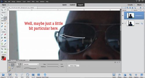
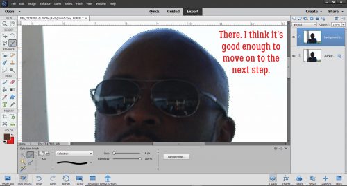
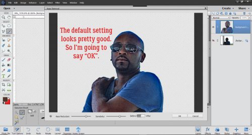
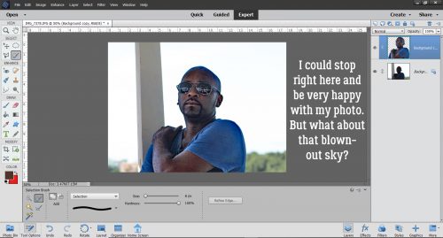
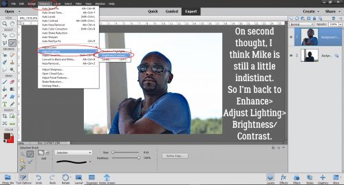
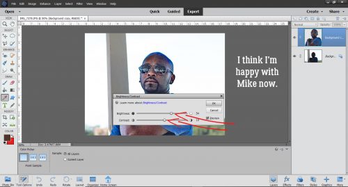
Tutorial Tuesday (Photoshop Elements 2018)
Double Indemnity? Nope, Double Exposure!

Here we are, at the very end of 2019!! I hope you all had some wonderful times with family and friends over the holidays. If you’re celebrating tonight, stay safe!!

Are you ready for another Guided Edit? This one was only introduced with the 2018 version, but I LOVE it!! It’s under the Fun Edits tab and it creates a double exposure almost automatically. It caught my interest when I started seeing lots of double-exposure photos popping up on my Pinterest feed after I Googled PSE techniques. All the how-to’s were for Photoshop‘s full version and try as I might, I wasn’t getting the results I hoped for when I tried to find a work-around. Then I tried this. I know you’re going to love it. I’m playing with photos I downloaded from Pixabay and chose a black-and-white close-up portrait as my base photo.

Once I clicked on Guided>Fun Edit>Double Exposure this is the menu that comes up. (Remember, if you click on Cancel, you’re back to the Start Menu so be very sure that’s what you want to do…)
For this tutorial I just took the most basic route possible with my photo choices so as to make it as straight-forward as possible. I’ll be playing with it a lot more in the weeks to come, so you may see another more complex tut later. The Edit tools are lined up top-to-bottom for easy progression through the steps. If your photo needs to be cropped, this is when you’d do it, with the Crop tool. The Guide suggests cropping so your desired focal point is in the centre.

There’s also the option of Selecting only a portion of your photo. I skipped both the Crop and Select steps altogether.

Now, the software has some images already embedded in the Edit that you can use for your double exposures: a forest scene, a cityscape and some clouds. Here I’ve superimposed the forest scene over my photo; if you look in the upper left corner you can see the girl’s eye, but it’s pretty well concealed.

Thankfully the software knows that might not be the look you’re after. The Intensity of the superimposed photo can be easily adjusted by pulling the slider to the left. Here you can see the difference it makes to decrease it to about 47%.

There’s also the opportunity to move the superimposed image around a bit by using the Move tool. It can be activated either by clicking on the tool image in the upper left of your workspace, or by clicking on the tool bar in the menu.

The cityscape almost completely obliterates the original photo. Good thing it’s adjustable!

I decreased the Intensity to about 35% and the resultant image is really moody. It suggests the girl is homesick for this view, at least in my imagination…

What will the clouds do? Well, at first glance, we can see her nose and chin fairly clearly, but not her eye, and I think the eye is the key.

I’m conflicted as to which emotion this evokes. I think she looks wistful, so maybe it’s dream-like.

Okay, before we move on, I want to show you how to use another of your own photos. So instead of using a preset, I clicked on Import a Photo. It opened up Windows Explorer and let me find a suitable photo for the look I’m aiming for. Once I clicked on the thumbnail in the photos folder, I clicked on the Place button.

Wow! That’s a really dramatic image!! I don’t even know if there’s any adjustment needed.

But just to be sure, I decreased the Intensity  by 50%. There are still more ways to manipulate the image so let’s keep going.

Before I moved on, I opted to shift the rocks in the superimposed photo down and almost off her face. It makes the sky more of an element in the image and you can’t see the demarcation where the superimposed photo ends. Further down the menu, there are some more Effects presets. So working with the image with the superimposed photo at 50%, let’s hit it with each of the Effects to see what they do. The very first one, top left of the tool menu is No Effect… just the way it is.

I’ve circled the Effect with each image so you can see what they look like right out of the box. This one adds a lot of colour.

This one makes the original image more vivid and increases the contrast.

Here, it’s basically a black-and-white version. If my original photo had been a colour portrait, it might make a big difference to use this Effect.

This one is a soft, rainbow-hued look.

I think this one would be amazing with underwater photography, or for photos with a beachy, watery theme.

This adds a touch of cool colour to a tonal black-and-white image.

I’m showing my age. All that’s missing is a prism in the middle.

The last one gives the whole image a warm, golden look.

After seeing them all, I decided I like the third version best. I decreased the Intensity to 50% again and have a really eye-catching image. I might add an inspirational quote into the dark area to the right of her neck. What do you think?

Before I shut down for the night, I decided to play with a couple of other photos I had. The one of the stone bridge provided a perfect frame for a superimposed face, but I didn’t take the time to figure out how to use the Guided Edit. Instead… I took a lot more time doing it manually. Duplicated layers, layer masks, erased areas, clipping masks, more layer masks to bring out the blue in her eyes, blend modes, sheesh. There’s gotta be a better way! When I find it I’ll share it with you!

I hope that whatever 2019 brought your way is greatly improved on in 2020! I know there are big things coming up for our family, details to follow. Happy New Year, dear GingerScrappers!

Tutorial Tuesday (Potpourri)

Beyond the Ordinary – Holiday Photos

Wow, can it really be only 8 days until Christmas? Even fewer until the first night of Chanukah… Families all over are getting ready for the Main Event and of course, no special occasion is ever complete without the photos to prove it happened. I think I can speak for most of us when I say I’ve taken a LOT of really ho-hum photos over the years. If you’re like me and browsing through the Gallery in late December makes you envious of the amazing photos OTHER scrappers have scrapped, I’m going to offer some thoughts on how to make our holiday photos better. I’m not going to completely rehash this tut from last year but some things do bear repeating.

First, make sure you have fresh batteries and a large SD card for all the great shots you’re going to take. If you’re into phonetography, you might want to trim your in-phone collection by saving them to your computer or the Cloud, then deleting them from your internal storage.

Make a list – physical or mental – of the shots you MUST have. We all have our own preferences for what we want to document so don’t feel like you’re being forced to conform. But there are some sort of standard images we all like.

Even if you feel like decorating for the holidays is a dreaded chore, take some photos of the process. Get a shot of the decor while it’s still in the box. If your kids are helping, turn them into models for your portfolio. Remember to get down on their level. Even the cutest kids aren’t great photo subjects if they’re always shot from above. And get in close!!!! I know I’ve mentioned before that the best crop is the one you do in the viewfinder. so fill the frame! Don’t be afraid to zoom in. Same goes for your pets, if you want them in your photos.

When shooting your tree, look for a different approach than the typical 8-feet-away-so-the-whole-tree-and-gifts-are-in-the-shot. Maybe take some close-ups of your favourite ornaments. Use a portrait mode to soften the background and make the ornament totally the focal point. Get down on the floor and shoot up toward the topper, or shoot down through the branches and make the presents the subject. Turn off all the room lights and shoot the tree with just the tree lights. Experiment with shutter speed and aperture to create some lovely bokeh effects. Add a human or a pet to the frame. Or take a photo of the lights reflected in a window. (If you don’t want your reflection in your photo, stand at an angle to the window and look carefully at what’s in the viewfinder.) Or take a photo of the tree THROUGH the window! Turn off your flash though, so you don’t spoil the shot.

If you’re celebrating Chanukah, there are lots of great ways to take photos of your menorrah. A series, with each night’s new candle lighting, would make a lovely layout. Look at the angles. On the last night, when all the candles are burning, an angled shot from one end with each flame visible would be incredible. Some of my favourite photos of my grandsons are of them lighting a candle, with the soft glow of the flame on their cheeks and wonder in their eyes. (Their mom takes amazing photos.)

We’ve all got a folder full of group photos where everybody is stiffly lined up and fake-smiling at the camera. So how can we take better group shots? Having the subjects doing something together is a good start. If you have snow in your area, have the group build a snowman, or have a snowball fight. Or play football in the snow. Beach ball volleyball (in sand or snow) would make some entertaining shots. But if you just have to have a posed group shot, give some thought to who goes where. If you can arrange the people so that their faces form little triangles, you’ll have a nicer image. Have them turn their shoulders toward each other or the centre of the photo so they can get a bit closer together. Make sure you’ve chosen a landscape setting so everybody will be in focus. Think about trying not to cut people’s legs off. If you can, shoot everybody down front from the waist up. Your subjects will thank you.

Do you go all out with a gorgeous table-scape for your guests? I’ve never done it, but I love seeing how others do it. If you’re hosting and have your table all set well in advance (like the experts recommend for sanity’s sake 😉 ) take a few minutes to look at it with your photographer’s eye. Take a shot of a single place setting. Try and get the whole table in a shot, easiest if you shoot from one end. Take a closeup of your crystal.

Don’t forget to get some shots of the dinner prep. Be stealthy and get some candids of the main cook, or if that’s you, get some of your helpers. Look for interesting camera angles of your turkey, ham or standing rib roast. Ask someone to be the carver and get some action shots. And look for smiling faces as the meal commences.

What about gifts? Well, there’re lots of opportunities around gift opening. Get down on the floor with the kids. Try to capture the moment when they identify what’s in the package. If it’s your thing, you can take some of them channeling Vanna White, holding up a favourite gift. If there’s a very special gift being given, arrange for it to be delivered when you have a moment to frame your image. I really wish I had a photo of myself when I opened a gift from my sister quite a few years ago. It was a resin frame with dragonflies on it, but what made it truly special was that it held a photo of me with my grandfather, who died when I wasn’t yet 4 years old. If you know in advance, you can be ready to catch the emotion.

After the dust settles, you can relax, but don’t forget there might still be some great photos yet to happen. Like when a child falls asleep in the middle of a game, or the dog takes off with a long piece of ribbon… they could be the best shots you get all day. But don’t concentrate so hard on getting good photos that you don’t have fun! At a family reunion, my niece made a point of taking a selfie with every single one of us, and they were all fantastic. If you have mad selfie skills, give it a whirl. You might surprise yourself!

I’ll be taking next Tuesday off, as I expect most of you will too… bigger fish to fry! Merry Christmas! Mazel tov! Kwanzaa blessings to all!


Tutorial Tuesday (Photoshop Elements)

DIY Christmas Card Workshop

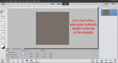
Woohoo! I’m on deadline today!! Things are looking up. Today’s tutorial isn’t necessarily scrapbooking-related, but it definitely uses digital scrapbooking supplies. It’s also not really in time for this year, but it can be a thought for next year. I’m going to show you how to make 2 personal Christmas cards from 1 sheet of cardstock. The resulting cards are 4 1/4 inches by 5 1/2 inches. You can get 50 envelopes that will hold these beauties at Michaels for $8 (Canadian, so about $5 in the US).

If I would have been thinking I could have skipped this step by putting the dimensions in reverse in the New Document screen. But I didn’t so I had to Rotate the canvas 90°.

Next I snapped a line across the centre of the page, and another from top to bottom. I used the Ruler and the Pencil Tool. To snap a straight line in a project, select the Pencil Tool and set the size of the line you want. I wanted these lines to be faint, so I went with 1 pixel. Line up the cursor with the halfway point along one side of your canvas. You can see a moving dashed line on the Ruler so you’ll know when you’re in the right place. Click once just barely inside the edge of your canvas. Then hold down the Shift key and move the cursor to the same spot on the opposite side and click again. It’s just that easy. Then do the same with the top-to-bottom centre point. These are guidelines for placement of elements and for cutting and scoring later.

Then I opened up the folder where I’d collected the objects I wanted to use. I have a photo taken several Christmases ago, a 3D snowflake from Lindsay Jane‘s Snowed Under kit and a mask from PrelestnayaP‘s December Wishes.

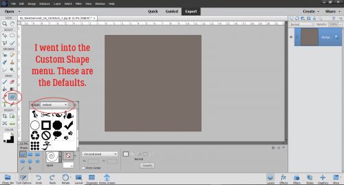
Working in the lower left corner of the canvas, I opened up the Shape Tool, chose the Rectangle, set a Fixed Size of 5.25 by 4 inches and chose a darkish green colour.

The resulting rectangle will fit inside the guidelines for one card. and by Simplifying the layer, I can make adjustments to it as needed because it’s now a Smart Object.

The next step is to add the mask. I resized it to fit inside the green rectangle completely.

The photo went on top of the mask and was resized to approximately the size I’d need. I want the deer and some of the illuminated snow visible later.

Clipping the photo to the mask is simple. Right click>Create Clipping Mask or CTRL/CMD>ALT>G for more recent versions of PSE or just CTRL/CMD>G for versions pre-15.

Final position tweaks included a little shifting and a little more shrinking.

I chose a gold colour from my photo to use for the sentiment. Here’s where all those amazing fonts you have in your stash will come in handy. You can make this text as personal as you want, even making it family- or person-specific. But it still looked like it needed something. So I CTRL/CMD>clicked on the green rectangle layer’s thumbnail to select the outer edges of the rectangle. Then Select>Modify>Contract.

I pondered for a nanosecond how much I should shrink my selection and settled on 25 pixels.

And then I added a Stroke to the new selection. Edit>Stroke (Outline) Selection

I then used the same gold as for the text and added my Stroke. The position for this isn’t a make-or-break thing, so don’t obsess over it.

Yes, I think that’s what it needed.

The final step for this card is to add a trademark to the back. I went with the green for this.

Knowing that it’s on the BACK of the card and should be readable with the card right-side-up, I Rotated the text 180°.

I’m going for 100% honesty here… I saw a card like this second one on Pinterest so I’m not taking credit for the idea. (Ignore the typo on the screenshot please!) I added a new blank layer to the stack and Loaded some watercolour Brushes. These are from a set of 20 free brushes from Brusheezy. I chose 3 shades of wintery blue for the brush area.

I layered the brushes, each on its own layer so I can make adjustments to just one – or all – if I need to.

For a bit of contrast I chose an aqua for the topmost brush layer.

I added in the snowflake and sized it appropriately. But it wasn’t quite enough by itself. So I added a Layer Style from Ooh La La ScrapsIn the Frosty Air collection.

It still was missing something so I turned off the snowflake layer for a second and added a white paint splatter. That makes a big difference!

A few words and it’s pretty much what I was looking for.

A trademark on the back in the dark blue and it’s finished!

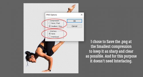
I saved the file as a .png so the printer wouldn’t need to add a white background to everything. To turn this into cards, I’ll load up my printer with white cardstock and print several copies. Using my guillotine cutter I’ll cut the cards apart on the top-to-bottom guideline and score then fold along the side-to-side guideline. I choose to print my sentiments for the inside of the card on resume paper (it’s a bit fancier than regular printer paper) and trim to fit the inside of the folded card. Word art would be perfect for this! Another option is to use a sentiment stamp and ink in a colour to match the front of the card. All that’s left is to sign them, pop them into their envelopes and mail them!

Whew… two weeks until Christmas Eve! Better get on that!

Tutorial Tuesday (Potpourri)

To Theme or Not to Theme

I apologize for missing my deadline. I got caught up in a Christmas sewing project and by the time I came up for air it was almost bedtime. But I didn’t totally forget about you!

When I was looking in the Forum at the December Challenges I was drawn to the Mini Kit provided by Neia Scraps. Although it’s called Christmas Spirit and has a Christmas-y theme I knew I would be using it instead to scrap one (or more) of my DD’s wedding photos (from July) because the palette is PERFECT for them. So I downloaded the kit and created a layout that has nothing to do with the kit’s theme. And that started me thinking about how often others might use a themed kit for a layout about something completely unrelated. I do it fairly often, and figured we could talk about that a bit today. (Note to Glee… the light source is almost directly centred over the layout, but slightly left and up. The frame is holding the paper star down but the points are free.)


For this layout I used a Valentine’s Day kit, the GingerBread Ladies‘ collab Smitten,  to scrap a dog photo. (I know, I do a lot of layouts with my dogs front and centre. What can I say?)

Then I took a (very quick) tour through the Gallery.

Gingerscrapper dshepard created a layout with a kit from Magical Scraps Galore with a candy theme; it’s called Sweet as Candy. The subject of her layout is a visit to a theme park.

This pretty example from honeybee was created with Harvest Sunrise from Mag’sGraphics. No harvest anywhere in sight… but lots of love!

Then I found this cute layout from snojewel about pirates. She used a motivational kit from the GingerBread Ladies called Love Yourself.

And then I found this one from teamkobza about a fun day she had with some little people, although I doubt they were in Iowa. The kit she used is Travelogue Iowa from Connie Prince.

So here’s a challenge for all y’all. I’d like you to create a layout using a kit with an obvious theme but about something unrelated. It’ll broaden your horizons!

Tutorial Tuesday (Photoshop Elements)

Hybrid Pillow Box

Have you ever wished you could customize your gift boxes and make them really personal for the intended recipient? Well, have I got a treat for you! And once again, the credit goes to calgirl (Steph). She found a printable template online for a pillow box and thought I could bring you a great seasonal tutorial for doing it digi. I thought it would be a lot more complicated than it ended up being, and I even managed to come up with a layered template for your crafting pleasure. You can grab it here: Dropbox

The template is on a letter-sized canvas so it can be printed on standard (inexpensive) cardstock. You can easily resize it a bit bigger or a lot smaller, and really make it your own. When you’re ready to print it you can either turn off the top (instruction) layer or delete it altogether.

So, go to your stash and decide what you’re going to use for your special pillow box… papers and embellishments for the occasion. I used Aimee Harrison’s A Rustic Christmas kit. Turn off that top instruction layer for now, or go ahead and delete. You’ll know what to do without it.

Drop your paper on top of the bottom layer. You’ll still be able to see the guidelines.

Then Clip (right-click>Create Clipping Mask or CTRL/CMD>ALT>G) your paper to the template.

Using the guidelines, add in your embellishments. If you’ve added a tag or a label, pick a pretty font and type in your sentiment. What could be better than NOT to need a tag or label? Once you’ve got your clusters and what-have-you in place, add in your shadows. All that’s left is to print it, cut it out from the cardstock, score it and fold it up. A little dab of glue along the very top edge to hold it together and you’re DONE! You can use a bone folder, or a stylus or a totally dead ballpoint pen to do your scoring. If you’re worried about the guidelines showing on your finished box, you can decrease the Opacity of that layer down to barely visible. Or… If you want, you can put the guidelines on the back simply by flipping over the paper and running it through the printer again. Just turn the rest of the layers off and everything will line up perfectly.

I make jewelry for gifts, and I think this would be a perfect way to present them. In a custom box with my signature on it! How many ways can you think of to make this work for you??

Tutorial Tuesday (Photoshop Elements)

Paper-to-Digi 3D Emboss

I’m back!! I’ve recovered about 85% from my unfortunate tumble and should be all there again soon. Thank you all so much for your kind wishes for my speedy healing, I’m positive it helped. (I think that’s my post with the most comments ever!)

Before we get started, I want to apologize for the lack of consistency with the images I’m sharing with you. I’m still not happy with the way this laptop does screenshots and wish I could go back to how my dead one did it, where I could hover over a control so you could actually see what I was selecting. But alas. Add that to the changes WordPress has made to their blogging software, and now I’m also having to resize every image before I write the text. It’s a real drag!

Okay, so. Another suggestion I got from calgirl (Steph) via YouTube video was to show you all how to create a deep 3D embossed look with digital tools. I had to play around a bit to make this work the way it looked in my head, and I think I succeeded. I’m working against a solid cardstock background using a nice blue one from Ooh La La ScrapsPocket Full of Sunshine. I’ll also be using a brush – on a separate layer, of course!

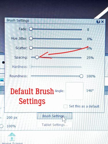
The brush I used is from Brusheezy, one of a free set called Frosted Flakes. (linked) I’ll use it at full size. The Opacity isn’t totally important, as you can see it’s set at 65%. I’m going to stack the brush until it looks dark and sharp enough for the technique.

Here’s what the first click created. I think it has a lot of 3D potential, don’t you?

I kept clicking until I had an almost solid image, a total of 5 clicks. I used white to make the steps easy to see as we go along.

This is another non-essential step. I enlarged my brush image to make everything more easily visible. You do you!

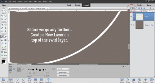
Then I made 3 copies of the brush layer. At this point, I thought I’d use them all, but I ended up only using 3 total. It’s always better to have something and not need it rather than need it and not have it. Onward.

I turned the visibility of the copy layers off, because this is a bottom-up technique.

My next step was to click on Styles and choose the Bevel set.

For the bottom brush layer I used the Simple Pillow Emboss option.

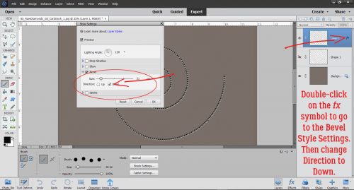
You can see that there’s some texture there now. I clicked on the fx icon on that bottom layer to bring up the Style Settings menu. Then I added an Outer Glow of 13 pixels at 50 % Opacity. The Bevel is set at 27 pixels. Now, this is a matter of taste, and I found that the Outer Glow added some depth that wasn’t there with just the Bevel.

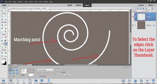
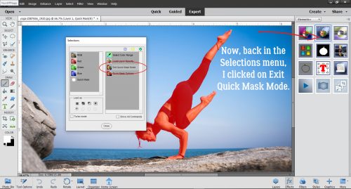
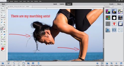
With the second brush layer now visible, I CTRL/CMD>clicked on the Layer Thumbnail (the little picture on the left side of the column) in the Layers Panel to Select the edges of the brush. Selecting an object brings up the marching ants.

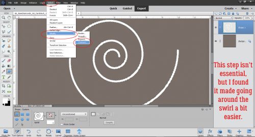
To enhance the 3D effect, I decided to shrink the second brush layer a bit by Select>Modify>Contract.

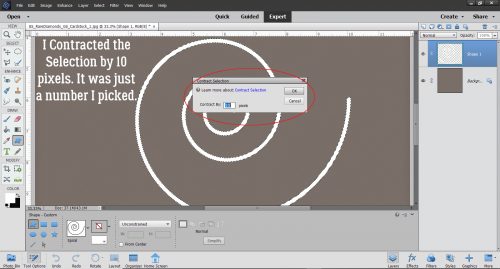
I opted to Contract by 10 pixels, meaning that the outline of the brush will be moved toward the inside by 10 pixels all the way around.

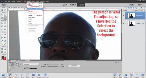
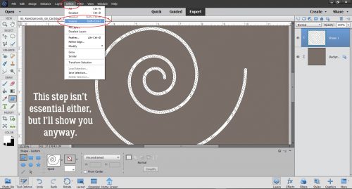
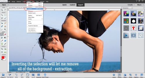
Then I Inverted the Selection by Select>Inverse (or CTRL/CMD>Shift>I)

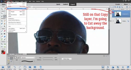
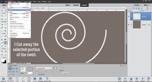
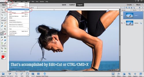
And then I Cut away the outer piece of the Brush layer that was now Selected through Inverting. Edit>Cut (or CTRL/CMD>X)

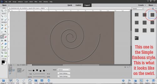
Just like on the first brush layer, I used a Bevel, this time the Simple Emboss as shown.

See the new texture that adds?

I also tweaked this layer, adding an Outer Glow of 29 pixels at 49% and adjusted the amount of Bevel to 15 pixels.

Now on to the third brush layer. I think you know what’s coming. Select the outline again.

This time Select>Modify>Contract to 15 pixels.

And then Invert the Selection (CTRL/CMD>Shift>I)…

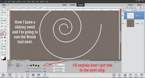
and CTRL/CMD>X away the Selected area.

Hit it with the Simple Emboss Bevel.

Adjust the Style Settings to add an Outer Glow of 29 pixels at 50% and the Bevel at 30 pixels.

I realized that I’d gotten the effect I was looking for without that 4th brush layer. I could have left the resulting image as it was, which would look like a very detailed 3D white paper die cut, but I wanted to see how it would look as a true embossing of the blue paper. I opted to add a copy of the paper layer on top of all my brush layers, in case I changed a Blend mode for the paper and lost the original blue. Here I’ve toned down the Opacity of the top cardstock layer to 78% and it looks pretty much like I’d expect an embossed blue cardstock to look.

I don’t know if doing this step made much of a difference to the overall effect, but I added another paper layer and changed the Blend Mode to Color. What do you think?

Have a look through your brush collection to see what you have that might work for this and give it a whirl!

Tutorial Tuesday (Photoshop Elements)

Another Paper- to Digi-Technique – Stenciling

After last week’s tutorial came out, I got a really nice private message from calgirl (aka Steph). It read, in part: “I love the tutorials you have done on the digital version of a paper-scrapping technique.
I have been trying to think of other techniques it would be fun to see – how do you do this. I happened upon this you tube video which has many ideas but I was particularly interested in the stenciling concept.” Well, I checked out the YouTube video she linked in her message – it was a speedy card-making video (more about that later) and I knew just what would work to create the look she was after. Below you’ll find three ways to use digital scrapbooking elements as stencils! The basics are the same for all three, but the looks are all quite different. It’s a lot easier than it looks, and definitely less messy!

The most obvious element I could think of – and find quickly – for this technique is a doily. I chose one from Lindsay Jane‘s kit Dogs and Puppies. It’s pretty, and has some nice open areas that could work nicely for stenciling. I opened a new 12×12 canvas on my workspace and dropped the doily onto it.

Next, I decided on some colours and got them set. Then I opened up my Brush tool. The Basic Brushes set that comes with the software will work for this method so I chose a large, soft, round brush. I’m working on the layer UNDERNEATH the doily, but don’t worry, it’s going to work exactly like I want it to. If you recall, working on a separate layer with your brushes gives you a lot of options such as simple resizing, repositioning and adjusting Opacity. And you can copy the brush layer(s) as many times as you want.

Here you can see that I have the layer at the bottom of the panel active.

I centered the brush over the doily and gave it a single click. if the screenshot was bigger and clearer, you’d see the doily sitting on top of the brush layer.

With the doily layer turned off, this is what I see.

I decided the brush layer just wasn’t… enough. So I Copied it once (CTRL/CMD>J) then I made the copy brush bigger, to 120% of the original. By doing that, I deepened the Opacity of the original layer and pushed the softer edge further out.

Before I moved on, I Merged the two brush layers together.  (CTRL/CMD>E)

Keeping the brush layer active, I CTRL/CMD>clicked inside the layer thumbnail for the doily – the image inside the box on the doily layer. That Selects the edges of the doily, and produces the marching ants.

The next step is to Edit>Cut the doily area away from the brush layer. (CTRL/CMD>X)

It’s a bit hard to see in the screenshot but the area where the doily laid over the brush has been removed and the transparent background shows through. The doily layer is turned off.

Here’s a much closer look at it. As you can see, there’s no doily texture showing, just the outline of where it was.

I looked at the results for awhile and decided I wanted the edges to be just a smidge sharper. So I added another layer on top of the brush layer. (Doily is still turned off.)

This time when I Selected the outline of the doily, I chose to add an outline Stroke. I wish there was a keyboard shortcut for that, I use it a lot. But there isn’t. Edit>Stroke (Outline Selection) has to do.

I used the same colour as for the brush layer. The outline doesn’t have to be too bold, so 2 pixels on the outside of the selection will work. Why put the stroke on a separate layer? It’s all about control!

I’m still thinking about how to remove the overspray area around the outside of the doily outline. I think I have it figured out, but will need to play with it a bit more. Once I’ve got it down pat, I’ll edit this post to include the details of how I did it.

Okay. Let’s go back to the beginning and look at another way of doing it. Because you know there’s always more than one way of doing most things.

For this example I used a sharp-edged round brush from the Basic Brushes set that I could size to fit the doily exactly. It’s at full Opacity too.

But here’s where the fun starts! I changed my foreground colour to that fuchsia/magenta colour you might have noticed in the previous screenshots. Then I chose the Gradient tool, which is right below the Eraser tool. This tool has a few options that make it very useful. Because I’m working with a circle, I chose the Radial setting. I clicked on the centre of the doily image and dragged my cursor up to the top left corner of the canvas and let go there. That tells the tool which way to grade the colour. I could have chosen any point on the canvas for either action and the gradient would go “from here to there”. If you look closely, you can see the pink is darkest at the centre and fades away as it moves from the centre out. Notice too how the turquoise has changed to periwinkle.

I used the same steps to remove the area of the gradient layer where the doily covers it. I don’t know how many of you can see it, but the doily layer is turned off, and it doesn’t matter! The software will still select the edges even when YOU can’t see it. And, of course, the gradient layer is separate from the others.

Now, with this method, it’s super-easy to remove the overspray area. I used the Elliptical Marquee tool to pull out a perfect circle. The tool’s settings let me go with a Fixed Ratio of 1:1, which creates a circle shape. The hard part is getting the size right. It took me 5 tries to get it right.

The Selected area needs to be Inverted so that you’re cutting the part of the gradient layer OUTSIDE the circle away, not what’s inside. You can either Select>Inverse or CTRL/CMD>SHIFT>I to make that happen.

Then, just like before we’ll Cut it off. Edit>Cut or CTRL/CMD>X.

There! The only pink area is inside the circle.

I liked how it looked, but thought I could make it even better so I Copied the gradient layer and dropped the Opacity down to 70%. Pretty?

One more! I might have mentioned that I have LOTS of brushes. Many of them were freebies or challenge-related, but the ones I get free from Brusheezy are fabulous. One of these sets is the 20 Spray set. I had to load the brush set to be able to use it, since I haven’t had the opportunity to load them all on my new laptop, but that’s easy enough to do. I wish I could still screenshot the selection bars but haven’t figured that out either! I changed colour to this purple and hit my canvas with it. It’s a different look for sure. I Cut the doily out of the brush layer too.

I changed my brush, made it smaller and changed my foreground colour back to fuchsia. Then I randomly added some pink to the mix. On its own layer. ALWAYS!

After Cutting away the doily this is where I was.

Then I thought, how would it look with some green?

Some random hits with a third brush from the same set gave me this… before I did anything else to it.

I thought the green was too much so I toned it down to 35%.

And then for fun, I plopped a black spider web paper from Just So Scrappy‘s Spookalcious kit behind it. (I erased the big splats from the purple layer too.) I think it looks gloriously boho!

What do you think? Something you might try? Obviously, you can use anything that might work as a stencil with this technique, it doesn’t have to be a doily. I had fun with it, and I know you will too.

Now, about the video… the host showed off a paper-scrapping tool that caught my eye. It’s called a Misti (Most Incredible Stamp Tool Invented)… anybody familiar? It allows for perfect placement of stamps on just about any size and shape of paper, and for restamping the same image multiple times for more hefty outlines both with acrylic and unmounted rubber. Well, I decided I wanted one, since I do make cards and have a big collection of acrylic stamps. So I looked for it on Amazon… and nearly died when I saw the price! $138 seems like a lot to me for something so simple in concept. So I kept looking. I found some YouTube videos that showed a couple of similar products, but they had to be withdrawn from the market over patent infringement claims. Sounds like I was going to have to suck it up and pay the $$… until I found a seller who had a couple of the taboo knockoffs for $37 each. It arrived today and will work beautifully! I’ll have to wait to use it though. It has to go into storage with all the rest of my paper crafting stuff. To be continued!

Tutorial Tuesday (PSE and TypeFace 2)

For all the Mac Users – Unlocking Secrets in Your Fonts

I honestly wasn’t sure if I’d get a tutorial out this week. I made a flying visit to BC to check in on my parents (they’re both fine, thank Heaven) over the weekend and didn’t get home until early this morning. But looking through my mailbox led to this!

I was really pleased that last week’s tutorial on using the hidden extras in our font files was so well-received. I had fun putting it together and hoped it would be a good choice. A comment from Carina got me thinking about what might be a suitable, similar font manager for Mac users that could work for the tut the way MainType does. And darned if I didn’t find one! It’s called TypeFace 2, and like MainType they have a free version and a paid version. (If you click on the software name above, it’s linked to the app store.) Of course, the user interface is different, but it has the same options. You can customize your tags so they make sense for you, you can move similar fonts into folders so you can quicken your search for the right one, and you can preview the fonts using the text you’re planning to put into your layout.

Here’s an example of a customized preview.

To be useful for finding, selecting and using the special characters that come with the fancy fonts, there needs to be a way to access them. I will admit that I didn’t test it, but reading the description of the app and some reviews, I’m pretty sure it’s going to work in a very similar way. One other benefit to this one is that it’s available for both Mac AND PC!

Now, for your viewing pleasure, some awesome (totally free) Hallowe’en fonts and dingbats!

This one I found at FontSpace.

The rest are from my second-favourite site, Dafont. You can grab this one here.

This is a bit of a variation on a theme, perfect for bold titles. Get it here.

This font isn’t quite a Hallowe’en one, but it’s very pretty, and the curlicues are reminiscent of the tendrils on pumpkin vines. It’s here.

I like this one for its simplicity, and its slight grunge. Find it here.

What do you think of the Gothic look of this one? Look for it here.

I think this would make the most interesting border on a Hallowe’en layout. You can find it here.

Happy haunting!

Tutorial Tuesday (PSE/MainType)

Unlocking the Secret Extras Hiding in Your Font Files

So… I think this might be a great tutorial… for all you Fontoholics in the room. If you’re already using MainType by High Logic to organize and preview your fonts, this is for you. If you’re NOT using MainType, this might be your impetus to grab it and go. For those who aren’t familiar, MainType is a very versatile, fully customizable font manager. It allows the user to create descriptive tags for all the fonts in their collection, which makes searching for that perfect font for a project much simpler. It has a number of ways to preview the fonts and characters within the font. There are two versions, a free one that will handle up to 2000 fonts, and a standard edition you pay for if you need more capacity. (I use the paid version.) And I thought it was pretty great BEFORE I learned this little trick. Have you ever seen cool projects on Pinterest with fancy, swirly, curly tails and embellishments, only to find the font they used, but no fancy, swirly, curly tails and embellishments? They’re there, you just have to know how to find them!!

Over the weekend I was scrolling through Facebook and came across a link to a video on how to access extra glyphs (those extra characters some fonts include) and use them with Cricut Design Space. I don’t have a Cricut, and I almost didn’t look at the video. But then I thought, maybe I’ll learn something I can use. Well. It turns out Photoshop Elements will do exactly what was shown on the video, so now I’ll share it with you! Start with a blank canvas of whatever size will give you room to work.

Using the font viewer in Elements (or use MainType if you prefer) find the fancy, swirly, curly font you want to use. I have a large collection of fonts, many of them free ones. Many free fonts don’t include “extra” characters, like punctuation, numbers and @#$%… But you’d be surprised how many not only have all the usual characters but a bunch of extras too. I’ll show you how to tell which is which later. For now, I’ll tell you I used a purchased font in my sample, one called The Eye Catcher Regular. I paid $11 USD for it. If you’re interested in where I got it, comment or PM me and I’ll give you the details.

I set the size to the largest default of 72 points and selected a colour that would coordinate with the layout the title was being created for.

Here’s where I may lose some people. Each letter has to go on its own layer. It’s a bit more time-consuming and labour-intensive but it’s worth it!

Here are all the letters, sort of lined up.

Then I selected all the layers and used the Tool Options to align the bottoms of all the letters.

Then I went (back) to MainType, where my font was already chosen. I had typed in my title and now I was ready to make it fabulous. Remember I said I’d tell you how to know if your font has extra characters. Look at the blue-highlighted line in my screenshot. If you look at the far right of the blue area, it has 1047 characters, so you KNOW it’s a goldmine!

The Characters map on the right below has a pull-down menu that shows the character sets within the font. If you scroll down this menu you’ll find the Private Area. That’s where the fancy stuff hides.

I’ve circled the spot where you’ll find this pull-down. These are the upper case extras. Just look at that O!! But how can I get it into my title? It’s so easy…

All I did was Copy and Paste!!!!!! As my faithful readers know, I use keyboard shortcuts: CTRL/CMD>C to Copy, CTRL/CMD>V to Paste. To move the O from MainType to Elements, I Copied in MainType then opened Elements and Pasted there. I just toggled between screens.

Then I decided to swap out the R for something with more panache.

Oh yeah!!

Then I started closing the gaps between the letters. But I wasn’t happy with the way the C and the T weren’t quite connected. So…

I went and found a C that would work better. The tail is going to need some adjustment but it’ll do.

If you look at the Layers panel on the far right, you;ll see that I’ve turned visibility for the original layer off, and once I’m sure I like the new option, I’ll delete that original layer.

Did you notice that the sample in MainType didn’t look quite the same as the text in Elements? There’s more of a swoosh on the T. So I found THAT T and swapped it out.

Now to try connecting the letters again. See where the tail on the C intersects with the T? I’m going to Erase some of the tail.

I moved over the rest of the letters to see where else I might need to make some tweaks.

The B and the E weren’t quite right. But this fancy font also has a bunch of swashes that can be added to any of the characters so I picked one. See it down in the lower right?

The tail on the B needed to be shortened a bit to make the swash fit.

See in the Layers panel where two of the letters look different? I Simplified those two layers, the C and the B, so that I could Erase bits of them. Text layers can’t be altered unless they’re Simplified. (Don’t worry, Elements will remind you!)

My title is done! Before I added it to my layout, I added a narrow black stroke to make it more defined, then a white stroke to turn it into a sticker. It looks great!

Tutorial Tuesday (Photoshop Elements 2018+)

Background Check

Well, this didn’t turn out to be the fantabulous tutorial I had planned… let it be a cautionary tale instead! (I seem to be providing a lot of those lately.) What I was hoping would be simple and fun turned out to be more work than I expected, but it’s all good. I learned a few things while I was doing it and can provide tips for you to make it better for you. And that’s the goal with these tuts, right?

Starting with Photoshop Elements 2018, a Guided Edit for replacing an undesirable background was included in the Special Edits menu. I have SO many photos with blown-out skies that I’d love to replace with something more attractive, so I pulled one out of my Ireland 2018 folder. Let me say right now that next time I do this, I’ll be making some changes in how I do it. I’ll describe those changes as I go along.

So here’s my base photo, the one I want to improve on. The sky is pretty blown-out; this can be prevented in-camera through the use of neutral density filters, but I haven’t mastered that technique yet. It’s on my list… Anyway, I thought this would be a fairly simple edit, since the foreground is fairly sharply defined. When you try this, you might want to avoid trees. Just sayin’.

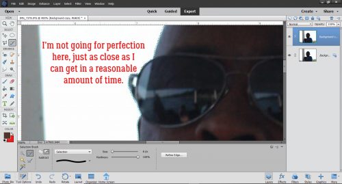
I tried the Auto selection tool but felt like it lacked control so I backed up and went with the Quick selection tool instead. It worked pretty well, for the most part. With a little more patience at this stage, I might have saved some time and effort later but that’s all part of the learning curve. I think the Brush tool might have been a better choice, and I’ll be trying that out in future edits.

Once I’d brought most of the foreground image into the selection, it was time for fine-tuning. See the marching ants along the roofline? The spruce in the foreground extends past the roof and needs to be included in the image. The trees on the far left are inside the selection already but will need some tweaking too.

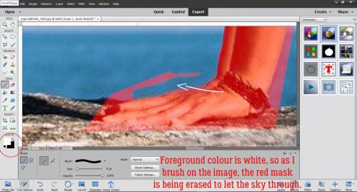
When I moved to the Refine selection tool, the selected area turned red. The settings for this are customizable; I went with the defaults. With the mask at 80% Opacity, I can see where the mask obscures areas I want to include, and the white area is where I need to extend the selection.

I found this part of the process to be a little frustrating. I couldn’t zoom in to see what I was doing. The Refine tool is supposed to “snap” to the outline where two colours abut, and perhaps if I changed the tool setting for Snap Strength to 100% it might have worked better for me. Having gone through the whole Edit, this is where I would choose to spend my time Refining in future.

At this point, I went ahead and chose the photo with the desired background by clicking on the Import a photo bar. It opened up the folder where I got my original image, and lucky for me, there were a few choices of a nicer background in there. But it would be easy enough to go to a different folder and pick something there.

I had this lovely landscape of blue sky with puffy white clouds that will fill the selected area beautifully. So I selected it and clicked Place. If I didn’t have a photo with something nice that would work, I could have used one of the Presets or a solid colour, or nothing at all.

One click and this is where I found myself! If you don’t look to closely, it looks pretty good. But there are still some obvious white patches at the ends of the spruce branches.

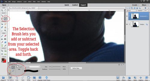
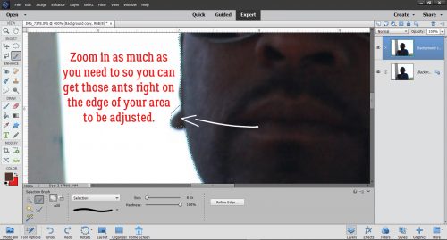
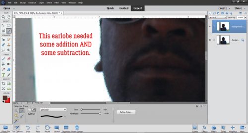
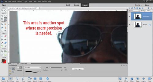
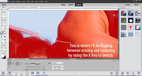
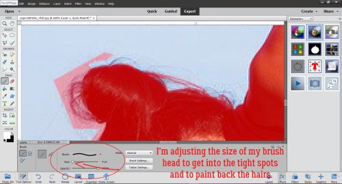
So I zoomed in a bit and clicked on the Refine Edge Brush then Subtract. (Add would just uncover more of the blown-out sky.) Then I started bringing the blue sky up to the edges of the branches. I used a smallish brush and 100% Opacity. And it took FOREVER!

Extreme zoom was helpful at times, and not so much at others. Add in the unreliability of my “left-click” bar on the touchpad and you can see how it was a time suck. And frustrating. But I did get a better handle on how much pressure is needed to engage the “left-click” bar and keep it engaged.

One thing I found disconcerting, and a bit annoying, was that when I used the Hand tool to move the zoomed image around, the Refine Edge Brush looked like it was still active, but it wasn’t. Clicking again on the Hand tool didn’t turn it off, and I never thought to try clicking on the magnifying glass to see if that would work. Next time! At any rate, each time I moved the zoomed image, I had to deselect the Refine Edge Brush, REselect it and resize the tip to make it more controllable. I can see there needs to be some more experimentation with this Edit.

Eventually, I was happy with what I was seeing, both up close and from a distance. There’s still a little bit of a glow around the farthest-left-most tree, but it’s not obvious.

There’s one last option in this Edit, the Auto Match Color Tone tool. I decided to click it to see what it does.

Ick!! It lightened and softened the image too much!! So I Undid that step.

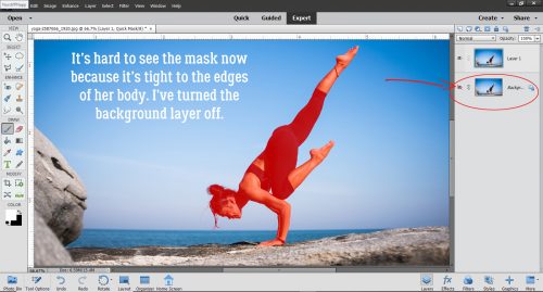
Now that I’m satisfied with my results I had another choice to make, what to do with it now. I chose to Save As it, with a new name so I’d know I’d edited it. But if I was ready to use it for a layout, I could have clicked on a Continue Editing bar and carried on. By this, I mean moving into the Expert Edit work space. In this space there are layers created during the Guided Edit that can then be tweaked more, for a much more satisfactory result. Some of the layers will have layer masks, which allows for pixel-by-pixel adjustments and are non-destructive. Meaning that if I remove a little too much I can paint it back in.

I know I’ll use this Guided Edit again, with the suggestions I’ve made firmly in mind. If I discover anything new, I’ll come back and edit this post to keep you all up to speed. (Thanks Ellen!)

Did you notice anything about this tutorial? The screenshots are so much bigger than usual – I learned something new about WordPress today!! I used the Windows Snipping Tool as Lori (teamkobza) suggested a couple of weeks back and it was less work than my previous method, so that’s a bonus. And then… when I imported them into WordPress, they were tiny; resizing them within WP made them really blurry. Then I noticed an advanced edit option that let me choose the original image size. BOOM! <doing the happy dance all over the living room>

See you next week!!