FINALLY! Kerning is here!
![]()
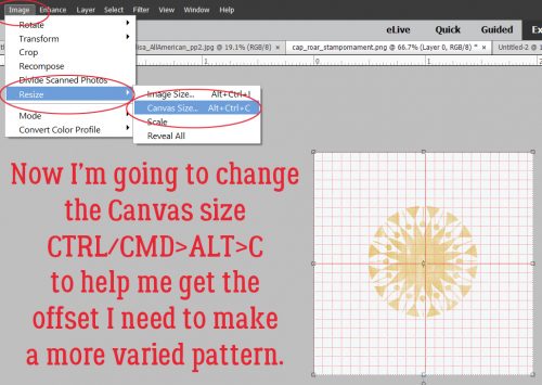
Yes, I upgraded. I mentioned it last week, and that I’d only given it a cursory look-see. I accidentally created a layout using 2019, even though I’d intended to stick with the familiar for a while longer. There was one thing that caught my eye that I wanted to explore further, and this is the outcome.
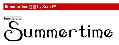
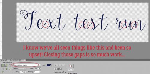
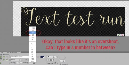
One flaw I’ve always lamented (and did so in a couple of previous text-related tuts) is that Elements doesn’t allow kerning. What’s kerning? (I can see your quizzical looks!) Kerning is a printer’s term meaning the setting of two letters closer together than usual by decreasing the space between them. And with some fancy script fonts, kerning would be a really handy tool. Like Ballerina Script Regular… as I’m showing in my screenshot below. Those gaps!! Having to put each character on its own layer then nudging them together one at a time is such a time suck.
When I was journaling on the layout I accidentally used 2019 for, I noticed the addition of a new tool option in the Text tool called Tracking, and I suspected it had something to do with letter spacing. I was right!
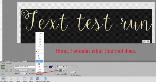
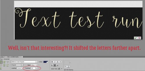
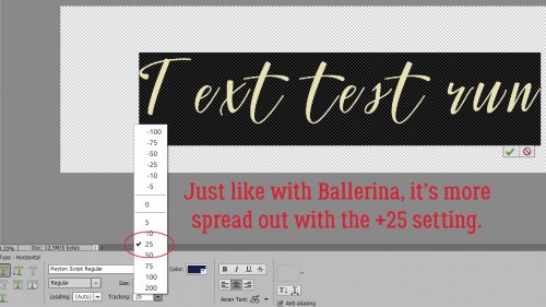
With my text selected (and that’s really important for WSNH), I clicked on 25, as shown, and the tool shifted all the letters farther apart.
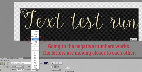
Obviously, to bring the letters closer together the negative numbers are the ones to use. Just a single click on -25 and it’s almost where I want it!
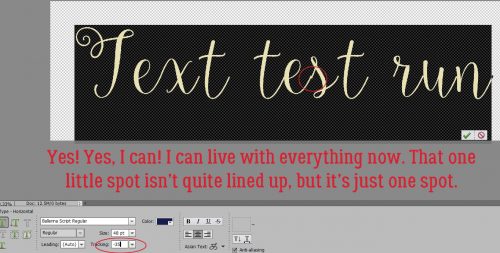
In an effort to make that “s” look better, I clicked on -50, but as you can see, the shift has now overshot and the “x” isn’t connected properly anymore. I know that other tools allow me to type in my desired number, so I tried that next.
I tried -35. SO close!
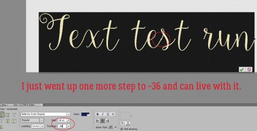
I changed it to -36 and decided I could live with it. What I DIDN’T think about was whether I could select just the “s” and move it by itself. That’s something I’ll try and I’ll let you know how it works out.
Here’s another script font that leaves huge gaps between letters. It’s called Peyton Script Regular. This might not be as quick to adjust.
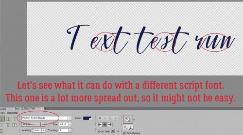
First I wanted to see what spreading it out more would look like. Because sometimes that might look okay.
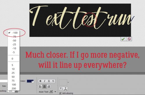
Then I went to the -25 setting and could see some improvement.

I figured it might be best to just jump right to -100. And it was better.
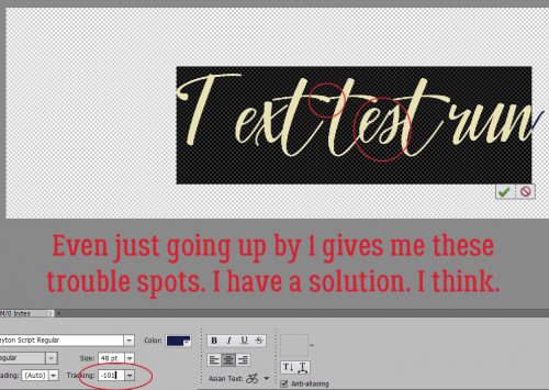
I only went up by 1 increment and ended up with sorta better. This is where isolating the “s” and adjusting only it might have been the answer. This font is fairly condensed to start with so I ended up with the crossbars on those two “t“s overlapping and looking wrong.
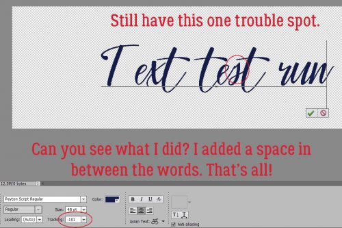
By adding a space with the spacebar between the words I was able to uncross the T bars, but was left with the “s“.
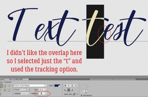
So now was the time to test my theory about isolating one or two characters only. Would it work?
I started with this “t“, which looked a bit funny, the way the stroke overlapped the “e“. I ended up at -15.
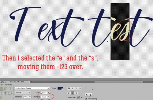
Then on to the “es“. It’s not perfect but it’s a lot better!
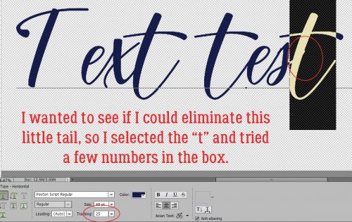
While I was at it, I decided I’d try to get rid of this little tail. Going to +25 was about the best I could do.
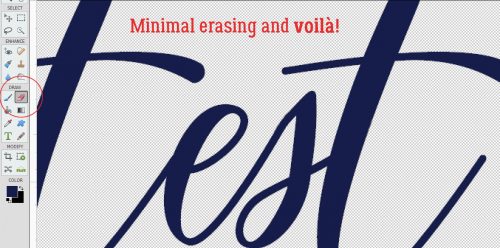
Then I Simplified the text and did some VERY minimal erasing. Looks pretty darned good now!
For me, this new tool option is a real game-changer. No longer do I have to choose between a font I love and the time it would take to make it look perfect. WINNER!!
![]()