Text on a Custom Path – Keeping the Path
![]()
PDF Version : https://bit.ly/3ToXcyv
One of the very first tutorials I wrote for GingerScraps was about putting text on a path – geek-speak for lettering that isn’t on a straight line. (If you want to see it, look here.) Early last week I got this message from Karen: “I found your tutorial on how to put text on a wavy line but what I want is for the line to stay with the text. I just cannot accomplish that.” So immediately – literally – I opened up Elements and figured out how to do it. We decided it would be a good tutorial topic, so here’s what I did.
If you’re a frequent reader, you know one of my mantras is to put things on their own layers so they can be manhandled without manhandling anything else. So of course, first thing to do is to create a new, blank layer to put your wavy line on. Then activate the Pencil Tool, with a hard, round tip at about 5 pixels in diameter. It can be thicker, but it’ll be more jaggy if it’s thicker, so choose accordingly. (It can be made thicker later if desired.) You can choose a colour now, or add a Fill Layer>Solid Color later. Set the Opacity at 100%.

Now, draw your wavy line. Moving your mouse quickly with the left button down, drag the cursor in a swooping motion. The faster you move the mouse, the smoother your line will be.

The font you choose will make or break this technique. If you’ve got a bit of a bumpy curve, using a font with a slightly wandering baseline will disguise that. But those really fancy fonts might look a bit weird. Choose one you like, and give it an audition. If it’s not what you were looking for you can change it later. I’m using one called Natalia Regular.
Activate the Text Tool and then choose Text on Custom Path Tool. The icon looks like a capital T sitting on a snowboard. The Tool will default to Draw.

The Tool Tip will look like the nib from a fountain pen. For those too young to have seen those, here’s one.

Carefully click-and-drag the Tool Tip along your curvy line. I find it easier to pull when doing this; I’m much more shaky when pushing. But this can create problems when the text goes the wrong direction. 😉 So my advice is to draw your guideline in the direction you want your text to travel. You can take a break if you need to; to find out where you stopped, turn visibility for the master line layer off momentarily and you’ll be back in the game. Go slowly and try to stick as close to your master line as you can.

Once you’ve gotten your text line in place, click on the Modify Button in the Tool Options. Wherever your text line departs from your master line, Elements will put a dot – they’re your “handles” to move the text line to where you want it. Click-and-drag the dots closer to your master line until you’ve got the text line and master line touching each other.

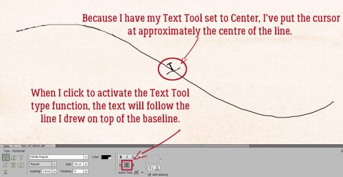
Know where your Text Tool is going to put your letters. Mine is usually set to Center, so I’ve put my cursor there and clicked to activate. You’ll know you’ve actually activated the Text Tool when a blinking line appears. If you have yours set to start at the left side, that’s where you start. Now I’ll just type my text.
The text may not fit properly on your master line. You can easily resize it, or add some extra spaces, change the Tracking if you’re using a more recent version of Elements… or you can change it to a completely different font. Until you Simplify it, you can make all the changes you want. Once it’s Simplified, the text line that told Elements where to put the text will disappear.

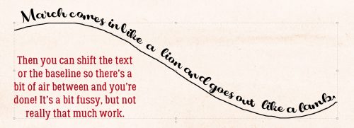
All that’s left is to decide how far away you want your master line. Nudge it with your arrow keys. If your master line seems a bit too jagged at the size you’re going to use this, add a small Stroke, centered on your line. That’s easier that trying to Refine it.
Here’s another sample, this time using an arrow brush.

And then I did this, which is when I found out the Tool takes its direction from – well – the direction the text line was drawn. I had started at the top of the bell and drew down to the lower left edge, and the text ended up on the inside of the line, not the outside. UndoUndoUndo! If I Rotated the Stroke line layer, I was able to get the Text where I wanted it.

I might have to try this one again, but with a shamrock, to celebrate my Irish heritage. [Editor’s note: Shamrocks have 3 leaves, to represent the Holy Trinity, not 4. Those 4-leaf clovers aren’t shamrocks!] See you next week!
![]()