Creating a Shadow Box Layout
![]()
Editor’s note: This is an intermediate level technique, with as much detail as I can get in here so it’s achievable by most.
Let’s see if I can get this finished and posted before our dog barfs again… She apparently ate two cotton bandannas (and I’m not positive that’s all!) and luckily for her, she was able to bring them back up before they created a surgical emergency. She’s not impressed with the forced crate rest or the fasting, but there’s been no vomiting now for about 4 hours. Cross your fingers!
Steph has once again brought me an idea for a tutorial that will blow you away. She found it in the challenges at another store and she (quite correctly) thought it would make a great topic. In fact, I had to it split up into two parts to avoid overwhelming the new-to-digi gals. But you’re gonna love it! And it dovetails with the custom shapes tut from last week, in a way. So let’s get after it!
I started by choosing a photo I wanted to showcase but this technique can absolutely be photoless, with a quote or word art as the focal point, or any combo of elements. Then I decided I’d use a heart shape. But not a boring, typical PSE heart. I used the Custom Shape heart as my starting point, then I changed it. A lot. Remember, to be able to do anything other than resizing, Custom Shapes have to be Simplified. I used the Transform tools, a Basic Brush and the Eraser tool to arrive at my final shape. You could use any shape that tickles your fancy, one of the preset ones in your software or a freehand geometric shape… whatever you like! Before we move on, let’s talk about the Transform tools (Image>Transform) a bit. If you haven’t played with them, DO IT!! It’s fun! There are several options in the dropdown menu: Free Transform, Skew, Distort and Perspective. You can use one or all of them on a single image, but not as a single step. I started with the Skew tool. The bounding box comes up with “handles” at the corners and at the midpoint of each side. Skew only moves in one direction at a time; if you grab a corner handle and drag it up, the side of the image the corner is attached to will stretch, while the rest stays the same. You can move the handle in any direction and for any distance you like. Distort is similar to Skew, but allows the image to look like you’ve turned it on its axis while maintaining the basic shape. Perspective moves the whole side of the Bounding Box. If you grab the top corner and drag it up, the bottom corner will move in the opposite direction in the same amount. We’re going to revisit the Perspective tool in a tutorial coming in a couple of weeks. But back to my heart – as I mentioned, I put a photo on my canvas and adjusted the shape of my heart so that all the parts of the photo I wanted to be visible would be visible. It was a bit of a process, moving back and forth between tools until I got it right.
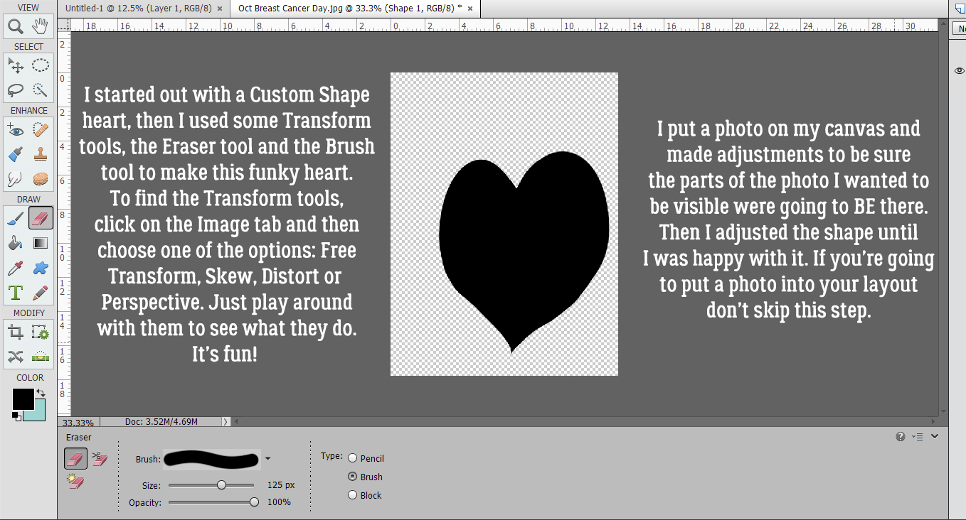
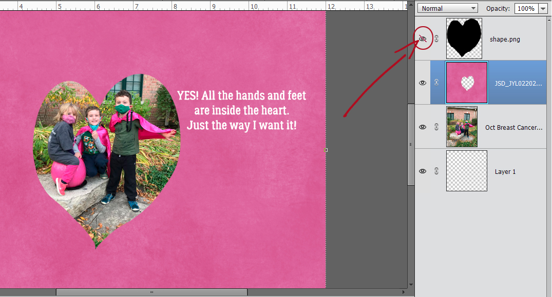
Here I’m showing you how I got the photo part right. I wanted all the hands and feet in there, but not so much of the background. I switched between Selecting the edge of the shape by CTRL/CMD>clicking on the shape so the edge was visible on my photo, hiding the shape layer, deciding what I needed to do to the shape and then making those changes. Lather, rinse, repeat. I finally got it just right, with a relatively smooth edge and could move to the next step.
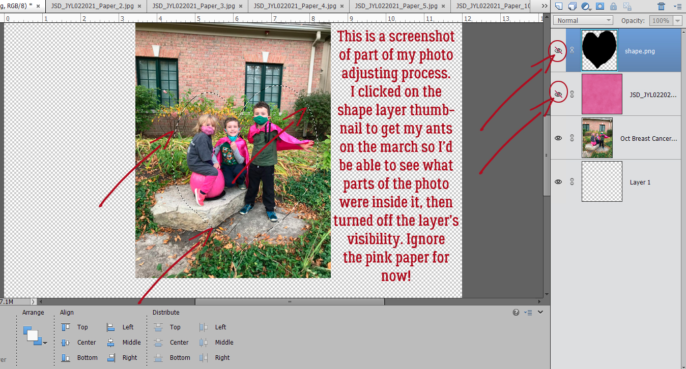
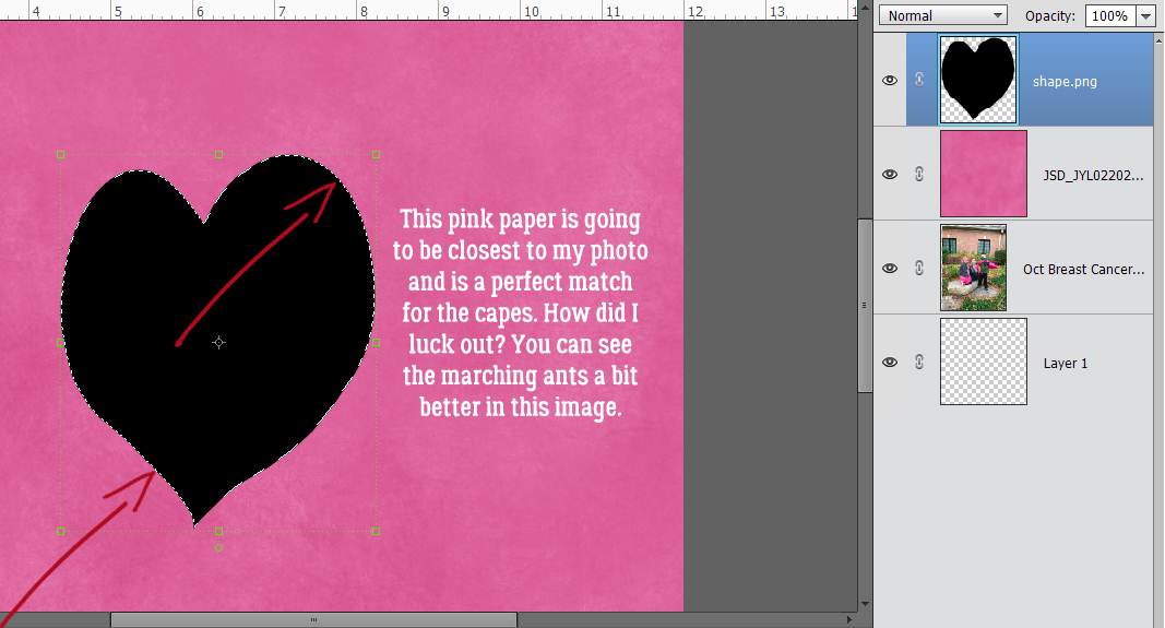
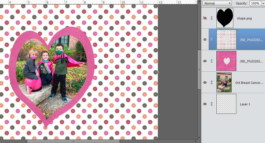
The first paper layer will be this hot pink. It matches my grandsons’ capes and my granddaughter’s mask and pants. (Their other grandmother is a breast cancer survivor and they’ve been doing the Walk for the Cure every year of their lives.) For this layout I used Jumpstart Designs Jumpstart Your February kit, which is free in the Challenge forum for the rest of the month. As you can see, the marching ants are still there from the last time I checked my fit.
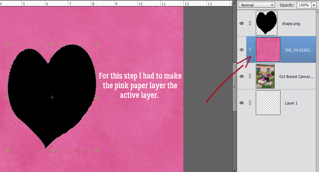
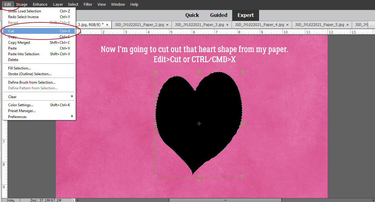
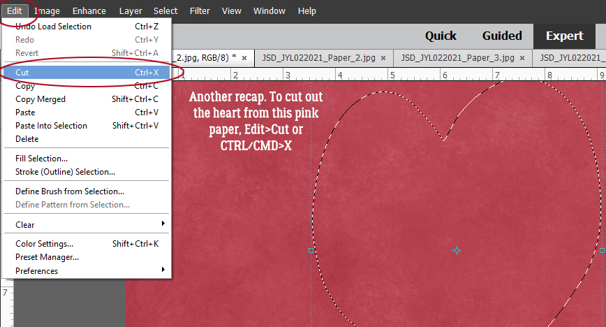
I had to be sure my paper layer was active because I want to cut that shape out of the paper.
Edit>Cut or CTRL/CMD>X will cut the shape out and the photo will be visible again. We’re going to do this step 5 times, one for each of my papers.
See what I mean? Perfect colour match!!
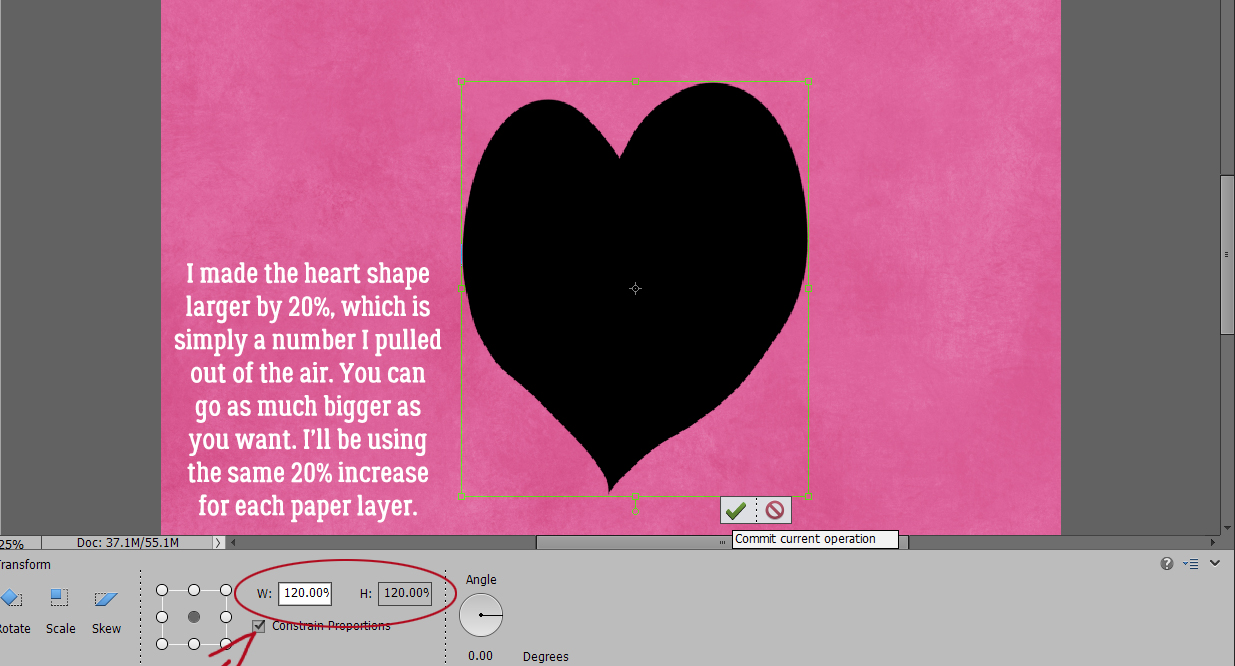
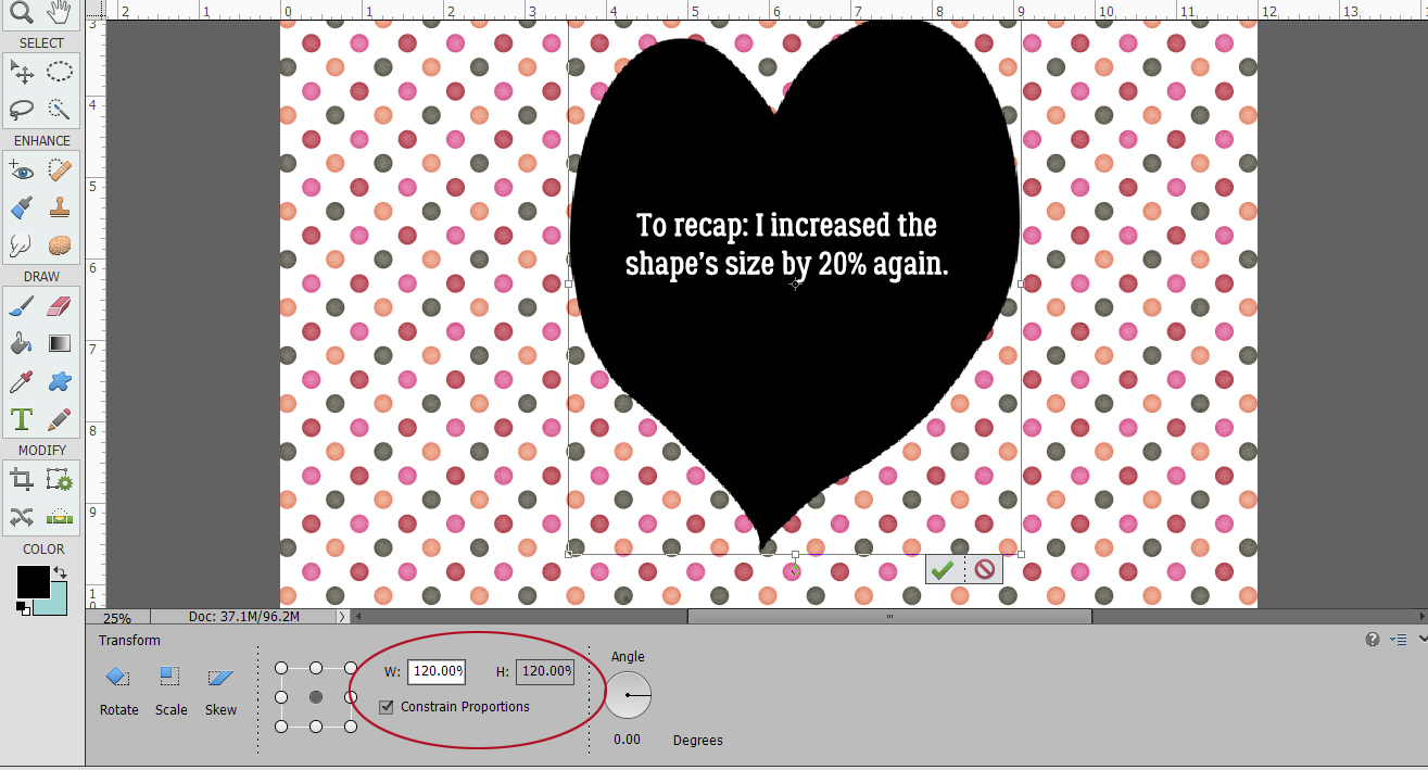
For the next step I resized the shape by clicking one of the corner handles and then typing the amount of increase I wanted into one of the size boxes. I chose 20% because it would be enough to be easily visible and it was easy to remember, because I’ll be doing this step 3 more times. But you do you. Make sure the Constrain Proportions is checked, unless you only want your change to go in one direction. That would also work with this technique, and give a really cool result.
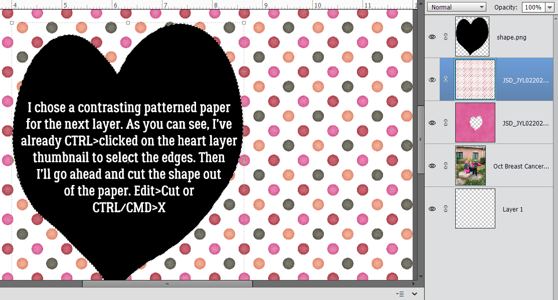
For the next paper layer I went with this polka dot paper for contrast. CTRL/CMD>click on the shape layer, with the paper layer active and CTRL/CMD>X and there’s another cut done!
Here’s how it looks with 2 paper layers.
Then again, I increased the size of the shape by 20%.
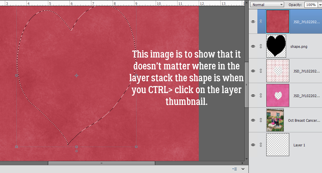
Now, the shape layer doesn’t have to be directly under the paper you’re cutting. It can be anywhere in the layer stack. It’s the selection that Elements cares about, not where it is. I added another grungy pink paper to the pile.
On to the cutting part.
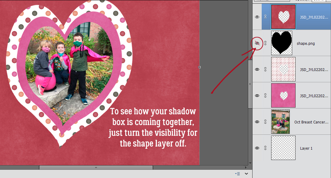
If you want to see how it all looks without the black shape in the way, just turn that layer’s visibility off.
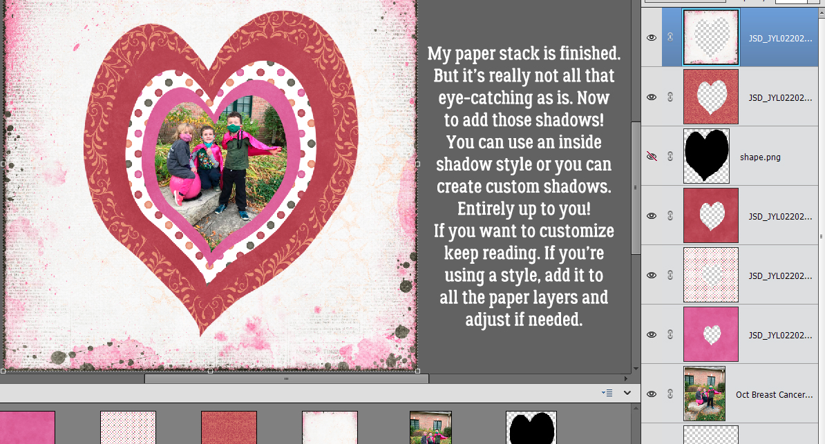
I went ahead and added two more paper layers, increasing the size of the shape layer by 20% each time. Now to add the shadows so it looks like I’ve stacked all these papers on top of my photo, and used those foam strips in between to give me a big offset. I’m going to create my own shadows for each layer and will take you through that process. But you can absolutely use an inside shadow style like these ones from Karen Schulz if you’d rather. That’ll reduce the number of steps for you quite significantly.
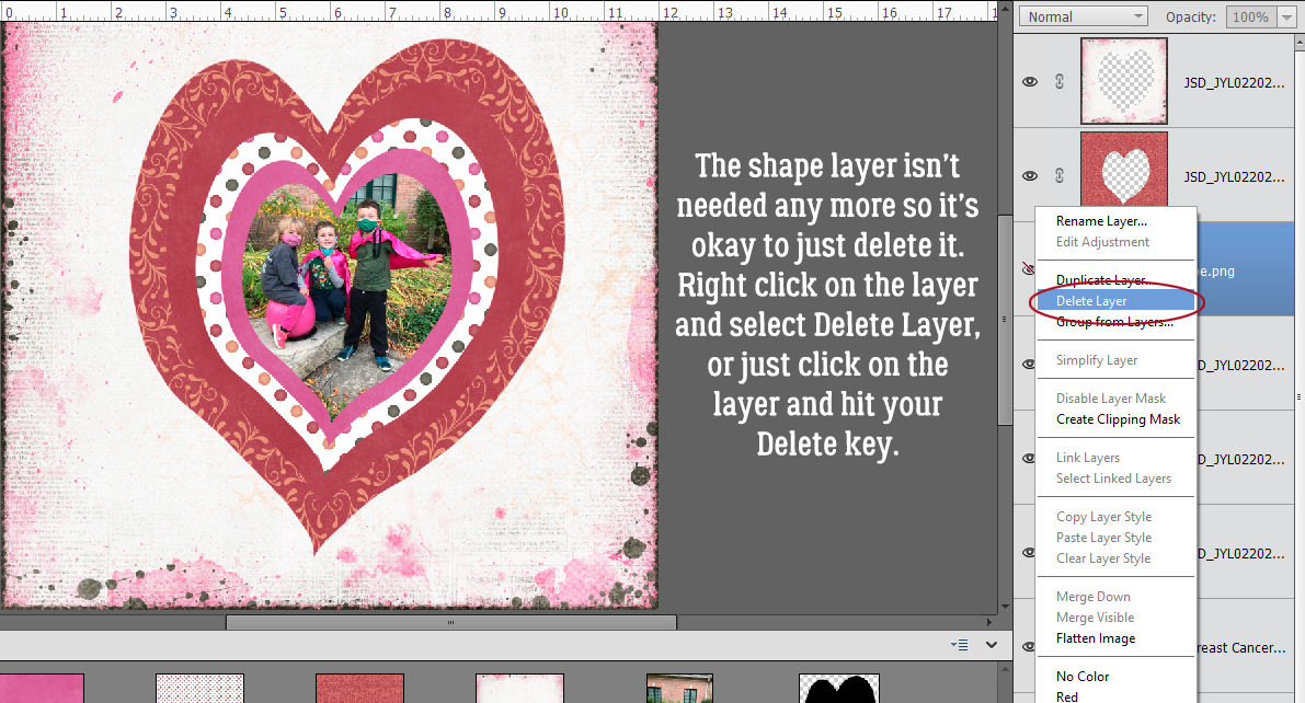
That shape layer isn’t needed any more so I’m just going to delete it. Right-click on the layer and choose Delete Layer, of just hit the Delete key. Either method will work.
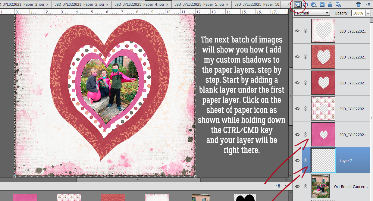
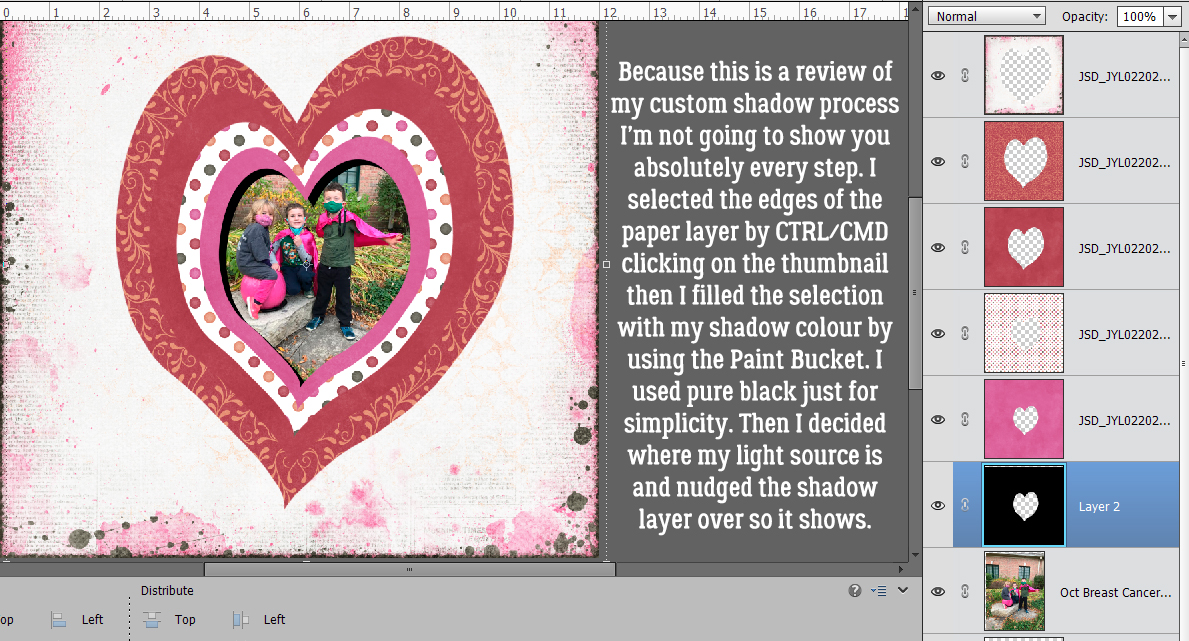
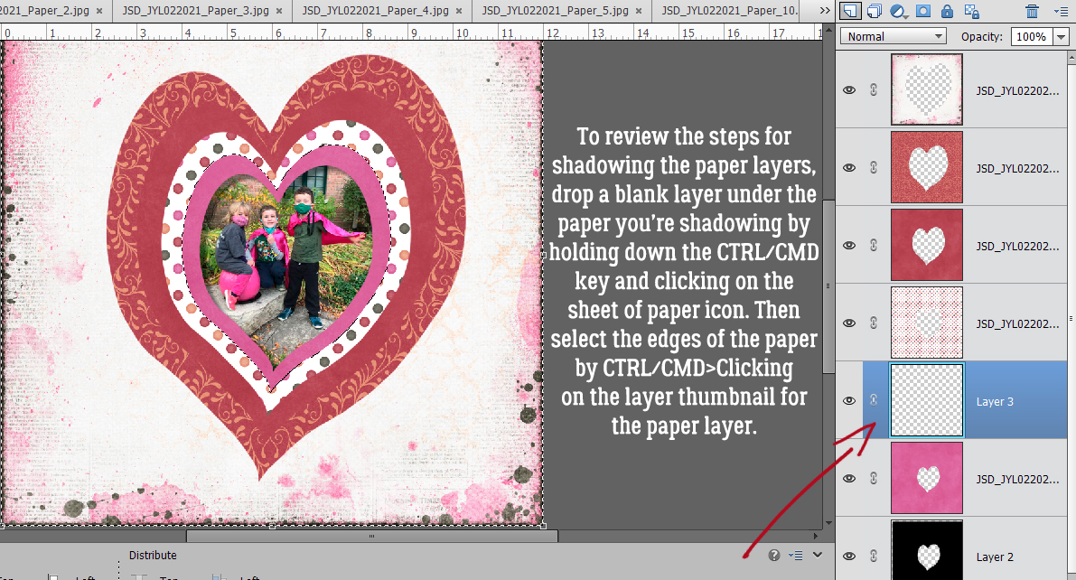
If you’re still reading along, we’re going to run through my method of creating customized shadows on a separate layer. There’s a tut for that here. The first step is to add a blank layer UNDERNEATH the layer you want to shadow, in this case my first paper. To do that quickly and easily, hold down the CTRL/CMD key and click on the sheet of paper icon at the top left of the Layers panel.
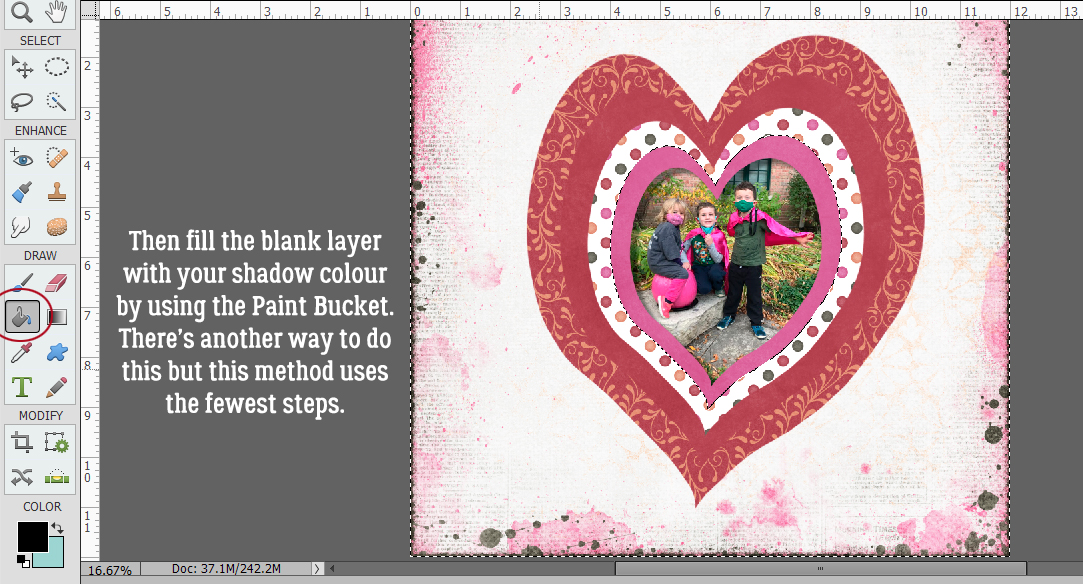
Then select the layer you’re shadowing by CTRL/CMD>clicking on the layer thumbnail (not the layer, because that’ll mess up your next step!). Using the Paint Bucket tool (click>K), fill the blank layer with your shadow colour. The colour will only go inside the selection, as shown in the Layers panel. I used pure black for simplicity but you can use a brown or gray if you’d rather. (There’s another way of filling this layer with your shadow colour, but this is the quickest with the fewest steps.) Decide where your light source is coming from (upper left corner for this example) and nudge your shadow so that it appears where the light source dictates it would appear in real life.
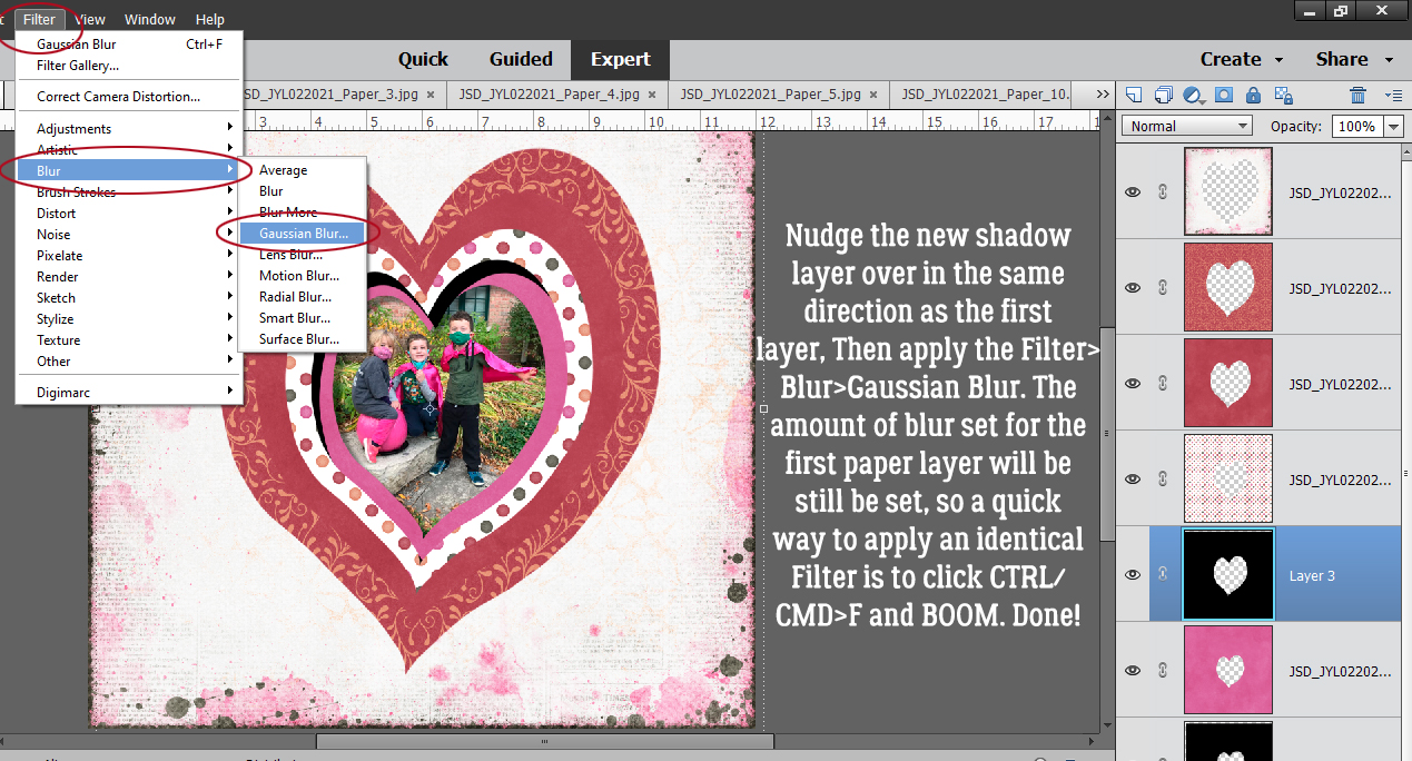
Now, real shadows can be harsh and sharp-edged, but that’s not pretty. So let’s not do that! The way to make your shadows look more realistic starts with adding a bit of Gaussian Blur Filter to them. Filter>Blur>Gaussian Blur
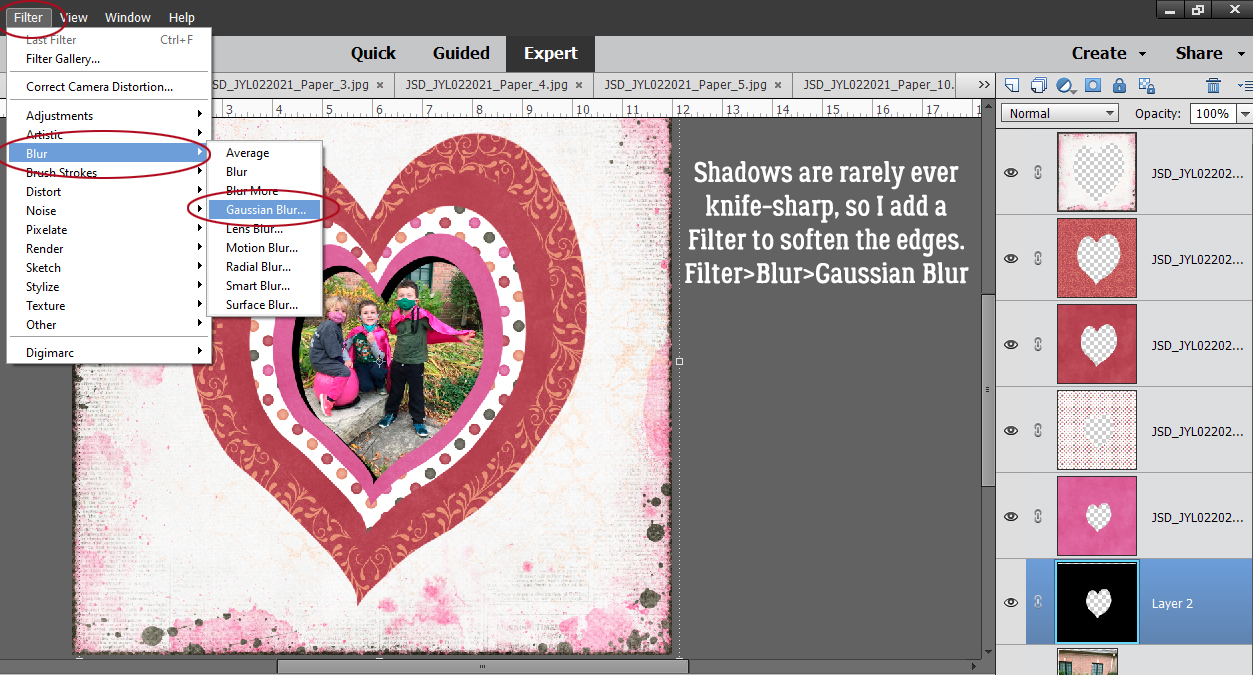
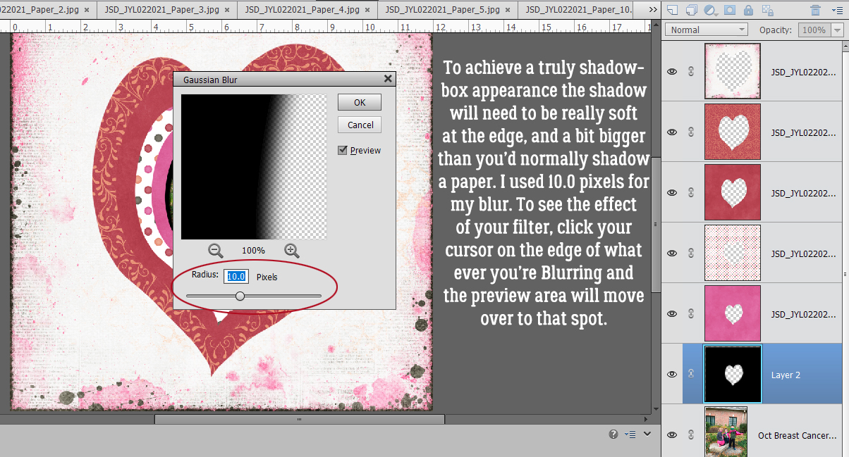
We want the shadow to make the paper look like it’s quite a distance from whatever is under it, so the Blur can be significant. I went with 10.0 pixels.
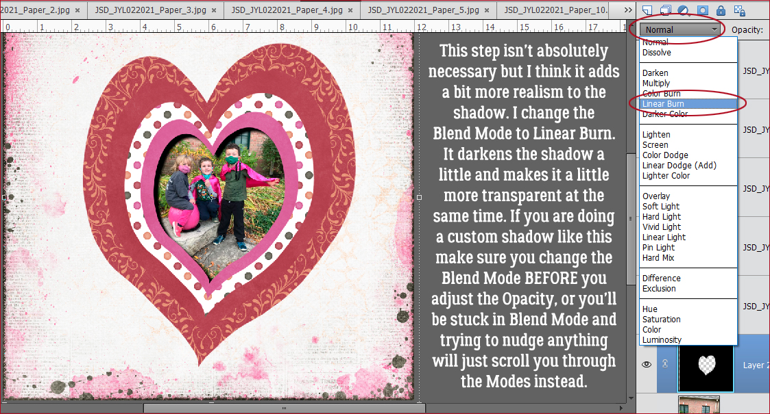
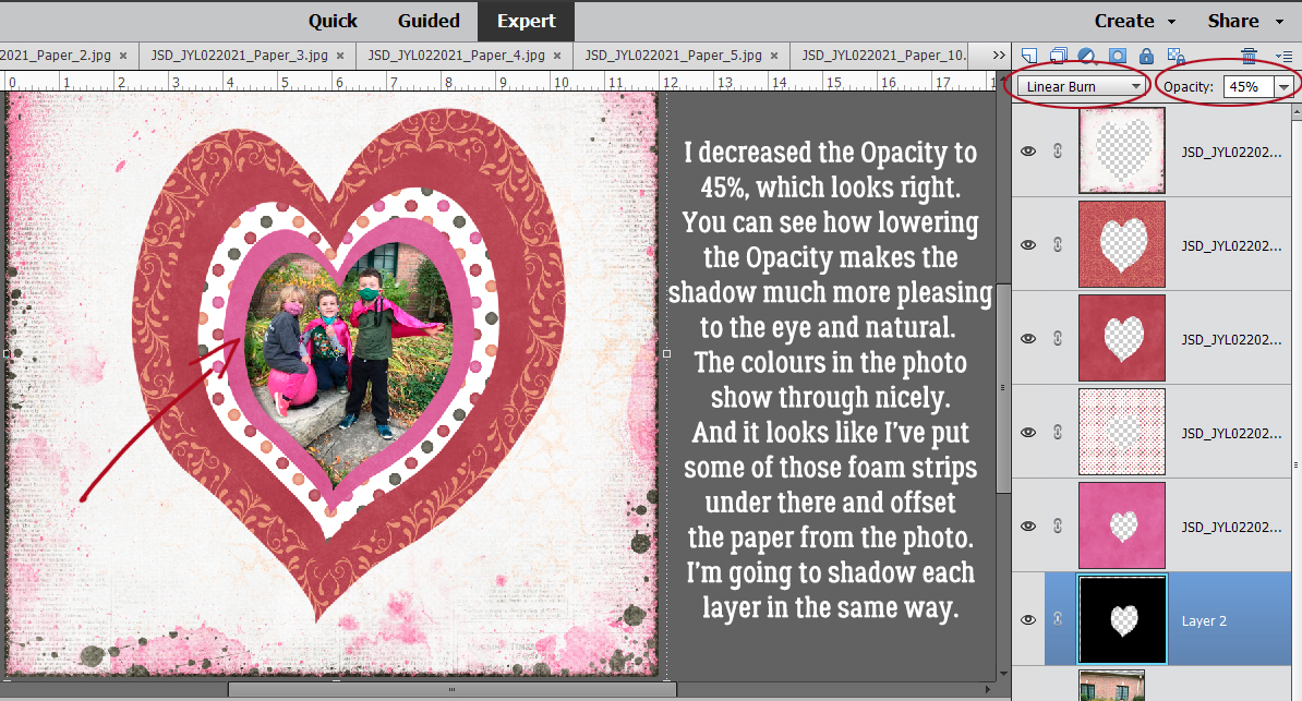
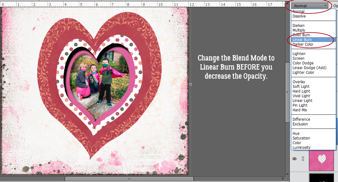
This step isn’t essential. I change the Blend Mode of my shadow layers to Linear Burn. It makes them a little darker but more transparent, if that makes sense. You don’t have to take this step, but if you do, make sure you do it BEFORE you adjust your Opacity. If you do it AFTER the Opacity change, next time you go to nudge something, Elements is going to change the Blend Mode instead!
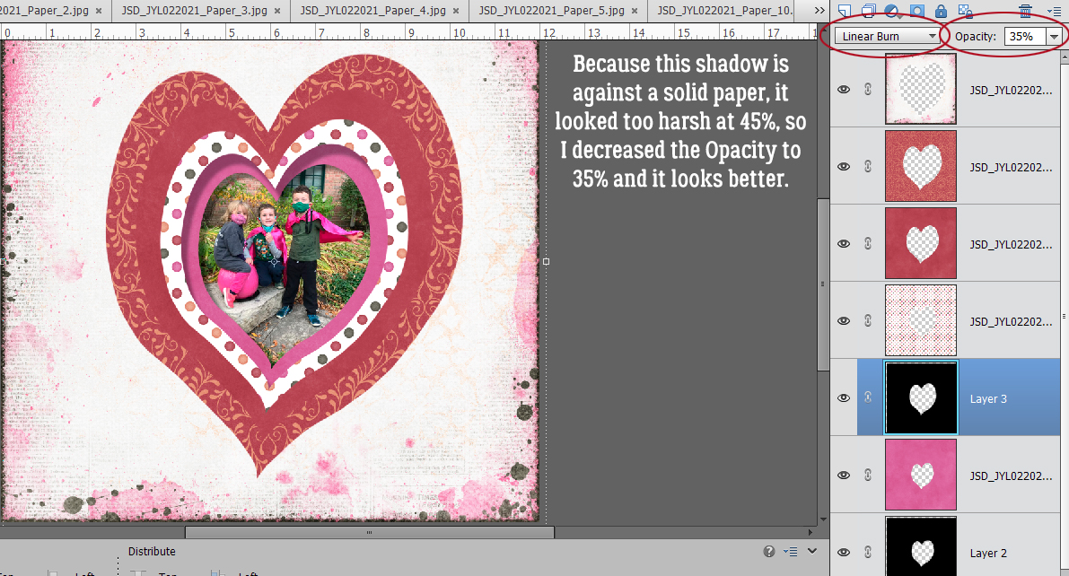
This screenshot shows the Blend Mode is Linear Burn and the Opacity has been lowered to 45%. Look at the shadow now, as it’s cast on the photo. The colours in the photo are still easily visible and unaltered by the shadow. I’m going to shadow all the paper layers in exactly this manner.
To review Step One: Blank layer behind that paper layer. Edges of the paper Selected by CTRL/CMD>clicking on the layer thumbnail.
Step Two: Fill the shadow layer with the Paint Bucket (click K) and click inside the canvas.
Step Three: Add a Gaussian Blur Filter. If you’re happy using the same amount of blur from the last step, the keyboard shortcut is CTRL/CMD>F and it’s done!
Step Four: Change the Blend Mode to Linear Burn. then decrease the Opacity.
I found that an Opacity of 45% was too harsh against a solid paper so I went down to 35% and it looks right to my eyes.
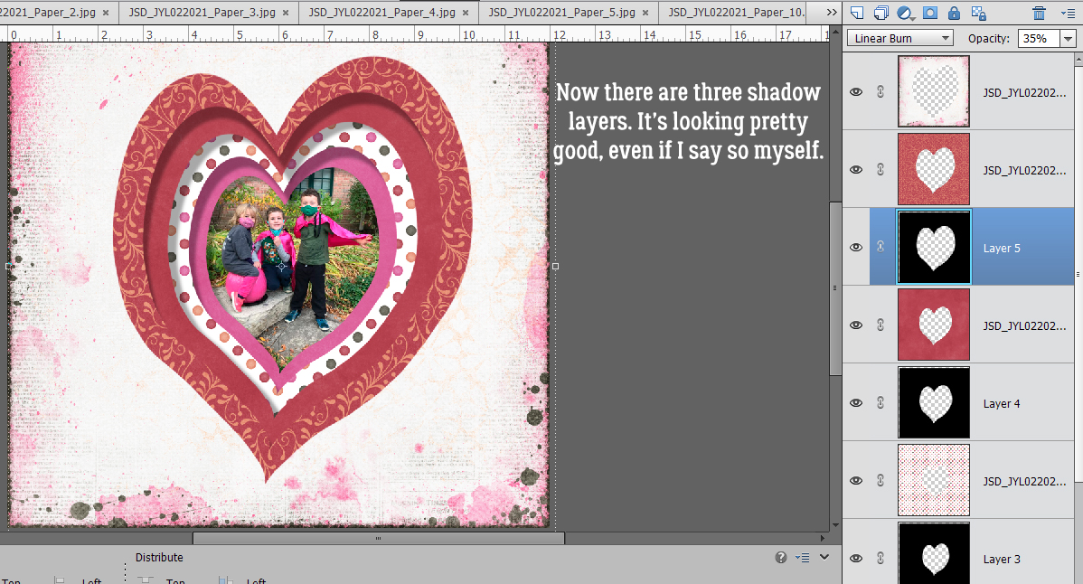
Follow the same four steps for each of the paper layers. This image shows 3 shadow layers finished.
And now all of them are done. Don’t you think the shadow-box effect works?!
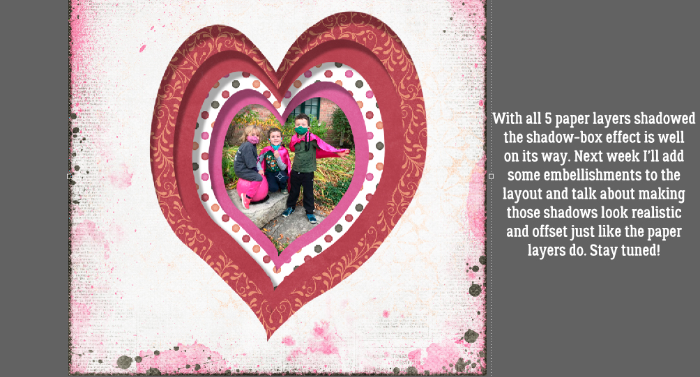
For the second part of this technique, I’ll add some embellishments and show you how I shadowed each of them to achieve the final, cohesive look. My layout is here so you can check it out. See you in a week!
PDF Download: https://bit.ly/2ZqQ73D