Creating a Shadowbox Effect, Part 2
![]()
Editor’s Note: This is an intermediate-level technique.
When we left off last week, the paper layers for the shadowbox were all complete. Now let’s look at adding some embellishments in between those layers. The adding part is pretty straight-forward. Shadowing those layers is the tricky bit. To give the layout the most oomph, the shadows will need to be as realistic as possible. So let’s review some shadow basics.
Shadows are created when light is obstructed by an object. When the object is sitting right on top of a surface, very little light can get under or behind it. Generally, paper will cast a very narrow shadow because it’s thin and flat, unless there are objects under it lifting it away a bit. Things with contours will cast shadows that vary depending on the size, shape, opacity and angle of the object. Flower petals or leaves may curve away from their backgrounds, and the shadows they cast will be narrower where they touch something else, wider where there’s more space. How dark a shadow appears also depends on the shape and density of an object. A button will allow almost no light under or behind it, even at an angle, while a bead may be translucent and will allow much more light through it. String and ribbon can be touching the background in some spots and curl away in others, so a truly realistic shadow will do the same. Now let’s apply these principles to the layout. Again, I’m working from the background out.

It’s possible to use commercial shadow Styles for this type of project, but it makes the whole task a bit more complicated. I’ve used a shadow Style on this flower , which offers some opportunity for adjusting it. Since this flower is underneath the whole paper stack, there won’t be a lot of room for light to leak under or behind it. So there aren’t many tweaks needed. To get to the controls for Styles, double-click on the fx icon on the right side of the layer in the Layers Panel.

I made the shadow narrower because it has all the weight of the layout on top of it. I also moved it closer to the flower’s edges for the same reason. Then I increased the Opacity because it’ll be sitting on top of a photo and might be lost there. Now, if this flower was further up the stack of papers and elements, it would be touching some things and well above others. Using a commercial style means there will need to be a lot of extra steps to adjust the distance and sharpness of that shadow where it’s really close to the object below it. For this reason, it’s working smarter, not harder, to create shadows for each layer as we did for the paper layers… many fewer steps.

The process of shadowing these objects is exactly the same as for the paper layers. Drop a blank layer underneath the object by CTRL/CMD>clicking on the new layer (sheet of paper) icon at the top left of the Layers Panel. Select the edges of the object by CTRL/CMD>clicking on the layer thumbnail of the object with the blank layer active. Fill the selection with your shadow colour using the Paint Bucket tool.

Nudge it in the direction the light source dictates.
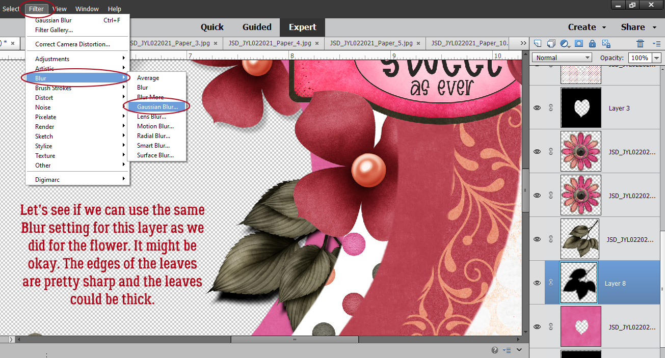
 Apply a filter by clicking Filter>Blur>Gaussian Blur.

 Change the Blend Mode to Linear Burn.
Decrease the Opacity until it looks right. Those are the basic steps. I’ve done them so many times that it’s almost automatic for me now and it takes no more time than just hitting it with a Style.
The leaves could be shadowed with a style if we assume they’re fairly stiff and will be a uniform distance from the background. Because of how they’re positioned, there’s going to be very little shadowing on the dark pink paper behind them. The next several screenshots show the custom shadow steps again. 


The smaller paper flowers at the notch of the heart shape need a bit more TLC to look realistic. They touch each other and the paper layer underneath them so the shadow will be narrower there. Then the petals are farther away from the background and will be bigger, broader and softer. The Smudge tool – looks like a finger pushing something on the page – will accomplish this. Some things to remember when using the Smudge tool: use a bigger brush than you think you need for a more subtle adjustment, use a light touch and watch the image as you work so you know when to stop. If you go too far, Undo (CTRL/CMD>Z) back to the beginning and start over. To move the shadow closer to the flower, push with the brush very gently. To move the shadow farther away, pull with the brush very gently. If you have crosshairs in your brush cursor, you’ll see that the main action takes place right next to the crosshairs. 
This screenshot shows how I’ve shadowed the second flower, before the Opacity is lowered. 
Use your imagination when it comes to things like flowers, leaves, string, ribbon and even word strips. Think about how you’ve attached the object to your layout. I’ve decided this flower curves away from the background; the lower petal is relatively flat while the upper one curves in the centre so that there’s a bit more shadow along and away from the curve. For the string, look at it from the perspective of what parts are close to the paper layers and which could be curving away. Use the Smudge tool as needed. 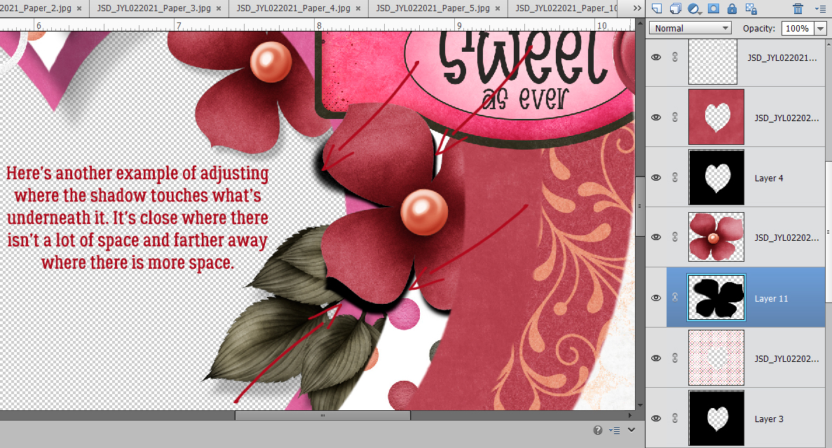
This next part is more complicated – if you want to try it and aren’t following how I’ve done it, let me know and I’ll do an in-depth tutorial on it. (The technique is somewhat covered in this tutorial.) I wanted a petal from the flower to overlap the tag. To make it look like the petal actually extends up and over the tag, I added a layer mask to the TAG by clicking on the blue square with the white circle icon at the top of the Layers panel. Then working on the layer mask,, not the layer, I erased away whatever was overlying the petal. When using a layer mask, the foreground colour in your Color Picker will be either white or black. Remember, black conceals, white reveals. Set the foreground colour to black to conceal then switch to white and clean up the edges. When you have a nice sharp edge where the mask and the object underneath it intersect. Simplify the layer by right-clicking on the layer and selecting Simplify Layer.
As you can see from the screenshot. the shadow for the tag looks really wonky. It needs to be Erased from the area over the flower petal. I used the Eraser tool to carefully remove the areas of the shadow that would be underneath the petal. 
But that leaves me with a new problem. The petal needs to cast a bit of shadow on the tag. What can I do to make that work? Well, I chose to find the shadow layer for the flower and Copy a sliver of that shadow. I used the Elliptical Marquee tool and Selected the section of the shadow that should be on top of the tag. Then I made a Copy of that section by clicking CTRL/CMD>C and Pasted it onto the canvas by clicking CTRL/CMD>V. Elements will drop the copied section close to but not on top of the original. So I nudged it over to the spot where it needed to be, extending just a little past the edge of the petal, and then moved it up the layer stack until it was above the tag layer as shown in the screenshot. It needed a little shaving down and the easiest way to do that was to Select the edges of the flower by CTRL/CMD>clicking on the flower’s layer thumbnail in the Layers panel, keeping the sliver-shadow layer the active one, then Cutting out the extra shadow by clicking CTRL/CMD>X. Bingo! The petal now has a shadow! It just needed a tiny bit of a Blur and it was done. 
Please don’t hesitate to ask questions. I want you to be confident and comfortable when you create, even when you’re being challenged!
Here is a link to a PDF version: https://bit.ly/3dLGZyN