Archives for January 2021

Fresh Baked: JANUARY 29, 2021

We’ve made it to the last Friday in January. That didn’t take long. I hope that your January was a fresh start from the craziness of 2020. We’ve got some fun things coming up, so make sure you check the newsletter each week.

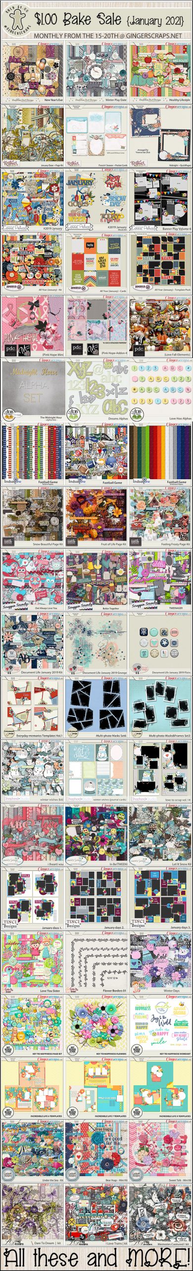
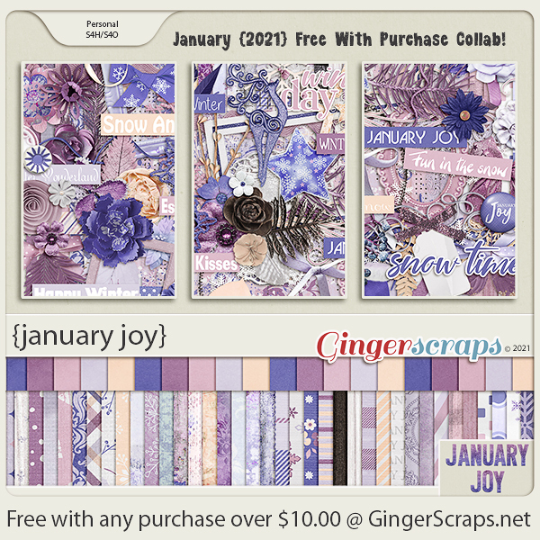
If you spend $10 in the store, you get this awesome kit for free. Last chance to get it free. If you miss it, it does go into the store and can be purchased on February 1st.

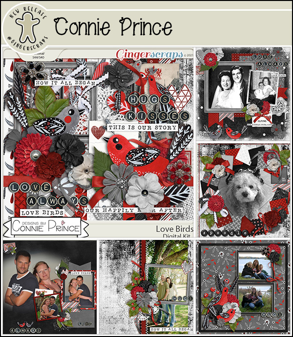
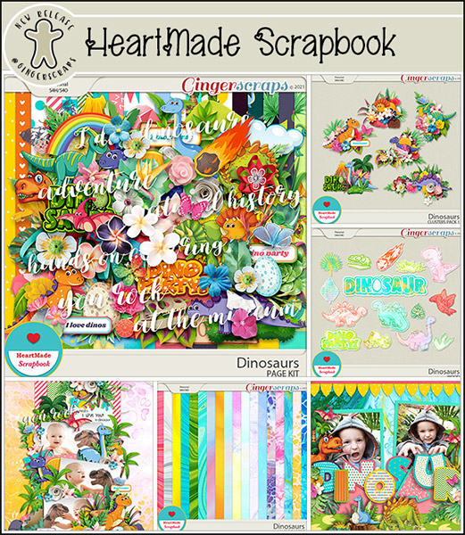
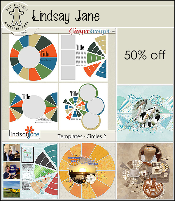
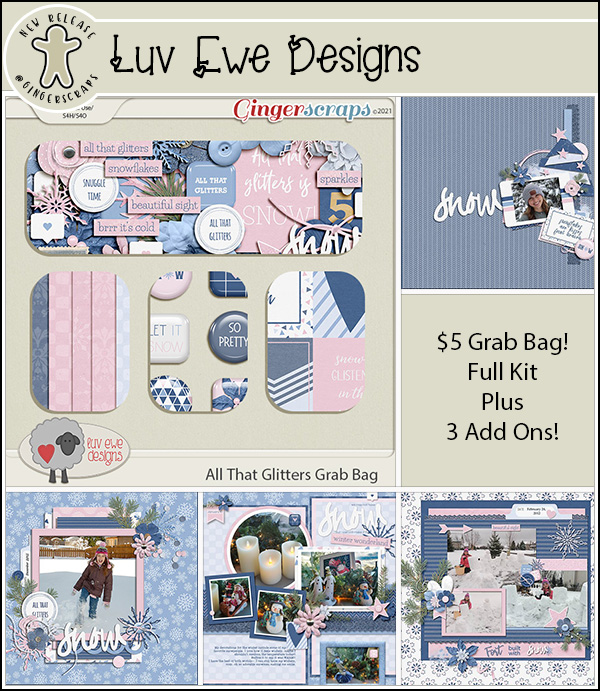
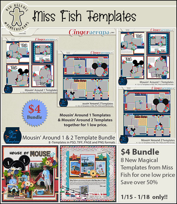
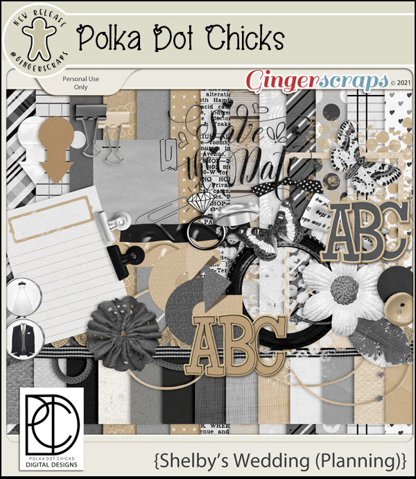
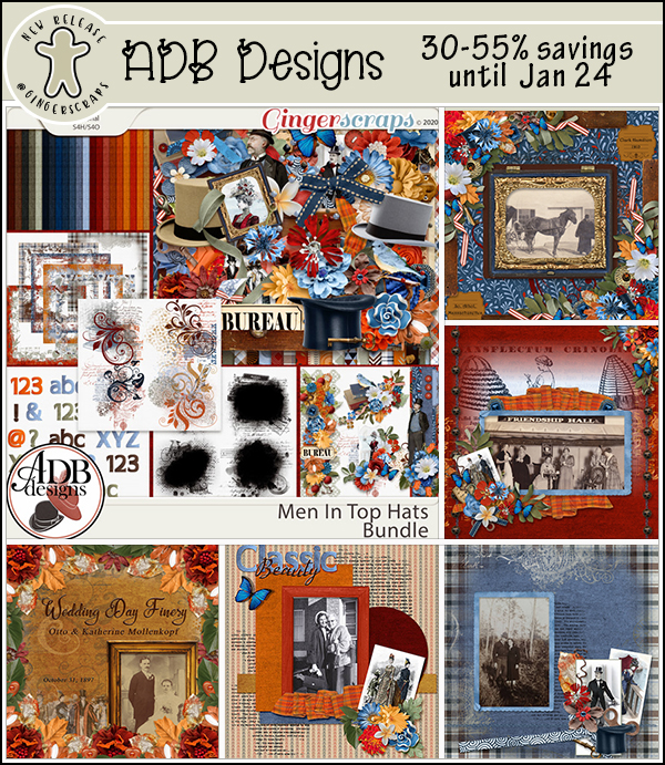
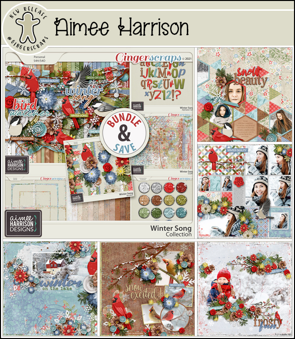
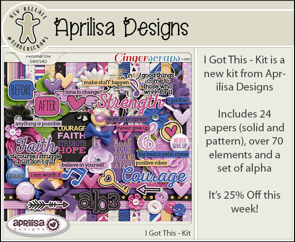
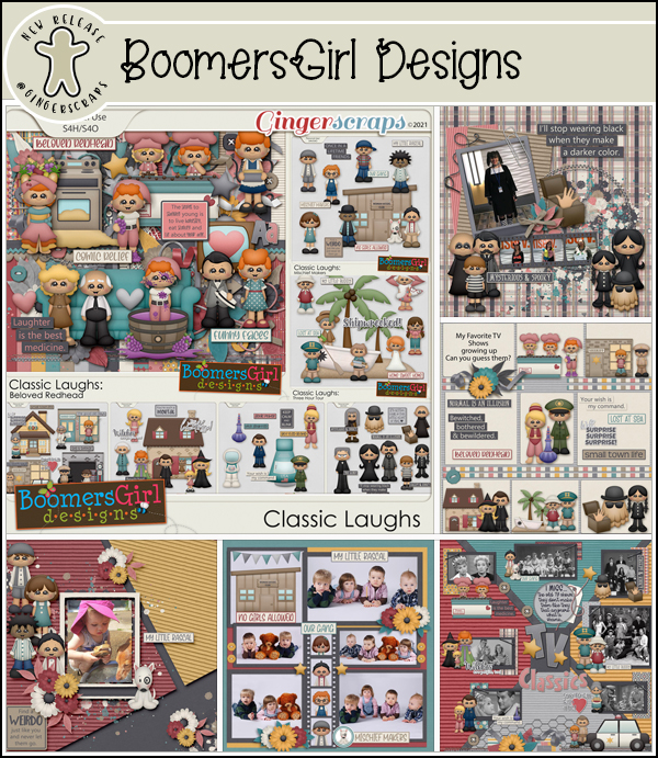
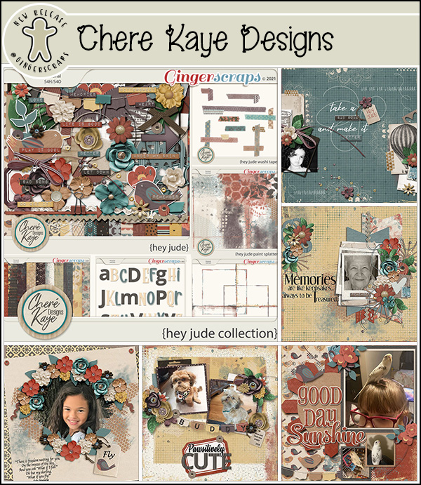
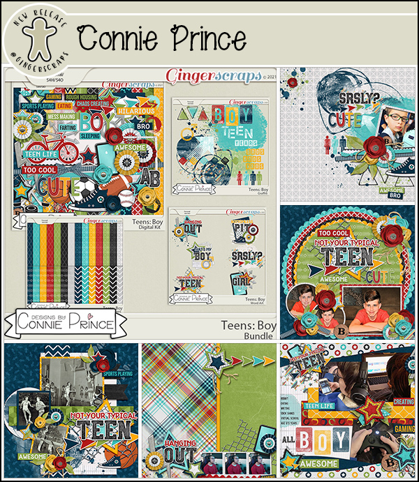
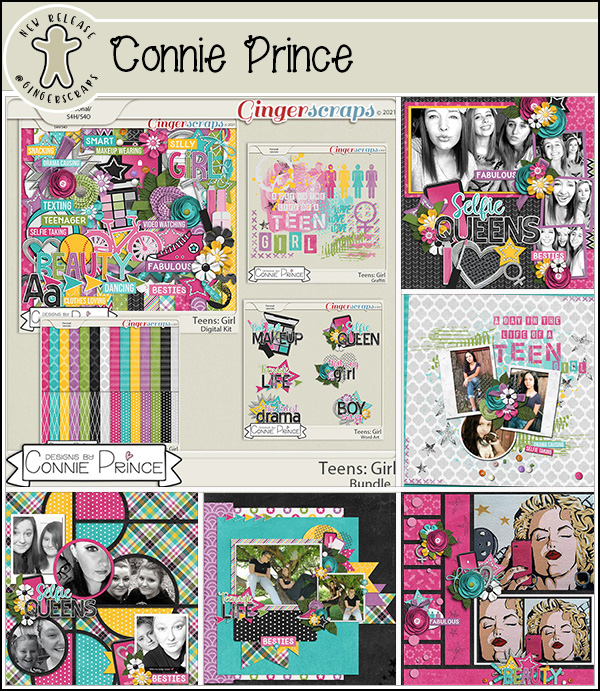
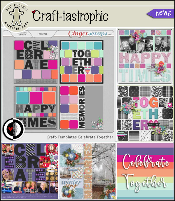
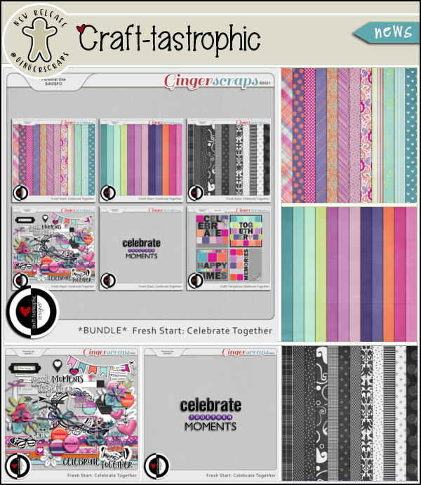
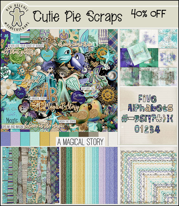
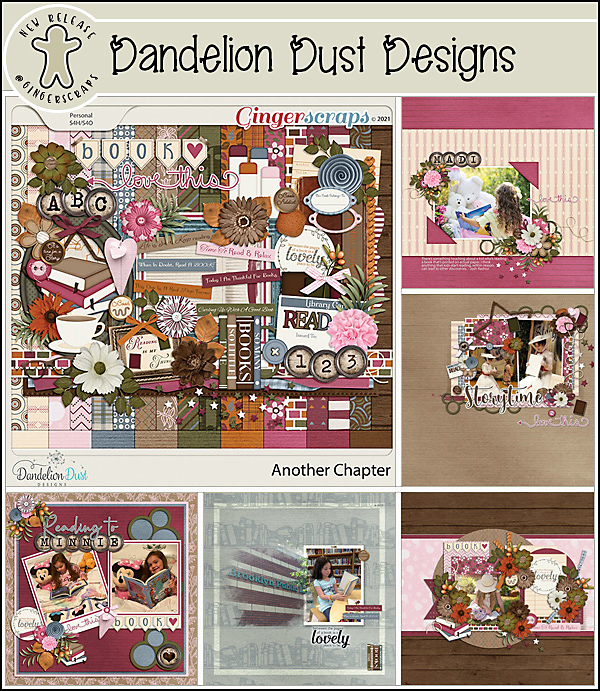
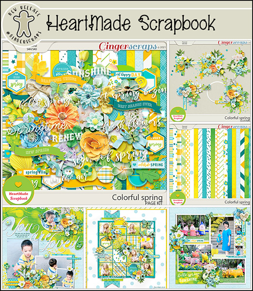
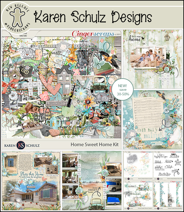
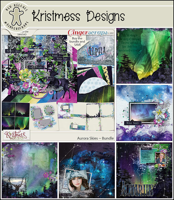
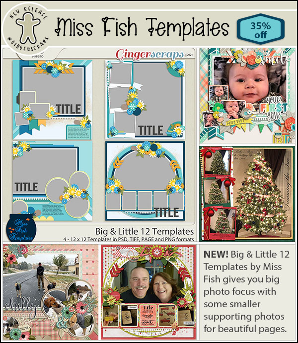
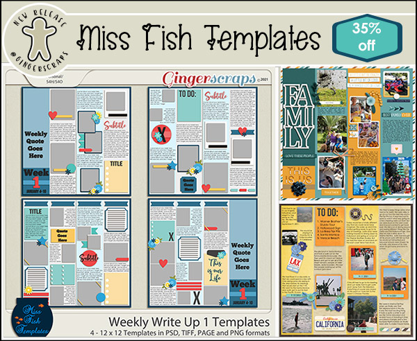
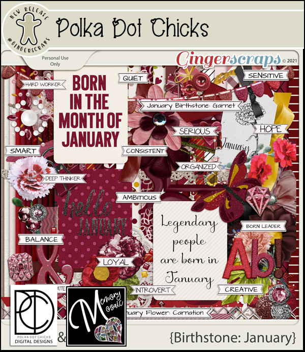
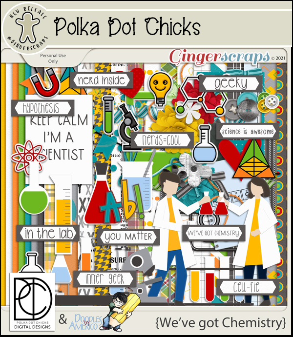
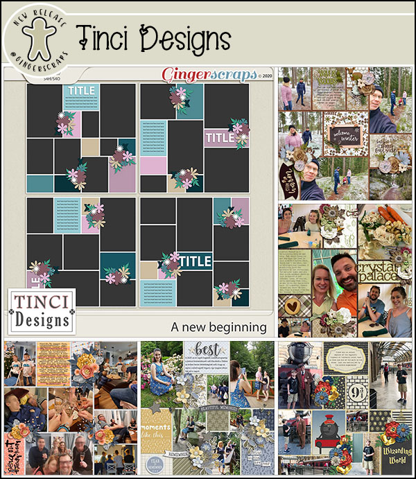
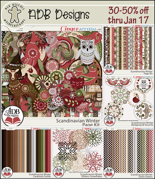
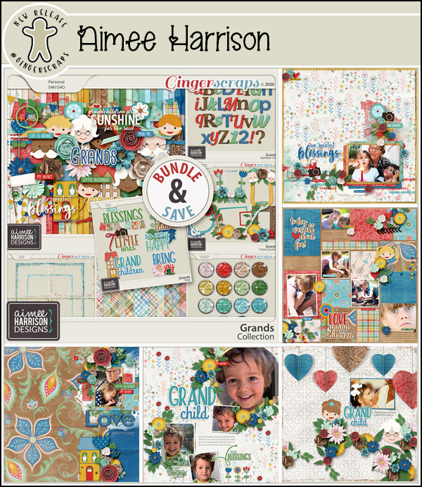
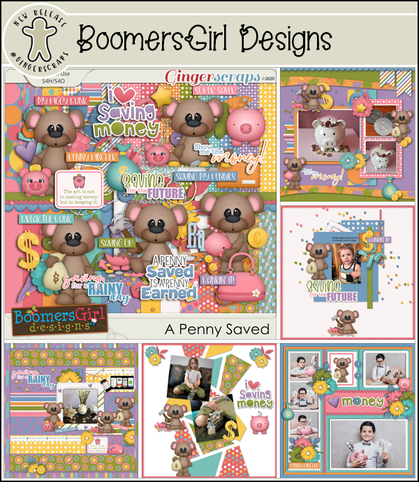
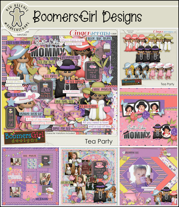
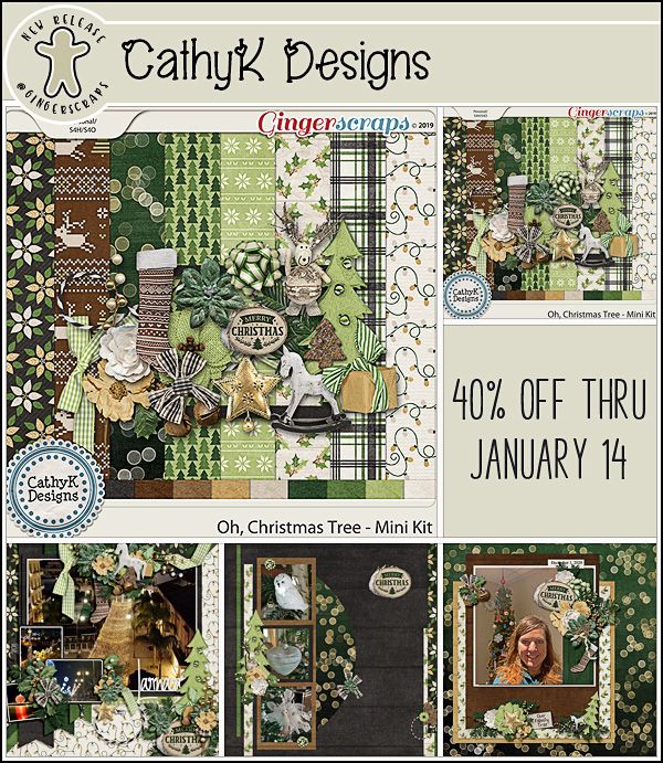
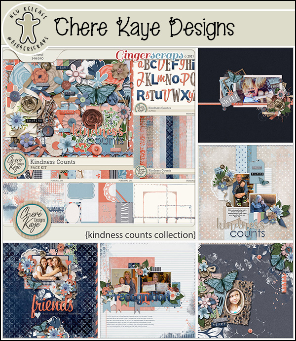
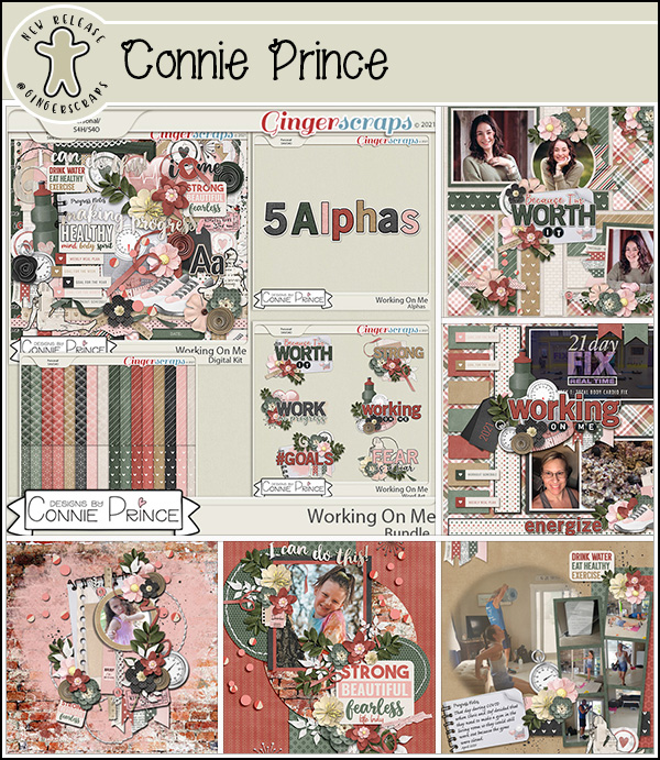
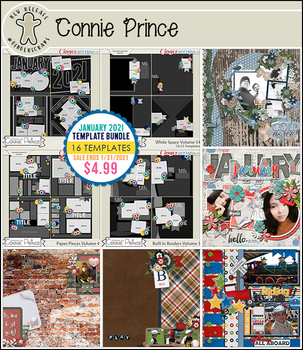
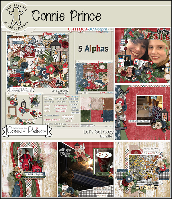
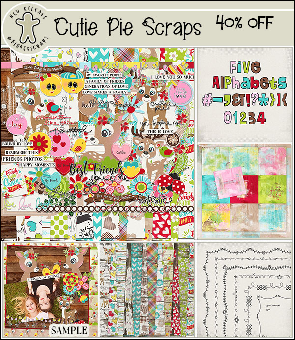
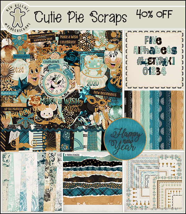
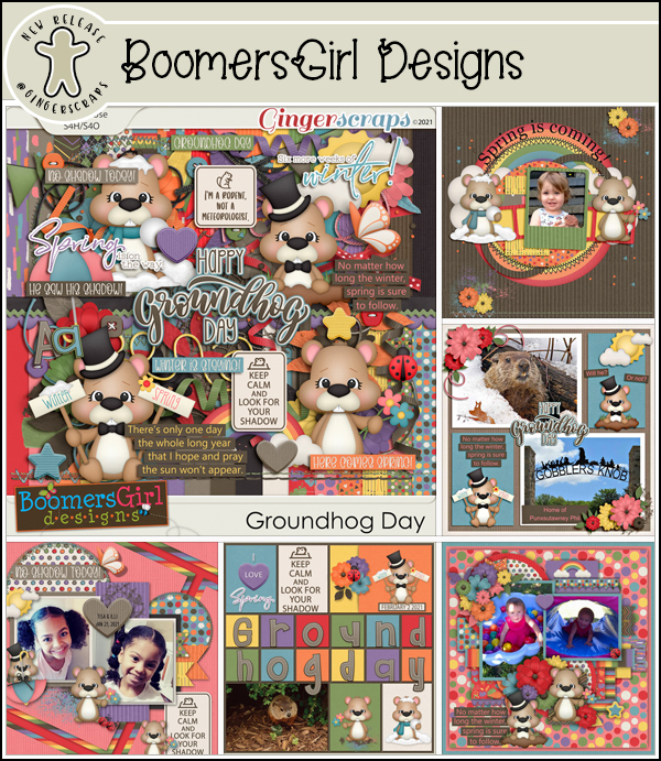
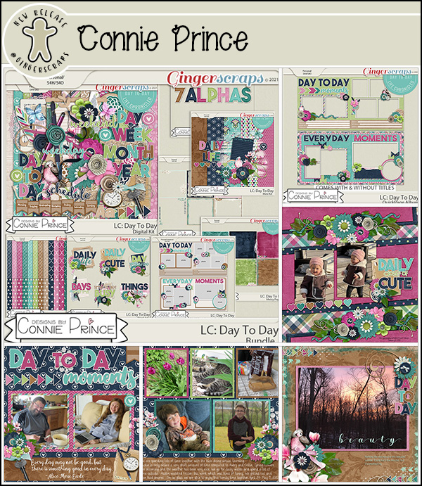
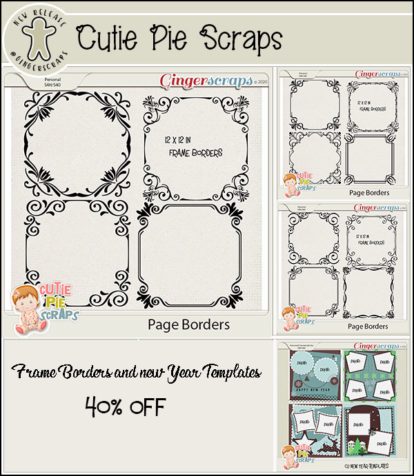
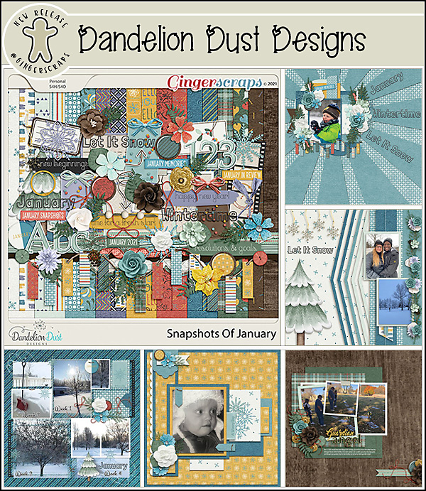
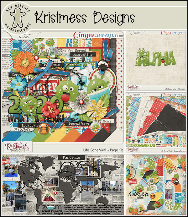
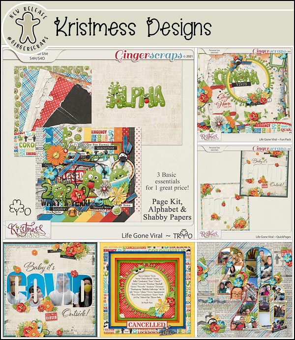
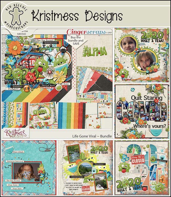
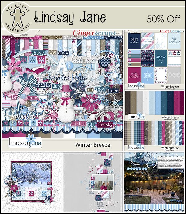
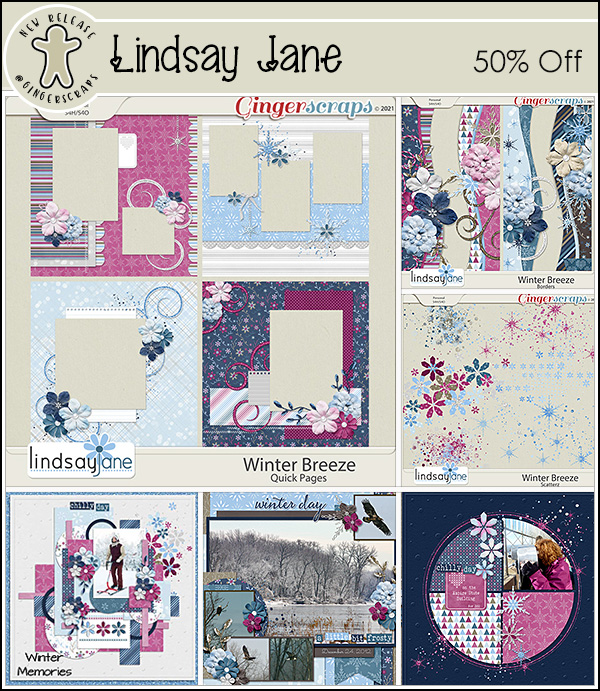
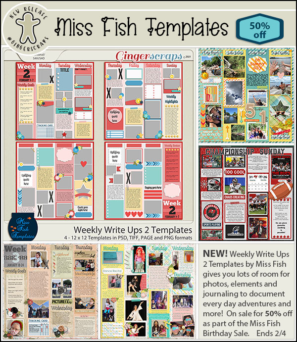
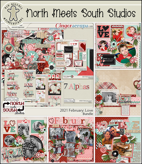
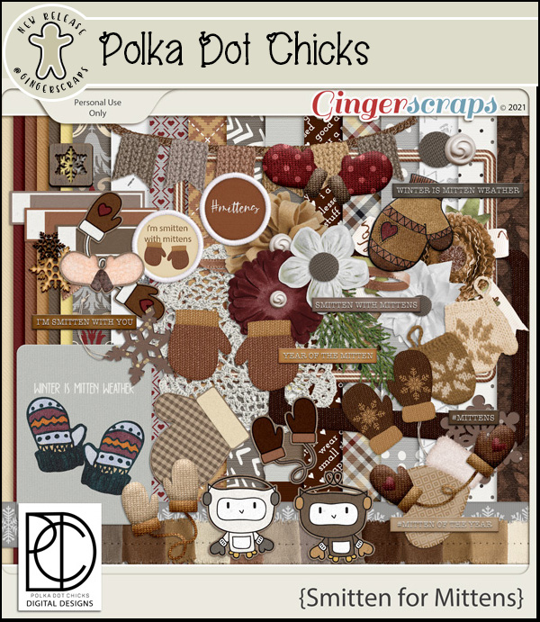
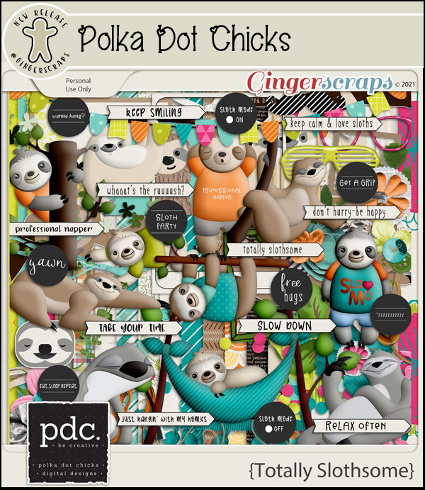
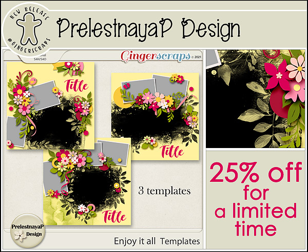
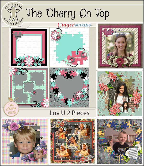
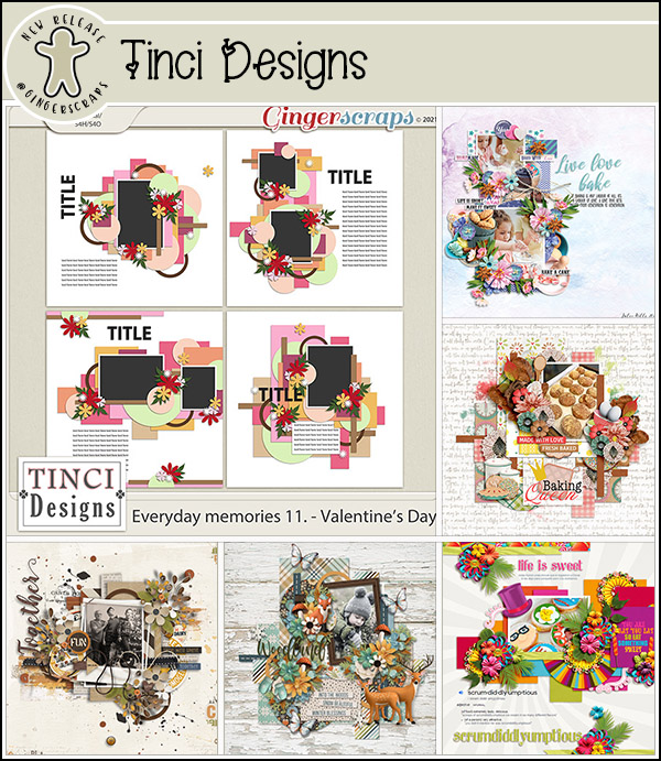
Let’s see what our designers have for us on this last Friday of January.

Aimee’s GingerScraps Store

Tami’s GingerScraps Store

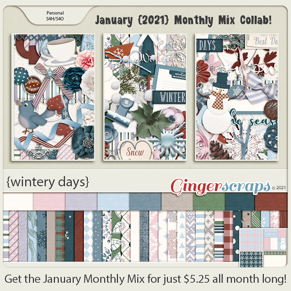
Have you picked up the Monthly Mix for January. I love that snowman in the preview.

How are your challenges going? You still have a few days to finish them. Remember, any 10 challenges completed gets you this full kit as a reward.

Tutorial Tuesday (Photoshop Elements)

Write Your Troubles in Sand

It looks like manipulating fonts is the theme for January! I love it when readers bring their ideas to me and challenge me to find a way to put them into practice. After the Ninja post, Sherry Pennington dropped this into the comments: “While we are on the topic of fonts, you wouldn’t happen to have one for Snow Writing or Sand Writing ?? I can find tuts and actions for Photoshop but nothing for PSE.” So I set about looking into that and ran with it! I found a video tutorial based on PSE, posted by the brilliant George Peirson of How-To Gurus that looked pretty easy, but I was disappointed that it didn’t look totally real. The following is built on his work, with my own finishing touches. [Spoiler alert: there are a LOT of screenshots, but some of them are for review.] First though, I had to find a suitable photo of sand.

Then I had to choose a font. I want to always offer options here that aren’t going to cost you any money, so with that in mind, I opted to use KG Drops of Jupiter, which is available free at dafont.com. While writing in the sand can be accomplished with a variety of found objects like sticks, shells and so on, I chose a font that looked like it could have been written with a finger, something all of us have.

We’ve made Copy layers in a lot of previous tutorials but I’ve never really shown this method of doing it. It’s great because it creates a layer with JUST THE SAND! And it eliminates a couple of steps, so that’s always going to be a winner for me. I clicked on the layer thumbnail of the text layer, got my ants marching around the edges, and then with a copy of the sand photo active, I clicked Layer>New>Layer Via Copy. (Actually, you know I used the shortcut CTRL/CMD>J. 😉 )

This was accomplished in just 2 steps! (I’ve turned the other layers’ visibility off so you can see just the text Copy layer.) Okay, that don’t impress me much.

To make it look like this text is actually depressed in the sand, we’ll need to add a Bevel. But this method I’m showing you is a bit different and much more useful for this specific technique. Instead of clicking on the Styles button at the lower right and choosing Bevels from the menu, I did this: Layer>Layer Style>Style Settings. I’d never done it this way before, but had to give it a try!

This menu opened up with nothing selected, but all the options right there.

When I clicked on Bevel, this adjustment panel opened. Notice the default settings are very different from the defaults you’d see if you went to Styles>Bevels route.

I wanted the centres of the letters to be quite round, since I’m “writing” with my finger. So I increased the Bevel to 12 pixels. I also reset the Lighting Angle to 120°, which is MY default setting. You’ll consider the angle of the light in the photos for your layout and the angle of the light for the drop shadows you’ll use when choosing these settings.

To carve the text into the sand the Bevel has to go down.

And after these few steps it looks like this.

I don’t always bother renaming the layers in the layers panel, but for this technique it makes a huge difference in the execution, because we’re going to do a bunch of copying and tweaking so knowing which layer is which will really be helpful. So I renamed this sand text layer SAND 1. Then I made a Copy (CTRL/CMD>J) and renamed it to SAND 2 before moving that SAND 2 layer below the first SAND layer. Refer to the screenshot if this is confusing.

This step seems silly, because it undoes what we just did to the SAND 1 layer, but on SAND 2 we’re going to flip the Bevel back to Up.

This image is purely for reference. It shows SAND 2 with its upward Bevel.

And this image has both SAND 1 and SAND 2 visible, but not obviously so.

With the sand photo layer visible the text looks like this. Ho hum.

As you know, when your write in wet sand, some of the sand gets pushed up into a ridge along the edges of each letter. To achieve this effect, I activated the Move tool and nudged SAND 2 over to the left and upward a little bit. Okay, that’s a little better.

Time for another Copy of the SAND 1 layer. You can Duplicate Layer or just CTRL/CMD>J it.

This new SAND 3 layer will have a Blend Mode change to Lighten.

The changes are subtle. And it’s still not blowing me away.

So we’re going to do something I’ve never shown you before. (Because I’ve never used it… but I’m going to now!) Let’s add a Levels Adjustment Layer! Click Layer>New Adjustment Layer>Levels…

Make sure you’re on SAND 3. Check the Use Previous Layer to Create Clipping Mask. This is going to become the Shadow layer, so you can rename the layer to reflect that if it will help.

In the adjustment menu box with the image in it, drag the dark slider to the right to darken the shadowed areas just a bit. It doesn’t need much.

Now move down to SAND 2 and do the same thing. Layer>New Adjustment Layer>Levels…

Make sure you’re Creating a Clipping Mask.

Only this time we’re working on the highlights, so we’re going to pull the light slider to the left a bit.

This layer looks a little too sharp so we’ll add a Gaussian Blur to it. Filter>Blur>Gaussian Blur

And it just need a teeny-weeny bit of blur, a Radius of about 2 pixels.

Were you thinking we were done with the Adjustment Layer masks? Nope… we’re going to add one to the SAND 1 layer now – which should be in the middle of the SAND stack – and tweak the Midtones.

Just to review…

By sliding the centre slider to the right a bit, it deepens the midtones and makes the letters look more realistic. Whenever you’re pulling sliders, always watch what’s happening to your image so you don’t go too far. However… you can definitely still go back and readjust each of these Adjustment Layer masks if needed.

This was where the tutorial from George ended. But to my eye, it still didn’t look real enough. When looking at images of actual writing in actual sand, they all had some crumbly grainy rims of raised sand, and this looked too perfect. What to do? I reactivated the original text layer from way back at the beginning.

Then I added a new blank layer ABOVE the text and set my foreground colour to something sandy-looking.

Every time I tried to show you how I chose my Brush, the selection box kept disappearing. So this is a photo from my phone. Assorted Brushes is a set that comes with the PSE software. I chose a texture brush from the set.

Then I got ahead of myself and missed a screenshot. I went into the Brush Settings and added a small Scatter, about 5%, so the edges would be more natural. Then I started brushing over the text in a random pattern, making it a bit heavier wherever a finger stroke would have started or ended. I think it looks suitably crumbly.

With only my brush layer visible I was able to see where it might need a bit more sand.

That looks more like it!

In this image the brush layer is still on the top. It’ll need to be moved down the stack so it sits underneath the SAND layers, but it looks pretty good.

Zooming out with the crumbly layer at the bottom lets me see the full effect. I think the raised edges are still too perfect.

So I brushed some sandy clumps onto the SAND 2 LAYER (not the Adjustment Layer). I think it looks pretty real now. Now, this is just the basic technique. The text can be skewed for photos where the sand isn’t perpendicular to the lens, but that’s a topic for another time.

This technique can be done with whites and grays too, so it looks like writing in the snow. (If you’re really cheeky, you could add some yellow in there too… ) Sherry, I hope this is what you were looking for. It seems like it’s labour-intensive, but it really isn’t too bad.

Next week we might be manipulating text again. I haven’t decided yet!
Here is a link to the PDF version of this tutorial: https://bit.ly/2KRnSr3


65% OFF Retiring Products & Fresh Baked: JANUARY 22, 2021

It’s Friday! I hope you all are ready for some major deals and some beautiful new goodies! We have our annual “Out With The Old” Retiring Products Sale, starting today! Make sure you check it out and get these products before they are gone for good! There are over 500 products at 65% OFF! 

https://store.gingerscraps.net/-Out-…le-65-OFF-SALE

Remember when you spend $10 in the store you get this beautiful collab for free.

And now, let’s look at what our designers have for new releases this week.

We’re halfway through January. How are your challenges going? Just 10 completed challenges gets you this great collab as a reward.

Tutorial Tuesday (Photoshop Elements)

Another Take on Titles


I can’t be the only one who’s noticed the trend of templates featuring gigantic, block-letter titles with cardstock borders. And I KNOW I’m not the only one who’d like to use them but the titles offered aren’t working for me. So today I’m going to show you how to make your own jumbo titles that you can customize to your heart’s content. My inspiration was some photos of my granddaughter that were taken in August. She’s absolutely fearless and is already showing great promise as a gymnast, and I’m convinced she could be a worthy American Ninja Warrior even at her young age. I knew I wanted my layout to have a prominent title and that it should be feminine, because she’s wearing a dress in most of the photos… such a contradiction she is. The gigantic-block-letter-cardstock-bordered title appealed to me so I started by looking at my fonts for suitable candidates. There are lots of commercial fonts that are “layered”, meaning they have a a set of characters that provide a border that could work, but they tend to be fussy, and I wanted this to be accessible to everyone, so we’re not going to use one of those!

Actually, many of the system fonts that come standard on most computers will work beautifully for this technique; I’m pretty sure Impact is the basis for the commercially-available template versions. I decided to try two fonts and see which I liked better. I started with a commercial font called Liberation Sans Narrow Bold (yes… the name is that long!). It’s blocky but not harsh. And my second choice was Constantia Bold, a system-based serif font that I wasn’t sure would work, but worth a try. I went with BIG, 200 pixels for my text. And each letter is on its own layer.

Next, I created a New Layer above the first “N” and CTRL/CMD>clicked on the layer thumbnail for the “N” layer to select the outer edges. (Marching ants are not visible in this screenshot.) These steps will be followed for each letter in the title.

I added a white, 15 pixel Stroke to the outside of the selection. Edit>Stroke (Outline Selection) By putting the Stroke outside the selection, it keeps the sharp points and edges although some corners are slightly rounded. That won’t be visible in the end. You can make the Stroke wider, but be careful not to obliterate your areas that should have gaps. I’d suggest no wider than 25 pixels.

Each of the letters can now be used as a clipping mask. (That’s why I used gray as my foreground colour – to remind me to clip something to them.)

I added a white Stroke to every letter in the same manner. The white Stroke layers will become my “cardstock” border.

But first, to get the Stroke to that lofty goal, I need to make some adjustments. The Stroke by itself is a little anemic, so I’m going to give it a Bevel Style. I Selected all the Stroke layers by holding down the CTRL/CMD key and clicking on each of them, as you can see in the screenshot. Why? So I can apply the Bevel Style to all of the borders in a single step. Remember: Work Smart, Not Hard!

Adding a Bevel Style will accomplish a couple of things – it’ll give the border some substance and it’ll add a bit of shadowing to eliminate the need for doing that as a separate step. Click on the Styles button at the lower right of your workspace and select Bevels from the dropdown menu. Of course, I tried ALL the options for Beveling so I could say authoritatively that Simple Emboss is the right choice.

The default settings for this Style are 90° Lighting Angle, 21 pixel Size and Up for the Direction. I wasn’t blown away by the defaults so I started adjusting each of the Bevels with the letter “A”. Double-click on the fx symbol at the far right of the layer in the Layers panel to open up the adjustment menu. Then I made my changes. You may be able to see the difference between the “J” and the “A”. Once I was happy with the look, I right-clicked on the “A” layer and chose Copy Layer Style. Then I reselected the rest of the border layers and right-clicked again, this time selecting Paste Layer Style. WSNH again!

Then I went on to my second title, the one with the serifs. This time when I added the Bevel, I also added both an Inner and Outer Glow – all found in the adjustments for the Layer Style. I made it simple by setting everything to 10. In the image, I’ve adjusted the first “N” but that’s all.

When I was happy I chose some girly papers to clip to my letters from Ooh La La ScrapsBirthday Wishes Girl bundle. Need a refresher on clipping? Put your paper over top of the layer you’re using as your clipping mask. Then right-click on the paper layer and choose Create Clipping Mask or CTRL/CMD>G for PSE versions up to 14, CTRL/CMD>ALT>G for versions 15+. Cute, huh?

But which one will I use for my title?

Yes, I went with the second one with the serifs. If I want to manipulate the letters any further, I need to either Merge or Link the layers so that when I move one letter, all parts of it go with it. I Merged (CTRL/CMD>E), but if you prefer to have the layers separate but linked, go ahead and select all three of the layers for each letter then click on the little chunk of chain next to the eyeball icon.

I moved my letters around to make them a little less starchy. And it’s finished! I’m going to be looking for your layouts with jumbo titles now!


Here is a downloadable PDF: https://bit.ly/2LU4oT5


Fresh Baked: JANUARY 15, 2021

Welcome to another Friday. We’ve got quite a full newsletter today.

Remember when you spend $10 in the store you get this beautiful collab for free.

Today starts the January Bake Sale. Take a look at some of the great goodies our designers have put on sale for $1. The sale runs from today until the 20th.

And now, let’s look at what our designers have for new releases this week.

https://store.gingerscraps.net/Miss-Fish-Templates/

https://store.gingerscraps.net/Shepherd-Studio/

We’re halfway through January. How are your challenges going? Just 10 completed challenges gets you this great collab as a reward.

Tutorial Tuesday (Photoshop Elements)

One BIG Word – Using a Title as a Divider

This week’s tutorial is brought to you by Ellen (gmae) and Ann (ScrappinRosie). As you’ve likely noticed, Ellen is one of my topic-generators, bringing me ideas for tutorials fairly regularly. This one came to me via private message: “I came across this layout by ScrappinRosie and of course I love it. I know I can figure out how to do this but some others may not so I thought it may make a nice tut sometime. You did a tut about joining letters with extra swashes which is a good reference but some may not know how to decide what may make a good font to use in the first place and could a printed font even work.”

The tutorial Ellen referenced about using the extra characters that come with some fonts can be found here. As for choosing a font for this type of application, MainType has a handy way to show which fonts have extra glyphs – swashes, curlicues, whatever you want to call them. It’s discussed in the tutorial but for a little refresher, here’s a screenshot to help you out. (I just upgraded to the most current version of MainType, so I haven’t tagged any of my 1645 fonts yet. Gotta be in the mood, know what I mean?)

I started by opening a 12×12 scrapbook page canvas on my work space then surveyed my collection of fonts to see which ones would give the look I wanted. The title for my page was going to completely transect my layout, and it had to work with the mood of the layout. The things I considered were how I wanted the layout to feel, how the title would work with my chosen photo(s) and how large I wanted it to be. If my subject was something less emotive, I might have chosen a more upright, less fancy font. But “mellow” cries out for swirls!

The font I used is Camellia Regular; there are free versions that don’t include the extra characters so you might want to check first. I purchased my version from Font Bundles as part of a script bundle. Be sure to look at your font stash to see which ones might have the swashes included; you might have some really good ones already! For this step, any colour will do because it’s not forever. I replaced the “m” and the “w” with glyphs from the font extras to extend the beginning and end of the word. In some of the later screenshots you can see that in the layers panel – there are symbols in place of the letters in the name of the layer. If your chosen title will have more than one word like Ann’s does, you’ll need to ensure that the words physically touch, and that can be accomplished by using a long tail glyph to connect them.

It looked good but I thought that as a title it probably needed to be a bit more present. Remember that text layers are “smart” until you Simplify then, meaning you can’t change their appearance in any way other than colour and size. To add a Stroke – a heavier outline – the text couldn’t be “smart”. I Simplified the text layer by right-clicking on the layer and choosing Simplify Layer from the dropdown menu.

There are a couple of ways to make things bigger, and applying a Stroke is the easiest and gives the best results if done correctly. Edit>Stroke (Outline Selection)

Generally speaking, Strokes can be dainty or bulldozer-y, and everything in between, depending on the effect you’re looking for. With text, applying a Stroke needs a light touch. If you make your stroke too big, it’ll obliterate the loops and swirls and completely defeat the font you chose. If you apply your Stroke Inside the selection, it might not make a lot of difference. If you apply it Outside the selection there may be a tiny gap between the object and the Stroke – and that can be a disastrous thing to discover several steps down the road. So when I apply a Stroke to text, I choose Center, which puts the Stroke directly over the edge, half inside, half outside. Going with 4 pixels is usually a good number, adding just a bit more weight but without making your loops into lumps.

As you can see, the difference isn’t really obvious. But now the title has oomph!

The next step is to Resize the title so it extends all the way across the layout. I went horizontal, but yours could be vertical or diagonal. I plan to put a photo at the top of the layout with the title overlying, but you could easily use different papers for your layout. It’s important to have the title touching the edges of the canvas, as you’ll see in the next frame.

Because I want the lower paper to follow the contours of the title, I’m going to create myself a clipping mask. To do that I first need to make a Copy of my title layer. Right-click>Duplicate Layer or CTRL/CMD>J 

Then I went back to the original title layer and using the Paint Bucket tool, I Filled in the space where my paper will go with solid white. If my title didn’t touch the edges of the canvas or with multiple words that weren’t touching, when I dumped my Paint Bucket, it would have filled the whole 12×12 space! Where the title touches the edges, it forms a dam to keep the paint inside.

I want to be able to see the title against my photo and I’ll probably Clip a paper to it. I don’t want the lower paper to cover the title though, so to ensure that, I’m going to Select the title from that clipping mask layer and remove it. I CTRL/CMD>Clicked on the Copy title layer’s thumbnail but kept the clipping mask layer active. That isolates the title from the rest of the mask. You may be able to see the marching ants in the screenshot.

Still on the clipping mask layer, I Cut away the title: Edit>Cut or CTRL/CMD>X 

And with the Copy title invisible, this is what my clipping mask layer looks like.

I decided I needed to put my photo in place to see if I needed to move the title up or down. The clipping mask could be expanded vertically if needed to ensure my purple paper will cover the whole bottom. I put the photo under the other layers and adjusted the size to fit my space (and to crop out a post!). For those who are wondering, this is the view from our deck!

Clipping my purple paper to the clipping mask came next, then clipping paper to my title layer. The keyboard shortcut for clipping something to something else is CTRL/CMD>G for PSE versions lower than 15 and CTRL/CMD>ALT>G for versions 15+.

I thought I might add just a bit more interest to the title so I added a Texture Filter: Filter>Texture>Texturizer.

There are some options for what kind of texture you can use with this Filter tool: Brick, Burlap, Canvas or Sandstone. Each has a different look and I chose Burlap for this. Adjustments are Scaling (size of the texture), Relief (depth of the texture) and direction of the Light source. You can see what your Filter looks like on the Preview. I didn’t want the texture to be the focus, but rather a supporting detail so I went with 50% Scaling, 2 for Relief and the Light is coming from the upper right.

There it is! Definite, but subtle.

Last step is to add a shadow to the title! I could use a Shadow Style but I’m so used to creating my own custom shadows that I do it automatically. Once I’m done with that I can add my embellishments and journaling. Et voilà!

Have you seen a layout that wowed you but you’re not sure how to achieve the same results? Maybe I can help!

For a PDF version of this tutorial, go here. (linked)

Fresh Baked: JANUARY 8, 2021

Happy Friday everyone. I don’t know about you but I’m glad this week is just about over. Having had the week between Christmas and New Year’s off, this week was rough to get back into the swing of things. I’m tired.

Remember, when you spend $10 in the GingerScraps store, you get this great full kit for free. Perfect for those snow pics.

Let’s see what our designers have in the store this week. I’m seeing a trend to what 2020 was and what 2021 can be.

I love the sneak peek of the challenge reward kit. Any 10 challenges completed gets you the great collab as a reward.

Tutorial Tuesday – GingerScraps

New Year, New Challenges!

2021 has gotten off to a smashing start at GingerScraps. There have been a lot of “new” ladies joining our Facebook group and that tells me we’re doing something right. I truly believe GingerScraps IS the “friendliest place in the Digi Scrapping world“. Participation in our Forum has grown so much over the last year, especially in the Welcome! subforum. Of course, each of us is looking for something specific when we embark on a new adventure. For me, I came to GS as a creative team member for one of the GingerBread Ladies; this was my “assigned” store. I spent some time looking around, trying to find a way to engage myself and discovered the GingerScraps Challenges. Bonanza!!!

For those of you who have been GingerScrapping for awhile, you probably already have an established Challenge routine and likely won’t feel the need to read on. That’s cool… no pressure! But if you’re still getting comfortable here, you might not have looked into the Challenges and could maybe use some pointers. AND……. there are NEW challenges beginning this month so I want everybody to know about them.

Let’s begin with some general Challenge info. Challenges are one of the best ways of building your skills, and they also provide a framework to build them on by giving specific guidance such as a topic, a technique, a template or a word art. They’re also a good kick-start when you’re not really sure what you’re going to scrap, or when you’ve lost your mojo. But at GS, Challenges also provide a method of growing your stash! Several of the Challenges include access to high-quality freebies, such as brushes, mini-kits, templates and word art – you just have to download them! Even better than that though is the Challenge Reward! These Rewards are mega-kits created in collaboration by several of the GingerBread Ladies and there’s a new one every month. The January Reward looks like this:

Missi (missdamsel) does a really good job of explaining how Challenge Rewards work in the Cookie Jar – the Challenge tracking thread where you link to the layouts you’ve created for the Challenges. More about that later. But I’ll give you a little recap: You must create a different layout for each Challenge. Your Challenge layouts generally must contain at least 50% GingerScraps content – things available in the GS store – although the Designer Spotlight Challenge has a higher required content rule, 90% to be product from the Spotlight Designer(s) only. Another must is that you also post your layout in the Challenge thread. When you upload your layout to the Gallery, please also include the Challenge category in your description so it goes into that Challenge’s Gallery too. There’s a detailed set of instructions for this process in the tutorial A Road Map for Newbies. (**Just had a thought when I was talking to my hubby about this tut… MAKE SURE YOU’RE UPLOADING TO THE CORRECT YEAR’S CHALLENGE GALLERY!) When you’ve completed TEN Challenges and recorded them in your Cookie Jar, you’ll receive the Challenge Reward kit for the month you hit that milestone. Missi keeps track of all the Cookie Jar entries and sends out a Private Message with the coupon code for the Reward to the scrappers who qualify. One thing that can be confusing is that if you go OVER ten layouts in a given month, those “extra” ones aren’t carried over for the next month. If you create ten layouts every month, you get all the Rewards! Okay, that’s the important 411 on general Challenge stuff. Now let’s talk about some of the new ones!! (Each of the Challenges will be linked in the description so you can just click on the red text and go right to the Challenge. All coloured, bold text in this tutorial has a link attached.)

The Challenges are listed in the Forum in alphabetical order, so that’s how I’m going to discuss them. First up is Jumpstart Your Layouts: with Jumpstart Designs. GingerBread Lady Sheri provides each Challenger with a free product – this month it’s a really cute mini-kit – and the “rules” for the Challenge, which will change each month. For January she wants each scrapper to scrap their inner thoughts about the coming year, and include a selfie somewhere on the page. For some of us, the selfie IS the challenge!

Connie Prince has changed the focus of her monthly Challenge so I’m considering it to be a new one. Life Chronicled is a way to scrap about the more ordinary parts of our lives to give our future generations glimpses of our lives as they were every day, to let them into our heads a little so they “know” us. She gives some talking points to help decide where the layout will go. She also includes a mini-kit, that coordinates with one of her larger kits, for inspiration. (It’s not a required component, though.)

Marina brings us our third new challenge, Magical Scraps Galore’s Surprise Challenge. Each month the focus of the Challenge will be a complete surprise. For January she’s requiring a ten-item overlapping cluster on your layout with a list of each of the 10 objects included when you post your layout to the thread. Clusters can be really intimidating to new scrappers, and if you need some support, there’s a tut for that: Creating Clusters… Not Clutter

While it’s technically not new, the Mix It Up Challenge is now being hosted by Mish Fish every month. It’s similar to the Surprise Challenge in the sense that every month the goals will be a surprise. For January, Juli has given us a 1-2-3-4 list of ingredients for our layouts. 1 word title, 2 photos, 3 flower/element clusters (clusters again!) and 4 (or more) lines of journaling. Piece of cake, right?

This next one is bound to be a huge hit. My Favorite Things with CathyK is another opportunity for personal layouts, focusing on YOU and what you take pleasure in. Cathy would like us to think about, then scrap, some positive moment from 2020 for her inaugural Challenge. It wasn’t the most uplifting of years for far too many people, but there’s always at least some good mixed in with the bad. When I read Cathy’s post, I knew immediately where my layout will go.

Scraps N Pieces is bringing us a Pinterest Challenge. (Don’t worry, you don’t have to get into Pinterest, she’s done it for you!) Each month she’ll provide a mood board created from images she’s pinned, each with a related theme, to provide you with some inspiration. Your layout can take its cues from any aspect of the pinned images that pop into your head. January’s images are about food and how we relate to it. Who hasn’t started a new weight loss plan in January?

And the final new Challenge for 2021 is the Quote Challenge with BoomersGirl Designs. Each month Lori will provide us with a quotation she’s found meaningful. The challenge is to use it as a basis for a layout, but it doesn’t have to INCLUDE the quote. January’s quote is about the gift of time, and what we do with it. Layouts will end up related, but unique, because our personal stories will take us each in a different direction.

I have my personal favourites when it comes to Challenges and I have my own process for doing them. Having worked as an ICU nurse for 25 years, process for me is like breathing! It helps me organize myself and keep myself on track. I start off at the beginning of the month by looking at each of the Challenges I enjoy doing to see if they spark anything. If they do, I right away create a folder for them. (I have folders for everything!) The folder’s name will include the Challenge name and some clues about the topic so I can see at a glance what I should be looking for later when I’m ready to work. If the Challenge includes a freebie like a brush or a mini-kit, I extract the zipped folder right into my Challenge folder. Then when I’m ready to create, I Copy all the photos, elements, paper and whatever else I expect to use into the folder too so it’s all in one place. Once the layout is finished and I’ve posted it to the Gallery, I change the name of the folder by adding a simple hyphen at the front of it that tells me it’s complete. You can see in the screenshot (you had to know there’d be a screenshot!) none of the folders have a hyphen… I haven’t done any work yet. But I’m going to start right away, because I WANT the Challenge Reward!! You might also have noticed that half of those folders are for the new Challenges. Because they’re awesome!

On a more tutorial note, my plan for the coming year going forward is to have the tutorials available as PDF files. It’s a work-in-progress as Ginger and I try to work out the logistics, but we wanted you to know the work is happening to make it a reality! Unfortunately, the amount of time required to convert all 200 previous tutorials would be huge, so they won’t be converted. Stay tuned!


Here is a link to this tutorial in PDF version! https://bit.ly/3biN5FP

Designer Spotlight January 2021

Wow… it’s already 2021! I know we’ve all been relieved to see the last of 2020, and are hoping for a much better year ahead. Let’s start it off right with some conversation. I’d like you all to get to know the two amazing women who are in the Designer Spotlight this month: Aimee Harrison and Cheré Kaye. Be sure to read to the end, because these lovely ladies have a little gift for you!

Let’s get comfy and chat, shall we? (I’m not really a Grand Inquisitor, I just play one on TV.)

Jan: How long have you been designing?

Aimee: I have been designing since June of 2009, two weeks after I discovered digital scrapbooking. I knew it was what I wanted to do right away.

Cheré: I’ve been designing since 2007, with a short break in there to bring home my daughter.

Jan: You’ve both been doing this a lot longer than I have! No wonder you’re so good at it! Next question… Cheré, what made you decide to design?

Cheré: When I first started, I was doing paper scrapping, but wanted something specific to print out for my page and couldn’t find it.  I started playing around, and my design career was born.

Jan: I can relate! That’s how I’ve built my tutorial business. Aimee‘s turn… what motivates and inspires you as a designer?

Aimee: My motivation and inspiration is color and my own photos. I love color and it inspires me in so many ways. Color combos, photos that showcase a scheme, Ginger’s spectacular palettes to us each month. They all inspire me completely. I love color and you can probably tell by the bright colors in some of my collections.

Jan: I love the way you use colour; your kits have a definite elegance. Cheré, you’re up! Please describe your design workplace.

Cheré: I have a small corner of our living room.  I love my setup. There are two walls so I have a bulletin board and a calendar, and pictures of my family.  My computer is on a small corner of the desk, and I have bits of paper everywhere because I’m always writing myself a note or sketching something out. It’s perfect for me.

Jan: I work in my living room too, but I don’t have a setup like that! Just a laptop, a zillion scraps of paper and a good lamp. How about you, Aimee?

Aimee: I work at a big table in front of four big windows in my bedroom. I love this space because it has plenty of room and I can look out over our front yard and watch the birds and squirrels. It’s also lovely to watch the sunrise, which really inspires me.

Jan: I have 4 big windows in my space but I see sunsets. I’m okay with that! Cheré, next question is for you. What is your favorite kit currently in your GS store and why?

Cheré: My favorite is probably Dear Prudence, shortly followed by Star of Wonder.  I love the muted colors of both sets, and how they really showcase your photos.

Jan: You’re right, they are such soft and versatile kits. (Click on the titles to see the kits!) This one is for both of you. What one word would your friends and family use to describe you?

Aimee: Sleepy, lol! I have narcolepsy and sleepy is how I am 100% of the time. But I try to not let it get me down. One of the reasons I love designing is because I can make my own hours. I need a lot of naps. But I can work at any time that I am awake and that makes a huge difference in my quality of life.

Cheré: Hopefully, it’s kind.  I put a high value on being kind to other people.

Jan: Wow… narcolepsy! I was always sleepy, but it was from shift work. Cheré, I know you’re kind. You’re one of the first people who reached out to me when I came to GingerScraps in those Night Owl chats. So tell me, what would you do if you won the lottery?

Cheré: I’d pay off bills and treat my family to a nice vacation.  (Then go straight back to designing, because I love it!)

Jan: They say that if you love what you do, you’ll never work a day in your life. Aimee, this is a weird question, but enquiring minds want to know… If time travel was possible, would you go back in time or ahead? Why?

Aimee: I think I would go back in time. I am not sure if I would go back so many years. I think I would go back in time to where my parents were alive and other family members so I could appreciate them all the more. I may be a huge history buff but I would want to live the life I have been given over any others.

Jan: I think a lot of us would do the same, love the people in our lives more obviously. So let’s give Cheré an odd question now, to keep things fair. Are you more likely to dance or sing in the shower?

Cheré: If I tried to dance, it would end badly.  Haha.  I do love to sing, though.

Jan: I’ll let you know how dancing in my shower works out… Speaking of physical, Aimee… What is your favorite game or sport to watch or play?

Aimee: I love to watch soccer. I wish it were a big sport here in the US as it is all over the rest of the world. It gets me fired up like no other. I love the Spanish team Barcelona and Leo Messi is my favorite player. I also love to watch Greco-Roman wrestling. In high school or college. I was the wrestling manager when I was growing up and have a great love for that sport.

Jan: Nope. Not a fan of either. I worked with a lot of doctors from South America so soccer was always on in the breakroom, and my grandmother loved wrestling so it’s not like I haven’t been exposed. Cheré, I love gardening so do you have a green thumb? What do you grow?

Cheré: I have ONE plant I can keep alive here on my desk.  The rest of them I either kill or my cat eats them.  My mother tried to teach me about plants – she could grow anything – but it must have skipped the generation!

Jan: I’m doing the same with my daughter! Here’s one for both of you. Can you play a musical instrument?

Aimee: I used to play the French Horn. I still think it is the most beautiful instrument there is. When I hear it, it stops my breath.

Cheré: I can play the piano, the guitar, the trombone and the flute.  I also love to sing.

Jan: Such talent! Some of my favourite pieces of music have French horn in the intros. A friend from high school played the flute in our orchestra and me? I can listen to music all day long. Now, what did you want to be when you were small?

Aimee: I wanted to be an archaeologist. I was very passionate. Still am. I pursued that dream well into college and when my narcolepsy became too bad to be able to pursue it any longer I decided to design scrapbooking kits.

Cheré: I wanted to be a musician of some sort.  I did that for a while, and now I just sing for my family.

Jan: Archaeology would be fascinating! But not a great profession if you’re not awake to enjoy it. I sing, sometimes at the top of my lungs, but I don’t have any talent. Now I have one of those dreaded job interview questions. If you could change one thing about yourself, what would it be?

Cheré: I would lessen my anxiety.  I’m a pretty chill person – I don’t get angry easily at all – but the anxiety thing sometimes drains my energy.

Aimee: I would get rid of narcolepsy. If that was impossible, I would change how easily I get stressed out, lol. I think that is directly related to how tired I can get, though.

Jan: Stress, anxiety – two sides of the same coin, I think. I know them both well. And that’s a great segué into our last topic. Aside from necessities, what one thing could you not go a day without?

Aimee: My Kindle. I listen to videos with it while I work and I read it when I’m done. I get so much use out of it that it could have been named after me. I go everywhere with it.

Cheré: Probably my iPad.  It plays music, I can keep up with the people I love, and I do most of my artwork on it.

Jan: You two are more alike than you are different. But your design styles are so different. I’m excited for the Daily Download. It’s going to be epic! Now before we rinse out our mugs and head for home, remember I mentioned Aimee and Cheré had something for you for sticking with this post to the end? Both of them have coupons for 50% off EVERYTHING in their stores for the entire month of January- excluding bundles, of course. Aimee‘s coupon code is: aimeeh-GS-SL-50 and Cheré‘s is CKH-SL-GS21. Their stores are linked at the top of the post by clicking on their names. If you’re not flat broke after the holidays, maybe you should take a look!

See you all right here again at the beginning of February with a brand-new Designer Spotlight.


Fresh Baked: January 1, 2021 & NEW Free With Purchase, Monthly Mix and More

Happy New Year!! 2021 is coming in with a bang here at GingerScraps. There is so much information packed into this newsletter. January Buffet, Fresh Baked, GingerBread Lady Collabs and a new guest designer. Make sure you read all the way to the end.

Don’t forget to check out the Buffet Bundles. One easy click to add bundles of Buffet goodies to your cart.

I’m loving these buffet colors. So refreshing for the new year.

Let’s see what our designers are releasing with this gorgeous palette.

Aren’t those lovely?

Now, let’s see some new Fresh Baked releases for January 1.

Remember any $10 spent in the store gets you this great collab. These colors!!! Here’s hoping for lots of {January Joy}.

It’s time for a new Monthly Mix. Are you ready for some {wintery days}? This will be great for those snow pictures.

Do you like to read? It’s one of my favorite things to do. My total for 2020 (including audio books) was well over 170 books. Do you keep track of what you read? This sneak peek looks like a perfect kit for us readers.

We have a guest designer joining us for January.

HeartMade Scrapbook

Bio:
I’m the mother of 3 boys (6, 15, 18 years old) and I’m 44 years old this year. I live in Hochiminh city, Vietnam.
I’ve started making digital scrapbooks since 2012 and have made thousands outs for my kids. Since 2020, I’ve begun trying to become a scrapbook designer! Hope you enjoy my designs!

Look at this awesome new Challenge Reward for January. Complete any 10 challenges and get this full kit as your reward!