I’m not sure how we’ve reached the last Friday in June already. This month seems to have flown by more than others. But we are now at the halfway point of 2023. I hope your year has been amazing so far.
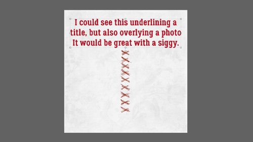
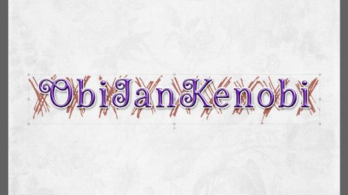
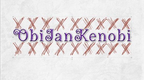
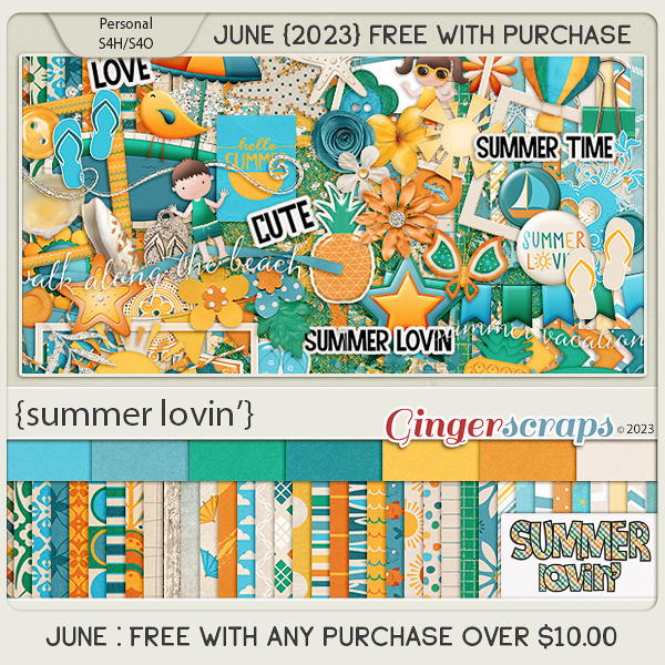
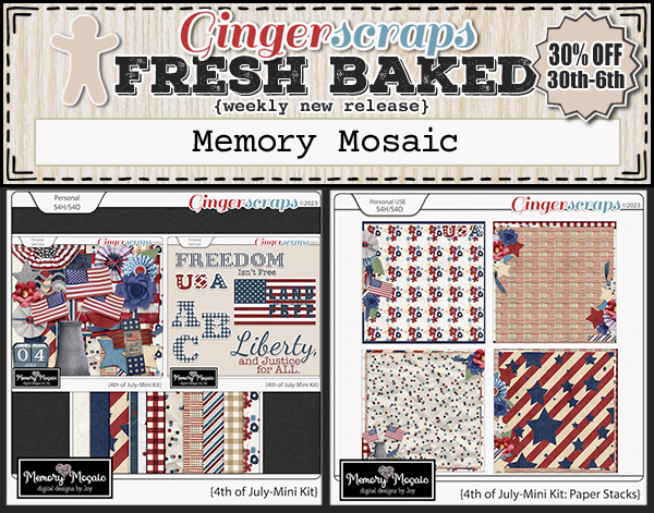
Remember if you spend $10 in the store you will get this great kit for free.
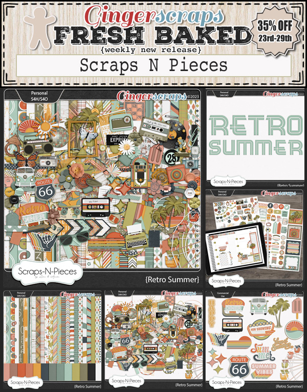
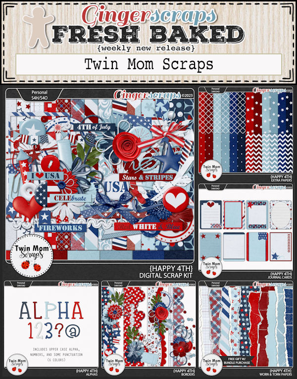
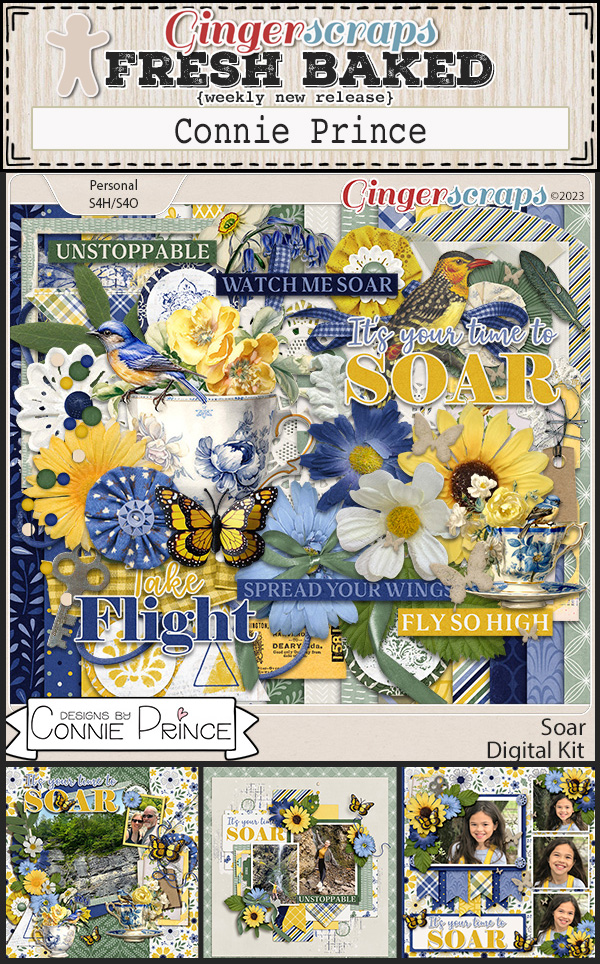
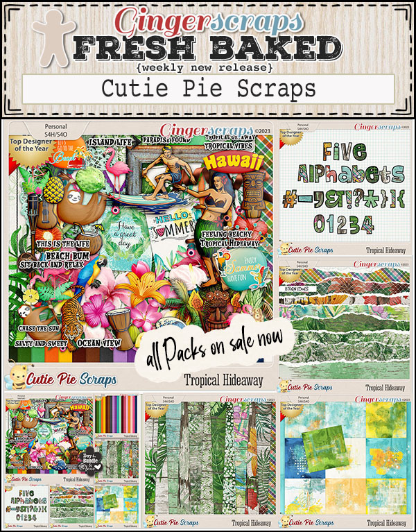
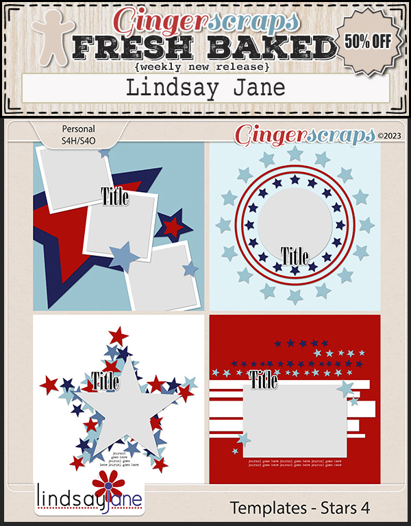
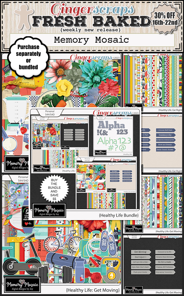
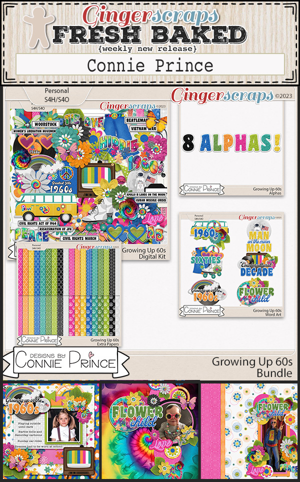
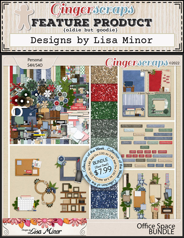
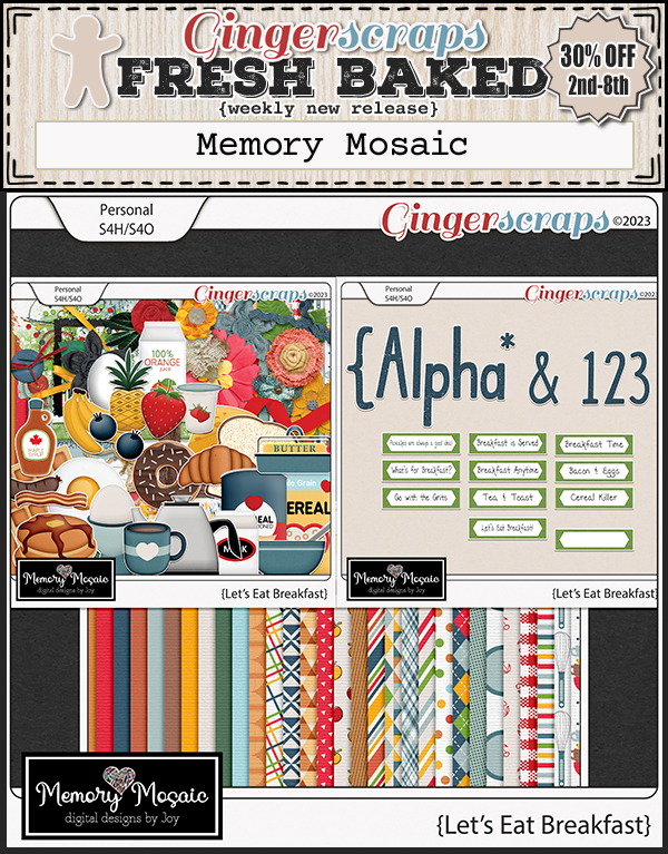
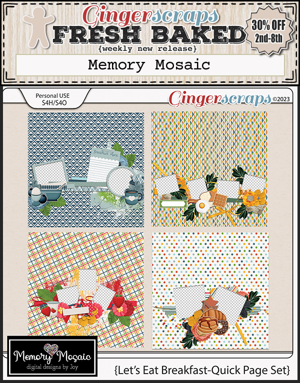
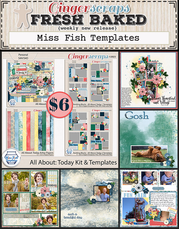
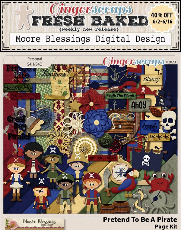
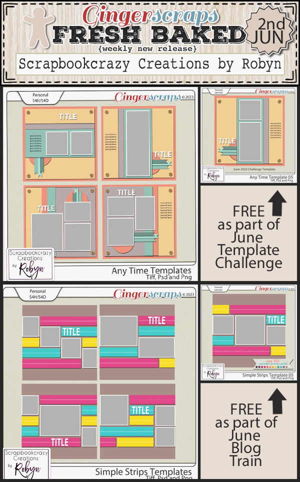
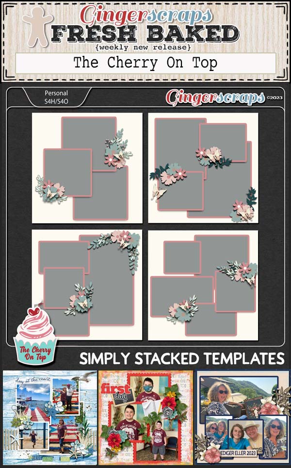
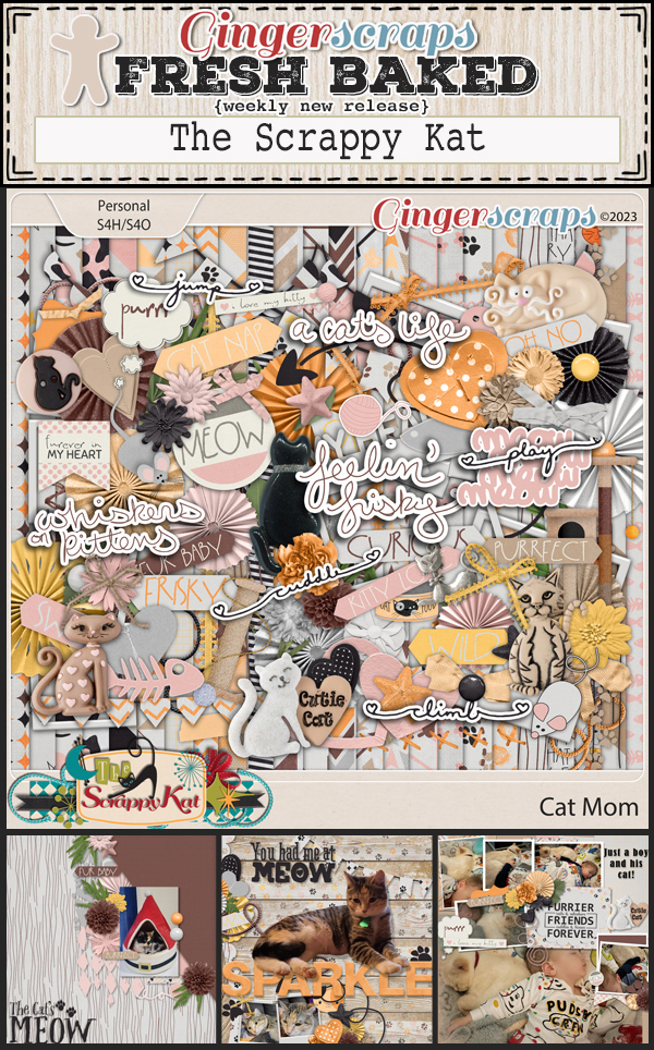
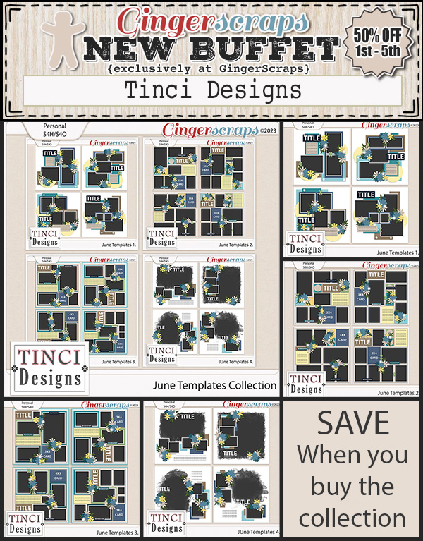
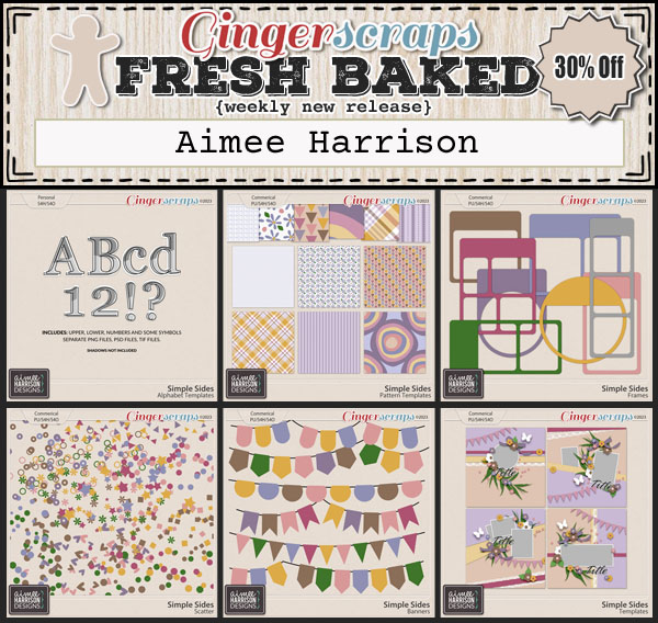
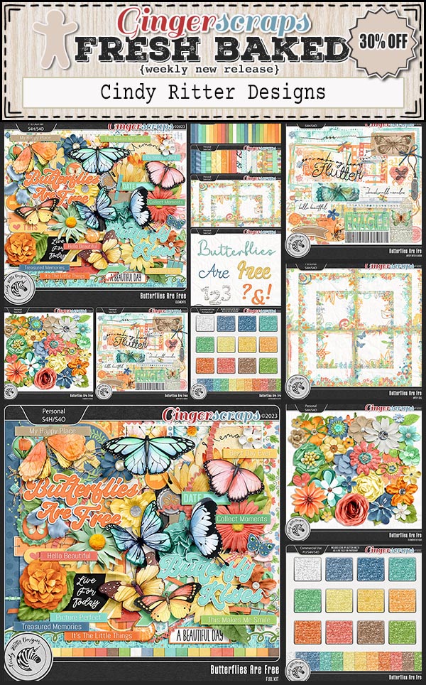
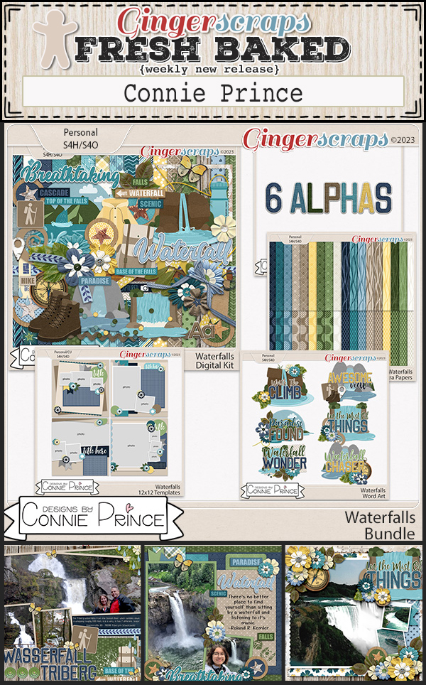
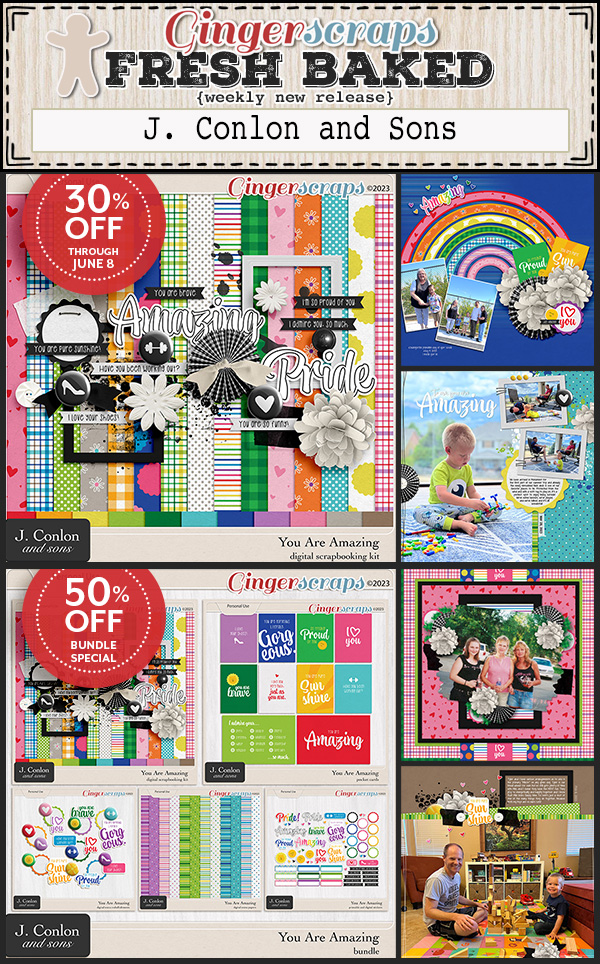
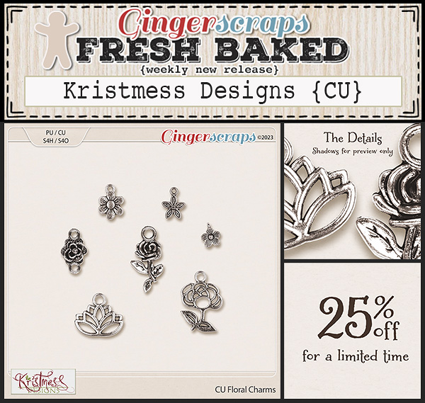
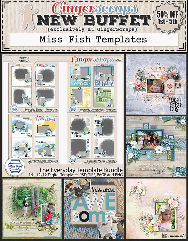
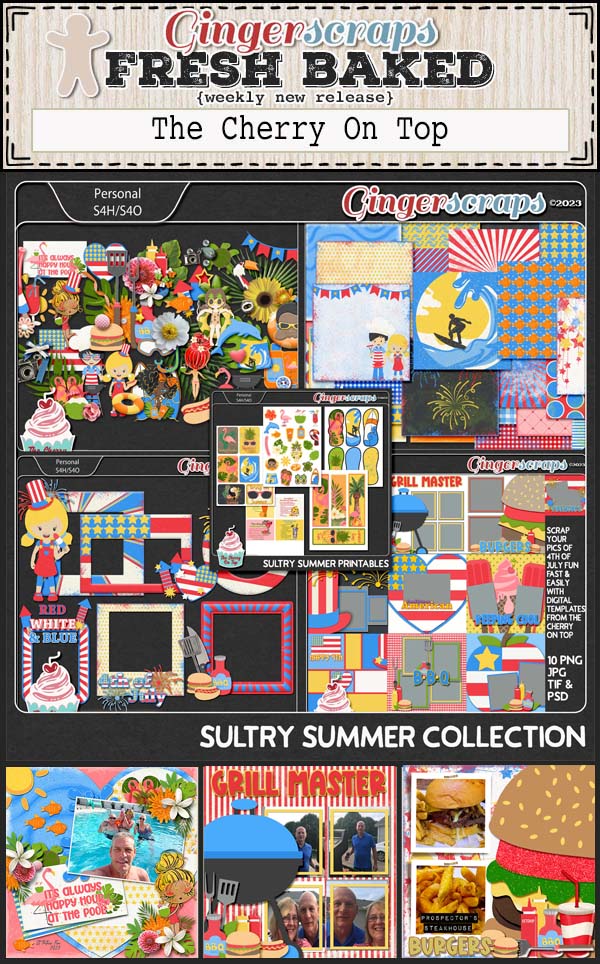
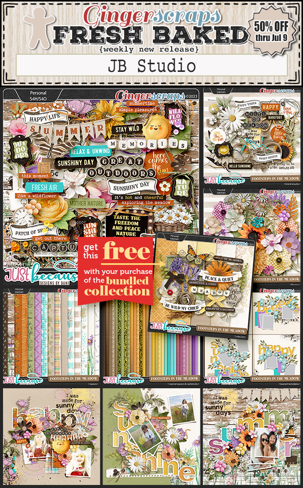
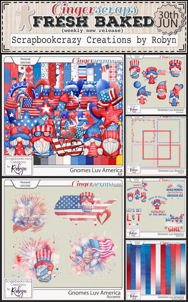
Let’s check out the new kits in the store this week.


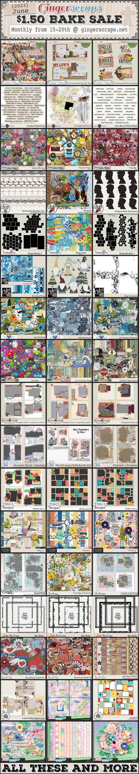
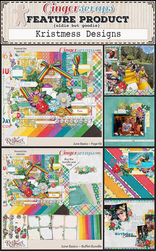
Have you picked up the June Monthly Mix? Only a day left to get it at this great price.

Have you got your challenges done? This kit is yours as a reward if you complete any 10 challenges.