Archives for January 2025

January 31, 2025: Fresh Baked

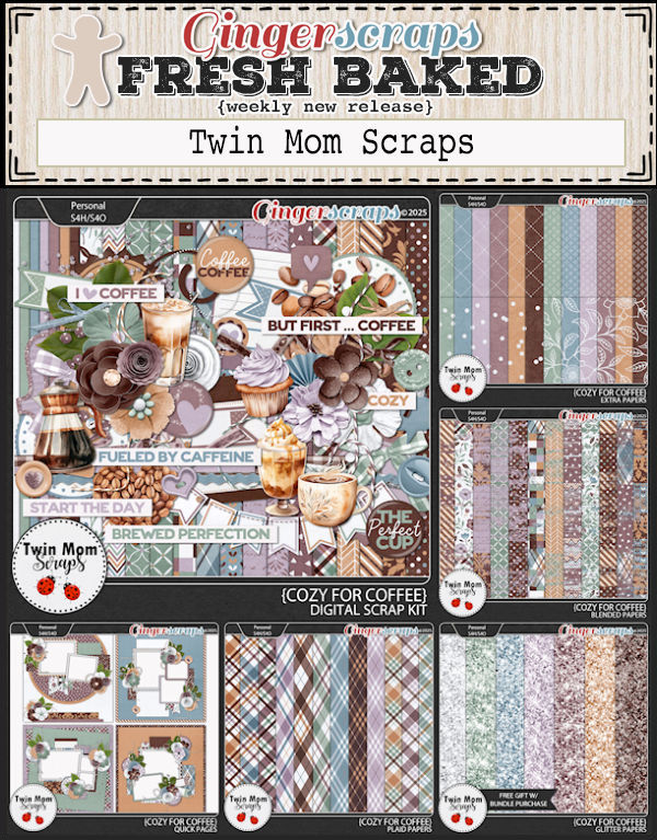
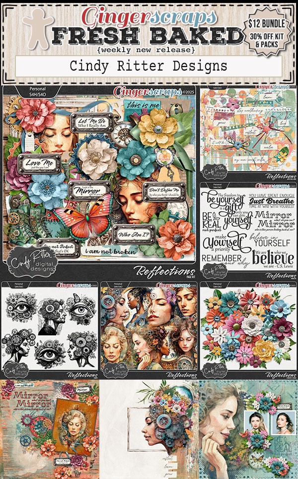
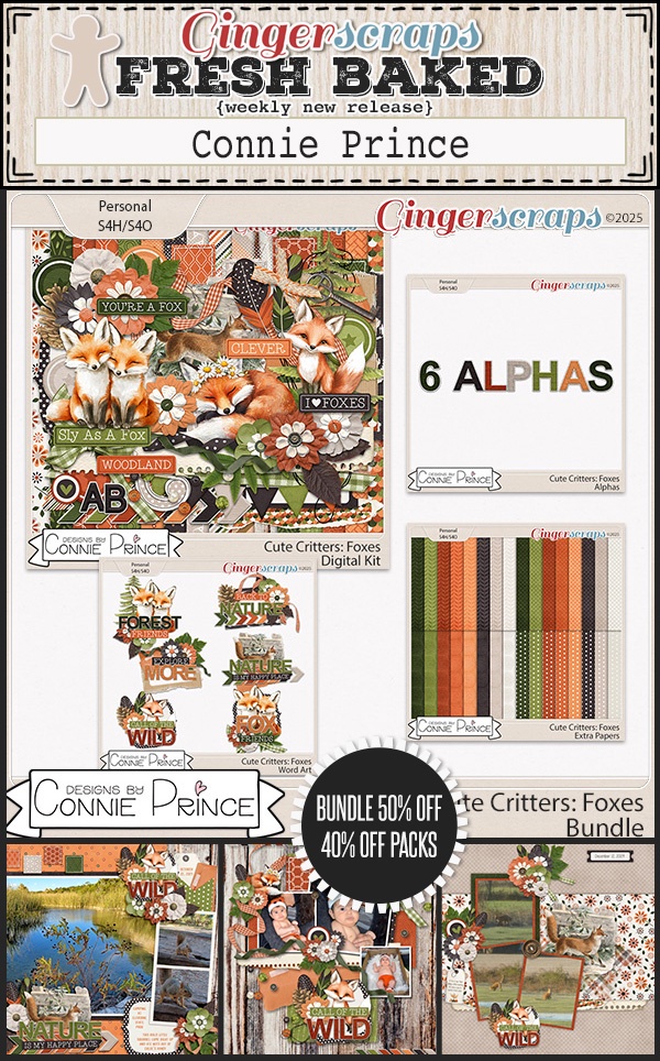
Can you believe it’s the end of January? This month just sped right by. Were you able to get some great deals in the Retirement Sale? We would love to see what you create.

Remember, spend $10 in the store and you’ll get this collab for free.

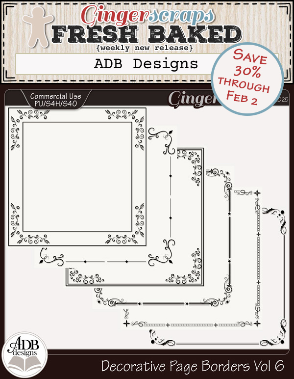
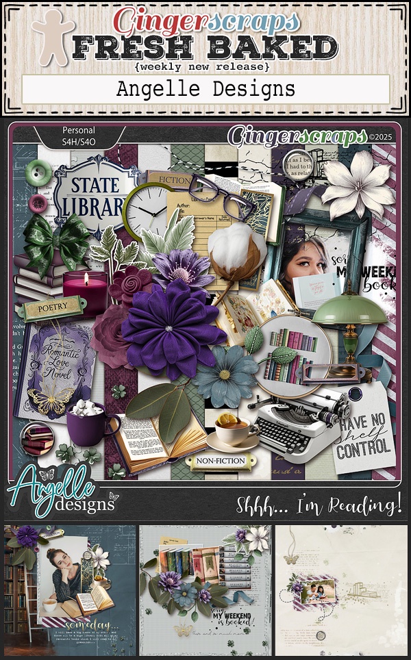
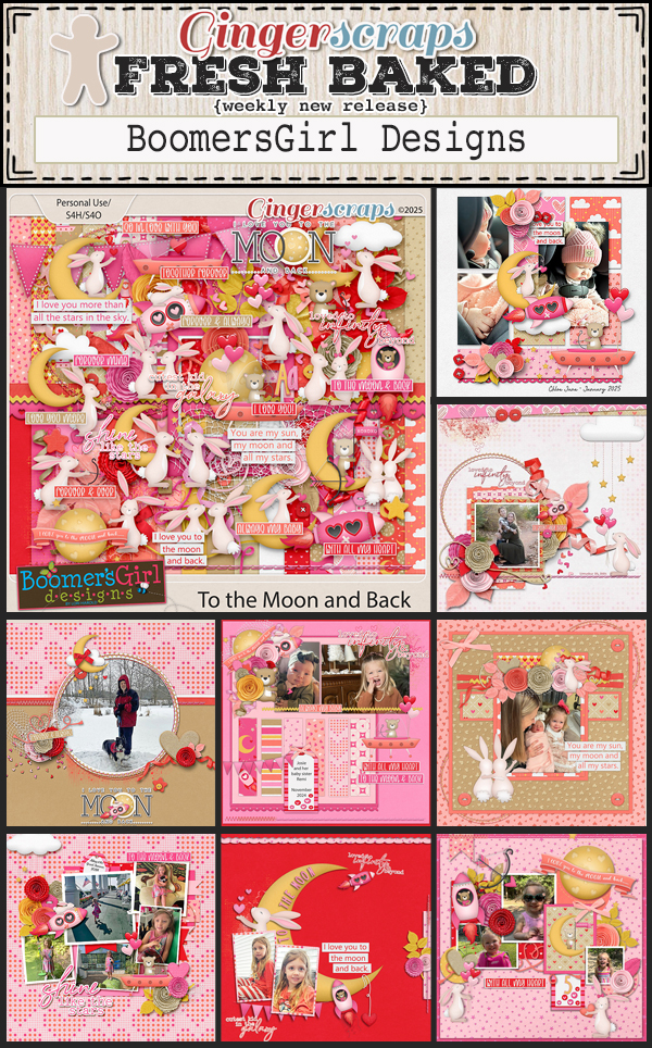
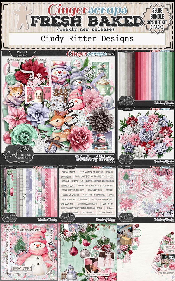
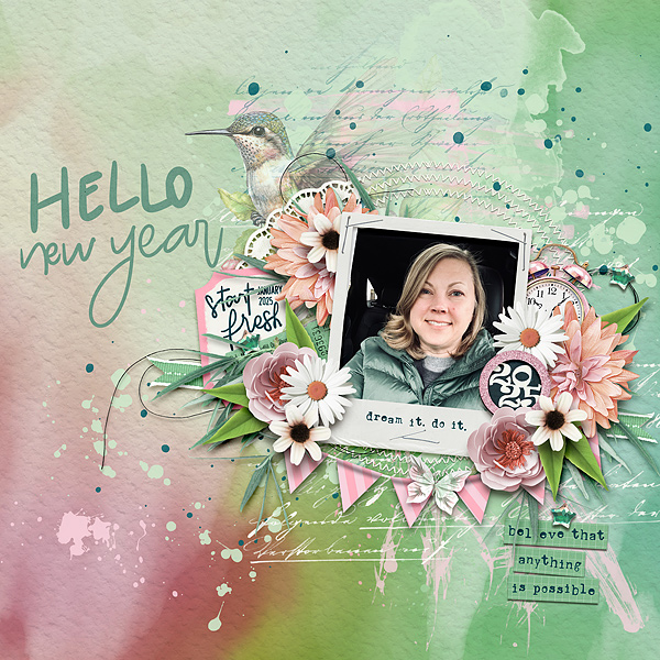
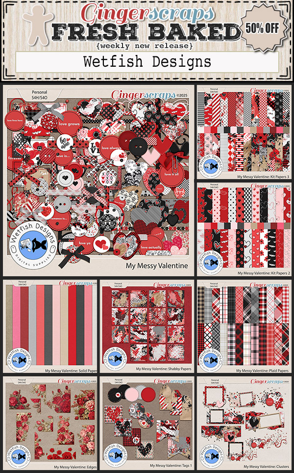
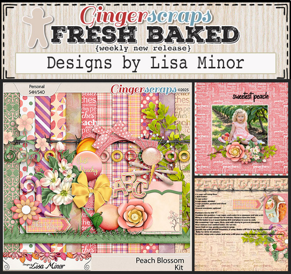
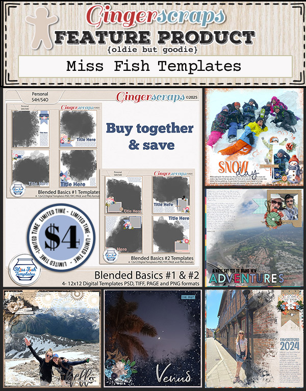
I see a lot of Valentine’s sneaking into this week’s new releases.

Last chance to get your challenges in for January. If you complete any 10 challenges this month, you get this gorgeous collab as a reward! (Or a variety of other choices, visit the forum for all the details).

Tutorial Tuesday (Photoshop Elements)

Quick Trick: Smart Brush Tool

The Smart Brush Tool was introduced in Elements 9 – a long time ago. But I only just played with it for the first time and was suitably impressed. So let’s talk about it. The Tool combines the Quick Selection (Magic Wand) feature with LOTS of options and allows you to apply special effects easily and precisely. My example took me about 2 minutes, so it can also be really quick. Some of the All-Purpose menu options are Blue Skies (turns gray skies blue!), Brighten, Increase Contrast, Darken, Make Lips Red and Whiten Teeth. There are several other menus, including Artistic, Black and White, Color, Lighting, Nature, Photography, Portrait, Reverse Effects, Special Effects, Texture and Tint. Each has multiple options in the submenu and I plan to try some of those out ASAP. So how does it work?

This photo is cute, but the puppy is underexposed, thanks to the bright snowy background. Adjusting the photo’s lighting as a whole would require several steps and multiple tweaks to achieve a good result. Let’s try out the Smart Brush All Purpose Brighten and see what it does.

The first thing I noticed is that the adjustments are made in real time – right on the screen. The change is visible in the screenshot! This is the whole workspace; I’ll add some close-ups below. I rolled the Brush over the puppy, not taking any great care. The red outline is simply to remind me that there are marching ants in the screenshot you can’t actually see. If I wanted to make the Selection more accurate, I could, using the options shown in the second close-up below. The effect is applied to a Layer Mask, not the actual photo. That means you can make even more adjustments by adjusting the Opacity or changing the Blend Mode.

Here’s a better look at the details. That coloured illustration is your Menu Picker; the little inverted triangle activates it. The Brush Size slider can be moved at any time during the Selection process, so you can save tweaking later.

You can also flip between the BIG Brush and the Detail Brush while you’re making your Selection. The stack of Brush icons on the right tell you what the Brush will do. The top one is for basic Selection. The one with the + sign ADDS to the Selection and the bottom one SUBTRACTS from the Selection – like an eraser.

If you want even more brightening it’s as simple as making a Copy of the Layer Mask [CTRL/CMD>J] then tinkering with the Opacity.

Here are the three versions: the original, after one Smart Brush Brightening and after I Copied the Layer Mask. For the final version, I decreased the Layer Mask Opacity to 29%. And it literally took less than 2 minutes! I didn’t fiddle with the Selection by outlining all the tufts of hair or Refining the Edge, and the outcome is acceptable for casual use. I could redo it with more attention to detail if I wanted it to be zoomable, but for this tut, I think it’s just fine.

Should I show you some of the other possibilities in future tutorials?

I hope this has provided some distraction from the goings-on in the news these days. Keep your chins up!


January 24, 2025: Fresh Baked and RETIRING PRODUCTS

Happy Friday everyone. This week really went fast. Along with our regular Fresh Baked releases, we have our Out with the Old Retiring Products Sale.

Take a look after the Fresh Baked items to see samples of items on sale.

Remember, spend $10 in the store and you’ll get this collab for free.

Let’s take a look at some of the Fresh Baked items for this week.

How are your January challenges going? If you complete any 10 challenges this month, you get this gorgeous collab as a reward! (Or a variety of other choices, visit the forum for all the details).

Tutorial Tuesday (Individual Style)

Challenge Spotlight: Photography

Today I’m shining the Spotlight on Cindy Ritter‘s Photography Challenge, and it’s serving two purposes. Her Challenge was to use a selfie on a layout, so now we’ll be able to put faces to user names! Cindy even obliged by posting her own selfie. Isn’t she beautiful?

As usual with the Challenge Spotlight, each layout you’ll see here will be linked to the GingerScraps Gallery for closer inspection and the leaving of praise. Simply click on the Scrapper‘s user name. [Editor’s note: whenever you see text that’s in bold, coloured text and is underlined, it’s a hyperlink. The work’s all done for you!] The layouts appear in the order they were uploaded to the Challenge Gallery.

Our first selfie is this very warmly yellow layout from pjm117 (aka Karen). Her choice of a spring-like yellow and green palette makes her selfie really pop.

This one is from zippyoh, and I love the way she’s used ombre paper and pulled the palette from her puffy vest. Lovely contrast is provided by pinks and peaches. So pretty!

Ah!! The many faces of Katherine Woodin! She has such a lovely smile, don’t you think? Going with black-and-white for all those “selfies” was a brilliant choice.

Stellar palette and paper choice, mdusellMarge! The shadows for her seagulls are perfect to give the illusion of flight.

Have you met lawyerlyn? She includes photos of herself on many of her layouts. This simple grid-style layout lets the photos tell the story.

Glee! What a morbid word strip… I think she’s aging gracefully. I like the spill of elements across the page, with her photos the focal point.

This is Alyssa, aka photocrazy. By keeping her layout clean and simple, that gorgeous sunset and those two beautiful smiles are where the eye goes first.

Who doesn’t love a grungy white space layout? It really makes the sky behind pbhill (otherwise known as Babette) pop… which leads the eye directly to her face. And the background emulates the colours of the desert.

Dorann (dorannmwin) is the one in the centre, in case you don’t know her. Those punches of orange echo the lights in the photo.

Tbear used a very similar palette here. That postage stamp frame highlights her photo and what I see first every time I look at it? Her twinkly eyes! I bet she’s a sweet, funny person everybody loves.

The next two layouts weren’t in the Challenge Gallery, but had been posted to the Forum thread. Ladies, don’t forget to post your layouts to the appropriate Challenge Gallery if you want them to count toward the Reward Collab. It’s easier for Missi to verify your participation there; she has thousands of layouts to vet every month, so let’s make her job a little easier, okay?

Sometimes I wish I hadn’t removed the SnapChat app from my phone; seeing photos like Sams Scraps‘ is one of those times. I have a bunch of photos of my son and me with these fun filters. Might have to reinstall it. Her palette works so well with those photos!

Here, princess-scraps has used some low-light New Year fireworks-related photos. Looks like it was a great party! The fragmented arrangement of her photos and papers give excitement and a tiny touch of chaos to the layout.

If I decide to take part in this Challenge, should I follow Glee‘s and Katherine‘s lead and go with a then-and-now retrospective, or should I use SnapChat photos of me with (or without my son)? Decisions, decisions!


Fresh Baked Friday and Bake Sale @ GingerScraps: January 17, 2025

Happy Friday! This week we have our regular Fresh Baked releases plus the January Bake Sale is going on.

Remember, if you spend $10 in the store you get this great GingerBread Ladies collab for free!

We have a lot of new items in the store this week. Let’s take a look at some of them.

The January Bake Sale is also in progress.

Have you seen the new challenge reward kit? If you complete any 10 challenges this month, you get this gorgeous collab as a reward! (Or a variety of other choices, visit the forum for all the details).

Tutorial Tuesday (Potpourri)

Layering Patterned Papers and Loving It

Over the weekend I managed to finish a couple of Challenge layouts – hooray for instant inspiration! – and one of them received a comment I’ve heard before. Jill worte: “Lovely choice of papers, I am always impressed by those who can layer multiple patterned papers successfully.” That started me thinking about my process, how I choose and use those same patterned papers and maybe I could share some tips. This is the layout in question. So let’s talk about it.

There are NO solid papers on there and the papers haven’t been resized. (I can’t say that about many of the patterns I use, but more about that in a minute.)

1. First things first: While you’re getting comfortable with using multiple patterned papers, work with just one kit. Everything has been designed to work together. That makes colour coordination easier and gives more satisfying results. I used a new-to-me kit, ADB Designs’ Emerald Isle for my layout. Once you’ve gotten some practice, you can branch out and use more than one kit; GingerScraps’ Buffet kits all use the same palette, so that’s one way to find good matches. Differing styles of kit can make for really beautiful layouts.

2. I’ve mentioned before that I prefer a neutral background. But that doesn’t always mean solid. The background paper here is one with a very small repeating pattern in neutral colours. The way I describe it to myself is that it “reads as a solid”. Applying some paint splatters doesn’t war with or get lost in the pattern. Using a more obvious pattern for your background means you should have at least one paper selection that “reads as a solid” to layer between patterns. Tone-on-tone can be quite effective as well; the dark green paper I used almost “reads as a solid”, don’t you think?

3. Scale is important. Layering small-scale patterns with more grand ones is a strong strategy. The small-scale print gives the eye a spot to rest. I layered the small green diamond repeating print over the brown paper with gold floral pattern to break up the chaos.

4. On the topic of scale, you don’t have to use the paper in its original size if the look is too aggressive. I will often resize the paper until I get the overall look I want. Constraints to resizing come from the specific paper layer place-holder shape if I’m using a template. Tinci Designs uses a LOT of paper layers for her templates; it’s one of the things I really like about them. (They’re a gift to creative teams – show off ALL the goodies!) I’ve also been known to shrink a paper to 1/4 its original size and create my own version of it by duplicating the paper 3 times then arranging them to fill a 12×12 square. It’s not really cheating…

5. You also don’t have to use the part of the paper that covers your place-holder shape either. Move the paper around – up, down sideways, rotated – until it looks good. Trust your eye!

6. Remember, nothing is final until YOU decide it’s final. If you look at your paper layers and think, “Ugh!”, rearrange them! Go back to the kit and get a couple more options. Turn off visibility to some or all of your other layers to see what it is you’re bothered by. If you were ever a fly on my wall, you’d get used to hearing, “Nope, don’t like that!” That’s one reason I always have the folder(s) for the kit(s) I’m using open on my toolbar until I’m positive my layout is finished.

I’ve been thinking about the wildfires in southern California a lot. The Grouse Complex fire here in 2023 followed a very similar script, and I know the terror and confusion the people affected are experiencing. It’ll be months before they can feel confident the worst is over. If you are (or know someone) affected, just know you have lots of people praying for you.

DD: JAN 11

https://bit.ly/4fHGYbE

Follow Jen on her Facebook Fan Page and her Facebook Group.

Remember, the download is kept up for 5 days, and then it is taken down. If you miss pieces, the kit will be available for purchase on the first day of the following month.

New for the 2025 Daily Download. Most months will feature two designers and two daily downloads. January only has one, but we look forward to having two for you in February.

Post expires at 10:00am on Saturday January 17th, 2026

Fresh Baked Friday @ GingerScraps: January 10, 2025

Happy Friday friends. I hope everyone has had a wonderful start to 2025. We have some beautiful kits and templates for you this week.

Remember, if you spend $10 in the store you get this great GingerBread Ladies collab for free!

Let’s see what our designers have new this week.

Have you seen the new challenge reward kit? If you complete any 10 challenges this month, you get this gorgeous collab as a reward! (Or a variety of other choices, visit the forum for all the details).

Tutorial Tuesday (Photoshop Elements)

Greatest Hits: Elements Preferences and Settings

[Link to PDF version will go here when Ginger has time to convert.]

Well, now. Trying to Work Smart Not Hard ended up in chaos. Again. In an effort to make the transition to my new laptop as streamlined as possible, I went through all my Brushes and Styles to make sure I didn’t have a bunch of duplicates, and that they all followed the same naming convention before Copying them to the new machine. Great idea, right? It would have been if I’d realized I closed Elements last time with the Styles menu active, and the specific Style last selected was one I’d renamed. Elements didn’t know what to do! “I can’t find that Style!! Danger, Will Robinson!” I couldn’t clear the error message, change the active Tool or even shut down the software. I used the 3-finger salute (CTRL/ALT/DELETE) to end the task, then tried again. And again. I even restarted my laptop, hoping that would reset the software. Nope. In the end, I had to uninstall Elements and reinstall a clean copy. [Thank heaven for being a hoarder… I still had all the email stuff from when I last upgraded.] But that solution meant all my Preferences and Settings were gone. Hence today’s Greatest Hits revue. It might come in handy for some of our newer digi-scrapping cohort.

First, you can’t set Preferences if you don’t even know why you’d want to or if it’s possible. Customizing the way your software behaves is a big part of streamlining and improving workflow, making it easier to do the things you want. Under the Edit tabPreferences is found at the bottom of the dropdown menu. Clicking on it opens another dropdown menu with a list of what can be changed. I’m going to go through each item on the list and expand on what they do.

There are lots of options in the General menu. You can choose what Elements uses for the Color Picker, between Adobe and Windows. I let Adobe’s Color Picker do it for me; selecting Windows for this setting doesn’t provide the palette you’ll see in my tutorials where it’s possible to make tiny adjustments to the colour chosen and the only options presented are Windows‘ basic colour sets.

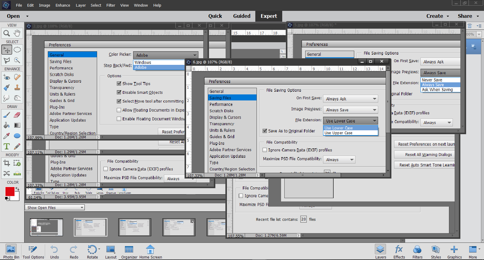
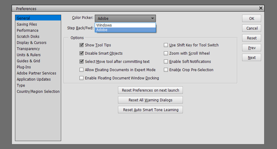
Just below the Color Picker setting is Step Back/Fwd. This allows you to decide the keyboard shortcuts used to Undo or Redo. I like the most basic, CTRL>Z and CTRL>Y – fewer movements and fewer keys to remember!

The other preferences I use are shown above and below. The ones I choose are largely self-explanatory but I’m going to talk about some of them in greater depth. Show Tool Tips means there’s a visible icon for the tool on the workspace so you can see where you’re putting your cursor. I don’t know about you but I NEED that visual! Select Move Tool after committing text also speaks for itself. As soon as the checkmark is hit, the Move Tool activates and you can shift your text in all directions, as well as resize it. Disable Smart Objects is a bit more complicated and needs a bit more discussion. Essentially, Smart Objects are “locked” and can’t be edited without first being Simplified. Also, with Version 14 and later, everything was considered a Smart Object and when an item was dragged onto the workspace from the Photo Bin, it was automatically made to fill the canvas. Think about a 12×12 button… Nope! I’m going to show you what unticking this box does.

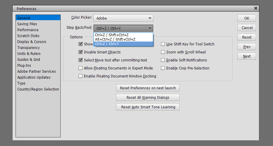
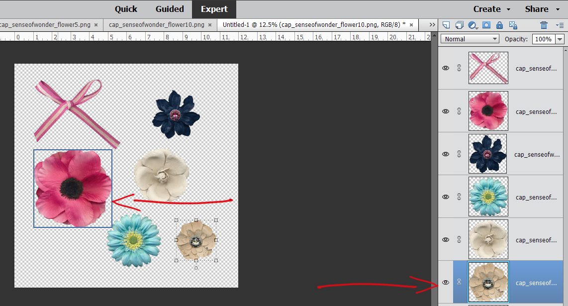
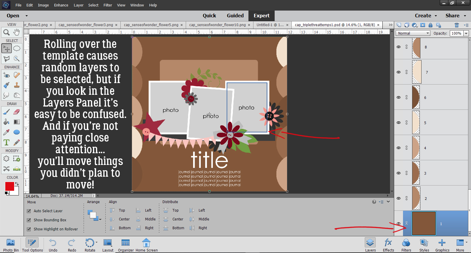
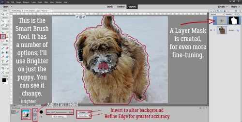
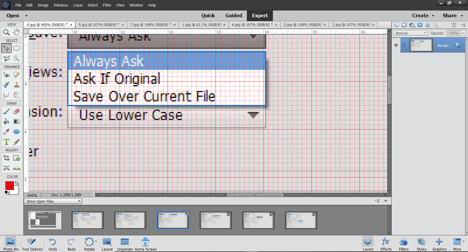
In the screenshot below, I want to Erase part of the bow. But when I try to do it, I get a pop-up as shown. And if you look at the layers in the Layers Panel, each of the embellishments I’ve got on my canvas has a little box in the lower right corner of the thumbnail. That tells me the layer CANNOT be modified other than to resize and rotate.

What does Allow Floating Documents in Expert Mode do? Well, instead of only having the images open up on the Photo Bin, they’re also opened in their own full-sized windows right on top of the workspace. These floating documents can be resized and moved around on the workspace by holding down the left mouse button and grabbing the document by the dark bar at the top. Lots of people like to work that way, because it allows you to drag things between these floating documents and it can be useful when photo editing. But for scrapbooking, I don’t think it’s all that practical. (“Preference”!) Here, I’ve resized some of the images I’ve opened.

Busy, isn’t it? Now let’s look at Enable Floating Document Window Docking.

This is another preference that lots of people love, but for me it only adds to the overstimulation! What it does is give each of the documents its own tab. You can see multiple Elements icons in the toolbar as shown. Moving the mouse over the toolbar will show each of these documents and let you move between them. For me, this isn’t workable, so I went back and unticked both Floating Document boxes.

Next on the menu is Saving Files. These options can be really helpful. I like to be asked before Elements does anything that might be hard to undo. Other people are okay with only being asked if the file is an original, and yet others are okay with Elements just writing over the file every time.

So you might wonder why I’ve selected Always Save when it comes to Image Previews. I’ve found it really doesn’t affect anything I do.

File Extension lets you decide how the saved file will be named when you save it. I prefer lower case. By ticking the Save As to Original Folder, I know anything I Save As (CTRL/CMD>SHIFT>S) will go into the folder where I opened it from originally. You may recall that I use folders to organize the things I plan to use for my layouts so this just makes sure the final versions of my layout will be easy to find later.

I’ve left the Ignore Camera Data (EXIF) profiles box unticked because although I use Elements for photo editing, that’s not my primary use and it makes no difference to my scrapbooking. Maximize PSD File Compatibility will allow me to use those PSD files in earlier and later versions of Elements without a lot of extra steps. Recent file list contains x files lets you choose how many files you’ve recently opened will show on the list when you select Open>Recently Edited from the File menu.

The Performance menu relates to how much of your operating system resources Elements uses when it’s running. The software will make a recommendation about how much RAM you have and how much you should allocate to Elements to keep things running smoothly. Just realize that when you allocate a lot of resources to Elements in this setting, while it’s running it will slow down other things you might use your computer for. There’s a good explanation of the other settings down at the bottom of the menu.

I like to have my Cache Level setting at the max to speed things up when I’m Undoing. With 100 History States and 8 Cache Levels, I can take a layout right back to almost any point from the start and make changes. Ticking Use Graphics Processor for Adjusting Facial Features lets the graphics processor in my computer be involved in any facial feature editing.

Scratch Disks relates to where Elements stores the History States and Cache Levels. If you have multiple drives, or work from an external drive, you can choose that storage area.

Display and Cursors is a really valuable menu. Here is where you can set things up to make working with Brushes, either as Brushes or within the Pen/cilDodge or Burn Tools, more streamlined and accurate. This shot shows my settings. I’ll show you what the rest of them look like in subsequent images.

The thing to look for in these screenshots is how the cursor looks, then decide which will work better for you. Show Crosshair in Brush Tip gives a higher degree of accuracy when you’re doing delicate work.

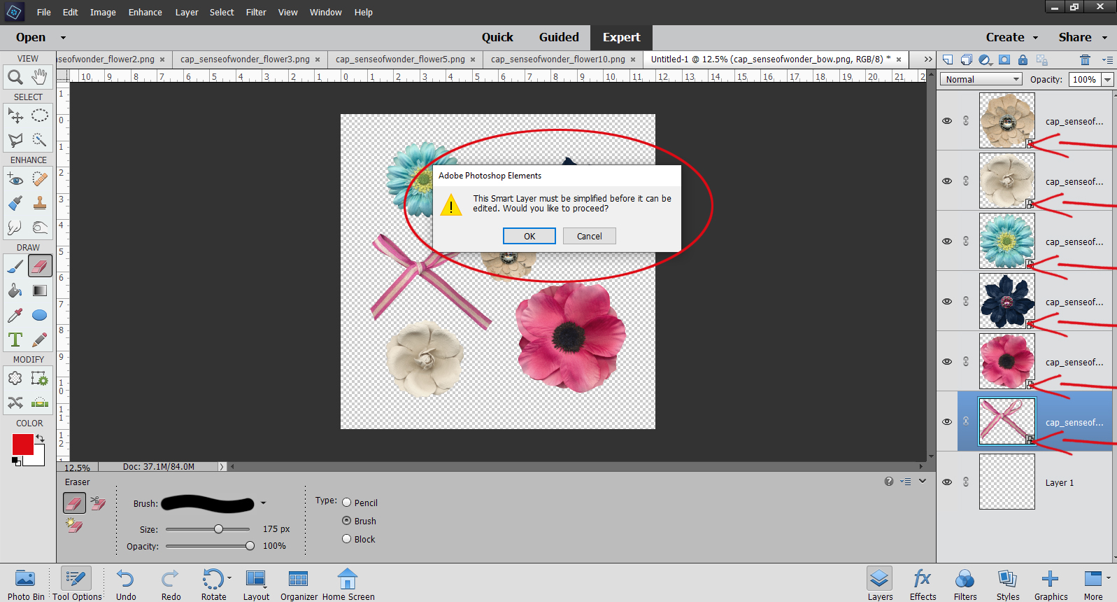
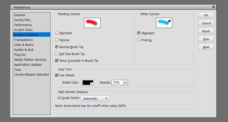
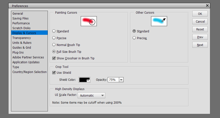
Crop Tool Shield lets you see exactly what part of your photo or image will be included when you crop it. I find that Black and 75% lets me see enough of the image to know if I’m keeping the parts I want. You do you!

The last setting on this menu is for High Density DisplaysAutomatic seems like a no-brainer.

Another really important menu is the Transparency menu. Here’s where you decide what you want to see when you’ve got something with a transparent background. I’ll show you some of the options for reference.

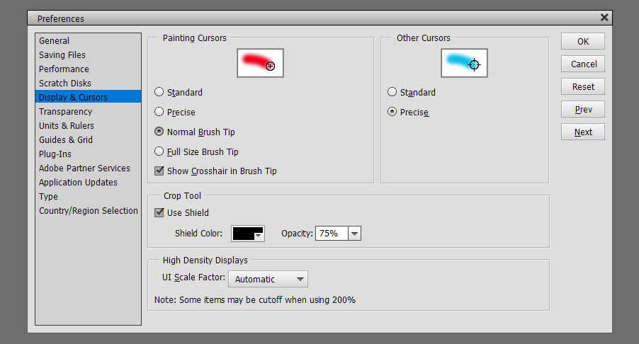
This combo might be useful for some activities but I really can’t think of one. 😉

Units and Rulers is where you tell Elements how you think. I still think in inches rather than centimeters, but when I set the country at the tail end of the Preferences menu, Elements wants to default to metric. I have to get tough with it! When thinking about TypePoints is the most commonly used measure and makes it a lot easier to have a clue about what will happen when you type in your text. Print Resolution is a vital setting if you’re planning to print out your layouts. 300 pixels per inch is the optimum setting for that, but when you’re just looking at it on the screen, 72 pixels per inch is good enough. (That’s why my screenshots aren’t as crystal clear as my layouts are.)

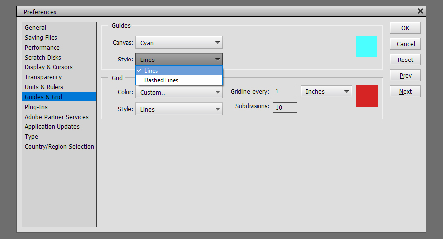
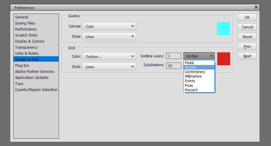
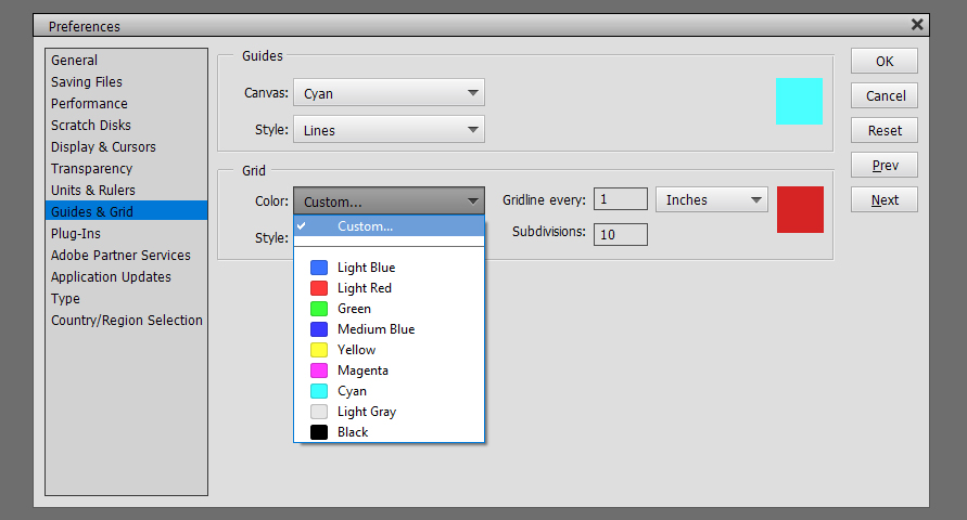
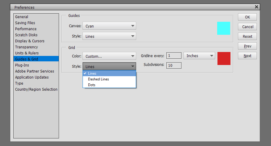
Guides and Grids are helpful tools. Guides are single straight lines that can be pulled from the top or the left of the workspace and allow for precise placement of objects and type on your layout. Grids give you graph paper, essentially. I use both regularly for my layouts. For them to be most useful, you need to be able to see them without them obscuring your work. These tools can be solid lines or dashed lines for Guides, solid, dashed or dotted lines for Grids. I have old eyes so my settings are what will work best for me. By all means, experiment until you get what you need.


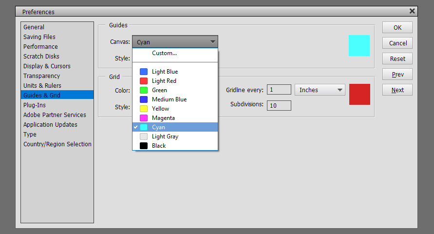
Here’s an image with two perpendicular Guide lines on it.

How do you get them to be visible? Along the top of the workspace there’s a View tab. Click it and a new menu opens. Click on the tool you want to make visible. I leave the Rulers on all the time. I like having them there as reference points. Guide lines don’t require this step. Just put your cursor barely off the workspace, hold down the left mouse button and pull the mouse either down or to the right. You can add multiple Guides in either horizontal or vertical plane. Making them go away again, click View and click Guide again.

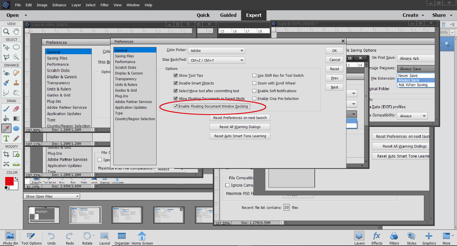
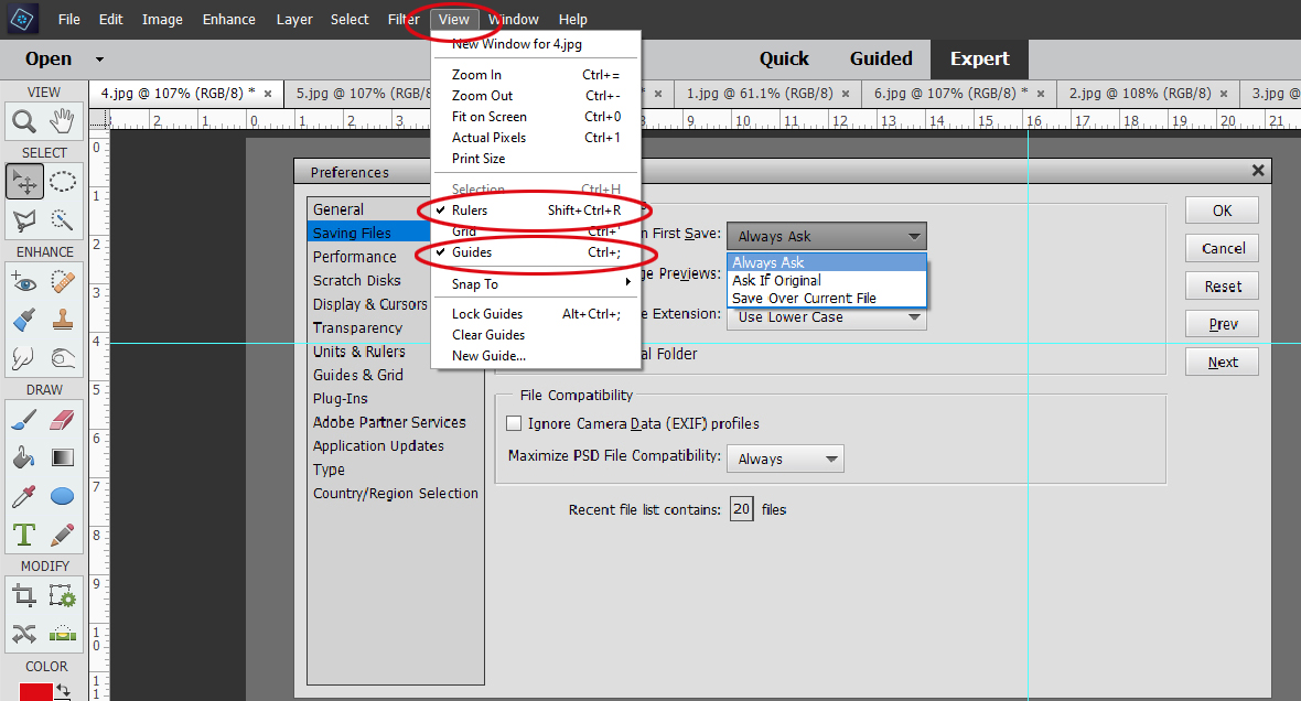
If you want to make it so your Guides and Grids don’t move when you accidentally mouse over them, you want to Snap To. To have them remain on your workspace regardless of what image you’re working on, Lock Guides.

The Grid, or graph paper tool is customizable in several ways. You get to choose the colour of the Grid, the measurements you want for your Grid lines and how that Grid is subdivided. Again you can choose between solid, dashed or dotted lines. I used this a ton when I was doing floor plans of the new house and trying out various furniture dimensions.

Here’s an image using a Grid. (This tool is so useful for speed-scrapping, when the facilitator says, “Place a large flower 2 inches from the left side and 1 1/2 inches up from the bottom.” Or, “Cut a rectangle from your paper measuring 4 inches long by 3 1/4 inches high.”)

Plug-ins aren’t something I have, so I’ve never had occasion to do anything with this setting.

Adobe Partner Services are for developers and people who are smarter than me.

Here you have the option to make Elements tell you when there’s an update to the software, or to give it permission to just update whenever.

Type… these settings are important for title work and journaling. Smart Quotes means all the quotation marks, apostrophes and commas in your text will be curvy, which is a high-quality typography feature. Show Asian Text Options allows the use of Asian fonts and dingbat style fonts. Missing Glyph Protection is a setting that gives Elements permission to substitute another character for one not present in a font family. Font Preview is something I insist on having as large as possible for my old eyes.

Country/Region Selection is self-explanatory.

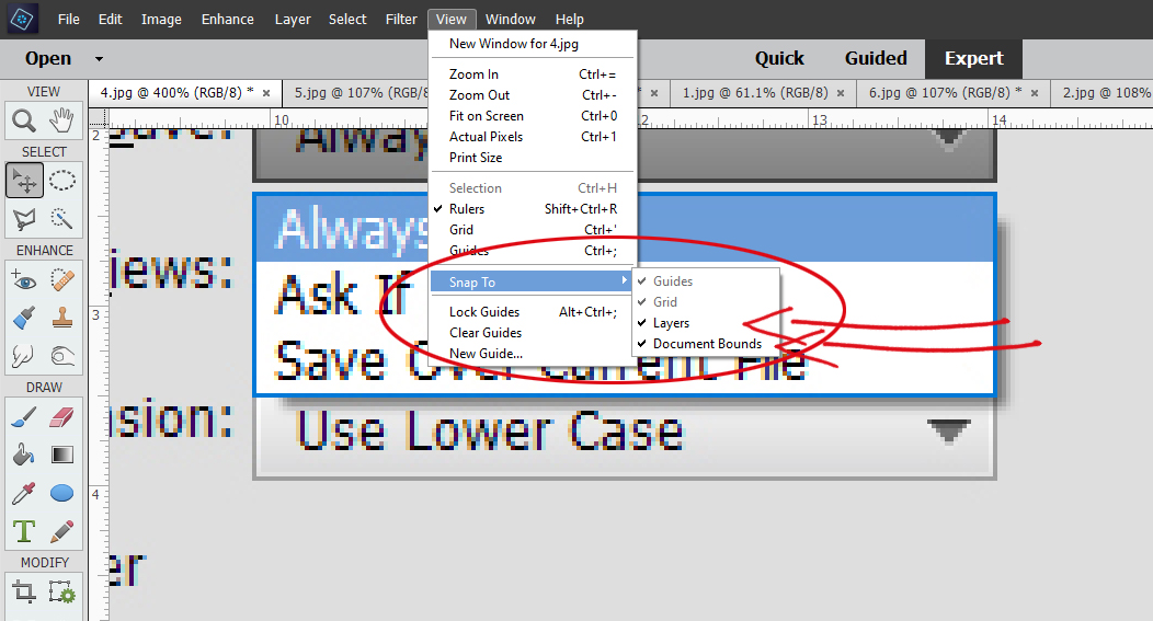
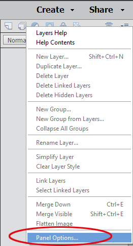
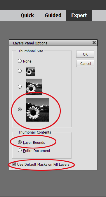
When you look at the Layers Panel, in the upper right corner of the screen there is an icon that looks like 4 horizontal lines with a tiny blue triangle just to the left of it. When you click on that, the dropdown menu has an item at the very bottom called Panel Options. Click on that and you can set the size of your Layer Thumbnails.


You’ll notice I’ve selected Layer Bounds in the Thumbnail Contents section. That means that ONLY what’s on THAT layer is shown in the thumbnail. If Entire Document is selected… well… the thumbnail will basically be a microscopic version of your entire layout. By selecting Use Default Masks on Fill Layers, I can see what part of the contents of the layer has been filled.


The last thing I want to talk about is Move tool options. You’ll notice I’ve ticked Show Bounding Box but haven’t ticked the box for Auto Select Layer. I want to show you why.

When Auto Select Layer is ticked, Show Highlight on Rollover is automatically selected too.

When there are just a bunch of random items sitting on a transparent background, this option isn’t a big problem. When the mouse rolls over any of the flowers or the bow on my workspace, a blue box appears around the outside of the object.

But when there are things positioned on top of other things, it’s very possible to move things you didn’t intend to move just because you had too much pressure on the mouse when it rolled over them. You might not even realize it’s happening until all of a sudden that flower is hanging off the page, or the paper you thought you put under your photo is now halfway across the page. And when you look at the Layers Panel the object’s layer isn’t even active! So I turn that off and just have the Bounding Box on so I can see the outer limits of the object as I move it around.

I hope you’ve learned some useful things today. I did, even though all I did was show you how I’ve selected my preferences. (I had to be able to explain them, right?)

See you next Tuesday.


Designer Spotlight: January 2025

J. Conlon and Sons

Well, look at that! Here’s our first Designer Spotlight of 2025. Allow me to introduce to you Jennifer, the J of J. Conlon and Sons. Jennifer is a relative newcomer to GingerScraps, but she’s not new to the world of digital scrapbooking design. Let’s get to know her! [Editor’s note: to avoid confusion, Jan‘s the “O” in the following conversation.]

O: Jennifer, it’s so nice to meet you! I enjoy your templates for their simplicity but I haven’t really done a deep dive into your kits. How did you find designing?

J: In 2009, after the birth of my first son, I started exploring online for ways to create a baby book using my graphic design skills. I didn’t even know the term “digital scrapbooking” existed at the time; I was simply looking for creative ideas. I was amazed by the array of products and layouts I discovered. As I began designing my own pages, I realized how therapeutic scrapbooking could be, especially as a gratitude practice. While I wouldn’t call myself a prolific scrapper, it’s something I find myself returning to time and again.

O: So we came to the digiworld around the same time. 2010 for me, but as a beginning digiscrapper, I was reallllllllllllllly bad. As time went by and my skills grew, I seemed to just gravitate toward certain designers and found my own style – classic and elegant but with a touch of whimsy. If you could describe your style using just three words, what would you say?

J: I try to mix it up a bit sometimes but I think my overall style is realistic, colorful and fun.

O: I appreciate realistic elements when I’m scrapping. Over the years I’ve developed a workflow that keeps me organized and productive. Do you have a process you follow when you’re designing?

J: This can vary depending on my inspiration, but I tend to start with a general theme, and I’ll put together a color palette inspired by that. I like a lot of color in my kits and on my layouts so I usually have at least 15-20 colors. Then I seek out or design some paper patterns. This is where the kit name can begin to form for me as the details start to fall into place. Once the main patterned paper pack is complete, I look for flowers, leaves, ribbons, etc. that fit with the theme. For example, in my 365 Little Things kit (the January Daily Download) I knew I wanted lots of brightly colored fabric flowers. Real flowers wouldn’t have felt as light-hearted as I wanted the kit to feel.

I wrote out a long list of word art and icon ideas that I knew would be the focus of the 365 Little Things collection. I created the simple icon illustrations in Adobe Illustrator—which were so fun to make! —and the word art for all the “stickers” in the kit. My scrapping style leans toward realistic so I will make a lot of my illustrations and word art into stickers, so they feel like a physical product.

The rest of the collection (extra papers, painted edges, pocket cards, etc.) will then be based off the kit. It’s so satisfying to watch it all come together!

O: It really is, isn’t it? I created a memory book for my sister using photos she took while on her first real vacation in about 20 years and gave it to her for Christmas. It was definitely a labour of love, but also deeply satisfying. I ended up with 31 pages! I tend to do most of my “work” in the evenings while watching TV. What does a typical day look like for you?

J: I am 100% a morning person. I not only just like to wake up early but I’m also at my most focused then. I get up around 5-5:30, make my coffee, and sit at my desk for work. In the afternoon, I’m taking care of house and family stuff. I will occasionally sit back at my desk after dinner to get something finished up but more often I’m reading or playing a game on my phone. And then it’s early-to-bed!

O: I HATE getting up early, which is a bad thing when you’re a nurse and you have to be at work and ready to rock-and-roll at 7 am. Now that I’m retired, you’d think I’d get to sleep in every day, but nope… I wish! Lately I’ve been in a real rut and have to force myself to be productive instead of scrolling my phone. Where do you find inspiration when your mojo’s blocked?

J: I like to look at the GingerScraps Gallery to see what people are scrapping. Like what life events or emotions are they documenting. Because that’s really what this is all about for me—pretty patterns and embellishments aside—it’s about the stories we are telling.

O: Oh, yeah! That’s a great source of inspiration. I usually get charged up while I’m prepping the Challenge Spotlight and end up in the Zone for a day or so. Sometimes I do something completely different, like make some greeting cards, play around with my Cricut or do some gardening, and that refreshes my creative juices. If you weren’t a digiscrapping designer, what creative path do you think you’d choose?

J: I went to school for graphic design and worked as both a print and web designer for 20+ years. I also dabble in all kinds of crafts and art techniques. This past year I played around with watercolors and collage. I’m currently working on a hexagon quilt that’s all hand-sewn so it’s taking forever but I can listen to podcasts and stitch away… it’s definitely about the journey and not the destination with that project!

O: I tried quilting. Not for me! My son and I dabble with watercolours – abstracts, since he’s developmentally disabled. It can be a lot of fun. His philosophy of life is that it goes on. What it looks like is up to us. Is there a quote or mantra that guides your designing?

J: “Done is better then perfect.” A former boss of mine said this to me and it has stuck around in my head ever since. At first, I thought she meant to just get things out the door even if they have flaws and I couldn’t get behind that ideology at all. Now I take it to mean that to be done means it is correct but you may still be futzing over the radius of a curved corner or if a button should be light teal or sea green. Little tweaks like that can become a waste of time.

O: Gina Krupsky, of Gina K Designs, has a similar outlook. “It’s better than horrible” is a healthy way to look at our work. Now, I have to ask… how did you choose the name of your brand?

J: My brand name, J. Conlon and Sons, was inspired by small company names I see on local vans and trucks all the time…lol. Like a plumber will have a van with a big logo that says “O’Hare and Sons Plumbing”. I wanted it to both identify me and be a bit generic. Fortunately, I was blessed with two sons!

O: Hey, that works! Do you have any guilty pleasures?

J: I love anything CIA-international-crime-action (Bourne Identity, HomelandJack Ryan) and quirky comedies (Schitt’s Creek, New Girl). I can watch any of these over and over and often have something on while I’m working.

O: One of my daughters is a BAU-type criminologist so I’m always watching true crime shows. Literally always! I LOVED Schitt’s Creek. Canada produces the best comedians, we really do! [We also originated pineapple on pizza, and put gravy on our French fries…] My husband could eat poutine almost every day, although his doctor would not like it… if you could eat only one food for the rest of your life, what would it be?

J: I may get caught on a technicality here, but I’d choose pizza but change-up the toppings. Pizza is my favorite “naughty” food. It would be hard to eat only one thing for the rest of my life but if I could have a salad pizza or a white clam pizza every once in a while that might work!

O: You’d get along well with my son! He’s a pizza fanatic. And now I’m hungry… It was so good to chat with you, Jennifer. I’ll let you get back to work. For our readers, don’t go quite yet! I want to tell you a bit more about Jennifer‘s Spotlight. In addition to providing all of us the Daily Download kit, she’s hosting the Designer Spotlight Challenge on top of her usual monthly Template Challenge. AND… drumroll please! She has a coupon for all of us! [And it’s good for TWO months!]

Remember, any time you see a bold, coloured, underlined bit of text – it has to be all three – in any of my Blog posts, it’s a hyperlink! Click on it and it turns into a magic carpet, whisking you directly to the good stuff. Go check it out!