Happy Friday Scrappers. I cannot believe we are at the end of August already. That means less than four months until Christmas. That is just crazy to think about.
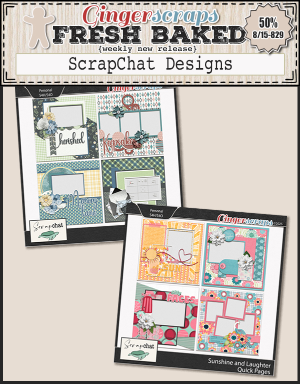
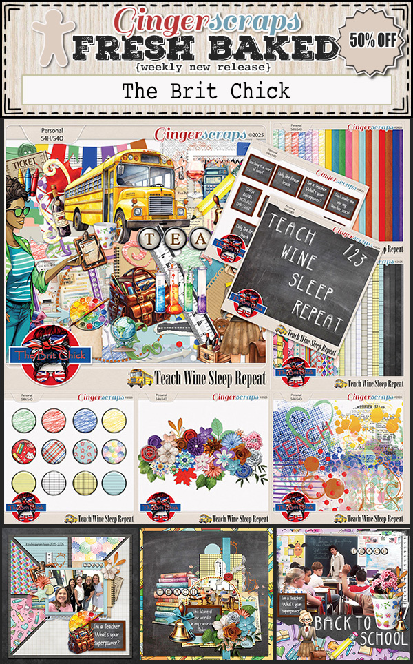
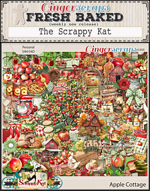
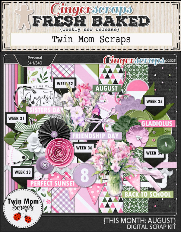
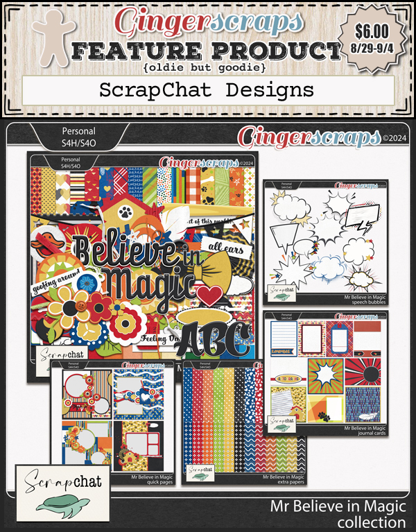
- We have a several Fresh Baked items this week along with some Featured Products from our designers.
- Make sure to go all the way through the newsletter for a little sneak at upcoming fun.
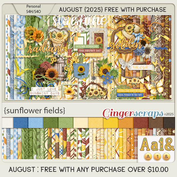
- Remember if you spend $10, you get this great collab free.
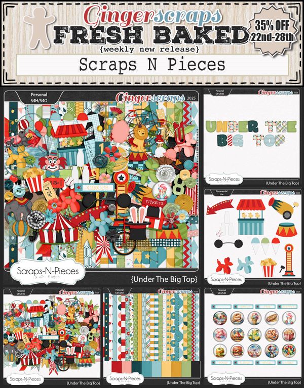
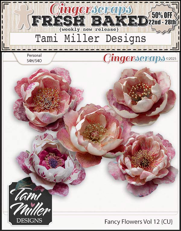
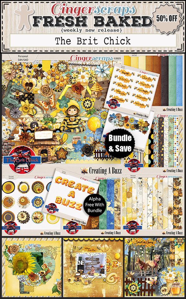
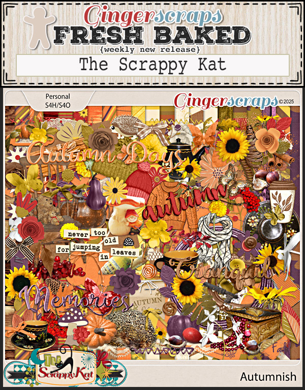
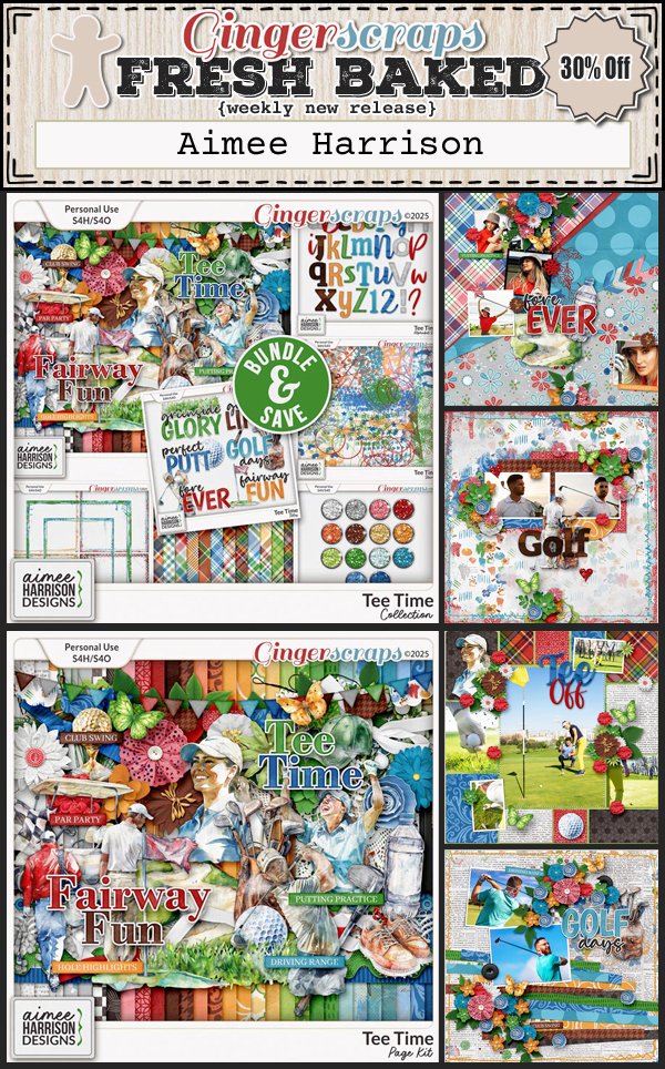
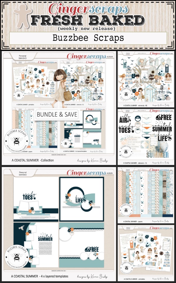
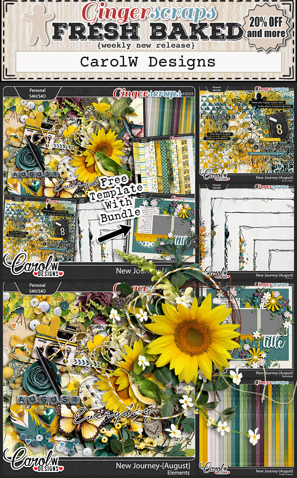
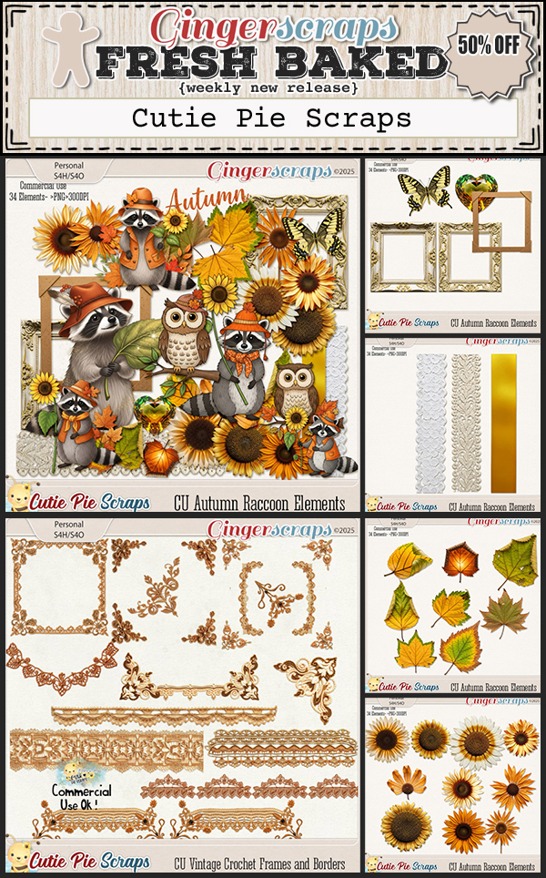
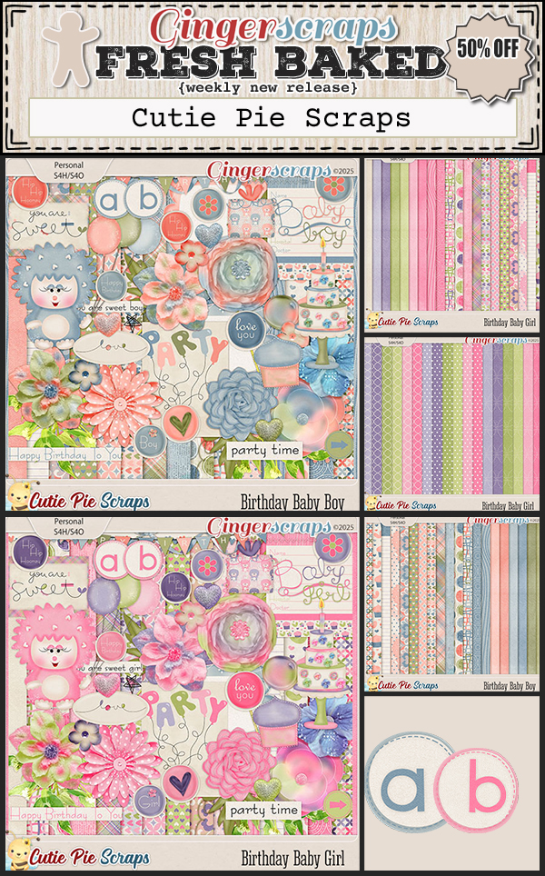
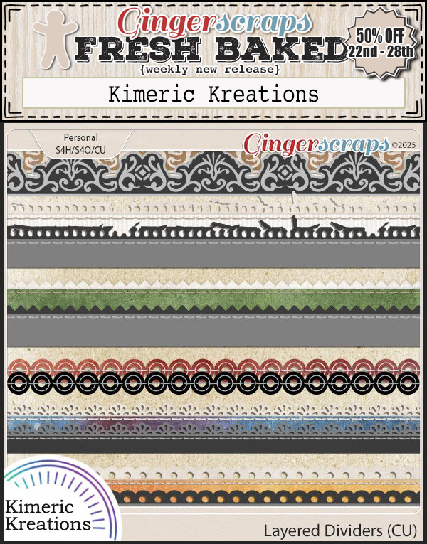
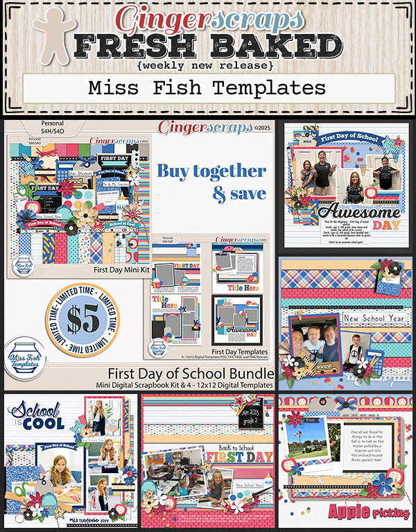
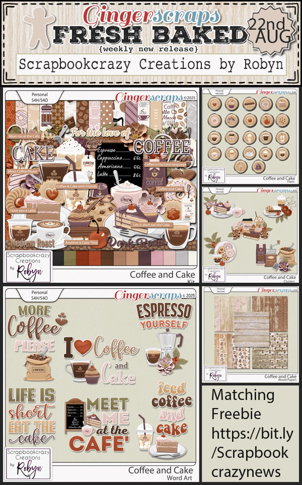
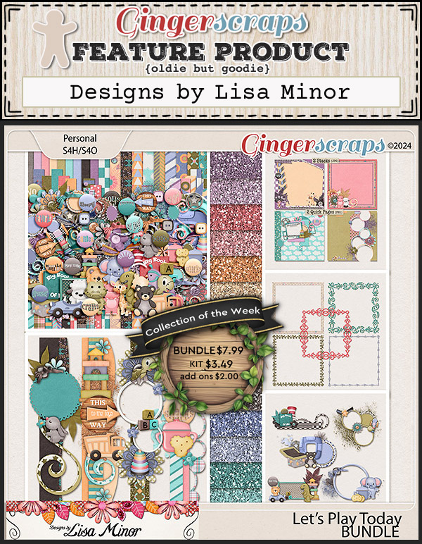
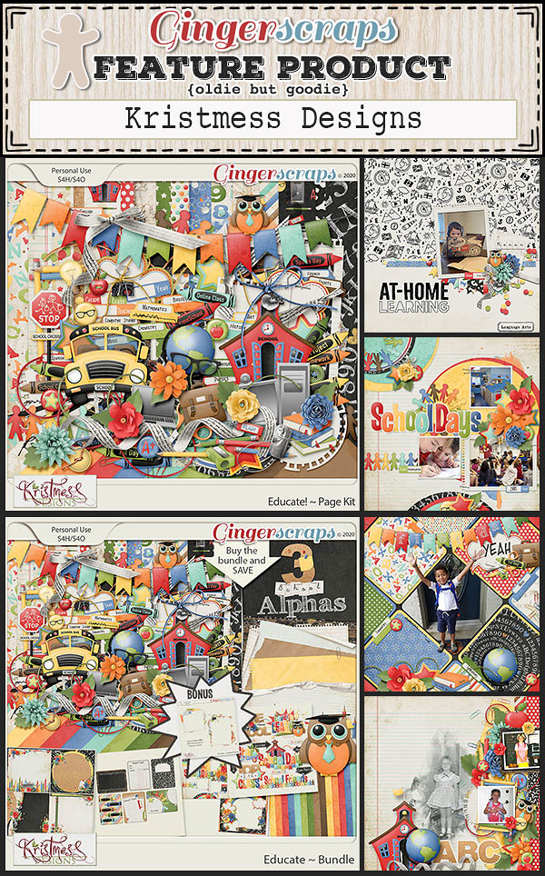
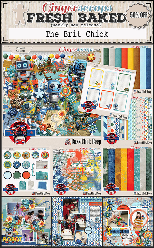
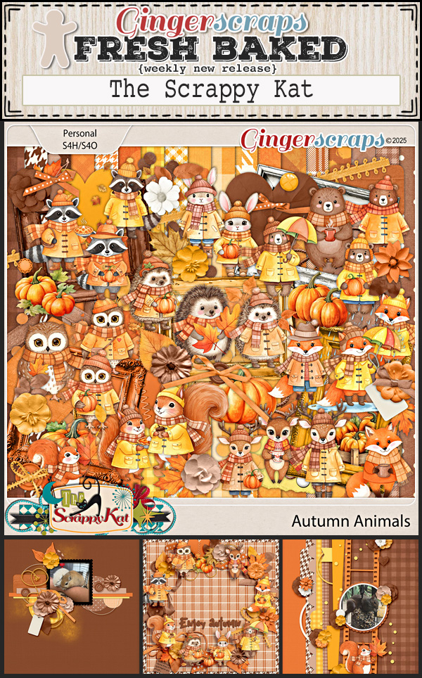
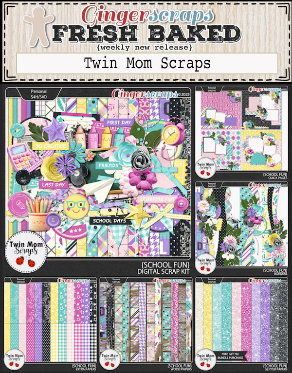
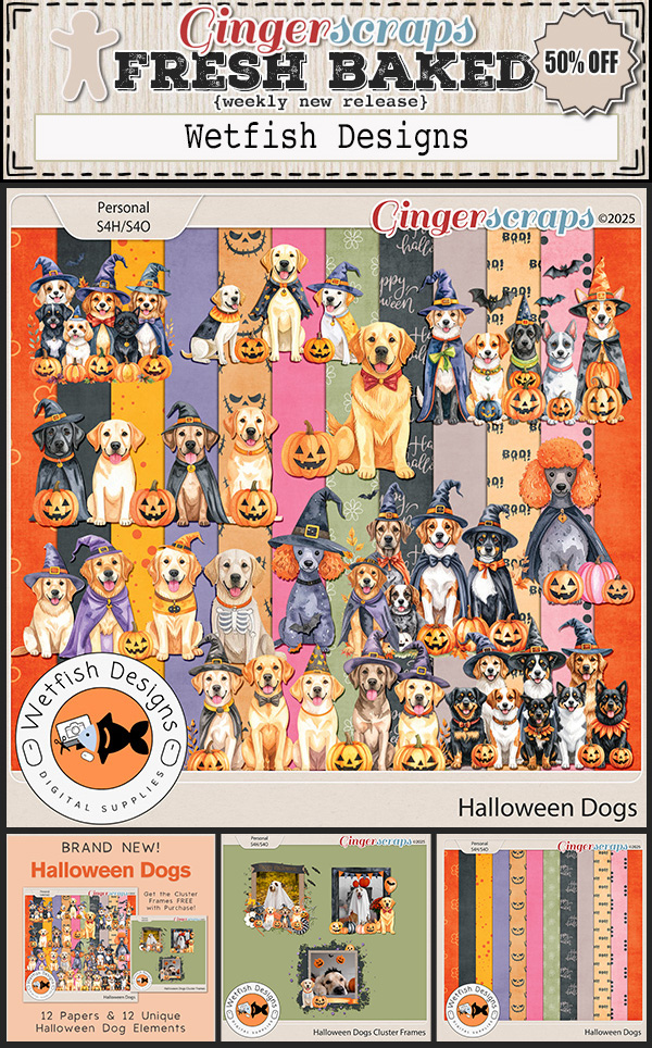
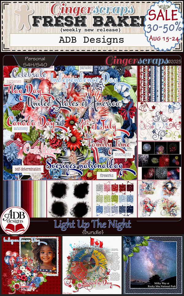
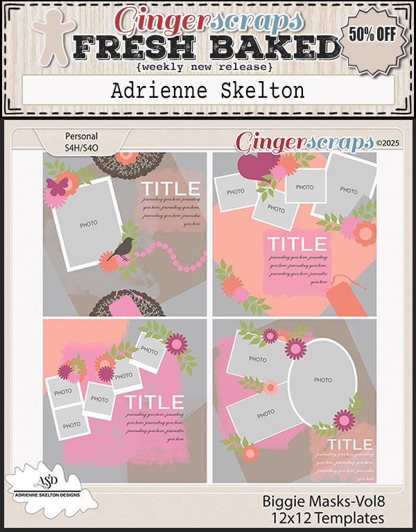
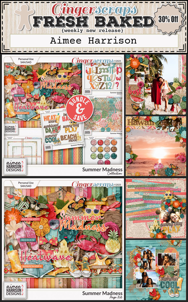
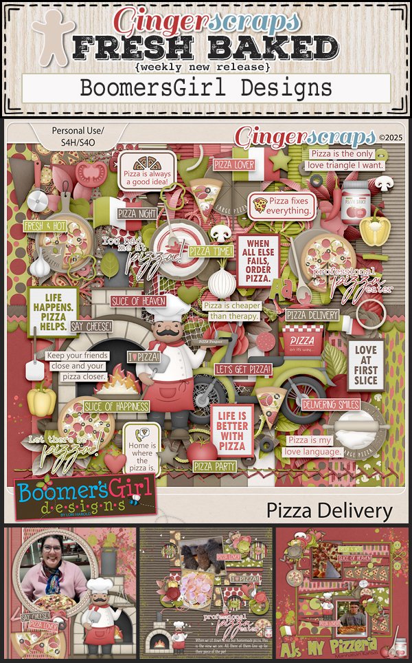
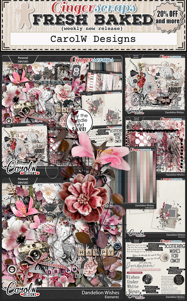
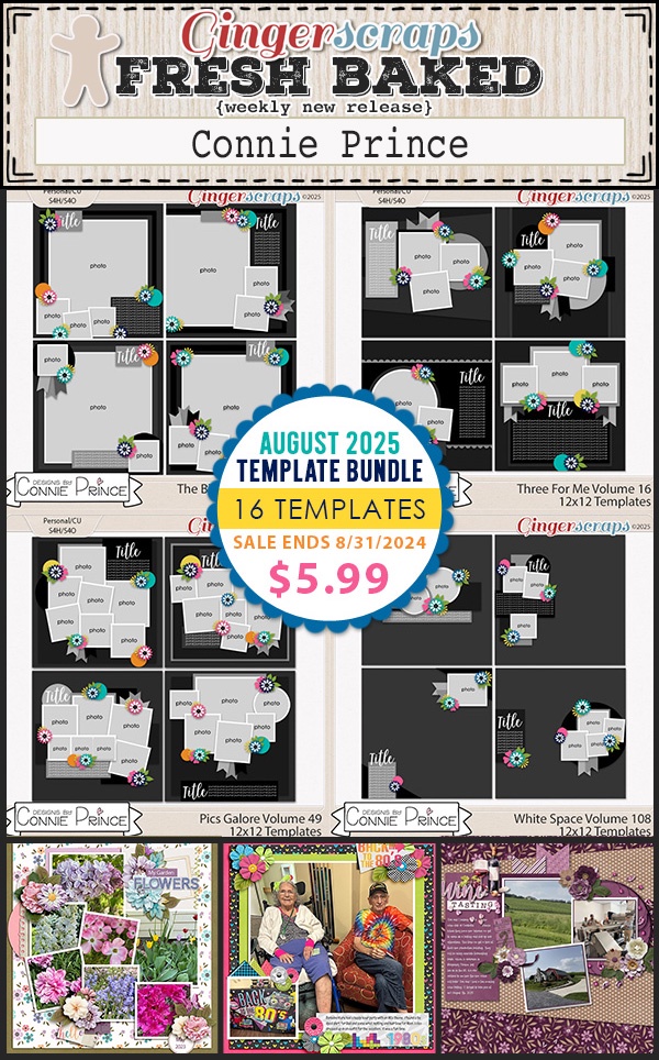
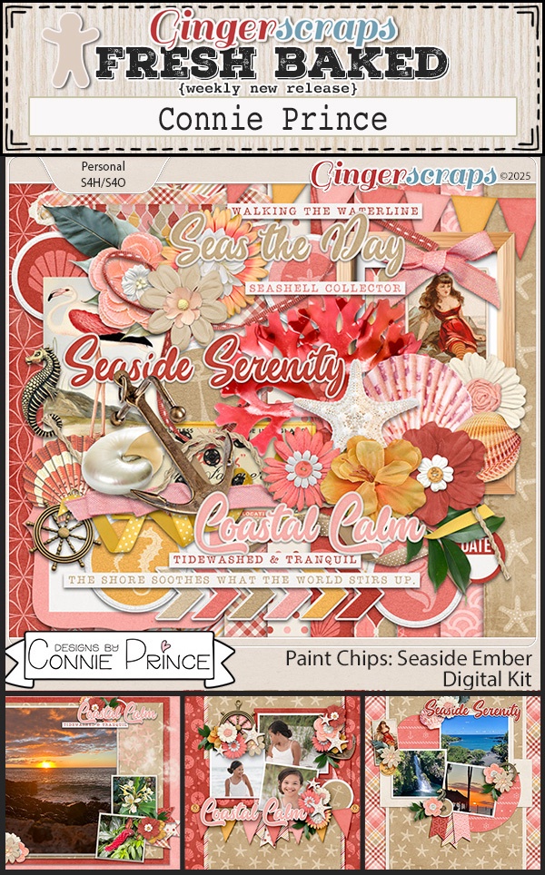
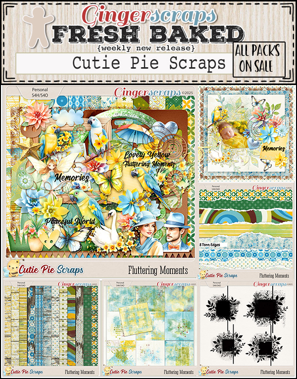
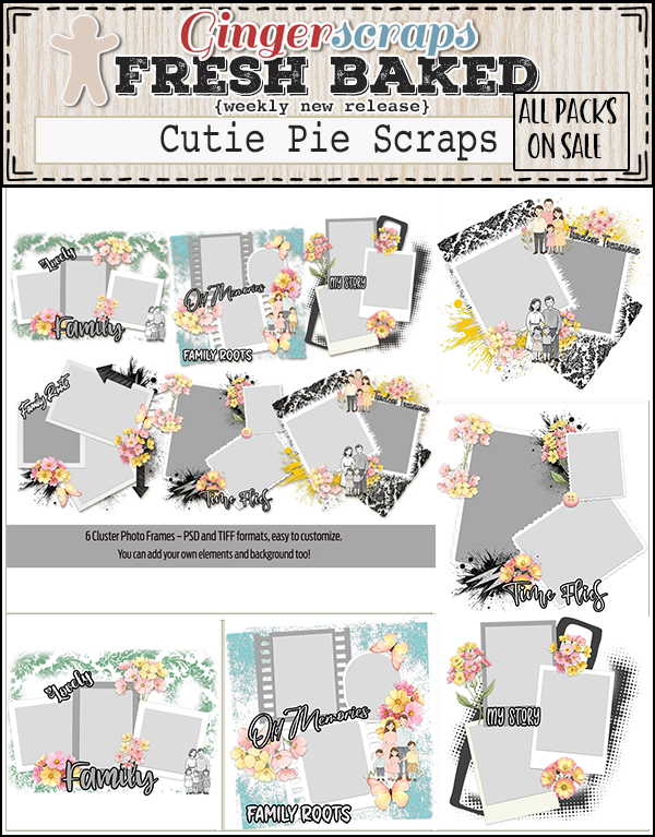
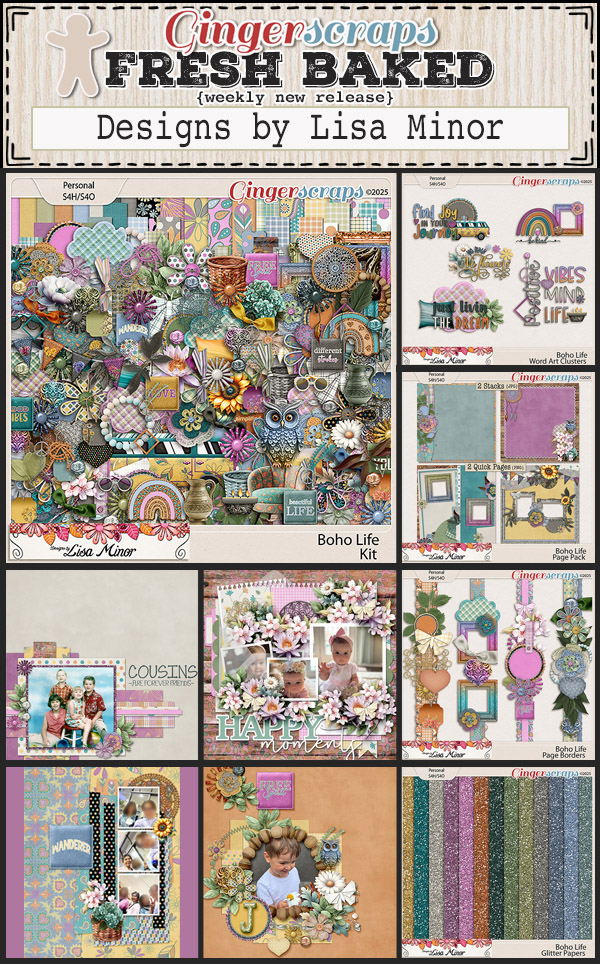
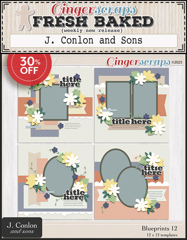
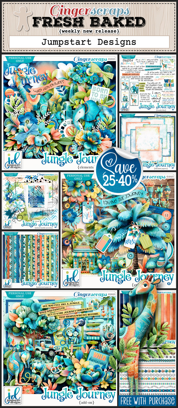
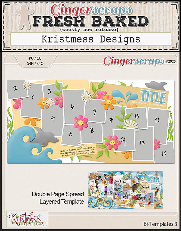
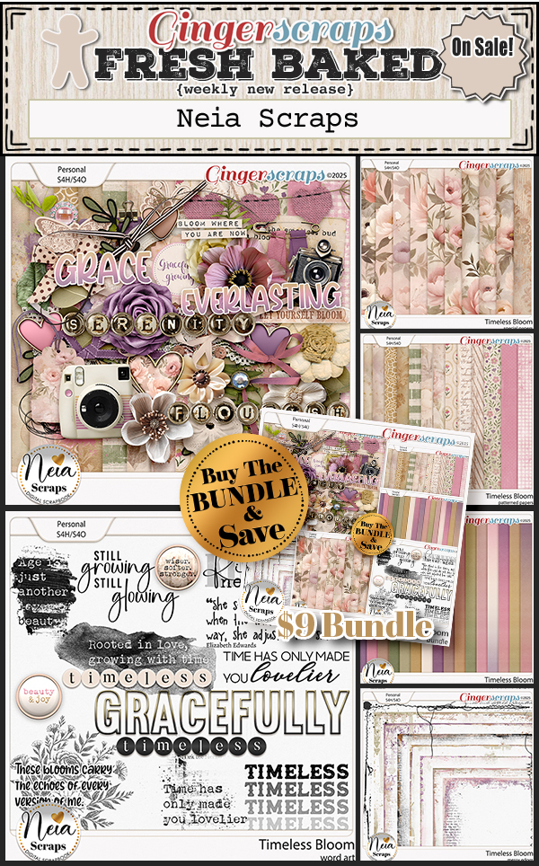
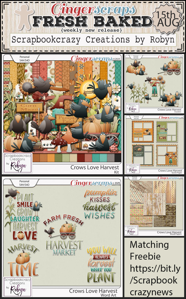
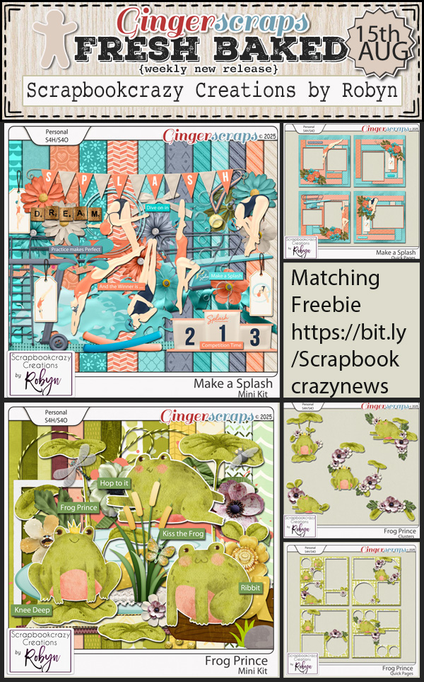
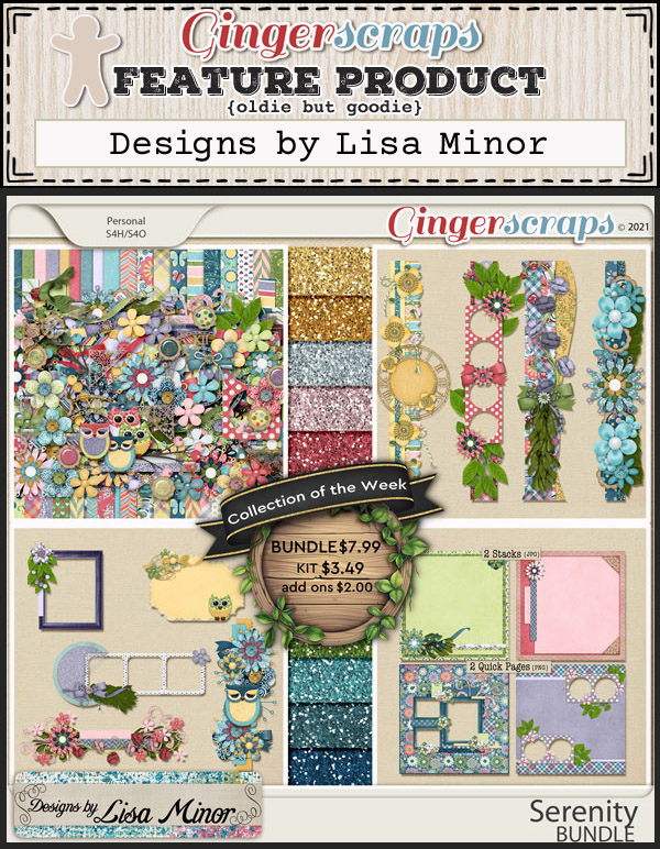
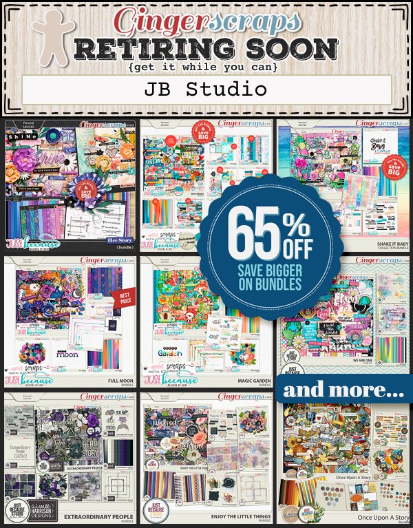
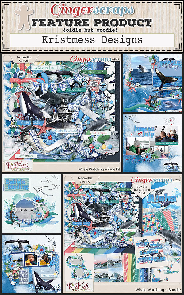
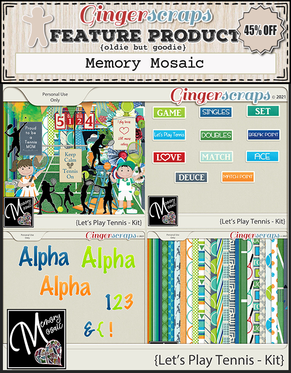
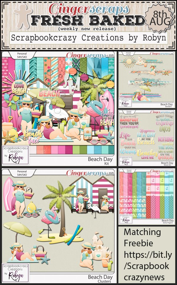
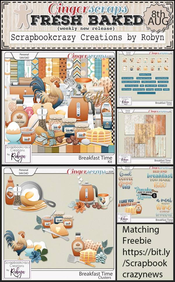
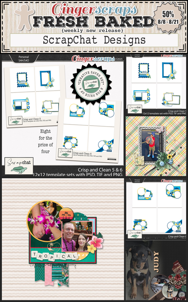
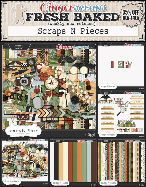
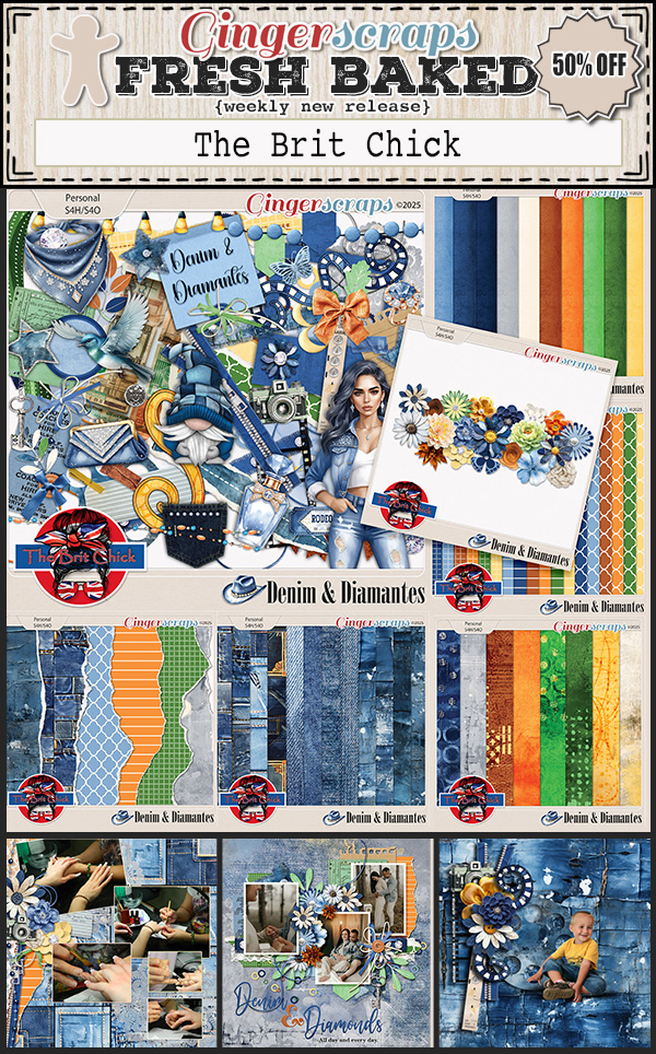
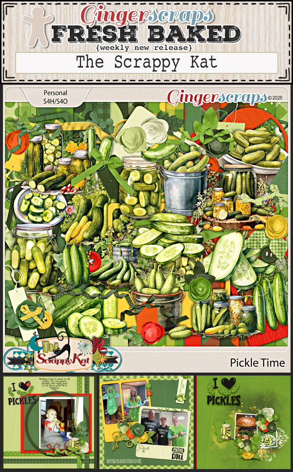
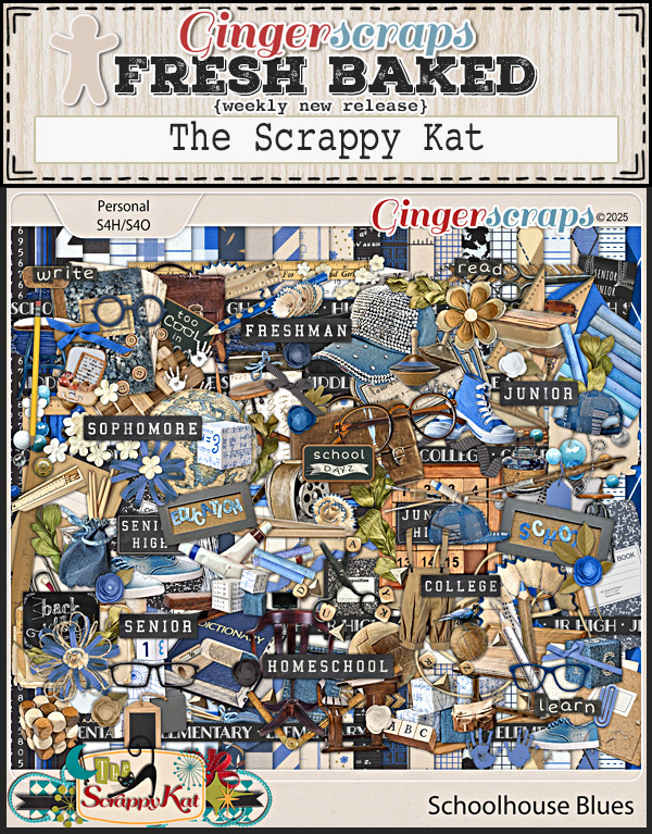
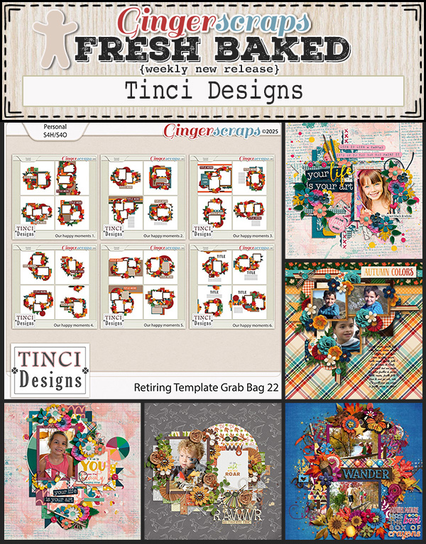
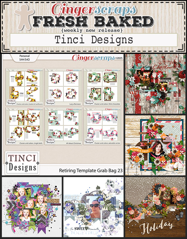
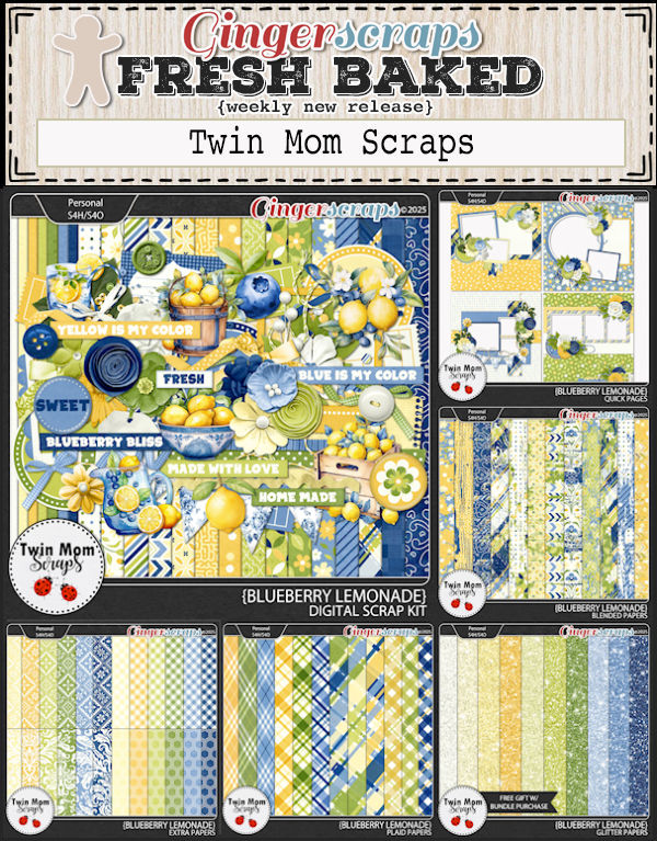
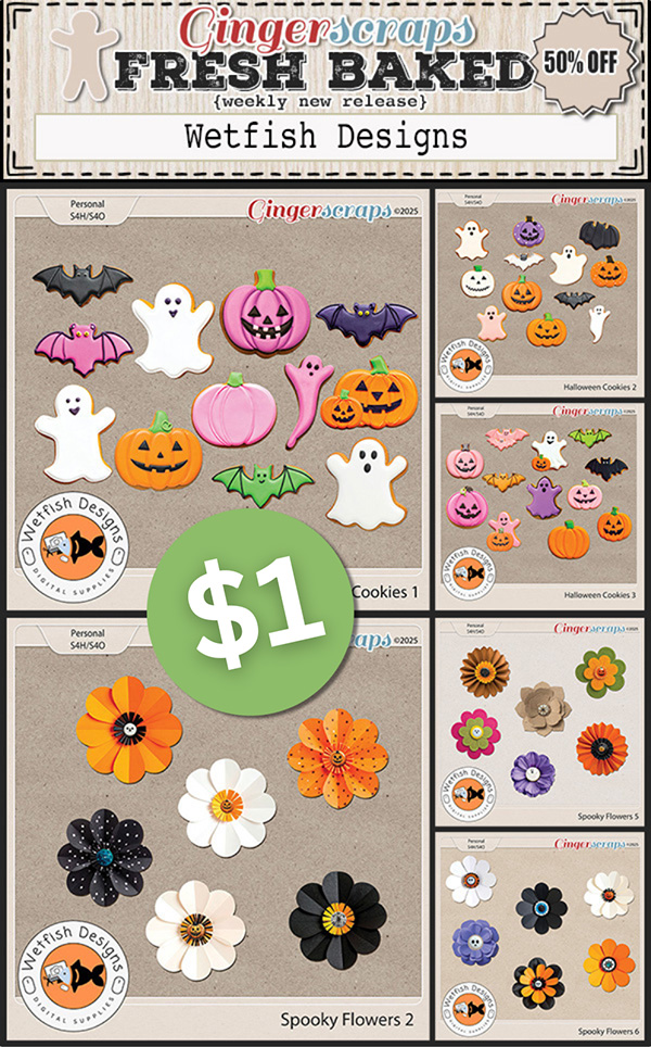
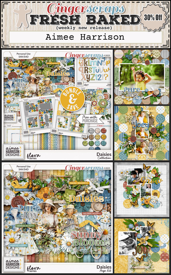
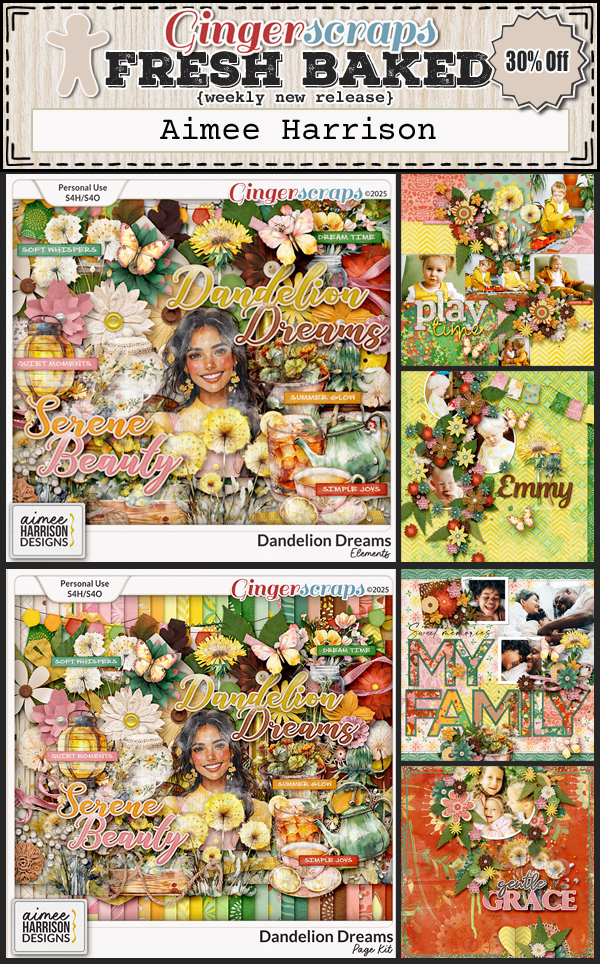
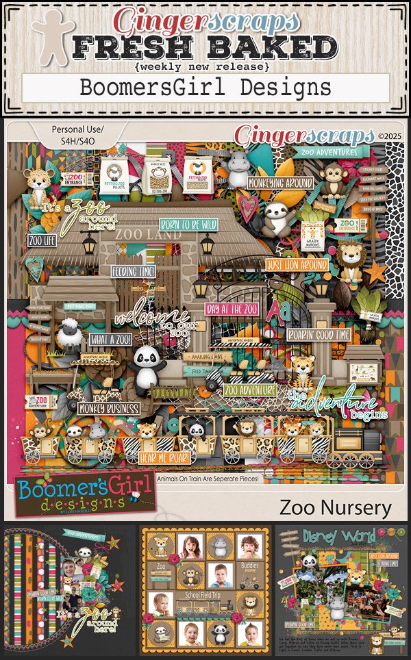
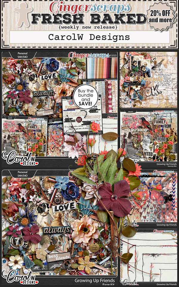
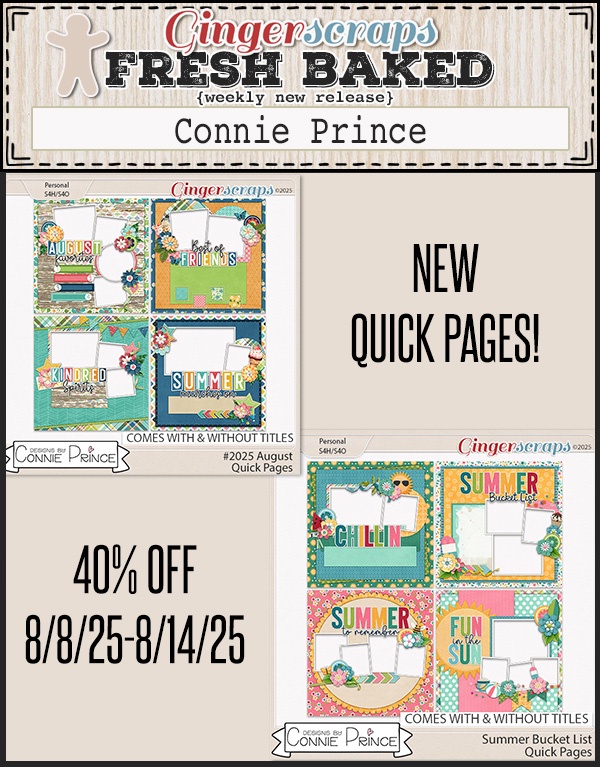
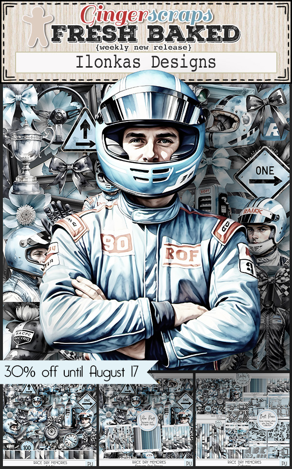
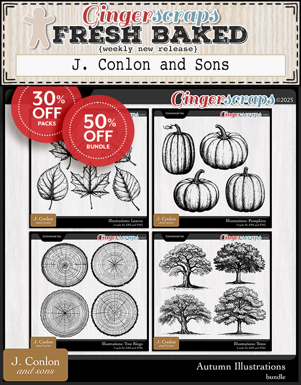
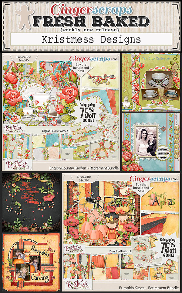
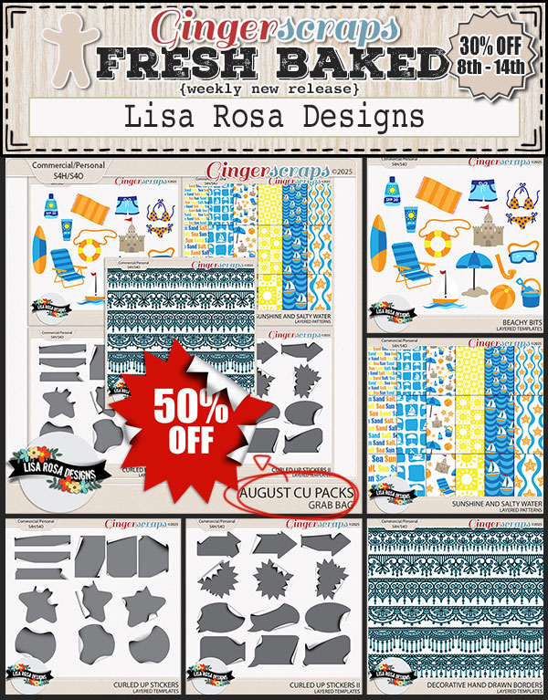
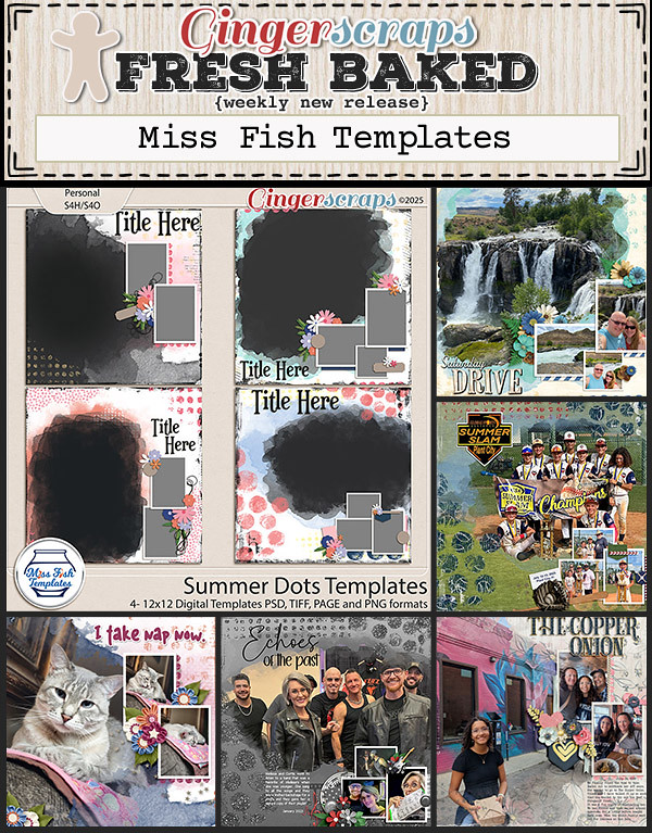
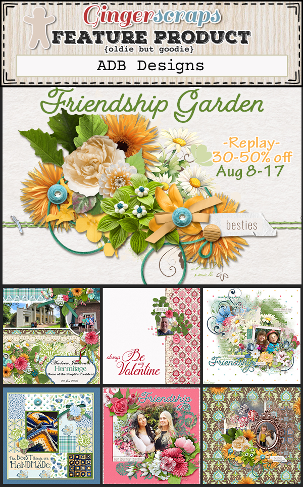
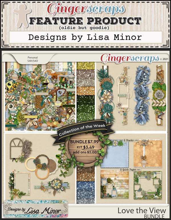
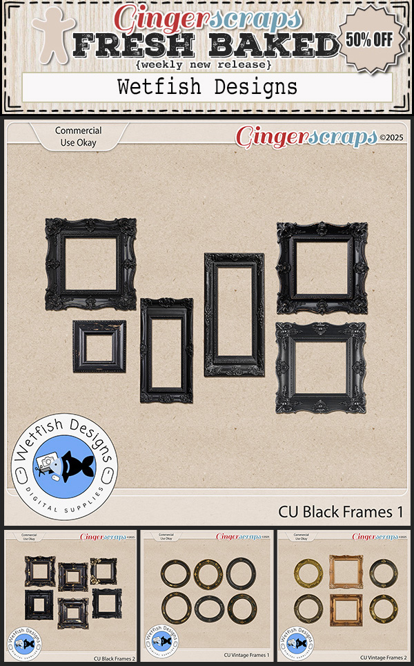
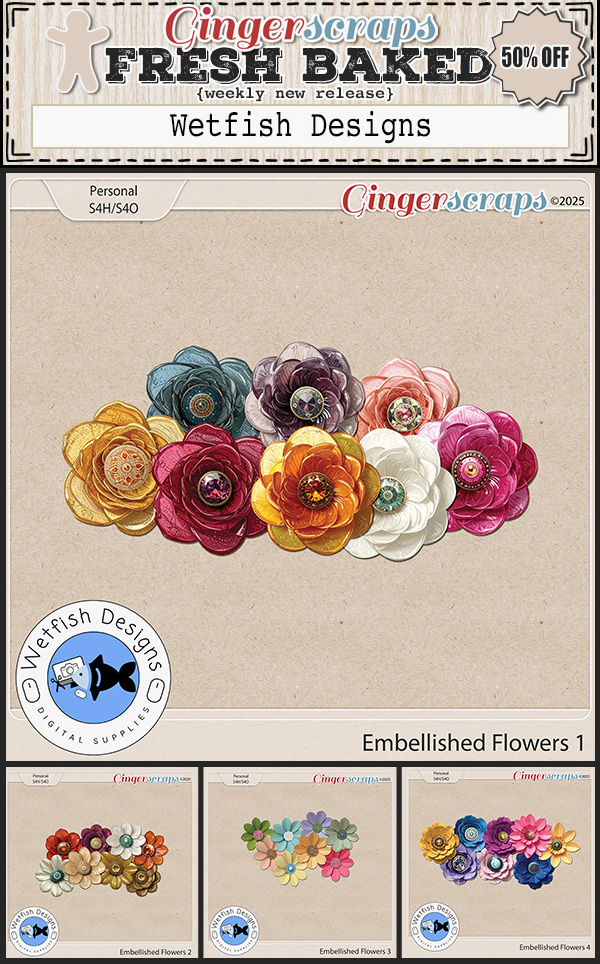
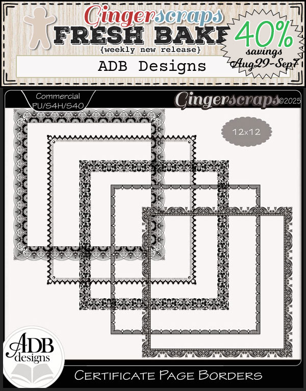
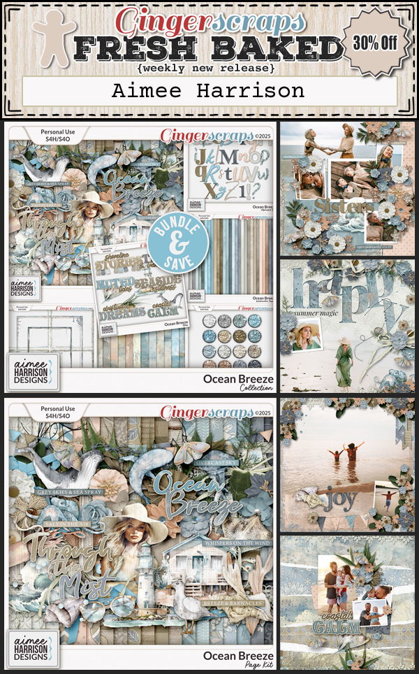
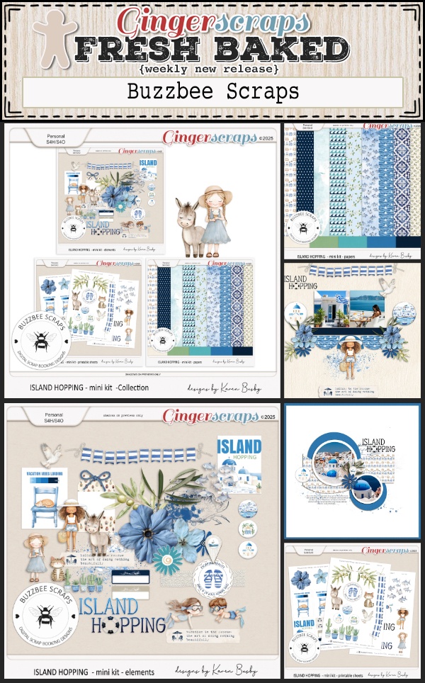
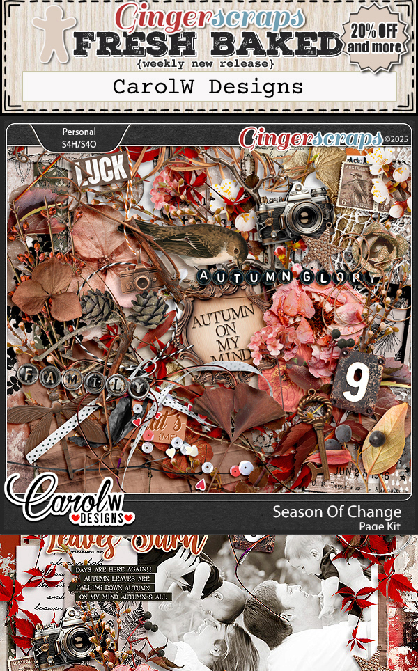
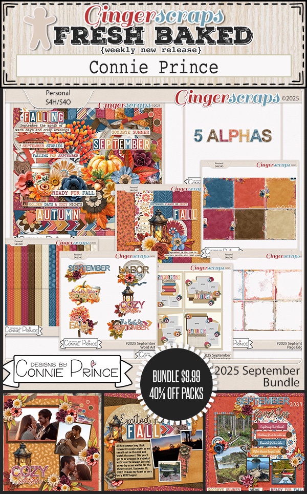
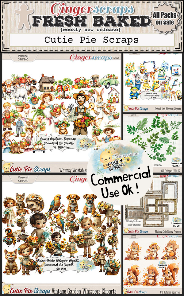
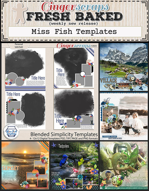
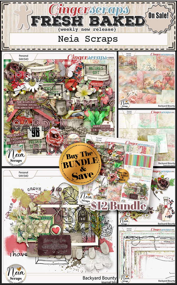
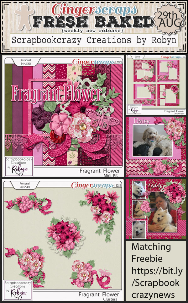
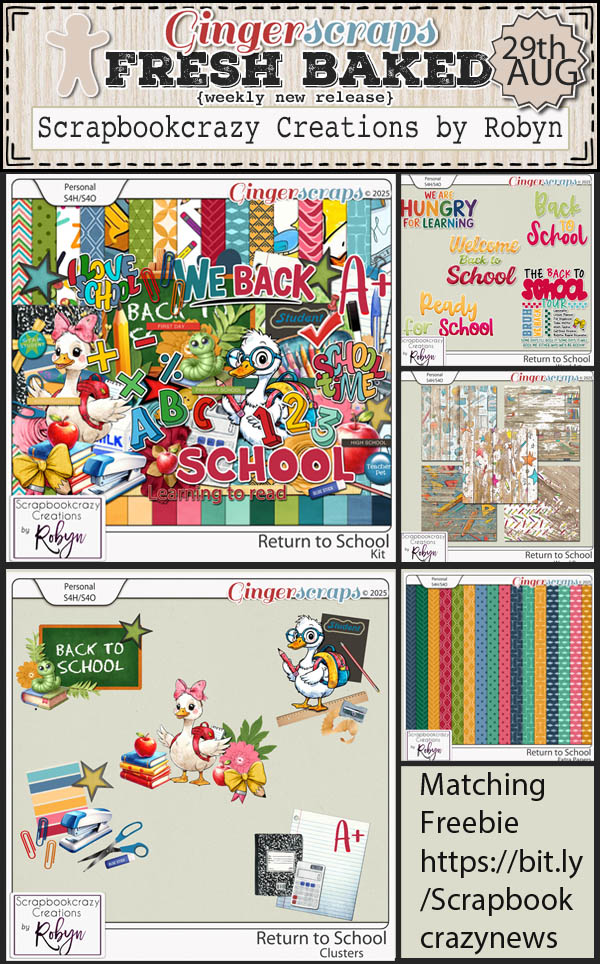
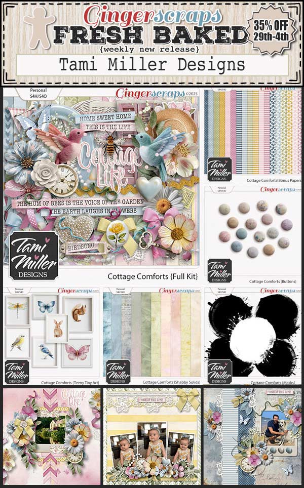
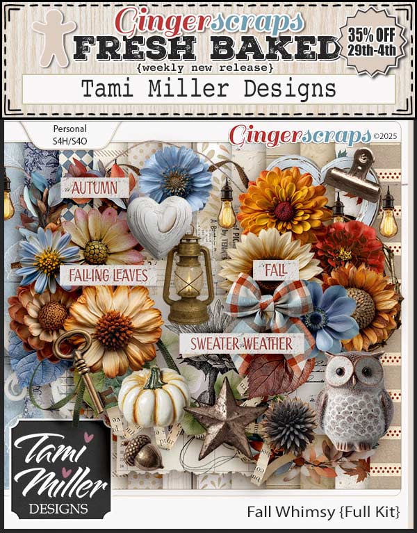
Let’s see what our designers have this week.

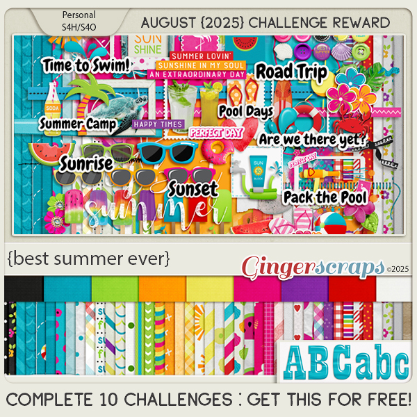
You still have a couple of days to get those challengest done and uploaded. If you complete any 10 challenges this month, you get this gorgeous collab (or a variety of other choices from previous challenge collabs) as a reward!
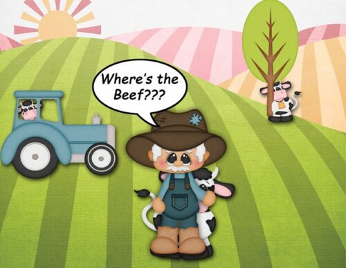
And as promised, a little sneak at some upcoming fun for the store and forum. You know when this little guy shows up, you are in for a fun time.