Guided Edit: Pattern Brush
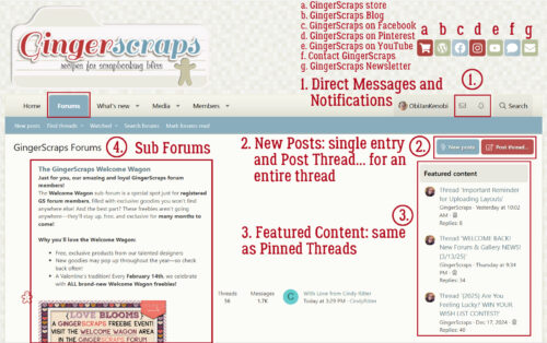
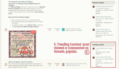
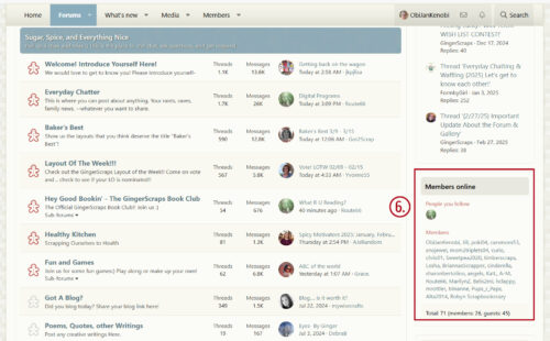
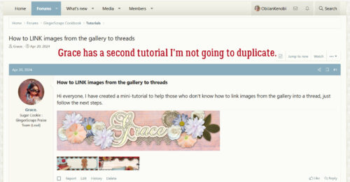
![]()
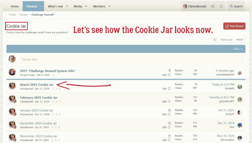
Today’s tutorial can be built upon in so many ways, and I’ll mention some of them at the end. For now, I’m going to show you a super-quick and easy way to make custom confetti for your layouts. I’ll be using two papers from Jumpstart Designs‘ Sweet Sweet Perfection in my example.
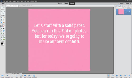
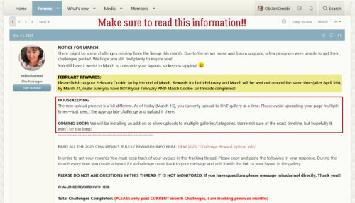
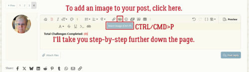
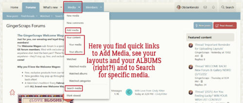
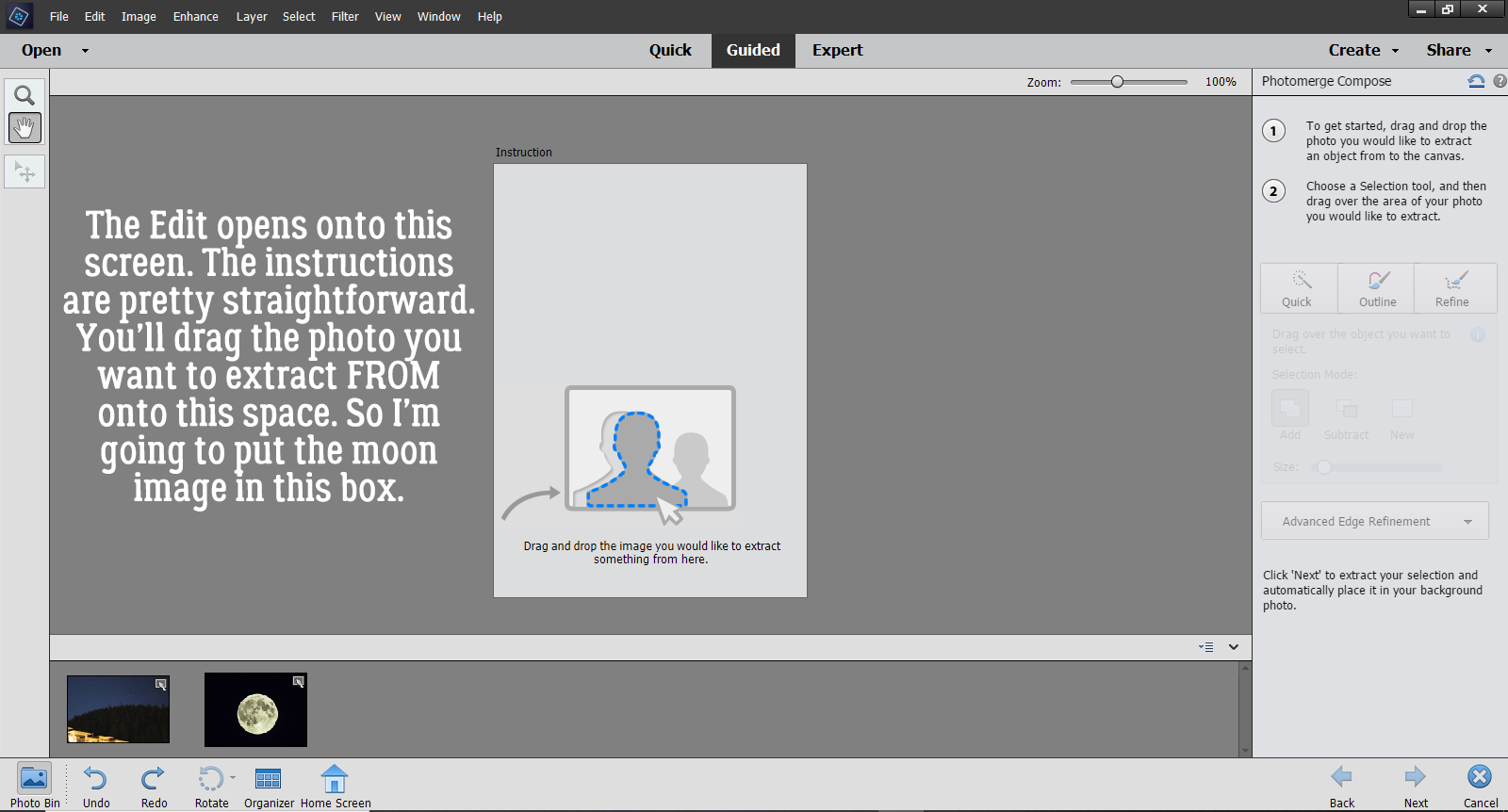
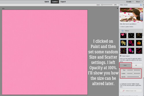
To use the Guided Edit, you need something on your canvas; it can be a paper or a photo. Then click Guided at the top of your screen, and choose Fun Edits. You’ll be looking for the Pattern Brush, which should be where the red box is below.
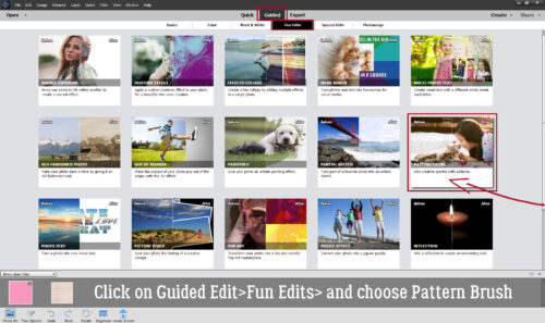
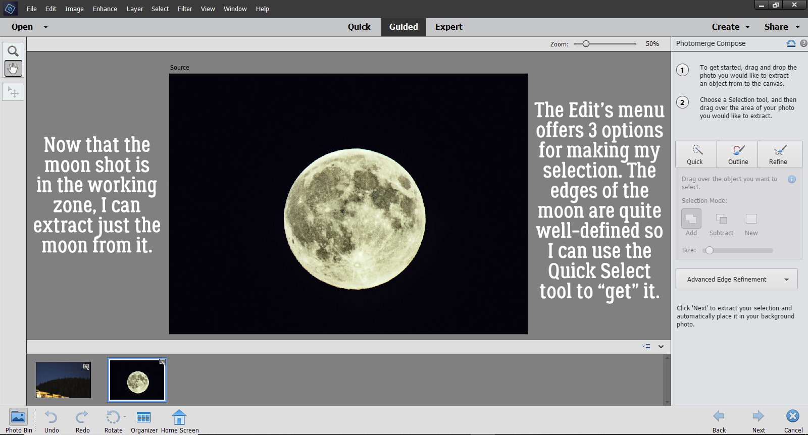
There are a total of fifteen Pattern Brushes to choose from; they all have potential for some fun looks. For right now, we’ll use the one that resembles bokeh, the first option of the second row of Brushes.
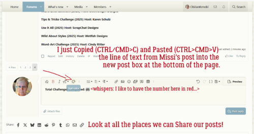
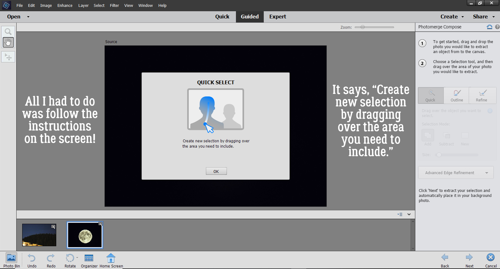
I clicked on Paint and just randomly moved the sliders around. You might want to play with the Size and Scatter settings.; remember you can always Undo [CTRL/CMD>Z] if it isn’t making you happy, change the settings and try again. For confetti or other element scatters, leave the Opacity set at 100%.
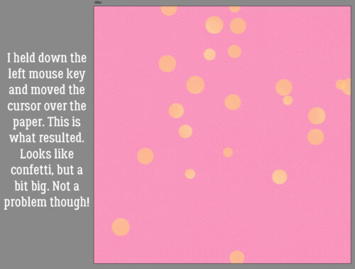
Then I proceeded as I would for any Brush, moving my hand in a random pattern across the paper.
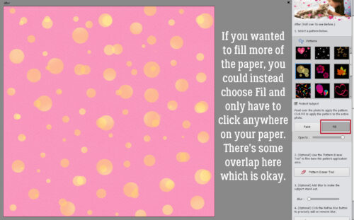
Just to show you the other option at this stage, I backed out to just the paper, and instead clicked on Fill, then clicked just once on the paper. This is what I got.
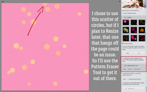
Trust Adobe to know some of us would be bothered by the ones hanging off the paper, and giving us a tool to make it better! The Pattern Eraser Tool can be employed to clean up your results however you choose.
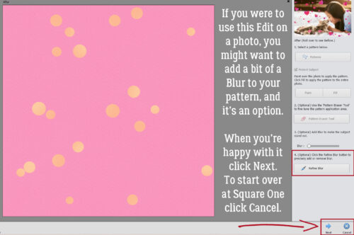
As I said above, this Edit can be used on photos to quickly add bokeh. If you find too much of the photo is obscured you can add some Blur to it. For confetti we don’t need the Blur, so when you’re happy with what you see, click Next.
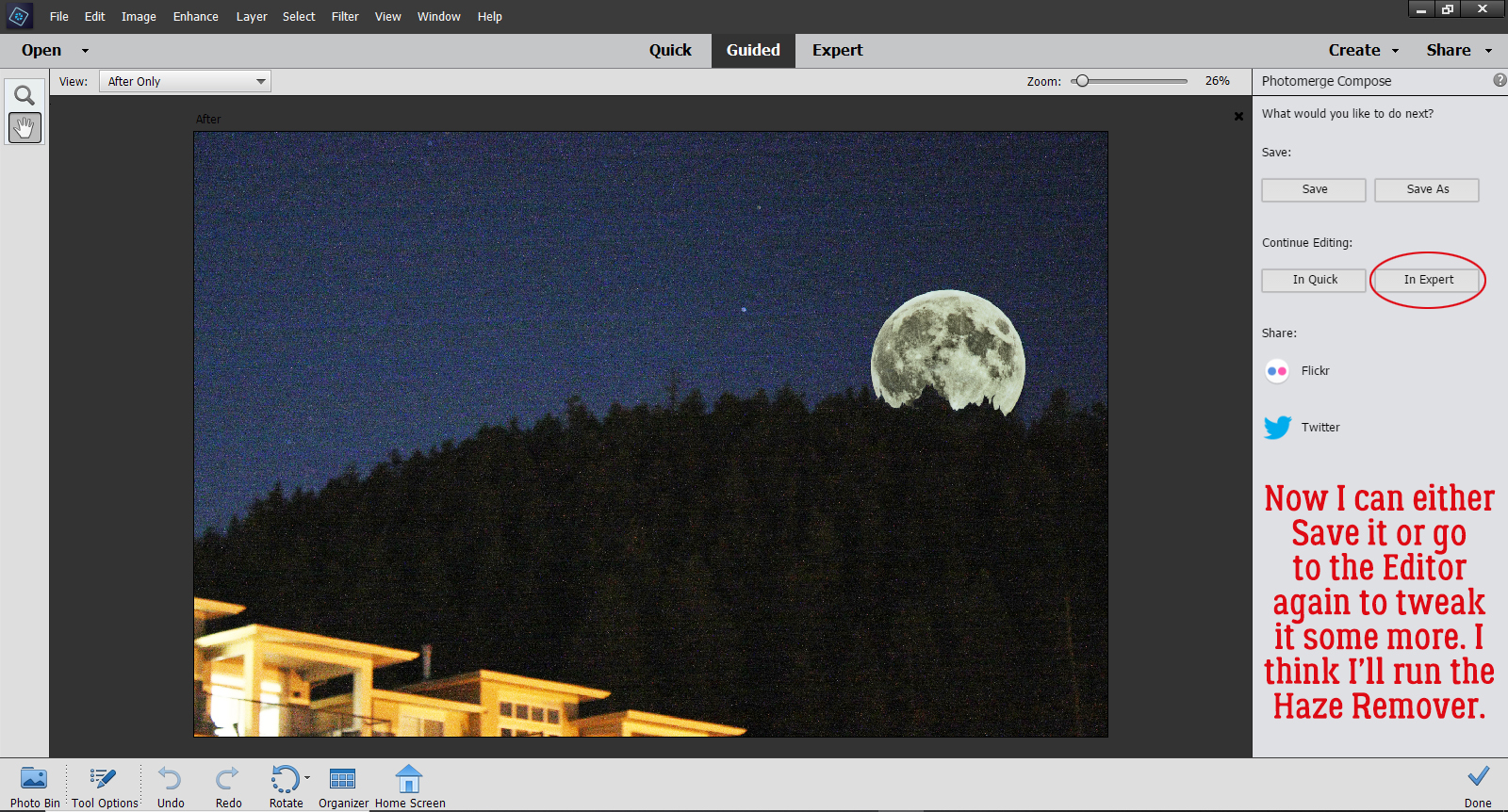
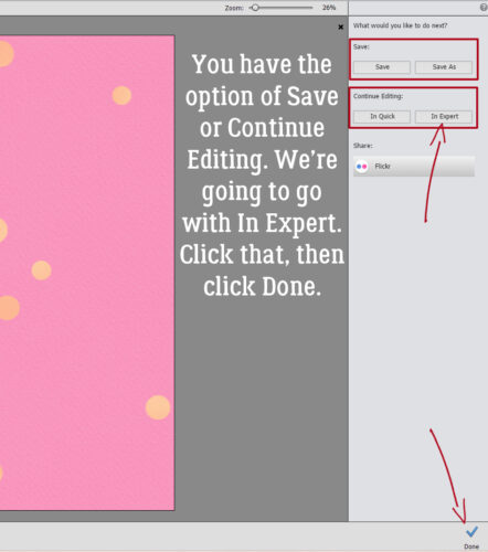
You’ll be whisked to this screen where you have the option to Save your work or to Continue Editing. Click on In Expert then click on Done.
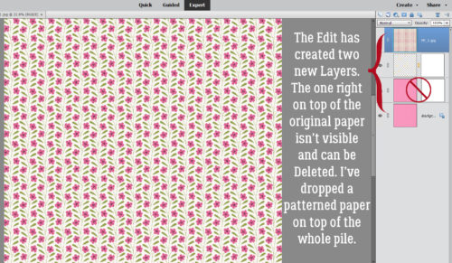
If you look at the Layers Panel, you’ll see that Elements has added two mask layers to the paper. The layer closest to the original paper layer isn’t actually visible, even if the Visibility is turned on, so go ahead and delete it if it’s in your way. I dropped a patterned paper from the same kit on top of all the layers.
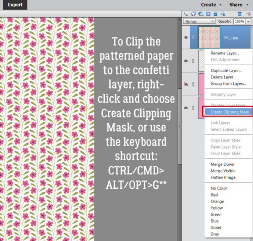
I think most of you know how to Clip papers to the layers below them, but I never assume… So if you’re new, right-click on the top paper layer then choose Create Clipping Mask. Or you can use the keyboard shortcut CTRL/CMD>ALT/OPT>G. **IF you’re using Elements 14 or more recent! If you’re using an older version your keyboard shortcut is CTRL/CMD>G.
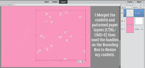
To Merge the patterned paper with the confetti scatter, click on the paper layer then hold down the SHIFT key and click on the masked layer. Both layers will be active. Then right-click and choose Merge Layers from the drop-down menu. Or you can instead use the keyboard shortcut CTRL/CMD>E. Once the layers are Merged, you can Resize by grabbing one of the “handles” at the corner on the Bounding Box and moving it in or out.
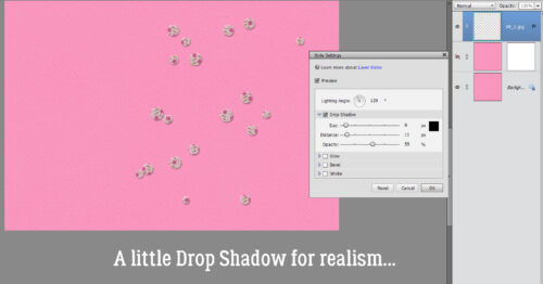
Pop a little Drop Shadow on the confetti layer to add realism.
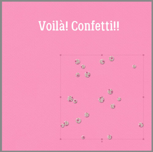
Simple!
Can you see using the Guided Edit>Fun Edits>Pattern Brushes for other scatters? You could use a glitter-gel Style on the hearts for bead-like hearts, a glass Style on the little starburst ones to create a gemlike look. What about a wire or metallic Style on the stars? I can see myself experimenting with this one a lot!
My sprained finger is still splinted, but it’s close to healed; the swelling is pretty much gone from the injured tendon. Still some stiffness and discomfort with flexing it, but a bit less every day. I never realised how much I use that finger when I’m typing!
![]()