Weaving – the Digital Way
![]()
PDF Version : https://bit.ly/428oL1i
Sorry to keep you waiting! When Ginger send me an idea for a tutorial that I really loved, I had no idea it would end up being much more complex than at first glance. I scrapped the first two attempts at making this a coherent process and I think you’ll find it’s not as bad as all the screenshots – and your faithful demonstrator – make it look. (However, this tutorial will require intermediate-to-expert familiarity with the Elements software.) It started with Ginger sending me a link to this layout by trinanne; she used this month’s brush and clipped her papers to it over and over. Of course, I had to take the long walk sown the garden path instead…

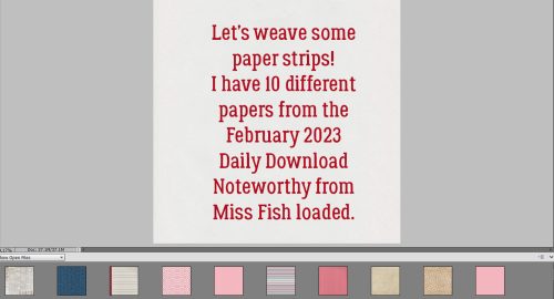
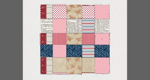
Now, obviously, if we’re weaving a bunch of papers or ribbons together, they’ll look best against a neutral solid background. I’m using 10 different patterned papers and a solid cardstock from the February 2023 Daily Download Noteworthy, from Miss Fish.
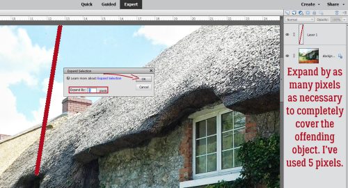
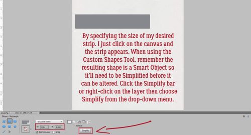
I decided it would work best for the way I was seeing this in my head if I created a bunch of paper strip Clipping Masks. If you’d rather use the Rectangular Marquee Tool to cut strips, that’s up to you. I want to have some variations in width, some crooked and torn edges, and one strip will have a deckle edge. (Instructions not included.) To make those individual features work best, the adjustments are made to the Mask to ensure the patterns on the papers aren’t distorted. I’ll be making a roughly 8 inch by 8 inch square, 10 strips in all. Here’s a tip: When using the Custom Shapes Tool you can specify dimensions and with only one click, you’ve got the desired shape in the desired size. I’m using a Width 8 inches, Height 1.5 inches for my first strip Mask.
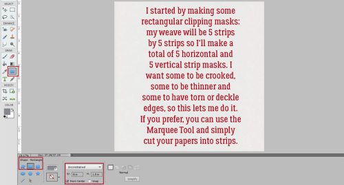
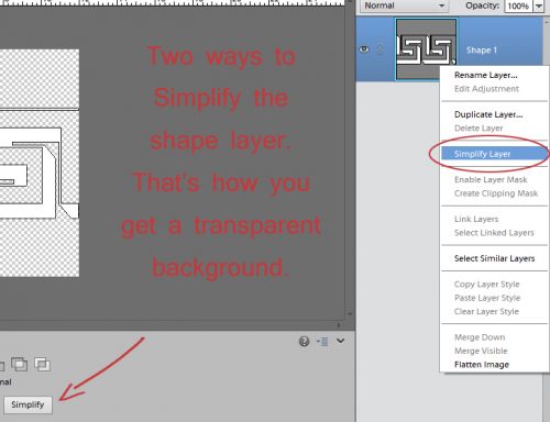
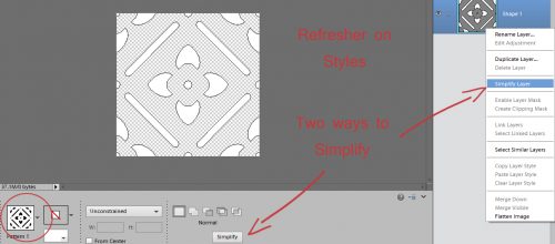
Don’t forget that when using the Custom Shape Tool, the resulting shape is a Smart Object – it’s locked and can’t be altered unless you Simplify it. More recent versions of Elements includes a Simplify button bar in the Tool Options. If your version doesn’t show it there, right-click on the layer and choose Simplify Layer from the drop-down menu that appears.
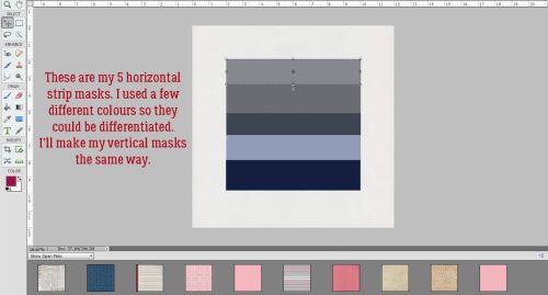
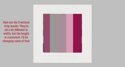
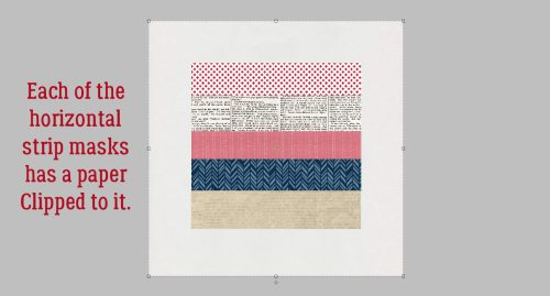
Here I’ve created all 5 of my horizontal Clipping Mask layers. I’ve changed the foreground colour a bit for each to help keep them separate in my mind. You can see there are some thinner and some thicker strips. Next I’ll make 5 vertical strips the same way.
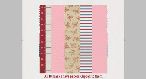
All 10 strips are there now. Let’s Clip some papers to them!
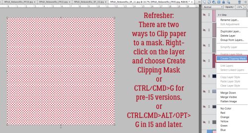
I know you all already know how to Clip papers to template spots but I’ll review anyway. With your paper right above the object you’re Clipping to, right-click on the paper layer and choose Create Clipping Mask. Alternately, you can use a keyboard shortcut. For versions 14 and earlier, CTRL/CMD>G will do it. For versions 15 and later, CTRL/CMD>ALT/OPT>G. My fingers just go there almost automatically now, I’ve used that shortcut so often.
Here are the 5 horizontal strips with their papers Clipped in place. The process is identical for the vertical strips.
Just like that.
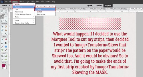
I’ll show you how to make them look a little less deliberate in the next few screenshots. Here’s why I opted for Clipping Masks and not just Marqueeing out a bunch of strips. If I decided to Image>Transform>Skew a paper strip, the pattern would also Skew and it would look awful. So instead, I’ll Skew the Mask, giving it crooked ends, and the paper will stay unblemished. Skew only allows the corners to move in a single direction.
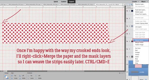
To make each paper strip more manageable, after I make my tweaks to the Mask, I’ll right-click>Merge the paper and Mask layers into a single layer. The shortcut is CTRL/CMD>E.
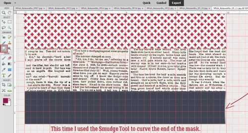
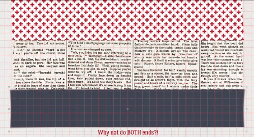
Here I’ve made a bit of a curved cut into the end of the Mask. The Smudge Tool will give that effect, or you could use the Elliptical Marquee Tool to Cut (CTRL/CMD>X) away a thin curved sliver. That method will give you a cleaner Cut.
Why not, indeed?
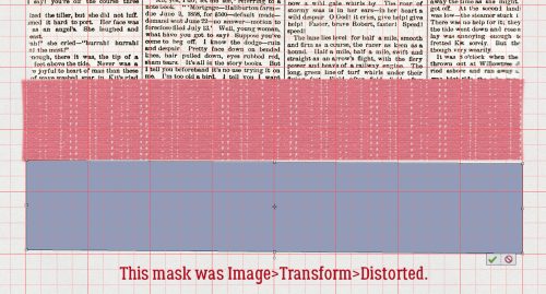
For this strip I used Image>Transform>Distort. With that command, each of the corners moves independently in all directions.
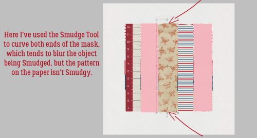
Another variation on the Smudge Tool.
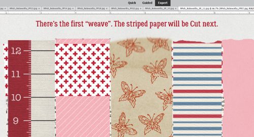
Now let’s get to the WEAVE. First you’ll need to decide which strip to start with. I’m going to skip the first vertical strip and pass the pink striped strip then the multi-striped strip underneath my red-and-white horizontal strip. I Selected the edges of the first horizontal strip by CTRL/CMD>clicking on the layer thumbnail in the Layers Panel. Then I made the pink striped layer my active layer. To make it look like it passed behind the horizontal strip, Edit>Cut or CTRL/CMD>X removes that Selection from the pink striped paper.
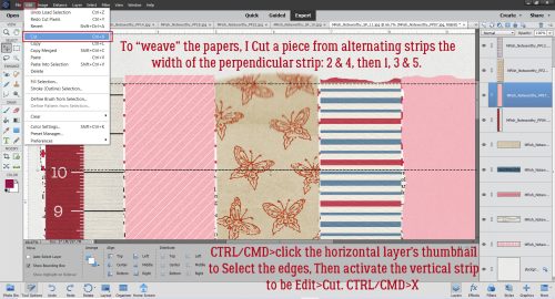
Alternate this process for each of the horizontal layers.
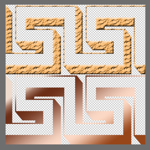
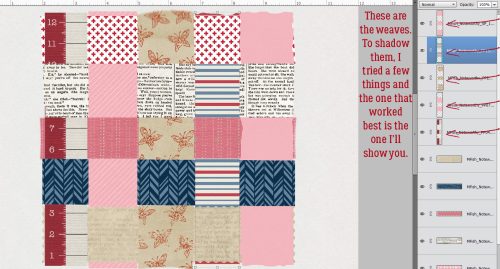
Here is what it looks like before the dimension of shadowing is added.
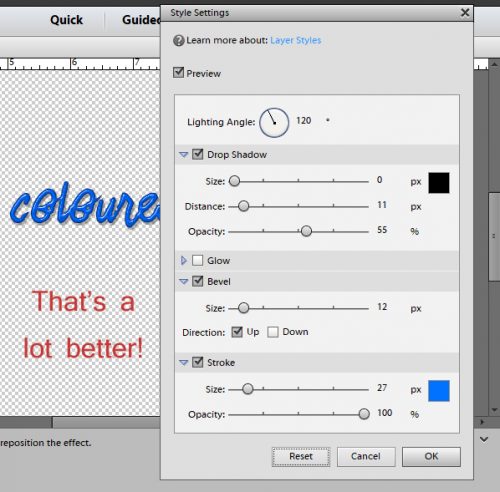
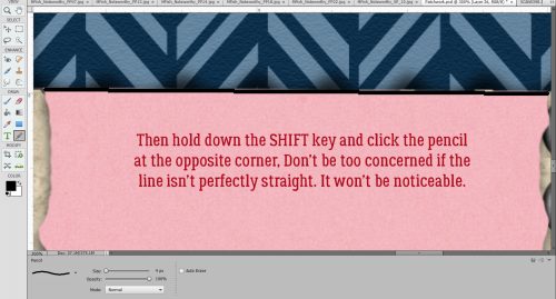
Add a new, blank layer at the top of the stack of layers. This is where you’ll put your shadows. Decide where your light source is. That will determine where your shadows will lie. I like my light to come from the upper left, at 120°. Because some of my paper strips don’t have sharp, straight edges, I created custom shadows for those layers. (Custom Shadows – Jan’s Method) If you’re going with straight edges you can ignore that. Instead, use the Pencil Tool. For the horizontal strips, you’ll be drawing in your shadows inside the edges of the paper horizontally. For the vertical layers, you’ll be drawing your shadows inside the edges of those papers vertically. The Radius for your Pencil lines can be fairly small, since the papers will be laying tightly together. I used 4 pixels but 5 or even 8 won’t be too big. Set your Foreground Colour to black (000000) Click the cursor right inside the corner of the paper square you’re working with.
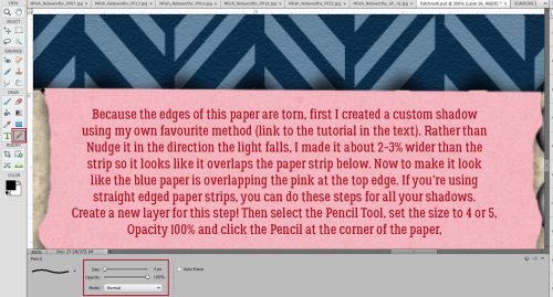
Then hold down the SHIFT key and click the cursor in the opposite corner. Here I’ve made a horizontal line. Don’t be too fussy about making it perfectly straight, because it’s not going to be noticeable later.
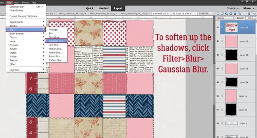
After you’ve got all your paper rectangles outlined in black, add a Filter>Blur>Gaussian Blur to that layer.
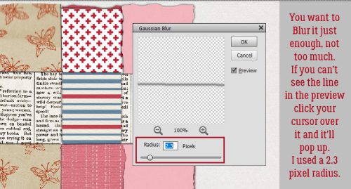
Don’t go overboard here. The Blur is to soften the lines, not make them blend right into the paper! If you can’t see anything in the Preview Pane, click your cursor in a spot where you know there’s a line. It’ll pop up in the Preview Pane and you can gauge how far to Blur. 2.3 pixels worked well for me.
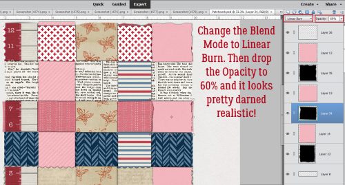
Last thing to do is to change the Blend Mode to Linear Burn and drop the Opacity to about 60% and it’s done! Now to decide how to use the weave…
You can Save this weave as a PSD to allow for alterations later, or as a PNG to preserve the transparent layer behind. Or you can just go ahead and scrap on top and around it.
Til next Tuesday!
![]()