Fun Fonts for Layouts about Kids
![]()
It’s been a while since I did a post about fonts. I didn’t really think there were that many more “types” of fonts to explore but Ellen (gmae) pointed out to me that there are categories I’ve overlooked. I have to tell you about this because it blew my mind totally. Ellen has created a spreadsheet of ALL the tutorials I’ve posted here – all 240-some – and made it sortable by a bunch of different terms. The amount of work she put in just boggles my mind! An unintended result of all her work is that she’s made some very important suggestions about where I could take you all next. One of those suggestions was to explore some fonts specifically suited to layouts about children. So I spent some time at dafont.com, looking at hundreds of fonts and selected this baker’s dozen along with five sets of dingbats I think you’ll like. (And while I was there, I came up with some new categories to share later!) Okay so let’s get a look at what I like. PS… each font name is linked to the website for one-click access. And they’re all FREE!
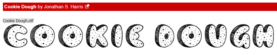
First up is Cookie Dough. What kid doesn’t love cookies (other than my second daughter)? This would be a great choice for a title or for some custom word art.
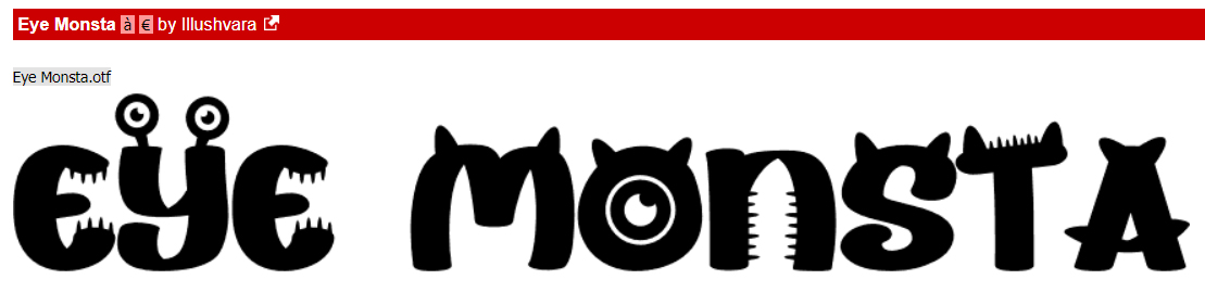
Eye Monsta made me think of my two grandsons right away, especially A-boy. J-man is more cerebral and a bit less inclined toward monster-like behaviour. It’s another title-suitable font but is legible enough that it could be used for both subtitles and journaling too.
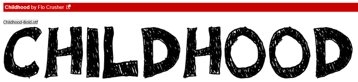
I like how solid Childhood is. It looks like it’s been filled in by a child and has a bit of grubby awesomeness too. Multi-use fonts are worth the download.
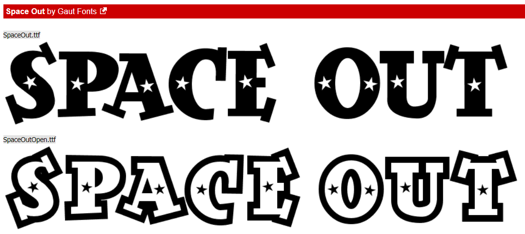
Space Out comes in two different styles. It’s another good title/word art font, don’t you think?
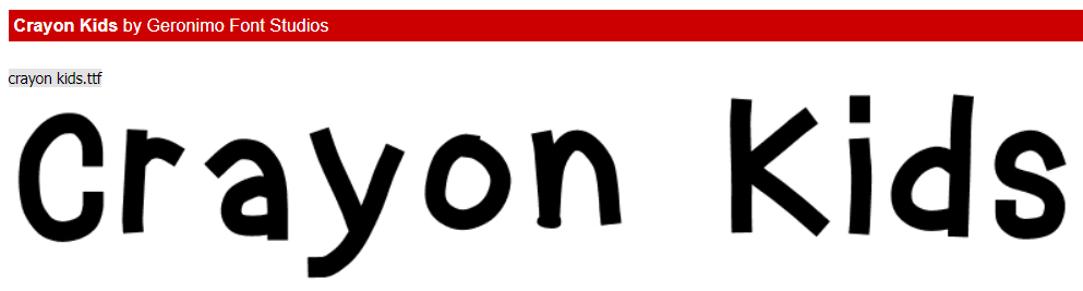
This font, Crayon Kids, looks like an older child was the writer. It can be fun for journaling and subtitles. It would also be a good choice for word art, when combined by a more fancy font.
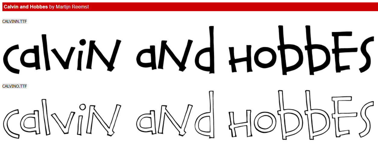
I LOVE Calvin and Hobbes!! Did you see the cross-over to Bloom County? An adult Calvin (click to view) is tracked down by Opus and it’s perfect!
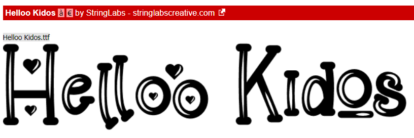
This cute font would make a good title, but is also legible enough for journaling. Helloo Kidos will be joining my collection.
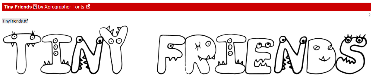
Tiny Friends is like Eye Monsta… very child-oriented and fun. And it has so much potential for creative alterations!
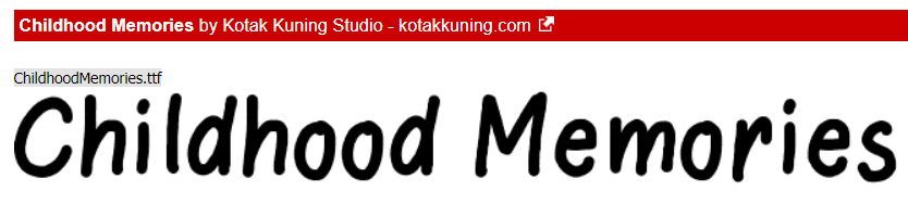
I think Childhood Memories looks like it was hand=printed by an older child/teen. Great choice for journaling.
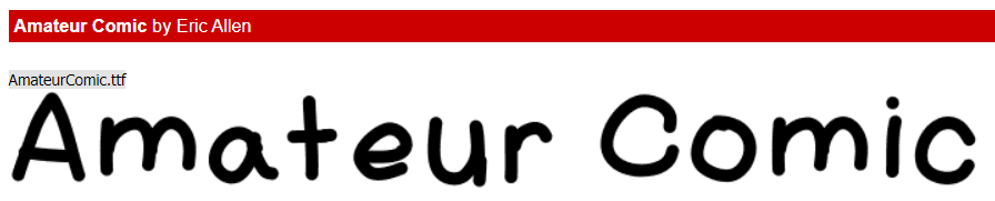
I like Amateur Comic for journaling too. It’s a bit less organized than Childhood Memories, but still easily read.
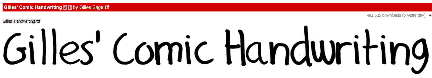
Another good font for journaling and subtitles is Gilles’ Comic Handwriting. It’s a nice blend of careful and a bit rushed.
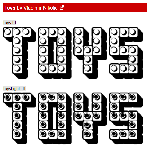
Who doesn’t adore Lego? Toys comes with four different versions and has a lot of potential.
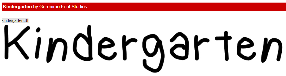
I think the name of this last font is totally appropriate. It’s Kindergarten!
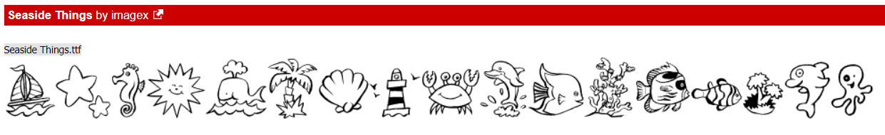
Now I’ve got some dingbat collections for you. What are dingbats? They’re accessed as fonts, but instead of letters, each character is a drawing. They’re really a lot of fun and have a multitude of possibilities. The first set is called Seaside Things. The drawings are child-like, but not necessarily childish.
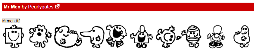
When my own kids were small, they all loved the Mr Men books. We had a box full of them and when I saw this set of dingbats, I was transported back to bedtime stories.
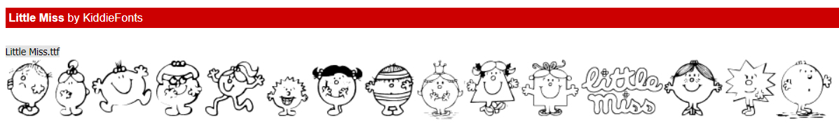
We can’t leave the girls out. Little Miss is a companion set to the Mr Men books and the dingbats too!
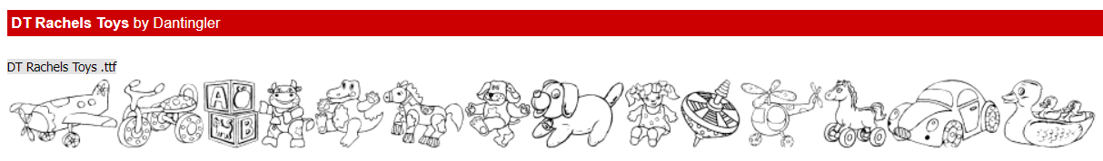
DT Rachel’s Toys is a bit more of a detailed set. I think there are a lot of ways these can be used.
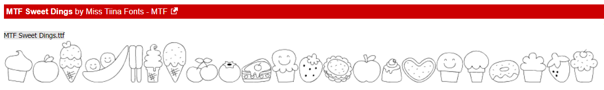
And our last dingbat collection is MTF Sweet Dings. They’re all so cute!!
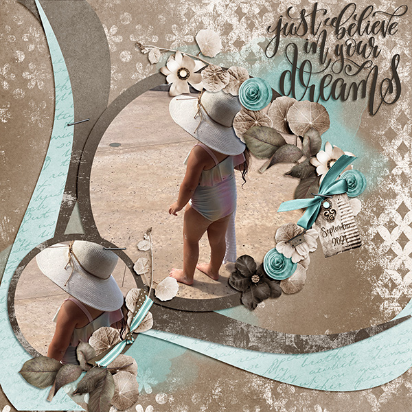
I’ve barely scratched the surface of the incredible choices you can find at dafont.com. There are other sources for free fonts too, if you’re interested. Next week I’m going to use two of the fonts and one of the dingbats to show you how to create your own word art. See if you can guess which ones. [Hint: I’m going to use it as a title for a layout featuring my granddaughter.] See you soon!
PDF Tutorial: https://bit.ly/3iBte7w