Happy March!! Spring is almost here!! Just a few more weeks! While you are waiting for warmer temperatures, spend some time scrapping with a few of this weeks new goodies!
From Lindsay Jane


From Tinci


From Carol W


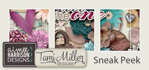
From Aimee Harrison


From JB Studio


From Jumpstart Designs