
Whoa… it’s August already! Who saw that coming? New month, new Designer Spotlight… Have you met Angie, the creative mind behind Down This Road Designs? Before we get to the Q&A part of this post, you need to know that Angie‘s ENTIRE STORE is on SALE for 40% off for the WHOLE MONTH of August!! (Guess where I’m going when I’m done here…)
Now let’s get to know Angie.
J: How long have you been designing?
A: I started designing in 2009. I have taken some breaks, but love it so much I couldn’t stay away. 11 years
J: What made you decide to design?
A: I just started playing around in Photoshop. When I saw a design contest in 2009, I entered that and ended up being a finalist, that was it….I was hooked.
J: What do you use to create your designs (program, additional tools, etc.)?
A: I use Photoshop, Illustrator and my iPad.
J: Describe your design workplace.
A: I have a desktop (Windows) with a dual screen. We have an office/ craft area in our home and that is where I spend my time designing.
J: What motivates and inspires you as a designer?
A: My life and the things we like to do, my family and my mood are the sources for my kit themes. I like to watch trends of colors too.
J: What is your favorite kit currently in your GS store and why?
A: I like With Brave Wings. I designed it for my sister and her battle with cancer so it means a lot to me.
J: If you could only eat one meal for the rest of your life, what would it be?
A: Pasta
J: What is your favorite game or sport to watch and play?
A: I would have to say football and soccer only because my kids played those sports. I don’t know if I would really consider myself a spectator of sports in general but a child of mine in the field keeps me very interested.
J: What did you want to be when you were small?
A: Teacher
J: Aside from necessities, what one thing could you not go a day without?
A: My family
J: Who would you want to play you in a movie of your life?
A: Reese Witherspoon
J: If you had a warning label, what would yours say?
A: Quiet but always watching.
J: What celebrity would you like to meet at Starbucks for a cup of coffee?
A: Tabitha Brown
And now we know Angie a wee bit better. But before I forget, make sure to check out Angie‘s Daily Download. It’s AMAZING!! I know you’re gong to love it, so just pop back here to the Blog every day and get your kit.
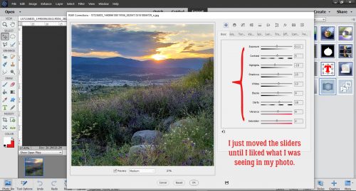
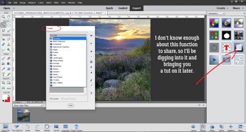
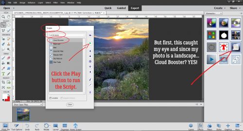
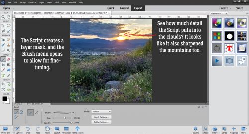
![]()