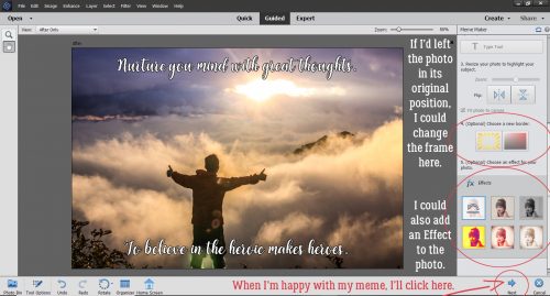
Building Strong Borders with Brushes
![]()
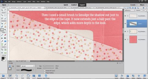
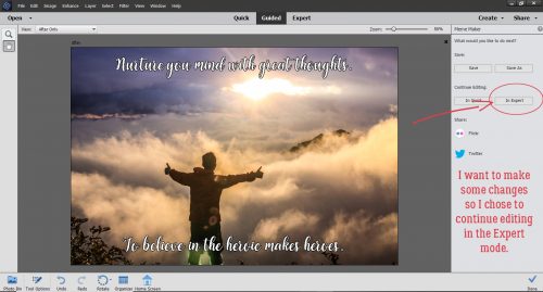
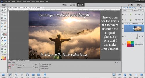
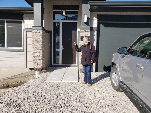
Woo hoo!! I’m BACK!! Did you miss me?? Our move went pretty well, despite the challenges of COVID-19 and all that entails. We’ve been in the new house a month and are gradually sorting out our lives, finding out how to get to the stores we like and settling in. The dogs have made meeting our new neighbours pretty easy – they don’t have any hesitation or social-distancing skills at all. Everybody has been very welcoming to both them and us. Getting down to work writing a new tut has made me feel more like myself too. So let’s get after it!
Awhile back I asked for some topic suggestions on the GingerScraps Facebook page. This is one of those, from Shana, who asked for some tips on using brushes to create custom borders for her layouts. This might not be what she was expecting, but here goes!
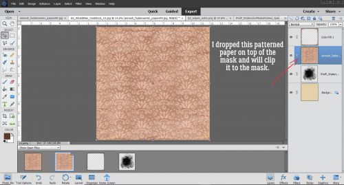
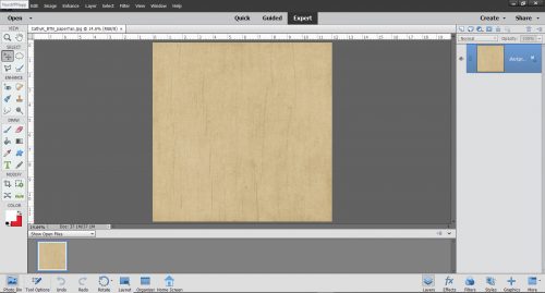
The area around our new house is quite natural and there are so many wildflowers in bloom right now, so the concept for this border will build on the photos I’ve taken in the last month. I went through my stash and found a kit that will work beautifully with them, it’s CathyK Designs‘s Back to Nature. This solid paper is from the kit.
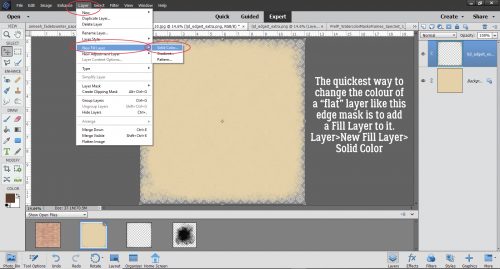
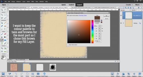
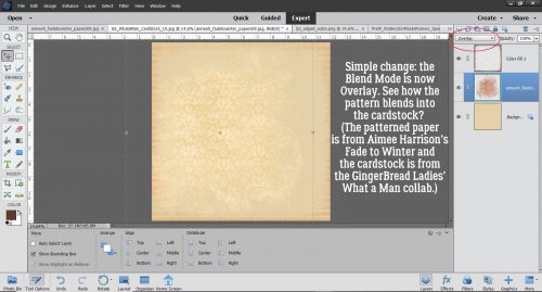
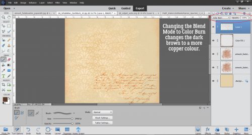
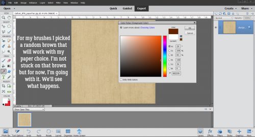
The colour I chose for my brushes is a medium brown. Don’t be too concerned about the colour choice you make, because changing the Blend Mode later might give you something unexpected, or you can always change it to something you like better later.
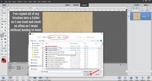
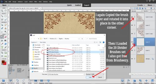
When I set up my “new” laptop several months ago, I discovered that I’d forgotten how to keep my brush library built in to Elements 2019, so I’ve changed my workflow with brushes, only loading the ones I want to use. Not sure how to load brushes? Click on the little icon that looks like 4 short horizontal lines at the upper left of the Brush control menu. Then select “Load Brushes“. Click on the set you want to add then click on Load. I put all of my brushes into a dedicated folder so I don’t have to hunt for them.
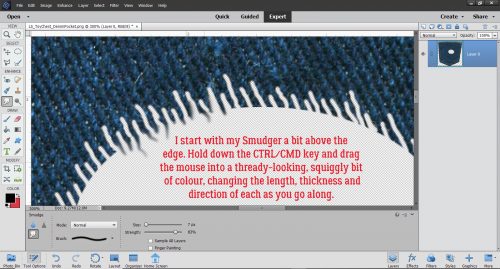
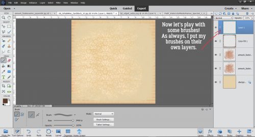
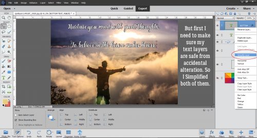
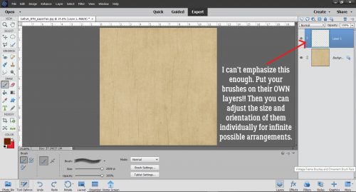
I might sound like a broken record, but this is VERY important. ALWAYS put your brushes on their own layers! If you forget and put the brush directly on the layer you’ve got active, there’s nothing you can do with it other than Undo. On their own layers they become “Smart Objects” and can be manipulated in many ways.
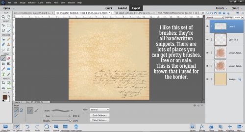
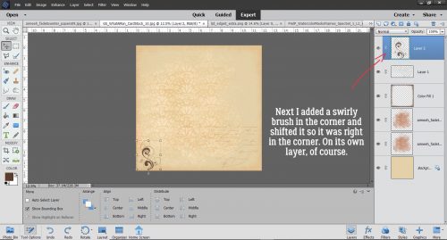
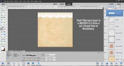
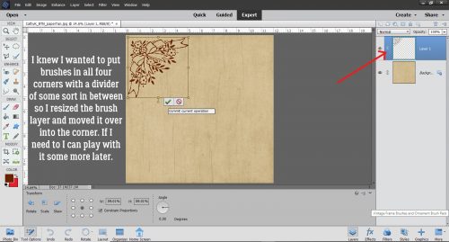
Because I put them on their own layers, I usually make them as big as possible, and then size them to fit my vision. I downloaded this set of free floral corner brushes from Brusheezy.com which is one of my favourite sources for free goodies.
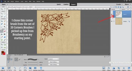
I then positioned and sized my corner brush to be slightly less than 1/4 of the available area.
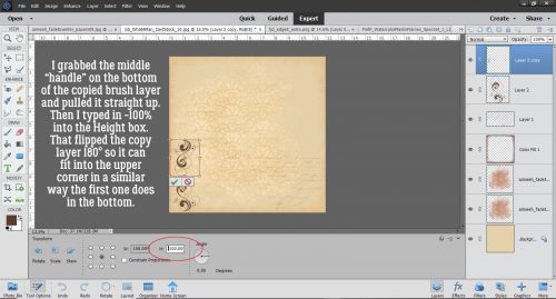
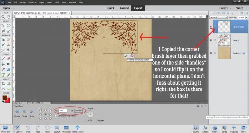
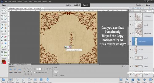
Then I made a Copy (CTRL/CMD>J) of the brush layer, grabbed one of the side “handles” (the little open square on the bounding box) and flipped the whole brush horizontally. I used to make myself crazy trying to get the exact dimensions with my mouse as I worked, but soon figured out that it’s much easier and more precise to just start the process, then tell Elements what I want! The Transform menu, which activates when you start the flipping process, has boxes for both height and width, so you can type in whatever you want there.
I decided I didn’t want to have upside down bows on my layout, so I went with a different corner brush for the ones on the bottom.
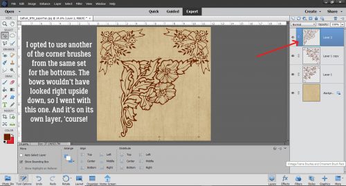
This one I just rotated 180°, resized and slid into place.

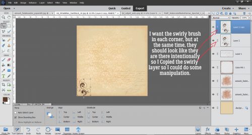
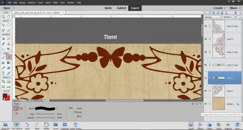
Another Copy, Rotate and slide for the opposite corner and it was time to tie the corners together. For this task I used a set of floral divider brushes I also got from Brusheezy.
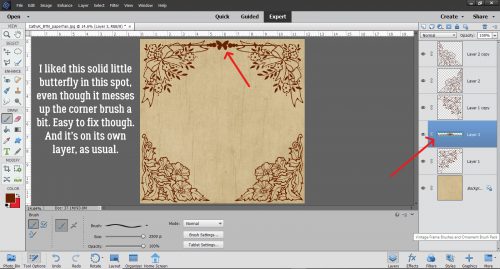
I liked the look of this butterfly divider, but didn’t like that it messed with the bows at the corners. That’s easy to fix, and because it’s on its own layer, I won’t be mangling anything else.
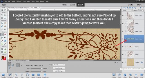
I wasn’t sure if the butterfly would work at the bottom, but just in case, I made a copy of the layer before I altered it in any way.
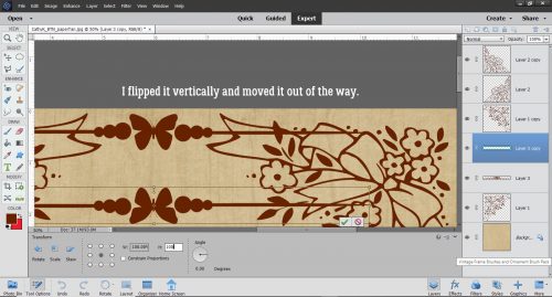
I flipped the second butterfly layer vertically, moved it out of the way and then turned the visibility for it off.
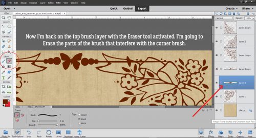
Using the Eraser tool on the original butterfly layer, I erased all the areas that impinged on the corner brush layers.
Like that!
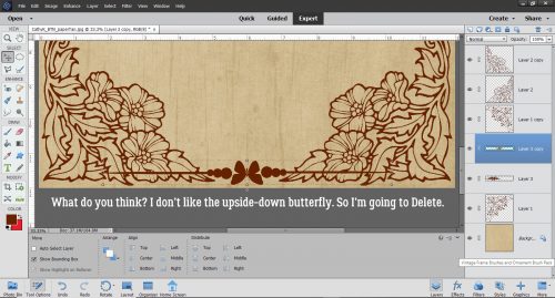
On to the bottom of the paper. Mmm. Nope. Upside down butterflies don’t work any better than upside down bows. I turned that layer off for now but it’ll be deleted.
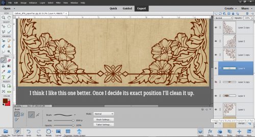
I picked this divider brush from the same set and it works much better. Just had to remove the parts that overlie the corner brushes.
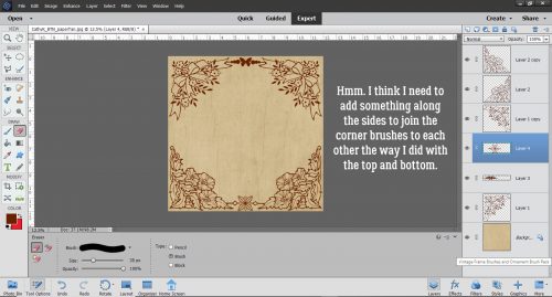
But….. it needs to be tied together at the sides too.
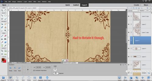
I like this divider brush, also from the same set.
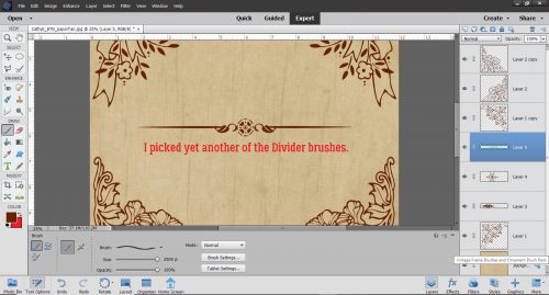
It needed to be rotated 90° to work with the corners.
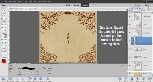
This time I didn’t need to have the brush where it was going to live to erase the extra stuff.
It fits in the gap so neatly!
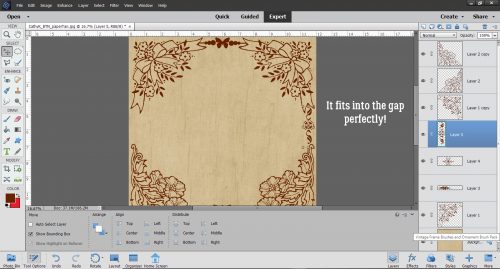
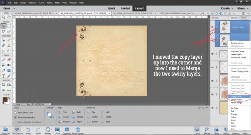
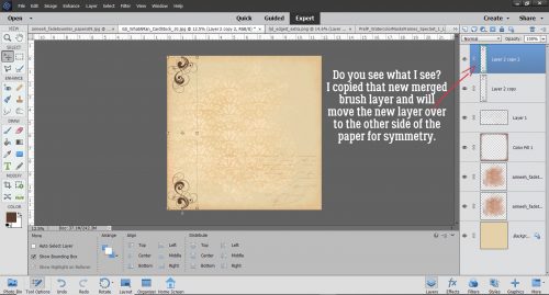
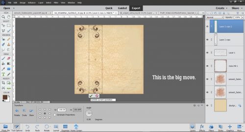
I made a copy of it and flipped it horizontally to slip it into the other side.
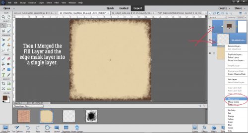
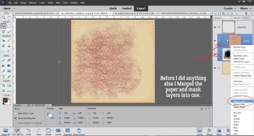
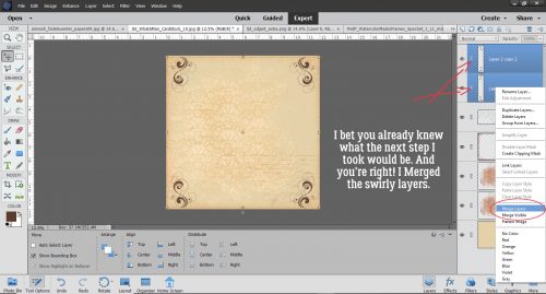
Once I was happy with where everything sits and how it looks, I went ahead and Merged all the brush layers into one piece.
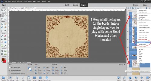
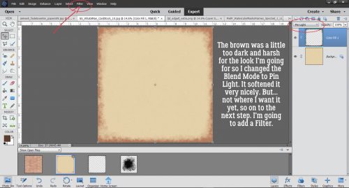
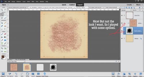
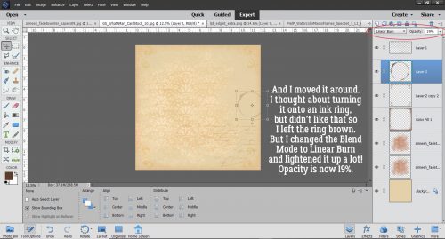
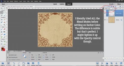
Now for the really fun part! I actually tried ALL the Blend Modes. Some of them turned my brown border to a beautiful red, but that wasn’t in keeping with my vision. I decided I liked Darker Color.
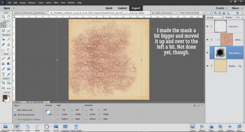
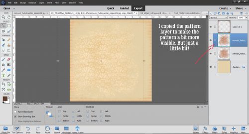
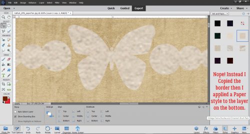
But instead of playing with the Opacity, I copied the border then applied a paper style I bought at Creative Market to the bottom layer.
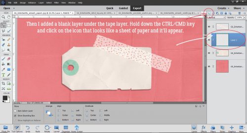
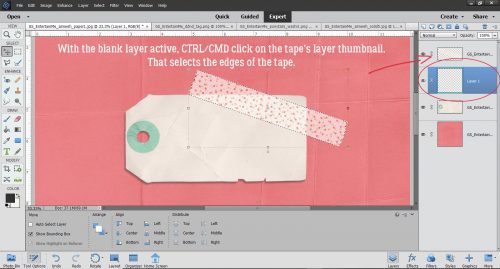
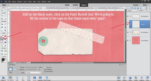
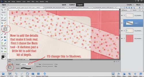
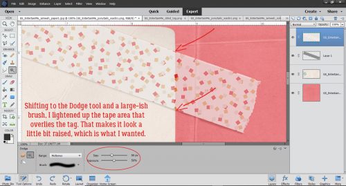
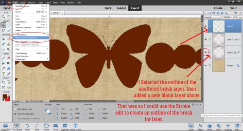
After some experimenting I realized I needed to put a thin stroke around my upper brush layer, and the reason for that will become apparent in a minute. I put the stroke on its own layer too. To do that I added a new blank layer above the brown brush layer, then clicked on the thumbnail of the border layer to Select the outline. Applying the Stroke to that selection on the new layer gives me a perfect outline of my border.
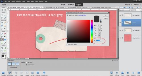
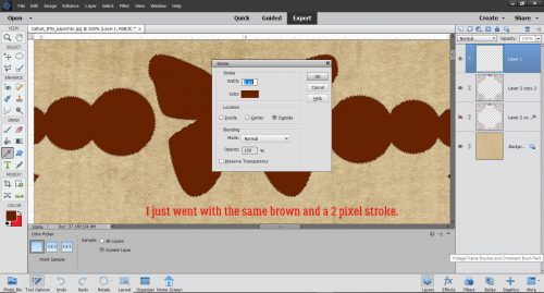
I used the same brown and went with just 2 pixels’ width, applied to the outside of the selection.
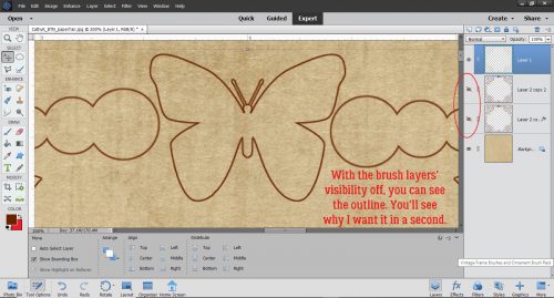
Just like that.
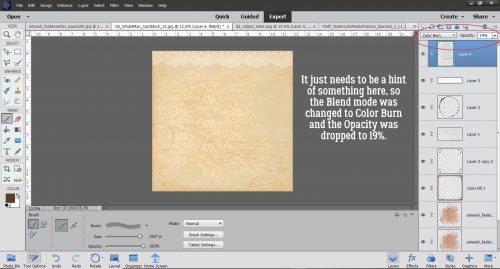
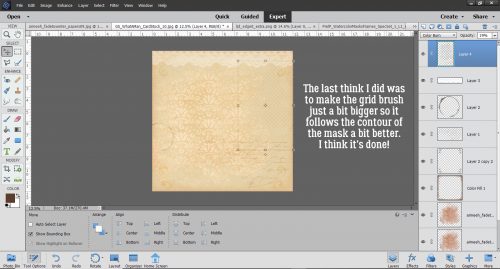
I turned visibility for the layer I added the paper style to off so I could concentrate on what was happening to the brown layer. I changed the Blend Mode to Soft Light and like it a lot more.
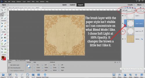
It looks so different, but it’s pretty good!
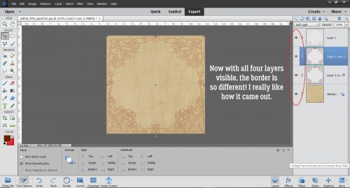
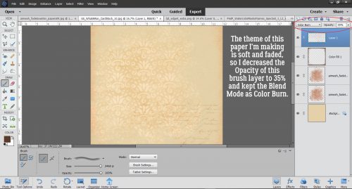
Once I brought the Opacity down to 85%, I could see a hint of the paper texture and the border looked more like it belongs on the base layer. I like the way it came out, so I saved it both as a .psd (with editable layers) and a .jpg so I can use the paper for my layout.

Hopefully I’ll have time to get my layout together soon so you can see the full effect!
![]()