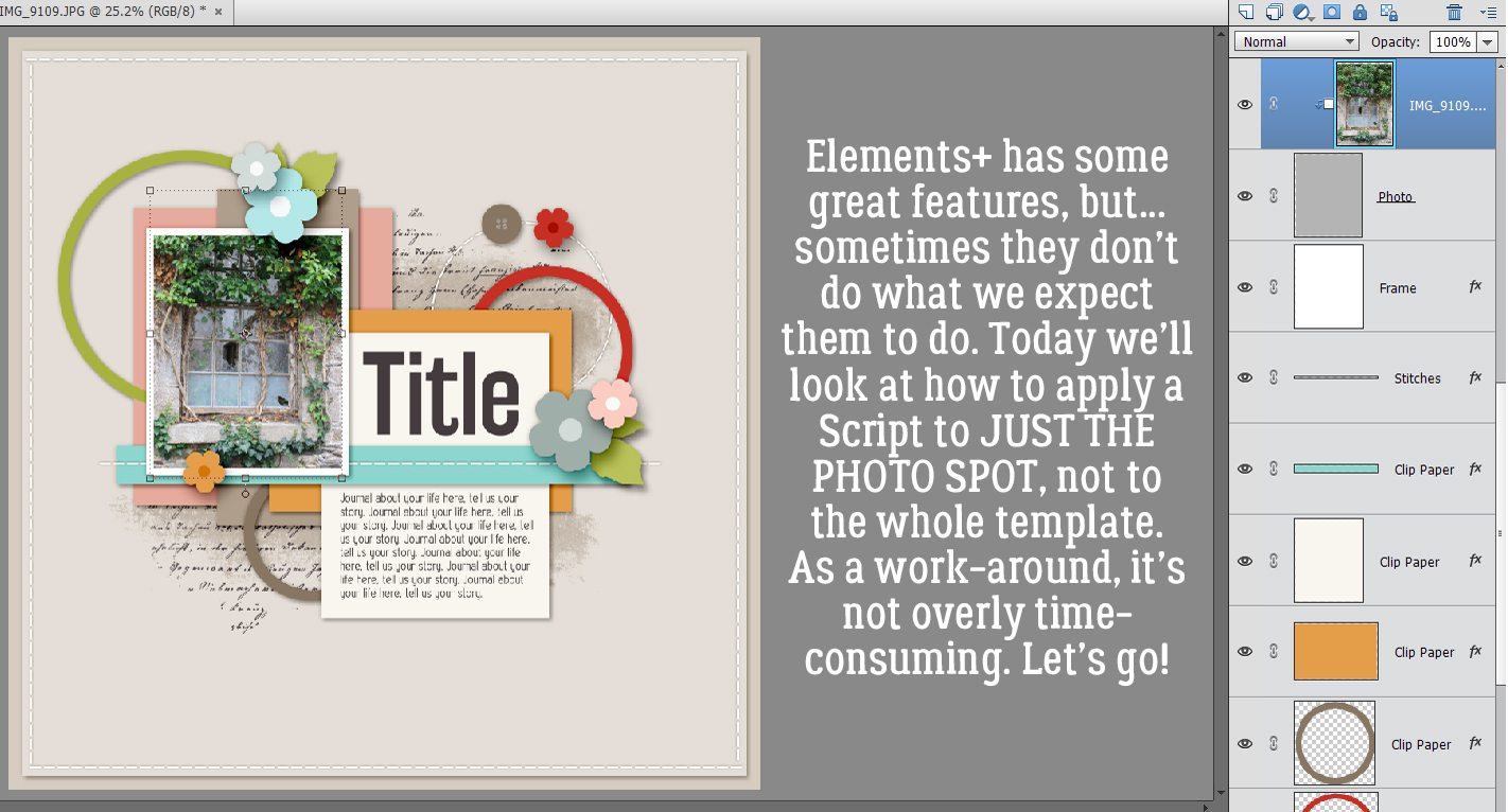
Jumpstart Your Layouts!
![]()
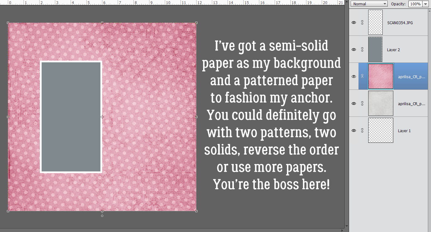
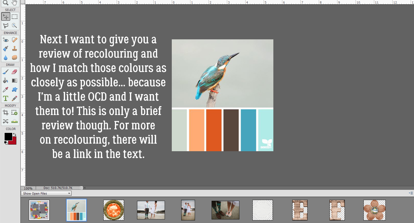
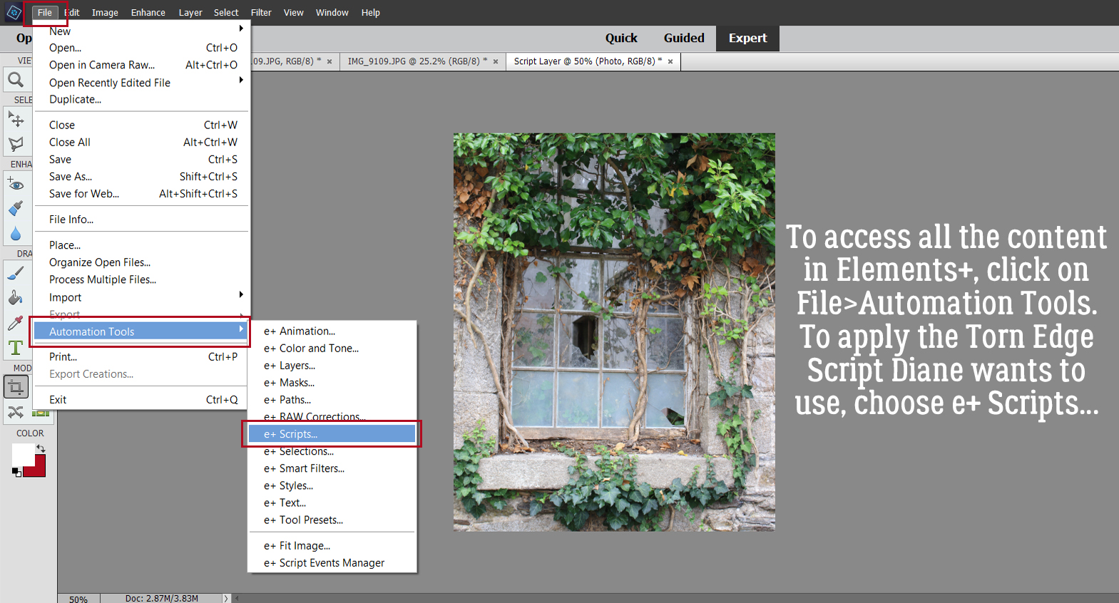
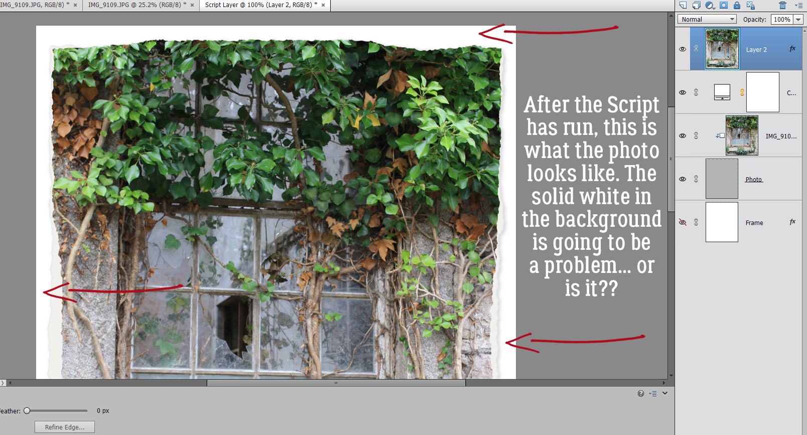
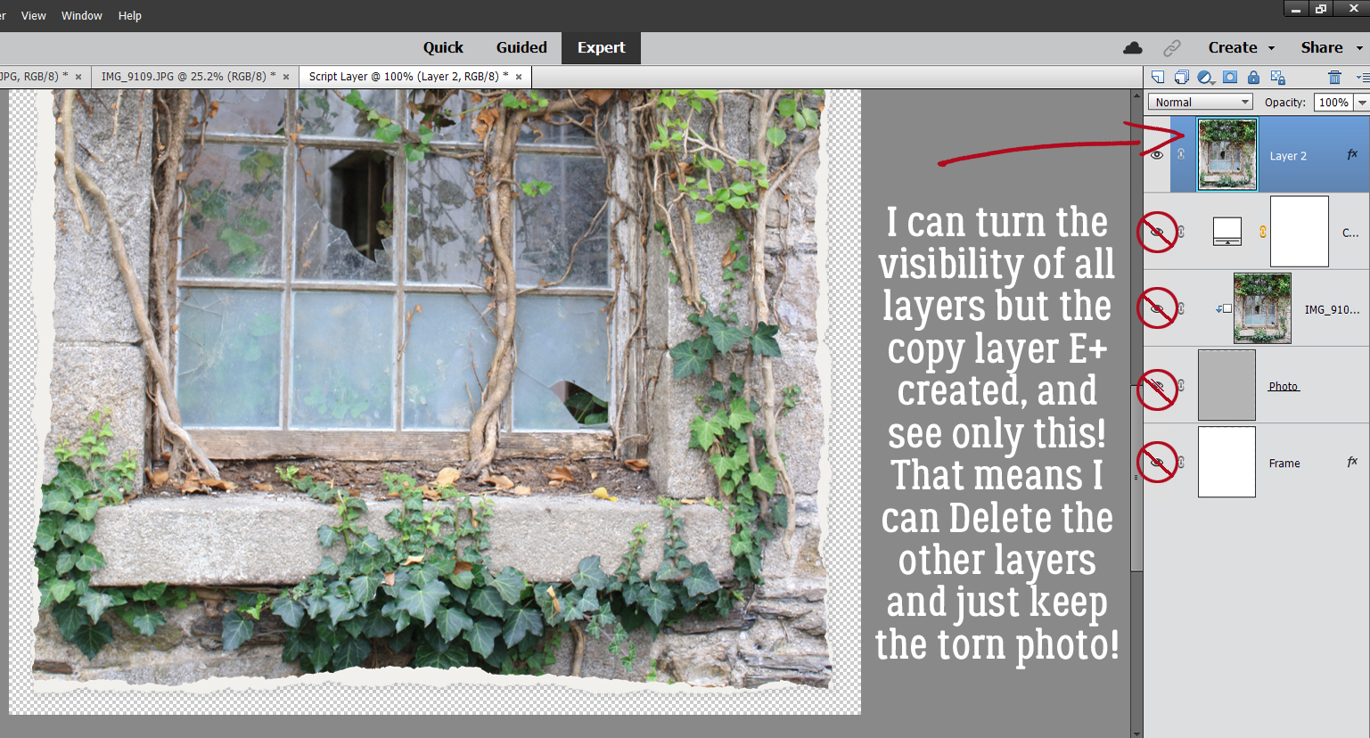
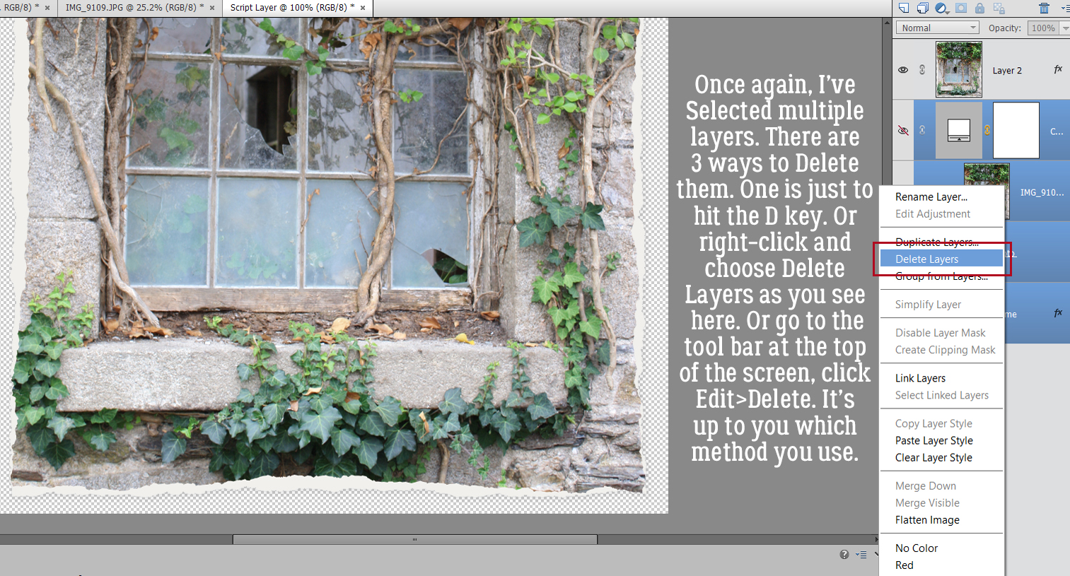
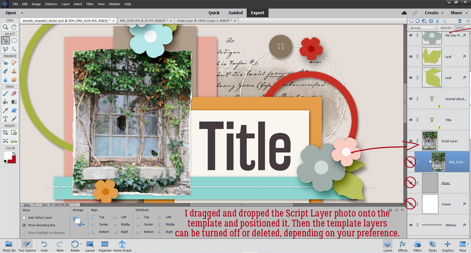
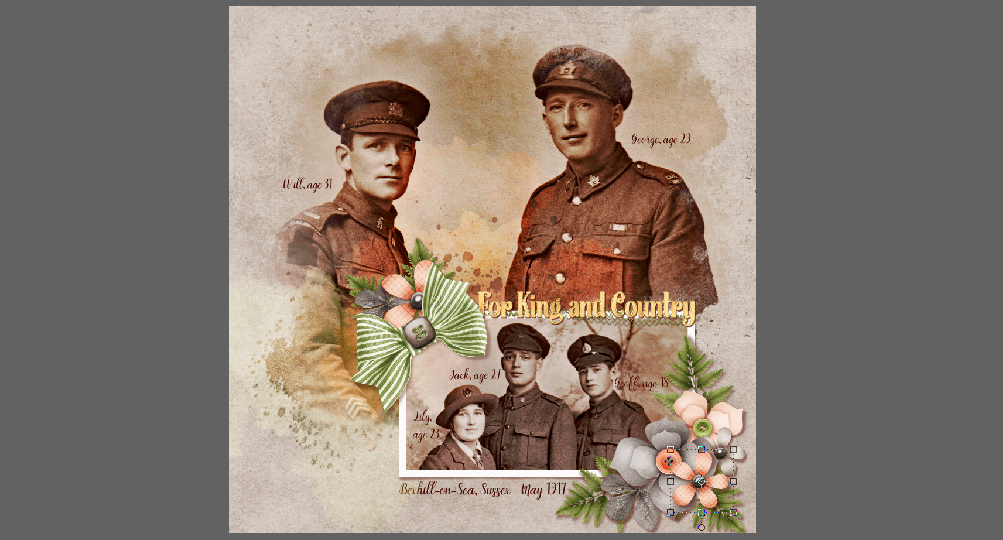
So how many of you are Challenge fans? If you aren’t, you should be!! The GingerBread Ladies designers are incredibly generous with their talents both through their participation in the GingerBread Ladies‘ collaborations: Monthly Mix, Free-with-Purchase and Challenge rewards, and within the Challenges themselves. Did you know there are freebies included in several Challenges EVERY month? Brushes, templates, word art, mini kits, add-ons – so many gifts!! Sheri, whose design handle is Jumpstart Designs, provides a mini kit every month in the Jumpstart Your Layouts Challenge (although these minis are the same size as some designers’ full kits…) and they’re amazing. I posted my JSYL Challenge layout to the thread in the Forum and couldn’t help but notice how every scrapper’s layout – using the identical collection of supplies – looked SO different. So I thought we could talk a bit about how we all have such individual approaches to creativity.
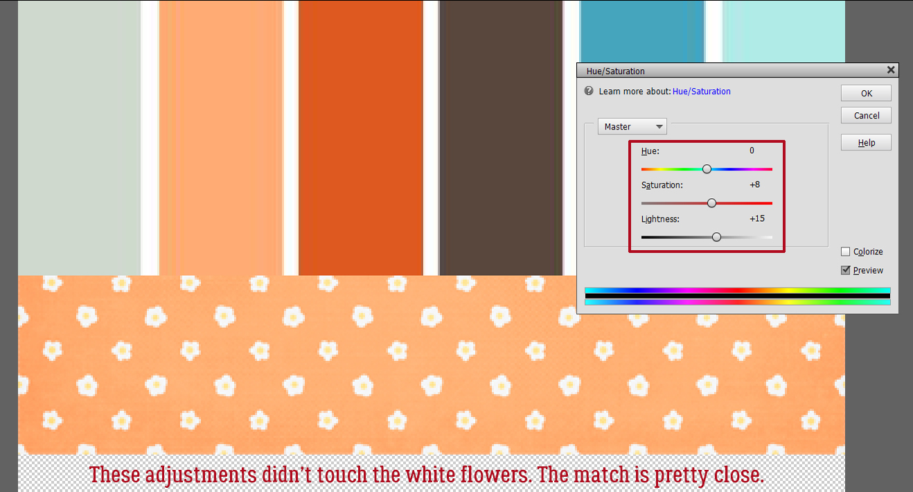
This is the preview for the Jumpstart Your Layout Challenge. Like all of Sheri‘s kits, the colour palette is versatile, it’s a bit grungy, a bit pretty, a bit sophisticated and 100% awesome.

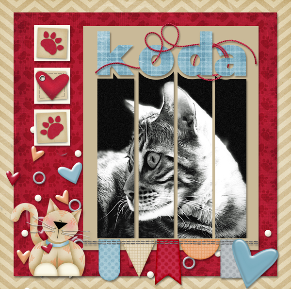
A-M chose to use only the cream and brown parts of the kit. Her layout is simple, but eye-catching. Having a black-and-white photo as the centerpiece was genius.
Breoni too chose mainly the neutrals, but added a couple of aqua pops… which are the perfect accompaniments for her photo. Her positioning of the metal tag and ribbon element frames her face and really leads the eye to her photo.

In keeping with the mostly cream background, next up is this beauty. What makes this layout by nimble4u truly stunning is the way she’s used her photo. She embellished with restraint and the sentimental feel of the photo is the star of the show.

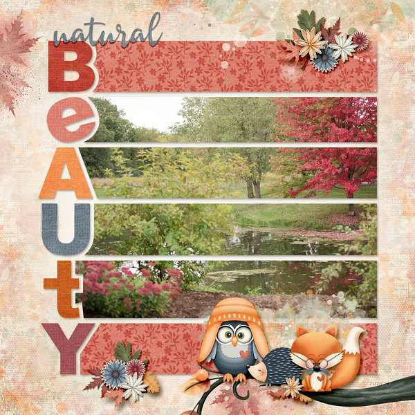
Roxana has added a bit more of the aqua to her layout. The large word art is perfectly displayed against the aqua paper and the photo she chose adds a bit of whimsy. I think she’s used every single item in the kit as well, even though it’s not a requirement.

Kristal’s background is also mainly cream, but with some taupe details that adds to the seaside impact of her photos. Masking the boat photo with some aqua behind it makes it look like the water continues outside the photo. Genius!

Maskyra used the papers with such panache! The grungy, rubbed, torn and splattered background is a masterpiece! Her layout is a bit of a segué from mostly neutral/cream background into more colour detail.

This layout by beckturn moves us to an aqua background with a beautiful tear revealing the shades-of-brown striped paper behind it. I love the way she repeated her heritage photo with a tighter crop on the girls’ faces.

What immediately caught my eye about jcfdelaware‘s layout is the undulating anchor behind her photos. With aqua paint behind all the brown paper hexagons, it moves the eye across the page. and the large word art tucks into the lower left corner so neatly.

LisaCampbell‘s layout doesn’t really use a lot of aqua elements, but it “reads” as an aqua background, thanks to the curved paper cuts and aqua paint wrapping around her photos. (
Alasandra‘s layout just screams HAPPY to me! The aqua elements pop right off the paper.

I love how Pippin has turned her photo to sepia and makes it look like it grew out of the paper behind it. The dark brown border draws the eye, the bokeh leads it to the photo and the clusters keep it moving.

This layout is so perfect in every respect! It’s from the creative mind of kabrak1207 and is gently shifting us toward a darker brown palette. Her use of the scalloped borders is clever, and really frames the focal photo perfectly.

MomDoc_99 went monochromatic with the browns and it works very well. The scatters echo the circles on the background paper and by framing the photos inside a circular paper mat and creating a similar frame for her title, her repeating shapes create a pleasing layout.

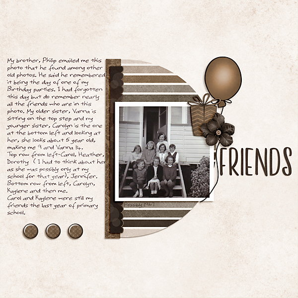
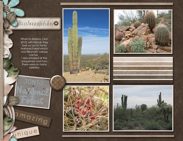
Here, DebraB has given us a grid-style layout on a deep brown background that makes the photos stand out. The border along the left draws attention to her journaling. I love how she used only part of the word art on a paper strip to customize her look.
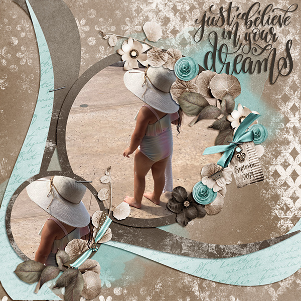
And last… this layout by galavictor is completely different! She’s changed the Blend Mode on the striped paper and the floral aqua paper to accent the orange in her photo, created a bokeh effect with the scatters while also making brilliant use of masking to blend papers together and fade the photo into them. She applied some Layer Styles to the word art too. So much creativity!!

There you have it, fifteen unique layouts using a single kit. (You can see my own vision for this kit here. And yes, my granddaughter does eat non-stop.) What might YOU do with this FRE-E-E-E-E-E-E kit?
PS… What do you think about a Challenge spotlight post every once in awhile?
PDF Version: https://bit.ly/2ZeFvb3
![]()


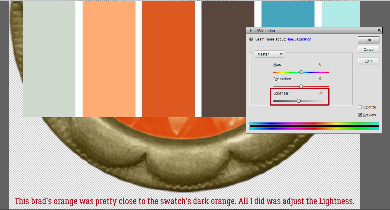
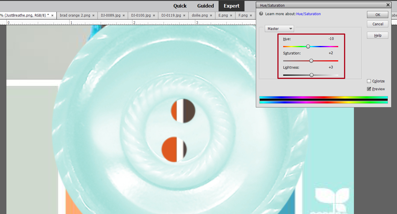
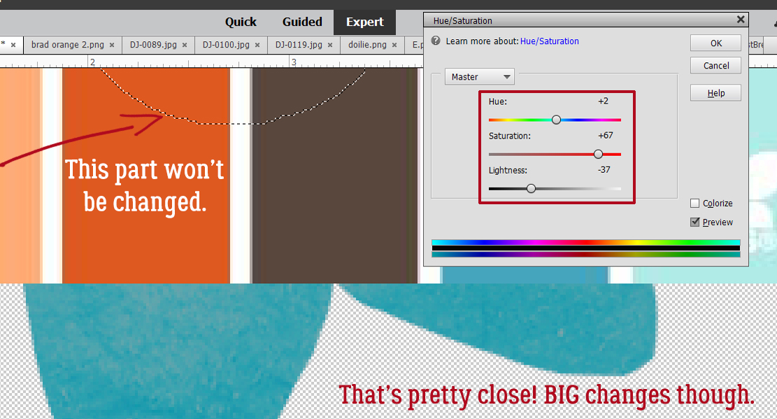
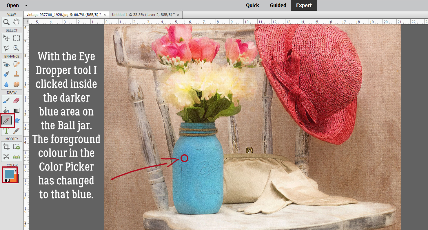
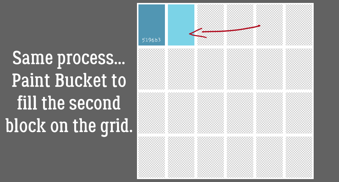
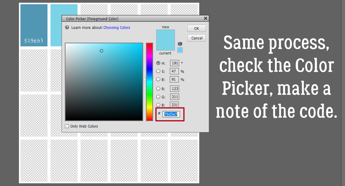
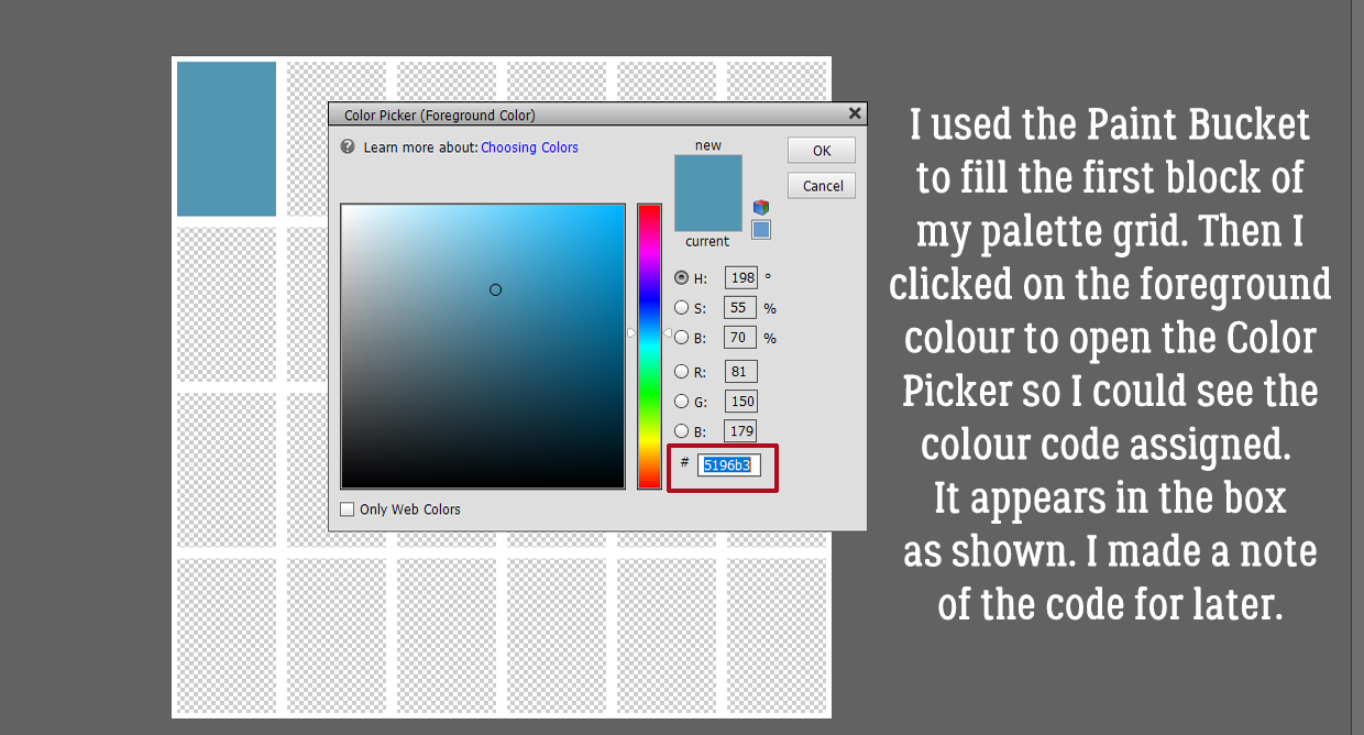 Following the same process I used the Eye Dropper to pick a spot of lighter blue.
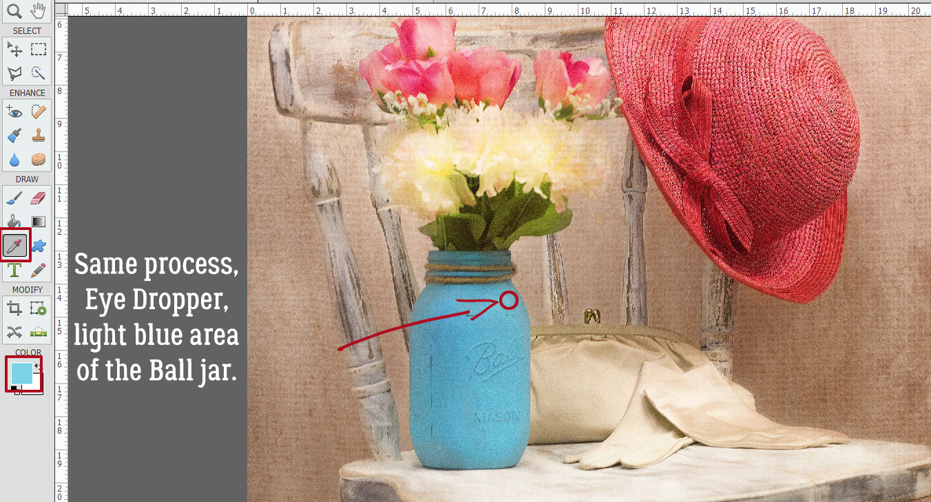


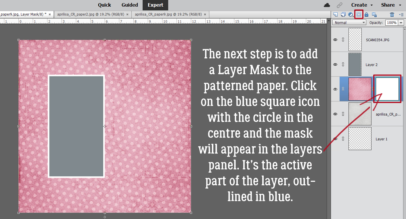
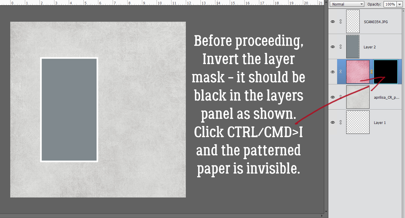
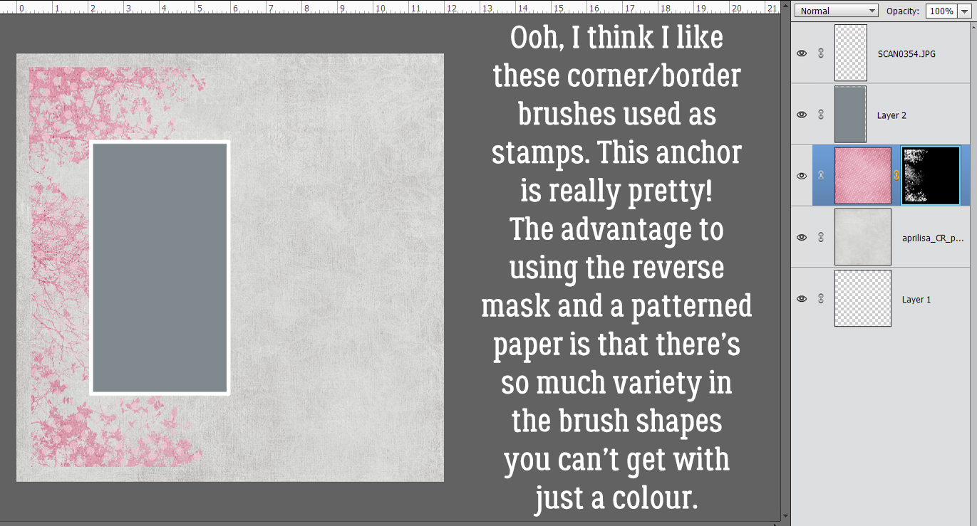
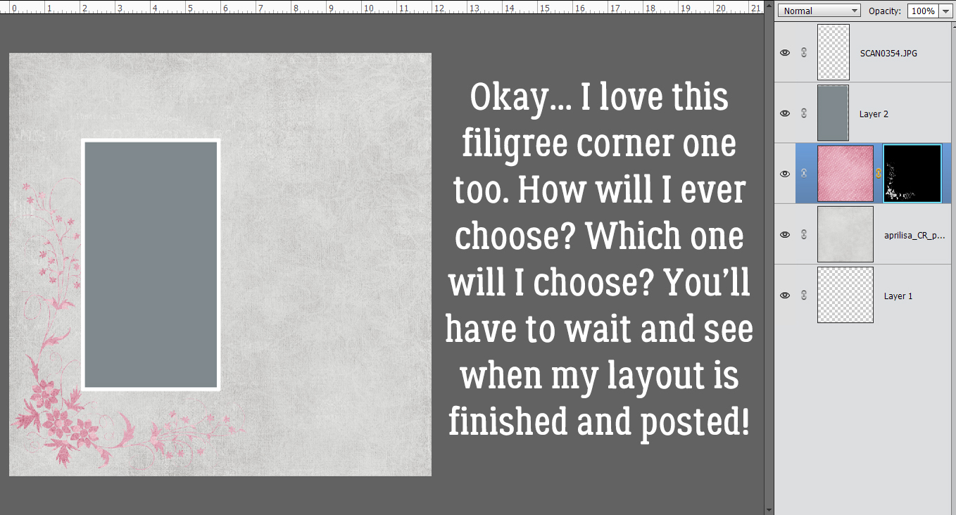
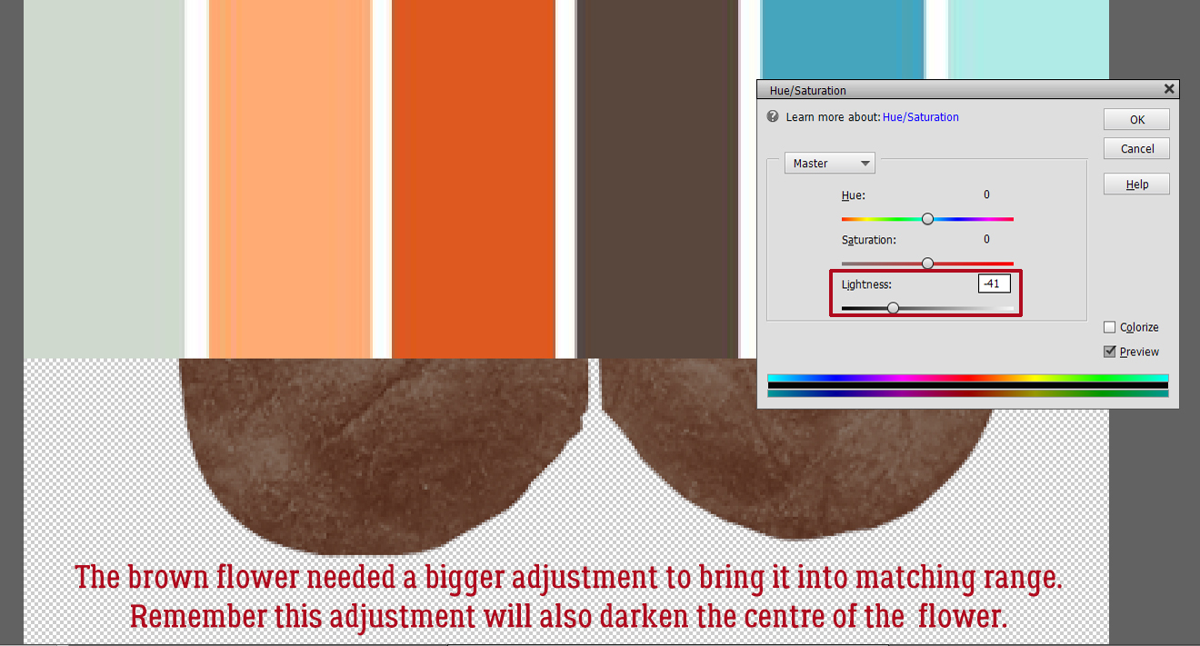
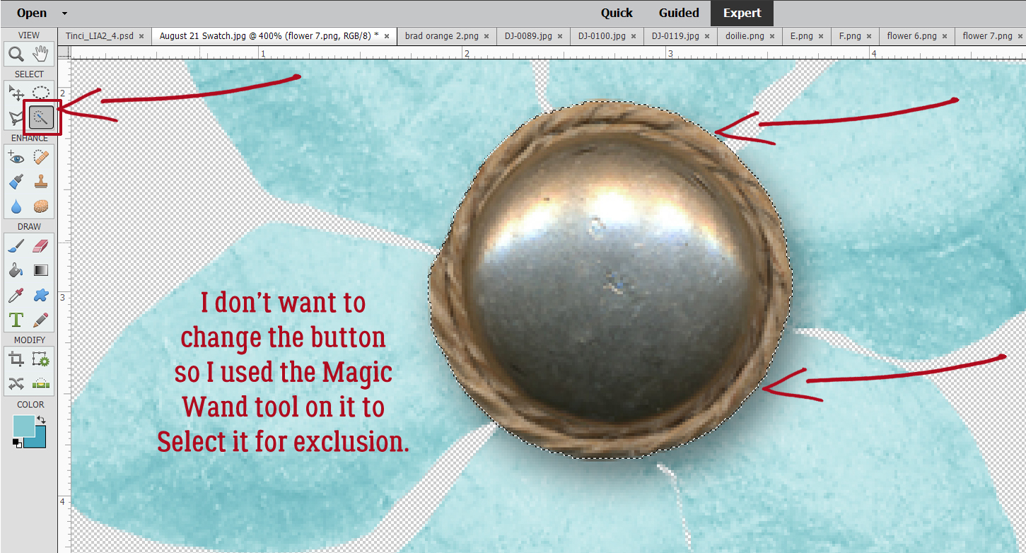
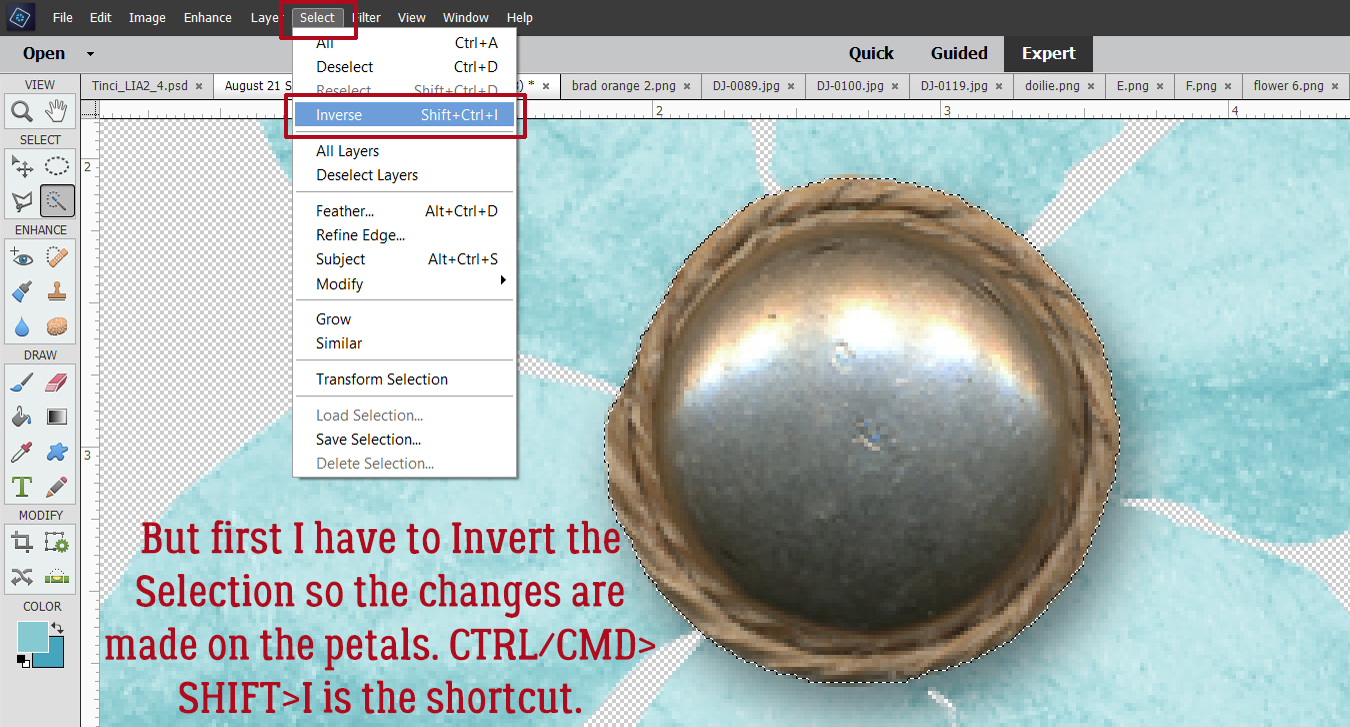
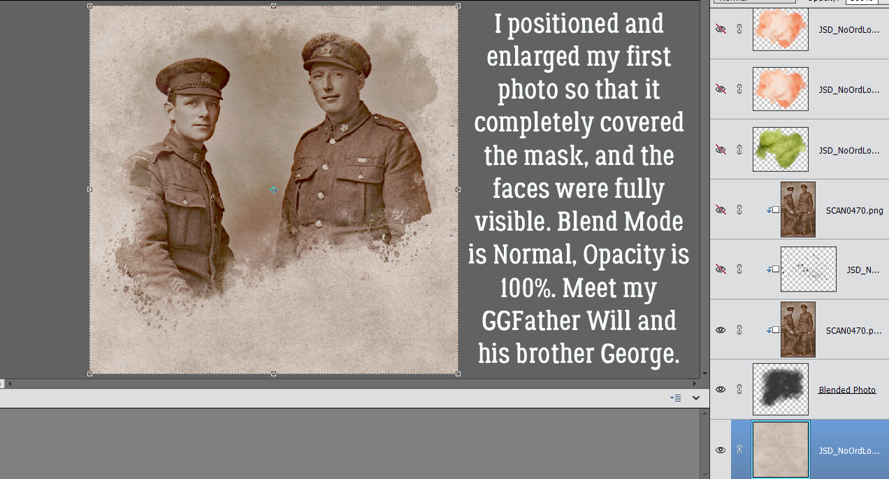
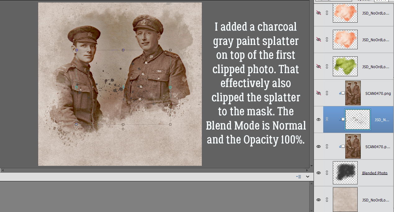
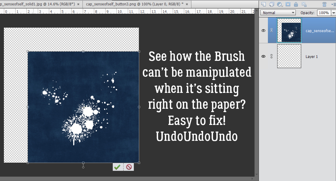
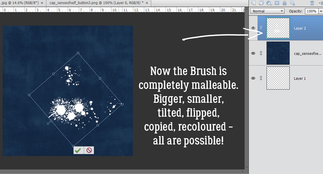
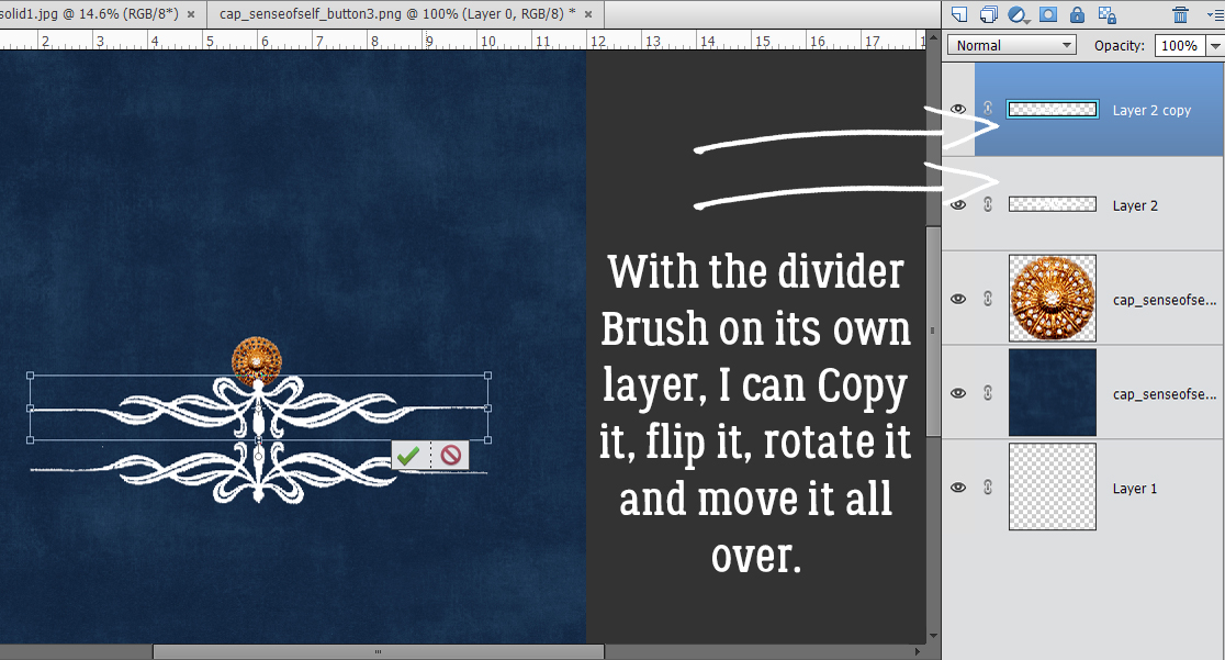
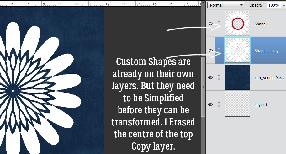
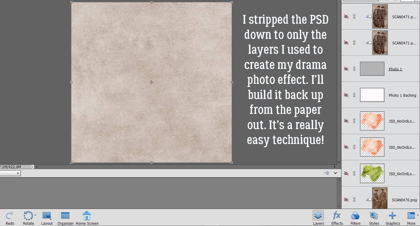 In the Gallery comments, Jill pondered whether I’d done any (labour-intensive) extractions or other witchery to obtain my results, but I didn’t. I used the mask exactly how
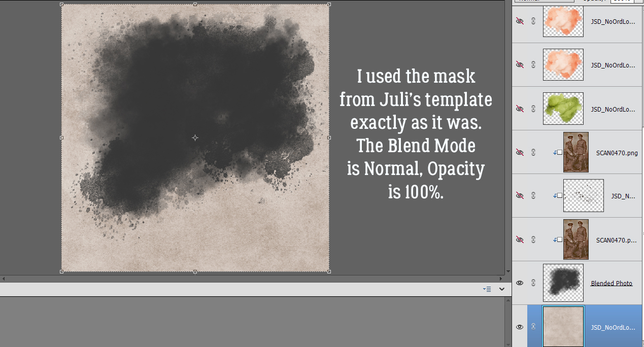
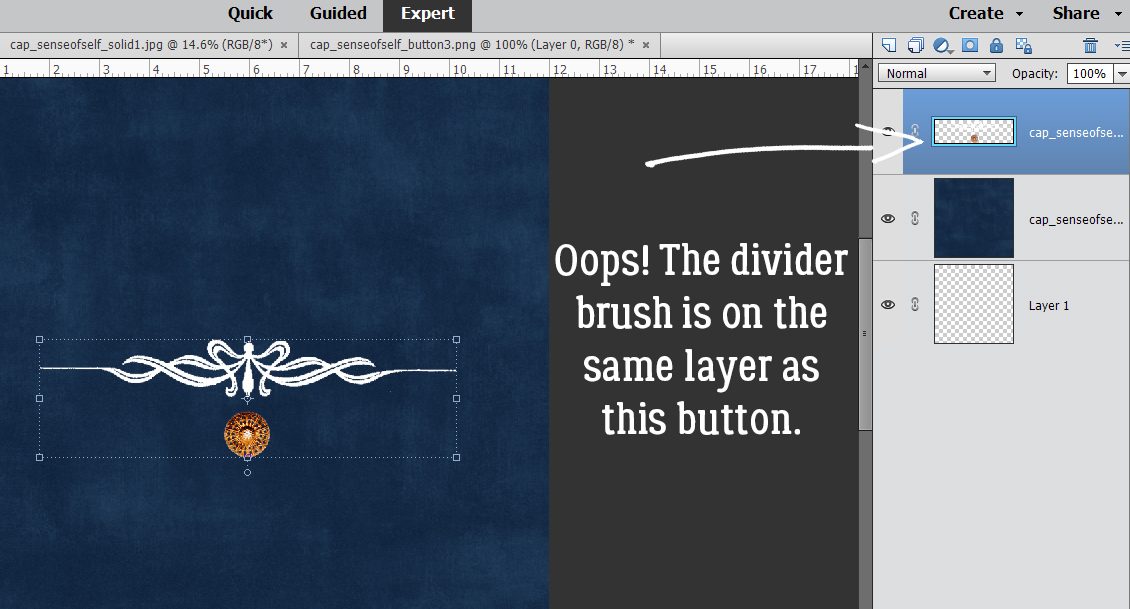
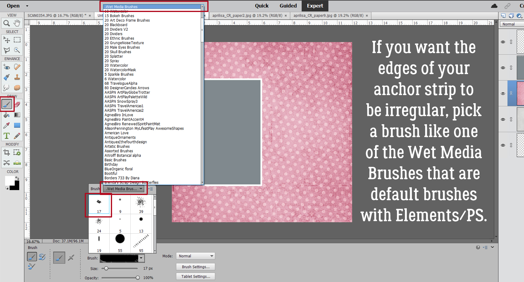
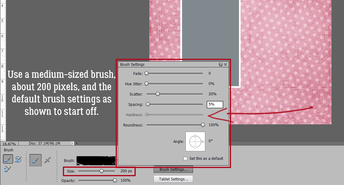
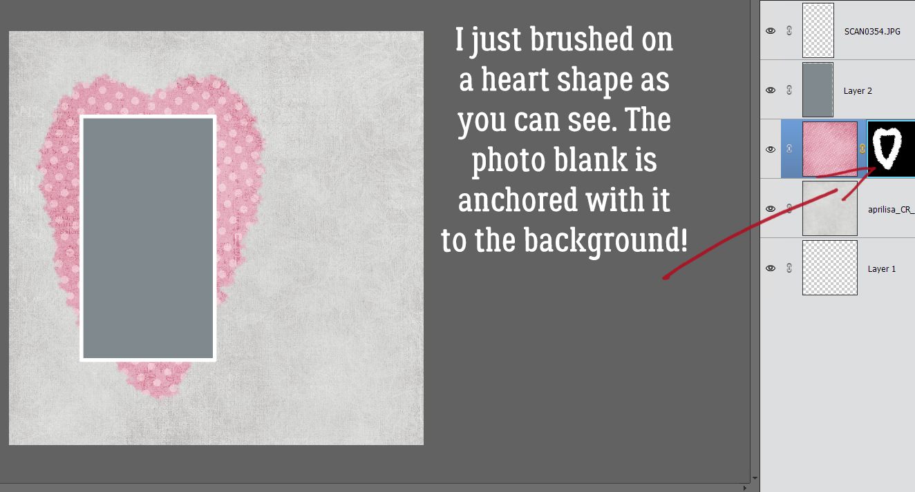
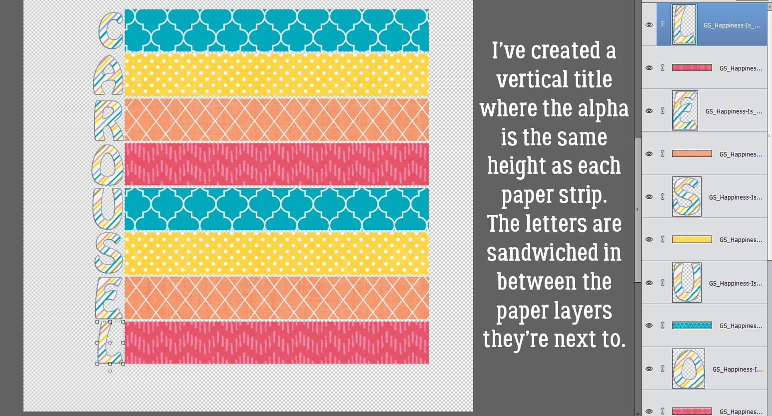
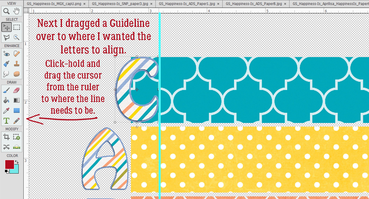
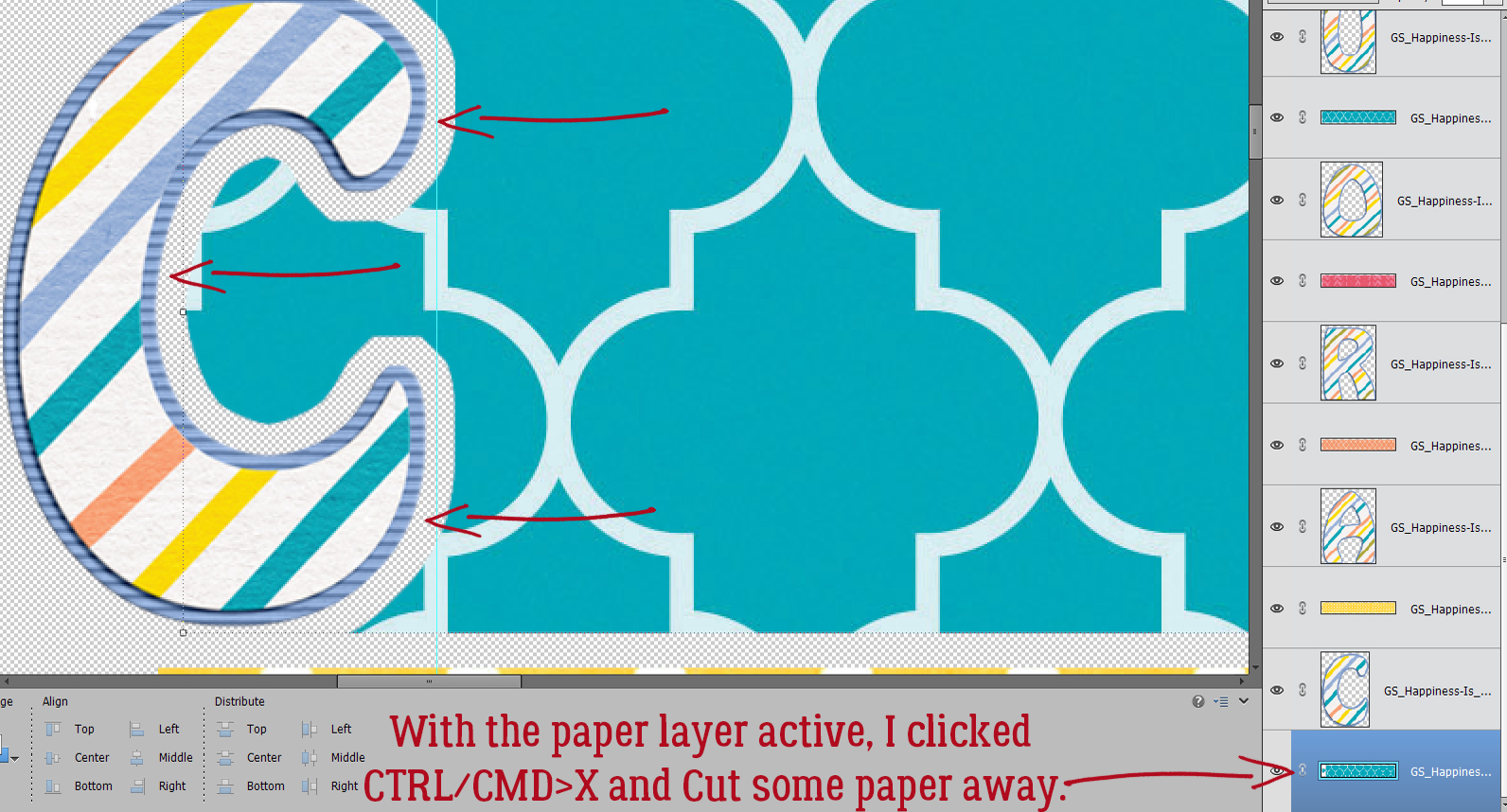
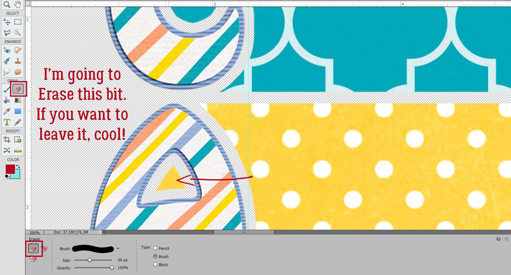
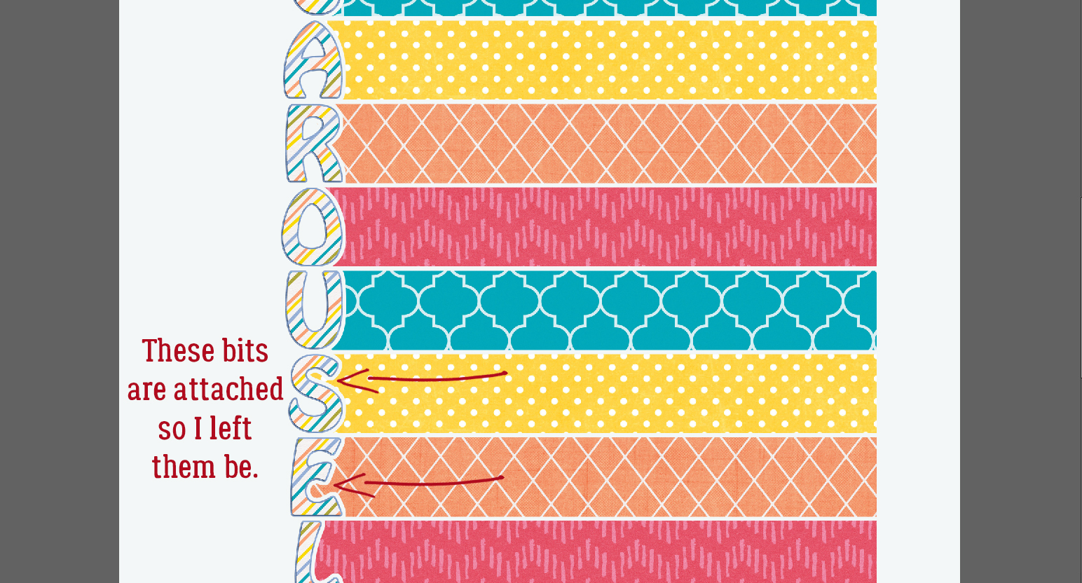
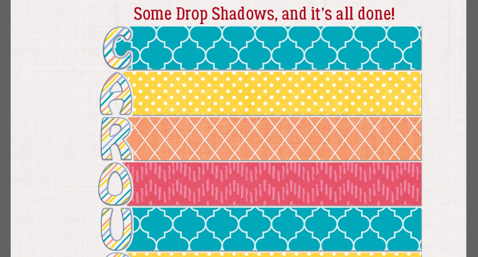
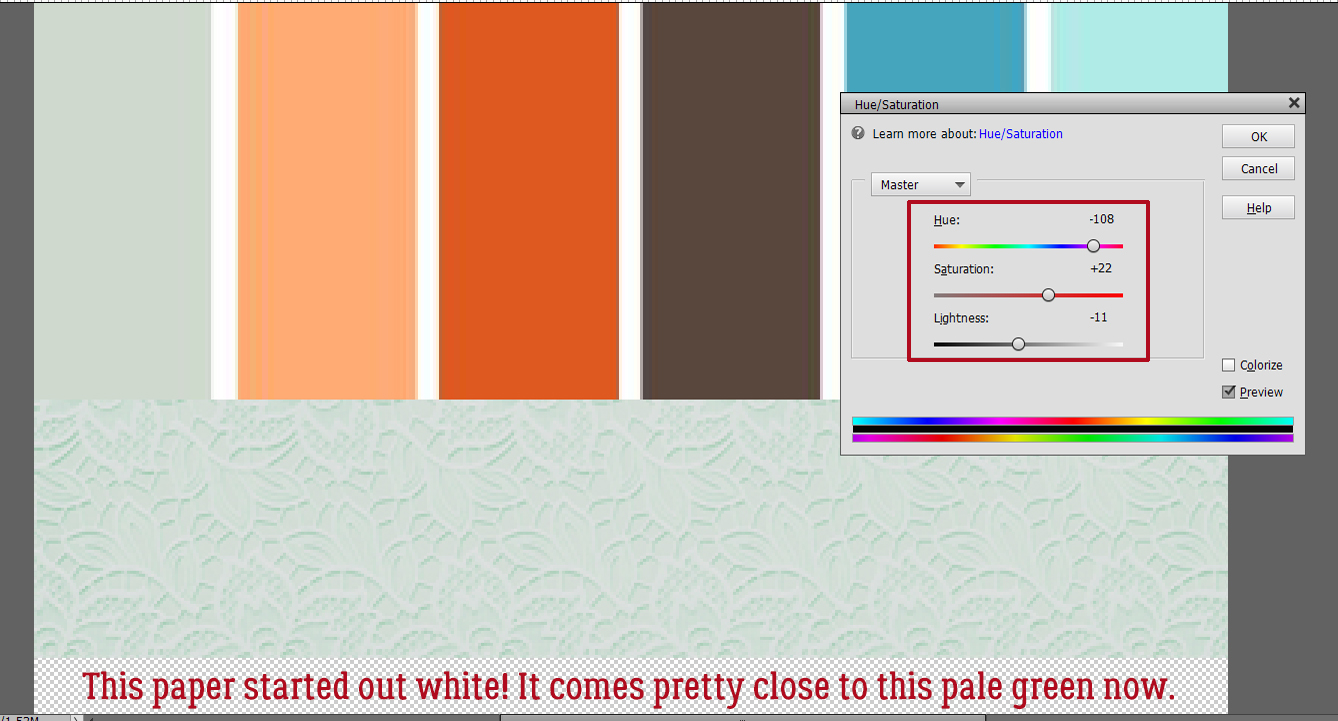
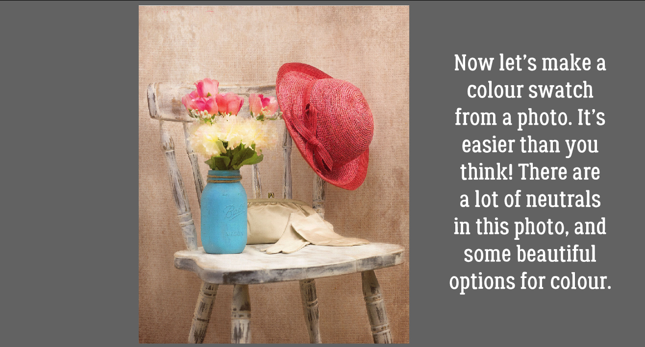
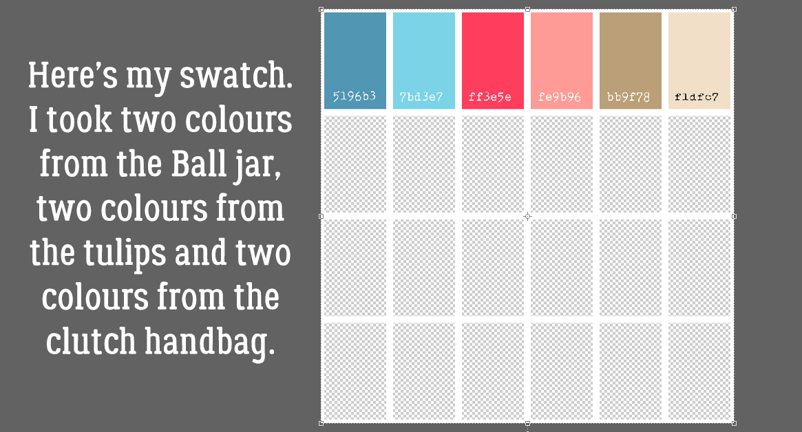
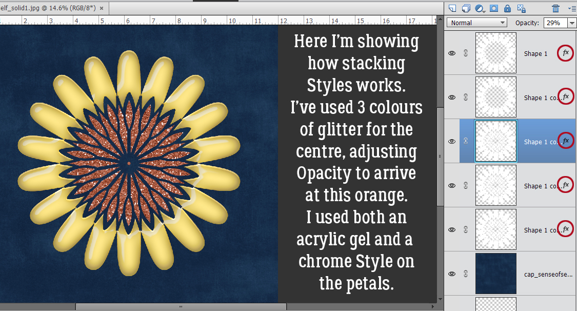
 Another example: this month’s
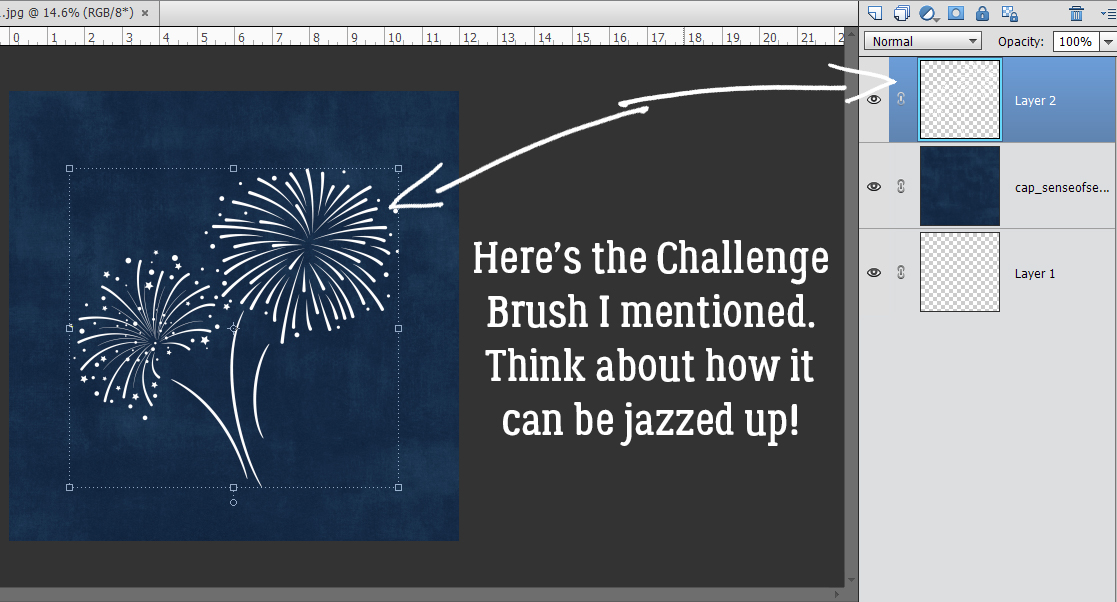