Challenge Spotlight – Update

Just wanted to pop in with an update. I was doing so well and then I crashed and burned this week. I tried to do to much at once and it caught up with me. So I have a new plan. I’ll have some more spotlights this weekend and then I have a new plan beginning in May.

I hope you are all doing well and staying healthy!

Challenge Spotlight: Buffet and Back It Up with ADB Designs

Happy Monday my friends. It’s hard to believe it’s the beginning of another week. I hope you had an enjoyable Easter weekend.

Today we’re going to start with the the Buffet Challenge. This month the challenge is hosted by Trixie Scraps. The only requirement is that you use kits and/or templates from this month’s buffet. Each month the designers create kits using a color pallet provided to them. By using the same colors, it allows easy mixing of the kits. This month’s colors are definitely Spring inspired:

Let’s see some of the layouts these kits inspired:

From basketladyaudrey:

From Grace.:

From greenfiend27;

And from kimb:

I’m so in love with these colors.

Now for the Back It Up Challenge hosted by ADB Designs. Each month, Diane encourages you to back up those photos on your camera, tablet, or phone so you don’t lose them. Then she gives you a challenge to use those photos. For April the theme is: Spring break, staycation, family vacation, etc.

The layouts for this challenge are gorgeous.

From Elynnia:

From Lisa Campbell:

From msbrad:

And from poki-04:

See what I mean? They are gorgeous.

Are you close to getting your 10 challenges done? If not, don’t fret. For one, it’s not even the middle of  April yet (although it feels like it), and for another, if you don’t get them all done this month, they roll over until the next month until you get 10. Here’s a peek at the reward waiting for you for April.

Have a great week. I’ll be back on Saturday with more!!

Challenge Spotlight: Brush and Storytelling with Dandelion Dust Designs

Happy Easter!! Today we’re looking at two more forum challenges. I originally thought I would have some days that had only one challenge, but we offer so many in the forum, once I put them all in planner to schedule them, I realized I would have to double them up. I think it’s awesome we offer so many ways for you to earn the free collab.

First up today is the Brush Challenge. This month it is hosted by PrelestnayaP. She’s provided a brush to use in both .png and .abr formats. It’s an awesome paint splatter:

Let’s see what some of our members have done with it.

From AriadnesClue:

From dhariana:

From digiscrapmomma:

And from jjaprice:

It’s always so exciting to see how each scrapper chooses to use the brush in their layout.

Now let’s look at the Storytelling Challenge hosted by Dandelion Dust Designs. If you love to journal, this challenge is for you. Each month you are given a focus word and an optional idea. Here is the requirements for April:

  • 50 Word Minimum with at least 1 photo
  • Focus Word: Outside
  • Idea (Optional): What is your favorite thing to do outside? Walk, hike, go to the park, ride bikes, garden, etc.

Here are some of the submissions from the forum and gallery.

From bkasko:

From emscraps:

From Firstoscartgrouch:

And from ktmoonblue:

Absolutely wonderful.

You only have to complete 10 of these awesome challenges to get the full collab kit. It’s always so beautiful and full of goodies.

Come back tomorrow for two more challenges. Are you finding anything new to try?

Challenge Spotlight: GS Created with Rewards and Font Challenge

Happy ?Saturday. Hope you are all enjoying this Easter weekend. Today I’m here to shine the spotlight on two more Challenges.

First up is the Gingerscraps Created with Rewards Challenge hosted by our own sweet Ginger. The only requirement for this challenge is to use the Free With Purchase kit or the Challenge Reward kit form the previous month.

I have grabbed a few member layouts from the gallery as samples. Let’s see what I found.

From Belis2mi using Bring On Spring:

From shariana using Bring On Spring:

From CathyS using read, learn, know, go:

From ktmoonblue using read, learn, know, go:

Now, let’s look at the Font Challenge hosted this month by Craft-tastrophic. Each month the host designer picks out a free font for you to you in a layout however you wish. This month, the font is called Columbia. I love fonts and this on is super cute.

Le’s see what I found in the gallery.

From Dee H:

From justpennys:

From A-M:

From lm44west:

I love the different ways they have chose to use this font.

Remember, any 10 complete challenges will get you this beautiful kit:

Hope you are enjoying these spotlight posts. I’ll be back tomorrow with more.

Challenge Spotlight: Facebook Header and Let’s Get Acquainted

Before we get into today’s challenge, I have to make a confession. I didn’t do a layout for either of these. My EHD was not playing nice tonight. Actually, I think my computer is just tired of me working from home (haha). But bigger reason is that when I looked in the forum to pick some samples, I knew I wanted to showcase only those. These are amazing.

First is the Facebook Header Challenge hosted by CathyK. This is usually one of my favorites to do. If you are a template junkie (like me), there are templates out there to help. This month’s theme for the header is “HOPE”.

Let’s see a few of my favorites from the gallery.

From honeybee:

From ptktj:

From shawnarenee31:

From pauline:

Aren’t these inspiring?

Second, we’re looking at the Let’s Get Acquainted Challenge with Snickerdoodle Designs. Here is this month’s question:

It’s officially Spring.What is it about the season that calls to you most? Is it talking a walk in the warm sunshine, feeling a cool breeze on your face, or perhaps planting a garden or tending to the flowers in your yard? There are so many things that we can do in the Spring that we can’t do in other months. What is your FAVORITE thing about Spring?

Since most of us are “sheltering in place” or on “lockdown,” feel free to show us what you are doing.

Let’s see what I found in the gallery. This first one spoke to my soul. Nani and I share a love of scrapbooking and baseball. I’ve been blessed to actually spend some time with her (at a baseball game no less).

From keevs:

From 01lousmith:

From Glori2:

Again – these were all so stunning, I decided it was better to share them.

Remember, any 10 challenges gets you this fabulous collab:

Enjoy your week. I’ll be back on Saturday with two more great challenges.

Challenge Spotlight – A Year of Blessings and Template #1

Hi fellow scrappers.  Hope your week is starting off well.

Today we’re focusing on the A Year Of Blessings Challenge and the first Template Challenge.

First up is the A Year of Blessings Challenge. This month it is hosted by Luv Ewe Designs. Her challenge to us was to scrap flowers. That is a perfect subject for me because my husband loves to photograph flowers. While we were vacationing in Lake Lure, NC in Jnue of 2018, we got to experience their Flowering Bridge. It was a super experience. Here is my take on the challenge and a few others I’ve chosen from the gallery.

From Grace:

From Dannisa:

From ktmoonblue:

Aren’t these beautiful?

Next is one of my favorite challenges each month. The Template Challenge. There are two of these each month. This month the first challenge is hosted by Laurie’s Scraps. Look at this gorgeous template that she has provided for us to use.

I love working with templates so these fall right into my wheelhouse. I had a blast pulling out some older pictures of my kids. They are now much older than this.

From KatherineWoodin:

From pjm117:

From poki04:

So much fun playing with these.

Remember, any 10 challenges completed will get you this full kit!

I’ll have an other challenge spotlight on Wednesday!

Challenge Spotlight – Layout Bingo and Project 365/52

Hey there scrappers. We’re starting a new feature here on the blog. Several times during the week, I will be shining the spotlight on a challenge (or two) that you can do to earn a full kit reward from GingerScraps. Check out the post from April 4, or the Cookie Jar thread in the forum for all the fun information about how the challenges work here at GingerScraps.

Today I’m focusing on two the the multi-layout challenges. Most posts will focus on only one challenge.

First up is Layout Bingo with MagsGraphics. I will admit, I had not had a chance to look at this one much until I started. This looks like so much fun. I’m going to give the highlights in this post. To see the full instructions and to get the blank Bingo card for this month, head over to the post in the Gingerscraps forum.

Each month, MagsGraphics will provide a Bingo cards with different items to complete. Things like: 1 layout with a border. 1 layout with a GS Free-With-Purchase Kit, 1 layout about spring break, etc. The idea, of course, is to get Bingo. Specific instructions on how to full out the card are in the forum. The good news, is that only one of the layouts has to be unique for this challenge (not used in other GS challenges). The other spots can be other challenges for this month (or within the last three months).

Here are a couple of finished bingo cards from March. As you can see, some choose to fill out only the line that makes BINGO and others fill out any of the squares that the task is complete.

From gmae:

From gadawg83:

Doesn’t this look like fun? I’m going to try to work on getting BINGO this month. I’ll show my card in a wrap-up post at the end of the month.

Here is a glimpse at April’s card. Remember to head over the forum for the complete rules.

Next, let’s look at the 365/52 Challenge. This one is hosted by Heather Z Scraps. This challenge is fairly straightforward. The only real rule is that the pictures used must be from the current week you are working on. If you take a lot of pictures and document everything, this may be the challenge for you. The good news? Each week counts as one challenge point. If you do layouts for 3 weeks of the month, that’s 3 of your 10 layouts done.

There are so many different ways you can choose to do these. Here are a few below, but browse the gallery and see what others are doing. These is also an FAQ thread on the forum to help if you have questions.

From CindyB:

From pinklily:

From pizazz:

And now for a sneak peek at the kit you will get for completing your challenges:

Leave a comment and let me know if you are going to try either of these challenges.  Happy Scrapping!


April 2020 Challenges

Hey there scrappers. Did you know that GingerScraps has 28 challenges you can complete each month? Yep – 28.  I know. I was blown away when I actually counted them. Did you know that if you complete any 10 of these, you get a free FULL SIZED KIT designed especially for this purpose (see the bottom of this post)? That’s just crazy, right?

In order to get your rewards, you must keep track of your layouts in the Cookie Jar tracking thread in forum. You just copy and paste the information MissDamsel has provided into a new post. During the month, every time you create a layout for a challenge, come back to your message and edit it with the link to your layout in the gallery.

April 2020 – Challenge Reward Info
Monthly Challenge Rules –

  • You will receive the collab of the month in which you COMPLETE your 10 challenges.
    For Example:
    You do 5 in March, 2 in April and 6 in May – you would get the May collab.
    You do 7 in March and 4 in April – you get the April collab
    You do 10 each month you get EACH Collab!! (BEST DEAL!!)
  • Challenge rewards will be sent out after the 5th of the month
  • All challenges layouts must have at least 50% of GS products – Daily Download and Welcome wagon counts. (See individual challenge rules for specific rules on usage such as Designer Spotlight Challenge)
  • Speed Scraps and Chats DO NOT count towards your challenge rewards (of course your host will usually provide fun goodies for all attending their SS or Chat)
  • Every challenge must have a unique LO. Meaning, you can not use the same LO for more then 1 challenge (the only exception is the Layout Bingo challenge – more on that in the next blog post).
  • You are responsible for tracking your completed challenges, find the monthly tracking thread in the “Cookie Jar“, and follow the guidelines.

(Just in case you missed it above – your challenges add up from month to month until you get to 10.)

Challenge Rewards:
Complete any 10 challenges, and you will receive a brand new designer collab!
Each month we will offer a brand new GingerBread Ladies collab as a reward for completing the GS challenges.

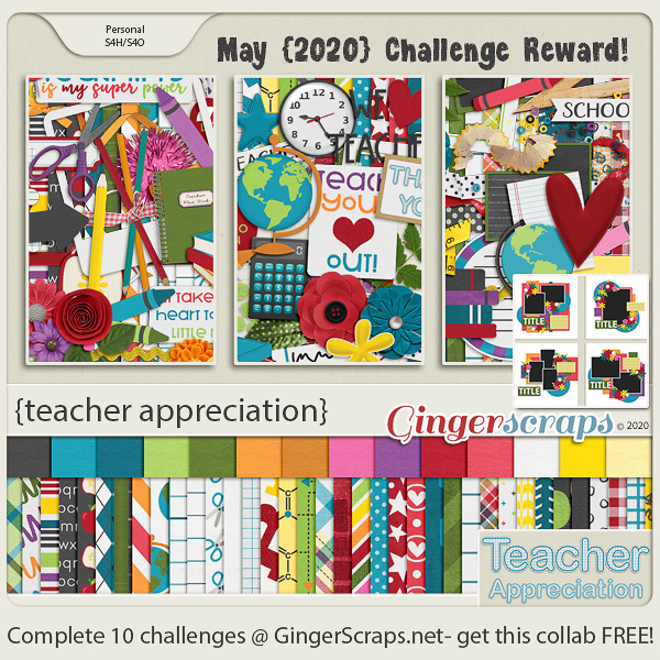
Complete any 10 challenges, during the month of April 2020, and receive this collab for FREE!!

Bloom & Grow: A collaboration from our GingerScraps designers
By Designers: JB Studios, LouCee Creations, Miss Fish Templates, Aimee Harrison

  • 2 Alphas {Uppercase, Lowercase, Numbers & Punctuation}
  • 50 Papers
  • 85 Elements

Come back tomorrow for the a spotlight two of the challenges you can choose from.

Tutorial Tuesday (Photoshop Elements)

Alphas Revisited

Are you ready for a really easy tutorial that looks a lot more involved than it is?

When I was looking at the June challenges at GingerScraps, I knew I wanted to do the Scraplift challenge – I already had the same template from Heartstrings Scrap Art in my stash, so it was a no-brainer! My dilemma came in the form of wanting to use a specific kit from Aimee Harrison called Tidepooling, that came with a selection of wickedly awesome alphas. And you know how I love those alphas! Now you get to see how I put that alpha to use.

I wanted my title to follow the same curve as the title that came with the template and to sit in roughly the same place. But creating my title right there on the template would have been very difficult, due to all the distracting layers. I could have just turned them all off, but I prefer to compose my titles on their own workspace then move them onto my layout so I duplicated the two layers of the circular photo spot.

Then I sent the Duplicate Layers to a New document.

I could have left it untitled, but chose to give it a name, just in case I was interrupted and had to find my title in the Photo Bin again later.

Now I had a new 12×12 document open, with the two layers of the circular photo spot in the exact same place as they are on the template.

Next I went to my layout folder and opened all the alpha elements I chose for my title.

I spelled out my title in the centre of my canvas. I made sure they were in the correct order so when I started moving them, they’d be where I wanted them. (Notice I’ve turned off the visibility of those photo spot layers. They aren’t needed at this step.)

I knew just from lots of practice, that these letters were much too big for their purpose on this layout. So I selected ALL the alpha layers and resized them together at one time.

I estimate how much I need to shrink letters when I’m doing this, and I randomly chose 65% as my target. I like to use round numbers, especially if I’m going to resize other objects later and want them to be to scale. A round number is easier to remember! I also checked the box that says Constrain Proportions. That makes sure that I only have to adjust in one plane and the other will follow suit.

Because I’m going to work with just one letter at a time, I turned the visibility for all the other letters off. They’ll be turned back on as I go along. And I turned the photo spot layers back on; they’re going to be needed now.

This alpha was super-easy to use. It has strong verticals, so I was easily able to position each letter perpendicular to the edge of the photo spot. Then I shifted the L into its place just sitting on the edge of the gray circle – my baseline – which will become my focal photo later.

I love that this L has a bit of a swoopy flourish to it.

The letter I will be a bit more of a challenge. It needs to sit close enough to the L so that it’s visually connected. It too is perpendicular to the baseline.

By turning off the visibility of the L for a second, I could be sure I had the bottom of the I touching the baseline. Then I turned the L back on and nudged the I into it’s spot.

The F also needs to be perpendicular. It’s got a strong vertical dimension and would look off if it isn’t perpendicular. But notice how the vertical aspects of the letters aren’t parallel. That’s how I want them.

Now, as you already know, I’m a bit… particular (or anal, you chose – most of us ICU nurses are) about some things. And this is one of them. The tops of the tall elements HAVE to be roughly lined up to look right to my eyes. But… some would argue the F could have a longer bottom end, and that would be right too.

If you scroll back up to one of the screenshots showing all the letters in the Layers panel you’ll see that the lower case letters are very slightly slanted. So I want to make sure they’re slightly slanted in my title too. As for spacing, I’ve tried using the Distribute Tool Option and usually I end up really unhappy, so I eyeball the spacing between letters (also known as kerning). I only care about it looking good, not having everything perfectly spaced.

Where I AM a perfectionist is when it comes to apostrophes. (Don’t get me started about the proper USE of apostrophes…) So depending on the look you’re after, the top of the apostrophe can be aligned with the tops of the tallest letters, slightly above for a casual look, or slightly below. It’s all about what you like.

The letter S in this alpha presented a few options. I decided the right-most edge should be my focus and so I made it perpendicular to my baseline.

This lower case A is an article, so it’s a word, not just a letter. It needed to be spaced accordingly.

The upper case B is another letter in this set that is easy to position, with appropriate spacing, of course.

This E, unlike the one in Life, looked funny when I tipped it to the same degree, so I stood it up a little straighter.

Below you can see the A as it looked when I moved it onto the canvas. It’ll need tipping for sure.

Perfect with both lower edges on the baseline.

When I played with positioning the C, my brain wanted the curved edges to be parallel, which actually made it easy to get it just right.

Last letter! This H was not upright when I moved it onto the canvas and so the upright section isn’t perpendicular to the baseline. The final position has the bottom of the upright and the curve of the serif resting on the baseline.

Zooming out, I was pleased with the spacing and the angles on each letter, but I wasn’t totally happy about where it starts and stops. So I selected all the letters so I could move them all together and rotated the title into a more pleasing position. With a little nudging of the entire title, it was successfully lined up with the baseline without having to adjust any letter individually.

Then I could go ahead and merge all those letter layers. For the remaining steps I don’t need to see my baseline so I turned visibility to the photo spot layers off.

The title would be just fine the way it is, but the original layout we’re scraplifting has a border around its title. So mine will too. I Selected my title’s edges by clicking on the title layer thumbnail in the Layers panel.
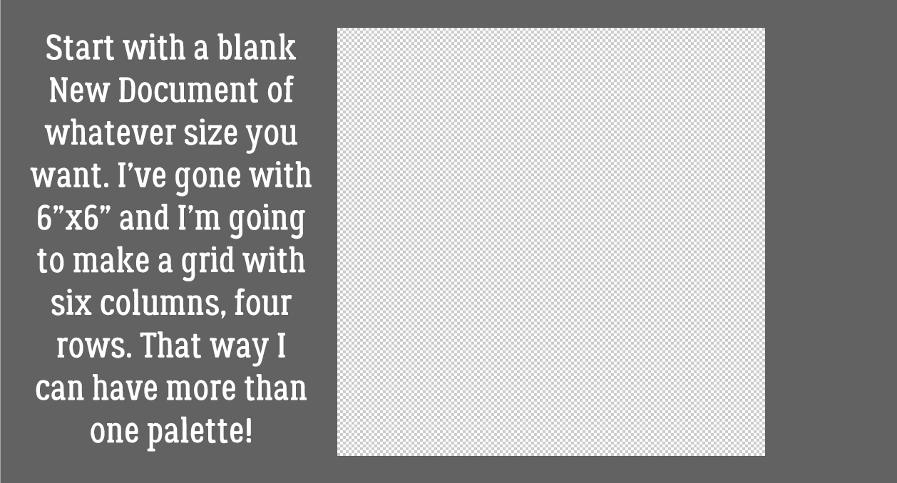
Next I clicked on the Select tab, then Modify>Expand.

I want my paper border visible but not overpowering. So I chose a single digit number at random. 8 pixels should be right.

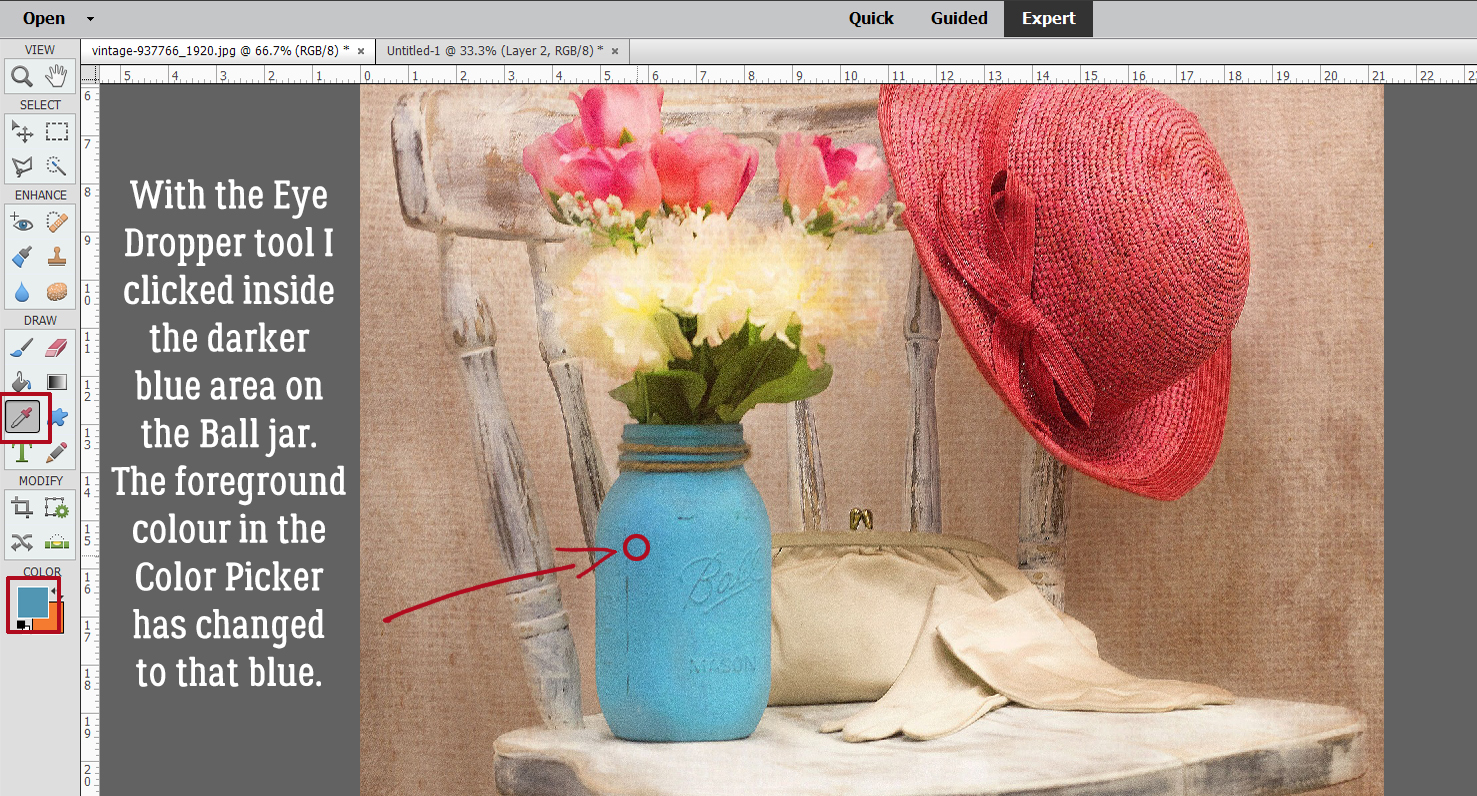
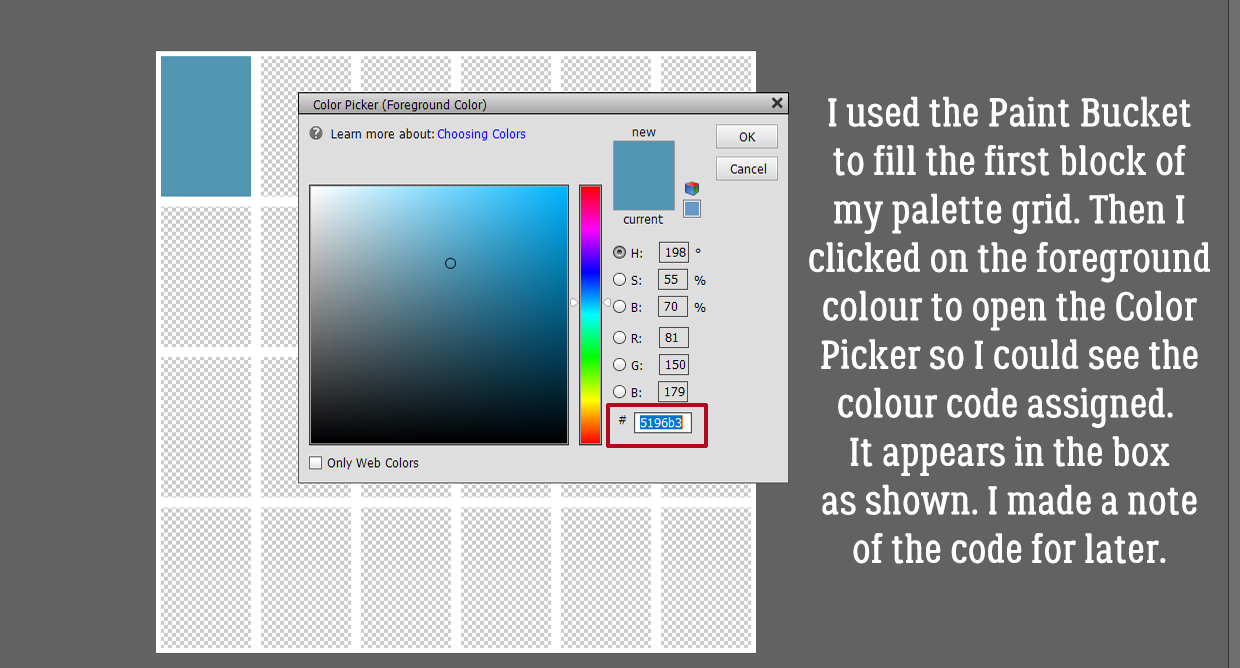
I pulled a colour from one of my papers to fill the area I just created. It’s a gray with a faint touch of green as shown.

If I just fill that space on the same layer as the title, there’s a faint void around the letters where it doesn’t fill completely. That might be okay, depending on how big your title is, how detailed your background will be and so on. But I’ll show you another way to eliminate the voids.
I created a new layer and filled the selection on it. Because it’s currently on top of the wooden letter layer, it shows you how the entire area is filled in. Alternatively, I could clip a paper here instead of filling the area.

Then I moved it down under the wooden letters. If I wasn’t doing it for a tutorial I would have just put the new layer under the title from the beginning and skipped that step now.

The title on the original layout also had a narrow white stroke around it, and that’s what I did next.

I could have used black for definition but I wanted visibility, so I used white.

This stroke can be pretty narrow. I went with 4 pixels and set it to be centred on the edge of the gray layer. That’s the best way to minimize squared-off corners.
If you strain your eyes you can see it.

The last thing I needed to do was put a drop shadow on the wooden layer. It has dimension and needed a shadow to emphasize that. I used the drop shadow styles included with the software for my example; I don’t want anyone to feel like they can’t achieve any of my techniques without spending more money. The Low shadow looks like this, which is TOO much.

So I double-clicked on the fx icon to the right side of the layer in the Layers panel. Then I adjusted the lighting angle to match the rest of the layout, made it smaller, brought the shadow in closer to the letters and lightened it up.

Then I zoomed out to make sure it looked like it should.

Once I was positive, I merged all the title layers together so I could move it onto my layout. It seems like a very time-consuming technique but it really isn’t. Putting together a tutorial detailed enough to make sense to beginners takes me a full day… this title took only about 15 minutes.

Wanna see the finished layout? [whispers to Glee – the focal photo is of my daughter’s hands. She was in Nicaragua for turtle-hatching season.]

Tutorial Tuesday – Photoshop Elements

Totally TACKY!

We’ve moved into the second quarter of 2018 already! And with a new month comes new challenges at GingerScraps… Don’t you love them?? This month, Marina (Magical Scraps Galore) has a really different spin on the Mix It Up challenge. She wants us to use at least 3 different silver or chrome elements on a layout. Well. When I saw “chrome”, it was like a bell went off! I had planned to show you how to create a dotted border the quick-and-easy way, and it very quickly morphed into a tacky border instead. (Well, it’s a couple of additional steps.)
I chose this fabulous bandana-style paper as my background. It’s from Just So Scrappy‘s Let Freedom Ring collection. Then I popped a new layer on top of it for my border layer.

Next step was to choose a round brush from the Brush tool menu. I resized it to 75 pixels (to give it some presence) and set the Opacity to 100%. The colour really doesn’t matter but you should choose something that will show up against your background. I’m going to turn the visibility of my paper layer off for the next few steps. You can do whatever works for you.

After making sure I was working on the BLANK layer at the top, I went on to my next step.

I went back to my Brush menu and clicked on the Brush Settings button. Here I made sure my Fade was set to 0, Hue Jitter also to 0 and Scatter to 0. Spacing needs to be a big number. It’s a percentage of the brush’s size and will determine how much space is between the dots. Since I have a 75 pixel brush, I set this number to 400%. But feel free to experiment. Hardness (determines how sharp the edge of the brush will be) and Roundness both need to be at 100% (unless you’re faking a stitched border but we’re not going to go there today).

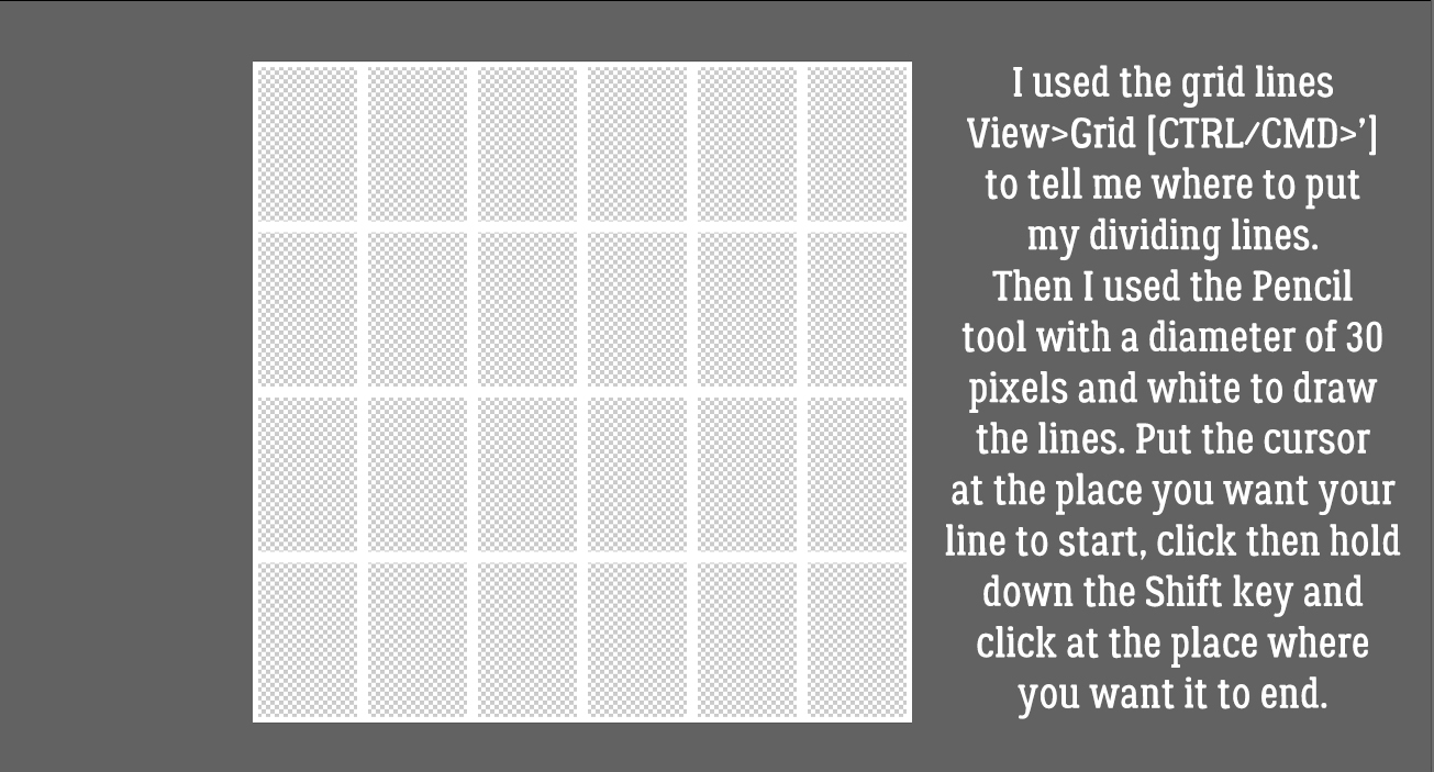
I turned on my Grid (View>Grid or CTRL/CMD>’) to save myself some effort. I decided my border should be 1/2 inch in from the corner. Then I clicked my Brush at that spot.

Do you remember how to draw a straight line in Elements? Hold down the Shift key and click at the spot where you want your line to end!

To make the rest of the border, it’s simply holding down the Shift key and clicking in the other three corners. It literally will take you 15 seconds. You can stop here if you just want a dotted border.

Now, to turn that dotted border into a tack border. I went to my Styles button down at the bottom of the Layers panel then chose Wow Chrome. In that menu I selected Wow-Chrome Shiny Edge. This Style set is one of the default styles that come with the Elements software right out of the box.

I liked the effect but thought it looked too umm… domed. If I’m smacking tacks with a hammer, they’re gonna flatten a bit. So I right-clicked on the fx on the layer and decreased the Bevel to about 6 pixels. I left the drop shadow alone.

This is how the finished border looked with the paper behind it.

To give you a better idea of scale, here’s the entire 12×12 canvas.

I wanted to see what other effects I could get using default Styles. So I copied the border layer and turned the Visibility of that layer off. It’s possible to add multiple Styles to an object or text as long as you work on individual layers with each.

This time I chose Bevels from the Styles menu and went with the Scalloped Edge bevel. Now the dots look like fancy tacks.

Next I selected the top layer and turned the Visibility back on.

I used the very same Wow-Chrome Shiny Edge style, but dropped the Opacity of that layer to 70%. Now the tacks look more like those pearl-inlaid buttons you see on Western shirts.

The different isn’t blatant, but it’s definitely there.

Another of the default Styles that came with Elements is Complex. I tried a couple of the choices here and settled on the Diamond Plate style. It has a funky industrial look to it.

When I decreased the amount of Bevel on this style, the effect became somewhat more matte and there wasn’t as much detail. It really looks like hand-cut nail heads to me now.

And here it is with the paper behind it. I’m not sure which one I like best. They’re all so neat!

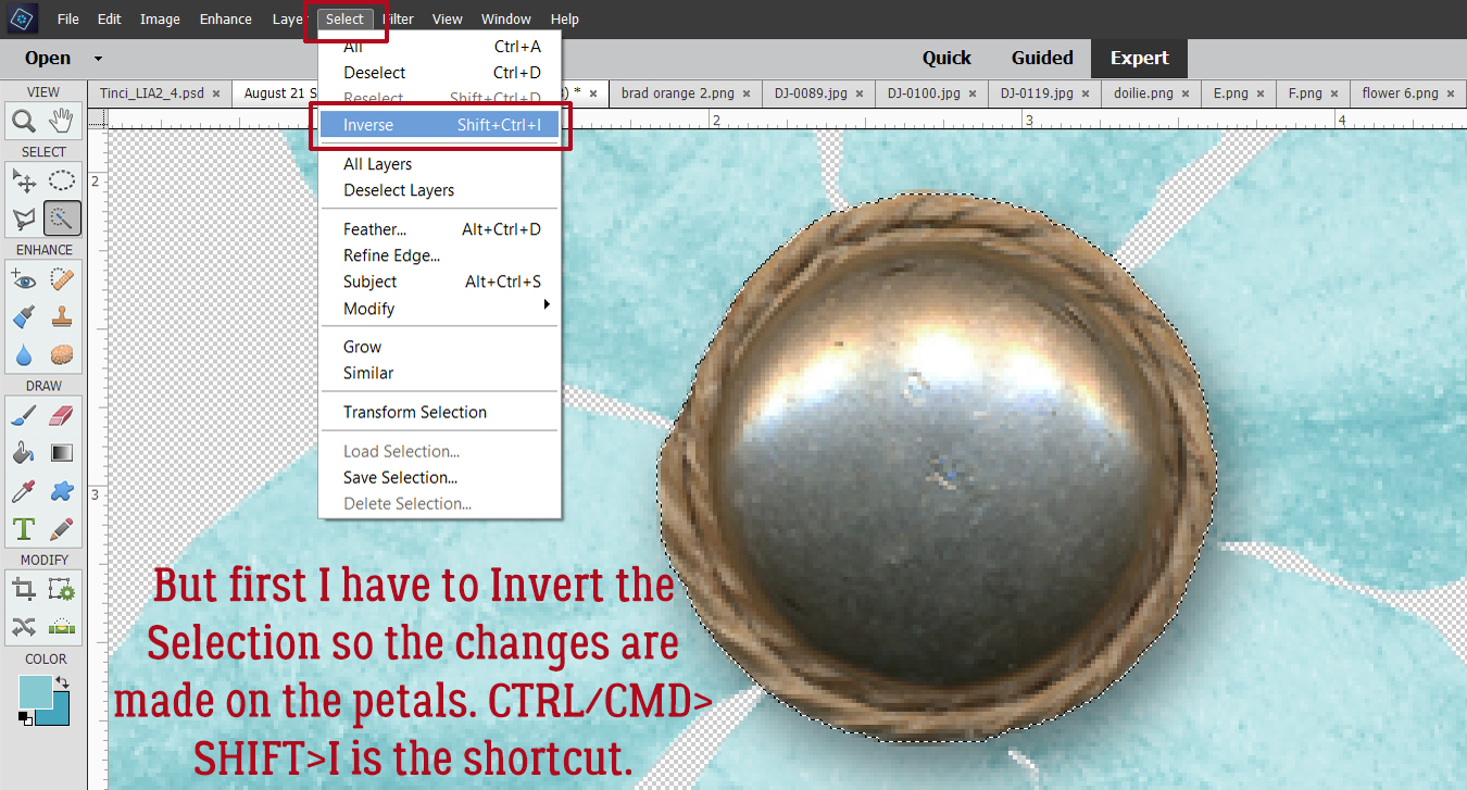
There’s one more thing I played with and that’s turning the dotted border into holes in the paper. So I Selected the Layer thumbnail of the dotted border layer by clicking on the thumbnail in the Layers panel. That gave me my marching ants.

I turned off Visibility for the border layer and made sure I was working on the paper layer.

Then I Cut the selected dots out of the paper. (Edit>Cut or CTRL/CMD>X)

That gave me perfectly spaced holes in my paper to perhaps weave a ribbon through.

I bet you can think of a few more ways to make this technique work for you. I’d love to see what you do with it!