Tutorial Tuesday (Photoshop Elements)

Quick Trick: Auto Colour Correction

PDF Version : http://bit.ly/3GTAA3e

With Thanksgiving looming over all our American members, it’s pretty convenient that today’s regularly-scheduled tutorial is a Quick Trick.

Today’s Quick Trick is another CS/CC-to-PSE workaround. Colour correction can be a bit of a time suck in Elements. But this little trick is brilliant! It uses an Adjustment Layer to accomplish in a couple of steps what can take MANY steps in any other method. The colours in this photo were so much more vivid in real life and just didn’t make it into the camera. So let’s give it a whirl.

Click Layer>New Adjustment Layer>Levels. All changes to the photo will happen on the new layer, so if you don’t like the change you can save the original as is.

I like to Clip the mask to the previous layer. It isn’t essential, but it does ensure that the two layers move as one. Click OK. The dialog box in the upper corner will come into play in the next step.

To access this hidden menu, hold down the ALT/OPT key then click the Auto button. As the screenshot says, the default setting is Enhance Per Channel Contrast. For this tutorial we’ll select Find Dark & Light Colors and Snap Neutral Midtones. You’ll see what’s happening to the image in real time behind the dialog box. If you think you might use this trick again, it can be set as a default so that when you click Auto in the Adjustment Layer menu, Elements will automatically do all these steps.

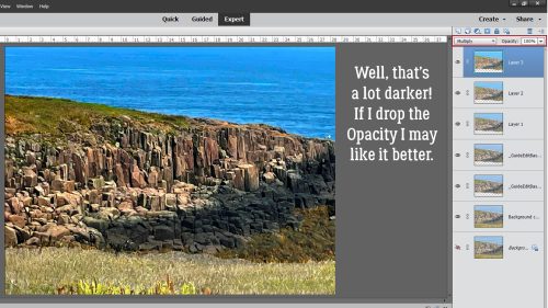
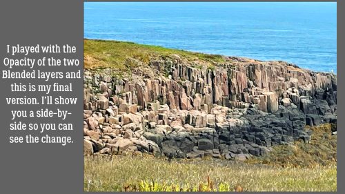
Here’s the result. It’s subtle, but definitely better. The artemesia in the background is whiter, the pink coneflower is pinker, the centaurea montana is bluer, there’s more definition in the leaves and the green cast is gone! No tinkering, just boom!

Since I’ve gotten some feedback about a side-by-side look, here it is!

That’s it. That’s all! Happy Thanksgiving to those celebrating this week. And remember, football is just a game…

PDF Version : http://bit.ly/3GTAA3e

Tutorial Tuesday (Individual Style)

Challenge Spotlight: Created With Rewards

Here we are, at the third Tuesday of the month again. Crazy how time flies!! This month our Challenge Spotlight falls on Created With Rewards. For those unfamiliar, each month our GingerBread Ladies – the GingerScraps Design Team – work together to produce two Rewards kits, one for completing 10 Challenge layouts and one as a Free-with-Purchase. The Created With Rewards Challenge requires participants to use only the previous month’s Rewards kits; templates are the exception – they can come from anywhere. For October 2022, the Free With Purchase kit is called Bootiful; the Challenger Reward is We Are Family. Let’s see how our intrepid GingerScrappers have risen to the occasion. The layouts are in the order they were posted; each is linked to the Gallery – click on the scrapper’s nom de plume and you’ll jump right to the Gallery, where I hope you’ll leave some words of praise.

Our first layout is from Dovedesign. Her layout has a good portion of white space. She used Bootiful and took it off-theme, which is awesome!

Next up is this CUTE little Hallowe’en layout by Jill. I really like the spiderweb base for her paper cluster. She too used Bootiful.

For this layout, becky_a has used a block style to anchor her photos and added some seasonal clusters. Bootiful is getting lots of airtime!

Ah! Finally We Are Family makes an appearance. I like how hiddenartist has stacked papers in several ways and positioned her clusters to frame her photo.

I love how fontaine has used blended masks to such good effect here. The green and orange contrast beautifully and the little Bootiful witch and warlock are cute additions.

See how kabrak1207 has turned a very theme-specific kit into an all-purpose one? Without the word strip and sticker, it’s hard to tell this started out as a Hallowe’en kit.

This looks like greenfiend27 went to a lot of trouble adding all those little bats! I think they’ve been cut from the background paper and individually shadowed. Impressive!!

I love how Katherine Woodin used the Hallowe’eenie kit for a fall layout that has no Hallowe’en flavour at all.


What a clever riff on the donuts mum23ms has in her photos!

Here’s another mainly purple layout using Bootiful. The pops of orange breoni has added, along with vignetting some photos, give the layout depth.

Look at all the spookiness angbrey has injected into her layout! I love how the elements move the eye around and right back to the photos.

Here’s another look at We Are Family. The way gadawg83 has echoed the bluebonnets in her photo with her tiny-flower borders is perfection.


Tbear has used some incredibly inventive techniques here to give the impression that the beaker has bats painted onto the glass. And maybe I’ve been watching too much paranormal investigation TV, but I think I see a ghost flying out of the test tube!

Tamsin McAtee went for complementary colours here, with her orange and blue palette. I like how she picked out the brown from the ceiling in her photo and included it in the elements she used from We Are Family.

Our last layout comes from mom2triplets04. She too has used We Are Family and kept her layout simple, focusing on the photos and her journaling.

I find it fascinating that more than 75% of these layouts were created with the Free With Purchase kit. It tells me there was a lot of traffic in the shop in October, and that’s fantastic! It’s also really interesting to see how different scrappers’ visions are when it comes to using a single kit. It’s inspiring!!

See you next week for Quick Trick Tuesday.

Designer Spotlight: November 2022

Memory Mosaic and Polka Dot Chicks

Now that the first-of-the-month insanity dust has settled, let’s get to know this month’s Spotlight Designers, Joy aka Memory Mosaic, and Tammy aka Polka Dot Chicks. [Editor’s note: It’s Joy‘s birthday month!] These two ladies sat down with me (and Tammy‘s 18 month-old grandson) to do a little Q&A session. What follows is a transcript… to minimize confusion, I’m taking the “O”.

O: Thanks so much for chatting with me and letting me give our readers a peek into your lives. I like to get the meat-and-potatoes out of the way first, then get to the sweets after, so I’ll throw you a softball. How long have you been designing?


J: I started designing in 2015.

T: Since 2008

O: So a good, long time! Joy, what led you to designing?

J: I will admit, when I started digital scrapbooking, I didn’t think I had the ability to do design work. In 2013, I started as a CT member for a designer. She taught me a few basic things that started to give me more confidence, to try more. In 2015 I made my first kit. I will admit, when I look at it now, it wasn’t very good. But, it was the start, and I’ve been doing it ever since.

O: Boy can I relate! I came to digital scrapbooking in about 2010, and those first layouts were so… awful! When I found my first digi home and started working through their challenges, my skills grew and so did my confidence. I never dreamed that I’d be doing what I’m doing now. What does your design space look like? [Editor’s note: Tammy is wrangling her little person ATM.]

J: This past year, I have tried a couple different places. I now have a small office that I work in a lot. It has an old tall secretary, some books shelves and a dresser with some baskets and file organizers. I still take my laptop out to the living room and work and sit on the sofa while watching TV. I hardly ever can just sit, and watch TV, most of the time, I am always doing something else at the same time.

O: I’m the same! Multitasking is like breathing for me. Where do you find your inspiration?

J: A lot of my inspiration comes from my everyday life, childhood memories/experiences, and my family.

O: I think you’re speaking for most of us. Do you have a favourite kit in the GS Shop? I know, it’s like asking you which one of your kids is your favourite. It changes from day to day!

J: One of my favorite kits right now is “Artsy Bits #6“. I love making kits with a “vintage feel” and “grunge”. I was challenged last year to come up with some “Art Journaling” kits. And I started making my Artsy Bits collection. This last one is my favorite. I love the colors and just how it came together.

O: Art journaling is a difficult thing for me. I never feel like I’ve done it well. Strong work! Oh, Tammy‘s back. Hey Tammy, Are you more likely to dance or sing in the shower?

T: Sing – even though I can’t sing! What about you, Joy?

J: Sing. I am not the most coordinated, and I would probably fall if I tried to dance in the shower. LOL!

O: I’ve asked that question a few times. And I’ve done both. Immediately followed by a trip to the hardware store and some no-slip strips for the shower pan. 🙂 Here’s another softball. What colours do you like best, and which make you shudder?

T: My favorite colors are red, pink and black/gray – well technically my favorite color is plaid but I am quirky. My least favorite colors are orange and green.

J: I love blues. I like to mix it with red/burgundy. I also really like blue and yellow together. These colors feel calm and happy. My least favorite is mustard yellow.

O: I don’t love orange or yellow. Tammy, you know plaid’s technically not a colour, right? 😉 Do you have a green thumb, even though you don’t like green?

T: I can keep indoor plants alive. I have a philodendron that I received when my grandma passed away in 1992 and it’s still alive
and now has an offshoot. Big plant is named Papa Phil and the off shoot is Phil Jr.

O: I’ve gotten pretty good at gardening, indoors and out. I bought a foot-tall fiddle leaf fig at Costco a couple of years ago and now it’s four feet tall, with branches everywhere. But I waited to long to clean up my flowerbed and got caught by a snowstorm. Too late now. Pray for me? Crazy question alert: If you could only eat one meal every day for the rest of your life, what would it be?

T: Steak, mashed potatoes, green beans & creme’ brûlée for dessert.

O: Yum! If you could have a super power, what would you like it to be?

T: To clone myself to be able to help out my kids/grands when they all ask at same time…lol.

O: YES!! If I had a clone, one of us could be cleaning up the yard while the other grocery-shopped. Oh well. Can you play a musical instrument?

J: I play the piano… not very well, especially considering all the money my parents spent on lessons. I started taking lessons when I was 6 and pretty much took them off and on through college. I did play in church when we were missionaries in Ecuador.

T: The radio! Nope. Not musical at all unlike all my kids.

O: I took piano lessons for a couple of years but we didn’t have a piano so I practiced at the school. Didn’t work so well. What would your dream car be?

J: Honestly we have only had older used cars for a long time, so I would say, my “dream car” would be a “new car”. You know one with all the new “bells & whistles”. But, for now I am happy to have a car that runs. 🙂

O: Been there! My current vehicle is a seven-year-old SUV with room for both people and my son’s wheelchair. I think my next one – when the day comes – will be a hybrid. I travel too many backroads with no services to feel safe going all electric. What did you want to be when you were small?

T: A nurse or a teacher.

O: Did you know that nurses are also teachers? That was my favourite part of my job, teaching parents about what was making their child sick and what we were doing to fix it. Aside from necessities, what one thing could you not go a day without?

J: My laptop. I am on it every day. It is what I use to make my designs, and I use it for other work.

O: Me too! If you had a warning label, what would yours say?

T: Caution: Will start snort laughing when cracking up…. lol.

O: Last question, I promise! What celebrity would you like to meet at Starbucks for a cup of coffee?

T: Any of the actors who played James Bond but Pierce Brosnan would be at the top of the list.

O: <fans herself> I can see it! Well, thanks again for giving our GingerScraps community a little glimpse of yourselves. Before we go, I’d like to remind everybody that not only are the ladies providing this month’s Daily Download (found right here on the Blog!), they’re also hosting the Designer Spotlight Challenge and have some coupons for all of us! Check ’em out.

See you all again next month for the December Designer Spotlight.

Tutorial Tuesday (Photoshop Elements)

Redirecting Text on your Embellishments

PDF Version : https://bit.ly/3DRkm8M

I’m never sure how complex I should go with tutorials that land on the first of a new month. There’s already so much going on and it’s easy to become overwhelmed with it all. So this month I went simple, but still very useful. Have you ever had an embellishment – think pocket card or fancy word strip – that you really wanted to use but it faces the wrong way to really work with the rest of the layout? You know flipping it won’t help because then the text would be backwards. And others notice that kind of thing… Well, here’s a fix!

My example will use a pocket card from CathyK DesignsBack to Nature kit. I want to put the card on the left of my photo and I want the deer looking AT the photo.

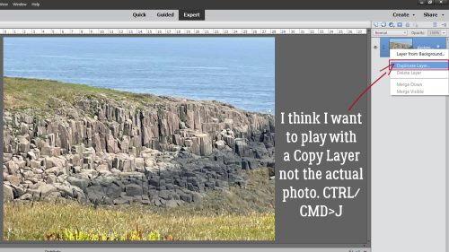
First, I’ll make a Copy Layer of the card. There are several ways to do this. You can click on the Layer tab at the top of the work space and select Duplicate Layer>OK. You can right-click on the layer in the Layers Panel and choose Duplicate Layer>OK. Or you can use a keyboard shortcut: CTRL/CMD>J. [Editor’s note: Keyboard shortcuts work with both Windows and Mac; Windows uses CTRL and Mac CMD.]

Now to flip the card so the deer is facing to the right. When using Photoshop CC you can flip single layers. In Photoshop Elements you can’t. So the easiest way to do it is to use the Move Tool, grab one of the “handles” on the side of the Bounding Box and drag it either vertically or horizontally. I get the flip process started this way, then I go to the dimensions box in the Tool Options toolkit and type in -100. For this one, the -100 went in the W(idth) box as shown. I do the same when I want to change the direction a spray of leaves or a ribbon is curving too.

The cards need to be stacked precisely with the backwards one on top of the original. Let your software do the work! Select both card layers (Click>Shift>Click).

Then go to the Align section of the Move Tool Options toolkit. Click on Left (side) and bingo, the top and bottom layers will be perfectly stacked.

Just like this!

Now, with only the top, backwards text layer active, I’ll add a Layer Mask to it by clicking on the icon at the top of the Layers Panel that looks like a blue sheet of paper with a white circle in the middle, as shown.

The Layer Mask sits to the right of the thumbnail on the Layers Panel. It’s simply a white box at this stage. You’ll know you’re working on the Mask and not the actual object when there’s a blue box outlining the Mask. Now I’ll activate my Eraser Tool.

Layer Masks are really useful when you’re removing parts of an object because it only makes the parts you’re removing invisible – they’re still there, just hidden. If you make a mistake – or the touchpad on your laptop is possessed and does its own thing – you can easily “paint” the part removed in error back in by switching foreground colours. Keep this mnemonic in mind: Black conceals, white reveals. What it’s referring to though is the layer UNDERNEATH! Black will hide the layer underneath, white will let it show. You’ll notice that your Color Picker is now set to black and white. While you’re removing parts of your object, you can toggle between removing and replacing by clicking the X key. Okay, on to removing the top line of text. My foreground colour is white and the layer underneath is temporarily turned off. I’ll turn it on and off to check my work a couple of times while I’m removing.

Here you can see that the lower layer is on, and the backwards text on the top line is gone. In its place is a line of text going the right way.

Now I’ve removed both lines of backwards text.

With both card layers you can see I’ve successfully turned the deer and birds around. To incorporate the Layer Mask with the top layer, right-click on the layer and choose Simplify Layer. This step isn’t completely necessary in this instance because when I Merge the two cards in the next step, the Layer Mask will automatically be Simplified. But if I wasn’t Merging layers, I would definitely want to Simplify that object layer.

To make it easy to use the modified card, I’ll select the two card layers (Click>Shift>Click) then right-click and choose Merge Layers. The keyboard shortcut is CTRL/CMD>E. And that’s it! You can’t even see where I’ve made the changes. (If you look closely though, you can see there’s a little nibble taken out of the bottom line of text at the lower swirly part of the N in Nature.)

I think this will give us some more options with our kits. I have some great ideas for upcoming tutorials that will be more complex than this one. Stay tuned!

PDF Version : https://bit.ly/3DRkm8M

Tutorial Tuesday (Photoshop Elements)

Quick Trick: Brighter Photos the Easy Way

PDF Version : https://bit.ly/3DTBCdq

I know this is true. We ALL have photos that we like but would like better if… they were more vivid. But making adjustments to lighting and colour can be time-consuming and takes some practice. I’m going to show you how to take a nice photo to a NICE photo with just a couple of clicks. I’ve tried this trick on a lot of photos and am really impressed, as well as disappointed I didn’t know about it sooner! The photo I’m going to use as my demo is one taken by my friend Sandy and I’m using it with her permission.

Fall is all about colour. These leaves are pretty, but they’re just a little insipid.

I haven’t really shown you too much under the Quick Edit tab, and that’s my bad. There are some pretty useful options in here and I strongly recommend playing with them when you have a few minutes. Today we’ll focus on the Color tab.

Click on that Vibrance option. This menu will open up. Notice the blue box around the “Free” space in the tic-tac-toe array. That’s the unaltered image. You can use the slider to adjust the colour vibrance or just click on one of the boxes. You can see the adjustments without actually committing to one by rolling the cursor over the array. Going up decreases the vibrance, going down increases it.

Each of the presets represents a 25% change in Vibrance. I’ll show you each of them.

With this laptop, I often struggle with getting the screenshots I want with the pop-up boxes open. Sometimes I luck out, sometimes I fail. Most times I fail – screenshots are captured by clicking CTRL>prt sc and as soon as I hit the CTRL key the pop-up disappears. SO frustrating!! Anyway, that’s what captions and text are for. This image is a 50% increase adjustment.

And on to 75%. Are you able to see the changes?

100% looks like this. Not only are the leaves brighter and more vivid, the fallen log under them has greater dimension and the whole image is just better. If you’ve gone to 100% and still think your image needs a boost, Save it with a new name then run the process again on the new version. When you’re happy with the way it looks, click on the Expert tab and you’re done, ready to use your bright, vivid photo on a layout! You can run through this process in the middle of a layout if you decide the photo needs some oomph. Moving between Expert and Quick won’t wreck anything, so give it a whirl!

Here are the original and the new-and-improved version. Impressive, right? And so easy…

PDF Version : https://bit.ly/3DTBCdq

Tutorial Tuesday (Individual Style)

Challenge Spotlight: Minikit

Hey GingerScrappers! It’s time for another Challenge Spotlight. This month I’m going to take you through the October Minikit Challenge Gallery. This challenge is hosted by the Polka Dot Chicks, Tammy and Shelby. The Challenge revolves around a minikit they design and provide to participants at no cost. Participants can use all of the kit, or only part of it, and are allowed to use a template. Here’s a look at the October kit, which coordinates with this month’s Buffet colour palette.

Let’s have a look at the layouts that have been posted up to now. The layouts are in the order they were posted to the Gallery and are linked through the member’s user name so you can pop into the Gallery and leave them some praise, if you should so desire.

First up is sparky_mom with a special event announcement. She’d used the entire kit, tucking part of the wavy string under her photo strip and using the large circles on her background as journaling blanks. Congratulations, family!

NHSoxGirl went minimalist with her layout, using the paper with the huge circles as a border for her large-and-in-charge photo.

Alasandra has used the whole kit, with a large-circle paper divider and the paper with the triangles on it cut in triangles to repeat a theme.

MarilynZ has added a word cloud, a soccer ball flair and a silhouette to her minikit. She slightly recoloured the photostrip. Using the large-circle paper as her background compliments the soccer theme.

The big-circle paper is pretty popular! Branma has it in her background too. She’s created a sweet little cluster with the flower elements and anchored her photos with the brads. Cute pup!

AnnieA has a cute series of photos in her photo strip. She’s used everything, with the big-circle paper forming more of a border around the tiny-heart paper. The cluster in the centre ensures the eye goes right to the photos.

I LOVE dhariana‘s use of white space here. I can see she resized the papers, adding a border mask to the tiny-heart paper in the background. There’s only a single photo, and every piece of the kit is visible. Very pretty!

The only part of the kit fontaine didn’t use was the paper with the triangles on it. She recoloured the photo strips and used them as ephemera, using the Paint Bucket to fill her background with the russet colour from one of the big circles. And her photo is masked so it spills over onto the paper behind it.

I so admire people who can use bold prints like these with such great results. Big, bold prints scare me! But not willow… she’s used them very nicely here, and turned one of the circles into a frame for her title.

PixyGirl has used it all, cutting the sides of the photo strip off, recolouring them yellow and using them as paper strips to anchor her photos. The photo strip makes another appearance, but separated into three independent frames.

I’ve never seen this effect jenazs has created before. It looks as though she’s turned her elements into overlays, allowing the papers’ patterns to show through. She has recoloured some of the flower elements with colours pulled from the papers and her photos and turned the brads into flair. Very interesting.

There’s a good amount of white space in this layout by mum23ms. She’s added some ricrac (maybe created using one of our tutorials?) and some splotchy paint behind her photo cluster. She clipped the big-circle paper to the photo strip – it took me several looks at it to figure that out!

Last but not least, we have this very inventive layout from Tbear. She’s used the whole kit, but in some unusual ways. The triangle paper has been snipped into tiny triangles, and scattered like confetti with some super-shrunken brads. The twine has been turned into stems for the flowers. The tiny heart paper has been desaturated somewhat and the big spot paper has been made smaller, duplicated and laid end-to-end to create a border along the bottom. I think this is my favourite of them all.

The first half of October has been unusually summery here in the Okanagan valley. But I see the forecast is showing a sudden descent into much chillier weather, bringing rain with it. I’m actually looking forward to it!

How many of last week’s fonts did you download? I picked up 14 of them! See you next week with a Quick Trick.

Tutorial Tuesday (Fonts)

October-y Fonts

PDF VERSION : https://bit.ly/3MB8f2u

The calendar says it’s fall, although where I am it’s still quite summery – I’m wearing shorts and flipflops, which is very much NOT October in Canada. The leaves are changing and the nights have a chill to them. So much inspiration for layouts, right? How about we look at some autumn-themed fonts for titles and journaling. And some dingbats too. All of them are free, from dafont.com and are linked so you can go right to them if you choose to grab them.

Autumn looks a lot like a vine, and is legible enough for journaling. It includes numerals and symbols as well as some alternate characters.

Autumn Pumkin is a more streamlined script that is also very versatile.

I like Autumn Leaves as a title font. It’s all upper-case, with a bunch of alternate characters and can be customized in so many ways.

Sketchy Autumn Dingbats can be incorporated into titles, filled with colour and turned into stickers or just resized and used much like a brush. The dingbats attached to the upper-case characters are different from the lower-case ones, so there are 52 sketchy little pics.

I like the simplicity of A Day in Autumn. It looks a little twiggy, a little leafy and is very legible so suitable for journaling. It has numerals and punctuation but no alternate characters.

LCR Autumn Harvest Dings is a limited collection of sketches. The characters A-P have dings attached. Don’t you love that scarecrow silhouette?

Falling is just a nice, curvy, script font; the only flaw is that it doesn’t include numerals.

KR Fabulous Fall is another 26-dingbat collection filled with leaves and other symbols of fall.

I think Harvest Fall would be ideal for subtitles, journaling and wordstrips. It has numerals, symbols and alternate characters galore!

WM Leaves 1 is another A-S dingbat font that includes a perfect Canadian-flag maple leaf. Yes please!

Tanaestal Doodle Leaves 01 looks like folk art. It includes 54 different shapes – upper- and lower-case and the period and comma keys have shapes attached.

Now, let’s do Hallowe’en! CF Halloween is up first. It’s an all-upper-case font with numerals but no punctuation.

I think Halloween Witches Script it my favourite, even though it doesn’t include the witch’s hat, spider or ghosts. It’s elegant and can (obviously) be combined with dingbats to make really fun text…

Dingbats like these! Freaky Halloween has it all.

Freaky Story is both creepy and refined. It’s another all-caps font, with the special characters hiding in the lower-case keys. It includes numerals and punctuation too.

Halloween is another fabulous assortment of dingbats you could use to customize your other fonts. What’s neat with this one is that the B, C and P keys give you the word “Halloween” plus some ghosts, bats, spiders and drippy blood. And it’s the only dingbat set I’ve seen that also has images attached to the number keys. Check it out!

Halloween Bell has 26 more themed dingbats.

I can see Spooky Halloween as a title font, can’t you? Unlike the other fancy fonts, this one DOES come with the fancy characters and you don’t even have to hunt for them. Numerals only though, no punctuation.

Halloween Rules doesn’t include those funky little skulls. I think it’s a cute-but-creepy, legible option.

I like Tricky Night for titles or subtitles. But don’t exclude it from journaling – it has numerals, punctuation and a bunch of alternate characters.

Last but not least, Spooky Webbie is cute, but still Halloween-y. It’s also the full package so you can use it for whatever your little heart desires.

Did you see anything that inspires you? I hope so!! Next week is Challenge Spotlight time, so I’ll be doing a Gallery crawl as soon as I recover from Canadian Thanksgiving…

PDF VERSION : https://bit.ly/3MB8f2u

Tutorial Tuesday (Photoshop Elements)

Curvy Lines/Borders Method #2

PDF VERSION : https://bit.ly/3gdizBK

Hey ladies! I’m running behind today after being awake half the night, so this might break a bit late. I’ll be trying my darnedest to get it out on time. Today I’m going to show you another method for curved lines/borders using Photoshop Elements. This one is pretty easy, but there are a few steps.

Open up a new canvas on your workspace. Then choose the Custom Shapes Tool. The border I’ll make will have 4 layers, all created with the exact same Shape but looking quite different. [Editor’s note: Jan started out using Arrow 17 but didn’t like how it was turning out. The tutorial uses Arrow 14.]

To make a bit less work for us, I set a Fixed Size for the arrow Shape. I went with 12 in for the Width and 4 in for the Height. The easiest way to make sure the Shape ends up actually ON the canvas is to click along the left edge. Note that heavy outline on the Shape; that signifies that the Shape is a Smart Object. To do any of the following steps with it, it needs to be Simplified. If you’re working with Version 15 or newer, you’ll have a Simplify button right there with the Tool Options.

If you don’t see that button, right-click on the layer in the Layers Panel and choose Simplify Layer from the dropdown menu.

Now to dispense with the pointy part. Drag out a box around it with the Rectangular Marquee Tool.

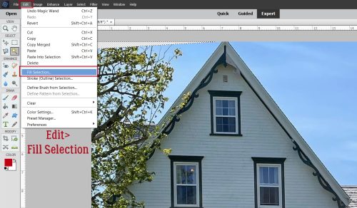
Now, Edit>Cut or CTRL (Windows)/CMD (Mac)>X.

If you’re making waves and not a side border, you can skip this part.

These steps that follow are all subject to interpretation – they’re examples that show you HOW to make alterations, not orders!! Here I’ve Resized the curvy shape and Constrained Proportions so it looked exactly the same as before, only it extends from top edge to bottom edge.

If you want to make your curvy shape into a Clipping Mask, it may be necessary to fill in one side of the curvy part. Drag out a box with the Rectangular Marquee Tool, making sure the edge on the side you want to keep curvy doesn’t extend too far. Otherwise those nice swoops will get squared off.

Then just dump the Paint Bucket into the space!

To get rid of the box outline, Select>Deselect or CTRL/CMD>D.

This is just housekeeping.

The preceding steps will be repeated for each of the variations to follow. Turn off the finished layer’s Visiblity, change colours and let’s make another curve. I changed the Height to 5 in for this one. the curves come out a little tighter.

Rather than just Resizing it, I’m going to use the Image>Transform>Skew menu. In this option, only the corner ‘handles’ are active. You can move them horizontally or vertically.

Like this…

Then I stretched it top-to-bottom (NOT Constrained) so the left edge runs the full 12 in. This also changes the curve a bit.

Here’s how the first two layers look together.

Same shape, slightly different dimensions, very different look!

After beheading the arrow, I stretched the curve across the canvas. But it’s not different enough from the previous two, so…

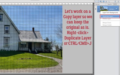
I made a Copy layer: right-click>Duplicate Layer>OK or CTRL/CMD>J.

I moved one Copy so that it overlapped and aligned with the other Copy. Then the two layers need to be combined into one by Merging. Either activate both layers by click>SHIFT>clicking on them, right-click>Merge Layers… or CTRL/CMD>E. The Merged curvy shape extends off the canvas, but I’ll show you something that’ll help with that.

To see the whole extended curvy shape, Image>Resize>Reveal All. Boom!

Here you can see that my extended curvy shape is about 18 1/4 inches long.

Now let’s change the way the curves look. This time let’s use Image>Transform>Distort.

Distort has a lot more opportunities for weird. Each of the handles is active and can be moved horizontally, vertically and laterally until you see something you like.

All three shapes are visible now and I can move them around until I have a chartreuse curve I like. Once I’d made my choice, I went to the Crop Tool, set the size to 12×12 and Cropped the canvas.

Last one.

And again, I made a Copy, aligned and Merged.

There! Four curved border Clipping Masks, all ready to go. And they all came from the same source Shape.

In case you wanted to see them in action, I Clipped some papers from this month’s Buffet kits to them and hit them with Drop Shadows.

I’ll be back tomorrow to introduce the October Designer Spotlight superstar…

PDF VERSION : https://bit.ly/3gdizBK

Tutorial Tuesday (Individual Style)

Spotlight Challenge: Recipe

Have you ever taken part in the Recipe Challenge? It’s a lot of fun! Hosted by Sweet Pea DesignsPenny, the basic objective is to take the Ingredients List and create a layout. Sometimes, there are additional Directions – for example, “Place one of your photos in the top left quadrant of the layout” – that are required to meet the Challenge goals. Participants can add to the Recipe if they want to, but MUST follow the basic Ingredients List. Let’s take a closer look. Here’s the September Recipe.

There have been quite a few layouts posted for this Challenge. We’ll check them out and see how each GingerScrapper has met the requirements. Each layout is in the order it was uploaded and is linked to the Challenge Gallery so you can see them in greater detail and leave some praise, if you’re so inclined. Just click on the GingerScrapper‘s user name.

First up is Windswept. Her first-day-of-school layout has each of the required ingredients, and she’s added an extra journal card.

This layout from alexandergirl68 ticks all the boxes, and then some. I needed to take a good look to see the ‘bling’ – gold lettering on the large flair. Very subtle!

KatherineWoodin‘s layout seems to be missing the pocket card. Do you see one? I love the visual impact of her arrangement.

I had to look for the bling on jenazs‘ layout too; it’s a subtle glitter spray behind her clusters. The pocket card is the size of a postage stamp, so it’s there but not center-stage. That crocheted border though!!

I LOVE this one from ElkFan! The kit she chose coordinates perfectly with her photo. The glittery paint, the little fishes, the lacy border… just beautiful!

Jill‘s layout just jumps out of the Gallery. The bright colour palette against that dark background is stunning.

The beach photo that inspired khoskins‘ layout really pops and is beautifully supported by her tiny clusters. The very narrow white border around the photo was the right choice. Simple elegance.

Could this layout be any cuter? I’m not sure I see a flair, but kristal has all the other goodies in there.

Using a paint swatch as a pocket card, as basketladyaudrey has done, is genius! And her interpretation of bling, a pearl dangle, is also brilliant.

Lisa Campbell chose to pull colours from her photos, then supplement them with themed elements. Love the sparkly crown that suggests the Magic Kingdom.

Daydreamer understood the assignment. Such a cheerful, colourful layout is an attention-grabber. Glitter paper… YES!

The woodgrain and plaid papers and hinges play to all the fallen leaves in the background of robinoes66‘s photo. Is there a hidden pocket card somewhere?

And last but not least, curio has created a simple but eye-catching layout. I like how she’s used the offset purple frame to draw the eye to the focal point of her photo. And the paper lanterns are amazing!

Have you been playing along with the monthly Challenges? Which one is your favourite? Maybe we’ll feature it next month!

Tutorial Tuesday (Photoshop Elements)

Realistic Folded Paper Shapes

PDF Version : https://bit.ly/3qGmUPF

I got a message from one of my most faithful readers, Karen Hampton, the other day. She had downloaded the Sweetheart template freebie that went out in Neia’s newsletter and was disappointed to find that although there’s a cute folded-paper heart on the layout, clipping a paper to the layer didn’t also recreate the folded-paper effect. She said she thought she could do it herself, but was very unhappy with the results. She was on the right track, but may have missed a couple of nuances. She asked if I’d do a tut, and here we are!

My example will start out showing a newsprint background paper that disappears a few steps in. You’ll probably figure out for yourself why that happened. 😉

Open up a canvas. Mine’s 12×12, as usual. Drag and drop a background if you want. Or don’t. We’ll start out with the Custom Shape Tool, aka the Cookie Cutter Tool. Pick a foreground colour that you can easily see. I’m going with the absolute most simple options here but if you want to, use the Tool Options to get a perfect shape. I’ll use the heart, since the template has a heart, but this’ll work with other shapes too. To more easily see the changes made with each step I’m going to use a plain, solid red paper. The technique works just as well on patterned paper too.

I dragged out a good-sized heart using the Custom Shape Tool. Note the solid line around the edge of the heart. That is one clue that the heart is a Smart Object. Another clue is that there’s a little icon in the lower right corner of the Layer Thumbnail that doesn’t show up on layers containing dumb objects. Before we can manipulate anything about that shape other than to resize it, it must be Simplified. In more recent versions of Elements, there’s actually a Simplify button in the Tool Options.

If your version doesn’t have that, you can accomplish the same thing by right-clicking on the layer to activate it and choosing Simplify Layer from the drop-down menu.

Here’s my red paper. To Clip it to the shape, right-click on the paper layer and choose Create Clipping Mask. If you’d rather use a keyboard shortcut, CTRL/CMD>G works with versions Elements 14 and previous. If you’re using Elements 15 or newer, that shortcut Groups Layers – which could be useful but doesn’t do what’s needed here. For you, the keyboard shortcut is CTRL/CMD>ALT/OPT>G.

Once the paper is Clipped to the shape, the two layers can be Linked by clicking on the little grayed-out symbol on the left edge of the layers, which keeps the layers together if one is moved or resized. I prefer to Merge them into a single layer so I don’t leave part behind or do a bunch or work on the wrong layer. Click>SHIFT>click on the layers to activate them then right-click and choose Merge Layers or CTRL/CMD>E.

To create the appearance of a fold, we’ll use the Burn Tool. The icon looks like an “OK” hand signal (or half of Heidi Klum‘s opera glasses, for those of you who watch America’s Got Talent). Select a small hard round brush from the Brush Picker. 20 pixels is a good size. Set the Range to Shadows and the Exposure to 100%. What this Tool does is darken whatever it covers, but keeps the underlying colour.

This is a hot tip: When using the Dodge and Burn Tools, to get the smoothest transitions, start your action OUTSIDE the object you’re altering. The effect will only be applied to the actual object on the active layer – it won’t touch anything underneath it! And to create a straight line, click>HOLD THE SHIFT>click. So I started my shadowy fold line by clicking off the red paper at the centre-top V on the heart (the upper + sign), held the SHIFT key down while I moved the cursor to below and outside the pointed end of the heart and clicked again (the bottom + sign). As long as you keep the SHIFT key pressed, Elements will know it’s drawing a line between clicks.

Still working with the Burn Tool set to Shadows, change the Brush to a BIG soft brush. You can resize your Brush two different ways. One is to use the slider in the Tool Options. The other is to use the keyboard. [ makes the brush smaller, ] makes it larger. Choose a brush size that covers about 2/3 of one side of the heart.

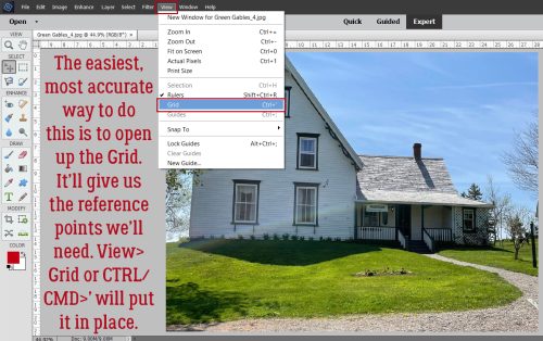
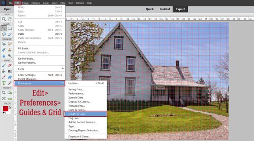
I like to have the utmost control over everything (Type A/OCD/ADHD??) so for this step I’ve turned on the Grid. View>Grid or CTRL/CMD>’ This way I can be sure the shading is oriented properly and that I’m starting and stopping in a straight line.

This screenshot expands on what I was saying about starting the Burn OUTSIDE the heart. I have my big, soft brush overlapping the fold by a bit (I think it looks more realistic, but you can line up the Burn with the fold if you want). I’ve shifted the left edge over 2 spaces past the fold. Click>HOLD THE SHIFT DOWN>click and there’s a nice shadow there.

If 100% isn’t quite as shadowed as you’d like, simply KEEP THE SHIFT KEY DOWN, move the cursor back to the first position and click again. If you click without holding down the SHIFT key you’ll be starting a new path and will be making work for yourself. Does that make sense?

To make the right side of the heart look a bit curved, change to the Dodge Tool – the one that looks like that paddle the optometrist uses to cover one eye. Keep your big soft brush but make it about 25% smaller than your Burn brush was; set the Range to Highlights and the Exposure to about 20%. Repeat the same steps you used to create the shaded part. One pass should be enough. Can you see the curve?

Once you’ve figured out your light source you can position your heart and add a nice cast shadow. And that’s it!

Let me know how this works for you. I’m always open to questions and suggestions through Private Messages. [User name ObiJanKenobi] See you next week!

PDF Version : https://bit.ly/3qGmUPF