Making Magic with Brushes
![]()
Yes, it’s the third Tuesday of March already. It’s a sad day here, as our daughter said goodbye to her furbaby Lucy this morning. We knew this day was coming, and tried to prepare, but it’s not that simple, is it? I’ll be working on a tribute layout later as my therapy, and seeing all the amazing ways our GingerScrappers have created magic with this month’s Challenge Brush has given me some inspiration.
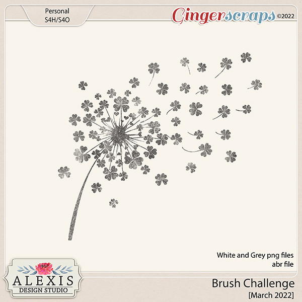
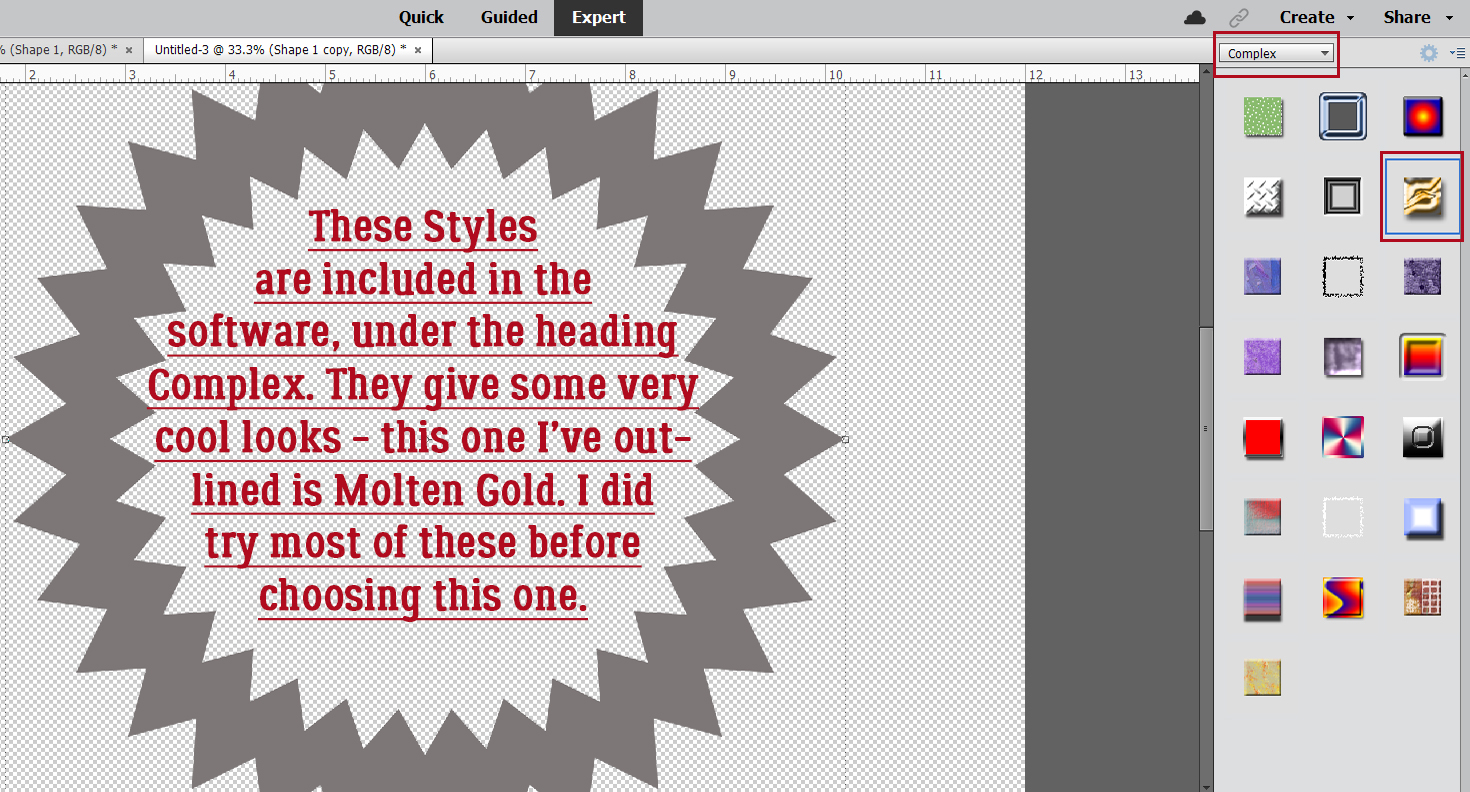
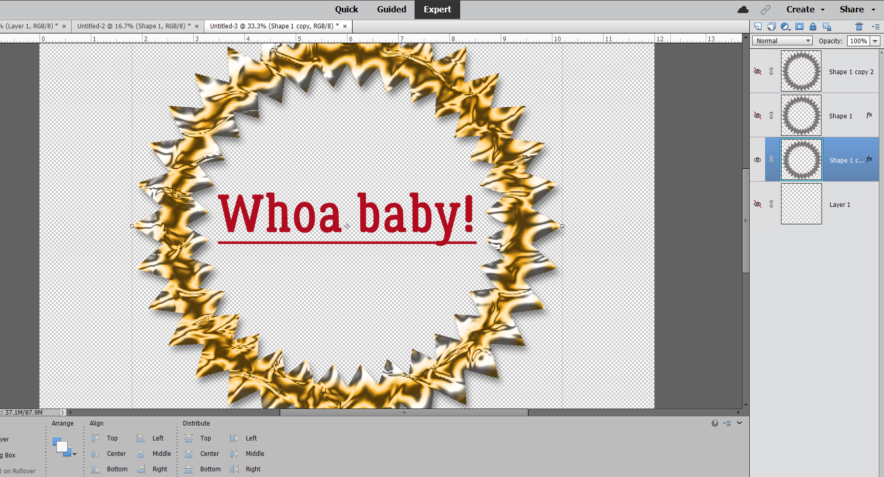
When I chose these layouts to show you, I was looking for uniqueness, and I had a lot to choose from. Each layout will be linked to the Gallery; the GingerScraps user names are your links so if you’re inclined, you can pop over and give them some praise. But first, let’s talk about the Challenge. This year, the host for our Brush Challenge is Alexis Design Studio. She’s brilliant with creating brushes, so we’re all very lucky she’s giving them away! The Challenge is to use the brush she provided (free) on a layout, and there are some very creative ways to use brushes. Let’s have a look.
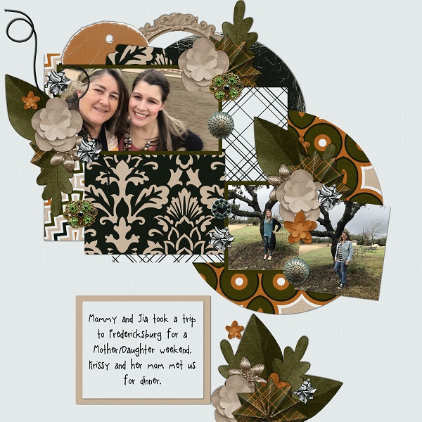
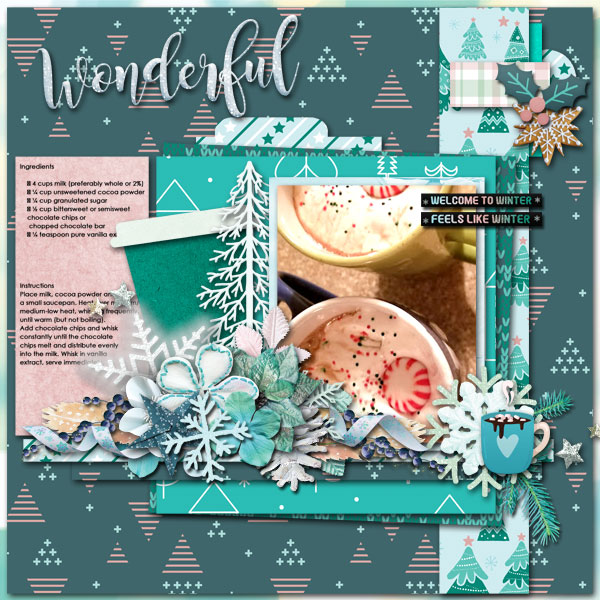
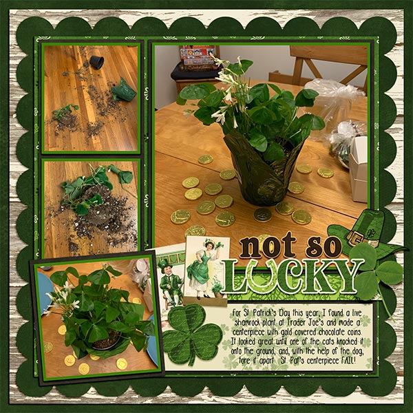
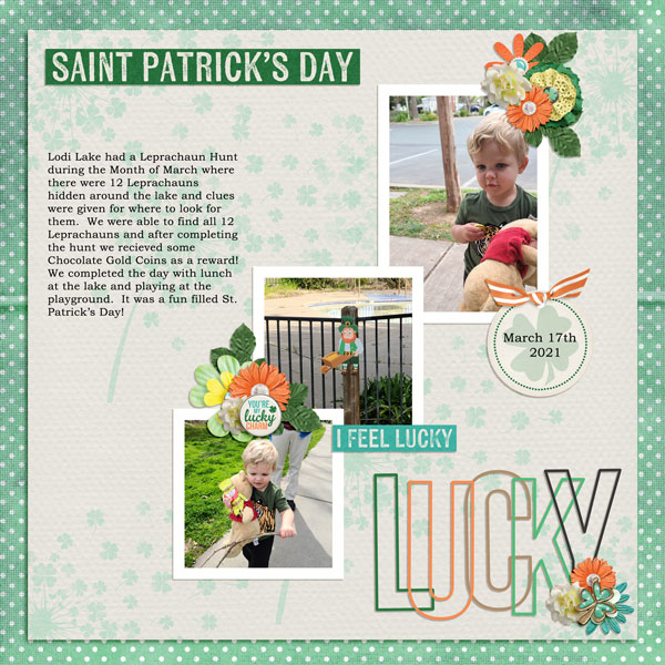
This layout by wendeeds is filled with shamrocks. I had to look hard to see the brush – it’s behind the journaling! I thought she’d used patterned paper.
Here, pippin has turned the brush into confetti and it’s showering the couple with luck.

I love how Rhewko has blended the brush into her background and added a touch of gold leaf to it. It’s both subtle and obvious.

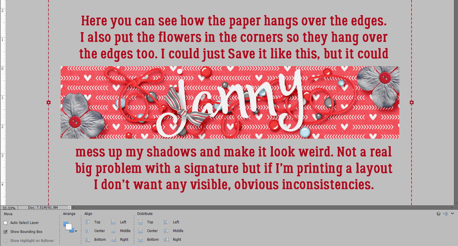
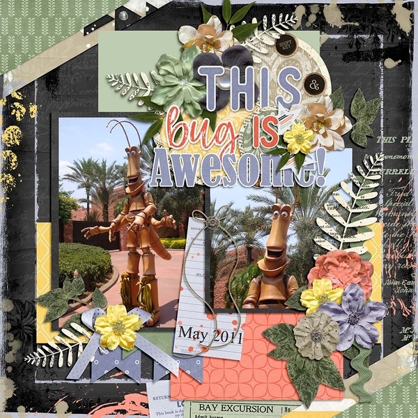
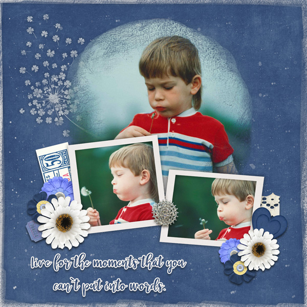
Here, jcfdelaware has overlaid the brush with her photo mask, blending them. The little boy blowing on the dandelions is blowing the brush’s shamrocks into the universe.
Look at the tone-on-tone beauty of this layout from ysgbo! The brushes are randomly positioned, with the layout divided diagonally. The upper right are embossed and the lower left are debossed. Brilliant!

Dannisa has the brush repeating and gradually shrinking, with the shamrock pouf overlapping and creating a cloud of parachutes.

My eyes went right to this layout in the album. The way Grace has turned one of her photos into a pencil sketch is lovely, and who isn’t drawn to sunflowers right now? But it’s the way the brush seems to mingle with the paper scatter that is the real genius here.

The way barbaraj has duplicated the brush is clever; it looks like she die-cut them from paper and carefully positioned each tiny piece.

Macsandy makes the brush an integral part of her background, and has pulled the green from other aspects of her background to create a seamless image. Using a black-and-white photo was a great idea.

For her layout, Effie4037 used the brush in a very subtle way. I like that she chose to echo the mint green from her border paper rather than the more traditional green of her title strip. The brush ties her photos together and grounds them to the background beautifully.
The way willow‘s brush explodes into the layout makes it so hard to know where the brush ends and her photo begins. Great choice to invert the colour where the brush extends into the central gray paper strip too!

To me, the brushwork on garrynkim‘s layout looks like a stencil applied with a very gentle hand.
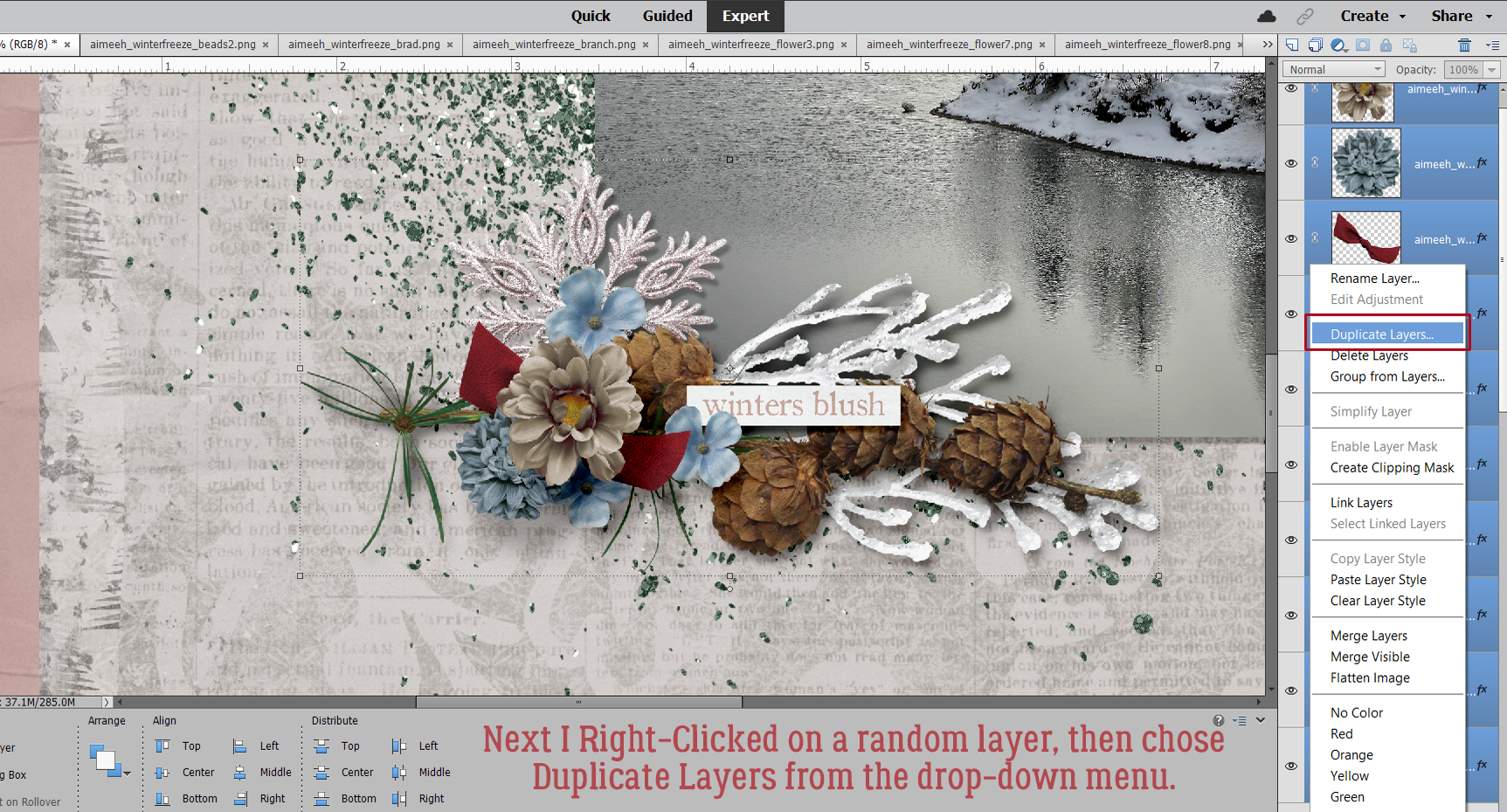
At first, I thought Jill had put her layout into the wrong album. So I took a closer look. The brush is there… russet and blended into the old wood background and providing a landing pad for that gorgeous cluster.

At first glance, you might think this layout from PixyGirl has popcorn on it. But it’s the brush, in white and with a pearl glued to many of the shamrocks.

Tsubasa went to a lot of trouble to blend the brush into her photo. Look carefully at how she’s lightened the main part of the photo, framed that focal seedhead and then augmented the blowing seeds with the brush. Amazing!

By blending the brush into this dreamy, soft watercolour paper, wvwendy has really added oomph to her layout.

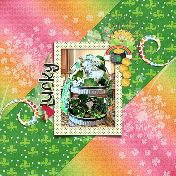
I saved this version from linweb for last. She used it very cleverly to create a St Patrick’s Day card and I LOVE it!!

I hope you’ve gotten some flashes of inspiration from this stroll through the Gallery. I know I did!
PDF Version: https://bit.ly/3KKY6Oz
![]()

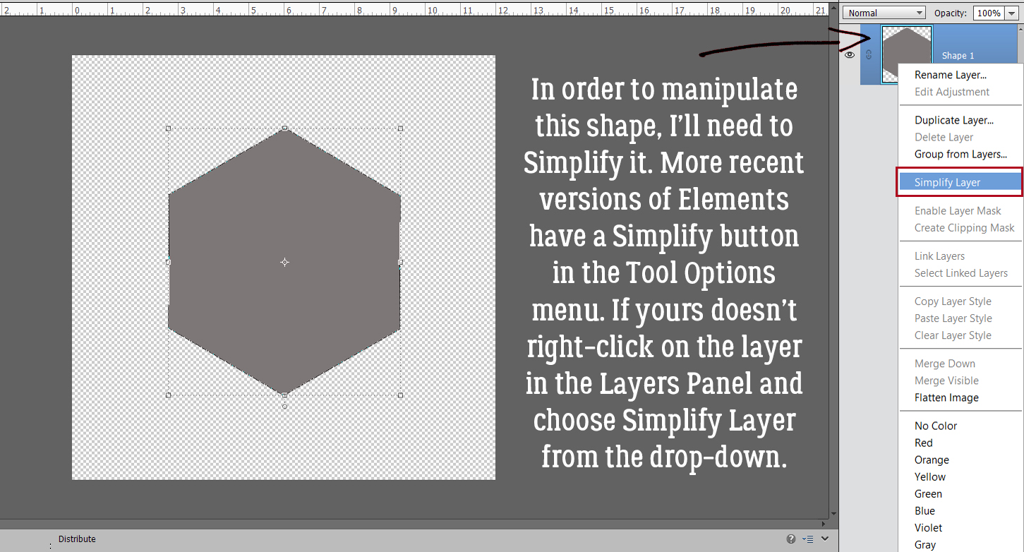


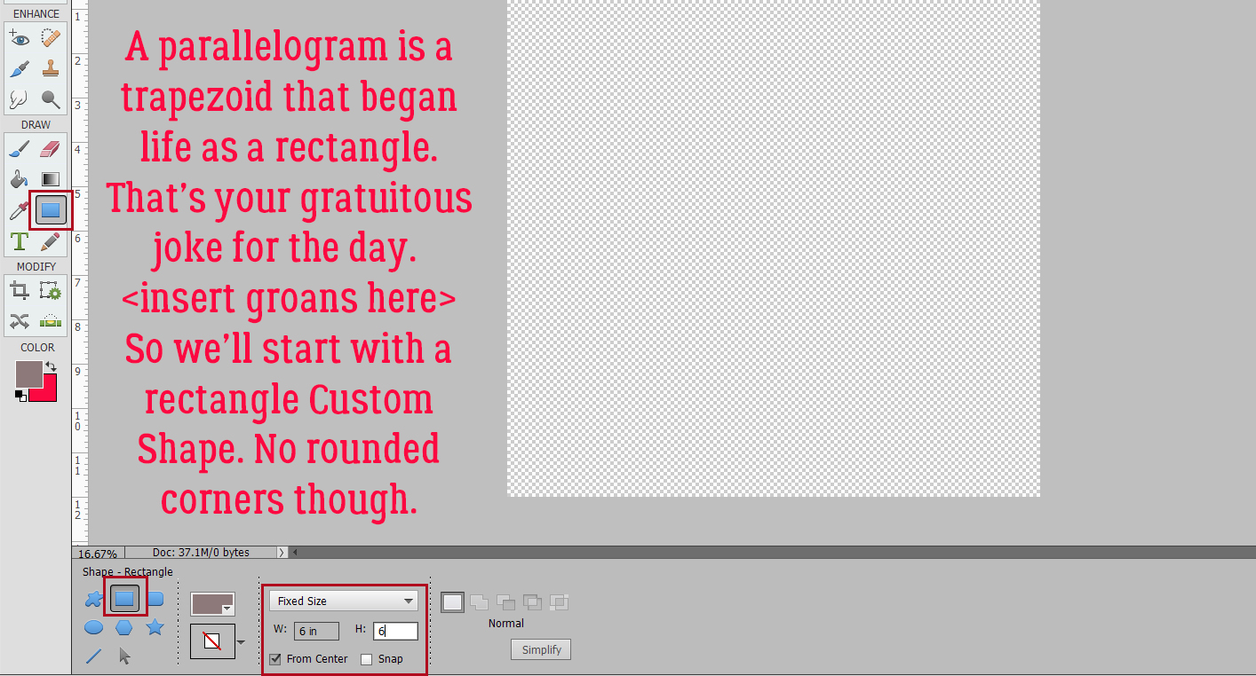
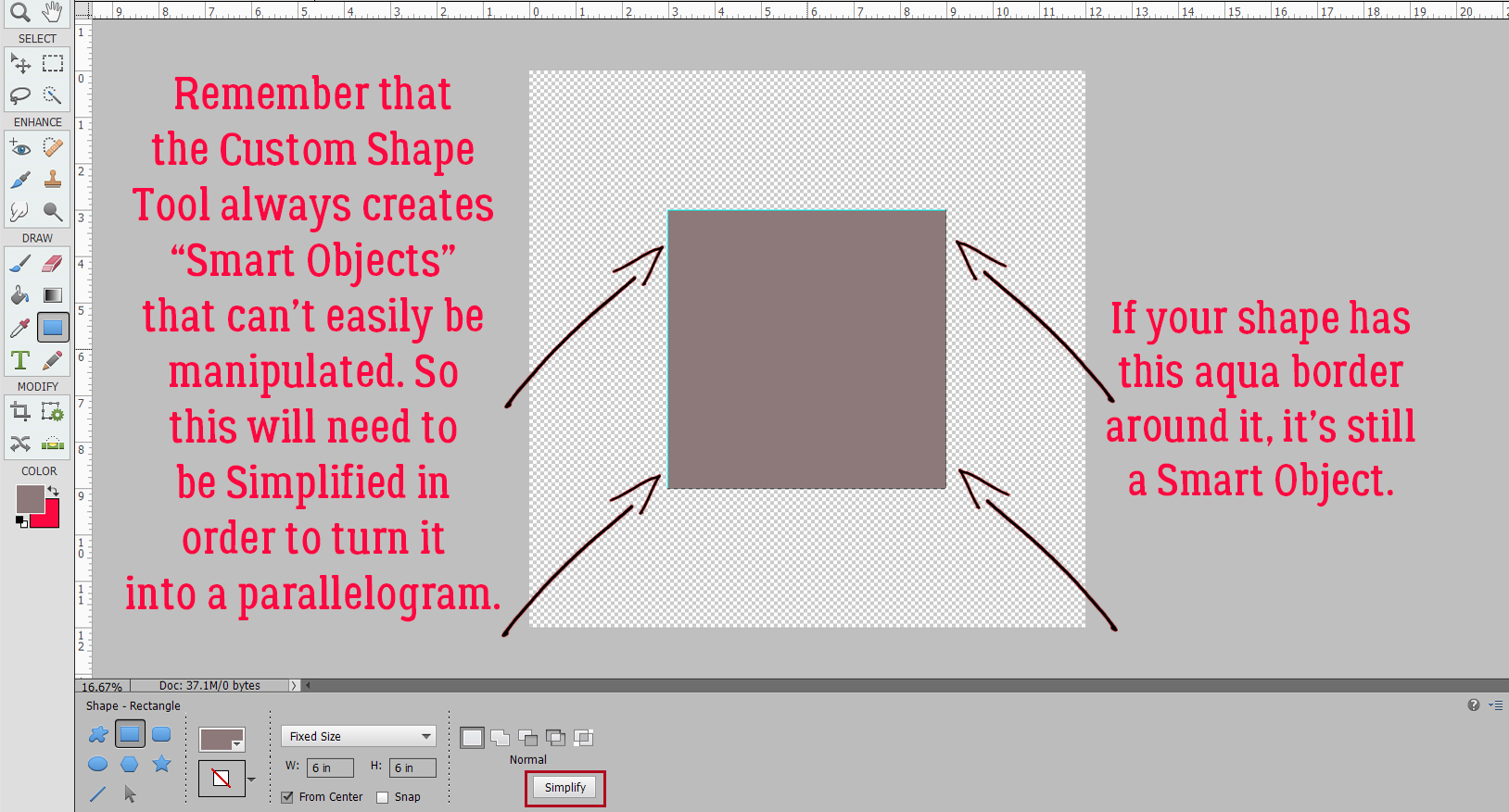
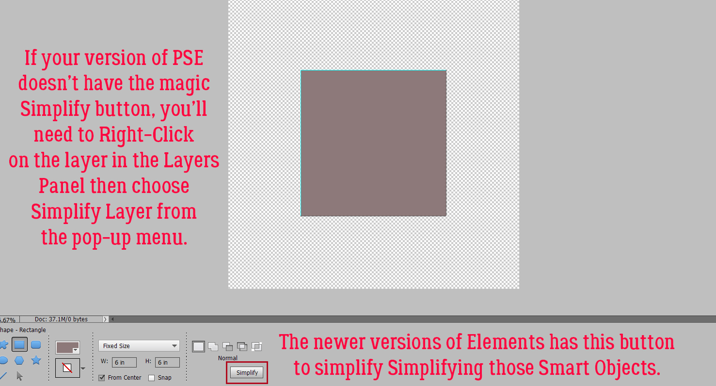
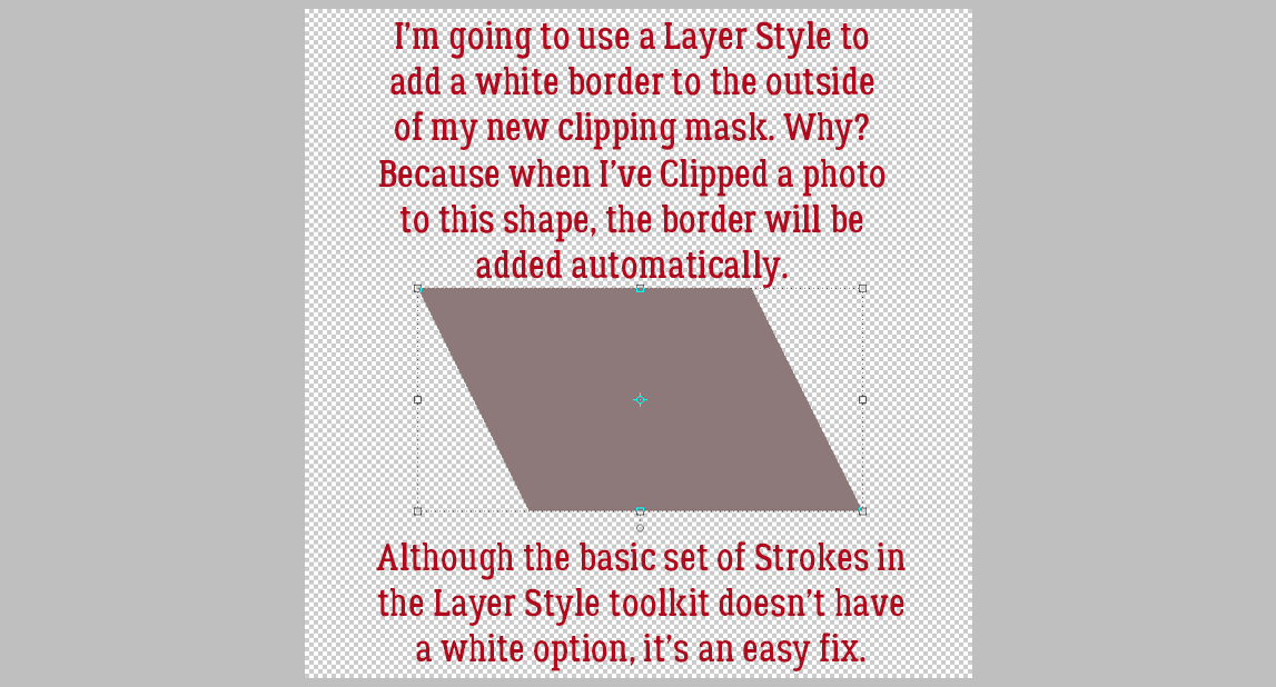
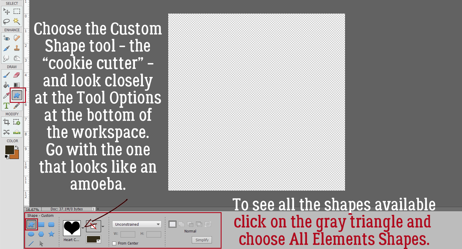
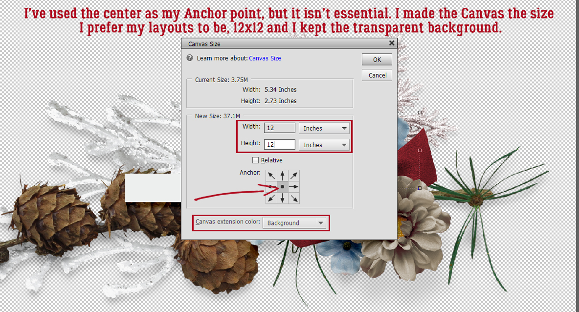
 We’ll come back to the hexagon in a minute. What if you chose a more complicated shape, like this seal? You can use all the controls in the Tool Options, like using Defined Size, and if you tick the From Center box, Elements will put the shape right in the centre of the canvas. Here, I’ve shown the Simplify button (the one you may not have). Experiment with your software; the more you play with it, the better you’ll understand what it can do and what it can’t. (And these tutorials will make more sense…) You’ll find a system and a rhythm that works for you.

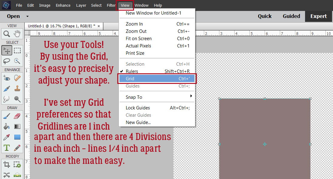
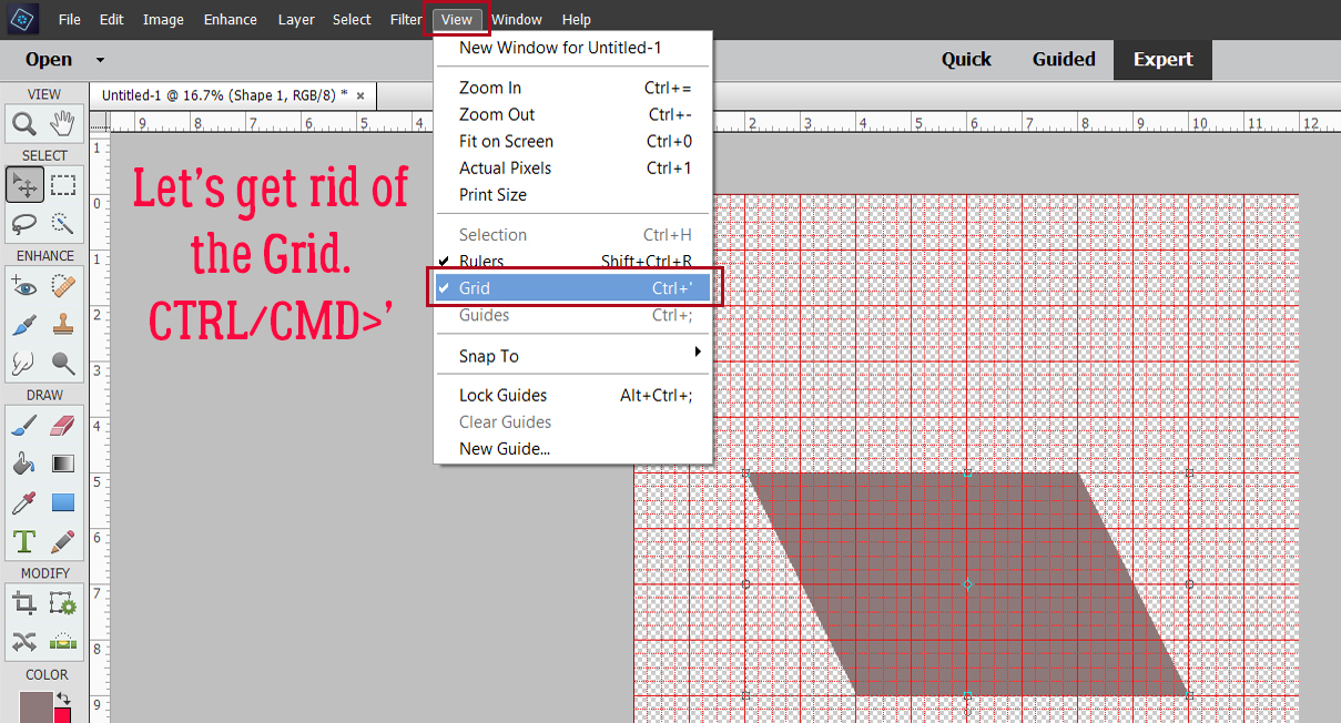
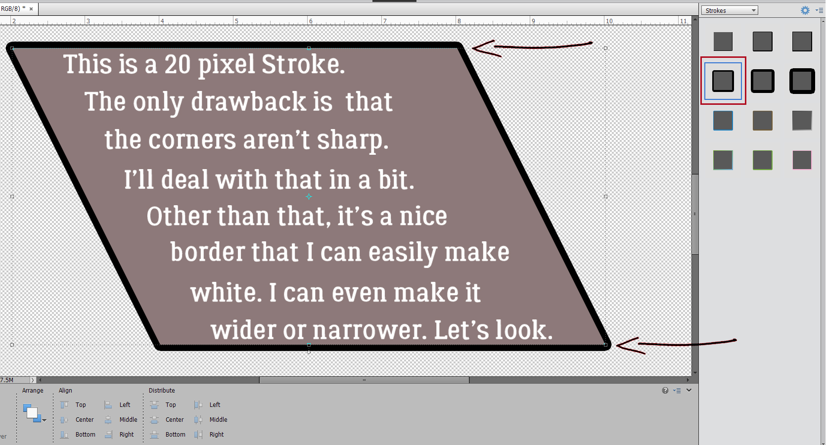
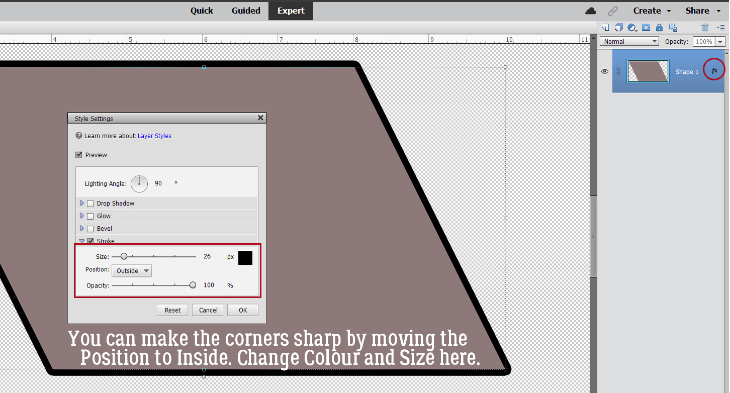
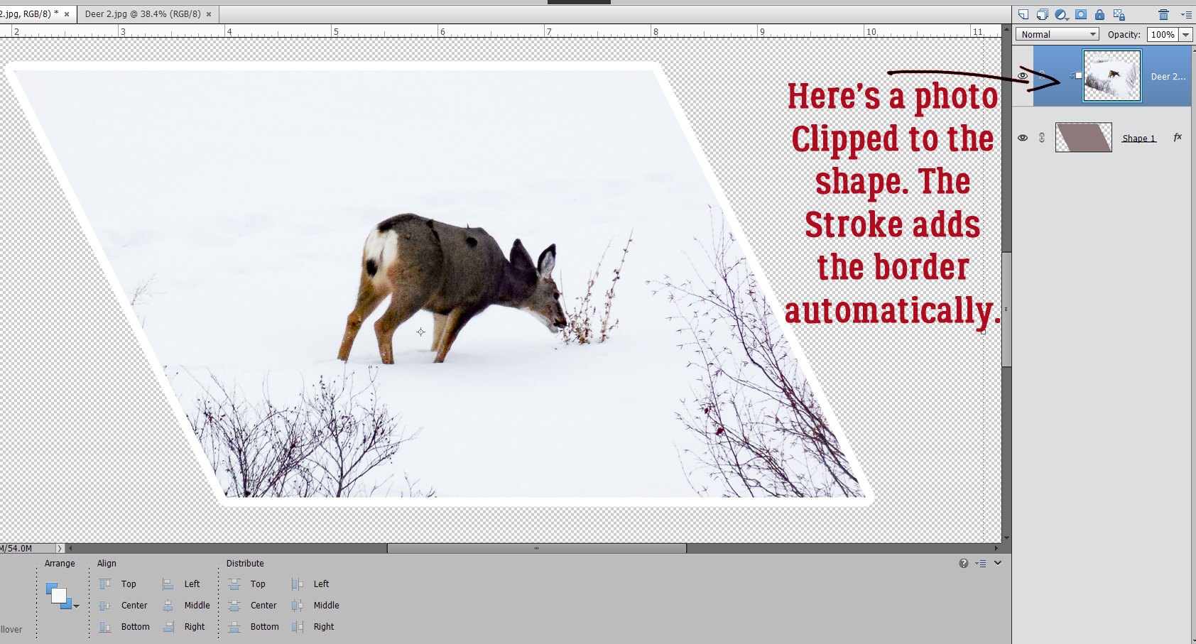
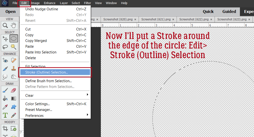
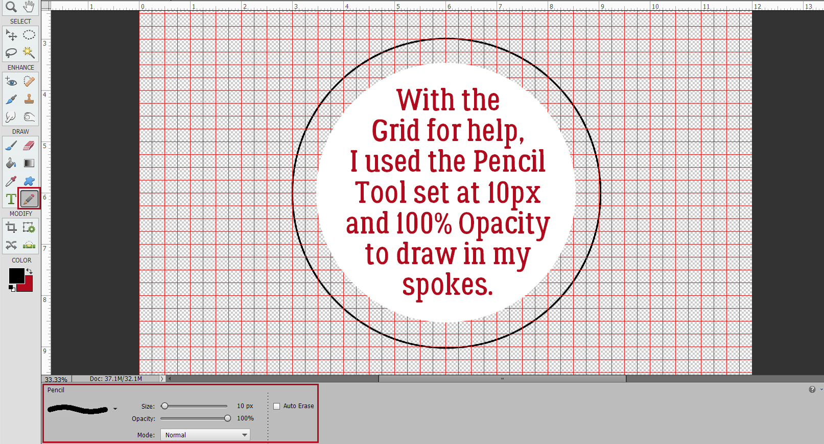
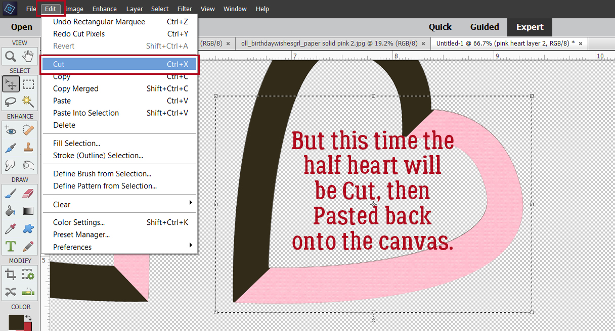
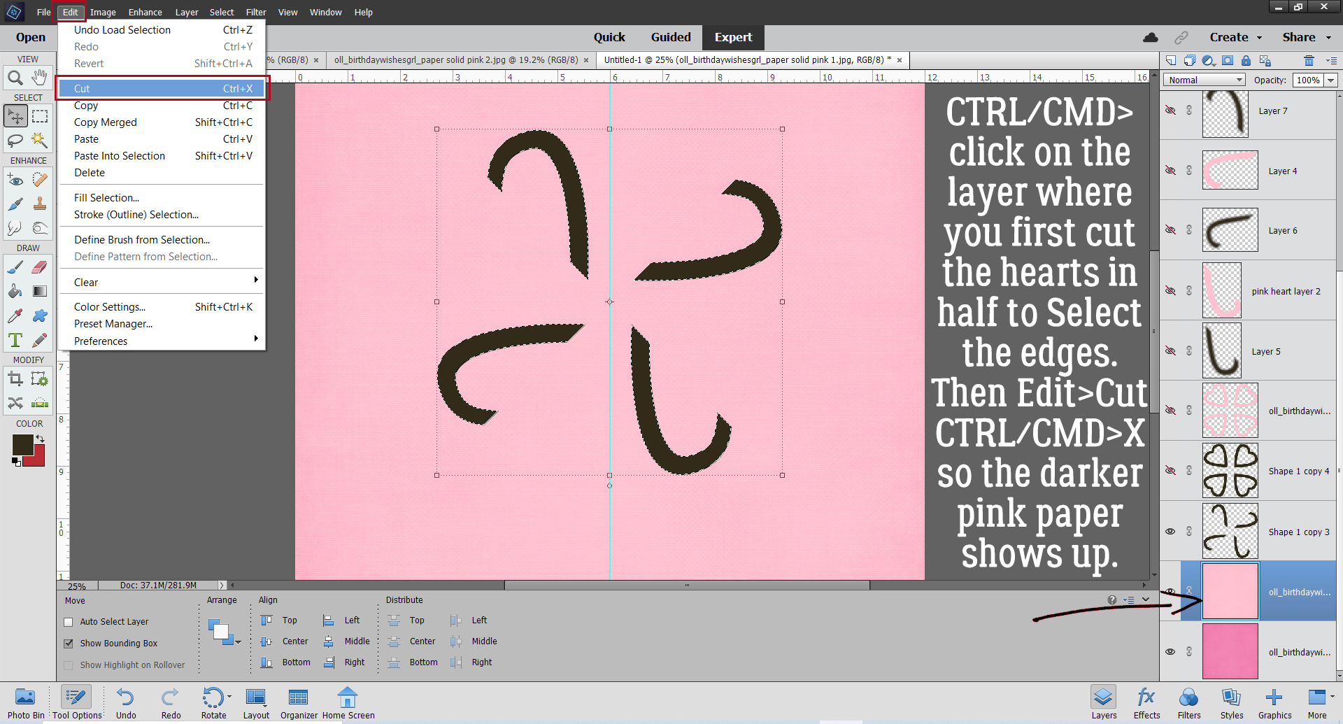
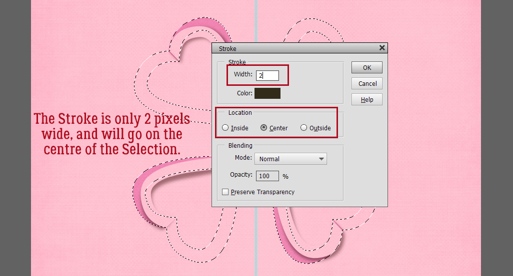
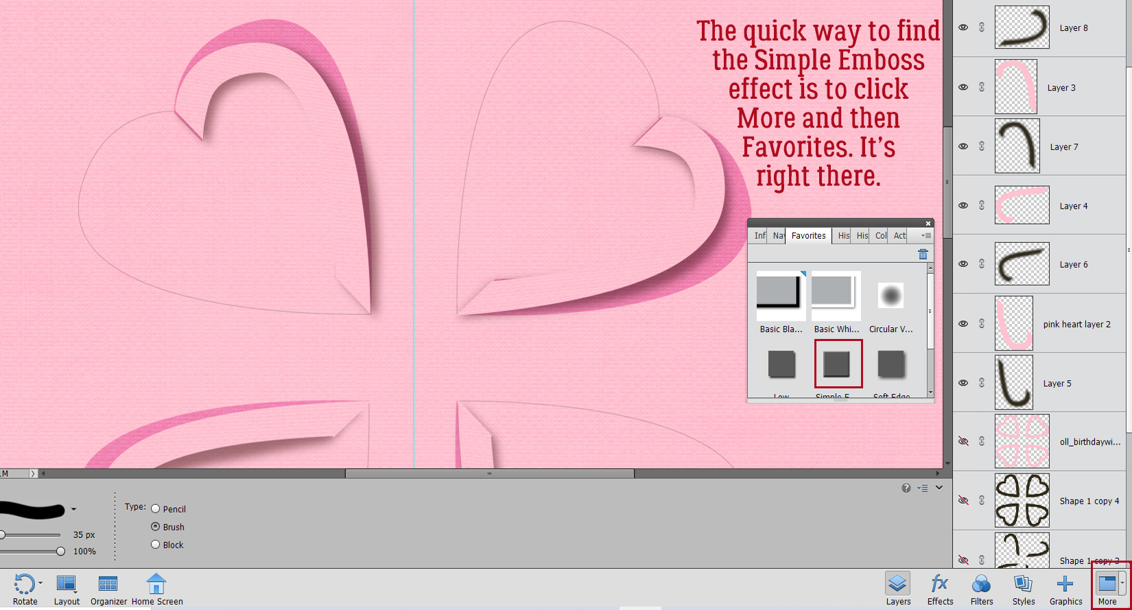
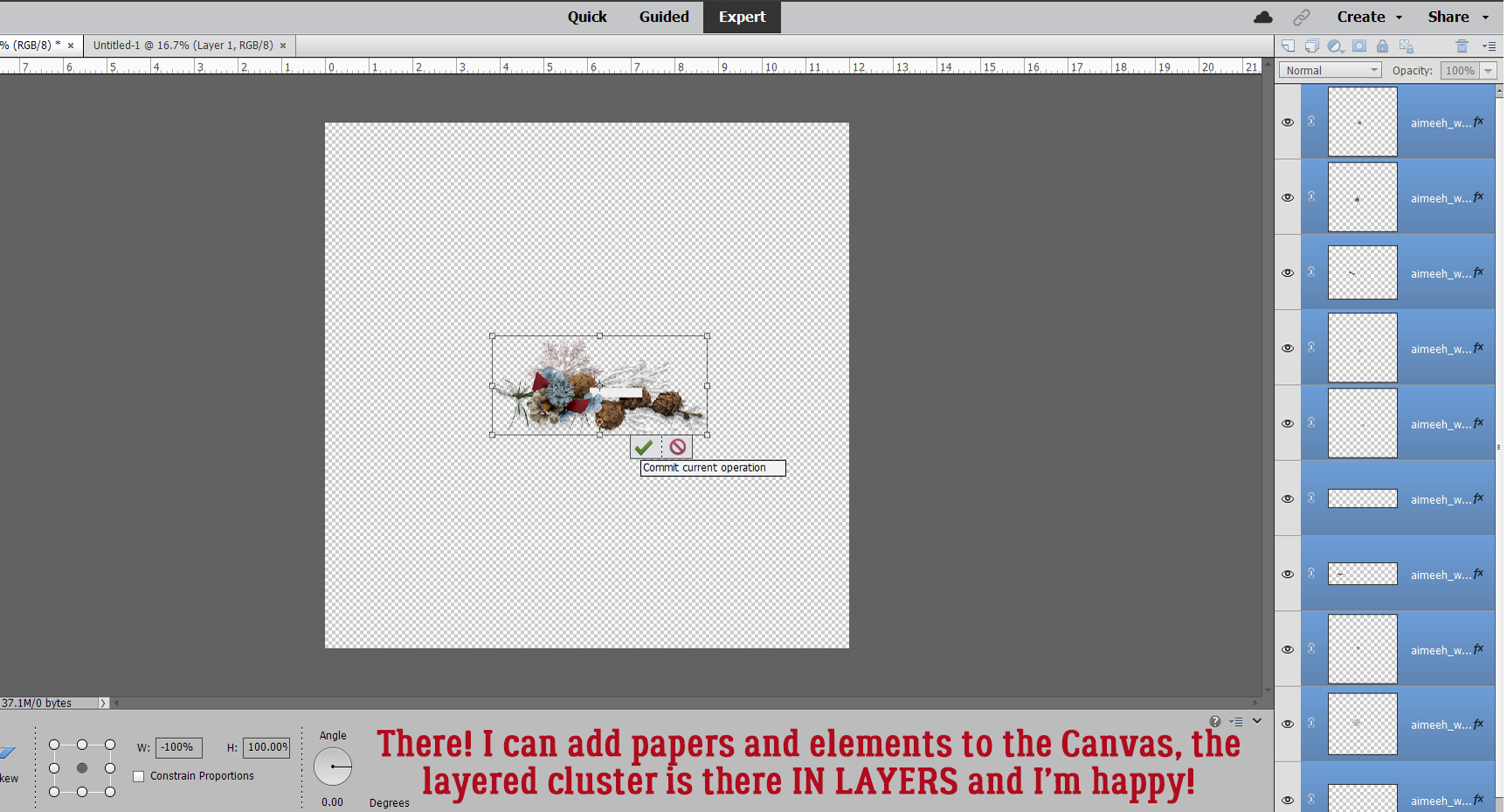
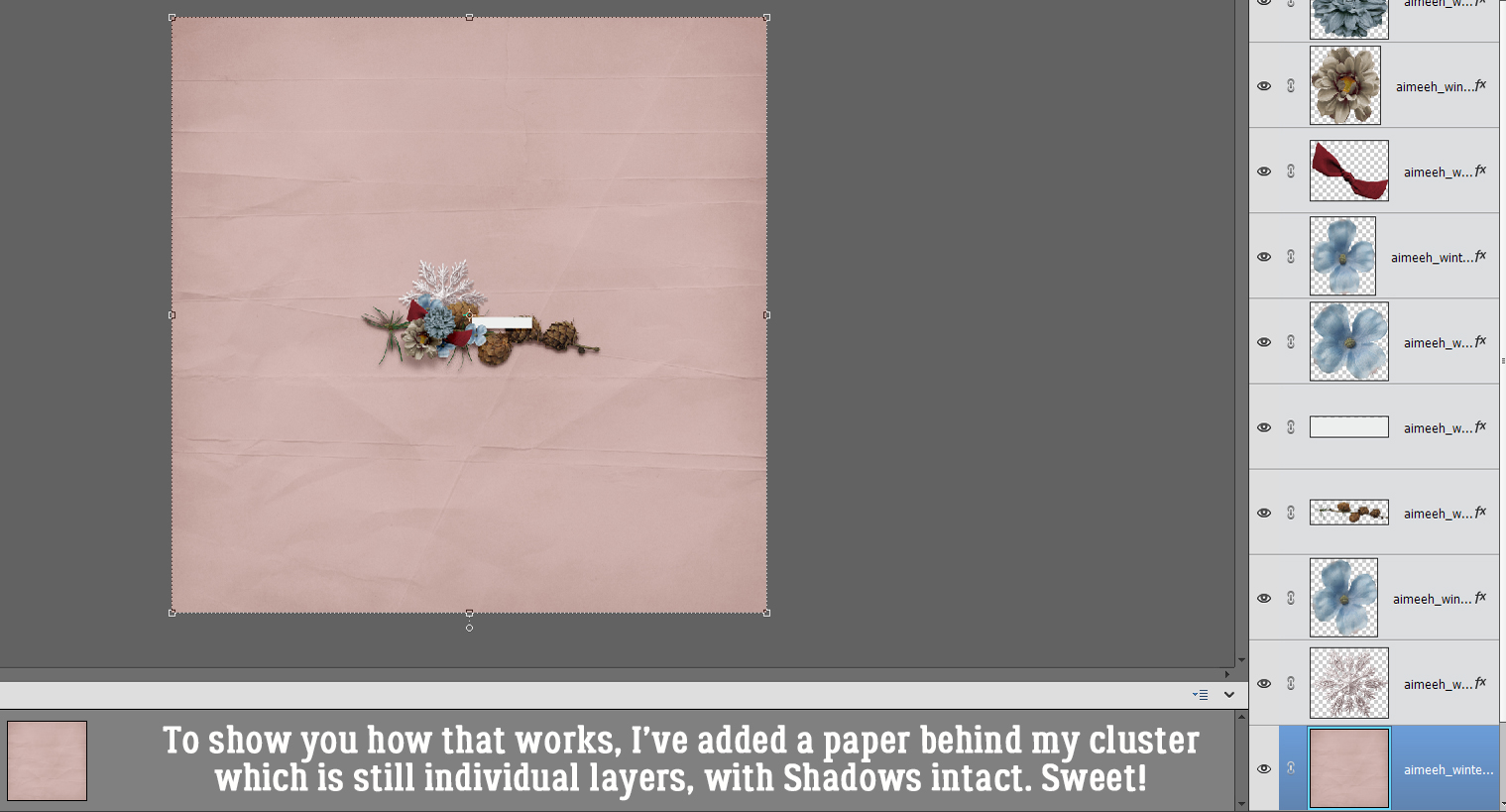
 Quick-and-easy border making uses the Stroke Edit. CTRL/CMD>click on the Layer Thumbnail to “Select” the edges of the hexagon, inside and out. Make sure you’re on the blank layer, then Edit>Stroke (Outline) Selection.