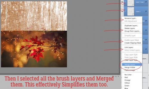
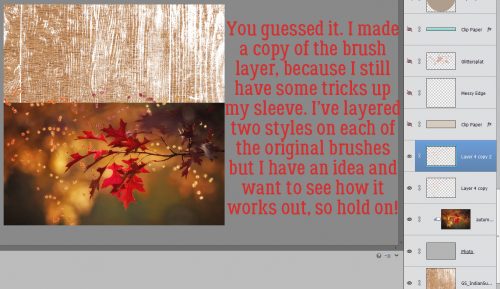
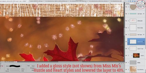
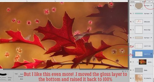
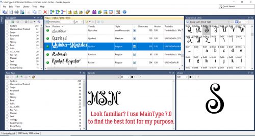
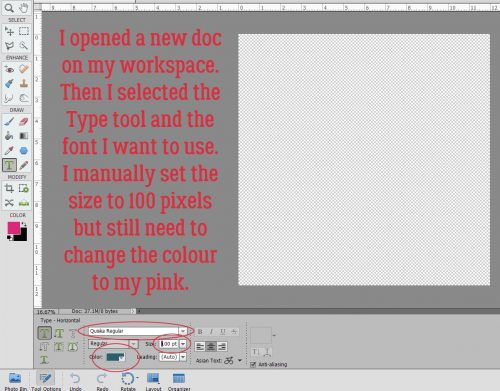
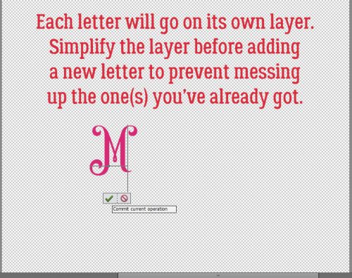
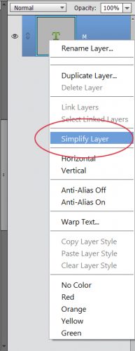
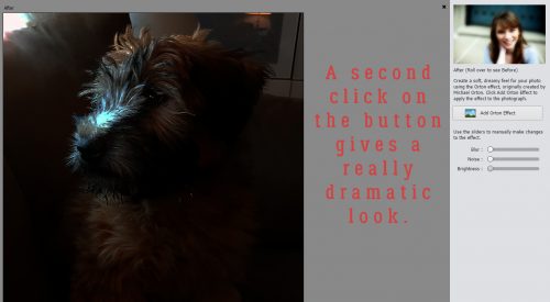
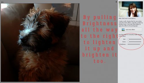
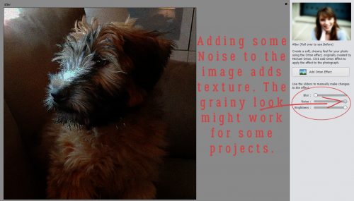
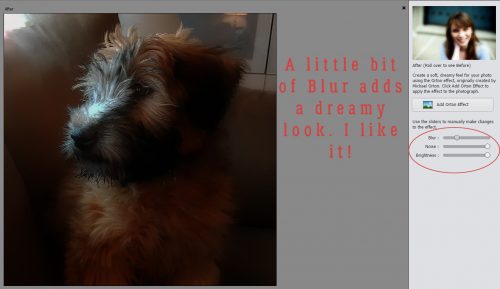
8 ball, Corner Pocket!
![]()
Last week when I was struggling to find a topic to write about, I asked the GingerScraps Ad Team members for some ideas. Teresa suggested I do something about pocket scrapping. I have to tell you, I was floored. Pocket scrapping isn’t my thing and it’s really not my comfort zone either. I know it was a big part of the digi world several years ago, and I flirted with Project 52 (there’s NO WAY I could commit to Project 365 and I admit it!) but I wasn’t all that successful. So I had some learning to do before I could present myself as an expert. Ha! The EXPERT is Becky Higgins, the developer of Project Life. She has an app for that in addition to a whole paper line for pocket scrapping.
What IS pocket scrapping? Basically, it’s a clean-and-simple style of layout based mainly on a grid. It’s ideal for documenting the memorable (and the ordinary) events of our lives. Each section of the grid or block can hold a photo, a pocket/journal card, art work or a cluster of embellishments.
Why is it called pocket scrapping? It has its roots in paper scrapping, and it makes use of vinyl pockets of mainly two standard sizes, 2″x3″ and 4″x6″. Digital pocket scrapping follows the same format, and it lends itself very well to hybrid scrapping. You can create your page, print it and then attach buttons, ribbons, lace and pockets holding ephemera to the page.
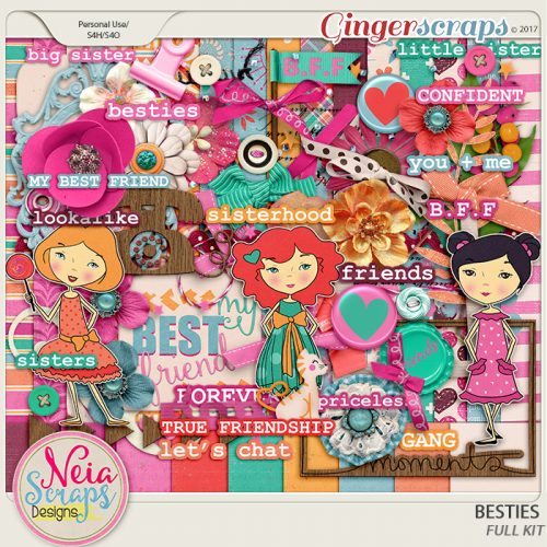
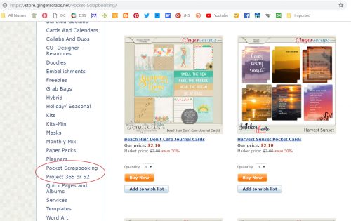
Most of the designers on the GingerBread Ladies team here create kits and templates that work beautifully for pocket scrapping. In fact there are pages and pages of kits tagged for this style of memory keeping. And it’s easy to find them, too! I thought about giving you a list of designers whose products are amazing for pocket pages, but it would be a lot faster just to show you how to see them for yourself.
I’d love to show you some examples I found in the Gallery. This one is from trina513. I like that she’s used her Instagram photos.
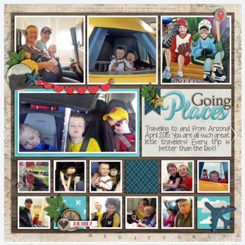
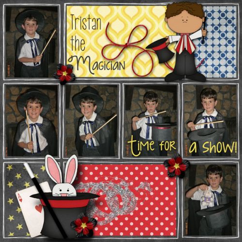
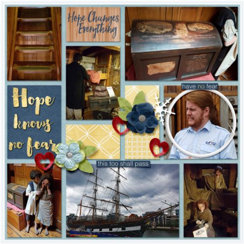
minicooper452 created this one. The photos tell a story, and the journaling preserves the excitement of the day.
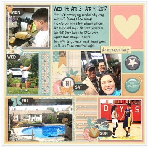
This one by emscraps is obviously a Project 52 layout. Em has managed to maintain her P52 for years now!
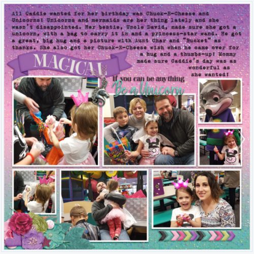
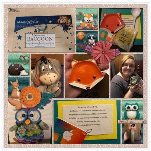
Belis2mi has documented a special day for her children with this layout.
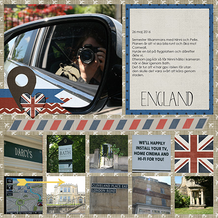
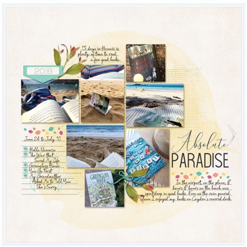
I really like the feel this layout from amyjcaz has, with the photos of how she spent her day at the beach.
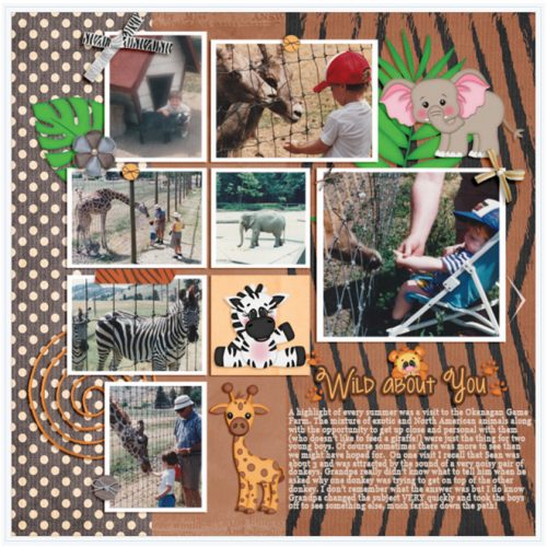
Because I live in cowboy country, this one by psychozoe caught my eye right away.
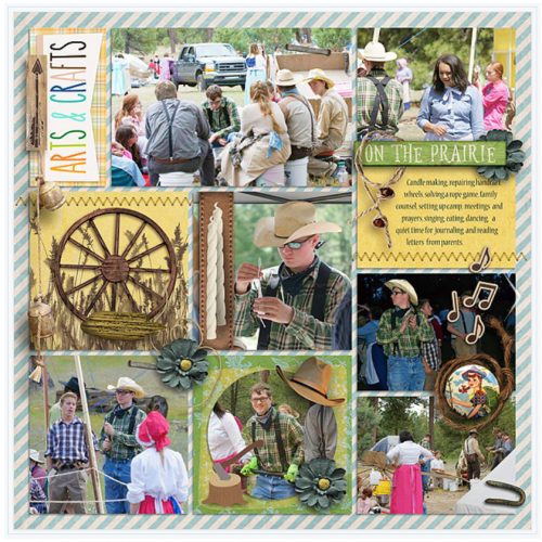
And then there’s this one from firstoscartgrouch that’s so whimsical and fun.
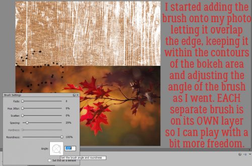
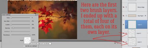
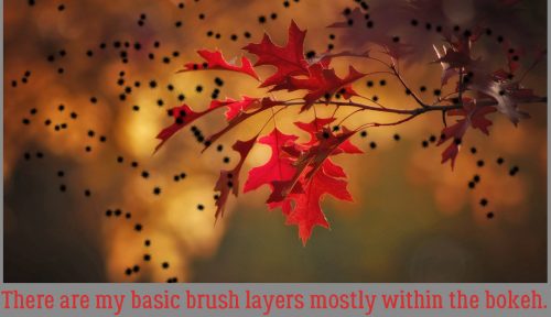
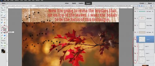
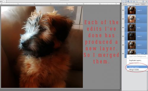
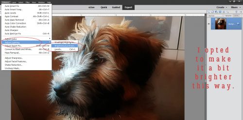
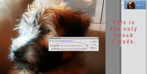
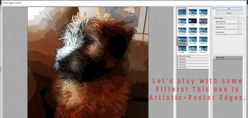
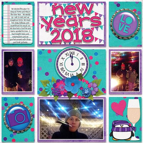
After looking at all these examples of pocket scrapping and seeing the individual stamps of each scrapper on her layout, I decided to give it a shot! It’s pretty amateurish, but maybe if I do a few more…
Next week there will not be a tutorial. We’re going to visit my parents and then our daughter in her new home in the mountains for a few days and I just won’t be able to squeeze in a blog post. I’ll be doing all the driving so I’ll be seeking a horizontal surface!
![]()