Challenge Spotlight: iNSD Mini Kit Challenge
![]()
Yep, I know. May is 2/3 over already. It seems Spring is a little behind for us this year; it’s quite cool and damp – I can’t complain about rain though, given the extreme drought we’re stuck in here. But I digress. This month I’m taking us on a bit of a different path for the Challenge Spotlight. Rather than going with one of the usual monthly Challenges, I chose the iNSD Mini Kit Challenge, hosted by CarolW. This was part of the week-long (inter)National Scrapbook Day celebration and it was VERY well-received. The kit Carol provided for the Challenge is beautiful! [editor’s note: There’s an entire BUNDLE that matches the mini in Carol‘s store…] The mini was so well-received, in fact, that I had to stop snagging images from the Gallery when I hit 20. Can’t lose the audience, you know! The layouts appear in the order they were posted to the Challenge thread.

As always, I’ll be linking each of the layouts to the Gallery so you can get a closer look at them and leave some comments, should you wish. Just click on the Scrapper’s user name and you’ll be zoomed right to her layout. Now let’s look at how each Scrapper has used the exactly same mini kit to create a very individual layout…
First up is this clean-and-simple layout from deej. She’s kept her focus on the photo with her minimalist use of papers and embellishments.

Katherine Woodin‘s a scrappin’ machine. She participates in EVERYTHING while also documenting all the moments of her life. She’s augmented the mini with bits and pieces from the full kit to create her layout. By blending her desaturated photos into the background paper, she was able to use photos that might not coordinate colour-wise with the kit while reflecting the theme. I like the precision of her perfectly-spaced button border.

LovelyMissKait makes her first Challenge Spotlight appearance with this beaut! [Welcome!!] The design of her cluster is perfection. The shadows on those papers… the paper looks like it’s lifting a bit in spots. Very effective.

For her layout, greenfiend27 blended some of the papers, threw some paint splashes on, then clustered the elements to draw the eye to her images. That star bokeh adds an almost mystical look. The quote is the perfect addition.

The yellow patterned paper is surely a hit! Here, aquaris has used the wire heart as a frame, anchored by her floral cluster. [Should I tell her I see hummingbirds out my living room window all the time?]

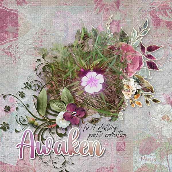
Ah! The grungy, gesso-smeared paper takes its first starring role! The photo of the crocus was a brilliant choice, andastra; it coordinates with the kit’s colour palette beautifully.

There it is again! But this layout looks very different – individual style, amirite? That tumble of paper rounds created by pagefrocks provides movement anc keeps the eye traveling across the page.

And we’re back to the yellow patterned paper again. But that’s the only similarity to the other yellow layouts. KarenDiamond has chosen a photo that coordinates perfectly, then blended it over a paper frame. Her use of brushes and word art to draw the eye while remaining true to the theme is quite skillful.

I see mum23ms has used elements from the full kit for her white space layout. Can you pick them out?

What an artsy look dhariana has given her layout. That grungy paper is the perfect background for this style. She’s made expert use of white space and created a strong horizontal aspect with the arrangement of her elements.

This just screams JOY at me! LidiaG has designed a gorgeous cluster to anchor her photo, and is the first to use the most neutral of the papers for her background. On (much) closer inspection I see she’s also used a mask to blend in the striped paper with a very subtle touch. Love it!

It’s so interesting that two Scrappers can use identical backgrounds and yet have such unique looks. I can see where trinanne got her inspiration – the carriage flair! So far she’s the only one whose extracted the hummingbird from the ephemera.

Cool!! Look at how the way jenasz used the star bokeh sparks her photo! It adds such a magical touch – almost like fireflies. The other unique touch is how she’s twined the vine all the way around the photo, like a frame.

Ooh, where do I start with this? The splotchy ink is gorgeous, the masked photo is perfect and to be honest, it’s really hard to tell where the photo ends and the elements pick up. This is a masterpiece, biche77!

I adore how bagheertje has blended her papers for the background. It looks easy, but getting it right isn’t! She too has extracted the hummingbird and used the loop of twine as a frame, but brings her own style to that beautiful central cluster.

There’s the star overlay again, but with a completely different look. Pippin‘s spray of flowers draws the eye to her photo beautifully blended into the ink splotch. See how the hummie ephemera almost seems like an extension of the ink?

I think this is the first layout to make prominent use of the raffia twine loops. I very much like the font demma_b13 chose for her title – it has an old-world feel, evoking thoughts of European colonization in the late 15th century. The yellow flowers bring a sunny warmth.

How clever is wvufan04? Using the ink splash as the background for some word art in a font very similar to the one on her male subject’s t-shirt… so smart! I like the tiny pops of pink too.

I like how jirsev has amped the ink splashes against that grungy paper. Her layout pops right off my screen.

Our last peep is muted and filled with luscious white space. AJsRandom opted to emphasize the yellow end of the colour palette for her layout and kept her cluster very simple. Lovely!

If you participated in this Challenge and your layout isn’t shown above, I apologize for the omission. It doesn’t mean your layout isn’t stunning and deserving, it means I ran outta gas! I’m functioning on very little sleep ATM and just couldn’t go beyond 20 today. I feel like my brain is melting… But I’ll pull it together and come up with a Quick Trick for next Tuesday!
![]()