3D Title – Paper Letters
![]()
PDF Version : https://bit.ly/3N838aO
Today’s tutorial is in response to a request from Glee. She’d seen a layout in a gallery created by biche57 that had a paper-letter title with the letters stitched to the background. The letters appeared to be lifted away from the background, sort of like butterfly wings. “How’d she do that??” Well, this is how JAN would do it…
I’m using the June Font Challenge font for my layout, and then Clipping papers to each individual letters. You can absolutely use an alpha to get it done faster and with fewer steps. The papers I’m using are from the GingerBread Ladies‘ collab Outdoorsy.

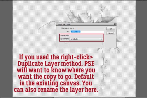
Here’s a little Quick Trick I just discovered. You can BATCH-SIMPLIFY all the text layers! To activate them all, click>shift click on the first and last text layers. Then right-click and choose Simplify Layer.

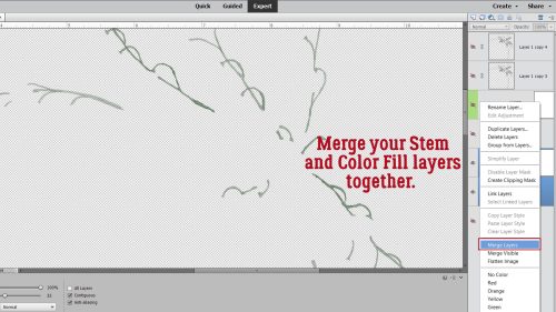
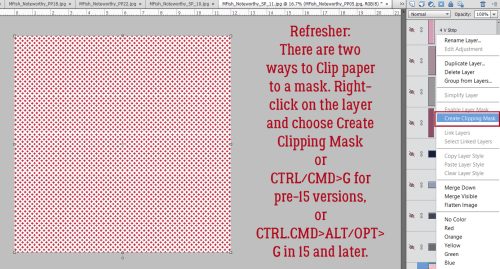
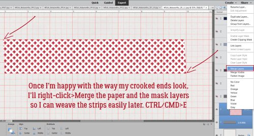
Here you can see that I’ve Clipped papers to each letter layer. Right-click>Create Clipping Mask or CTRL/CMD>ALT/OPT>G for Elements versions 15 and newer. For older versions the shortcut is just CTRL/CMD>G. To make each letter easier to manage, the paper and letter layers should be Merged. Activate the two layers then right-click>Merge or CTRL/CMD>E.

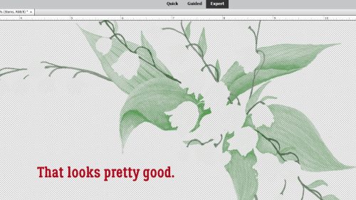
There! Now I have my paper title. Let’s stitch them down.

My granddaughter’s backpack is lavender, so I thought, why not use lavender stitches? You can put those stitches wherever you like; they’ll be your anchor for lifting the paper, so I felt it was best if I ran the stitches through the centre of the Bs.

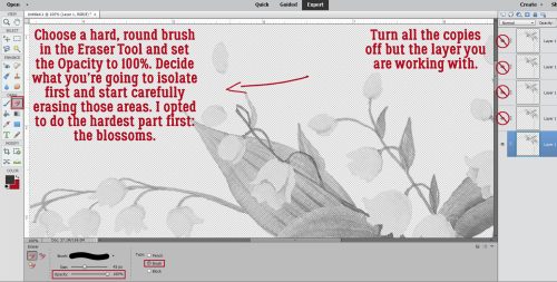
We’re creating the illusion that those letters are lifted away from the background, and the easiest way to do that is to use custom shadows. For a lot of you this will be a review so feel free to skip ahead. I won’t mind! (I also won’t know. 😉 ) For those who haven’t seen the previous custom-shadow tuts, we start with Selecting the outline of the object we’re shadowing. To do that, CTRL/CMD>click on the letter’s thumbnail – that little picture of what’s on that layer – in the Layers Panel. That engages the marching ants and gets them doing their drill around the contours of the letter.

Now add a new blank layer UNDERNEATH the layer you’ve just selected. CTRL/CMD>click on the sheet-of-paper icon at the top left of the Layers Panel.

Over at the Color Picker, choose your shadow colour by clicking on the Foreground Color as shown. I’m using black [#000000] but a lot of people like a browner colour like #2c2801. It’s up to you. Then grab the Paint Bucket Tool and dump it into the outline.

Before Elements will let you do anything else, you’ll have to Select>Deselect or CTRL/CMD>D to stop the ants from marching.

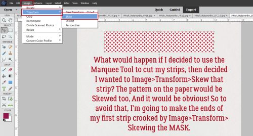
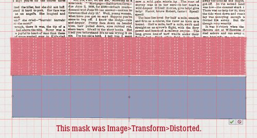
The quickest, most effective way to simulate lifting the paper away is to use the Image>Transform>Distort Tool. This lets us change both the size and shape of the image in all directions. The only real limit is how far you take it. Remember to have your shadows all falling in the same direction; decide where your light source is so you can be consistent.

Click-drag one corner of the Bounding Box at a time until you get the shape you want. See how my Bounding Box isn’t symmetrical any more?

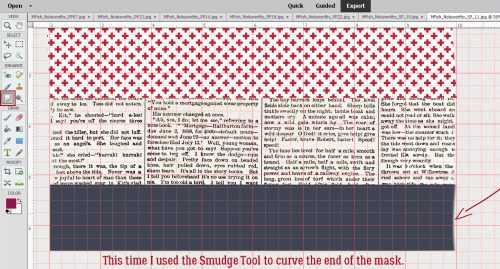
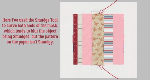
To hone the shadow and add realism to it, the shadow needs to be very narrow where the stitches are holding the letter down. I use the Smudge Tool for that. I push the shadow toward the letter at the stitches, and pull the shadow away where I want the paper lifting. The Smudge Tool also adds a slight Blur, but not usually enough to look real.

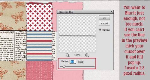
So… we’ll add a Filter>Blur>Gaussian Blur… to the shadow.

To be able to see a Preview of the Filter, click your cursor on the edge of your shadow. Then you can see up close how moving the slider softens the edges of your shadow. Remember, shadows are softer the more light is allowed to leak underneath an object – the farther away from the surface it’s sitting on it is, the softer the shadow. Hot Tip: you don’t have to go through all the Filter steps if you’re going to use the same settings for each layer. Just click CTRL/CMD>F and Elements will do the rest.

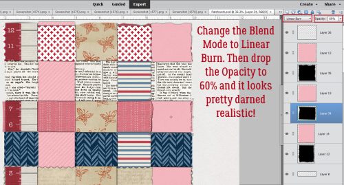
To be realistic, the background colour shows through the shadow. To achieve that requires changing the Blend Mode from Normal to Linear Burn.

To make it look less stark and harsh, decrease the Opacity of that shadow layer. Move the slider until you’re happy with what you see. I like 35% – for now – and it’ll be adjustable if I decide it’s too light or dark.

After each letter is shadowed, the stitches need shadows too. I just went with the same steps, but without the Distort and Smudge. I also used a much lighter touch with the Blur because the stitches are literally IN the paper so the shadows will be sharper.

Last thing is to make any tweaks you think will make your title really POP. I just use the Smudge Tool!

I know this method of creating shadows sounds complicated and labour-intensive. At first, it really is. But the more you do it, the easier and more intuitive it becomes. I don’t even really think about the steps now, they’re so familiar. It’s the shadows that really elevate a layout, so it’s worth practicing. Don’t forget to have fun! Next week we’re going to play with doodles.
![]()