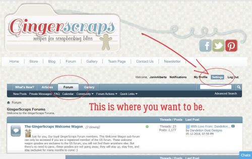
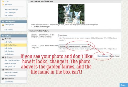
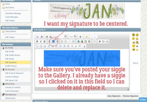
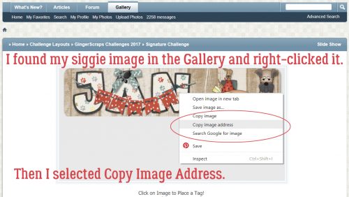
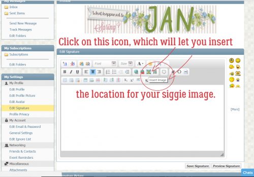
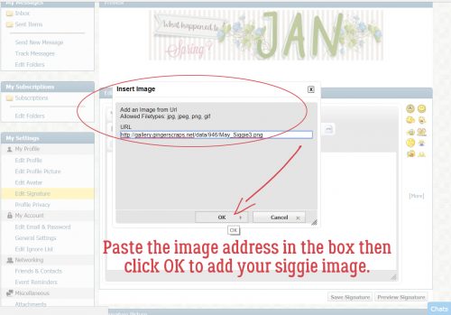
Good morning everyone. I have some good news. We’re getting so close to the forum and the gallery being up and running. There are still a few things being worked on in the background, but you can take a peek. I suggest not to upload anything until Ginger gives the okay to do so.
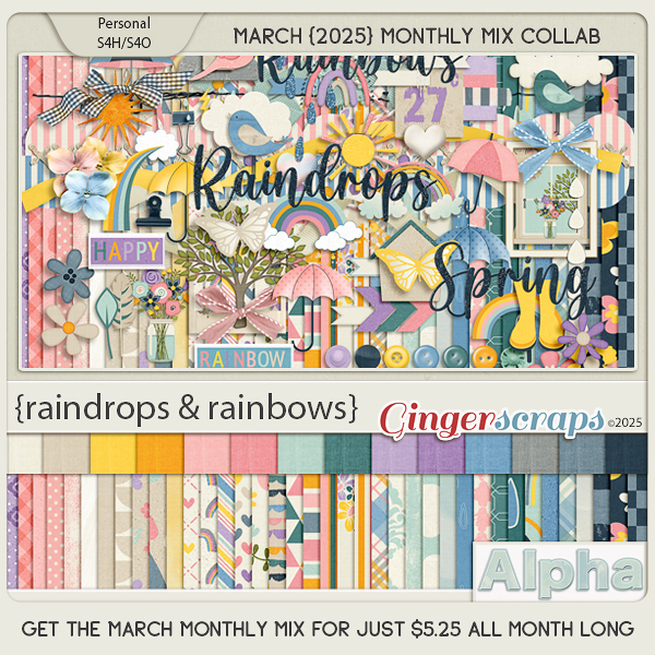
Spend $10 in the store and you will get this great collab for free.

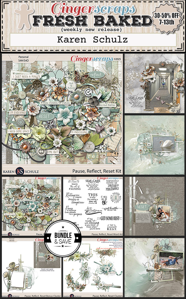
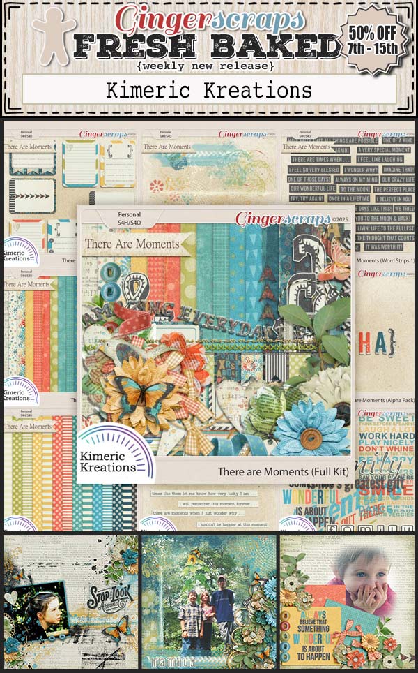
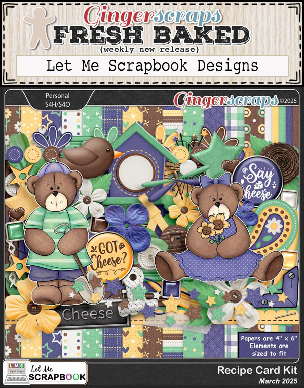
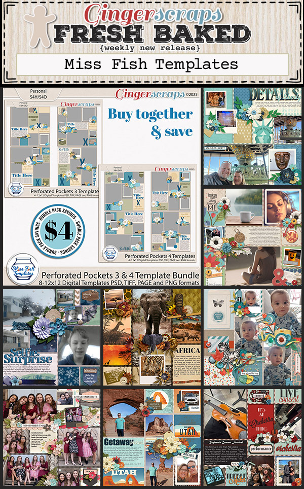
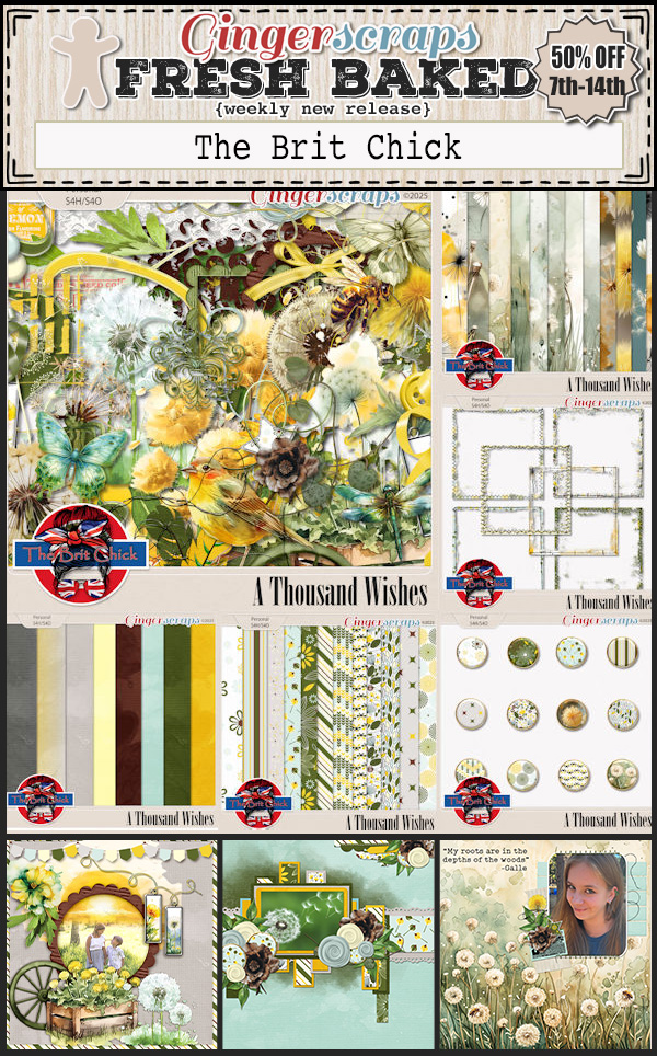
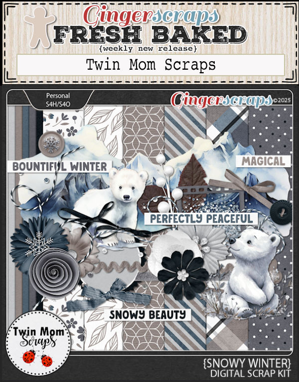
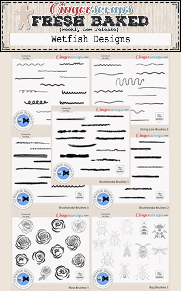
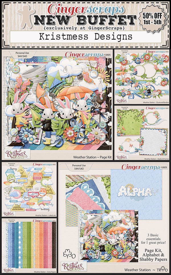
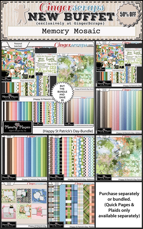
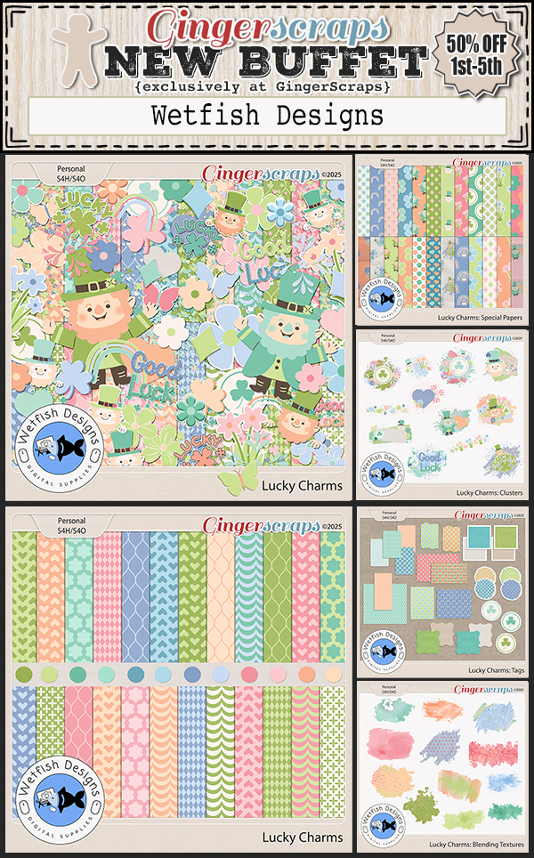
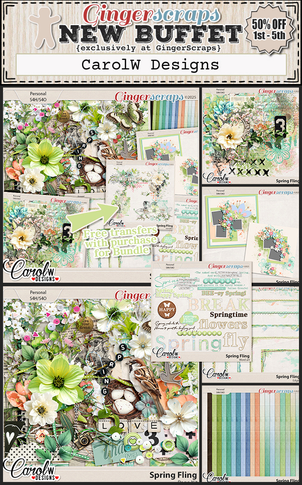
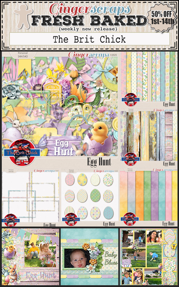
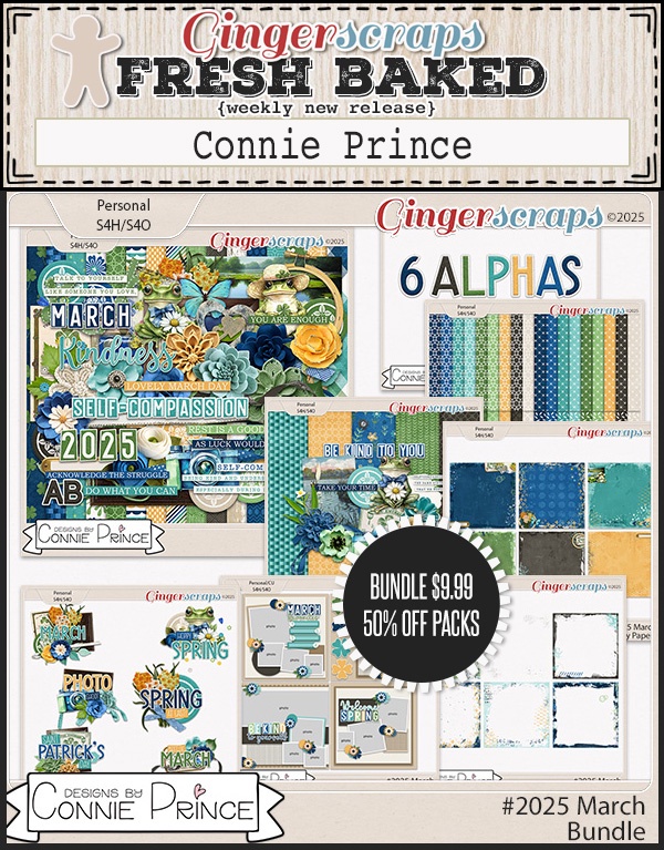
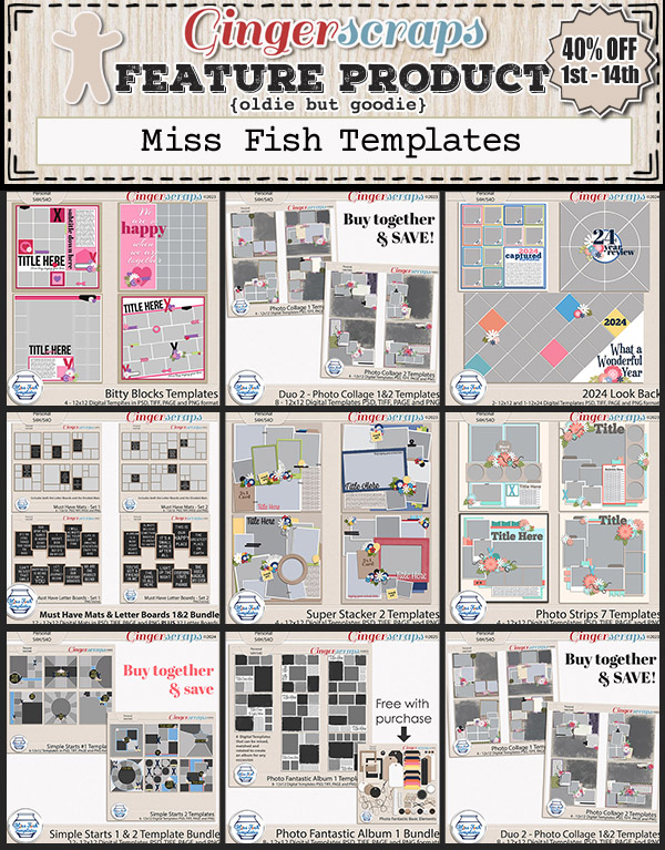
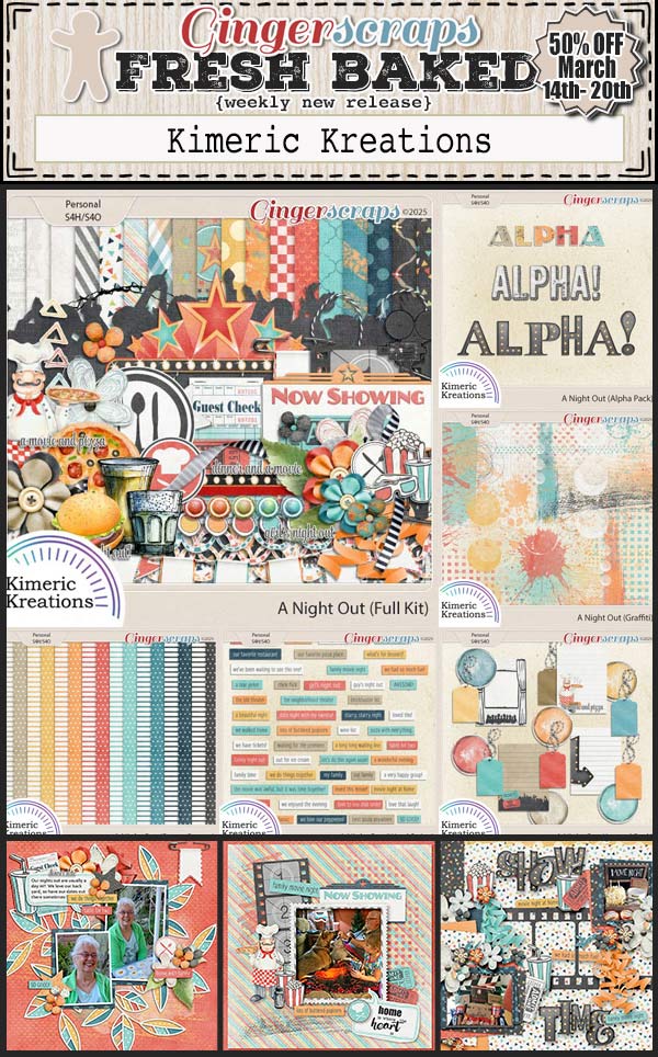
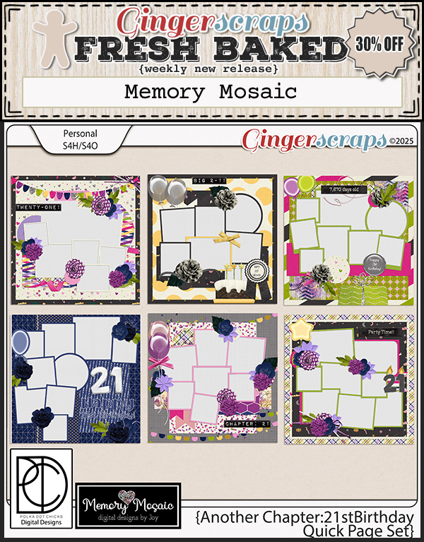
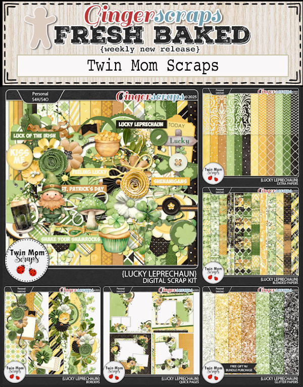
I see a little green in this week’s new releases. We must be close to St. Patrick’s Day!


Ginger has set up a temporary blog home and made blog posts for most of the challenges for March so you can get a start on them before the forum is up and running. This might make scrolling for Daily Downloads, Tutorials, or other blog content a little trickier, but don’t worry—you can use the “tagged with” feature at the bottom of posts to quickly find what you’re looking for. Whether you want to see all the Daily Download posts or just the March 2025 Challenges, the tags will help keep everything organized!
Complete any 10 challenges and you will get this collab (or a variety of other choices from previous challenge collabs) as a reward.