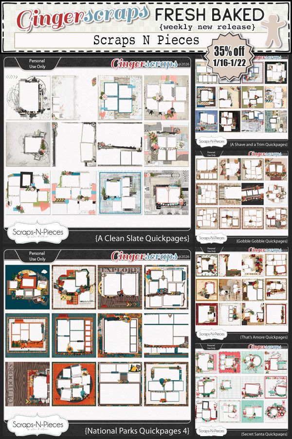
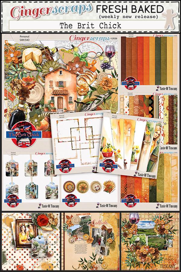
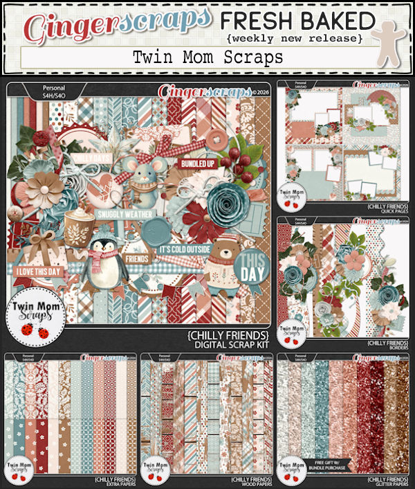
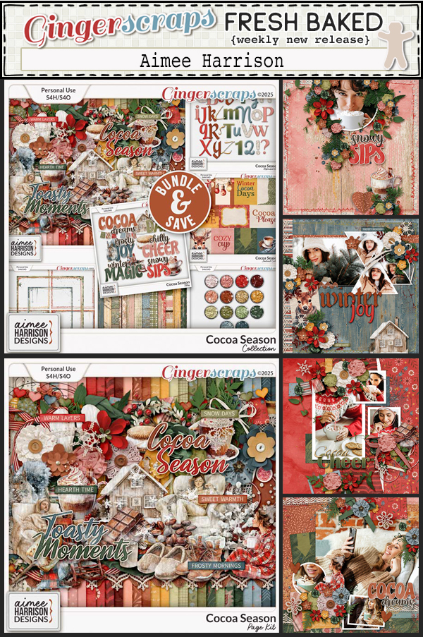
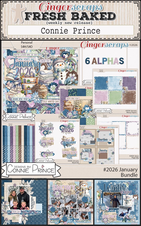
$2 Tuesday Is Live + Last Chance 65% OFF Retirement Sale @ GingerScraps
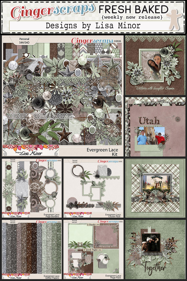
It’s one of those weeks at GingerScraps where you might want to grab an extra cup of coffee and settle in, because the deals are flying fast. $2 Tuesday and Wednesday are officially here, bringing you a fresh batch of scrappy favorites for just two dollars each. It’s the perfect chance to boost your stash, try something new, or grab a few extras for upcoming projects.
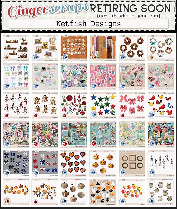
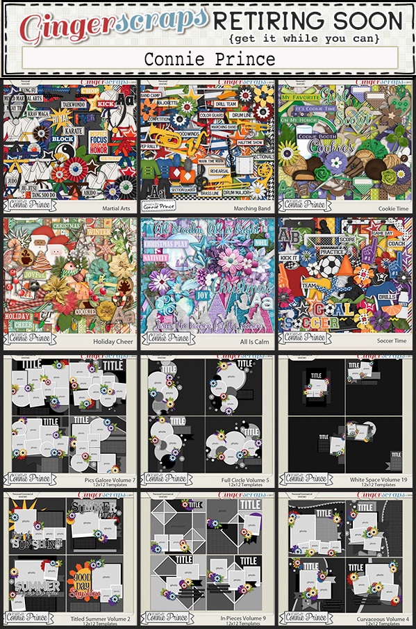
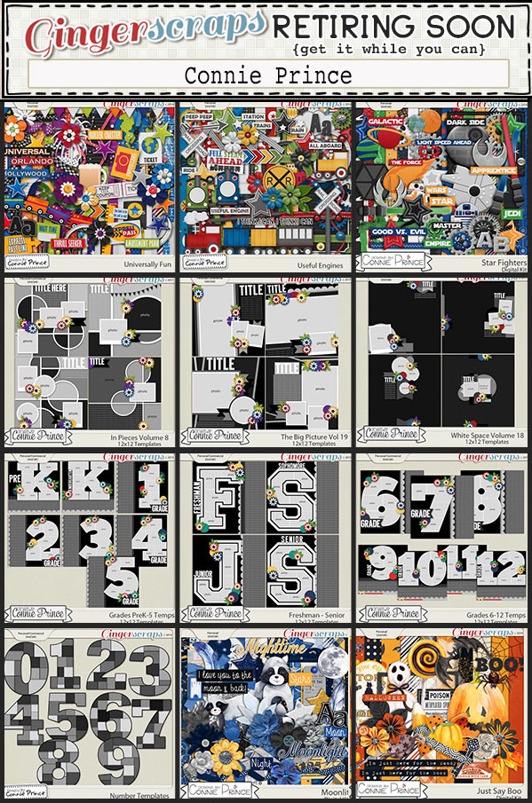
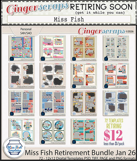
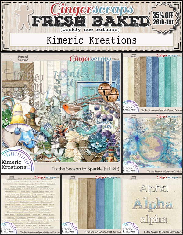
But wait, there’s more. Today is the LAST DAY of our $1.50 Bake Sale, so if you’ve been eyeing any of those sweet deals, now is the time to snag them before they’re gone. And this is also your FINAL CALL for the Out With The Old sale, with retiring products marked down 65% OFF and disappearing for good when the sale ends. Once they’re gone, they’re gone forever, so be sure to grab your favorites while you still can.
Three big sales and the PERFECT time to shop and scrap!