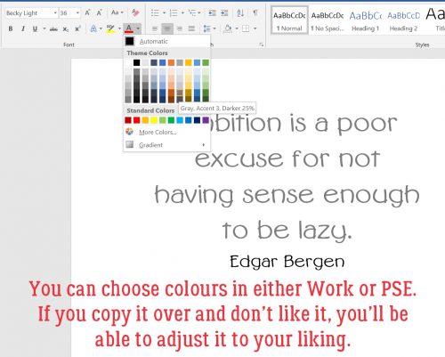
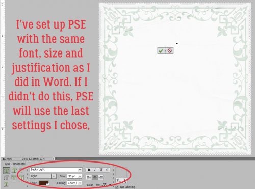
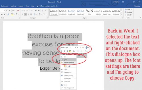
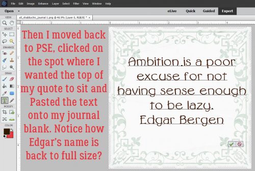
Magic Eraser!! (Not Mr Clean but close)
![]()
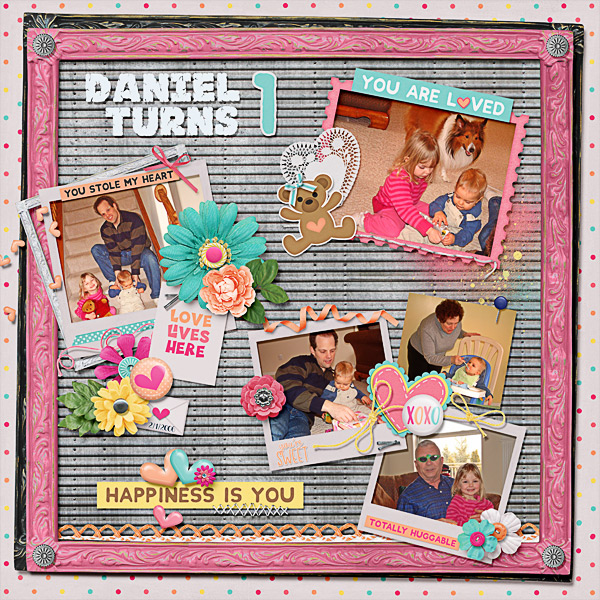
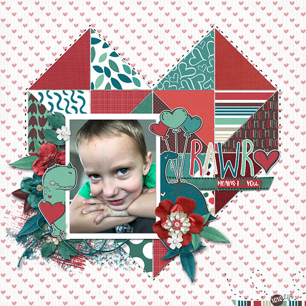
I know I can’t be the only one who collects brochures from the attractions I visit when I travel. And I’m pretty sure I’m not the only one who likes to make my own journal cards to go with my photos when I scrap those travel photos. I really wanted to use the Wells House logo somewhere on my layout below and decided this would be a good time to try something new (to me). The template I chose, from the GingerBread Ladies mega-collab Oh Snap! had a journal card spot, and it inspired me. And ADB Designs‘ January Daily Download kit Cozy New Year was the perfect kit to go with my photos.

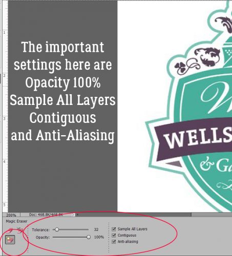
The logo is pretty well delineated in the image below, and I just want the logo itself. I could put it on a new document and extract it using one of the methods I’ve shown you in the past, but I wanted to try something new. So let’s get to it!

I’d never tried the other options in the Eraser Tool menu and this seemed like a good time to give it a look. That one with the yellow starburst is called the Magic Eraser Tool and it is indeed magical!

There are some settings that are vital to use with this technique. The Opacity has to be 100%, and all three boxes along the right side of the menu should be checked: Sample All Layers, Contiguous and Anti-Aliasing.
The screenshot says it all… I really did just click on the background and it vanished. (See the new transparent background?)

So then I wanted to play! I have a bunch of Bitmoji images saved to my computer and this one, which is pretty much how I’ve looked the whole month of February, was my next victim.

CLICK!

It was so easy, I wondered what would happen if I tried it on a photo. This one looks like a good choice to experiment with.

Oh. Didn’t expect that!

The tool magically erased some of his t-shirt along with the sky. That’s a limitation – the shadow isn’t enough of a contrast to the sky and Elements couldn’t tell

So I combed through my stock photos for one with more obvious contrast.

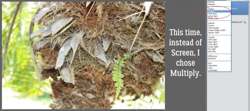
Now I’m starting to understand how the tool works. I’m going to need to click on every. single. different. colour. variation. Too much work!

So how about this one? Will it work better?

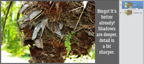
Not so much.

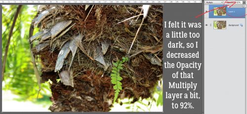
Maybe this one will work.

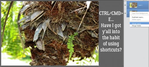
Or maybe not. Now I had to see what else I could do that would be smart, not hard, to preserve the stuff I wanted and remove the stuff I didn’t.

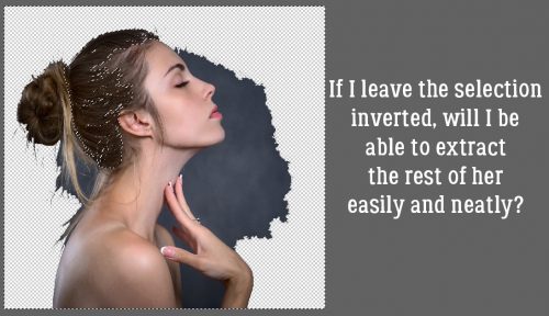
I went to the Magic Wand tool to see if it would be quick and easy enough to extract the woman and only the woman.

The marching ants surrounded her hair well enough. So I clicked on Select>Inverse (I lie. You know I went with CTRL/CMD>Shift>I.) to invert the selection… to “select” the background and not her hair.

Now you can see the marching ants around the outside of the photo. Back to the Magic Eraser I went.

Much better! The wisps might be a problem.

I clicked on other areas of the background that were still there.
Not bad! The only fiddly part of this is the wispy hair now.

I wanted to try it one more time, with this crest from one of the radar stations I lived on when I was a kid. It’s a fair representation of the place, I’ll say that! And it has a more detailed edge with that wreath of maple leaves.
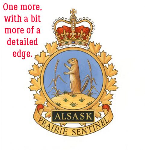
One click got rid of most of the background, but left the white in the spaces between the leaves. You can see them along the right side of the screenshot. I’d already clicked a few more times in the spaces to the left side. It only took about a minute to go all the way raound and get rid of the rest of the white background.

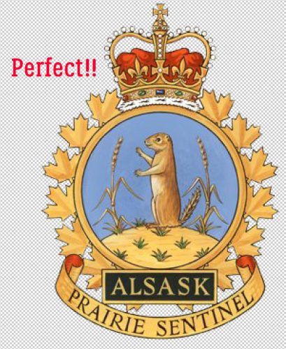
Sweet!! I’m not sure what I’ll use this for, and I’m going to see what I can do about wispy hair for a future lesson, but I can feel you chomping at the bit to try this one yourself.
Have fun!!
![]()