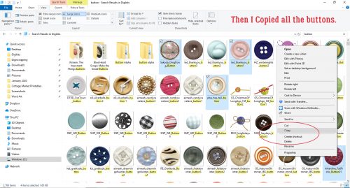
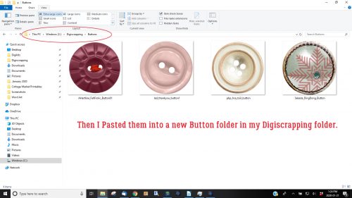
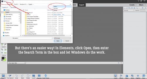
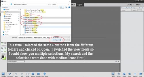
Be A-Frayed, Be Very A-Frayed!
![]()
When I asked the GingerScrappers on Facebook for tutorial topics, I got some great suggestions. This tutorial was inspired by Lisa, who asked me to figure out how to fray paper like fabric. I had a couple of ideas, but I wanted to be sure it would work, so I used a FABRIC object to test my theory. This is the outcome. I’m pretty sure I’ve also solved the paper-fraying goal as well. If, at the end of this tutorial you’d like me to do a follow-up with paper, leave me a note in the comments and I’ll do it. It’ll involve filters……
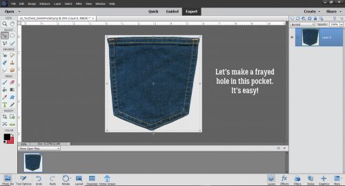
My fabric object is this sweet denim pocket from Laurie’s Scraps (one of our April Featured Designers!) Toy Chest kit. I plan to put a hole in it and then patch it. So let’s get after it! (Yes, I have Cuomo Prime Time on in the background.)
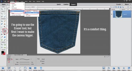
Something about the very narrow margins around this pocket bothered me. I like to have a bit more transparent workspace so I’m just going to enlarge the “canvas size”. CTRL/CMD>ALT>C for you keyboard shortcutters, or Image>Resize>Canvas Size for the ones who are new to Work Smart Not Hard.
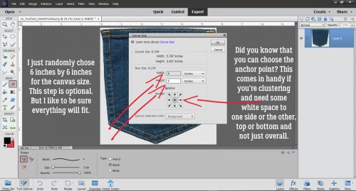
The margins don’t have to be huge so I just pulled 6×6 out of the air and typed it into the boxes. Now, see that tic-tac-toe board near the bottom of the menu box? Well, it lets you decide where the extra canvas goes! You can add it to one side or the other, top or bottom, depending on why you’re adding workspace. If I was making a cluster, for example, I would have an idea of where things in the cluster would be added and put the extra space where it would do the most good simply by clicking one the associated square to set the new Anchor Point. (I was yesterday old when I noticed that…)
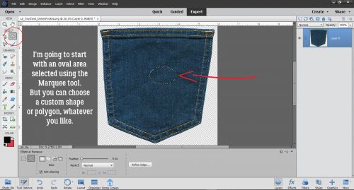
For the sake of clarity I chose to use just an elliptical shape with the Marquee tool to make my hole. But whatever your vision tells you is what you should do. I could have used a custom shape or polygon of any kind, and that might make a really interesting look on a layout. Once I had my ellipse pulled out, I Cut the area inside it out. Edit>Cut or CTRL/CMD>X.
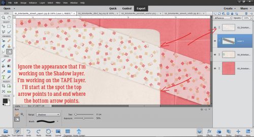
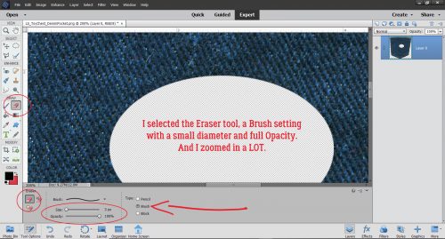
So now I have a hole in my pocket. How am I going to make it look like a REAL hole? With the Eraser tool to start with. I have the Brush selected as my Eraser type, and a very small size with 100% Opacity to completely erase my threads. Zoom is your friend for this technique.
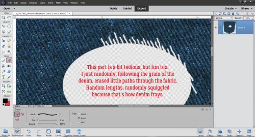
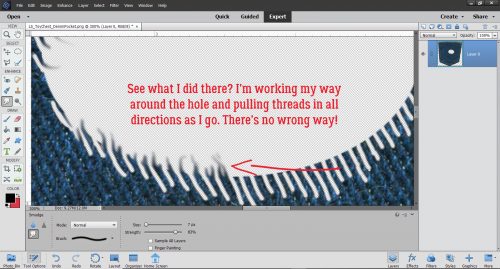
Denim is a twill weave, with diagonal grain, so my “threads” are following that direction. I used the Eraser to remove bits of the fabric past the edge of the cutout. There’s no need for precision for this step – actually for any of it! – so I just randomly Erased sections of random lengths, and some of them are quite squiggly. That’s good! I worked my way around the hole; I went clockwise but it doesn’t matter how you do it.
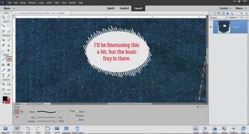
So this is what I had once I’d created my threads. The bones are there, now to put the flesh on them!
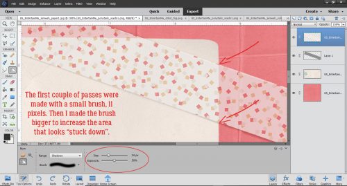
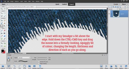
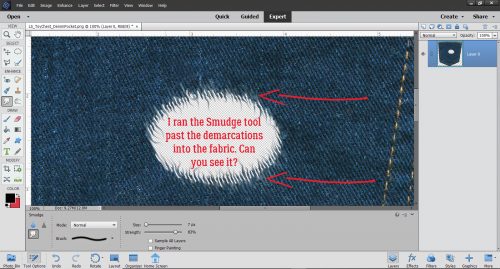
Next I chose the Smudge tool (the one that looks like a finger) to soften and stretch the threads into the hole. Again, I used a small diameter brush, and not-quite-full Strength to make my threads threadier.
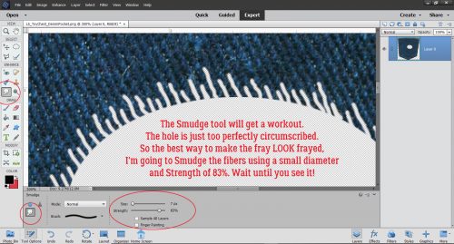
I put the Brush down on the denim then click-dragged the Smudger over the thread and out into the hole. To make a longer thread, start a little farther from the edge. Again, randomness and imperfection are the right things here, so make sure they’re not the same length or going in the same direction.
Everything about this technique is what you’re happy with, so don’t be too fussy about any of it. Just keep working it until you’ve got a good collection of stringy things in there.
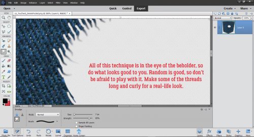
Yep, you can criss-cross some of your threads! Those holes in your jeans will have some criss-crossed threads so why not?!
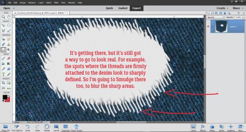
It’s starting to look more real by the minute, but there are still some things needed to get it right. The places where I Erased into the denim look too symmetrical and sharp so that has to be fixed. I’ll use the Smudge tool for that too.
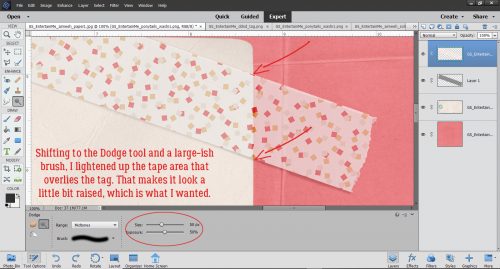
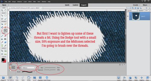
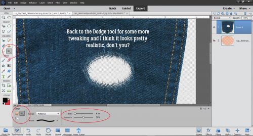
But I’m skipping ahead here. Those threads are still too dark to look like a real hole, so I chose the Dodge tool to lighten them up. Remember Dodge lightens, Burn darkens? Well, just make sure you’ve got DODGE selected. Again a small diameter, 50% Exposure and Midtones will be the settings. Now I’m just going to brush that Dodge tool over the threads and into the denim around the hole a bit.
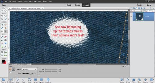
Better already! But not quite there. Close…
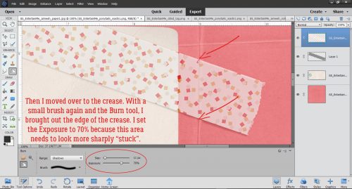
I moved back to the Smudge tool to soften up the edges. Same settings as before makes it simple to switch between tools.
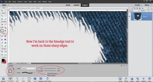
I was most definitely NOT precise with the Smudge tool here, running it up into the denim to soften the areas where I’d already Dodged. Now it’s looking like a real hole in real denim!
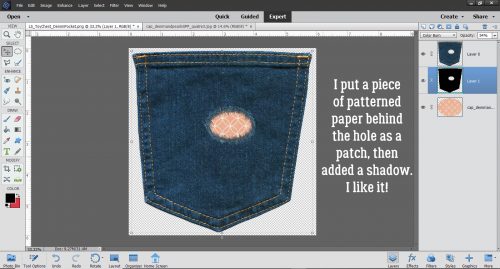
I just switched back and forth between the Smudge and Dodge tools until I was happy with my holey jeans. It looks pretty good!
Then I put a piece if this pretty pink patterned paper from Connie Prince’s Denim and Pearls extra paper pack behind the hole like a patch. A drop shadow layer in between and I think it’s darned near perfect!
Please let me know in the comments if you’d like me to do this again with paper to show you the tricks for that. Kellie, I haven’t forgotten your scene cleaner request, but it’ll take quite a bit more time to put together than I have just now. I promise, it’s coming!
I’ll be taking a month off while we’re moving – the movers are here next Wednesday already! Look for a new tutorial – maybe the paper version of this one – around the end of May. Stay home, wear a mask, wash your hands!