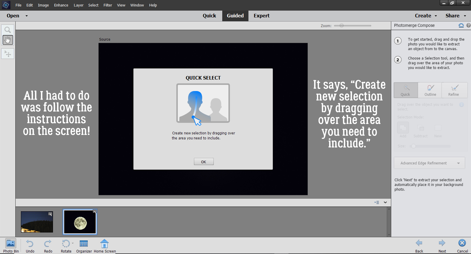
Challenge Spotlight: Wild About Styles
![]()
Well, so far May has been… a lot. My son has been ill, needing a lot of attention, and I’m mentally exhausted. He went back to his day program today, and I was awake half the night worrying that it might be too soon. So far, so good – no calls from the coordinator. Fingers crossed.
At the beginning of the month, glee asked me if I could help her figure out how to use Wetfish Designs‘ Wild About Styles Challenge Styles, and I said I would. Then everything unravelled. Yesterday when I finally started to play with them, it dawned on me that I should let YOU be the tutors, and I’d offer some commentary. Brilliant, right? Why would I reinvent the wheel? So let’s have a look at how YOU’ve used them!
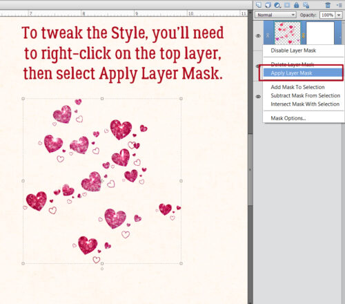
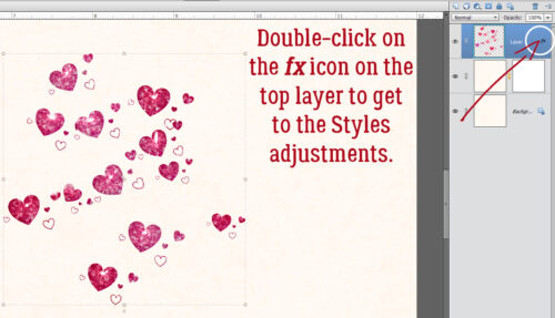
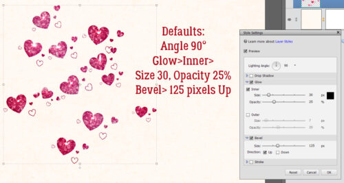
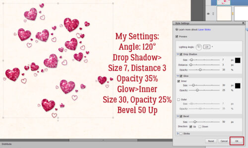
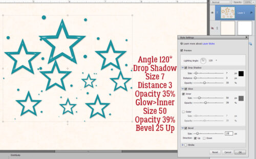
As always, the layouts to follow are linked to their spots in the Gallery so you can get a closer look, and maybe leave some praise. Just click on the Scrapper‘s user name and you’ll be transported. But before we get rolling, I should take a minute to discuss the Styles themselves. As you can see, some of them are heavily textured. They’re gorgeous as is, but aren’t scale-able – meaning the Style itself can’t be Resized. If you want the texture, but not the size, you’ll need to apply the Style to a paper or a solid Filled layer, Simplify the layer, THEN Resize. The Styles, when applied to objects, will not allow the contours of that object to be visible. They’re “flat”. This can be overcome by decreasing the Opacity of the Styled layer until the contours are revealed. And the third thing I want to mention is that what you see is what you get – solid, off-white texture. If you apply a Style from the set to a coloured paper, for example, the colour will be completely concealed. There are a couple of ways to colour the Styled layer. One is to drop a coloured (or patterned) paper on top of the Styled layer then decrease the Opacity of the paper layer until the texture appears. The second is to drop a coloured paper on top of the Styled layer then change the Blend Mode. Overlay works beautifully, but some of the others are also quite stunning. Color Burn, for example, gives a very sculpted look. So if you’re not seeing the look you want, don’t be afraid to experiment!
This is how the designer demonstrated her Styles.
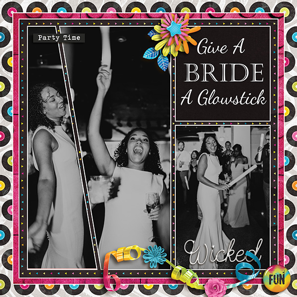
Next up is this layout from VariaMoon. She chose the horizontal plank woodgrain Style, then added some paint splash and paw print Brushes to it, picking out the brick colour from her large photo.
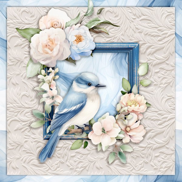
For her layout, dhariana used a bunch! The vertical woodgrain is her base, and she’s used masks to add the floral and flourish-y textures to her background.
Here, lm44west took a similar approach. She’s added a semi-transparent lily overlay behind her photo.
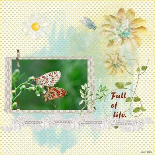
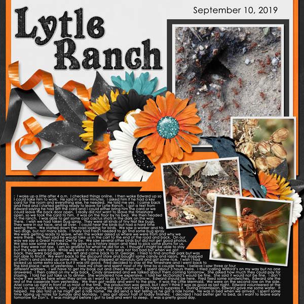
01lousmith kept it simple; she used the vertical woodgrain coloured to look almost like pressure-treated lumber, and threw some paint at it. Very effective!
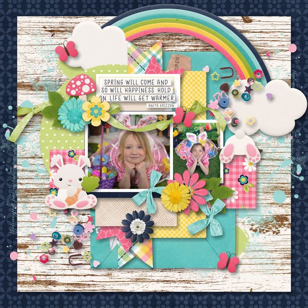
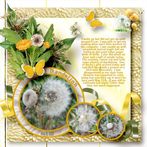
KatherineWoodin has recoloured the chrysanthemum Style yellow, likely by layering a solid yellow paper over the Style layer and using Overlay, to pick up her theme’s colour palette.
The chrysanthemum Style seems to be quite popular, used again here by greenfiend27. She created bilateral borders by layering lace over the Style but under her photo, all layers shadowed perfectly. The result is so pretty.
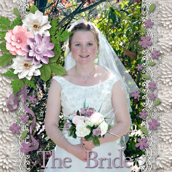
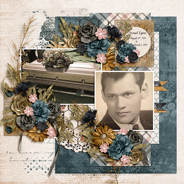
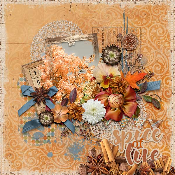
Pippin went with the flourish-y choice, creating a textured mat behind her framed photo. The original ivory colour of the Style works well with the elements she added.
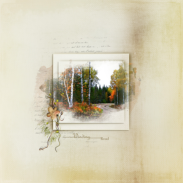
FormbyGirl has a very subtle touch, using at least two Styles, blending them into the background. The result if soft and lovely.
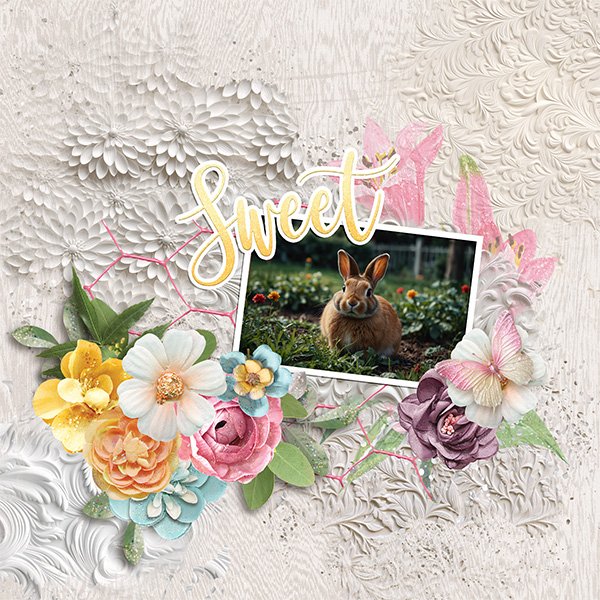
Jill used the chrysanthemum Style and put it behind some very expertly shadowed cutouts. She also used the flourish-y Style to add dimension to her background.
The vertical woodgrain Style seems to be quite popular too; stater used it for her background with a dark blue paper blended into it, likely with the Multiply mode.
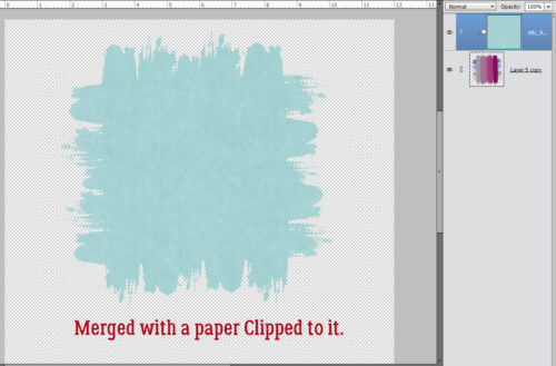
It looks like glee went ahead without me. 😀 She too went with the chrysanthemum, adding a blended deeply coloured paper border. Then she Clipped the flourish-y Style to her title. It took me quite some time to figure that darker border out.
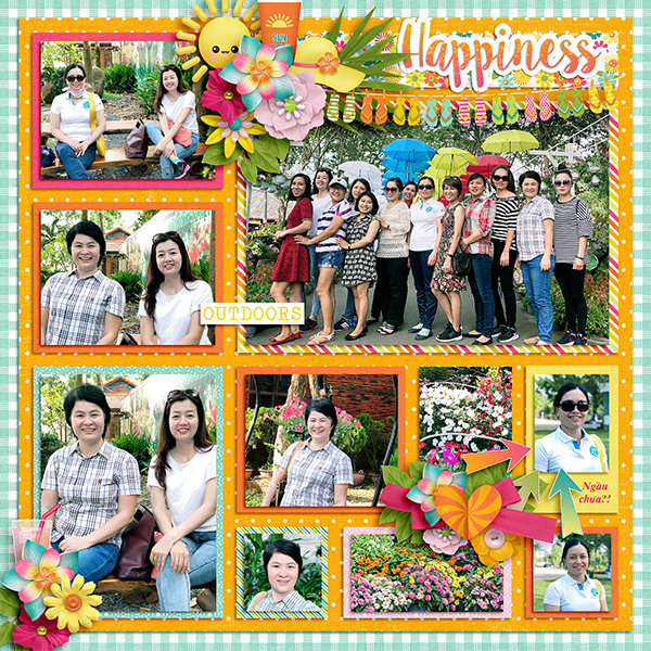
5grand has created a sampler, with at least eight different Styles represented. She Clipped papers to some, left others as is and presented us with a visual feast!
For her layout, imafishtank kept it simple and just Clipped the flourish-y Style to her title. It gives the illusion of colour but I zoomed WAYYYY in, and it’s not!
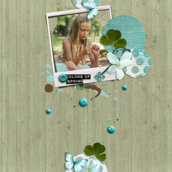
RobynC is our last presenter. She used two of the Styles, one on her background and the other on her title.
Have you been inspired? I have!
![]()